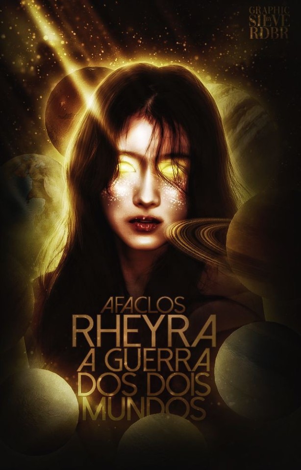
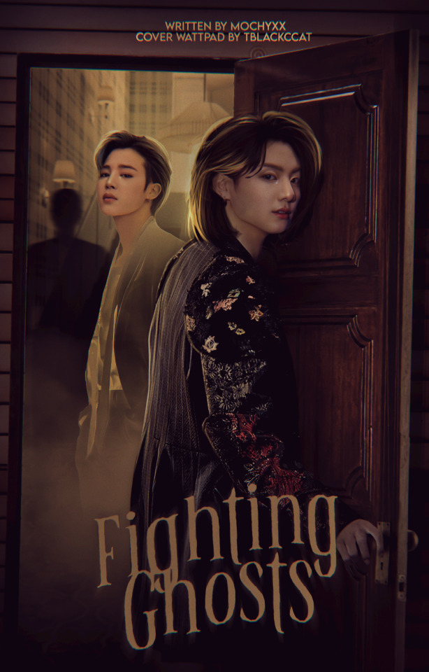
#cover wattpad
Text


58 notes
·
View notes
Text
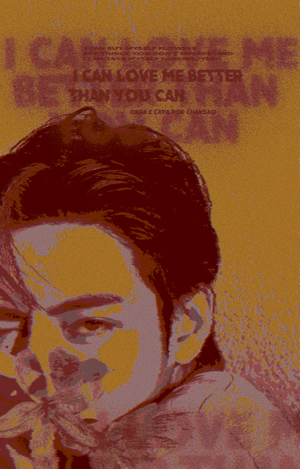
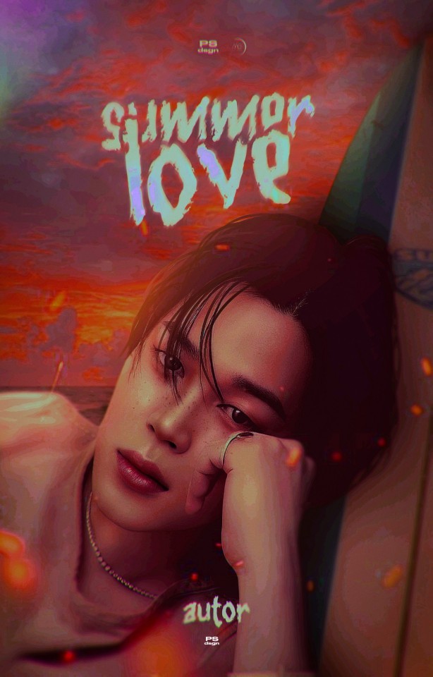
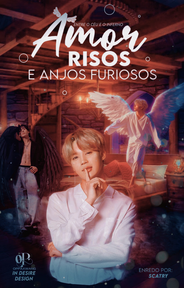
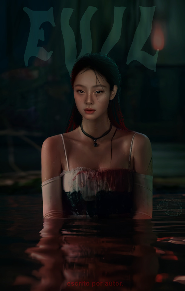
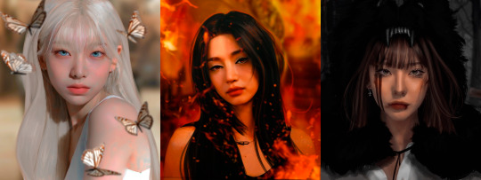
I can love me better:
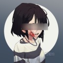
•capa para uso pessoal
Vi essas fotos do Tae e nao resistir em fazer uma capinha. Simplesmente sou apaixonado no meu estilo caótico das capas
#capa de fanfic#design simples#kpop edits#capa fanfic#coverdesign#capa dark#capa bts#capa wattpad#cover wattpad#capa taehyung#capa colagem#Spotify
37 notes
·
View notes
Text

"50's in Saint Tropez", capa teste (não disponível para doação ainda) (12/11);
Nossa, sobre essa capa, fazia muito, mas MUITO tempo que eu não ficava satisfeita com os manips que fiz. Mas esse de hoje, em especial, me fez ficar um pouco mais feliz pelo resultado, apesar de reconhecer que preciso aprender mais um pouco. Acho que apenas senti falta de editar com o Yoongi, kakaksk, enfim, posso dizer que gostei um tantinho dela ♡
#capa para fanfic#donaculkin#capa para spirit#capa spirit#spirit fanfics#600x400#capa 600x400#design#capa romântica#design simples#capa manip#manip#capa com manip#capa manipulação#capa manipulada#cover para wattpad#cover wattpad#cover#wattpad#capa wattpad#capa teste#min yoongi#bts#capa kpop#capa 3d#dona culkin fala#volta pra mim Yoongi 😭
70 notes
·
View notes
Text


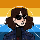
ʚ um presente de natal ɞ
・26/08/23・ pedido para king-yeom [stellarniverse]
#capa para social spirit#capa para spirit#capa para fanfic#capa para wattpad#wattpad capa#cover wattpad#wattpad cover#capa wattpad#wattpad#capa de fanfic#capa divertida#capa manipulação#capa iluminação#jin#namjin#namjoon#capista#iluminação#trancyz#stellarniverse#2023
68 notes
·
View notes
Text


Últimos designs simples entregues na plataforma do blog;
Parabéns à todes capistas envolvidos, nós te idolatramos!
📦 EM CASO DE INSPIRAÇÃO, CREDITE O DEVIDO CAPISTA (SEM PLÁGIO);
25 notes
·
View notes
Text

. mystery ; treino
🗂 caso de inspiração, credite!
#bts#capa de fanfic#kpop edits#coverdesign#capa clean#manipulação#capa para fic#capa dark#capa de wattpad#capa para wattpad#cover wattpad#cover edit
72 notes
·
View notes
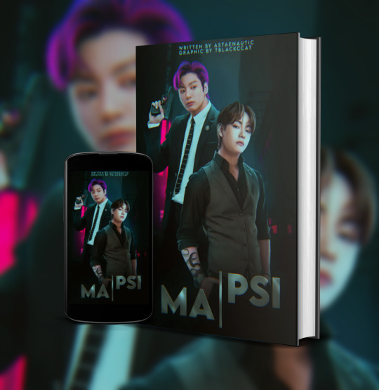
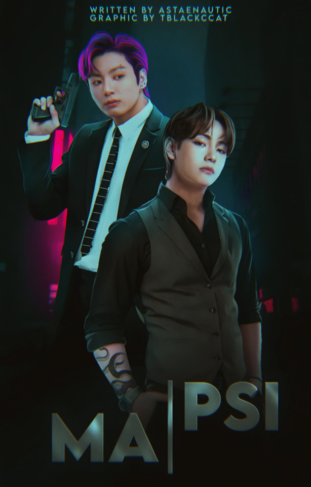
Text
Things graphic designer should know. 1 pt.
a unprofessional graphic designer telling you some knowledge and information about graphic design.
for only wattpad users. :(
For a cover, we use "512x800", for the banners in the stories they are more diverse and depend on your preference, but the most used and basic is "1280x475", then we go to the profile design,
there an icon of "500x500" is used and a "1920x600" banner. Many more graphics are used, but these are the main ones. The icon size also works for Instagram. There are many more graphics, but for these, there are no stipulated measures, I'll talk about them later.
Multiples of these can also be used for higher quality.
[photo]
fortunately, I found what is written in the second picture. Let me write it systematically.
The first says; 300x300 ( icon )
The second; is 500x500 ( story ad )
The third; is a 700x100 or 800x200 ( banner )
Fourth; 441x ---- ( thread )
The fifth; is 512x800 ( cover )
Sixth; 800x600 ( is like the banner but with more images, I think. )
The seventh; 1920x600 ( profile header )
The eighth; 1500x2100 ( Movie Poster )
the ninth; 600x2400 ( Bookmark )
I tried to get as clear as possible but if you have any sources that can be used for this then, please comment about it.
Now, let's talk about the type of covers;
I have taken several covers and I have grouped them by type, to explain myself better.
The type of cover varies depending on the preference of the writer, and what the story is about. Because of course, you can't use a pastel cover for a police and horror story, no.
The main covers are what we call minimalist -they should not be confused with typographic covers-, the simple and the manipulated ones. However, these three cover subtypes vary and I am here to tell you about every one of them.
It should be noted that not all of them are called the way I am going to say them, in some places
they are called different.
Let's start with the saturated style cover, also known as the collage or comic type.

In this style of covers, the saturation of colors is the center and the star, it has striking fonts and characters between and cut.
It is usually used for stories in the genre of comedy, drama, romantic drama, romantic comedy, and all its derivatives. However, he shines in comedy.

The light or neon style is a style where bright and striking colors are the center of attention, brightness, and contrasts that will make you freak out and leave you speechless, it is a style with great attention to detail.

The minimalist typographic style is nothing more than a photograph with a monochrome background where the contrasting color is the title. Simple.
2 pt., 3 pt., 4 pt.
#graphic design#kpop graphics#aesthetic#editingresources#kpop moodboard#kpopmanip#packpng#png#resources#kpop icons#wattpad books#cover wattpad#capa para wattpad#editorial design#capa de fanfic#design simples
29 notes
·
View notes
Text
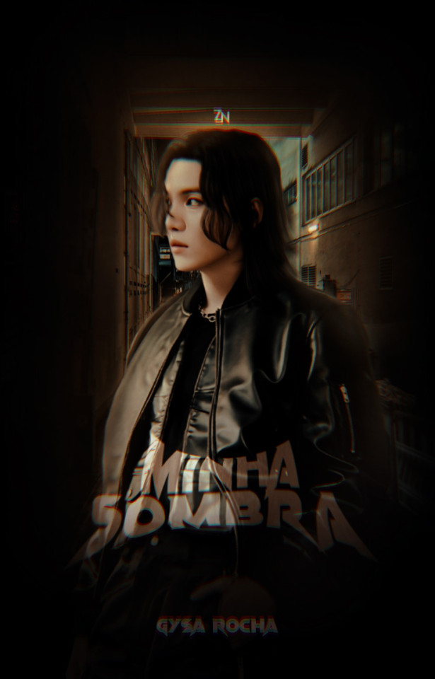
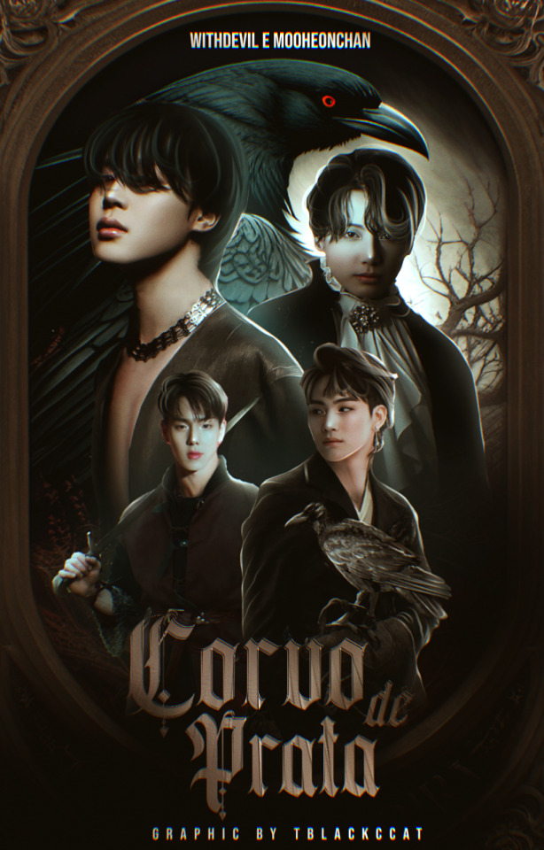
MINHA SOMBRA -- etapa bónus do mars no twitter
DOADA PARA GYSA ROCHA
17.01.2024
#capa fanfic#capa para fanfic#capa#capa wattpad#capa para fanfic wattpad#capa para fanfic kpop#capa fanfic kpop#capa fanfic wattpad#capa para wattpad#cover#wattpad cover#cover wattpad#fanfic#suga bts#min yoongi#suga#bta#bagtan boys#zelosnation#arttjxno#wooevill#wattpad#capa teste#capa dark
23 notes
·
View notes
Text
Doação de capas 🧡🎃
Regras:
Estar seguindo a conta.
Usar a capa por, pelo menos, um mês.
Dar os créditos.
[ 16.10.2023 ]


#capa wattpad#design#bts#graphic design#kpop#cover wattpad#park jimin#jeon jungkook#jikook#lee serafim#ive wonyoung#gidle#twice#twice mina#chaeryong itzy#itzy#blackpink#jennie#namjoon#bts jin#namjin#fnlinepark
26 notes
·
View notes
Text


Capa de fanfic - Wattpad recentes
#NOTA: Estou de volta depois de tanto tempo sem mexer na plataforma! Tentarei, aos poucos, postar as edições recentes.
Clique aqui para acessar meu portfólio!
#capa de fanfic#capa#ibispaintx#portfólio#jungkook#tblackccat#bts#cover wattpad#wattpad cover#kpop#design#kim taehyung#cover book
26 notes
·
View notes
Text

─── ⠀ ♡ Marjorie (pedido pessoal)
📍01.09.23
em caso de inspiração, credite.
24 notes
·
View notes
Text

Fri(end)s
• capa doação
•em caso de inspiração, credite
Tá para nascer que me faça não relacionar fri(end)s com Satosugu . Então fiz essa capinha porque aqui em casa , satosugu aconteceu e ninguém discorda .
#capa de fanfic#design simples#capa fanfic#coverdesign#capa dark#capa wattpad#cover wattpad#capa doação#capa jjk#capa satoru#capa suguru#capa anime#capa satosugu#capa jujutsu#capa jujutsu kaisen#capa manip#Spotify
21 notes
·
View notes
Text

"Burning Red", cover entregue através do blog Stellar Universe;
data: 16/01
#capa para fanfic#donaculkin#capa para spirit#capa spirit#spirit fanfics#600x400#capa 600x400#design#capa romântica#design simples#cover para wattpad#cover wattpad#cover bts#capa wattpad#capa para wattpad#wattpad#bts#capa manip#capa manipulada#capa manipulação#kim taehyung
43 notes
·
View notes
Text
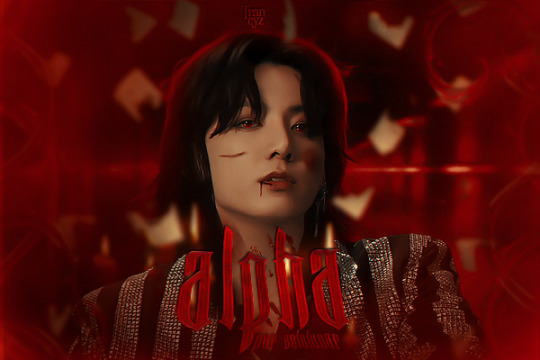

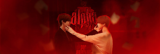
ʚ alpha ɞ
・30/07/23・pedido para sololunar [pessoal]
#capa para social spirit#capa para spirit#capa para fanfic#capa para wattpad#wattpad capa#cover wattpad#wattpad cover#capa wattpad#wattpad#capa de fanfic#capa divertida#capa manipulação#capa iluminação#jungkook#bts#jimin#capista#iluminação#trancyz#2023
58 notes
·
View notes
Text
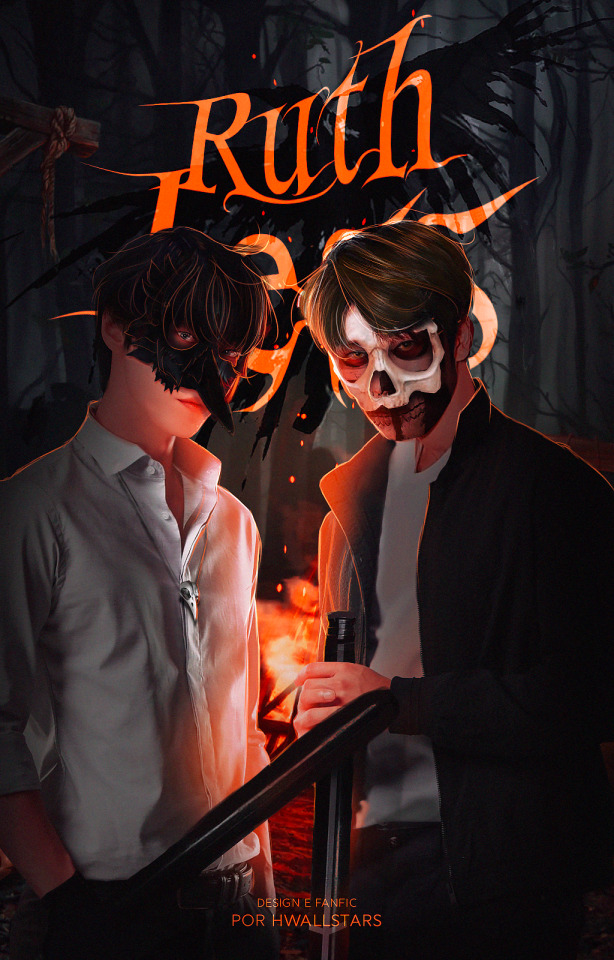

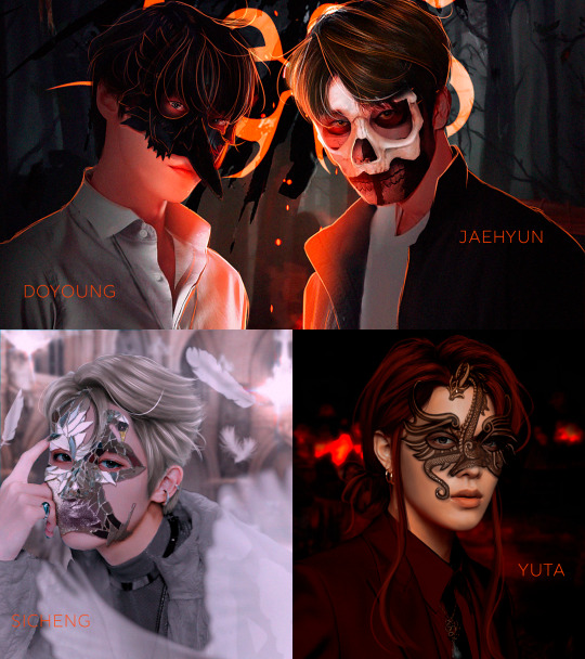
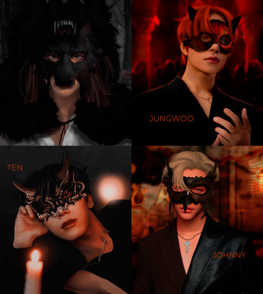
ℜ𝔲𝔱𝔥𝔩𝔢𝔰𝔰 » 𝔡𝔬𝔧𝔞𝔢
sinopse: Há anos atrás, Jaehyun fugiu de casa com a perspectiva de ter uma vida diferente da que sua família preparou para ele. Ele acreditou dia após dia que poderia ter uma vida normal e ser quem queria ser, mas sempre que dava um passo adiante, alguma coisa o fazia retroceder vários passos atrás. Por isso ele decide voltar para a ilha em que cresceu e enfrentar o passado que não quer que ninguém saiba. Esse passado, no entanto, é o mesmo que deu início a uma vida diferente para Doyoung, e o único vínculo que resta entre eles.
[ spirit | wattpad ]
#dojae#capa fanfic#capa dark#capa design#design simples#capa para fanfic#capa spirit#capa wattpad#edit kpop#my edit#fanfic#cover wattpad#cover book#cover spirit fanfiction#cover for wattpad#fanfic dojae#jaedo#jungwoo#nct#nctu#nct127#taeyong#yuta#yuwin#winwin#sicheng#ten#johnny#johnten#kun
54 notes
·
View notes
Last Seen Blogs

jnnlbrd
Untitled
taags-old-account
TAAG'S OLD ACCOUNT
birdly-vagabond
Adventures of a bird loving Exo
ghostlynico
this and this and this
ch-xr
CHXR