#could there be a more ME pic
Text
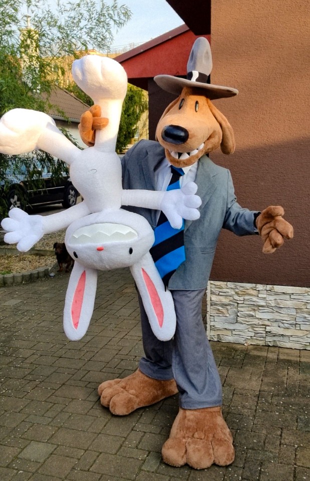
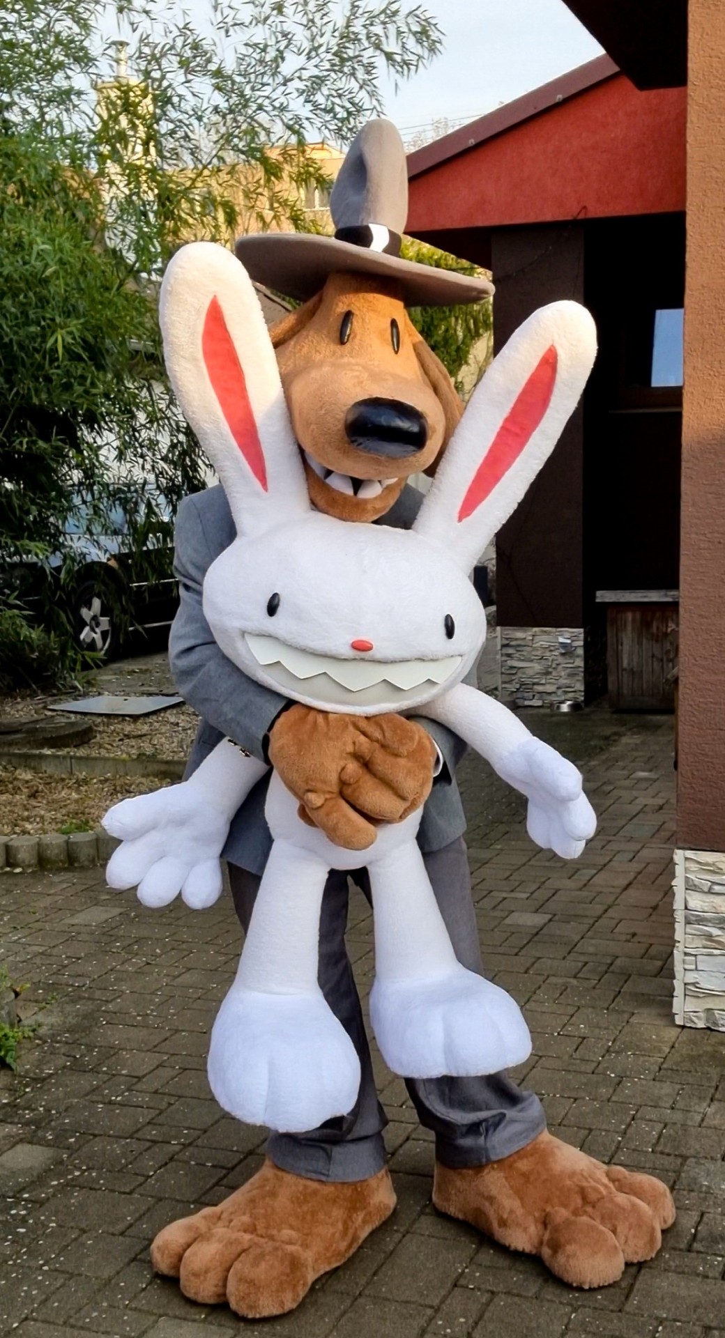
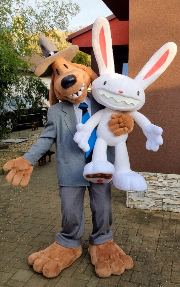
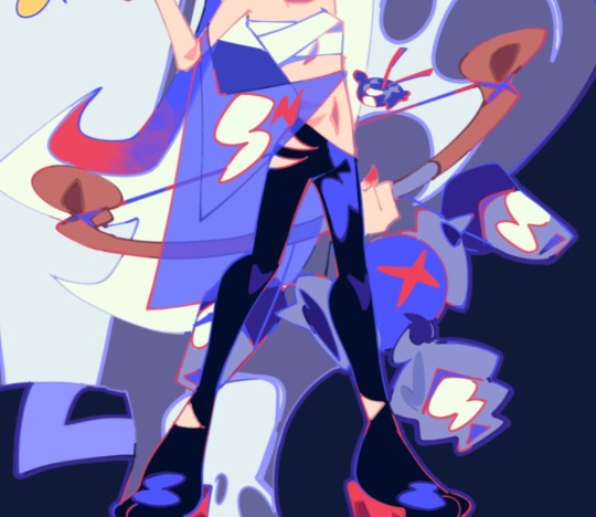
My Sam & Max cosplay I debuted at a local con during the weekend!
#wasnt wearing leg padding in these so sorry sams a bit skinny#sam and max#cosplay#crunchchute art#my art#i could remake the pants and jacket entirely but that would be quite hard actually. i suck at making jackets especially#so those are just thrifted and edited#lots of color differences that bug me but. oh well#pants and jacket arent that different but its noticeable in these pics#as well as maxs hands and feet. theyre slightly lighter as the fabric i used is better quality#but i ran out of the stuff i used on his body etc and i couldnt buy more from that store as they took their sweet time shipping the stuff#oh well. didnt make them for a competition so its okay#im my own biggest hater and my own biggest critic#at the end of the day i made a handful of people really happy and thats all that matters to me#gotta share them every chance i get as i usually just make a cos#wear it to the con and then put it on the shelf#but im too happy with these to just hide them away after#they need a good scrub and after that id like to bring them to another con. next main goal is viecc but thats just a maybe right now
2K notes
·
View notes
Text
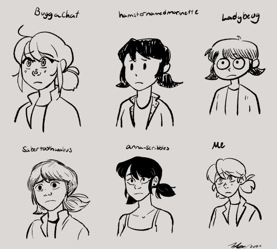
Drew a bunch of Marinettes in a bunch of different artists styles it was a lot of fun!!
Artists who's styles I mimicked: @buggachat @hamsternamedmarinette @ladybeug @sabertoothwalrus and @anna-scribbles all epic artists 🤟😎
#my art#marinette dupain cheng#miraculous ladybug#miraculous fanart#style mimic#sorry for the @s btw#yall should go follow those artists if you dont already also#this was sort of inspired by a post the three artists on the top row made#i think they all got together and drew with one another#which is really cool#but i was genuinely confused because i mimic styles a lot#and ive seen others do it too so i was just like#wow they really know each others styles really well#until i thought about it and read their posts some more#style mimicking is really freaking fun and i think its really good practice#and a good way to explore other ways of doing things#like you really have to learn new techniques and get out of your comfort zone#also anna scribbles i could not find a recent pic of marinette in her main outfit#so thats the only marinette i drew in different clothes cuz i couldnt find a more recent ref of you drawing it#anna scribble marinette has privileges thats the others dont#but ye#i also threw my own style in there as a frame of reference to what me draw like#ive drawn marinette before just not in a loooong while#sabertooth walrus was the hardest for me to mimic cuz they have a broad range in their style#so its like which sabertooth do i wanna be in this pic#Buggachat has such a distinct style thats very clean and consistent which is amazing so they were easy#being easy or hard arent bad things either it also has to do with like styles meeting up with one another#buggachats and mine arent too too different in some shapes and aspects#so yeah itd be easier plus they drew marinette like 3 sec ago so i have more recent of a ref#as opposed to sabertooth who i have a recent ref of ladybug but not marinette so we got two diff styles in one
3K notes
·
View notes
Text


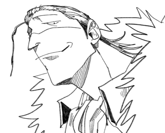
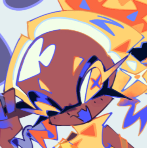
#my art#monkey d. luffy#one piece#dracule mihawk#sir crocodile#mihawk a little more moustachy and very OOC smile#the croc is from almost a year ago but i still find it neat#just normal drawings#hoping to draw less fanart and more original stuff this year. or at least really try to go out of my comfort zone#also plz no inappropriate comments about the croc#luffy and mihawk make good templates to experiment on. maybe cuz they're simple and shaped + wide brim hat#i seriously have a mihawk disease#i really like drawing low angles#i was looking at pics of tsurumi from GK and i was like mihawk could have a moustache like that#i think mihawk is the cutest guy in one piece.#April Edit: modified the luffy pic slightly. the shadow cutting off in the middle of his neck was bothering me for months
2K notes
·
View notes
Text


meow
#i feel like i should have made his ears a little bigger in th first pic. maybe ill go back and edit it later#GET WRINKLED IDIOT#i first thought of drawing him as a sphinx cat bc i looked at his third eye like hm... if he had wrinkles he could hide his eye#its also very fun imagining him wearing head coverings and hoods cause hes so fucking nakey#kinda makes me wanna draw him more... sphinxes are fun to draw. i kinda wanna make a sphinx design now <- loves designing characters#a thought i had while drawing this is that if only few had seen narinder before (like the lamb and previous vessels) then not many would#know what he looks like. since hes supposed to be death and the only time you see him is when you die and pass on i guess??#so i think it would be an interesting situation if the lamb just introduced narinder as some guy without telling anyone he is or used to be#the one who waits.. smth like a false idolatry situation so everyones like. oh wow our leader has been channeling the messages#of the one who waits for so long its almost like they have become death itself!! ^_^ and narinder is just. standing there#maybe if he gets enough power he can grow more eyes between his wrinkles like in his eldritch form. that would b cool#cult of the lamb#cotl#cotl narinder#cotl fanart#my art#myart#doodles#the one who waits
683 notes
·
View notes
Photo
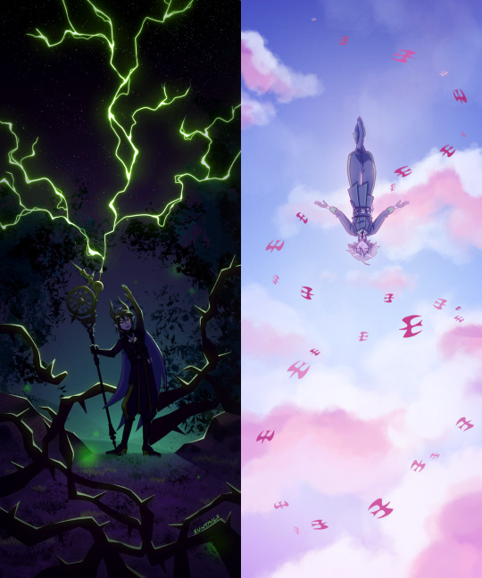
duality
#blinks lovingly at u. im insane. 3 pics in 2 days and i still wanna draw more its not enough its not enough its not enough its not enough it#their palettes. their vibes. their upbringings. their magic. their GGRGAGGHHGH i wish i was a writer i wish i could put words to how i feel#hmmggh if u wanna understand me as a person just put malleus and silver side by side and watch me start sobbing#as i ramble incoherently like 'the devotion. the loyalty. their fate. the betrayal#twst#twst spoilers#book 7 spoilers#twisted wonderland#malleus draconia#twst silver#silver vanrouge#diasomnia#suntails
2K notes
·
View notes
Text
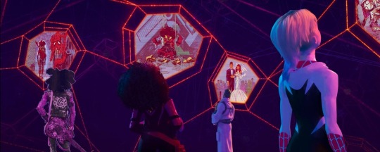
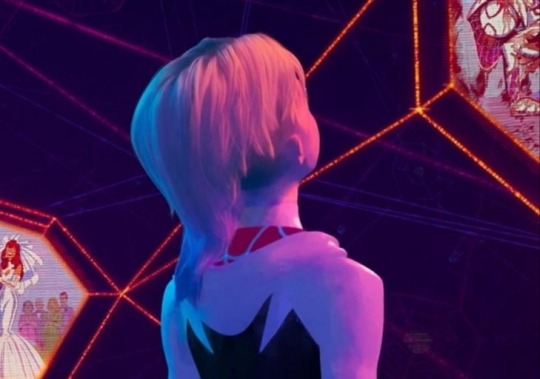
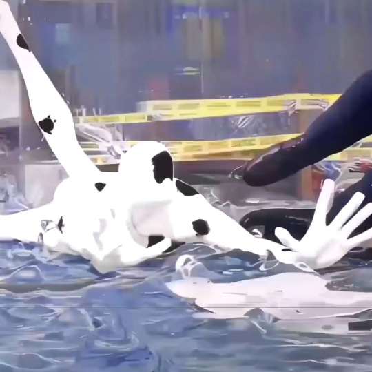
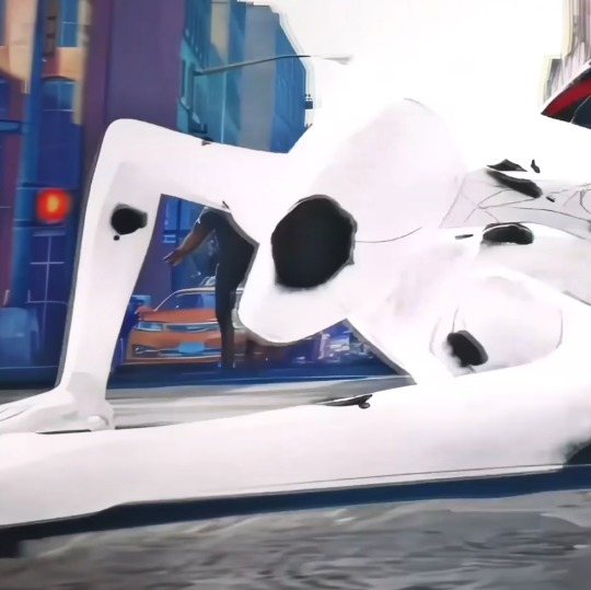
The fact that all Gwen knows about her variants in other universes is that they're dead is so sad. Like imagine you want to know what happens to you in other dimensions and it turns out that wherever you look you mean nothing, you're so unimportant that there's no bigger role for you other than dying.
And I've seen you guys pointing this out, where she's looking at what looks like her own death and even if it's not this is not just a "love interest" Gwen, this is a superhero who is supposed to mean something, but she doesn't. She's only here to die. And so far this (our) Gwen doesn't have any reason to believe that she won't die very soon just like other Gwens.
I think that one of the main reasons why she's rejecting Miles is not just her trauma and all shit she's been through and the fear of dying like other Gwens when they're involved with Spider-Man, but also because if they start something and she dies this will hurt him too.
It's easy to say "canon events aren't true she shouldn't believe in that" but this isn't just a regular risk, this is her life we're talking about.
#my baby just wanted to stay alive#her death just casually appeared above her head and she's expected to continue the conversation normally#and it doesn't look like she died peacefully at all look at her#spider man across the spider verse#Spiderverse#across the spiderverse#gwen stacy#spider woman#spider gwen#ghost spider#to anyone who says that this is kravens last hunt he injured peter badly in that comic almost killed him#but that doesn't mean that she won't die either in hands of kraven or anybody else#or that this is just one canon event she has more but as far as she knows she'll die if she touches spider man or just die like that#but I'm not sure if it's even kravens last hunt pic she doesn't look well here either way#to me it looks like she's hurt here I didn't think about other possibilities until y'all said it could be but it's sus i think she's hurt
471 notes
·
View notes
Text


i just remembered i had this post in my drafts for when the season ended! have some bts :)
#always sunny#iasip#sunny sweet 16#sunny spoilers#bts#s16#i have more but theyv got cast in them and idk if thats allowed#again. i am scared#every season im on i get slightly braver taking pictures lmfao#s15 i literally took NO PICTURES i was like 'if they see me taking pics of set they will detonate me on sight'#like i took a few of mySELF on the bar set cuz how could i not#but this time i took pics of cast and stuff and :)#yo also those fucking 'animatronics' scared the FUCK OUT OF ME when i first walked on stage#i would keep seeing them out of th corner of my eye while we were filming and like JUMP ajksdng#the gritty pic i love so much lol hes helping :)#that episode was really. bad. but it was more fun to film than the others#and still obsessd w macs fit
437 notes
·
View notes
Text
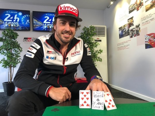
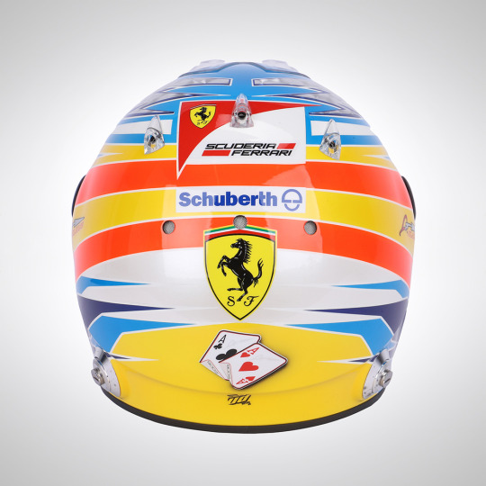
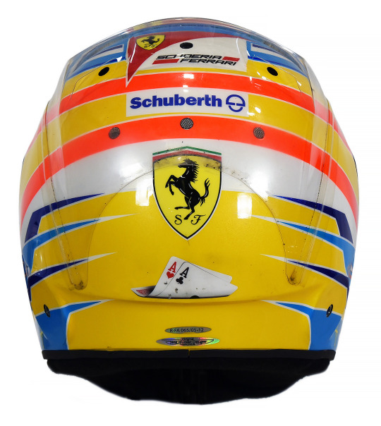
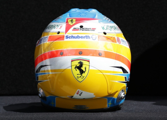
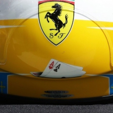
Fernando Alonso & His Relationship With Cards
I'm sure we're all familar with the cards on the back of Fernando's Vegas GP helmet by now, but did you know his relationship with cards goes a lot deeper?
I. Magic Tricks
You've probably seen or heard someone at least mention Fernando's propensity for card tricks. As far as I can tell he was doing them(publically) as far back as 2003 all the way to as recently as 2018. Even once performing a card trick, with a condom and a teddy bear(!??!?!??!!), in front of Valentino Rossi who said "How was that possible?"(x)
But how did this start? According to James Allen, "Fernando admits to having been heavily influenced by his grandfather, a mercurial figure, who taught him magic and card tricks, still one of his passions away from the race track."(x) And I'm not sure the validity of this one, because I couldn't find an actual source, but apparently he once said: "My parents are responsible for the two things I like doing most - driving and magic tricks. They bought me my first go-kart and a magician's kit."
In several interviews he described it as his hobby off track, and that he loved learning new tricks and surprising others in the garage with them! So clearly cards are pretty important to him both as a hobby but also to who he is as a person since they've been with him just as long as racing has.
II. Card Symbolism in His Helmets
This is the reason I originally made this post, but I thought I should also explain the origins of his card fascination first. As I said, we probably all remember the cards on the back of his helmet in Vegas, but did you know that wasn't the first time he had cards on the back of his helmet?
From 2008-2013, he used to have a pair of cards on the back of his helmets. The symbolisms of the cards themselves as well as the evolution of their design is really fascinating to me! Even more so with the recent development of the card choice in 2023.
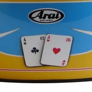
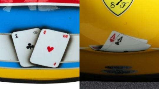
Fernando said he wanted to reference his two titles in some way on the back of his helmet and after his friend sent him several ideas, he decided on having two cards(an ace of clubs and an ace of hearts, sometimes pictured with 05 and 06 on them as well), saying: "I picked the cloverleaf [the ace of clubs - Ed] to give me luck, but the only pity is that it doesn't have four leaves!"(X)
2008.


Here's the very first appearance of the cards! They're displayed flat, with the 05 and 06 clearly visible
2009.

Very similar to 2008, but with a slightly different design, and they're maybe a bit more straight with less shadow?
2010.

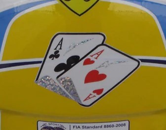
This is the first major change! I was sad they didn't have the years on them anymore, but then I realized they're sparkly to match with his signature lightning bolts on the top of the helmet!!
2011.
Honestly I'm still somewhat unsure if this is the actual 2011 helmet? It's pretty difficult to find clear photos of the back of helmets from older seasons. It's easiest to find them on replica sites or auction sites so I'm not 100%? But anyways, I like that this has the championship years on the underside of the cards
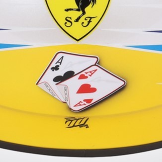
2012.

This is when I started getting weirdly emotional about the helmets. Do you see how they've progressed from being a centerpoint to being curled up and sad at the bottom of the helmet? Not listing the year anymore??
2013.
Same thoughts as 2012. And after this season, they cease to exist (just like his ferrari chair in the garage, WOAH CALLBACK), until cards make a reeappearance in his Vegas helmet, albeit in a different form
2013 Monaco(Honorable Mention):
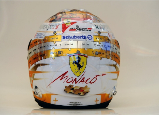
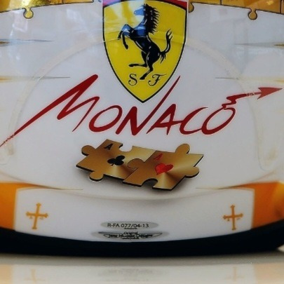
For some reason 2013 helmets were easier to find proper pictures of, so I happened to witness this absolute beauty. The creativity of this helmet genuinely blows me away??? Wanting to keep the card motif, but making sure to incorporate it into the rest of the puzzle piece design?? Mwah! There was another special 2013 helmet but they didn't change the cards at all so I really applaud this one
2023 Las Vegas(The Return of The King):
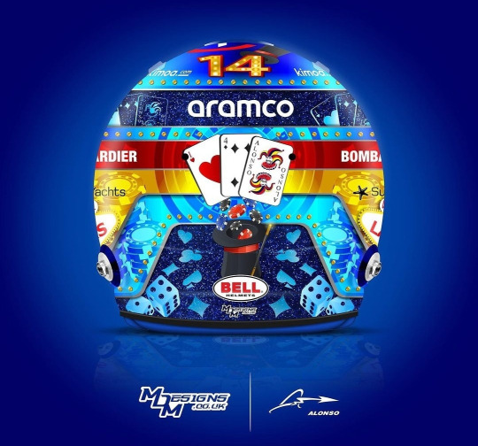
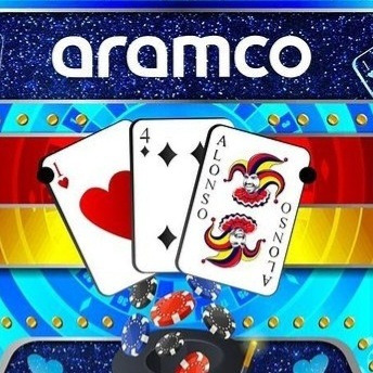
The magnificent return! But look! The cards are different cards! Instead of being two aces, it's now an ace of hearts, a four of hearts(his driver number of course!) and, the, now iconic, representation of himself as a Joker. I literally could not believe my eyes when this helmet was released and I saw the Joker card, what a fucking silly old man....I really wonder if he felt nostalgic having cards on his helmet again or if he didn't think about it all and was just like, "ah cards because Vegas!!!"
III. Why Does This Matter?
*The rest of the post was factual, this is moreso my personal thoughts on the symbolism of the cards/designs
This post spawned from me recently watching the 2010 Bahrain gp and noticing "hey wait a minute...are those CARDS ON THE BACK OF HIS HELMET!?" It's a really tiny detail that's unfortunately covered up by the HANS device pretty much whenever he's wearing the helmet, so it's really difficult to spot! But I became fascinated with the fact that he had cards on his helmet before that recent helmet, and now here we are!
There's something to me about how the design of the cards evolves over the course of six seasons from the cards being front and center to being smaller, more folded up and closer to the bottom of the helmet. As I said, the 2012-2013 ones genuinely made me depressed because it feels, symbolically, like his hopes for getting another Ace are becoming more and more unlikely and falling away until they eventually fall falt and fade away entirely after 2013 and disappear for basically a decade.
But when they return? They're not the same cards! Instead of representing Fernando's championships, they now represent him as a person, displaying his driver number and his persona of being a Joker!! Though I do think it's interesting he happened to keep the Ace of Hearts, even though he talked more about the Ace of Clubs before. I'm not sure it's actually this deep in reality, but I like to think that it's him not letting his championships(and the lack thereof) define him, but rather letting who he is as a person shine and be the centerpoint instead! But on a sadder note, as @suzuki-ecstar said to me, maybe the Aces aren't there anymore because he's lost all hope for a chance at a third Ace entirely :(

#yes its finals week and im up to my eyes in coursework but instead decided to spend like 5 hours researching and writing this post#nah bcs i actually genuinely put more work into this then I think I have all semester dsfjdskjg#that thing about him using a condom and teddy bear in a magic trick genuinely had me crying with laugher. actual tears rolling down my face#<- HOW!?!? WHAT WAS THE TRICK?? its literally inconceivable to me what he did. oh if only there were pics UGH#anyways!! this post was a lot of fun to make!! i really really love the symbolism and design of helmets so this was a rly fun project#and i also went down a lot of rabbitholes while make this and saw many very weird articles from yore#i feel like i make an equal amnt of deranged posts abt seb and nando but i dont know why nando is gifted w all my well researched projects#<- i.e. chair post. that was the same level of research as this one but at least this one i could find actual sources about....#idk theres smth about the extremely long history of nando's history that evokes research posts like this KLAJSLSKDJ#theres just so much that i dont think I ever really see people discussing! so i must create.#haha what was that joke tag i wanted to make abt my researched posts? I think:#normal posts that catie normally makes in a normal fashion#<- one day ill go back and actually tag posts w that. bcs the amtn of research compared to my actual schoolwork is so unwell#fernando alonso#fa14#f1#formula 1#catie.rambling.txt#we do a little bit of f1
277 notes
·
View notes
Text
OK heres zeno coloring tutorial 2.0 !!!! i'm gonna do it kind of in chapters i guess?
chapter 1: choosing base colors
when i'm choosing base colors i always pick everything based on a specific off-white! my 'default' off-white is this kind of very light cyan color but i change it regularly based on character designs/environment/lighting whatever,, examples here!
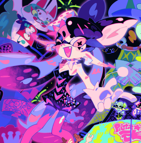
for callie in this piece, i based everything off of this pinkish color! her skin tone, tentacles, outfit etc are all chosen to harmonise/contrast with the pink color

and with this piece, i used a slightly darker blueish color as they're in space but there's still a lot of light... and the lighter colors in the background (the explosion) make a sense of depth i guess? i used that blue color and chose similar cool colors to harmonise with it!
so i more or less base the tone of the colors in the piece off the off-white! warm off-white = warmer colors (like the nova valentine's day art) and cold off white = cooler colors (like the explosion nova and paro art). but i switch up this formula often !!
chapter 2: coloring specific things
here i'll go over some specific textures and stuff like skin and hair ... skin first !!
for skin, i like to use a variety of tones! there are different ways to draw cooler and warmer skintones that other people have gone over way better than i have but basically for skin i use this part of the color wheel and pick the darker tones of oranges/reds/pinks etc. (for darker skintones, i go to the middle of the color square thingy, and for lighter tones, i usually slide down the upper-right side)

when it comes to shading skintones, it's pretty straightforward, just a darkish-purple and a pinkish color on 100% multiply, and i always add a little shadow on the nose and blush becuz i think it's cute
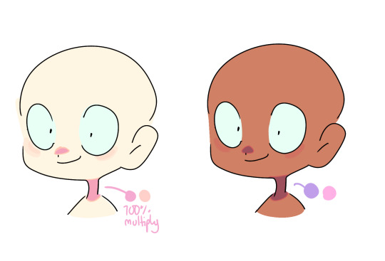
(also i like to add reflective spots on darker skin tones sometimes because 1. darker skin tones reflect in real life and 2. it's fun)

next up is hair... this is very specific to my artstyle but i like to add 3-6 long oval line thingies to the hair to mimic reflection ! it looks cool, it's a good way to show off different colors in the design and i like to switch it up sometimes based on a character's personality!! (like how the frye pic above has a lighting bolt shaped hair thing, or how my teto design has a wing shaped hair thing to mimic her wings in her chimera form!) (note: it doesn't always need to be lighter than the actually hair color and it usually isn't)

for other materials like metal, screens, etc etc... i just add random X marks lol... and reflections!!!

(also, just a general thing, but adding little saturated lines to shading really adds depth and color imo!!)
i would put more tips with refs but tumbles only allows 10 images per post ;w; so i will simply close off by saying don't be afraid to add overlays and filters to your art!! overlays can really help harmonise colors and filters like brightness and contrast can help colors pop... try not to completely rely on them for color choice tho!!
and that's basically it !!! this is not a definitive 'how to draw/color' post... i am not a color theorist... i just wanted to show people how i choose colors cuz a lot of people say they like my color choices! honestly i don't know much myself but i hope that this and the philosophy of 'do what looks good' will help you all o_ob thank you and goodbye
#long post#ah its so freeing to have zero character limit on this site#i did want to add more pics tho 😭#i would make a part two but i dont have much else to say#hope this helps people maybe#also idk how to add a cut/'continue reading' thingy on mobile so if someone could tell me how id appreciate it 😭😭😭
936 notes
·
View notes
Text


Domestic Oscar
Pt. 1
#I’m gonna start just posting all the pics I have on my gallery of him to save them here#I have over 2.5k pictures and no more space on my phone#google drive won’t let me storage them#so yeah this could be fun#oscar isaac hernandez estrada#oscar isaac#como amo a mi flaquito#also the white T-shirt omg
259 notes
·
View notes
Text


Early movie Spot icons request
#vark posts#why does this man shrug so damn much#i could make an entire icon post of him shrugging istg#my gallery rn makes me look like a spot fanatic with all the pics i got#so pls lmk if u want more lmao#as always no credit needed#only did minor edits#atsv#atsv icons#the spot#across the spiderverse#request
584 notes
·
View notes
Text

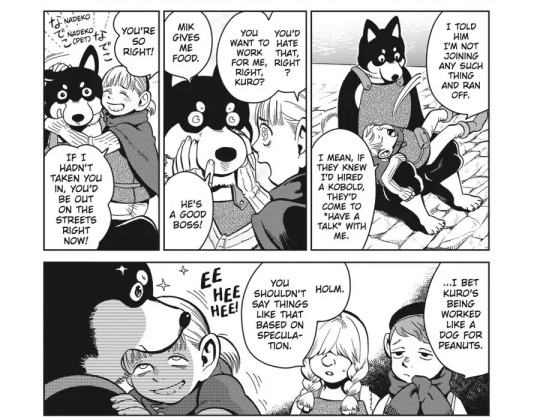
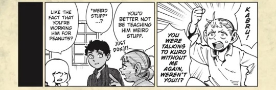
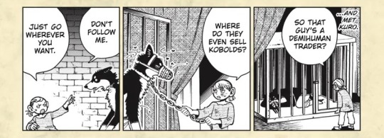
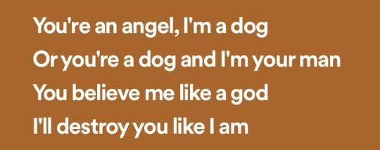
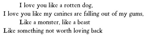

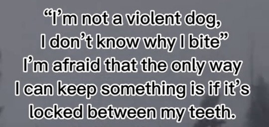
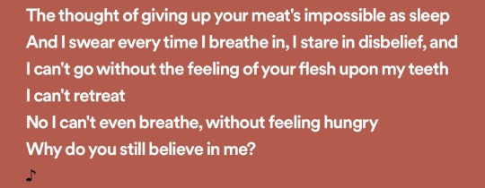

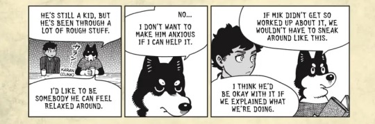
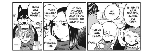
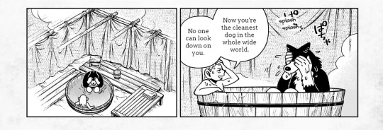
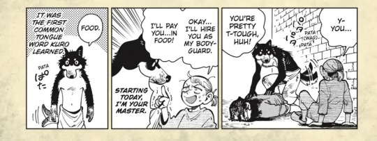
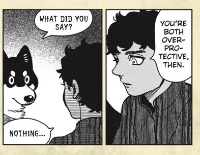
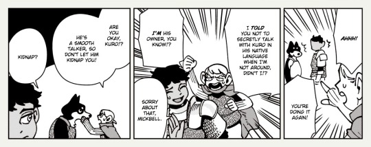
Canines
The hand that feeds
Mickbell Tomas & Kuro
Dungeon Meshi
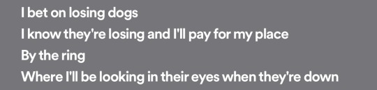
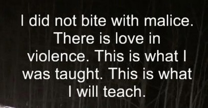
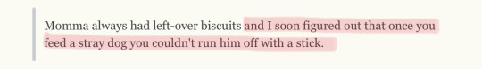
^ 1: Ink-the-artist, I will remove my teeth / 2: Margaret Atwood / 3: C.S. Lewis, The Horse and His Boy / 4: Mitski, I’m your man / 5: Ojibwa, I love you like a rotten dog / 6: KotOR II / 7: Stardrop, Everything that’s ever been mine is covered in teeth marks / 8: Sodikken, People Eater / 9: Mitski, I’m your man / 10: maxime., The life and death of a dog / 11: Mitski, I bet on losing dogs / 12: maxime., The life and death of a dog / 13: hun, I did not bite with Malice / 14: C. Michael Davis, Don't Pet the Dragon / 15: Mitski, I’m your man
v 1: Early versions of the myth as in aeschylus orestes / 2: Ink-the-artist, I will not remove my teeth
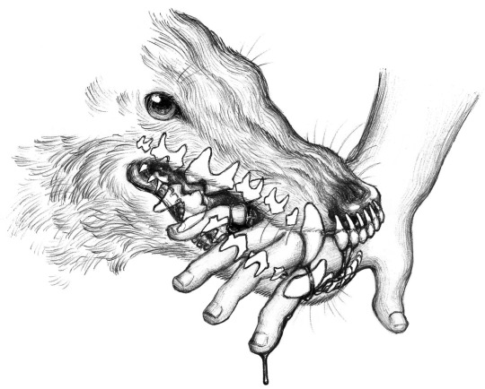
#Yeahh i’m workng on a mickbell & kabru party analysis oops#I’d bleed for anything if it held me the right way. Even teeth#dungeon meshi#delicious in dungeon#Mickbell tomas#kuro#mickuro#mickrin#It’s on topic in my heart#The red means I love you…#The duality between the care & devotion and the hurt & isolation is really what gets to me#Traumabonded kittens highkey#Tw#cw#cw abuse#tw abuse#Web weaving#web weave#webweaving#I hit 30 pics :( would have added more if i could#Idk even anymore… Pls tell me you see the vision#Mick obvi loves Kuro a lot but this was meant to focus on the unhealthy side if that wasn’t obvious. Abuse tactic of isolation etc etc#People always leave. doesn’t matter how or why but his parents his sister everyone he’s never enough to stay#and that’s why he thinks he has to trick Kuro into thinking Mickbell’s the whole world or he’ll discover that there’s more out there.#Stuff that’s worth leaving him for. He has to make the world scary and unknown and not pay him and not let him have connections#That’s why he doesn’t want people to have a choice!! Either Mickbell doesn’t care about you or he’ll make sure you can never be without him#and there being a third option/outcome in this freaks him out!!!#Some of these should be called ‘No Title’ instead but I have bad academic crediting etiquette this looks cooler sorry#He’s scared of course he bites. There’s only throwing bones when feeding a stray. So bare your teeth and chew me up
90 notes
·
View notes
Text
Do Jeff Ward and Peter Gadiot know about shuggy?
And by that I mean:
Do Jeff Ward and Peter Gadiot know that they could literally just take a selfie together one day, even without costume or makeup, post or online, and a very significant part of the fandom would be in complete shambles?
Do they know the power they have?
#this is me copping with the fact that we probably won’t see live action shuggy interaction for the next 50 years#unless they change some things or give us some more flashbacks#jeff peter if you hear me you the power you can be my saviors if you so choose#actual TAZ could be my savior because he is bestie with both of them I think#TAZ PLEASE COME THROUGH GIVE US A PIC#one piece#shuggy#buggy the clown#red haired shanks#jeff ward#peter gadiot
361 notes
·
View notes
Text


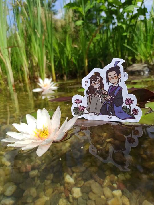
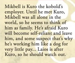
baes on a yunmeng lake date :))


i was craving some sang of the cheng variety and made these and not gonna lie, big fan of how they turned out hahha they're so cute 🤲
also pls ignore the shite cut job on these I hate cutting and all I had was old as dirt mini scissors.
↓more pics with the lilies under cut cuz i liked those as well
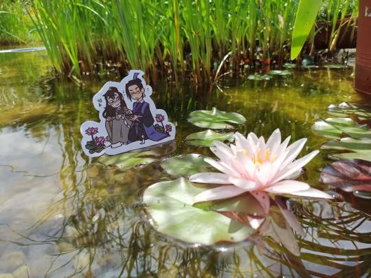

#my art#sangcheng#nie huaisang#jiang cheng#mdzs#i had these done already on friday but had to wait for today so I could go and print them lol#pls appreciate the gimmick and congratulate me for going outside lmao /j#pics credit to mayhem whom i bullied into taking them for me yet once again#i had more to say but forgor#oh yeah if it isnt obvious the one with jc picking nhs up is moments before theyre about to be sopping wet lol#some more enthusiastic about the impromptu swim it than others jhdfksdf
335 notes
·
View notes
Text
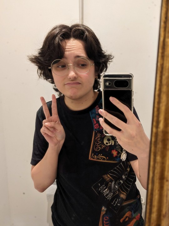
why am i in witch hat atelier (this is the best thing that has ever happened to me) (please read witch hat atelier)
#witch hat atelier#wha#atuarto#atwert#chin hair in progress sdfjkln#@ my t shots: stop slacking off#COSPLAY ONE DAY???? but i can't sew and i don't have money :((((( but omg can you imagine#imagine if i was wearing his cosplay in that pic#also this pic was taken two weeks before i read tbna so I wasn't even trying!!!#my hair isn't always perfectly like this but it is on the day i wash them#the days after that it gets a bit wavier#bUT YEAH#I LOVE HIM SO MUUUCHHHH#whenever he's on the page i'm like this is both so weird and exciting because i can't unsee myself 😭😭#when i go “i love you you're so pretty” at him i have to pause like wait.#is this how i start to self-love more#also it makes me feel so good about my gender presentation and my choice to go on t like.......#i'm only one month on t so there are no visible changes and yet i look like this sweetheart!!!!#and it makes me happy!!!!#how could i be wrong about going on t#it's just so unexpectedly affirming idk
102 notes
·
View notes
Text
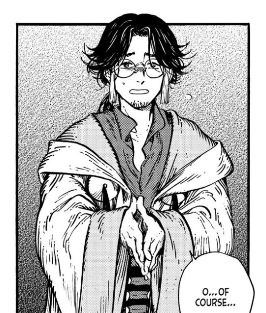
wait!!! i never showed yall this masterpiece did i?
✨Larp'alor Jaster Mereel Master Jereel in all his historically accurate glory✨
#back from the days when i drew Jaster as more of a twink#but the idea still stands#this man could larp his way into the jedi council and they would not know what happened to them#still one of my fave ever plunnies that hit me#random boli thoughts#art for my fic#my art#me writing#jaster mereel#master jereel#i think i have another larp'alor pic somewhere else lemme go look for that too
89 notes
·
View notes
Last Seen Blogs
clownshrooms
there goes our ghetto fabulous lifestyle
alicerovai
Alice Rovai
helloiamalive
OMAYGOT
fuckupbro
Damn

thefancynerdguy
Untitled