#color symbolism
Text
A Quick Guide to Colour Symbolism
Colour symbolism has been a long-standing part of the writers' craft. Colours can hold different meanings across various cultures, but here are some common examples of some colours and their associated imagery.
🍎 Red: Love, lust, anger, danger, violence, passion
💎 Blue: Tranquillity, calm, peace, sadness, isolation
🥬 Green: Jealousy, rebirth, growth, greed, renewal
♠️ Black: Death, sadness, loss, grief, evil, depression
🎀 Pink: Sweetness, love, kindness, innocence
🍊 Orange: Joy, creativity, energy, excitement
🌼 Yellow: Joy, cowardice, innocence, optimism
🏳️ White: Innocence, faith, peace, purity, mourning
🐴 Brown: Stability, comfort, predictability, boredom
💟 Purple: Royalty, bravery, virtue, luxury, spirituality
#writers#creative writing#writing#writing community#writers of tumblr#creative writers#writing inspiration#writeblr#writing tips#writerblr#writblr#color meanings#color symbolism#writing advice#writing resources#references for writers#help for writers#writing help#creative writing tips#quick writing tips
3K notes
·
View notes
Text
Dark features/people as blessed, white and light people as sick
ladyoftheseastuff asked:
I'm writing a fantasy story where the world is permanently covered in snow & ice. The people share a common culture & are loyal to their city states, but they are not homogeneous in appearance; there will be many, many characters coded as PoC. The main religion centers on the sun, & those with dark features are 'favoured' by the sun god, while pale people or anyone who has white/blonde hair are thought vulnerable to "snow sickness", a disease caused by environmental factors (1/2)
& have other rules and customs to gain religious approval. It's dangerous & infectious but not well understood. It affects social standing and opportunities, but it's meant to be tied with ideas of youth, vitality, & fear of aging & sickness: it's not limited to those coded as white. This is a cultural detail and not part of the main conflict, but I want to avoid unintentional allegories/parallels & fetishization. Is this a concept that's too close to crossing any of those lines? (2/2)
This feels less like a means to show dark skinned people in an empowering light and more like a weak attempt at subversion. My primary concern (which you have not specified) is how do the "blessed" class treat the "sickly" so to speak. We have fantasy stories like The Grisha Trilogy and Girls of Paper and Fire, which deal with magical ability/feature-based segregation and conflict.
In both cases there is a sense of entitlement which comes with hailing from the "favoured" class, quite obvious, since there will always be an inherent othering metaphor whenever you create such a division, whether it was meant to be a source of conflict or not.
However, the two mentioned series use the "magical people are blessed, non magical people are to be pitied" arc which is somewhat more subtle than divisions created just on the basis of skin colour.
Disclaimer as I do not have albinism or vitiligo: The latter can be extremely harmful, and not just in a racial context, but in cases of albinism, vitiligo etc.
~Mod Mimi
The pitfalls of subversions
While it is always lovely to see dark features considered in a favorable way, there are some issues you may come across. Such a story could easily end up dressing those you wished to uphold as bad guys in the readers' eyes, even if the story's society and the sun god etc. thinks they're amazing, and white and light people as the victims of dark people, deserving reader sympathy. This may especially be the case based on how these groups get treated in the story.
These sort of subversions lean dangerously into "reverse discrimination" plots which are not overall accurate or favorable allegories for your real, human audience. There being diversity on both sides doesn't necessary fix this issue or remove racial or ethnic implications. On that note, and as Mimi mentioned, being demonized and ostracized particularly for skin and genetic disorders like albinism is already a thing. What does your concept say of them?
I think Dark/Black as good and Light/white as bad is a doable concept. Your concept differs a bit from simply subverting black/white tropes. This is not just Black good guys and night skies being peaceful or neutral. It's not just white/light villains (as opposed to victims) or snow symbolling death or sickness.
White and light people are quite blatantly being declared as sick and unfavored and they may very well be victims in the reader's eye with the dark people being the villainous, unsympathetic bunch. Is this your intention?
More to consider
Such a concept requires thoughtful, careful planning and intentional writing. You should have an understanding of what your story implies to the readers and the real-life takeaways.
I think it's possible to make dark skin the favored skin of the sun god without it meaning white/light people stand in a negative light and are sick or unworthy.
Consider what it is that you like about the concept of your story. Can you keep the essence of whatever it is that excites you about your ideas, without denying a whole group of people favor? If not, how will you go about telling such a tale that is not meant to symbolize a sort of reversal of roles discrimination?
Why does the sun god get to determine what is good?
Are there other gods that might have different strong opinions? Perhaps who is favored varies by time of day, season, region, culture, god?
Can dark skin get its favor without white and light features being deemed unfavorable as a whole?
How big of a deal does this favor have to be? I advise reconsidering it being the point of discrimination to white/light people for all the reasons already described.
No matter the directions you go, please research and get the appropriate beta-readers for feedback on the in-depth concepts and story.
~Mod Colette
601 notes
·
View notes
Text
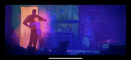
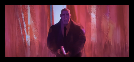
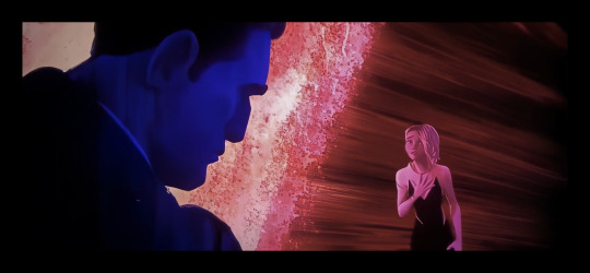
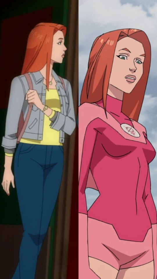
i wanna speak to the void abt gwens universe's colour symbolism and how it links to trans identity so here it is, feel free to read
the colours used in gwens universe - primarily in interactions with her dad are pinkish and bluish tones. the animators used pink as a way to show honesty, candidness and openness expressed, whilst the blue served to show isolation and dishonesty. ill discuss why i think so below
in the scene where gwen returns home after quitting the band, gwen is coloured in blue tones.
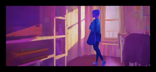
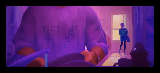
shes hiding her identity as spiderwoman from her dad and isolating herself in her room.
her dad tries to open up and talk to her about the case, hence the warm/orangey tones. but gwen remains blue, shutting him out. but when they hug, gwen is more purplish, showing a hint of her opening up.
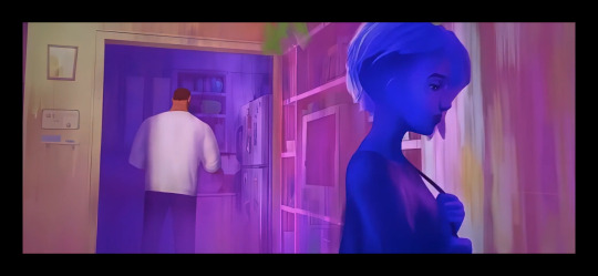
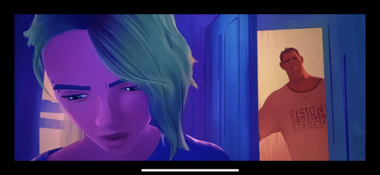
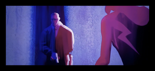
the other scene i think is especially significant with her colour symbolism is the confrontation after the guggenheim sequence.
when gwen comes out as spiderwoman, the colours start to shift.
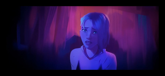
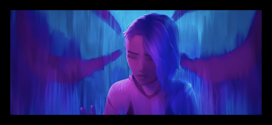

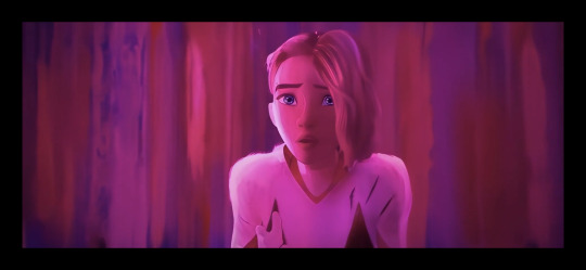
gwen is now candid, shes come out to her dad and is trying to make him listen and understand her. but just like gwens blues became pinks, george's pinks shift to blue.
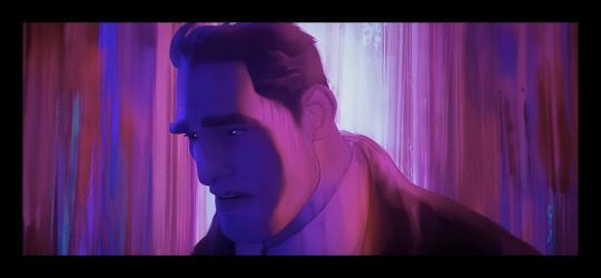
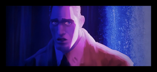
the last image in this set is actually so chilling, the fear in his eyes hurt me deeply 💀 anyway
george hides behind his cop persona, avoiding and isolating from gwens confession to him, which is supported by the colour used to portray him.

all of this builds to what i think theyre trying to say about gwen being transgender. the typical gender to colour association is pink girl and blue boy. the choice of colour is deliberate here as much as it usually is with the spiderverse team. why use these two colours in this specific way? a lot of people who dont think gwen is a trans girl will say "well those two colours dont have to represent trans identity" they dont, but the details say that the spiderverse team (once again) is intentionally using them to talk about trans identity and coming out.
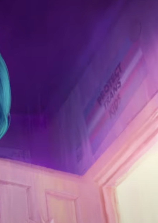
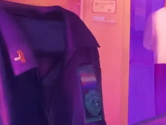
i think that by putting the "protect trans kids" poster in gwens room, and the trans flag patch on officer stacy's jacket show that theyre not just randomly picking the colours, but that they made the conscious choice for the boy associated colour - blue - to show hiding and isolation. whilst pink is about honesty and openness whilst being the girl associated colour. i think that the use of these colours in this way is saying that gwen is a trans woman.
and if ur still not convinced well
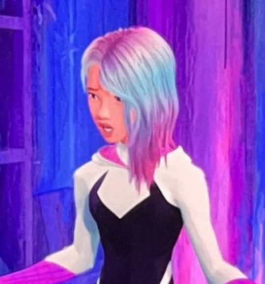
i havent even talked about the DIALOGUE in this movie and how trans it is. her arc (and miles' arc) across the two movies is such a queer coded story. "can i tell my dad, will he approve of me? will he still love me the same?" like it couldnt be more obvious. someone also mentioned somewhere that the side shave is also significant? like when she has the long hair facing toward the viewers its the same as the pink being used to show honesty and linked to femininity, and the short side almost like a masc haircut and being of the opposite meaning when its facing the audience. idk abt that one but its an interesting thought! that as well as her like having the same shoe size as hobie even tho that man is so fucking tall - yk this cuz her chucks are stated to be his.
anyways if u got that far, thanks???
and if u still deny that gwen is trans then idk what to say, u prob hate trans ppl
gwen is trans, they dont need to explicitly say it inorder for it to be true, just bc they didnt say gwen is trans, or miles is somehow queer, or hobie is gender non conformist, doesnt mean theyre cishet.
#across the spider verse#spiderverse#into the spiderverse#gwen stacy#george stacy#atsv#itsv#trans#transgender#transfem#gwen is trans#colour symbolism#color symbolism#gender#gender identity#queer#pride#spider punk#hobie brown#miles morales#punk#gender noncomformity
832 notes
·
View notes
Text
I had a really distressing thought about Cody's gray armor, so I decided to make it everyone's problem. As a refresher, here's our beloved marshal commander in his orange/gold Republic armor, and in his gray Imperial armor:

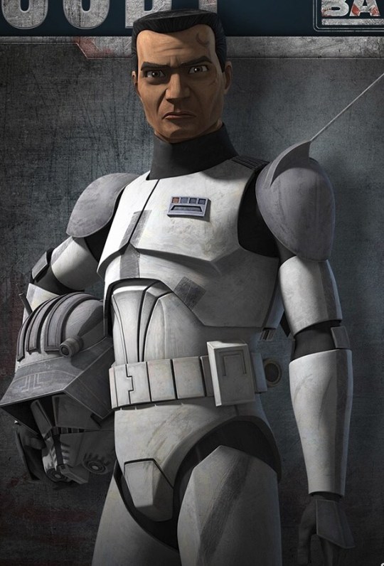
A lot of ink has been spilled about this, and most of the analysis I've seen has talked about how he's had to suppress his personality and identity under the Empire, and I agree.
However. I wanted to draw a parallel with another clone we've seen who painted his armor gray after having a much more vibrant look:


The Wolfpack used to have red-painted armor. After the devastating battle of Abregado, when their entire battalion was killed except Wolffe, Boost, and Sinker, they painted their armor gray in mourning of their fallen brothers, and that's how it stayed for the rest of the war.
We've seen several clones who kept their original armor paint during the Imperial era, like Howzer, Fireball, and Nemec. So I question whether Cody was actually forced to paint his armor gray, or whether he chose to do it himself as a sort of passive resistance or possibly malicious compliance thing.
Incidentally, in Mandalorian armor color symbolism, gray stands for the mourning of a lost love.
476 notes
·
View notes
Text
Fantasy Worldbuilding Questions (Clothing and Fashion)
Clothing and Fashion Worldbuilding Questions:
What is considered typical or everyday dress for each region?
What values or status does society confer to clothing (or is it entirely functional, or even non-existent)?
Who is permitted to wear what? Are there taboos, superstitions, or laws governing dress? Why?
Who has access to clothing? Which fabrics are cheaper and which more expensive (and why)?
Where are fabrics and other materials used in clothing sourced, and is their production ethical or problematic in some way?
Where are specific dress codes or uniforms enforced, and what are they?
When do styles or what people typically wear change, are there seasonal, spiritual, customary or other aspects to this?
When have (or will) clothing styles change in the world, and what are the economic, environmental, or other contributing factors?
Why is clothing in this world the way it is, what are the aesthetic beliefs, meanings or symbolism ascribed to colors, and other contributing factors?
Why does gender, class or race impact what people wear (for example, a group may have spiritual or familial meaning attached to the type of jewelry or body modification members embrace).
❯ ❯ ❯ Read other writing masterposts in this series: Worldbuilding Questions for Deeper Settings
#writeblr#worldbuilding#fiction writing#writing tips#writing advice#writing#novel writing#fantasy writing#fwq#fantasy worldbuilding#fantasy fiction#superstitions#color symbolism#character creation#urban fantasy
156 notes
·
View notes
Text
So now that we at long last have Summer’s actual design, I can finally ask this question with absolute certainty and no ambiguous context:
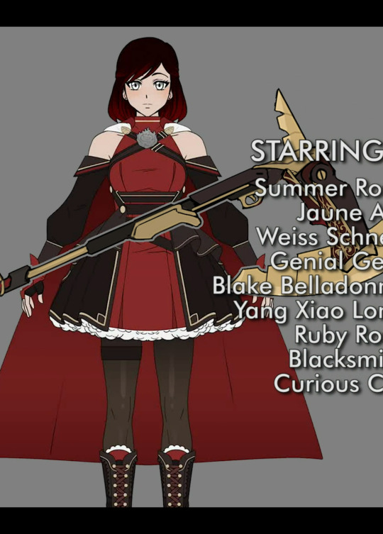

Why did CRWBY give Ruby, Summer AND Raven the SAME THREE COLORS?
And less relevant due to development lag and Summer’s outfit clearly having been designed/finalized much later, but still an interesting detail:

In hindsight, Ruby’s Volume 1 look is basically the design of Summer’s outfit... with RAVEN’S predominantly red/black color scheme.
#rwby#rwby spoilers#rwby volume 9#rwby rambling#crazed rwby rambling#Summer Rose#Raven Branwen#Ruby Rose#rosebird#rosebird parents#rosebird parents theory#color parallels#color symbolism#GUESS WHO'S BACK ON THEIR BULLSHIT? XD#seriously these three have the same three colors is NEVER going to stop bugging me
456 notes
·
View notes
Text
Colors in shows and such mean EVERYTHING to me so I'd like to point out how in season 1 Stede's "I'm being a pirate captain" outfit is this very elaborate teal blue outfit, and in season 2 Stede's "I'm a famous pirate now" look is in a dark teal blue top, it's like a more realistic gruffer version of what he was trying to be in the first season. It's Stede but in a darker light.
Meanwhile Ed has traded out all black for a white, but still dirty, ensemble that shows how much he's changed and how much change he wants. Stede's motivations are still the same from episode 1, so he's wearing the same colors but the slight change shows his progress in that goal, but Ed's change shows his entire motivation flip.
It's so good I love it.
#our flag means death#ofmd#ofmd spoilers#our flag means death spoilers#our flag means death season 2#ofmd season 2#ofmd s2 ep 7#stede bonnet#stede bonnet ofmd#edward teach#edward teach ofmd#blackbeard ofmd#color analysis#color symbolism#ofmd analysis#ofmd s2 spoilers#text post
267 notes
·
View notes
Text
comparison and analysis on eve and mark's colors
i know this miggght be me overthinking but i really need to get it out of my system ahahajshajsha
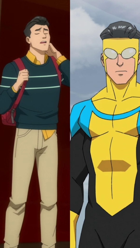
Pink is definitely Eve's signature color, it's the main color of her costume yet somehow you don't see that in her casual attire. As for Mark, no doubt his signature color is blue (even yellow can be included), and that's obvious in both his costume and his casual attire.
this post contains pics from season 1 and the atom eve special, putting a cut here cause this is lowkey long so,,,, oops-

Eve wore pink a LOT when she was a kid, it's in her every outfit throughout all the time skips in the special. When a character has a signature color, it's something that's reflected in (nearly all of) their outfit/s.
So where did the pink go on Eve's casual attire on season 1? Where did she even got the idea of wearing yellow of all colors when it's so far from her favorite color? There's red that when you mix it with white, it gives you pink. So she could have had a red top and white pants in her current casual attire, but that's not the case.
We got our answer on who she got the idea of wearing yellow from in the Atom Eve special: it was from Betsy.
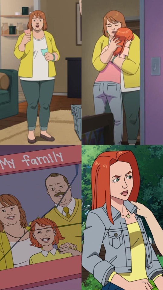
There's a key thing that I noticed from the shade of yellow Betsy wore and what Eve is currently wearing. Betsy's yellow seemed happier. It was more vibrant.
Comparing Betsy's yellow to Eve, Eve's yellow is lighter. It's dull. As if it was drained of its vibrancy. And with what we saw of Eve's past in the special, it checks out that she must've have become so, so tired of so many things.
In animated series, yellow is often associated with warm, happy, and energetic characters. But when it comes to cinematography, yellow represents other things. From the link, I think cowardice is the symbolism of Betsy's yellow - due to her fear of Eve not being "normal" and her inability to accept Eve as she is. And @mandareeboo even pointed out Betsy telling Eve to "try harder" which leads to the symbolism of yellow that I associate with Eve: insecurity. There is no bigger source of insecurity than having your own parent say that to you, especially at a young age when a lot of things feel they're scary and overwhelming that you need a parent to guide you through it but instead they just tell you to repress yourself.
It's no wonder that Eve's yellow looked pale in comparison to past Betsy's yellow, pretending for years must have been exhauasting.
(Before anyone comment that Zak could be the reason Eve wore yellow instead of Betsy, I have an explanation I'm going to be giving later so please bear with me on this one hahahsdfjahsfda)
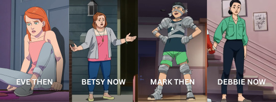
Now on to Mark!!
In the Atom Eve special, Debbie wore no shades of either blue or green. In fact, her top's color leans more to give a nod to Nolan's signature color (red). That, and their family pictures from season 1 showed that aside from Debbie, there was a time that Mark wore red too.
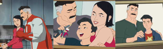
Compared to Eve and Betsy, I find it so fascinating that the opposite applies for Mark and Debbie.
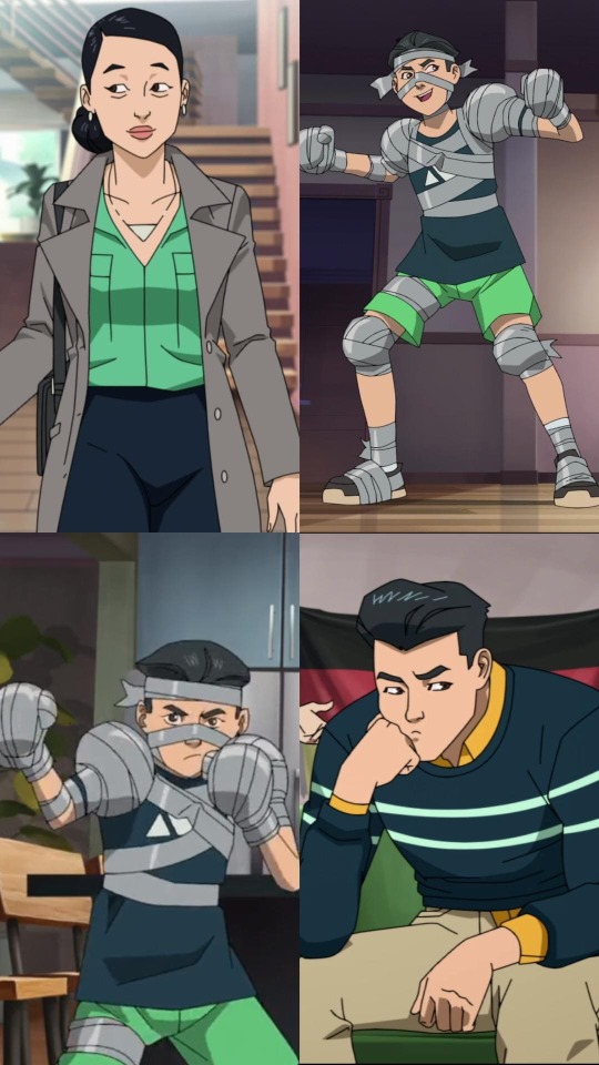
We can see that kid Mark's shorts and top are currently the colors of Debbie's top and pants.
It was a nice switch to see the mom's colors reflecting her child. You often see the kid copying the color of their parent/s. This doesn't necessarily mean Debbie copied Mark, as a mom, this is her way of commemorating her son.
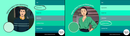
The two stripes on Mark is a brighter shade of aquamarine while Debbie's top is a darker shade of Caribbean green, and both colors are near to each other in the color spectrum. Which is definitely something we can describe their relationship: they are close to each other.
I always thought that the stripes across Mark's chest was sort of a subtle design thing to show that he keeps his mom, who represents his humanity, close to his heart. Seeing that Debbie got her colors from kid Mark adds a whole new layer to it.
This is the part where I compare the then & the now:
The reason why I mentioned Eve would never have picked up yellow with Zak in mind was that he was just a temporary figure in her life. Eve used to wear pink so much before, it was her favorite - so one can assume that the color itself brought her joy. You see Betsy wearing pink (this is the episode Eve left "home"). So my reasoning for Betsy wearing this color was to appease Eve, while Eve wore yellow to represent her trying to please her mom.
For Debbie and Mark, it was crucial for Debbie to wear the colors Mark wore as a kid. Throughout the series, we see how desperate Mark wanted to be like Nolan, to be good with his powers so he can be a good hero. One would think that Mark would have incorporated red in his outfit, but he didn't. What stood in the place of red in Mark's outfits was yellow, a color that's close to red in the rainbow arrangement. Using the same link for the meanings of the color yellow in cinematography from earlier, Mark's yellow symbolizes two things: naivety and idealization.
See how Mark has a yellow button-up underneath his sweater? It's his naivety about his father, it's not all out there yet it's on all the ends of his sweater as if making sure you know that the yellow is something that should be seen. And Mark's yellow I in his costume? That's idealization. In his eyes, Omni-Man is (probably, I can't speak for Mark 100%) the best hero. He idolizes his dad, there was never a doubt about it. He has put Nolan in such a high standard that there was more yellow in his costume to represent his idealization rather than his own signature blue.
That's why it's so important that Debbie wore his colors from the Atom Eve special in season 1. That Mark sees that on his mom. It was a reminder of kid Mark. That even then, he was just as precious. That he mattered even wayyyy before he had powers. That he mattered because of his humanity.
[inhales deeply to catch my breath] NOW FOR THE FINAL PART!!
i'm sorry this is so long i had so many thoughts about colors, color symbolism in characters is so personal to me.
you guys can skip these pics and list cause this is kinnnnd of a stretch now hahajsdfha - feel free to go straight at the portion after the bullet points end, that's just my final ramblings dedicated for season 2
Back to topic of colors!! It's obvious at this point how relevant both Mark and Eve's moms are when it comes to their colors. So it leaves me with two remaining things about Mark and Eve: (1) the color red on Mark on his casual outfit and (2) the color pink on Eve on her casual outfit
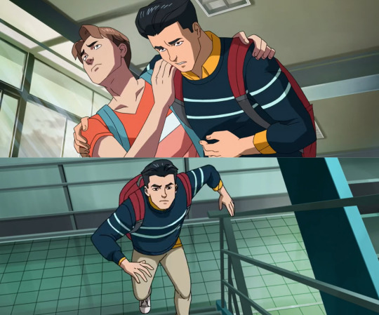
The only moments we saw red on Mark that isn't blood is when he wore his bag. Now I know this is a pretty small thing but that bag could literally be ANY other color - and it isn't, it's specifically red. It could have been white to match his shoes or black to match his hair but it's neither of that. It's red. It's Nolan.
I think it's really important to know the relevance of that red bag, especially in those two pictures. (1) The moment Todd was harassing Amber and Mark wanted to intervene, it's totally obvious that Mark carries the heavy fact that at the moment, he's powerless unlike his dad. And it sucks. Cause he's his father's son and even though he carries his blood, at the time, he doesn't carry Nolan's powers. It doesn't stop him from defending Amber, but it still hurts bothliterally from Todd's hits and emotionally. Mark's carrying the feeling of inadequacy cause he has no idea how to defend himself in this situation, his dad never taught him how to fight because he didn't have powers.
(2) The second picture was Mark rushing to school because his training with his dad made him late for class. He got powers now, and it's literally dragging him from his education (among other things and that's including his relationship with Amber). His power of flight, no matter how fast it is, doesn't get him to places on time. Even when he got his powers, he still had problems. They actually piled up now.
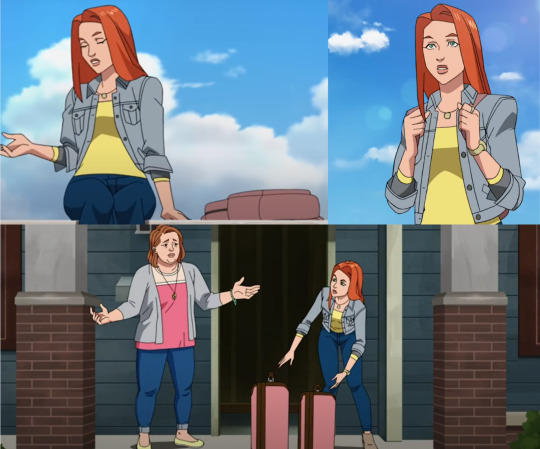
Now as for Eve, sure her casual attire doesn't have any pink on it but her bags are pink!! (1) The first picture of her was when she and Mark met at school. During my first watch, I found it cute that she held on to the straps cause it's a little habit of mine when I wear backpacks. Then at the (2) other picture where she had her luggage out so she can run away from "home", I noticed they're pink too. And it's a small observation but compared to Mark that just lets his bag hang down, Eve holds on to her bags.
The bags are both pink, and pink is her color. It's not a piece or part of her, it's her. Pink has been something she deprived herself to wear but it's something she still wants to keep, even if it's just with bags. It's the thing she's comfortable to carry, it's something she wants to hold in her hands.
I know bags are a practical item for any student to have and I overthought a lot about their bags' colors but yeah hahasdfjasdfha I'm done with that now
CLOSING WORD TIMEEEE HAHAHADSFAHFAHA
man that was a lot, anywayssss
The season 2 poster showed that Debbie has a new outfit. As for Mark and Eve, they're both wearing their hero costumes.
Slight spoilers from the comics: When Nolan left, there was a time that Mark began to dress himself in a style similar to Nolan (I can't tag op for some reason :(().
I feel there's a big chance Mark and Eve will also have new casual attires this coming second season.
Mark is likely to dress similar to Nolan just like in the comics. He will definitely have questions about his identity now that he knew the truth about Nolan, so I think Mark won't be able to wear his usual colors to show that he's figuring things out.
Mark could also wear that blue and black costume, the one that doesn't have the yellow anymore. Because he won't be idolizing his father's heroic persona anymore.
Mark, of course, misses his dad but he won't be looking up to him anymore after what happened.
As for Eve's season 2 casual look though, now that she has her own treehouse and starting to feel free from her parents, I hope she allows herself to incorporate pink in her clothing. She deserves it <33
#invincible#atom eve special#mark grayson#debbie grayson#atom eve#samantha eve wilkins#betsy wilkins#long post#character analysis#color analysis#color symbolism#i will definitely edit this later but now imma pass out hahasjdfhadfa#would ya'll believe me that styling eve in sims is what led me to this color analysis rabbit hole? (w-would ya'll also like to see said sim#outfits i assembled for her-)#summer.txt#summer.jpg
206 notes
·
View notes
Text
Color Symbolism
❀
⤷ black
⟼ banishment, classy, cleansing, dramatic, elegance, exclusivity, formality, glamor, luxury, mystery, power, protection, retribution, sophistication, unconsciousness
⤷ blue
⟼ calm, clean, conservative, forgiveness, insight, inspiration, integrity, loyalty, patience, peace, reliability, security, serenity, stability, trust, wisdom
⤷ brown
⟼ approachability, comfortability, earth, friendliness, grounding, organic, permanence, practicality, security, strength, stability
⤷ gold
⟼ illumination, luxury, prestige, prosperity, radiant, rich, traditional, valuable, wealth, wisdom
⤷ green
⟼ abundance, balance, fertility, freshness, growth, harmony, healing, health, luck, maturity, nature, prosperity, restoration, wealth
⤷ grey
⟼ balance, calm, maturity, minimal, intelligence, neutral, reliability, sleekness, stability
⤷ orange
⟼ activity, creativity, confidence, encouragement, energetic, enthusiasm, excitement, friendliness, joy, optimism, success, youthfulness
⤷ pink
⟼ affection, compassion, femininity, friendship, happiness, harmony, love, optimism, playfulness, romance, self-love, softness, sweetness
⤷ purple
⟼ ambition, creativity, honor, intuition, luxury, majesty, mystical, nobility, royalty, sensitivity, spirituality, success, wisdom
⤷ red
⟼ action, ambition, attention, confidence, courage, danger, determination, desire, energetic, love, livelinesses, lust, passion, power, strength, urgency, vitality
⤷ silver
⟼ classy, glamor, grace, magical, modernity, style
⤷ turquoise
⟼ balance, emotion, healing, imagination, peace, protection, sophistication, spirituality, wisdom
⤷ white
⟼ beginnings, clean, divination, freshness, goodness, hope, imagination, innocence, minimal, modernity, peace, purity, simplicity, wholeness
⤷ yellow
⟼ cheer, energetic, enlightenment, friendliness, happiness, joy, intellect, learning, optimism, youthfulness
#writing#writing tips#story ideas#writing reference#reference#knowledge#colorful#colors#color symbolism#symbolism
2K notes
·
View notes
Text
was chatting with some other readers about the possible significance of color in Homestuck, which is mostly black and white. exceptions so far include:
the design on John's shirt
the Sburb poster on John's door
John's calendar
the outside world as seen through John's window
GAMEBRO magazine
the yellow stars and moons on John's magic chest and magician's hat
John's captchlogue cards and strife specibus
the covers of John's books (Colonel Sassacre's Daunting Text of Magical Frivolity and Practical Japery and Harry Anderson's Wise Guy by Mike Caveny)
John's smoke pellets and blood capsules
John's computer screen
several of the games in John's CD rack
the vividly psychelic harlequin paintings in the hallway and living room
the fire in the fireplace
some of us were speculating that it might signify escapism; John is titularly stuck at home, seeing a more vivid world through both his literal window and the figurative window of his internet-connected computer. everything connected to the game he's hoping to play--the poster, the magazine, his calendar (featuring the game logo)--is a spot of color, as are the gaming abstractions in his ordinary life, as well as things associated with magic.
the harlequin paintings might also signify another world, but apparently not one John wants to escape into- that's more his dad's thing, I guess.
34 notes
·
View notes
Note
Hi! First off all, brain praise: I LOVE THE WAY YOU SEE I LOVE THE WAY YOU ANALYZE I LOVE THE WAY YOU THINK
*clears throat and shifts feet *
How much do you think the colors apply to people in real life? How far are someone's true colors (hah) identifiable through the colors and accessories they wear? And does your brain highlight those for you in real life too? (If yes please elaborate please)
Do people choose the colors they like consciously and then over time the qualities/traits get magnified/infused (?) or do the qualities make you subconsciously choose those colors as silent representation of the inner self?
Like if a red rascal consistently and consciously is trying to be a green guy or blue boy, will wearing those colors change his red rascal-ness over time?
Thank you in advance for taking the time to read through this
Anon, go look at your closet. What does it say about you? Is it an accurate representation of who you are as a person.

Maybe it is. Maybe it isn't. But I KNOW colors apply to people in real life, and I've written about this in other posts:
Why the colors?
Color-coding groups
Cultural color coding
Real-life color coding
Real-life color coding Part 2
Visual Rhetoric
But I'm going to be more scientific in my answer here since you want specifics.
TLWR: The colors mean things in real life, but we cannot color code the same as in visual media.
Most of these research studies are hidden behind a paywall, but the links will show you the abstracts.
A 2013 study found that people who were ovulating wore more red and pink clothing. It was a subconscious decision to highlight they were fertile [x]. However, when the study was conducted again in 2021, the results were not significant. The researchers suggested this change was due to a shift in unwanted attention (e.g. MeToo Movement). [x]
But women who wear red in the service industry receive more tips from men. [x]
Sports psychologist have long noted that players who wear red are deemed more aggressive than those who wear blue. Players who wear green are judged more fairly. [x] [x]
Several studies have found that people who wear black are seen as more attractive, specifically men [x]. There is an entire book about the historical context of Men in Black. [x]
During times of global competitions (World Cup, Olympics, etc.) color association is the strongest for national identities. For example, this study showed that orange was consistently associated with The Netherlands regardless if the person wearing it was Dutch. [x]
Research in educational design, interior design, and architecture concludes that colors affect the space in terms of emotions and production. [x]
Plants react differently depending on the color of the lighting they receive [x]. Animals as well. [x]
Colors mean things.
However, when you ask how colors affect people in "real life" I always have to give a tiny lecture because the term "real life" is broad. I know what you are asking, but art is real life. What colors we see on our screens have a real-world connection; therefore, they have real life implications. Barbie being pink is real life because pink in Eurocentric ideals is a feminine color, and Barbie is the epitome of femininity. We see this carry over into other pieces of visual media like Power Rangers where for thirty years, the Pink Ranger has been a woman.

The Japanese equivalent of Power Rangers finally had a male Pink Ranger in 2022, but culturally, Japan isn't tied to feminine pink the way the United States is. We use these colors in media because they mean something in real life.
But most people do not consciously go around choosing colors. People have favored colors, and they gravitate towards them more. People also have favored prints and styles such as florals or hoodies. So trying to categorize people based on the colors they wear in their everyday lives could quickly fall into dangerous territory, especially because a lot more goes into “real life” choices.
Neutral colors are more accessible in clothing – black and white. Blue can be found in nature; therefore, it has been easier to duplicate in dyes using natural resources. The red dye we typically use today comes from squishing a bug. When inventing new colors that weren’t seen in nature or that could not be duplicated through natural means, we used dangerous ingredients that could not and should not have been produced on a large scale.
All of this is to say that it is difficult for us to color code in real life because we do not have unlimited closets to pick items from like production teams. Most of us are not rich, so we must purchase what is available on the public market, and we must wear what we have available on the public market. Looking briefly at any clothing store, we can see how limiting those options can be:

This man cannot be a Red Rascal nor a Pink Person because the options do not exist for him at this store, and this is true of most men’s clothing. Because we live in a binary society, we get binary options. Men can’t be colorful unless it's blue (standard boy color), but women can. Prime example - The Met Gala.

And yet science tells me that we will find the man in the clothing ad more attractive in black. We will find him more approachable in white. We will deem him nonthreatening in blue-ish grey. We will see him as more of a worker in the tan/brown.
So, yes, I notice colors . . . because we assign meaning to colors.
If I see someone in a red suit in a crowd of black, I’m going to think that person is bold and wants to stand out, but that might not be true of his everyday nature.
People make subconscious decisions based on the society they live in, so if someone is feeling down or wants to appear more attractive, they might wear more black, but if someone wants to stand out or appear Dutch, they could wear orange.
But because it’s real life, we can’t always pick colors to match our emotions or personality. But we CAN do that in visual media, which is why we do. We can be more intentional about everything in visual media, so we are. Visual media is a more extravagant version of real life. So we can get the boy in the blue and the girl in the pink and when they come together, it makes purple.

I could write about this all day, but I have to work for a living and actually get to teach about this ALL SEMESTER because there is a lot to unpack. This is art, biology, psychology, anthropology, sociology, marketing, and so much more because this is life.
Colors are real life.

And they mean things.
#the colors mean things#color coding in real life#color coding is real life#color association#color symbolism#color psychology#color theory#it's everything#because colors are everything!
26 notes
·
View notes
Text
Quotes from the Pacific Rim commentary re: Guillermo del Toro's aesthetic decisions
"You cannot do world creation without filling in with texture and detail."
...
"People think that world creation - movie, for example - is the big gestures. But it isn't. It's all this small details. Look at the markings. Look at the vehicles that open the doors. Look at the banners and the markings in the crawler that moves the robot. Everything is full of detail. We designed this."
....
"We going to what I call gothic tech, or goth tech. Which is to go right away into a world that is rusting, that is in decay, where you have the concrete is cheap, the paint is chipping off, the armors in the robots is dented, it's sort of pitted and they feel like knights, like these ancient knights, and we start accumulating, for example, atmosphere."
...
"I wanted the movie to be very romantic, but not romantic in the Harlequin novel sense or the romance novel sense of the word. I wanted it to be romantic in its epicness. You know, I wanted it to feel like an opera. I wanted it to feel dramatic. So instead of doing this in a well-lit street in New York I wanted this first fight to happen in an almost like, the middle of a romantic painting, like Caspar David Friedrich is a romantic painter I adore. And I wanted very much for it to happen in the rain in the middle of a tempest in an ocean where the waves are crashing into them. And the water throughout the movie becomes an incredibly complex expressive element."
...
"We're going to go from the biggest, the widest, to the little bug of a pilot crawling out of the helmet. Isolate Raleigh. You know, we isolate Raleigh. I'm telling the story: Look at the markings on his suit, the burn marks on his skin, those are going to become scars that he's going to carry for the rest of the movie. And I'm telling you this is when we started losing. This was the price for arrogance, this was the price for youth, and we're staining the white with red. I'm trying to build a character not just by the work of the actor, but by the storytelling with audiovisual elements."
...
"And look at this, Raleigh's all introduced in this one color, he'd golden, gold colors, and he's all coated in warm greens and earth tones and the light that is bathing him is always golden, and it's about that color coming together with Mako's dominant color, and Pentecost in this case, which is connected with Mako, which are blue."
...
"So this, we come to the scene where they meet for the first time. And I have color-coded this scene entirely in those two colors, in the blue and the ambers. You know, the bright ambers and the blue, the sort of cyan blue. And this is Mako meeting Raleigh, so the entire thing needs to be color-coded like that. And Mako's blue, because I'm making her origin to the kaiju, the kaiju blue, the blood of the kaiju - but also you will see in a few minutes a memory. A memory that is all color-coded in blue and splashes of red in her past as a child. And that blue has stained her hair. Even her hair has this strands of blue because she cannot get rid of that memory. She carries it in her."
...
"We color-coded, for example, the Chinese robot, we color-coded it red and gold and is patterned after medieval armor, and it needs to feel Chinese in essence, it needs to respond to martial arts movements; its musical theme is very strong."
...
"And here again we have now a robot, a Jaeger, that is designed, a mech that is designed to resemble a T-series Russian tank, color-coded like that, with like a cooling tower from a nuclear reactor on top."
...
"And we introduce Striker Eureka, the Australian Jaeger, which is designed a little bit like an all-terrain vehicle and color-coded with the outback camouflage colors and is the most masculine of the robots, of the Jaegers, of the mech, and is very much testosterone-driven."
...
"We talked about the color red; well, here it becomes very important. We have these characters fighting that is very very color-coded to be warm; we have a lot of reddish art direction here. We color-coded this arena in black and red. The stakes, the wood, the machines, the color of the light hitting the machines, the symbols on the wall, everything is permeated with red. Because again, I wanted red to symbolize sort of the heart. And Mako's going to find her heart and Raleigh's going to find his heart, or life, by connecting with Mako. We saw him bleeding - the last time we saw red with any importance other than the Chinese robot was when he was bleeding in the beach."
...
"And again, red coming in and linking these three characters; these three characters are the heart of the movie, you know. And blood for nobility and mortality is what makes us human. And Pentecost and Raleigh and Mako are the heart of the film."
...
"And now we start bringing, literally, bringing the crazy colors into the film. I wanted to color code this movie, bring it as close as possible to a living anime, or a living incarnation of a magazine that was very important for me growing up, which is Heavy Metal with Angus McKie, Richard Corben, Chris Foss, all these guys working with super primary colors, and I wanted to bring that saturation of colors to this, and for that I needed Hannibal Chau to meet Newt in Hong Kong."
...
"In shooting the film, we then came to the final moment and again, these three characters, Mako, Raleigh, and Pentecost, which have existed in a blue-amber world start to come to a red space, you know? This is the first time we used this red space properly in this film. Other than the Chinese robot, we were very careful with not coding anything in red. But now, at the end of the adventure, everybody's coming away. And at the end of the life, at the end of their life, that is Mako, Raleigh, everybody's gonna find this light is red. And now I can talk to you about the way I sort of organized the three fights for Raleigh. I wanted one fight with the kaiju to be the fight where he loses someone. He loses his brother in the beginning. That's where he bleeds red, you know? Then the second fight in Hong Kong is where he gains a partner. He loses a partner in the first fight, he gains a partner on the second fight. And in this final fight, he saves that partner. So, it's a full circle. I show him in the construction area in the beginning sitting in a sort of throne of concrete, if you remember, when he meets Pentecost; he made an incomplete circle. And here he completes that circle."
#pacific rim#pacific rim 2013#guillermo del toro#aesthetic#colors#color aesthetic#design#color symbolism#jaegers#jaeger#mako mori#raleigh becket#stacker pentecost#kaiju#striker eureka#cherno alpha#crimson typhoon#quotes#guillermo del toro quote#guillermo del toro quotes
32 notes
·
View notes
Text
the first thought that entered my mind when looking at that still of RainPhayu at the PaiSky wedding is that blond Rain is wearing teal, which is the combination of yellow and navy blue (Rain and Phayu's respective representative colors in LITA!!)

(picture is from Eul's twt)
#phayurain#wedding plan the series#love in the air#lita the series#paiskyi#i do love how i can't not type blond Rain - like this is not the same Rain as before so I have to distinguish#color symbolism#i actually love the color threads in lita#and i like that they didn't just make all the pairs red blue#it's nice to have some yellow#for joy#bc i am joyful
81 notes
·
View notes
Text
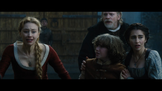
The color symblism in Dracula Untold
How the change of colors represents Vlads and Mirenas journey through out the movie (Spoilers for the movie of course)
Colors are extremly important in Dracula Untold and they are not only used to look fancy. Everything in this movie centers around three main colors: Black, white and red
Red symbolizes blood, but in a positiv way. Red means: Being alive, being full of life. Black symbolizes the darkness. White symbolizes purity, but also death. No really deep, I have to admit, but the interesting bit is how those colors are used throughout the movie and how Red is the connecting element between Black and White
Let me explain it to you.
This movie starts with a blood red sky. Symbolizing Vlads bloody past, but also indiacting that Red is his color. (Also keep in mind how warm the colors look here. That will be important later on)
Same goes the following scenes. he is dressed entierly in red. A warm gentle red. And he is surronded by warm red colors. (But already notice how he is always dressed in: red + black.)

And also his wife is dressed in the same red. Because she and Vlad share the same life, the same human (!) life and of course love. So it is just logical they are both dressed in Red. It is a little bit hard to see here but Mierna wears red + white. (Also pay attention to how the warm colors are slowly vanishing).

After Dracula makes the decision to be turned we see the coat one last time. Dramatic and it looks like it is flying away from him. And again it is red + black.
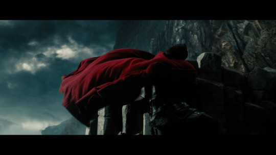
After that scene we never see him in his red coat ever again. The red, symbolizing life, is gone, completly, from one moment to the next. From here on, he never wears anything red ever again. We only see him dressed in black from now on. Showing that he isn't human anymore. Belonging completly to the darkness. (Sorry, the movie also looses every color from here on and it was so hard to find scenes where you see that he dressed in all-black).


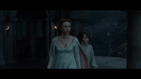
And now the most interesting bit. His wife is still dressed in red. The same red she is wearing from the beginning onwards, the same red her husband wore before he was turned. because she is still full of life. (Red + white).
But then her story slowly comes to an end. She isn't suddenly killed like Vlad, instead she is slowly drained off life. In her finale scene she is wearing an all white dress. Only inside the sleeves we can see a strong red color, symbolizing being full of life.
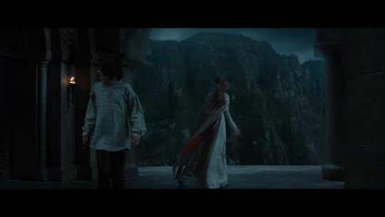
But when you look closer that sleeves are not completly red anymore, the red starts to vanish. Aka she moves closer to her death. She leaves her life (red) behind to join the light and purity, aka death (white).
And shortly before Vlad dies, even his extremly red uniform is now black. It only turns red again, shortly before he "dies", and only for a really short moment. because for a short moemnt he is human again, for this short moment he had found peace (i refuse to take a screenhot of this extremly ugly CGI scene).

And then Vlad and Mirena meet again in present time. In front of red and white flowers, the same folowers that surronded them during their first meeting in the garden (deleted scene).

And now Mirena is completly dressed in white and him completly in black. All red is gone.

He has become one with the darkness and she has become a true bride of darkness. She is pure, and she is the light in the darkness and she is a bride. But all red is gone. Because they both died. The life is vanished from both of them. They are both shadows of their former selves, altered, something new. They will never be able to return their former life’s (red).
TL.DR: The symbolism of Red/White/Black is not really deep, but it is consistent and used in a really clever way. One i haven't seen often in other movies yet. The production team really put a second thought into it. The color red is extremely important for Vlads journey.
Bonus:

Them having their finale meeting in front of a HUGE ASS DRAGON picture. The same dragon that was on Vlads uniform!
31 notes
·
View notes
Text
Listen I dont know a lot abt dsmp lore but it kinda fascinates me how quackity representative color shifted from blue to red considering how red is a more 'agressive' color that represents passion anger and other strong emotions meanwhile blue is like a more peaceful version of red, a serene color that represents calmness freedom sensivity etc
Just thinking how interesting that is

#dsmp#dsmp quackity#quackity from las nevadas#c!quackity#color theory#?#color symbolism#dsmp analysis#analysis#character analysis#dsmp character analysis#(?)
41 notes
·
View notes
Note
I had a thought, kinda builds onto your "Alastor's powers are not his own" theory
it's probably nothing, just a coincidence, but have you noticed how when Alastor displays his powers, it appears as a glowing green, a color not found in his palate?
Compare this with other overlords, Vox's electricity is blue, Valentino's smoke is red, colors found on their regular palates
Basically, Alastor's power does not match him
Ooooh, I did NOT notice that. And yeah, that is VERY interesting :D
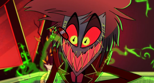
The fact that the 'stitches' on Alastor's mouth are ALSO green certainly leads some credence too.
29 notes
·
View notes
Last Seen Blogs
darkacademiapoetry
Constantly Yearning

kavisthetic
kavisthetic

textpost-trash
Textpost Trash

faggotaboutit
fuhgettaboutit

iamnianicole
Sunkissed Desert Flower