#but until then i'm really enjoying tweaking things and playing with all the different elements
Text
seven sentences game
rules: post the last 7 sentences you wrote and tag 7 people
thanks for the tag, @the-cloud-whisperer! this came at a good time. luckily, the last 7 sentences i wrote don’t contain any major spoilers for after the flame, a pause, only a suggestion of where the story is headed - but if you’d like to avoid knowing anything at all, feel free to scroll on by. this is from chapter 11.
Zuko caught only a few moments with Suki before her days were consumed by meetings with the palace guard. All over the city, unnoticed except by those who knew what to look for, security measures tightened. The days ticked past and the palace guard in Suki's meetings were replaced by the Fire Nation's elite spies; whatever security discussions happened there had her returning with shadowed eyes. Zuko didn't ask, and she didn't tell.
The Earth King's delegation, led by Shen, arrived and was welcomed with a banquet. The Avatar's absence was a point carefully skirted past by all parties involved. The dinner concluded with the intention of commencing negotiations the following day and Zuko was numb with exhaustion, too tired to feel worry, too tired to feel surprise, when he returned to his chambers to find Aang perched on his bed.
i’m tagging @praetorqueenreyna, @lady-tortilla-chip, @thinkingisadangerouspastime, @slpytea, @foxy-knowledgeseeker, @irresistible-revolution, @richardcampbellganseytheiiird. feel free to ignore :)
#tbf this might not even end up in the final version#these final few chapters have been doing my head in these past 2 weeks#pacing has been such a huge issue#but by gahd#i will reach a point where idgaf anymore and just throw this all on ao3#but until then i'm really enjoying tweaking things and playing with all the different elements#zukaang#my fanfic#atfap#atla#also yes mikhaila ik you're getting double-tagged#it's to shower you with regard from multiple fronts#is it working?
6 notes
·
View notes
Text

In June, I "attended" a local writers' festival (through Zoom). The only panel I managed to attend, because I totally didn't forget about the other panel I'd signed up for on the Saturday, was a writers' workshop with Richard Van Camp. I'd just come off a week of the online Association of Canadian Archivists conference, which was of the "sit back and watch" model, so when he went around asking everyone to talk about their projects and why we were here it was very much, oh, I have to talk. i did not expect that.
Richard Van Camp seems to have boundless energy and enthusiasm, for everything. In hindsight, it was very refreshing, but at the time, oh shit,. People are talking about things That Matter to them and here I am.
I don't remember the specifics of what I said. I don't even remember if I actually gave a plot summary, unlike literally everyone else. I don't even know if I can adequately summarize it any more. But the gist of it was that I was hashing out and re-hashing the same ideas, and finding it difficult to reign in my words, leading to bloated wordy chapters that were a chore to write and forced me to bloat subsequent chapters to get in all the necessary info--in short, I was spinning my wheels and not going anywhere, and frustrated.
He immediately suggested a graphic novel format. In a subsequent email, he said that GNs pare things down to core scenes, so it makes sense in that regard--if I'm having trouble writing concisely, adopting a format that forces me to do so would be a solution. He suggested I print out my current manuscript and basically pick out the core scenes. I did not tell him my current manuscript was unfinished, and that I'd been dabbling in tweaking the base idea even more than what I'd already written (of which I've already decided to do now, but at the time I was still on the fence.)
Other things he suggested:
- Renegade Arts Entertainment, a publisher he apparently has a working relationship with, might be interested
- Read Brian K. Vaughan's Saga as it is sci-fi
- Email him the script when I was done and it was the best I could make it (he said this same advice to everyone)
I read Saga, and generally enjoyed it (still salty about the "year-long" hiatus that ended on a FUCKING CLIFFHANGER). Not sure I'd want to make CS like that but it did tell me I didn't have to be so obsessed with making things accurate. Saga has robots that look like humans with television heads, the ghosts of killed children, a wide variety of talking animals or insects that are aliens, a wide variety of different types of humans with one unusual element (horns or wings or amphibious) that are also aliens, a rocket ship that's literally a giant tree, and landscapes that effectively look like, you know, a big city.
Not the aesthetic I want for CS specifically, but it did show me I can do whatever I want and it's fine. I want some hippie futuristic aesthetic, I can fucking go for it. I want bright eye-searing colours, fuck yeah.
As for the art, when I said I could draw, and had drawn these characters before, Richard informed me that I'd basically done half the work that a hired artist would do. I could just write the script and hire an artist, But looking at Renegade Arts' submission guidelines, I could also...just...do it myself? (I don't know if my work fits their submission guidelines. They look to mostly publish horror or Canadiana-themed works, and CS really isn't either one of those.)
Despite me bingeing on webcomics, despite me looking up ways on How To Comic, I don't know if I'd be able to go ahead and do it. Not so much the artistic ability (although yes, that plays a role--dynamism is not my forte) but mostly the time to do it. I suppose I wouldn't know until I try.
BUT really, the art is the second half of the issue. I still need to write the damn thing first, and That is Goal Number One now. Just write the damn script. See if a pro author thinks it's decent. Get that done, then worry about whether or not to draw or hire or anything like that.
(I have not done that yet, obviously. I don't want to wait until November to do it, but I have yet to finish writing up the plot outline and breaking it down into scenes like I said I would. It's the middle, man. The middle drags.)
-------------
That being said, I still wanted to see what it might look like if I tried. I have Clip Studio Paint Pro, and it's apparently designed for comics/manga creators. There are some useful tools I never bothered to explore, like how it automatically makes panels and speech balloons for you, blocks out individual panels, etc.
I don't like Clip Studio's inking tools as much as Affinity Designer or Procreate, mostly because my usual pen stabilizing tool does NOT work with Clip's mechanics, and my hands shake too much. I'm sure this is inexperience. but inking this was a trial. I'm glad I worked at 600 dpi like I saw someone suggest. Once you shrink down the errors are less noticeable.
Other nice features:
- You can set your inks as a reference layer, open a new layer, and if you use the right settings in the Magic Wand tool, it will select areas based on the inks, even if you'r enot on the inks layer
- Has a TOOOOOOOOON of free 3D models, which I blatantly used for poses
- Also has 3D backgrounds you can use for reference
- Some of the actual brushes are nice if you like the traditional media look
I saw this tutorial and got GUNG HO about generating a good background--the 3D model takes care of the perspective and everything, and there's nothing saying I can't cheat for sped when I'm making comics-type stuff. But oh. Wait. That feature is only in the high-end Clip Studio Paint EX version. But don't worry! Because I have Pro, I can upgrade to EX for a discounted price...of 160 USD.
Basically they took the price of EX and subtracted the price of Pro, which is considerably cheaper. $160 USD comes out to something like $215 CAD, and I...I just really don't know if I can justify that right now. Or for a while.
So I just traced it like an idiot. This is not nearly as complex as the original 3D model would've been, but it gets the gist of it.
Long story short, I'm balking at paying over $200 CAD when I eventually had to wind up converting it to PSD and finalizing the colours/shading in Photoshop anyway. Not that the shading is great--I went for speed more the time, compared to this image (the last time I did cell shading). But if I'm using JUST this to generate linework for backgrounds, is it really worth it? I could just trace. It'd be a real PITA, but I did it here. If I ever figure out how to use SketchUp, I could just use that too (I do not know how to use SketchUp).
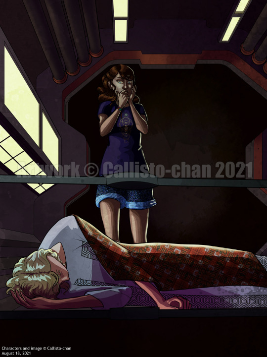
I don't know. But I did try to do as much of this in Clip Studio as I could. The cell shading doesn't look as horrible with it shrunk down like this, but it's still not...great. I struggled to figure out a good 'style' to draw this in, and settled for...I don't know if it's just Chris who turned out weird due to the perspective or what.
Although Caelis' perspective was fun. Thank goodness for those 3D models; they're a bitch to pose with a mouse, but once they're in place they're so useful. You can even specify the height and body type and it adjusts the model accordingly, so Caelis got to be a skinny beanpole as intended.
I also like the weird AI-generated colour fill. It gives you some weird, weird settings, as AI does, but when I played around with the layer settings, it highlights Chris' face with an eerie green glow, and gave Caelis some weird highlights omn his hair that rather made his hair look like it could glow in the dark. So I kept it at a very weak opacity and Soft Light solely for ~aesthetic~ Not perfect by any means, but it has that mood lighting and stark contrast, I like it XD
----
That second sheet is actually the first sheet, drawn like the weekend after the workshop, where I was...I was overthinking, as I usually do, and trying to get ideas down for a new (tweaked) plot in a coherent way when I started doodling. Experimenting. Nothing major, just to see if I could draw expressions. Some turned out great, others not so much (both from idea and execution POV), but they don't have to be good.
I wouldn't have considered this worthy to upload this on its own, but since I'd already done a cell shading comic practice piece (which is all it was - if I draw this as a comic, I would probably redraw this scene), I might as well. Playing with some stuff. Konnie's hair shift was basically:
- she would look good with short hair
- she'd probably WANT short hair anyway
- if I have to draw something over and over, it'd damn well better be simple and easy to draw, and Konnie's braid can get finicky
also I am not opposed to Eric with glasses AT ALL. i feel like this means I should take Shelby's away to compensate, but I also like the idea of twins who are not identical, but have identical crap-quality vision
but yes, while I'm still undecided, graphic novel might fit the bill. I've always drawn these characters, which doesn't make sense for a published book with words, but would make sense for an illustrated format. If nothing else, I'm willing to give it a shot and see what happens.
0 notes
Last Seen Blogs
aloneinthehellfire
Alone In The Hellfire
aloneinthehellfire
Alone In The Hellfire
avpd-queer
Cute & Creepy

wxynxy
uuuuu

heavenlymale
heavenly males