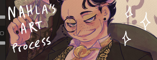
#but drawing the lineart is very boring
Text
unstoppable force (desire to start a new story and write something new for nano) vs immovable object (Brain Fucking Broken)
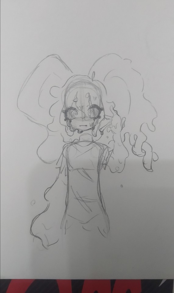
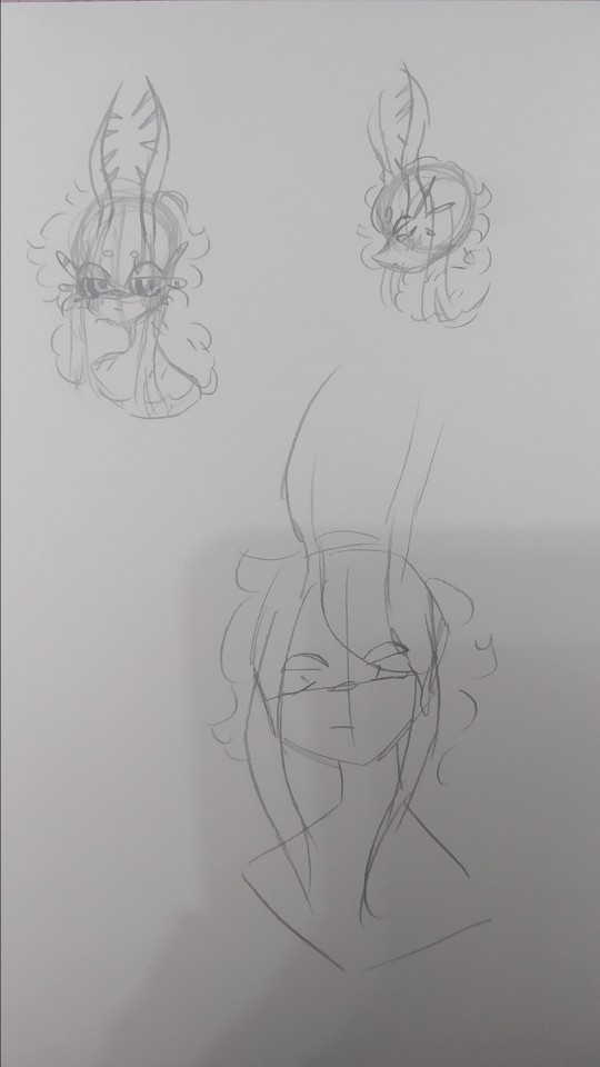
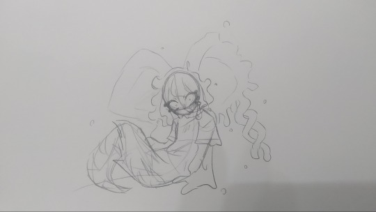
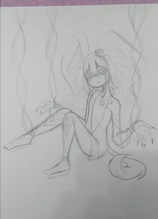
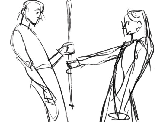
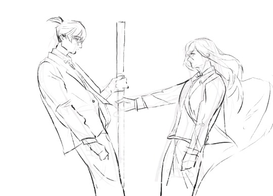
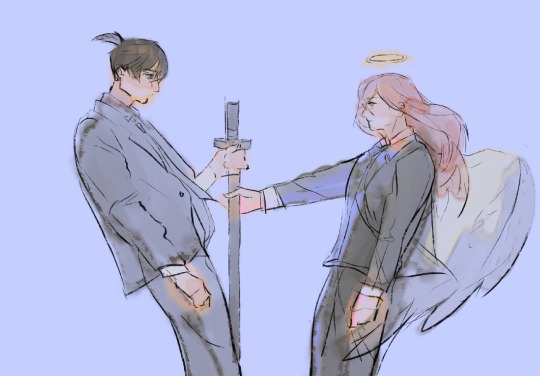
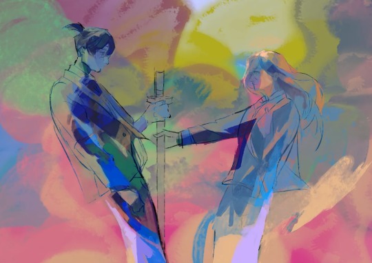
#elise lives a life of excitement and intrigue#in some ways im glad i have cd to fall back on because it means i inherently cant have an apf situation on my hands#where i barely knew any of the characters and the plot was Extremely cobbled-together and last-minute#and its not exactly right to say im bored of cd because theres a lot of stuff in this *KNOCKING ON WOOD* last 3rd that im very excited for#but my brain with its little reborn baby-bird wings wants so bad to make up something new and run wild with it like when cd was born!#but. even though the bottom of my brain is filling up again with little trinkets and scraps that can be someday strung together...#i dont know. theres no fullness there. i think im still scaring and stopping myself because the only thing worse than not having a story#is having a flat story that im only trying to be interested in. where i have everything i should need but i just cant figure out how to-#-do anything with it :( like sunrunners / like TRouble / like hypotheca bloom theory / like like like.....#even the only reason isc and satsuma boys as (incomplete) summer nanos turned out at all was bc past me had built them in a better time#i know going through old sketchbooks and coloring in the lineart is a valid way to go#but i want to draw the lines again too :(
10 notes
·
View notes
Text
sitting there like has my art gotten better over time or do I just add way too much unnecessary detail now
#but lineart becomes honestly really meditative for me at times especially if im adding texture to something#i will say at least i dont pick such ugly colors anymore. i used to always have reslly bright colors and then i thought it was too much#and overcorrected imo so everything was desaturated and boring#oh i also used to color in the lines for like every single color on the character? idk how to describe it but it was tedious#i like it on other people's art but i dont have the patience and i dont like how it looks when my lines are “cleaner”#sometimes i do miss how i used to not care if what i drew was “cringy”#but i think im coming back out of that considering all i draw is like. gay shit and elves and various iterations of myself and also my ocs#i should redraw some really really old art after what im working on maybe#i almost started working on a redraw of when i drew yavanna in likr 2017-18 but i dont like the design i gave her at all#minus the weird branch ears those were cool#mostly im just frustrated it still takes me hours to draw lol. i dont know why i get insecure about it or about art in general#i guess bc no one in my family really does so they have this idea im good at it#and i wanna grab them and shake them sometimes and explain all the reasons im actually not and all the mistakes i regularly make#i dont know if that makes any sense and i dont know why i struggle to just take the compliment#i guess because i know im not good enough at it for it to be a job? except thats not it either because ive almost always wanted to write#its very dumb and weird. especially considering i dont really draw for other people. i mean i like when people like my art but unless its#for somebody specific im not necessarily going to take it very hard at all if its not to their taste. i just do it because i enjoy it#and because there are things i only know how to express through writing or drawing. and when one doesnt work sometimes its the other#maybe i just get frustrated i cant be good at everything#its not realistic but i always end up wanting to do so many things and getting frustrated when i dont pick them up right away#because OF COURSE i dont#ok where was i going with this#its nearly 2am and my head is pounding again i dont even know what day this makes it. at least a week?#i dont know
1 note
·
View note
Text
Doodling - Lawlu HS
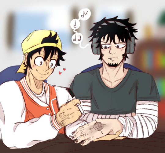
Hhhhh I don’t even know how to start this post really—
This is basically a love letter to @naturecalls111 and their Lawlu high school AU. Such an incredible AU and so well written take a visit if you just enjoy art in general frr!
For this art you’ve got Luffy drawing on Law’s hand. I do this all of the time personally. I did it today just for the purpose of doodling on my hand and I feel like Luffy would too even if he’s not very good at drawing.
Uhhh Nature (i think it’s okay to call you that?) if you see this I really like your art a lot. :) it’s so well made and the anatomy is just perfect imo! The backgrounds that you draw are breathtaking. You’re so creative 😭💖💖 I dunno what else to say really I have too many good things to say about your art in one post hdhhhh.
ANYWAYS I know that this isn’t my best art piece ever but I tried I swear— this also counts as my @lawluevents 10 days of Lawlu entry for today since I don’t have time to make anything else and it’s the free day. :)))
Drawing requests are open in my ask page if anyone is interested. I’ll take any ideas. 💖🌝
p.s ignore the mistakes I don’t have enough skill to fix them. I need to study anatomy.
Oh also

A little test for a different lineart style while I was bored. Of course they’re there hhoskdjfkrk.
#lawluweek2023#lawlu#one piece#lawlu fanart#lawluffy#monkey d. luffy#trafalgar law#hs au#Check out the person that made the AU please#Their art is go fuckin good
422 notes
·
View notes
Text
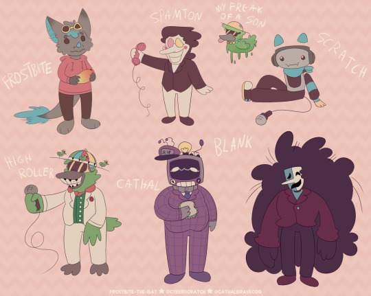
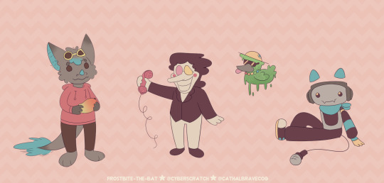
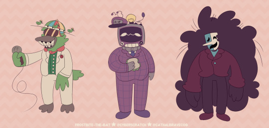
'evil'/anti artstyle meme! inspired by excessive-moisture's post doing this same thing!!! i showed it to my friends and asked them to give out my own art traits and basically a list of things i should not do.
the result is this art style! soft colors, less purples, very round and soft, thin lines + no line weight, no trademark things like how i draw fur and mouths PLUS slightly different desighs to fit the style more! (for example spamton being drawn more like his shop sprite)
i drew several characters i'm known to draw a lot / mean a lot to me just to see them how different they are from when i draw them normally! HURTS to not have an oversaturated drawing, uegugh.... but coloring was the most fun part! i love working with colors! the worst part was the lineart because i got SO BORED. fun challenge anyway!
little explanations on each character under the cut since this is a multifandom + ocs post and i wanna short talk about my silly guys ever (my, what the kids call these days, blorbos,)
since this has multiple characters not everyone may be familiar with, here's a tiny bit of info on everyone
frostbite = my fursona! they're a bat / dragon mix. they're holding a mango! nothing much to say since they're just my sona. me, y'know?
spamton = you know him! it's spamton from deltarune chapter 2 !! he's a shopkeeper and a secret boss in the game where he appears in his 'NEO' form. he's based on scam e-mails and ads!
my freak of a son = toontown corporate clash oc - he's a goopy low baller that i call my son. or rather, toontown version of frostbite and i call him their son. regular frostbite as shown in this image and frostbite are separate. he was made using one of high roller's attacks.
scratch = my deltarune sona and self insert! they're the fourth member of sweet cap'n cakes. they're a dj! they're inspired by cat headphones, soundboards and karaoke machines! they're who this blog is named after :P
high roller = from toontown corporate clash! he is a cog 'manager' who only appears during a yearly event 'april toons'. she is a show host and a fusion of two characters ('dave brubot' and 'buck ruffler'). it's show is also the boss fight you fight when they're around!
cathal = full name cathal ray toby bravecog aka the multislacker, also from toontown corporate clash. he is a manager you can fight in-game after completing a set of 'kudos' tasks. they are the VP's son and are based on crt tvs! they're known for being 'lazy'.
blank = (full name blank b. addison) a deltarune oc for my big deltarune au named datapack au. he is an addison who got corrupted by a swatchling mask - which is a new concept introduced in my au. he used to sell movie related trinkets and was a stand-up comedian.
#oc art#[frostbite]#[scratch]#[sscc]#my freak of a son#deltarune#toontown#toontown corporate clash#spamton#high roller#multislacker#blank#dpau#datapack au#guz art#[2024]#[January_2024]#<- new system specifying months... makes it a bit easier than the archive for me in the future!!!!#blank b addison#i forgot which tag for him i used... but oh well i want my tags Somewhat organized on my art blog.
61 notes
·
View notes
Text
HAPPY HALLOWEEN!

We have a frightening tale for you today... reader be scare, you're in to beware! Please, come in. Sit in the Chilling Chair at our Terrible Table in our Devious Dining Room. Now, I hope you're hungry, because we've made plenty of PETRIFYING PASTA! Fufufu... let's begin.
It was looking to be a very special Halloween. This particular year, the holiday had fallen on Friday the 13th! Spooktacular! Alas, nobody could go trick or treating, for there was a blood moon that day, and nobody wanted to be outside where their costumes would be stained with all the blood. Sigh... what a boring, uneventful day it was shaping up to be!
But then... a sound right outside. The sound of the mailbox opening and closing. Mail? On this federal holiday? How strange! And a bit disconcerting... who would dare to venture out with the town moist with blood? Maybe a vampire... eep! I opened the door, shivering, worried I may accidentally invite the hypothetical vampire inside, only to find...
Nobody there. No body at all. Just a severed, green hand clinging to the mailbox. So that's what the sound was! And here I was, worried it would be something scary. I shooed the little critter away, and as it scuttled off on its fingers, I saw that it had left something in the mailbox! Something familiar.
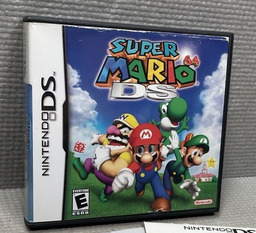
Why, it was a copy of Super Mario 64 DS! How generous, a Halloween miracle! I had been wanting to play this lately, but my childhood game card had stopped working. This was shaping up to be a nice Halloween after all! It was a used copy, and it still had the price sticker on it, having been resold at $6.66. Upon seeing this number, I immediately screamed. Someone had gotten an incredible deal on this game!
So, I opened the box. Everything was in great condition! Even the manual was included! I don't remember the manual looking like a torn piece of paper with "I SEE YOU" written on it with blood, but it's been a long time. I know I still have my original manual around somewhere, so no need to flip through this one. I got right to playing the game!
What a rush of nostalgia! There was my friend Mario's funny face on the touch screen, ready to be tapped! And tap I did! Rather than the game drawing the lineart of Mario's face, though, it drew something else. A tombstone with my full name, date of birth, and another, later date written on it. Weird! Must be a weird coincidental thing drawn by the previous owner? I played around with the squiggly lines and spun it around. It was fun :)
I got right into the game, and everything was just as I remembered it! I was visited by Lakitu, went into the castle, and jumped into the first painting, like I had so many times before. But something definitely was strange here. I was reasonably certain that the first mission of Bob-omb Battlefield was not called "Kill The Big Bob-omb Dead" in any version of the game! Nevertheless, I continued on.
That was when I saw it. Where I would expect a Bob-omb Buddy to stand was the most terrifying character design I had ever seen. Against my better judgement, I approached and interacted with it.
"Hi! I'm Bob-omb...
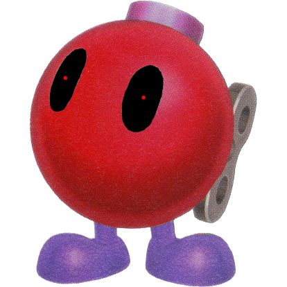
BLOODY!!!"
EEK! I could not believe my eyes! I would expect such material in an "adults only"-rated game, but in MARIO?! I had no idea what to do. I continued playing for some foolish reason, running off toward the Big Bob-omb the way I always would, hoping to find comfort in the familiar. The game felt normal again, aside from how Big Bob-omb left a large splatter of realistic blood on the ground when defeated, and I was mercifully brought back to the safety of Peach's Castle.
And yet... I felt a morbid curiosity. An urge to continue playing. Maybe it was just a glitch? Maybe the second mission would be back to normal, and I would get to see my friend Koopa the Quick? That would be nice. I selected the second mission, and...
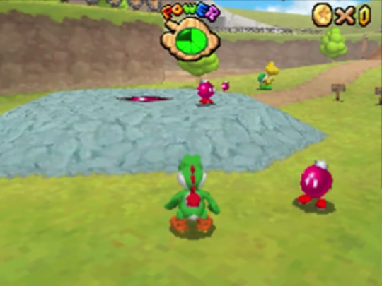
It was normal. It was safe. The Bob-ombs, Buddies. Maybe none of that was even real. Maybe I was still shaken up about the knock at the door earlier? Whatever it was, it wasn't important anymore. I could finally play my funny Mario game and have fun! I walked on over to my friend the Koopa and interacted with him.
"Excuse me? Can I help you? Who are you?"
I was confused. Wasn't he supposed to ask for Mario? Wasn't this Koopa the Quick?
And then, as if he heard me, he turned his head. He wasn't looking at Yoshi. He was looking straight through the screen at me, and his eyes were more realistic than ever.
"I'm not Koopa the Quick.
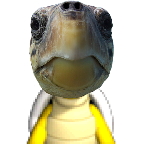
I'm Koopa the TRICK!"
AIIIIIEEEEE!!!
Of course, none of this has been real! Just some Halloween Hijinxs! There is no such thing as a realistic turtle!
...Or is there?
That's for you to find out... heehee! Happy Halloween!
#mario#super mario 64 ds#bob omb buddy#koopa the quick#halloween#creepypasta#unreality#long post#mod chikako
127 notes
·
View notes
Text
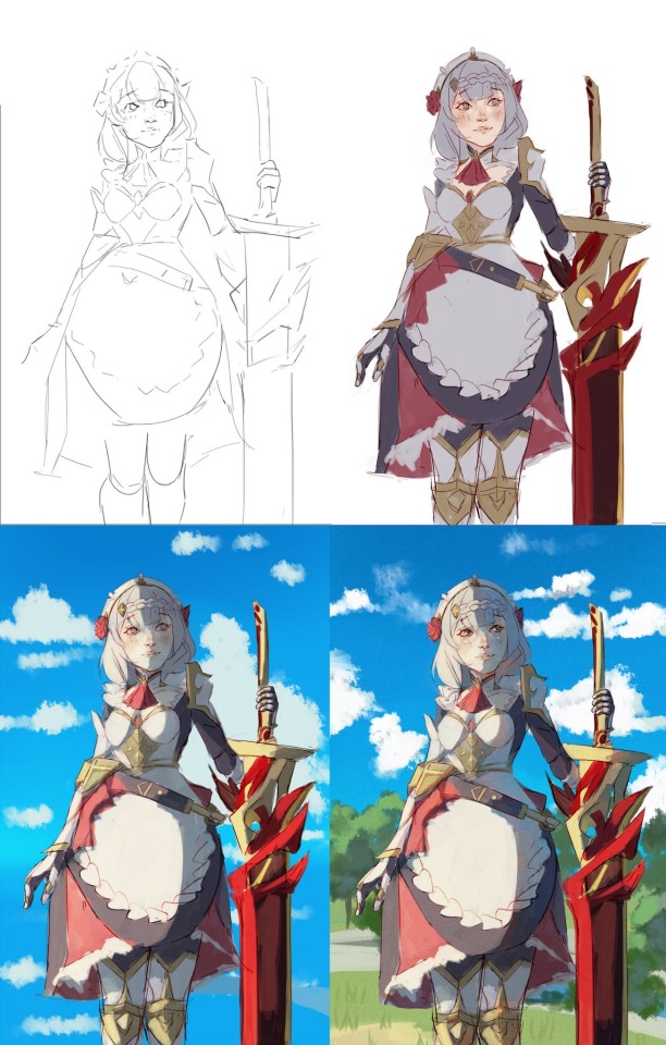
Or how I fudge and find out my way through making digital paintings.
art program used here : Procreate ( but the method can be applied to other programs )
original painting time ≈ 3 hrs
*note : English isn’t my native language in case something is confusing or wrong. Don’t hesitate to ask for more details regarding anything
**more important note : take breaks, drink water, don’t push your hands too hard.
Base
I start off by sketching where the bodies and objects are. Nothing too detailed. I’m just arranging stuff around and figuring out sizes. You shouldn’t spend too much time in drawing this and they shouldn’t be detailed so you can easily move the elements around without exhausting yourself beforehand ( also to avoid getting bored when you’re just starting.

composition is a little complex to figure out but for this one I made the characters around the middle point to create some sort of guide for the observer’s eye movement.
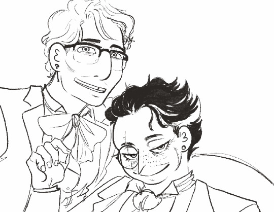
2. Initial sketch (optional)
I usually make one sketch for a drawing unless it has little details or elements I’m not used to drawing. For this one it was figuring out the clothes and the details on them. Again, don’t pressure yourself to make this look perfect or right. You’re just figuring out where things are.

As you can see, the sketch is pretty rough, not all the details on the hands are drawn. The eyeliner are still there and the chair is just a shape. Lots of lines are overlapping and.. you basically get the idea.
3. Second (final) sketch.
I wouldn’t call this a lineart. Linearts are more careful, less rough, cleaner. I like using sketches more than linearts because I like the rough sketchy texture they provide, and also it’s less restricting boring for me personally . Although we keep in mind this is the drawing we’ll color. So we’re more careful about it. I draw the details and clean the sketch.
also don’t be like me, I forgot to draw the cane here and was upset about it :(( didn’t notice till days later. But also sometimes I do change things here. This one wasn’t on purpose though.

it’s important here to avoid chicken scratch by using less strokes. For example. Instead of drawing a curve with say a hundred strokes, draw it with one and then clean up anything wrong. You make have to redo one stroke a hundred times to get it right, but it’s cleaner and softer. ( it helps with drawing hair )
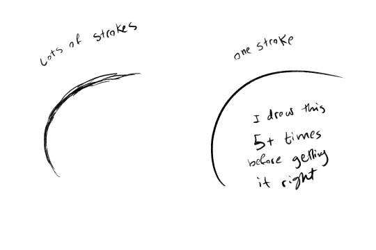
Nothing is wrong in art but it depends what kinds of effect you want. You can use both methods to give different vibes, draw different things. But it’s important to know how to do them.
oh and, it is one stroke but it’s fast. If you linger on it the line will come out woobly and shakey. If you do it fast it’ll come out clean.
4. Blocking.
You go back over the drawing here to fill in black spaces. Maybe if someone has black hair or for shading, you can also add texture on things like walls and etc*. I like leaving some white spaces when doing this because black is very reflective irl, so it gives some shine to it. It honestly depends on what the black element is, something’s are shiny some things are not. But it’s pretty fun
**when it comes to texture this is an example from another drawing

5. Grey scale coloring.
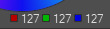
I have already a plate on hand of colors from white to black to use in my drawings. You can use three or more. This is the one I use
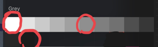
Circles to indicate that if you have white, grey, and black, that’s enough.
why grey scale? The thing about grey scale coloring is that it helps figuring out contrast. You don’t want all your drawing to be of similar tone, when you have contrast, it helps make elements pop and differentiate things.
"Joseph Nelson." Roboflow Blog, May 15, 2020. https://blog.roboflow.com/when-to-use-contrast-as-a-preprocessing-step/
I’m honestly still figuring out how greyscale works but, looking at real life pictures is one way you can know how to do it. See how light is distributed where whites and blacks are used. One key element is to figure out where light comes from, and shading according to that . The light source isn’t very strong with this drawing so it was more of a simplified shading.
If something is over the other, shade underneath. That’s the simplest way to figure out shading
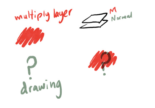
before coloring, I did change the sketch to a more grey color and set the layer to multiply. What multiply does is that it darkens the color underneath it with a hue of the color in the multiply layer. I know, confusing, so here is a picture.
Sorry, got a little detailed there.
back to our drawing.
As I said, the light source wasn’t very complex here to give more of a photo shoot vibe, but I can show another drawing with a more natural strong light
Places directly getting the light get very light colors like white, the ones opposite use very dark grey or even black.
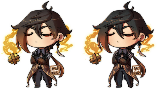
of course the coloring here isn’t very realistic, I have, after all, colored the character, kristen, in lighter colors than everything else. This is because I wanted to create a sense of contrast to make her pop out against the background. So don’t limit yourself, play around.
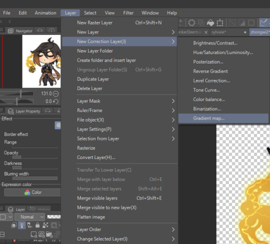
6. gradient map
gradient maps replace the grey scale colors into other colors on a specific range, you can use a gradient map offered by the program or one you make yourself. How to chose them? Depending on the vibe you want to translate. I have synesthesia so I sort of follow my gut when it comes to this, but you can also look at movies and pictures and see what colors they use and what feelings they give. Or just go warm colors give warm feelings and cold colors give cold feelings. Or just whatever you like. Just have fun with it

See? It looks pretty fun. Heck you can even stop here even. Note that I merged the sketch layer and the grey scale one into one layer so it can change the color of the sketch layer too. Also sometimes id use the blur tool to blend some things but I didn’t use that here.
another thing to note is that if you leave things empty in the greyscale drawing they won’t change color in the gradient map, that’s why I use white in the empty spaces. Or sometimes I don’t if I’m unsure if I want to keep something white/black or not.
7. Coloring.
here, I add another layer and set it to multiply and basically color it in over the drawing. I have the colors for the characters on hand to use, and they change according to the gradient map.
note that it will look weird and wrong at first but just keep going, trust the process. The colors will fit in together.
Also notice the difference between the colors in the drawing and the colors on the color palette. Cool no?

And this is how the whole thing looks. You can also add details in here. Like the drawings on the vets and Ed’s bow tie. Makeup, blush, lipstick, nail paint… etc etc.
8. Details
I add another normal setting layer here and basically go back over the drawing to add details, fix mistakes, draw over things to make them pop off or look more hard than soft.


I mostly like going over the hair and facial features in this step, and also adding highlights and shine.
I also felt that the background was a little too empty, but I didn’t want something too detailed so it wouldn’t take the attention from the characters. so I added a pattern.
9. Finale touches. (Optional)
sometimes the drawing is done here, sometimes it’s not.
I’d maybe add overlay and/or add layers and to highlight light sources, or add a multiply layer to emphasize shadows like in this example.
for this drawing I didn’t do that as I was satisfied with the lights and shadow, but it still felt too… rigid.
so I added a textile texture as a multiply layer so it would look more…Touchable?

And…that’s it!

If you like this, you can check out the original drawing’s post ( or support me on ko-fi? ) 👀👀👀
93 notes
·
View notes
Note
Okay I cant -- I need to say it out loud.
I am 100% sure, at this point, you are my favourite artist so far.
And I have to honestly thank you for a lot of stuff so let me get to the point before my anxiety takes me back --
I came across you less than a month ago. I don't remember if I saw your art before reading your fictions (Mon Horrible Cherì was my first) or the other way around, but both inspired me so much I can't describe it properly.
Art itself is my absolute weak spot. In my past years I always struggled working on that, I was never happy with my results, and mostly had drawn to pay bills than for my own happyness. In the end I hated it at the point that every line I drew was a cut on my hand instead of a moment of joy. And that was horrendous.
But then I came across your art, at some point - and I was amazed. Your style is something I wished to achieve years ago, or very similar to that at least, so I was totally into looking for more, and more, and more. I can't produce art of that quality, but for the first time I wasn't envious of another artist's ability and talent, I was just... Amazed.
I felt very happy, can't say why, but your style totally fascinated me. It still do. Anytime you post something new it gives me a shot of serotonine, it makes me feel happy and inspires me to get back on my Huion and draw something too.
I started to push it through everyday, and in less than a month I grew a lot. You don't know that, but you pushed me into art with a passion I didn't had since I was 16, and I turned 30 couple months ago. Now it gives me joy everytime I draw. It doesn't matter if the art I produce is no good, or if I change my style everytime (I'm trying a lot of styles right now), the only thing that matter is the way I feel when I sit here and just let my inspiration go. And I feel happy.
Happy to draw. Happy to experiment. Happy to share. Somehow I don't feel ashamed of my art anymore, and I was for a long time. I improved so much in these weeks. I watched carefully almost all of your timelapses (I am in love with all of them btw) and followed your tutorials more than once. Your examples, the way you work, is just inspirational for me. I've seen someone was thankful to you for the way you use references and says people out there to do it too: I want to thank you for that too. References was a taboo until last month for me, and I was SO wrong! Those helps so much!
So, well. I am not sure I wrote this all correctly, english is not my native language (I'm italian) and I may have done some mistakes, well, I do not care. I just hope I was able to express you my gratitude for all you did for me - I had to let you know how much this means to me everyday.
Oh also: I love every part of your art, but I could stare at your linearts for days and never get bored by that. And the way you color! Don't make me start on that. I could speak for hours. Not sure you'll want that, believe me.
So, thank you. Thank you from the bottom of my heart.
Thank you for making me believe in myself again. Thank you for giving me back my passion. Thank you for reminding me everyday I can draw for myself, for my own happyness. And thank you for making me happy.
You are a great artist.
Thank you! <3
i put off replying to this because i wanted to draw you something, but i just haven't had the energy after work and dont want u to think im ignoring you 😭
but i dont have WORDS. i'm so fucking proud of you. i'm so happy for you. browsing your blog and seeing the sheer amount of art and AUs you're making is so inspiring. your happiness is contagious and i hope you only continue to grow, and continue to foster all that joy for art.
thank you <3
43 notes
·
View notes
Text
How i make my drawings
Hello! Since @wolfsune09 asked how i make my shading and all that i decided to make a little tutorial on my shading style! (I draw in Clip Studio Paint)
Also english is not my fist language so i'm sorry if i make any mistakes or say weird sentences!
So let's start with brushes:
The brushes i mainly use are The Calliflakes brush, Soft square brush, and the regular Turnip pen and Design pencil from Clip studio
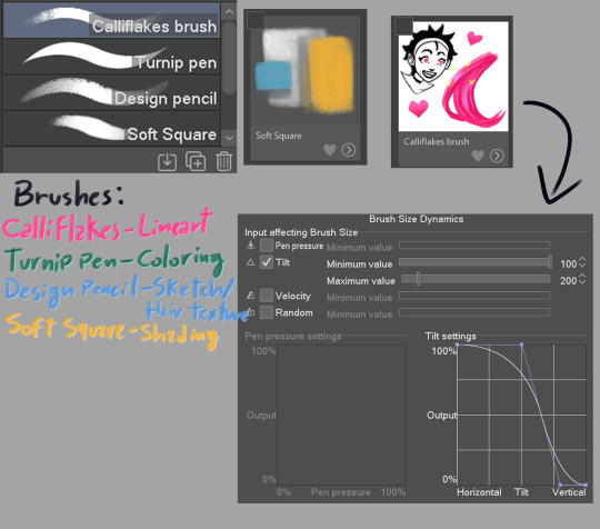
These brushes are like, MY LIFE i love them so much dfjsdbfhbsdb
Anyway, the drawing i'm making is a screenshot redraw of a homestuck panel because i can
Get homestucked lol
Anyway after the sketch i make the shading plans, they are really important and will basically dictate if the drawing will be good or not

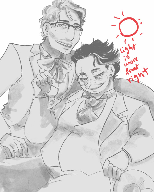
always make sure the light direction is the same throughout or else it will look lackluster, think about the character in they're primary forms(head is a square, torso is also a square, nose is a piramid etc.)
Now is the real kicker, plan the reflective light (i can't explain it really well so researching it is a better option)


I like to see the light sources with their correct blending modes before drawing to check if the colors look ok
In the end, the objective is to make it so the drawing still holds up without the sketch, if the light makes the pose readable, it's all good to go
Finally, it's time for the lineart, i made the Calliflakes's brush change in size depending on the tilt, this is great for a dynamic lineart and a crunchy look
I usually use three sizes in the lineart, the main size, a medium size to make more detailed parts, and a smaller one for when i need even smaller details, tho it's good to use it sparingly since it might make the drawing look unbalanced
Also, i usually don't use black in my drawings, mostly because of the shading process
Looking good!
Now it's time for the flats! This part is pretty simple, this ios also the part where i paint the lineart, i ONLY paint parts that are INSIDE the silhouette, mostly to make everything blend more and also becuase i like it :)
What a handsome fellow!
Alright now for the part you came here for, the shading! Alright, remember the shading plan? Use that as a base for the actual shading.
First, since this drawing is in a dark place, i grouped the whole drawing in a folder, then made a multiply layer with the color closest to the original image, then i clipped it to the folder(this is a very common thing here)

(I didn't shade the eye since it is the main point of focus of the drawing)
Now let's see it with the lighting plan
nice
Now let's talk soft squares and design pencils
The way i shade with the soft square is that i make it mostly cell shaded, then i come with the same brush but transparent, and i VERY CAREFULLY make circular motions to erase part where i want the shading to make a gradient effect, the key to a good shading job is balancing the sharp shadows with the soft ones
Now with hair, i use the design pencil, i basically just make a bunch of close streaks, almost like painting with a paint brush, after that i make streaks with the same pencil but transparent, making variations in lenght so it looks natural and organic
Alright time for the first shade pass, this one is for the more general shadows, so it won't look that dynamic
Now you can see where the shadows are lacking and make the second pass to deepen the shapes
(P.S: all these layers are the same color, they are in multiply mode)
Alright time for the star of the show! The lights!!!
Using the shading plan i refined the shapes and put it on the add(glow) mode, a good tip i have for this stage is to make shapes shapes shapes! Also remembering that the farther the thing is, the least bright it will be.

Oh my! That changes the whole vibe!
Now i saw the hair was a little boring looking, so i added an extra layer of airbrush to make it more dynamic

Actually fuck it, time for some finger tip smudge
Now we're talking.
Alright, now it's time for the reflected light, make sure it's not too bright unless it looks like a second light source, also this layer is in glow dodge mode!
We could say it's done as it is...
BUT NOT BEFORE THE COLOR DODGE
It looks so muck better now! But that's not all!
Now that we have this beautiful boi, it's time for the finishing touches! These make ALL the difference in the drawing
There we go!
Well now it's my favorite part... the FUCK AROUND AND FIND OUT part!
This is where you add all the textures and special effects! I like mostly using a noise filter (so AI can't steal my stuff) and achromatic aberration, also adding some ashes and a nice metal texture in the background to make it nicer looking

Now, this is technically finished, but if you want to go the extra mile, you can do some color correction, i like doing it to give more contrast, also to make the piece more balanced, i also added some extra details on the eye and a blur last minute

And it's done!
As you can see my process is a little all over the place, but that's the fun part of drawing for me! It's always an adventure where you never know how it's going to end!
Anyway hope this helped at least a little!
#art tutorial#art advice#? kinda#homestuck#homestuck 2#commander karkat#shading tutorial#rendering#long post
82 notes
·
View notes
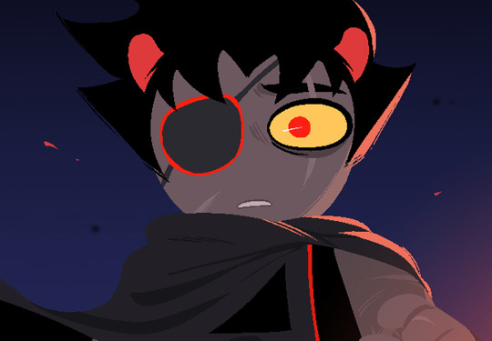
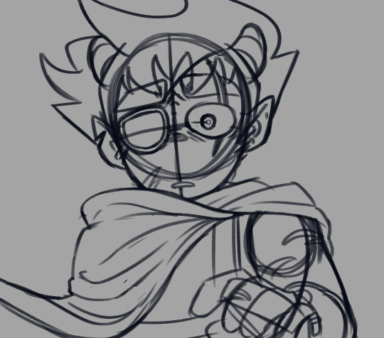
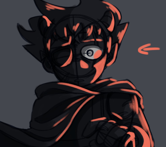
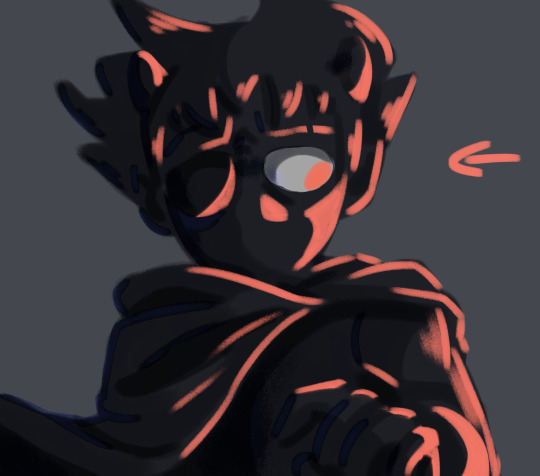
Text
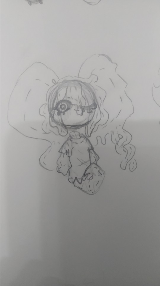
rat brainrot going hard
sorry for not posting this week, i was cooking some stuff but this drawing took almost the entire week to do, worst part, it was a shitpost
i still dont know why this took me so much
so uh, almost all my drawings this week have been related to this two(and lis) so much so that i struggled because i wanted to draw other things so i would just stare at a blank sheet of paper for over half an hour, god that was torture, tho i dont mind drawing the sillies, sometimes it gets a bit boring drawing the same over and over y'know? im also going to take this as an opportunity to ramble about my forgo gijinka, because surprisingly i hadnt done that yet.
og image

ok now to actually talk about the wet rat
ive tried doing a gijinka of em since i joined the fandom (my first gijinka was fecto elfilis (well not really they were fnaf, but i mean when i got into kirby and when i started using the term gijinka))
but most of the time it just looked like elfilin but like...evil, with a different ear and a hospital gown, thats it, so i barely drew them since i didnt like that, but on february, i actually sketched an idea that i liked, and thought it looked cute but a bit off (i mean off in a good way)
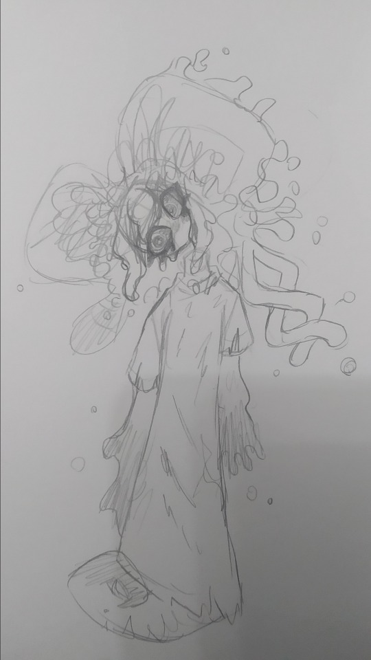
(yes im posting this image again because i think its the best drawing of my forgo (im very inconsistent with my style ok))
they have their eyes closed most of time, like in game, i considered giving them legs but i ended up with the tail, since i didnt want to end up with like a fourth evil elfilin, the arms are like that so i can have em be small and weird like in the actual game, but i also made it so they can like change it, that way i can make em have hands and stuff if necessary (like to hold that frying pan for example)
not sure if a lot of you notice it but um, bro has no neck, i took away his neck privileges, i did it just to see but i ended up falling in love with that and stuck around, and also that allows me to draw them bending their head like in the drawing above because their neck isnt necking and i like that, i like being able to draw characters doing stuff that shouldnt be anatomically possible or is abnormal (i did something a bit similar with void) thair clothes are rugged because well forgotten land you know what i mean, but in general theyre actually pretty simple
i also did the drawing in digital

i tried doing very sketchy lineart, i tried a new brush in this one and thats the one im using for my last drawings (not sure if anyone noticed the brush change) it was pain painting it because i did it all with the brush in the same size, not changing it, god did my hands hurt and it was a bad idea
i accidentaly downloaded the following 3 drawings twice lol
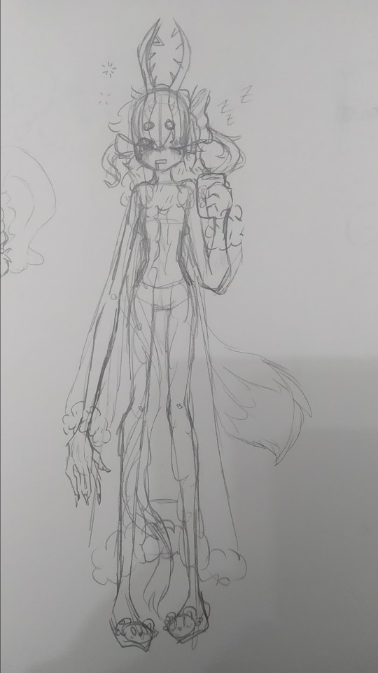
sleepy zzzz
i think they would wear something like this to sleep, i dunno i just wanted to draw em in something cute, and sleepy, with elfilin slippers (the mug also has elfilin btw) oh and also i like changing their hair, here one of their long bangs is tied into a bow, kinda like callie from splatoon, i have some drawing im probably wont post, one more of forgo wich looks very much like the upper one but like eyes closed, and one of fecto elfilis gyaru because my sister asked me to draw them like that, bad thing is i didnt look up references on gyaru since i couldnt use my phone at the moment, i did like the hair i did for them in that one tho, they have their bangs tied up in a bun, and then left the rest loose, making it look longer than it actually is. i might redraw it, but actually looking up gyaru so i can make something more accurate, i like the style, but im not too informed on it
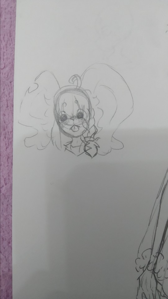
elfilin being silly like a kitty :p
not much more to say on this, just sillines :3
there is totally not a cropped drawing there
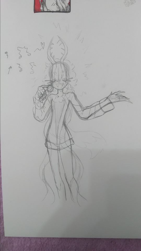
based on the kirby manga, where they make it so elfilis sings really bad, at first i didnt like it that much since i had imagined they'd sign great, but after i while i started to find it a bit cute so now its a headcanon, they like to sing but suck at it.
writing this just made me remember i wanted to do another drawing too for this with kirby and them singing, but i forgot to do it, im kinda tired (and its late) ill probably draw it, but for next post or another one
tried drawing fecto forgo as a plushie, silly.
i wanna learn how to sew so i can make plushies of characters (like prince fluf!) but im way too lazy, i will get around it some day! (hopefully)
elfilin too as a plush
i also wanna learn to sculpt, i tried doing a clay kirby once, but one his feet broke in half, and one day my mom put it in a box, and his eyes fell off and stuck to the box :(
i really wanna do figures for characters i like or dont have enough merch or my ocs (prince fluff, flamberge, fecto elfilis)
but as i said, im way too lazy and unmotivated, though its be nice, one day, maybe one day if i stop procrastinating
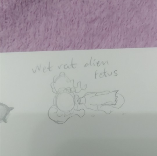
it doesnt have the same ring to it as "feto rata mojada alien" wich is how my sister and i call them (she doesnt know that much about kirby, but i sometimes show her my drawings (reluctantly sometimes, but im the older so like >:) she has too if she wants to show me her stuff too))
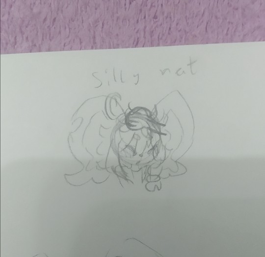
silly rat and wet rat, thats how i call em (because wet rat alien fetus is too long sometimes)
you can tell the brainrot was too strong (were near done(kinda))
they gain a mouth whenever i fell like it very much
artblock hit, and all the rest of pages i stared at them for 30 minutes
it felt weird looking at my fecto elfilis with the eyes so big, it looked off (in a weird way)
dunno, tried drawing them in a different pose i i dunno really
i think these are from tuesday. i did more but those were oc (mostly splatoon) or other kirby character related, and i want this to be a rat post (might post those tommorow or another day maybe)
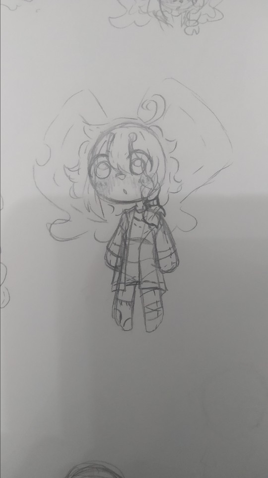
i dunno (x2), i tried drawing elfilin like elfilis, i really liked the hands here. i still struggle a bit with anatomy but i think this was quite good for my usual character just stading looking at the front or a quarter profile. im considering making this into a fully digital drawing, what do i say by considering im actually doing that fuck it, i just think it looks kinda cool

"This new creation, driven by pure chaos, was defeated by the bright light of Kirby's hope."
Chaos Elfilis reminds me of a moth. kirby's hope is a bright light.
you can see my thought process. i just thought itd be a bit cute and kinda silly and funny.
the kirby fandom wiki, said that chaos elfilis looked akin to a moth, and it just stuck with me, so i wanted my gijinka of them to be moth inspired, and thats when i saw just how cute moths are! i mean im still a bit scared of insects but at least now i kinda like em.
i feel like i need to say sorry to that one moth i desintegrated in a matter of seconds with a book because i thought it was an spider and didnt think (im so sorry little guy)
but ah yeah elfilis, moth, it made sense to me since chaos elfilis has the soul of morpho knight, who is a butterfly, and moths are kinda like butterflies too. and i thought itd be cute
so uh yeah i sometimes like making my chaos elfilis be a bit like a moth, that includes liking light, a lot, so uh kirby is like a lamp in here because i said so
now to talk about the desing since for some reason i hadnt earlier, as i said before, they are very moth inpired so uh im might say that word way too many times (im sorry i suck at explaining stuff)
their horns are thinner to resemble moth anntenae, and they curve just because i thought it look cool, and to differentiate it a bit from fecto elfilis. their bangs tie into a bun (i forgot to draw that but i dont wanna go and change it now, way too tiredv man and i still have to post this on other places) the bun looks a bit like an eye, because well, they are basically a soul boss, and moths have things in their wings that look like eyes, btw chaos elfilis doesnt have their wings here because i got lazy and i didnt want them to like cover most of the drawing. the things coming from their bun are like the trhee things theyve got in their head, theyre shaped like that to resemble insects legs a bit, fecto elfilis also had the 3 things (i dunno how to call em sorry) as their eyelashes, but chaos elfilis has just white eyelashes, because the bun already has the 3 things and because my morpho has white eyelashes so (i still havent done my morpho gijinka yet, i just know im gonna give the butterfly some white eyelashes cuz cute and pretty grimm reaper) the rest of the hair is shaped into like a ponytail but like, adn shaped, with whats left shaped like a lil moth
the waistband they have is a nod to morpho, they used to have a bow shaped just like the butterfly morpho appears as, but i took it out because i thought it crowded the design way too much, and also because it was too on the nose. the arms have those golden things because my fecto has it and because my og chaos elfilis gijinka had them so i wanted to bring it back, the hand fades into white because the red in the hand wasnt hard to distinguish so i came up with that to make it easier to see.
the red part of the pants are actually a bit fuzzy akin to a moth and the white part has those stripes to loke like insect stuff because y'know akin to a moth. the boots are like the red part in their legs their model in-game has, so i just made em tall boots, the high heels? originally it was platform just ike my fecto but then i wanted to draw them in high heels when i was slightly redoing chaos elfilis, and welp, i loved it and now theyve got high heels. those rings around the ankle are inspired by the ones leaongar has around their arm. also can you tell anatomy is not my strong suit? and that i dont draw high heels often?
i made a slight change in my kirby, making the sleeves be a different color, since the one he had before i felt was way too white, and i wanted to have more saturation in it
i also forgot but elfilin is supposed to wear that during forgotten land, and then i decided that after the anding of the main story he changes clothes, but i forgot about that while doing this so he has his pre-ending clothes (also because i still cant really decide on their second outfit for the post-game)
god im so tired i wanna talk and show more drawings but o shit im sweating why is it so hot in here
um thank you for reading all the unnecessary long rambles about why i do certain stuff in my gijinkas, i appreciate it a lot (im still sorry about writing walls upon walls of text but i just cant help it)
Jambuhbye! :D
#art#fanart#kirby#kirby fanart#kirby gijinka#silly#digital art#firealpaca#traditional art#fecto elfilis#elfilin#chaos elfilis#kirby elfilis#fecto elfilis gijinka#elfilin fanart#elfilin gijinka#chaos elfilis gijinka#gikabi#gijinka#fecto forgo gijinka#fecto forgo#shitpost#they have invaded my brain#fuck it the next drawing are probably gonna be them too btw#its 1:53 rn lord save me please#you know what#staright up kill me please#i love you tumblr mwah thank you for not having such a small character and image limit like x formerly know as twitter#i still dont know why the alastor elfilis blew up on twitter#im cooking some fanfics btw
22 notes
·
View notes
Note
Hello! I am a beginner artist and I love ur art!! Super pretty and the colors are very tasty. Do you have some tips? I'd love to see your art process!
HELLO ANON!! first of all i am very honoured that u would ask me this because 90% of the time i feel like i have no idea what i am doing and like im still a beginner artist myself DSDSJDF. i would love to share some stuff i learnt and some stuff about my process (regardless of how messy it is sdfhsj)
(final piece)
here's an old example of my process i found! while the steps sometimes look different for other pieces, i feel like this is a good demonstration of how the basic structure looks.
1. the sketch - this is where i'm mainly figuring out how i want the piece to look. i was redrawing a screenshot for this piece so it looks a LOT neater than what a lot of my other sketches look like, for example, here's the process of me figuring out my recent drawing of haise:


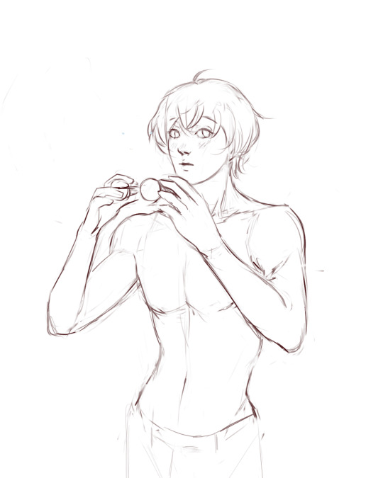
(final piece)
in the first two steps, i was mainly working with showing myself what the piece was going to be. the last one was where i used references/technical knowledge to try and show whoever will be looking at it what the piece was
2. cleaning up the sketch + base colours. these two usually occur simultaneously because i will get bored cleaning up the sketch midway through and want to start adding colour LMAO. on a more practical note, sometimes putting down the base colours and having a better idea of what the finished product will look like might make it easier to refine things.
a note: cleaning up for me doesn't mean doing lineart. it mostly means erasing any overly messy lines on the sketch and redrawing small parts to make it look tidier where needed. i often leave it 'messy' at this stage, too. like here:

(final piece)
3. light/shadow. this is my FAVOURITE part because it's where the piece starts pulling together. the method i used in the current piece was putting a multiply layer over the colours folder and filling in where light would be obstructed. after that, i used a luminosity layer to put in some bright sunlight. marc brunet has a great way of explaining it by advising to pretend that the light is the camera and you're behind the lens. this is such a good way to block in average light/shadow values! sometimes this looks a bit crazy because everything is still so messy but that is why we have...
4. rendering. this is where i fit all the remaining pieces of the puzzle together. i'll refine the colours a bit more -- e.g. colouring in the eyes, -- and fiddle a bit with the shadows to add some more variation to the hues/value. this is where i think a lot about light and shadow theory and try and make it look more realistic. marco bucci saved my LIFE with his videos about ambient occlusion and ambient light (part 1 / part 2) -- essentially, what i keep in mind the most is that if a plane in shadow is facing the sky (or is open to any other form of light that isn't the direct light source) it will contain ambient light. it is SUCH a game changer when you add it to your pieces, trust me, even if youre lazy about it. if needed i'll pull up some references to make everything look good!
5. rendering... part 2? honestly this step kind of blends with the last one as i tend to do it simultaneously. i basically clean up all the messy lines from before by painting over them! with the majority of the colours i need put down, i can just eyedrop them and paint over anything that's needed. this also comes in with the light/shadow, where, if i need a more subtle hue for either/or, i will eyedrop it and brush it in.
some further notes:
i very rarely use references during the first stages of my sketch. i think it tends to look quite stiff and unnatural if i rely too hard on the. and i personally prefer the creative room when the idea is still being conceived. references come in when i can look at what i have down on the canvas and have a fairly decent idea of what i want, including pose, composition, etc. it's essentially a first draft to guide me to where i want to go with the piece. it's when i'm done with this that i bring out references, and even then, they don't necessarily have to be the exact pose -- i'll usually get a couple of pics which show what i need to double check and keep them up as a guide. by the end of the 'sketch', i usually have a basic construction of what i need to continue, even if it's messy.
i use very soft brushes when putting down colour because it allows for more hue variation. like i said, i enjoy eyedropping and brushing in colours afterwards, so this really helps!
layer modes are ur friend! i try not to rely on them too hard during rendering because i like the freedom of painting over but they're very useful when you're blocking in your initial colours
sometimes, when i feel like i want to try something new with my art, i'll keep pieces that inspire me up in front of me. i have two of sui ishida's art books and sometimes i'll just flick to a page that oils the Art Gears in my brain and keep it open while i draw. i don't necessarily reference it, but i like having it there so i can glance over every once in a while. i don't usually make a conscious choice where i'm like "ok i want to render skin the way he does" but it's more like. my brain knows what it likes in his art and it'll try and push that part of my art in a similar direction.
honestly the best advice i have is that art is very much based on vibes. everytime i've tried to think too much about it, to do things 'correctly', to rigidly stick to art theory, my art has not come out nicely. i think the technical parts of art are important to know and understand but i also think it's important to let your knowledge come through naturally when it is needed instead of pressuring yourself to do things 'right'. tbh you probably already know that but it's something i forget a lot so maybe it serves as a helpful reminder?? sedsfhsl
ANYWAY SORRY THIS WAS SO LONG! i hope i covered what you needed and if you need anything else/want me to expand on anything feel free to drop me another ask ! <3
make sure to look after yourself and trust yourself and ENJOY!!! art is about having fun!
79 notes
·
View notes
Text
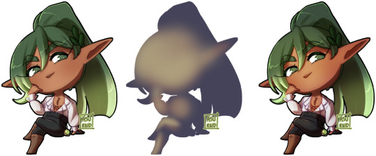
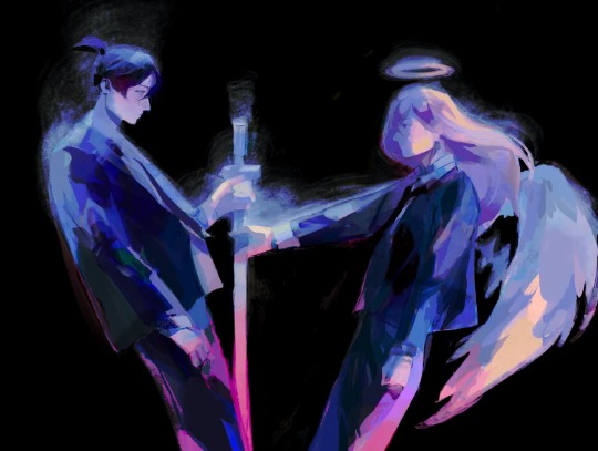
A Cancelled Project.
I was bored and wanted something to do and then one day, I came up with a VERY huge project. Originally,I was gonna make with 9 different designs of GL and 9 different designs of CL (including my designs of the lights), making up a total of 18 characters to draw, which would beat my personal record of putting the most characters in a drawing which was 9 characters. However, I started losing more and more motivation until I didn’t want to do the project anymore. So, I decided to leave it unfinished and cancel the project all together.
Here is the sketch with some lineart:
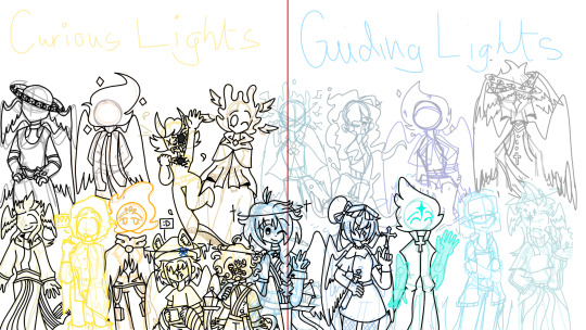
This project was going to be a gift for all the doors blogs I followed and to show how much I appreciated their work. I’m sorry I couldn’t finish this project for you guys, but I hope you like it even though it’s unfinished.
Credits:
@basilthepizzabagel @behind-closed-doors-ask @tis-blackbxrry @the-4l73rn4t1v3 @hydrxnessa @d-alva45 @hellowyelloww @anonymousbloke
65 notes
·
View notes
Text
HOPELESS JUNCTION 2: MAID BOGALOO (clickbait sorry sdhjgjsd)
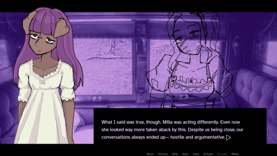


despite the overlap of toxic manipulative yuri, tragic dumb lesbians and people fucking dying, this project is definitely very different to hopeless junction im just using the project and assets as placeholders for gametesting purposes lmfao
i think i might actually color up all my shit this time but ill have to see how i actually feel about it when i get closer to the end of this project cause i feel like theres going to be a fuckton more art already given that my cast is like twice the size and this game might end up being significantly longer than hopeless junction
i think tho that just using overlays and throwing shadows on my drawing and coloring the outlines can pretty quickly get pretty nice looking results. i kinda hate making clean lineart i get so bored but if i leave the cgs a bit more sketchy and have clean(er) sprites that might be a good angle for me.
ive written a good 20k words so far and its probs a third of the story so things are proceeding fine. i was going to release this for yurijam but i probably wont and will just let this project be something i work on in my own pace
41 notes
·
View notes
Text
I was thinking about artwork that I’ve seen.
I dunno I felt poetic
I was thinking about artwork that I’ve seen.
Drawings where the linework was so fluid it melted seamlessly into the colours, as if it were all one thing rather than layers piling one on top of the other. The shading was fantastic and gave it magic and depth. The lighting turned it into something beyond beautiful — powerful, warm, and comforting. It had background art that transported it into places of wonder. It had special decorations and detailing that would take a lifetime to uncover. It was so real it moved. It breathed. It lived.
And I wondered if people looked at art the same way I do. If people see stories in the ink blots. If they hear music in the color scheme. Do they feel warmth in the expressions, do they find wonder in the brushstrokes, do the ink marks glisten and gleam and glitter like gold?
And I wondered if people knew they were art, too. If they knew that their freckles are strategic paint splatters, made to add depth and decorum. If they saw their scars as storylines, markers of where they've been and how far they've come. How their eyes are jewels and gemstones, they sparkle and reflect the light of the sun, moon, and stars. Their smiles and frowns are strokes of a brush with precision pigment, and tears and laughter are a symphony. Can they see the extravagant and extraordinary dye used in their skin, in their lips, in their blood and tears? Have they seen the delicate weaving and braiding and crocheting of their hairs? Their joy shines like magic through their pores, their fingers are tools and their voices are instruments. Their names are reflections of their person, the title of their artwork. Do they know they are masterpieces?
And I wondered if people…
If one person would ever look at me like that. If someone would see my lighting, my shading, my composition and negative space. If my lineart was seamless, if my colours clashed or blended in a lovely way, if my details drew them in, if I was intricate or creative or magic. Could they notice how I sway when I get tired, like I'm slow-dancing to a lullaby, or how I click my tongue and hum when I'm bored… How my feet turn in, how sometimes I stumble on my R's, how my eyes resemble sunflowers… My freckles go down like connect-the-dots in a constellation on my arms, my nails are nibbled down, my hands are covered in ink, my ears covered in headphones secured within a song… My shoes are decorated with charms, my jeans are old, ripped and cut-off at the knees, my sweaters are warm and oversized, I hide inside them like a picture in a frame, snug and silly, flapping my hands underneath the long sleeves. Do they hear how I sing constantly, how I talk in every accent I can get my hands on, see how I add extra U's to words like “colour” or “honour” or “favour”, how I talk to myself in the woods where I write my stories, how I still believe in magic like Ents and Faes and the Loch Ness monster and miracles... could they see all my quirks and flaws and what very few redeeming qualities I find in myself, and could they see them all as paint? As pencil marks? As ink and dye? As gloss and varnish? Could my rambles sound like music? Could my smile be glitter? Could my voice be winds and strings and brass? Could anyone look at me and see the artwork?
But mostly I wondered if I would ever be able to look at myself like how I look at the artwork.
#poem#artwork#you are a masterpiece#you are beautiful#you are loved#i was feeling poetic#writing#tumblr writers#magical#artist on tumblr#artist stuff#phoebepheebsphibs#phoebepheebsphibs pheeling phoetic#phoebepheebsphibs feeling poetic
14 notes
·
View notes
Text
aid’s collection of neat art tricks
aka I wanted to compile all the neat things I’ve learned and picked up over the years across various sources; I wish I knew some of these, but they’re scattered across a variety of social medias and some from conversations.
of course, these are not a must and just have helped me! I just wanted to put them all in one place in hopes that maybe it’ll click something in someone like it has for me. c: I’m not the best at explaining, but I hope it makes sense!
some may use Clip Studio assets but can be replicated through other methods (or done by hand in the case of how I do my lineart colouring), but do keep in mind all of these are written with CSP in mind.
this is pretty heavy in images and gifs, and is quite long.
how to quickly fill your outlines (CSP tool)
this is a CSP specific method, but this tool has been my absolute saviour for making colouring so much easier for me (even if sometimes it still does require me to manually fill in some holes or erase sections). the bulk of how it works is explained in the tool as well, but I’m going to show a gif example for myself!

you have to make sure your lineart is set as the reference layer to ensure this tool does work; with messy outlines (like my own) you may need to manually fill in holes as can be seen in the gif above; with cleaner outlines, you don’t need to worry as much, but you may have some bleeding out of the lines for places that are a bit too close together (as you can see below, those areas would need to be erased).
the tool can also help to close ‘gaps’ between colours!

I usually tend to have a ‘base’ colour that I just clip a folder of flat colours to, so it doesn’t bleed outside of it, but I’m also a nested folder freak to make sure everything is cleanly separated and doesn’t get ‘destroyed’ while I work on it. this tool just makes it so much easier to get that base down and just jump right into adding flats.
adding a little pop of depth
this one is thanks to a clip studio article itself where I saw it from, and I’ve been using it in practically all my drawings so far; all it is, is a simple blue-ish overlay layer with some muted yellow/red shading to give it a bit of a “3D” effect, for me I enjoy more that it adds a bit more colour variation underneath (usually lowered to 20-50% opacity, depends on the drawing)
the article definitely explains it a bit more nicely, but this is an example of having it at 50% opacity over one of my drawings
making your lineart feel less ... boring?
of course, boring is subjective from person to person, but I’ve always found my lineart to be too boring by itself

like this is fine, but it’s missing some kind of oomph. there are two tricks I use when it comes to sprucing up my lineart: using the watercolour edge effect in CSP, and a combo of coloured outlines + black outlines
first things first, the watercolour edge option: by default it’s a bit too strong, so I usually find the sweet spot to be at 1 range and with an opacity of ~20


this can be replicated through duplicating your lineart, and if the option is available, using gaussian blur on the duplicated lineart to achieve around a similar effect.
coloured outlines!
when it comes to colouring my lineart, truth be told I do use a wonderful auto action for it which can be found here, and there is this alternative one as well (which i’ll be trying now!!!).

it is a little different since it uses the flats, vs the one i use which just requires you to have the lineart selected, but as you can see it is a very quick way to colour your lineart ... this isn’t perfect by itself and will require you to have your flats finished.
this is my process: outlines done, autoaction, cleaning up by adding black outlines where they’re required and fixing up sections where the colours don’t quite make sense (like the sleeve area).

as you can see with the last drawing, I also tend to add a black outline around the outside of the piece, I personally found I really enjoy the contrast of the dark outside and coloured interior lines, as you can see in this little sample; it just adds a bit more visual interest for me!

unfortunately, outside of manually doing it, I cannot think of alternatives for this specific action (perhaps duplicating + flattening all your colours and placing it on top of the lineart may be a start)
crunchy textures and pretty colours ...
the texture i use on top of my drawings can be found in this CSP asset pack (though the marker brushes themselves are very lovely, and I’ve used them myself). this can be replicated through adding perlin noise, but I just find this texture to tickle the good spots in my brain, and it’s why I use it on pretty much all my drawings for some additional visual goodies.
yes, i am also a person who uses gradient maps. I usually tend to use them as finishers and more subtle ways to add more colours and variations to keep my shading from looking too flat, but they do have to be handled with care lest they become overwhelming. vampbyte does a wonderful introductory thread on gradient maps, how they function, and how they can be used.
they can be found through layer > new correction layer > gradient map -- or at least that’s how i usually access mine!
i often place mine at 20% opacity on the colour mode, though soft light and overlay also do their own fancy things! really depends on which you like most and works with your piece.
an example of my chibi w/o texture and colour gradients vs the texture + colour gradient ... as you can see it does change the colours quite a bit, so usually it does take me a bit of playing around to find a colour gradient I like (I’m a gremlin who has downloaded a lot of them) and to play with opacity values.
and to top it off, here’s the combination of all of these vs one with them all off.

how i personally shade (multiply layers)
i usually tend to either go for multiply shading over the whole drawing using one colour (and a few lil tricks to add more depth) for smaller pieces, or hard light shading for bigger and more complex pieces since it has more value depth.
my multiply layers are usually just one or two layers using around the same off-purple shade (though i shuffle it around pending on how it looks on the drawing

the second layer is a duplicate of the first, and i usually use an airbrush to either erase or expand areas to give it a softer shade (as you can see in the gif, the second layer is definitely missing chunks), or to add a different colour to the shading that isn’t the off-purple
how i personally shade (hard light mode)
this one’s a bit more of a mouthful, and thanks to a friend who introduced me to it! my second method is hard light shading, which, at its simplest, is greyscale shading and feels like it leans more into ‘painting’ your shades (as it works best with a brush that blends colours).

although I’m obliterating my own art here, it’s to show that most of your work will be in the greyscale/muted colours! it is inherently a non-destructive method of shading, so any changes to the colours underneath will maintain the shading regardless. normally I do have to duplicate the layer a second time since I don’t go too close to black shades, and it gives me a bit more control over how ‘hard’ I want my shading to be.

the middle is your ‘neutral’ shade, aka what you want to fill your entire hard light layer with, then your lighter greys will be your highlights, and darker greys your shading!
alternatively, you’re looking for this when you want to find your ‘neutral’ shade.
once you got your hard light layer filled with your base/neutral shade, grab your favourite painting/blending brush and go ham!
as a heads up: when it comes to skin or warm colours in general, you may need to get out of the greyscale range otherwise it will look too desaturated and grey, as you can see below. for any other tones, the greys usually work well.

as of the moment, I think that’s all the little tricks I use when doing art, I hope it helps you guys!
(unless I somehow remember something else, but these are usually my default tricks I use for everything)
#art tutorial#clip studio paint tutorial#digital art tutorial#clip studio paint#tutorial#art tricks#mine.txt#10#20#50#100
222 notes
·
View notes
Note
i'm so obsessed with ur colour choices and painterly style, if u don't mind sharing, could you explain a bit about your process when it comes to ur art? thank u!!!
ahh thank you! i guess i’ll use this recent akiangle piece bc it’s one of the more recent finished paintings. long post up ahead sry
0. sit in lecture and think about what i can be drawing instead of listening for 3 hours about urbicide.
1. sketch concept - i like to use the emilyamiao linebrush 3 for this, it’s really good for life drawing too. usually i just save a bunch of poses on pinterest to use as reference later
2. refining bc the sketch is messy; i don’t do another round of lineart so this is the cleanest it gets
3. basic colours with kyle webster wet gouache brush <3 it really gives a nice watercolour texture which i’m currently digging. sometimes i use lasso tool for this step too
3. fuck around on a new layer using a really big brush size; i like to change opacities and go through all the procreate layer modes until i find a colour palette i like. early stages of colours i dont like going into details much

4. ???????? get serious
5. giving up on initial concept and going for a black background

6. kyle webster cool drag brush for some texture, lasso tool on luminosité (brightness? it’s the last layer mode on procreate idk the actual eng name sry) layer to block shading (v inspired by chuwenjie for this)

7. colour adjustments to make colours boring again but atleast it’s more cohesive ??
this is what the layers usually look like at the end. no i dont know what’s going on either. it’s a nightmarish process and not a workflow i recommend

finish with chromatic abberation :)
this isn’t a very detailed piece so it’s a bit more straightforward, but sometimes i also like to start with 3d modelling and taking multiple shots to render later. sometimes i take my assignments and make it into fanart lol. usually i do like incorporating architecture in my art as well and looking at all the ref pics i save in pure ref :)
100 notes
·
View notes
Note
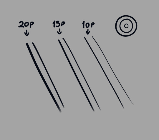
I absolutely love your line work in the Likewise time lapse. may I ask what program/brush / settings you use to achieve it so I can use it for my own lineart ? thank you
ah thank you! but my answer is actually pretty boring! (in an interesting way? i hope?)
i used the default CSP "Pen" > "G-Pen" brush for that. with low stabilisation so i could use my wrist a lot
the bad news is i don't use any special brush, i just use whatever comes to hand. the good news is, what you're probably noticing is my line weight! and i cheat my line weight! and you can too!
...i just go back over my lines after i'm done doing the outline. and i make it thicker and thinner depending on how much emphasis i decide i need. like this:
when i'm inking, i ink in one specific thickness, THEN i just go over/emphasise the parts i decide need to be thicker.
hopefully this helps! i really don't use any special brushes, i just go back and personally thicken the parts i need to stand out more.
i also use my line weight to imply shadow sometimes. i'm still experimenting :^)
i tend to add details (like fabric stitching, or in above, the softer/minor fur detail) in thinner lines so that they stand out much less than the main outlines. they draw less attention from the eye.
the inside of the ears are like caves with shadow in them, so i go back and add more black there to make it look like they're in more shadow.
the snout of this dog is a main facial feature, AND it's long and thus closer to the camera, so i thicken its lineart at the end to make it draw the eye to the face. i do this with human noses too sometimes
a bonus example of how the "heavy ink" pretends to be shading:
all i did for these was just add more black, but it really adds to the illusion that the stand-out pieces are casting a shadow
hope this helps somewhat! sorry i couldn't give you a simple brush to use but i really just go chunkify my lines manually. it's kinda fun! if you squint you can catch me doing exactly this on the Likewise timelapse (though because i'm used to doing this i sometimes do it on the fly. i recommend drawing a whole thing in one singular lineweight, then going back to beef-up the lines you think should be more emphasised. the trick is only beefing those bits! it is very tempting to thicken everything. remember you're playing with emphasis! which parts need GUSTO??)
#gmtxt#gmask#anonymous#art timelapse#digital art#artists on tumblr#digital inks#??? idk which of these tags are good to use#anyway i hope this helps!!
12 notes
·
View notes
Last Seen Blogs

jodiethegeek
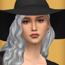
Untitled
narukiisims
Back Lives Matter

plainmadentists
Untitled
eggopaw
meowdy!
leuxcrows
Crows Things