#bootstrap grid media
Text
Mastering Web Development: A Comprehensive Guide for Beginners
In the vast landscape of technology, web development stands as a crucial cornerstone. It encompasses the art and science of building websites, ranging from simple static pages to complex web applications. Whether you're aiming to pursue a career in software development or seeking to enhance your digital presence, understanding web development is essential.
In this comprehensive guide, we'll take you through the fundamental concepts and practical skills needed to master web development from scratch. Let's dive in!
1. Understanding HTML (Hypertext Markup Language)
HTML serves as the backbone of every web page, providing the structure and content. It uses tags to define different elements such as headings, paragraphs, images, and links. By mastering HTML, you'll be able to create well-structured and semantically meaningful web documents.
2. Exploring CSS (Cascading Style Sheets)
CSS is the language used to style HTML elements, enhancing their appearance and layout. With CSS, you can customize colors, fonts, spacing, and more, giving your website a polished and professional look. Understanding CSS selectors and properties is essential for effective styling.
3. Introduction to JavaScript
JavaScript is a versatile programming language that adds interactivity and dynamic behavior to web pages. From simple animations to complex web applications, JavaScript powers a wide range of functionalities. Learning JavaScript fundamentals such as variables, functions, and events is crucial for web development.
4. Building Responsive Websites
In today's mobile-centric world, it's essential to create websites that adapt seamlessly to various screen sizes and devices. Responsive web design achieves this by using fluid grids, flexible images, and media queries. Mastering responsive design principles ensures that your websites look great on desktops, tablets, and smartphones.
5. Introduction to Version Control with Git
Git is a powerful tool for tracking changes in your codebase and collaborating with other developers. By learning Git basics such as branching, merging, and committing, you can streamline your development workflow and effectively manage project versions.
6. Introduction to Front-End Frameworks
Front-end frameworks like Bootstrap, Foundation, and Materialise provide pre-designed components and stylesheets to expedite web development. By leveraging these frameworks, you can create responsive and visually appealing websites with less effort and code.
7. Introduction to Back-End Development
While front-end development focuses on the user interface, back-end development deals with server-side logic and database management. Learning back-end languages such as Node.js, Python, or PHP enables you to build dynamic web applications and handle user interactions efficiently.
8. Deploying Your Website
Once you've developed your website, it's time to make it accessible to the world. Deploying a website involves selecting a web hosting provider, uploading your files, and configuring domain settings. Understanding the deployment process ensures that your website goes live smoothly.
9. Conclusion and Next Steps
Congratulations on completing this comprehensive guide to mastering web development! By now, you've gained a solid understanding of HTML, CSS, JavaScript, version control, frameworks, and deployment. As you continue your journey in web development, remember to stay curious, practice regularly, and explore advanced topics to further refine your skills.
Resources for Further Learning:
Online tutorials and documentation
Interactive coding platforms
Community forums and discussion groups
Next Steps:
Explore advanced topics such as web performance optimization, server-side rendering, and progressive web apps.
Build real-world projects to apply your skills and showcase your portfolio.
Stay updated with the latest trends and technologies in web development through blogs, podcasts, and conferences.
With dedication and perseverance, you'll continue to evolve as a proficient web developer, creating innovative solutions and contributing to the ever-changing digital landscape . Happy coding!
3 notes
·
View notes
Text
Brower Electric - Commit #3 - Service Information Tree
This commit used a Bootstrap 5 Grid to build an information tree for the site.
On Desktop:
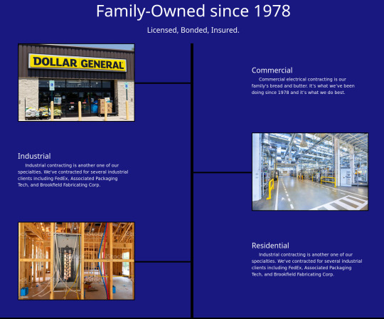
On Mobile:

In Between:

The HTML:
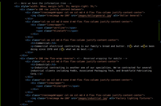
First, I set up a container div with a width of 90vw and 5% on each side. This keeps everything in the middle and at least 90% of the width is used.
The Bootstrap 5 Grid system is a framework for flex-boxes. Basically, they set up the rows and columns classes for me, with pretty extensive responsiveness and including table/grid-like tools that let you adjust the size of the cols without sweating.
By default our cols are not flex containers, so we added d-flex and related attributes so that we can position the column content using flexbox tools.
The middle row flex-wraps in reverse so that even though it's positioned opposite the others on desktop, when wrapped, it reverses itself back to a sensible position.
The reason that I have both an image and a surrounding wrapper is so that I can flex position the image to keep it in line with the rest of the page. The border is applied to the image directly though.
The middle cols contain the lines. This was the biggest challenge. The lines are contained in a positioned (relative) wrapper stretched to fit the div. Because the wrapper is positioned but not flex, I can use absolute positioning for my line spans. This is desirable because flex positioning, which I generally like better, does not let you overlap your elements as easily. Took me more than an hour to figure out this solution.
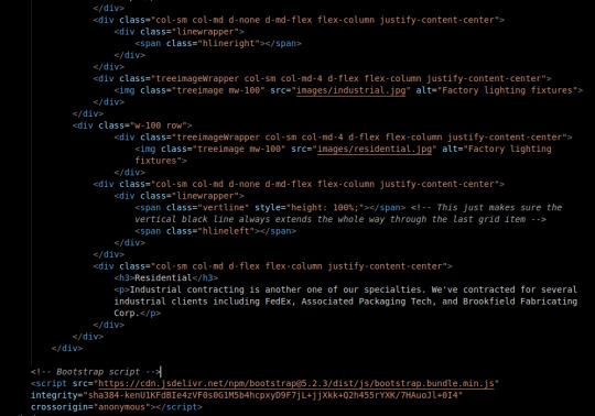
The vertical line is 350% height in the top div, but not present in the middle div. This is to work around the row padding and stretch across all rows. The last div has a 100% height vertical line to help hide make sure the line does not cut short as the page flexes. This took me like 10 minutes to come up with but it was a satisfying fix. Maybe writing the div outside of the rows and positioning it in regard to the whole section of the page could be better though.
The CSS:
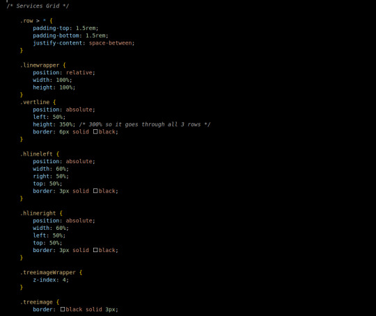

The CSS is comparatively simple since Bootstrap lets me do a large amount of the styling on the HTML doc.
Every row child has a top and bottom padding, additionally they position themselves across the row with equal space in between.
The linewrapper stretches to fit it's div with width and height at 100%. Because it's relatively positioned, I can play with absolutely positioned elements on the inside.
The vertline, as mentioned earlier, has 350% height, no width. a 6px black border and is absolutely positioned 50% from the left border of it's wrapper.
the hlines are similar. Absolutely positioned 50% to the left or right of the wrapper, with a 3px solid black border. The width of the line is 60% so it goes through and under the image. The treeimageWrapper has a z-index of 4 so that the lines go under it.
The treeimage has a 3px black border.
I added one media query to the tree images to make sure they are at least 30% of the viewport in terms of width on desktop. Without this, you get some baby-sized images.
Conclusion:
I think that learning to develop is a lot like learning to play chess. When you practice chess, you get better in two ways: 1) You get used to stretching your brain in the chess direction and 2) You have at least some memory of how you have solved similar problems in the past.
It took me a few hours to write, what I realize now that I review it, is a small amount of code. I'd say more than 50% of the code I write, I delete and rewrite before I actually solve the problem. I think that as I solve more problems like this, my memory of their eccentricities will strengthen and I will be able to write quick solutions because, well, I've already solved it.
You can visit the site's github repository here: https://github.com/Xacheri/BrowerElectric
4 notes
·
View notes
Text
Advanced Techniques in Modern Frontend Development

In the ever-evolving landscape of web development, front-end technologies have witnessed remarkable advancements, empowering developers to create highly responsive, interactive, and visually stunning user interfaces. Leveraging these advancements not only enhances user experience but also streamlines development processes. Let's delve into some advanced techniques shaping modern front-end development.
1. Component-Based Architecture:
Adopting a component-based architecture, often facilitated by frameworks like React, Vue.js, or Angular, facilitates building scalable and modular applications. Components encapsulate UI elements and logic, enabling reusability across the application. Leveraging this approach improves code organization, enhances maintainability, and fosters collaboration among team members.
2. Responsive Web Design:
With the increasing prevalence of mobile devices, responsive web design is imperative. Utilizing techniques like fluid grids, flexible images, and media queries ensures seamless user experiences across various screen sizes and devices. Employing frameworks like Bootstrap or CSS Grid simplifies the implementation of responsive layouts, enabling developers to create adaptive designs efficiently.
3. Progressive Web Apps (PWAs):
PWAs combine the best features of web and mobile applications, delivering fast, reliable, and engaging experiences. Implementing service workers enables offline functionality and caching, allowing PWAs to load instantly and perform reliably, even with limited or intermittent network connectivity. By leveraging web app manifests, developers can enhance discoverability and installability, providing users with a native app-like experience directly from the browser.
4. State Management:
Managing application state efficiently is crucial for complex frontend applications. State management libraries like Redux, Vuex, or MobX facilitate centralized management of application state, ensuring consistency and predictability across components. By adopting unidirectional data flow and immutable data patterns, developers can minimize bugs and optimize performance, enhancing the overall robustness of the application.
5. Optimized Performance:
Optimizing front-end performance is paramount for delivering fast and responsive web experiences. Techniques like code splitting, lazy loading, and bundle optimization reduce initial load times and improve time-to-interactivity. Leveraging tools such as Webpack or Rollup automates optimization tasks, enabling developers to deliver optimized bundles while minimizing development overhead.
6. Server-Side Rendering (SSR) and Static Site Generation (SSG):
SSR and SSG techniques enhance SEO, performance, and perceived load times by pre-rendering content on the server or at build time. Frameworks like Next.js or Nuxt.js simplify the implementation of SSR and SSG, enabling developers to leverage the benefits of server-side rendering while retaining the flexibility of frontend frameworks.
7. Accessibility (A11y) Considerations:
Ensuring accessibility is integral to creating inclusive web experiences. Following accessibility best practices, such as semantic HTML, keyboard navigation, and ARIA attributes, ensures that web content is perceivable, operable, and understandable by users with disabilities. Integrating accessibility testing tools and conducting regular audits helps identify and address accessibility issues proactively, fostering inclusivity in front-end development.
8. Micro Frontends:
Micro frontend architecture decomposes monolithic frontend applications into smaller, independently deployable units, or micro frontends. This approach enables teams to develop and deploy frontend features autonomously, fostering scalability and agility. By leveraging technologies like Web Components or iframes, organizations can seamlessly integrate micro frontends while maintaining isolation and encapsulation.
In conclusion, modern front-end development encompasses a plethora of advanced techniques and best practices aimed at enhancing user experience, optimizing performance, and fostering collaboration and scalability. By embracing component-based architecture, responsive design principles, progressive web app capabilities, and efficient state management, developers can create highly functional and visually appealing web applications.
Explore cutting-edge frontend techniques such as component-based architecture, responsive design, and progressive web apps. These approaches, coupled with efficient state management and optimization strategies, empower developers to create highly performant and engaging web experiences. Web development company in Mohali specializes in implementing these advanced techniques.
0 notes
Text
Mastering Responsive Design: Crafting Seamless UI/UX Across Devices and Platforms
In today's digital landscape, ensuring a consistent and engaging user experience across various devices and platforms is imperative for any website or application. Responsive design has emerged as the cornerstone of achieving this goal, allowing designers and developers to create fluid and adaptable interfaces that seamlessly adjust to different screen sizes and resolutions. In this blog, we'll delve into the principles, best practices, and tools essential for mastering responsive design and optimizing UI/UX across the digital spectrum.

Understanding Responsive Design: Responsive design is an approach to web design aimed at crafting sites to provide an optimal viewing and interaction experience across a wide range of devices, from desktop computers to smartphones and tablets. At its core, responsive design involves the use of flexible grids, layouts, and media queries to adapt the presentation of content based on the device's screen size and orientation.
Key Principles of Responsive Design:
Flexible Grids: Implementing grid-based layouts that can fluidly adjust to accommodate different screen sizes without sacrificing the integrity of the design.
Fluid Images: Using CSS techniques such as max-width to ensure that images scale proportionally to fit smaller screens while maintaining clarity and visual appeal.
Media Queries: Leveraging CSS media queries to apply specific styles based on device characteristics such as screen width, resolution, and orientation.
Content Prioritization: Strategically prioritizing content and functionality to ensure that essential elements remain accessible and user-friendly across devices.
Touch-Friendly Interfaces: Designing for touch interactions by optimizing button sizes, spacing, and navigation elements to enhance usability on touchscreen devices.
Best Practices for Responsive UI/UX:
Mobile-First Approach: Starting the design process with mobile devices in mind and progressively enhancing the layout and features for larger screens.
Performance Optimization: Streamlining code, minimizing HTTP requests, and optimizing assets to improve loading times and responsiveness on all devices.
Cross-Browser Compatibility: Testing designs across various web browsers and devices to ensure consistent rendering and functionality.
User Testing and Feedback: Soliciting feedback from real users and conducting usability testing across different devices to identify pain points and areas for improvement.
Accessibility Compliance: Adhering to accessibility standards such as WCAG (Web Content Accessibility Guidelines) to ensure that the design is inclusive and usable for all users, including those with disabilities.
Tools for Responsive Design:
CSS Frameworks: Utilizing frameworks like Bootstrap or Foundation to expedite the development process and create responsive layouts with pre-built components and utilities.
Responsive Design Testing Tools: Leveraging tools such as BrowserStack, Responsinator, or Chrome DevTools to preview and debug designs across multiple devices and screen sizes.
Device Emulators: Using emulators like Xcode (for iOS) or Android Studio (for Android) to simulate the behavior of mobile devices and test responsiveness without the need for physical hardware.
Prototyping Tools: Employing prototyping tools like Adobe XD, Sketch, or Figma to create interactive prototypes and mockups for testing and validation across different devices.
Performance Monitoring Tools: Monitoring tools such as Google PageSpeed Insights or GTmetrix to analyze website performance metrics and identify areas for optimization to enhance responsiveness.
Zuku-X, the premier UI/UX design agency in India, presents "Mastering Responsive Design: Crafting Seamless UI/UX Across Devices and Platforms." In this comprehensive guide, we delve into the art and science of responsive design, offering invaluable insights and practical strategies to optimize user experiences across diverse devices and platforms. Whether you're a seasoned designer or a novice developer, this blog equips you with the essential principles, best practices, and cutting-edge tools necessary to create fluid and adaptable interfaces that captivate audiences on desktops, smartphones, and tablets alike. With a focus on flexibility, performance, and accessibility, we empower you to embrace a mobile-first approach, leverage responsive design frameworks, and conduct thorough testing to ensure your designs shine on every screen. Join us on a journey to mastery as we unlock the secrets to delivering unparalleled user experiences in today's dynamic digital landscape. Elevate your design game with Zuku-X and embark on the path to crafting seamless UI/UX across devices and platforms.
#ui ux design agency in india#top ui ux design agency in india#Best ui ux design agency in india#ui ux design agency in Maharashtra#top ui ux design agency in Maharashtra#best ui ux design agency in Maharashtra
0 notes
Text
Responsive Design: Adapting UI/UX for Every User
In today’s digital age, where users access websites and applications across a multitude of devices, ensuring a seamless user experience (UX) has become paramount. Responsive design is a key approach that addresses this need, allowing websites and applications to adapt their layout and functionality based on the device and screen size. This article explores the importance of responsive design in UI/UX, its key principles, challenges, best practices, tools, and future trends.
Introduction to Responsive Design
Responsive design is a web design approach that aims to create web pages that respond to the user’s behavior and environment based on screen size, platform, and orientation. It uses a mix of flexible grids and layouts, images, and CSS media queries to achieve a fluid user experience across different devices.
Importance of Responsive Design in UI/UX
With the increasing use of smartphones and tablets, users expect websites and applications to provide a consistent experience regardless of the device they are using. Responsive design ensures that users can access content seamlessly, leading to higher engagement and conversion rates. Moreover, responsive design is crucial for SEO, as search engines prioritize mobile-friendly websites in their rankings.
Key Principles of Responsive Design
Fluid Grid Layouts: Using relative units like percentages instead of fixed units like pixels for layout design.
Flexible Images and Media: Ensuring images and media can scale based on the screen size without losing quality.
Media Queries: Using CSS media queries to apply different styles based on the device’s characteristics.
Common Challenges in Responsive Design
Performance Optimization: Ensuring fast loading times on all devices, especially on mobile.
Navigation Complexity: Simplifying navigation menus and structures for smaller screens.
Content Prioritization: Deciding which content to show or hide based on the screen size.
Best Practices for Responsive UI/UX
Mobile-First Approach: Designing for mobile devices first, then scaling up for larger screens.
Prioritizing Content: Displaying the most important content prominently, even on smaller screens.
Performance Optimization Techniques: Minifying CSS and JavaScript, optimizing images, and using caching techniques.
Tools and Resources for Responsive Design
Frameworks: Bootstrap and Foundation provide responsive design templates and components.
Testing Tools: BrowserStack and Responsinator help test websites and applications across different devices.
Future Trends in Responsive Design
Artificial Intelligence: AI-driven design tools that automatically adapt layouts based on user behavior.
Augmented Reality: Integrating AR features into responsive designs for immersive user experiences.
Conclusion
Responsive design is essential for providing a consistent and user-friendly experience across devices. By following key principles and best practices, businesses can ensure their websites and applications are accessible to all users, leading to higher engagement and conversion rates.
Visit my Upwork profile for — UI/UX design, Web design & Mobile design
0 notes
Text
In today's digitally driven world, users access information from a plethora of devices – desktops, laptops, tablets, smartphones, and even smartwatches. As a web designer, ensuring your website delivers an optimal experience across this vast landscape is no longer a nicety, it's a necessity. This is where responsive web design (RWD) comes in.

RWD is a design philosophy that prioritizes creating websites that adapt and adjust their layout based on the size and capabilities of the device being used. It's not about creating separate websites for each device, but rather a single website that can fluidly transform itself to fit any screen.
Why Responsive Web Design Matters
The dominance of mobile browsing makes RWD an essential strategy for several reasons:
Enhanced User Experience (UX): Imagine a website with text so tiny it's unreadable on a phone, or buttons too close together to tap accurately. Frustrated users are likely to abandon the site altogether. RWD ensures clear readability, easy navigation, and intuitive interaction regardless of the device.
Improved Search Engine Optimization (SEO): Search engines like Google prioritize mobile-friendly websites in their rankings. A responsive design helps your website rank higher in search results, leading to increased organic traffic.
Cost-Effectiveness: Maintaining separate websites for different devices can be a significant drain on resources. RWD eliminates this need, saving time, money, and ongoing maintenance efforts.
Brand Consistency: A responsive website ensures a consistent brand image across all devices. Users will experience the same look, feel, and message, regardless of how they access your website.
Core Principles of Responsive Web Design
Here's a breakdown of the key principles that underpin effective responsive web design:
Fluid Grid Layouts: Imagine a flexible grid system that can expand or contract to accommodate different screen sizes. This is the foundation of RWD. By using percentages instead of fixed pixels to define widths and margins, elements on your website can resize proportionally to fit the available space.
Flexible Images and Media: Images and videos are crucial website components, but they can become problematic on smaller screens. Responsive design utilizes techniques like flexible image containers and media queries (CSS code that dictates how styles change based on screen size) to ensure images resize or even swap out for smaller versions on mobile devices.
Media Queries: As mentioned earlier, media queries are the workhorses of RWD. They allow you to define specific styles for different screen sizes and orientations (portrait or landscape mode). For example, you can use a media query to adjust the number of columns in your grid layout for a tablet view or increase font size for better readability on a smartphone.
Responsive Navigation: Navigation menus on desktops often utilize horizontal layouts with multiple dropdown options. On mobile screens, such menus become cumbersome. RWD employs techniques like hamburger menus (three horizontal lines that reveal the navigation options when tapped) or responsive tabs that adapt to fit the smaller screen size while maintaining easy access to all navigation elements.
Building a Responsive Website
While RWD might seem complex, the process can be broken down into manageable steps:
Planning and Defining Breakpoints: Identify the key screen sizes your website needs to cater to – desktops, tablets, and mobiles might be the basic starting point. These are your breakpoints, where the layout of your website will adapt.
Fluid Grid System: Establish a flexible grid system using CSS that can adjust to different screen sizes. Frameworks like Bootstrap can be helpful in simplifying this process.
Responsive Media: Ensure your images and videos are optimized for responsiveness. Use tools that allow for different image sizes to be served based on the device.
Media Queries: Implement media queries to define how styles change at each breakpoint. Start with basic adjustments for font sizes, image sizes, and layout modifications before diving into more complex interactions.
Testing and Refinement: Test your website rigorously across different devices and screen sizes. Emulators and browser developer tools can be invaluable in this phase. Refine your design based on the testing results to ensure a seamless experience on all devices.
Beyond the Basics: Advanced Responsive Design Techniques
As you gain experience with RWD, you can explore more advanced techniques:
Responsive Typography: Use relative font sizes (ems) that adjust based on the parent element's size, ensuring optimal readability across devices.
Progressive Enhancement: Start with a basic website that functions well on all devices and then progressively enhance the user experience with additional features for larger screens.
Responsive Forms: Ensure forms are easy to fill on mobile devices by using appropriate input types and larger touch targets for buttons.
0 notes
Text
Getting Started with Web Design: A Comprehensive Guide
Web design plays a crucial role in shaping online experiences and communicating brand identities. Whether you're a beginner looking to embark on a career in web design or a business owner seeking to create a professional website, understanding the fundamentals of web design is essential. Partner with a reliable website development services provider to bring your vision to life.

Understanding the Basics
Familiarize Yourself with Design Principles
Before diving into web design, it's essential to understand fundamental design principles such as layout, typography, color theory, and visual hierarchy. These principles form the foundation of effective design and guide the creation of visually appealing and user-friendly websites.
Learn HTML and CSS
HTML (Hypertext Markup Language) and CSS (Cascading Style Sheets) are the building blocks of web design. HTML defines the structure and content of web pages, while CSS controls the presentation and styling. Familiarize yourself with these languages to gain a deeper understanding of how web pages are created and styled.
Choosing the Right Tools
Select a Code Editor
A code editor is essential for writing and editing HTML, CSS, and other web languages. Popular code editors include Sublime Text, Visual Studio Code, and Atom. Choose a code editor that suits your preferences and workflow, and familiarize yourself with its features and capabilities.
Explore Design Software
Graphic design software such as Adobe Photoshop, Adobe Illustrator, and Sketch are invaluable tools for creating mockups, wireframes, and visual assets for your website. Experiment with different design software to find the one that best fits your needs and design process.
Learning Responsive Design
Understand Responsive Design Principles
Responsive design ensures that websites adapt and respond to different screen sizes and devices, providing a seamless user experience across desktops, tablets, and smartphones. Learn responsive design principles such as flexible grids, media queries, and fluid layouts to create websites that are accessible and user-friendly on all devices.
Practice with Frameworks and Libraries
Frameworks and libraries such as Bootstrap, Foundation, and CSS Grid Layout provide pre-designed components and responsive grids that streamline the web design process. Experiment with these tools to build responsive websites more efficiently and effectively.
Building Your Portfolio
Create Personal Projects
Building a portfolio of personal projects is essential for showcasing your skills and expertise as a web designer. Start by creating your own website, redesigning existing websites, or tackling design challenges and projects to demonstrate your capabilities to potential clients or employers.
Showcase Your Work
Once you've completed projects, create a portfolio website to showcase your work and attract clients or job opportunities. Include case studies, project descriptions, and visual samples to highlight your design process, problem-solving skills, and creativity.
Continued Learning and Growth
Stay Updated on Industry Trends
The field of web design is constantly evolving, with new technologies, trends, and best practices emerging regularly. Stay updated on industry trends by reading design blogs, attending webinars, and following influential designers and organizations on social media.
Seek Feedback and Mentorship
Feedback and mentorship are invaluable for growth and improvement as a web designer. Seek feedback from peers, mentors, or online communities to receive constructive criticism and guidance on your work. Actively participate in design forums, communities, and meetups to connect with other designers and learn from their experiences.
SpaceEdge Technology stands out as India's premier website design service, delivering cutting-edge solutions tailored to clients' needs. With a focus on innovation and user-centric design, they craft visually stunning websites that elevate brands and drive results. Trust SpaceEdge for unparalleled creativity, functionality, and exceptional customer satisfaction.
Feel free to stay connected with us for further updates and information. You can reach out to us through various channels, including our website, and social media platforms, or contact us directly via email or phone. We value your engagement and look forward to connecting with you further.
Contact No.: +91-9871034010
Mail ID: [email protected]
0 notes
Text
Responsive Web Design: Understanding its Essence
Embark on the journey of responsive web design with Zapperr ! In this discourse, delve into the art of tailoring web experiences to match user behavior and environmental dynamics, such as screen dimensions, platform nuances, and orientation preferences.
In the ever-evolving realm of web design and development, keeping pace with the myriad resolutions and device variations has become an arduous task. Crafting distinct versions of a website for every conceivable resolution or new gadget is not only daunting but often infeasible. Are we resigned to forfeiting visitors from certain devices while courting those from others? Or could there be a more pragmatic solution?
Responsive web design (RWD) emerges as the answer, aiming to seamlessly adjust website layouts to suit the user's device. The overarching objective is to ensure consistent usability and visual appeal across diverse platforms and screen sizes. By employing flexible grids, adaptive layouts, and responsive imagery alongside CSS media queries, RWD adeptly caters to varying user needs, encompassing different screen dimensions, orientations, and platform specifications.
What is the purpose of responsive web design?
Responsive web design offers advantages to users, web designers, developers, and businesses alike. Instead of crafting separate versions for various devices, developers can create a single adaptive website. This approach streamlines the process, eliminating the need for a distinct mobile version alongside one optimized for desktops. With the prevalence of mobile browsing, responsive design ensures a superior user experience, catering to the needs of individuals who rely on smart phones for activities like browsing, shopping, and banking. Furthermore, responsive design can enhance a site's SEO performance by aligning with search engine preferences for user-friendly interfaces characterized by quick loading times and responsive layouts, facilitating a seamless user experience.
Why is Responsive Design so important?
Creating and maintaining numerous iterations of a website to ensure compatibility across all devices would be impractical and prohibitively expensive. Moreover, such an approach would leave sites vulnerable to becoming obsolete as technology evolves, making upkeep nearly unmanageable.
Here are some reasons why responsive design matters and why it is important:
Increasing mobile Usage
Better UX
Maintenance is Minimum
Responsive Design is Preferred for SEO
Reduced Bounce Rate Due to a Better User Experience
Reduce the Page Load Speed
The Future Is Mobile
Can Responsive Design impact a website's SEO?
Absolutely, Following a significant algorithm update from Google, prioritizing mobile-friendly websites, it's now imperative for all online platforms to embrace full responsiveness. With the latest Mobile First Index update, mobile sites take precedence over desktop versions, underlining the critical importance of mobile optimization.
Web Development Services offer you website development services in Australia to increase your business sales. Know more
Which are the best Frameworks to use for Responsive Designs?
Following are the most widely used frameworks creating Responsive Designs:
Bootstrap Framework
Zurb Foundation
Pure
We Web Development Services provide you the website development services in Australia and Responsive Design services. Know About Us
0 notes
Text
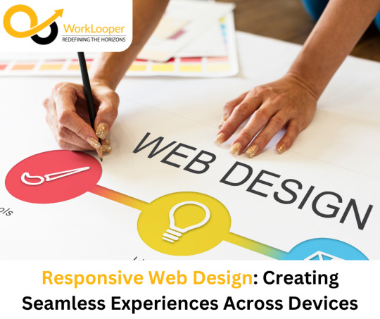
Responsive Web Design: Creating Seamless Experiences Across Devices
In today's digital era, where browsing occurs across various devices, from smartphones to desktops, ensuring a seamless user experience is paramount. Responsive web design addresses this need by adapting websites to different screen sizes and orientations. Let's delve into the intricacies of responsive web design and its significance in modern web development.
Introduction to Responsive Web Design
Responsive web design is an approach to designing and building websites that respond dynamically to the user's behavior and environment, based on screen size, platform, and orientation. It ensures that users have a consistent experience, regardless of the device they use to access the site.
Importance of Responsive Design in Web Development
With the proliferation of mobile devices, responsive design has become a necessity rather than a luxury. It allows websites to reach a broader audience and provides users with a seamless browsing experience across all devices. Additionally, responsive websites tend to perform better in search engine rankings, as Google prioritizes mobile-friendly sites.
Key Principles of Responsive Design
Responsive design is guided by several key principles, including fluid grids, flexible images, and media queries. These principles enable websites to adapt their layout and content to different screen sizes and resolutions, ensuring optimal viewing and interaction experiences for users.
Benefits of Responsive Web Design
Improved User Experience: Responsive websites provide a consistent and intuitive user experience across all devices, leading to higher engagement and satisfaction.
Increased Accessibility: By catering to users on various devices, responsive design ensures that everyone can access and interact with the website effectively.
Better SEO Performance: Responsive websites are favored by search engines, leading to higher rankings and increased visibility in search results.
Common Challenges in Implementing Responsive Design
Despite its many benefits, implementing responsive design can pose challenges for web developers. These challenges include browser compatibility issues, performance optimization, and complex navigation structures. However, with careful planning and testing, these challenges can be overcome.
Best Practices for Responsive Web Design
Mobile-First Approach: Start by designing for mobile devices and then scale up for larger screens. This ensures that the website performs well on smaller devices.
Prioritize Content: Focus on delivering the most important content and features to users, particularly on smaller screens where space is limited.
Testing and Iteration: Regularly test the website on different devices and browsers to identify and address any compatibility issues that may arise.
Tools and Resources for Responsive Web Design
Various tools and resources are available to assist developers in creating responsive websites. Frameworks like Bootstrap and Foundation provide pre-built components and layouts, while testing tools like BrowserStack and Responsinator help ensure compatibility across different devices and browsers.
Future Trends in Responsive Design
The future of responsive design holds exciting possibilities, including AI-driven responsive design, augmented reality integration, and voice user interface optimization. These advancements have the potential to further enhance the user experience and push the boundaries of web design.
Case Studies
Several businesses and organizations have successfully implemented responsive design to improve their online presence and user experience. Case studies highlight the benefits of responsive design in terms of increased traffic, engagement, and conversions, demonstrating its effectiveness in driving business growth and success.
Conclusion
In conclusion, responsive web design is essential for creating websites that provide a seamless user experience across all devices. By adhering to key principles, overcoming challenges, and adopting best practices, developers can create responsive websites that engage users and drive results.
0 notes
Text
The Ultimate Guide to Front end Development

Introduction
Front-end development is a dynamic and ever-evolving field that plays a crucial role in creating seamless and user-friendly web experiences. As technology advances, so do the tools and practices used by front-end developers. Whether you’re a beginner looking to enter the world of front-end development or an experienced developer seeking to stay current, this ultimate guide is designed to provide a comprehensive overview of the key concepts, tools, and best practices in front-end development.
The Front End Is Crucial to the Success of Your Business
A company has to have an appealing, well-maintained, and effective website in order to succeed. A website like this will draw users and keep them interested. In addition, improper developments likely to drive away business in addition to producing unfavourable looks.
A website’s programming and design must take the enterprise’s aim, branding, and customer needs into account in order to completely serve the business itself. Let’s now reveal the factors that make front-end development essential to the expansion of your company.
Understanding Front-end Development:
Definition and role in web development.
The importance of user experience (UX) and user interface (UI).
Essential Technologies:
HTML (Hypertext Markup Language): The backbone of web content.
CSS (Cascading Style Sheets): Styling and layout.
JavaScript: The programming language for interactivity.
Responsive Web Design:
Importance of responsiveness.
Media queries and flexible grid layouts.
Frameworks like Bootstrap and Foundation.
JavaScript Frameworks and Libraries:
Introduction to popular frameworks (React, Angular, Vue.js).
The role of libraries such as jQuery.
Version Control with Git:
Basics of Git for collaborative development.
GitHub and GitLab as version control platforms.
Task Runners and Build Tools:
Grunt, Gulp, and npm scripts.
Webpack for bundling and optimizing.
CSS Preprocessors:
Sass and Less for more maintainable stylesheets.
Variables, mixins, and nesting.
Web Performance Optimization:
Minification and compression of assets.
Lazy loading and asynchronous loading of scripts.
Browser Developer Tools:
Leveraging browser tools for debugging and optimization.
Tips for efficient development workflows.
Cross-Browser Compatibility:
Challenges and strategies for ensuring compatibility.
Browser testing tools and services.
Web Accessibility (A11y):
Importance of creating accessible websites.
Guidelines and tools for testing accessibility.
Front-end Testing:
Unit testing with frameworks like Jest.
End-to-end testing with tools like Cypress.
Continuous Integration and Continuous Deployment (CI/CD):
Automation in the development pipeline.
Popular CI/CD tools.
The Future of Front-end Development:
WebAssembly and its impact.
Progressive Web Apps (PWAs) and their role.
Conclusion:
Front-end development is a dynamic and exciting field that requires a diverse skill set. This ultimate guide serves as a roadmap to navigate through the essentials and advanced topics in front-end development. Whether you’re just starting or looking to enhance your skills, embracing the continuous learning mindset is key in this ever-evolving landscape. Stay curious, explore new technologies, and build amazing user experiences on the web!
Are you passionate about creating stunning and responsive websites? Dive into the world of front-end development with LearNowX comprehensive Front End Developer Course. Whether you’re a beginner eager to learn the basics or an experienced developer aiming to sharpen your skills, our course is designed to cater to all levels of expertise.
LearNowX is not just an institute; it’s a community of passionate learners and experienced mentors. We believe in providing quality education that empowers individuals to thrive in the fast-paced world of front-end development.
Don’t miss out on this opportunity to boost your career! Enroll in LearNowX Front End Developer Course now and take the first step towards becoming a skilled front-end developer.
Transform your passion into a profession with LearNowX — where excellence meets education.
0 notes
Text
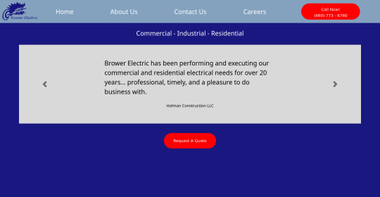
Brower Electric - Commit #2 - carousel
This commit, I built the testimonial carousel, added a new hamburger menu, added a Quote button, and fixed some previous errors.
The HTML:
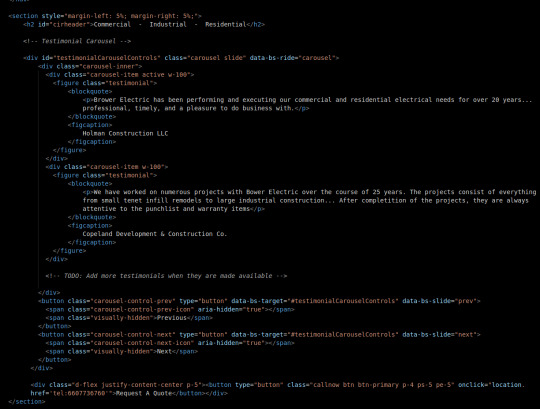
First, we will keep most body elements in a <section> with a small margin on either side. Then, we make a simple header.
After this, I adjusted a bootstrap carousel to have consistent size and to rotate through quotes. Notice that the typical d-block classes are missing, that's because I overrode that in my stylesheet where I rebuilt it using flexboxes so everything is centered and nicer in terms of responsiveness. No <img> tags to be seen here either, those are replaced with the <figures> that contain our quotes.
At the bottom, before the </section> tag, you will see a div that holds a button. This is our Request A Quote button, built just like the other button on the page and using Bootstrap flexbox classes to center it.
I also fixed some validation issues. First, there were extra "s in some tags. The buttons also had <a> tags which I discovered is an issue. They now use onclick="location.href='tel{insertnumberhere.}'"
The CSS:
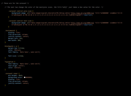
First in the css we added this commit, I changed the carousel background images. There's a hex value you can change in the background image element to accomplish this.
carousel-inner is a flex container, centering its element vertically in the middle, then testimonial is also a container doing this same thing. This keeps our text in the center of the carousel, no matter what text we use.

Finally, our media queries change font sizes to be more appealing and responsive on desktop (remember, we built mobile-first.)
The most exciting challenge I encountered writing this part was grinding through the carousel and using the flex-boxes to rebuild it. I definitely feel like it helped me build on my understanding of positioning a lot, which I know is important.
Next, we will use a Bootstrap 5 Grid to build the information tree.
4 notes
·
View notes
Text
Essential Web Design Training Courses for Beginners

Are you interested in stepping into the dynamic world of web design but not sure where to start? With the ever-growing demand for visually appealing and user-friendly websites, having a solid foundation in web design is essential. Fortunately, there are numerous online courses tailored for beginners, offering comprehensive training in essential skills and technologies. Here's a curated list of some must-have web design courses for beginners:
HTML & CSS Fundamentals: HTML (HyperText Markup Language) and CSS (Cascading Style Sheets) are the building blocks of web design. Understanding these languages is crucial for creating the structure and style of web pages. Look for courses that cover the basics of HTML tags, CSS selectors, layout techniques, and responsive design.
JavaScript for Beginners: JavaScript is a powerful scripting language that adds interactivity and functionality to websites. Beginners should start with courses that introduce JavaScript fundamentals such as variables, functions, loops, and DOM manipulation. Understanding JavaScript will enable you to create dynamic and interactive web experiences.
Responsive Web Design: In today's multi-device landscape, designing websites that adapt to various screen sizes is essential. Responsive web design courses teach you how to create websites that look great and function seamlessly on desktops, tablets, and smartphones. Topics typically include flexible layouts, media queries, and mobile-first design principles.
UI/UX Design Basics: User Interface (UI) and User Experience (UX) design play a crucial role in creating engaging and intuitive web experiences. Beginner courses in UI/UX design cover topics such as wireframing, prototyping, usability testing, and design principles. Understanding UI/UX fundamentals will help you create websites that are both visually appealing and user-friendly.
Adobe Photoshop/Illustrator Basics: Graphic design skills are valuable for web designers, and Adobe Photoshop and Illustrator are industry-standard tools for creating and editing images and graphics. Beginner courses in these applications cover essential tools and techniques for designing graphics, editing photos, and creating visual assets for websites.
Bootstrap/Foundation Frameworks: Frameworks like Bootstrap and Foundation provide pre-designed templates and components that streamline the web design process. Beginner courses in these frameworks teach you how to use their grid systems, components, and styling options to build responsive and professional-looking websites more efficiently.
Introduction to Web Design Tools (e.g., Adobe XD, Figma): Web design tools like Adobe XD and Figma are indispensable for creating prototypes, wireframes, and mockups. Beginner courses introduce you to these tools' features and workflows, enabling you to design and collaborate effectively with clients and team members.
WordPress Basics: WordPress powers a significant portion of the web, making it essential for web designers to understand its basics. Beginner courses in WordPress cover topics such as installation, configuration, theme customization, and content management, empowering you to create and manage WordPress-powered websites.
Embarking on a journey into web design can be exciting and rewarding, especially with the plethora of online courses available to beginners. By investing time and effort into these essential training courses, you'll gain the skills and knowledge needed to kickstart your career as a web designer. Unlock your potential with SkillIQ's premier Web Design Training program. Dive into HTML5, CSS3, responsive design, and UI/UX principles, gaining expertise in every facet of web design.
#Web Designing Course#Ui Ux Course#Web Designing Training in Ahmedabad#Best Web Designing Course#Web Design Training#Web Design Training Courses#web developer course in Ahmedabad
0 notes
Text
Ultimate Guide To Building Responsive ASP.NET Web Applications
In the ever-evolving field of web development, it has become crucial to create mobile-friendly and responsive ASP.NET web applications. As mobile devices continue to dominate internet usage, ensuring a seamless user experience across various screen sizes and devices is paramount. This comprehensive guide will walk you through key principles and techniques for building responsive ASP.NET web applications that cater to the diverse needs of today's users.
Understanding Responsive Design
Responsive design serves as the foundation for responsive web applications, involving the creation of layouts that adapt to different screen sizes and resolutions. In ASP.NET development, this entails utilizing CSS media queries and flexible grid layouts to ensure optimal functionality and appearance on desktops, tablets, and smartphones.
Embracing Bootstrap for ASP.NET
Bootstrap, a widely-used front-end framework, offers a robust set of tools for building responsive web applications. Seamless integration with ASP.NET projects provides pre-designed components and responsive utilities. Leverage Bootstrap's grid system, navigation bars, and responsive classes to expedite development and achieve a consistent look across devices.
Device-Agnostic Approach with CSS Flexbox
CSS Flexbox is a powerful tool for creating responsive layouts in ASP.NET web applications. Adopting a device-agnostic approach with Flexbox enables dynamic container layouts that adapt to various screen sizes without relying on device-specific styles.
Optimizing Images and Media
Optimizing images and media is crucial for responsive ASP.NET web applications, particularly for mobile users with slower internet connections. Implement techniques such as lazy loading, responsive images, and media compression to ensure fast loading times and a smooth user experience.
Touch-Friendly Interactions
Given the prevalence of touch interactions on mobile devices, design your ASP.NET applications with touch-friendly elements. Adequate spacing, optimized tap targets, and avoiding reliance on hover states enhance usability on touch-enabled devices.
Progressive Web App (PWA) Features
Consider incorporating Progressive Web App features into your ASP.NET application for an app-like experience across devices and browsers. Offline functionality, push notifications, and the ability to add the app to the device's home screen enhance user engagement.
Testing Across Devices and Browsers
Thorough testing is essential to ensure a consistent experience. Use browser developer tools, online testing platforms, and real devices to test your ASP.NET web application on different screens. Address any issues related to layout, functionality, or performance for a flawless user experience.
Mobile-Friendly Forms and Input
Optimize forms for mobile users by implementing responsive designs, using HTML5 input types for mobile keyboards, and incorporating touch-friendly controls. Testing and refining the form experience on various devices contribute to a seamless user journey.
Implementing Device Detection and Adaptation
While responsive design caters to a broad range of devices, implement device detection mechanisms to customize the user interface or functionality based on the user's device, ensuring a tailored experience.
Performance Optimization for Mobile
Prioritize speed and efficiency for mobile users by minimizing HTTP requests, utilizing browser caching, and employing content delivery networks (CDNs) for static assets. Load essential content first and defer non-essential elements to enhance perceived speed.
Mastering mobile responsiveness in ASP.NET web applications involves understanding responsive design principles, leveraging frameworks like Bootstrap, embracing flexible layouts with CSS Flexbox, and optimizing every aspect for mobile users. By following this ultimate guide, you'll be equipped to create web applications that seamlessly adapt to diverse devices, providing users with an exceptional experience on desktops, tablets, or smartphones.
1 note
·
View note
Text
Crafting Responsive User Interfaces with ASP.NET

In the dynamic landscape of web development, creating responsive user interfaces is paramount to delivering a seamless user experience across various devices. ASP.NET, a robust framework, provides developers with powerful tools to achieve responsiveness. This blog post will guide you through the essential techniques for crafting responsive user interfaces using ASP.NET. Let's delve into the key strategies and best practices that will empower you to build web applications that adapt gracefully to different screen sizes and devices.
Understanding the Importance of Responsive Design
Responsive design is more than just a trend; it's a necessity. In this section, we'll explore why responsive user interfaces matter in today's digital era. Understanding the impact on user engagement, SEO, and overall accessibility will set the stage for the techniques we'll delve into later.
Getting Started with ASP.NET for Responsive UIs
Before diving into the specifics, we'll ensure you have a solid foundation. This section will cover the basics of ASP.NET relevant to responsive design, including key components, layout considerations, and the role of CSS frameworks.
Responsive Design Principles in ASP.NET
Explore the fundamental principles of responsive design that apply specifically to ASP.NET. We'll discuss the importance of flexible layouts, media queries, and how ASP.NET supports these principles out of the box.
Leveraging Bootstrap for Responsive ASP.NET Applications
Bootstrap is a powerful front-end framework that seamlessly integrates with ASP.NET. Discover how to leverage Bootstrap to expedite the process of creating responsive user interfaces. We'll cover grid systems, responsive utilities, and other Bootstrap features that enhance the responsiveness of your applications.
Media Queries and ASP.NET: Tailoring Styles for Different Devices
This section will provide a deep dive into media queries, a critical aspect of responsive design. Learn how to use media queries effectively in your ASP.NET projects to adjust styles based on screen characteristics, ensuring a consistent and appealing user experience across devices.
Optimizing Images and Multimedia for Various Devices
Images and multimedia play a pivotal role in user interfaces. Discover techniques for optimizing and delivering images efficiently based on device capabilities. We'll discuss responsive images, lazy loading, and other strategies to enhance performance.
Testing and Debugging Responsive ASP.NET Applications
Ensure the responsiveness of your application by implementing thorough testing and debugging processes. This section will provide practical tips and tools to test your ASP.NET applications across different devices and browsers, addressing common challenges in the development workflow.
Case Studies: Real-world Examples of Responsive ASP.NET Interfaces
Explore real-world examples of successful responsive ASP.NET applications. We'll analyze case studies to understand how other developers have tackled challenges and implemented responsive design effectively.
Future Trends: Evolving with Responsive Web Design in ASP.NET
Web development is ever-evolving, and responsive design is no exception. In this final section, we'll discuss emerging trends and technologies that will shape the future of responsive web design within the ASP.NET ecosystem.
Conclusion: Mastering Responsive User Interfaces with ASP.NET
As we conclude our exploration, you'll have gained valuable insights into crafting responsive user interfaces with ASP.NET. Armed with the knowledge and practical tips shared in this guide, you're well-equipped to create web applications that provide a seamless experience for users across a diverse range of devices.
0 notes
Text
Mastering the Craft: Top 12 Tools Every Web Designer Should Know About
In the dynamic field of web design in Geelong, it’s essential to stay abreast of the latest technological advancements. As technology progresses rapidly, web designers must use the latest tools to create visually stunning, user-friendly, and optimised websites. In this blog post, we’ll explore the top twelve tools that every web designer in Geelong should know.

1. Adobe Creative Cloud:
Adobe Creative Cloud is a robust toolkit for web designers, offering tools like Photoshop, Illustrator, and XD. This suite allows designers to seamlessly create and edit images, graphics, and prototypes. Whether crafting logos or designing user interfaces, Adobe Creative Cloud is a preferred choice for professionals in the field.
2. Sketch:
Sketch is the go-to tool for numerous web designers, especially those focusing on user interface (UI) and user experience (UX) design. Its intuitive interface and strong features simplify the creation of responsive designs and prototypes. Its sharing and commenting features also streamline collaboration, making it an invaluable asset for team projects.
3. Figma:
Figma, a cloud-based design tool, is highly popular for its collaborative features. It allows multiple designers to work together simultaneously, streamlining the design process. With real-time collaboration, prototyping, and design specifications, Figma has become an essential tool for modern web design teams.
4. WordPress:
WordPress is a widely-used content management system (CMS) that plays a crucial role in powering a significant part of the internet. It goes beyond being just a tool for bloggers; it’s a versatile platform for constructing websites. Designers can tailor websites to meet client needs using a variety of themes and plugins. The user-friendly interface also empowers clients to manage their content easily. Furthermore, integrating tools like Yoast SEO and a WordPress plugin enhances the platform’s capabilities, offering valuable insights and recommendations to optimise content and boost search engine visibility, ensuring websites are well-optimised for SEO in Geelong and beyond.
5. Bootstrap:
Bootstrap is a front-end framework that makes building responsive and mobile-first websites easy. Designers can utilise its grid system and pre-built components to craft consistent and visually appealing layouts. It’s a great choice for designers looking to save time while ensuring the final product is polished and responsive.
6. Google Analytics:
Mostly, people believe that Google Analytics is for marketers; it is equally beneficial for web developers. Developers can use user actions, rebound rates, and most-liked content to make data-driven choices. Through analysing website performance, designers can refine user experience and optimise designs for improved engagement.
7. Canva:
Canva is a user-friendly graphic design tool suitable for both professionals and beginners. Web designers can utilise Canva for swift design tasks, social media graphics, or crafting engaging website visuals. It’s a helpful tool, especially for designers with limited graphic design skills, allowing them to create visually appealing content effortlessly.
8. Sublime Text:
Sublime Text is a versatile text editor well-loved by both developers and designers. Its speed, simplicity, and robust plugin support make it an excellent option for coding in HTML, CSS, and JavaScript. Offering features such as multiple selections and a distraction-free mode, Sublime Text enhances the coding experience for web designers.
9. Asana:
Asana is a versatile project management and collaboration tool that benefits web design teams. It helps in planning projects, tracking progress, and facilitating effective communication. With features like task assignments and timelines, Asana streamlines project workflows, enhancing overall productivity.
10. Trello:
Through the use of Trello, the web designing team can manage their projects in a more organised way. The smart use of boards, lists, and cards can enhance the group’s interactions while ensuring everyone is aware of their tasks and deadlines effectively. Trello is an easy-to-use and understandable platform that offers great customization for different needs, giving users an upper-hand experience that can help them with their projects. The facility of Trello’s real-time updates and the ability to attach files with each task provide an efficient way for teams to work, helping the team align their goals throughout the lifespan of a project.
11. SEMrush:
SEMrush is a web analytics and SEO tool designed for tracking and analysing your website’s traffic and performance. It offers valuable insights into website analytics, keyword research, backlink analysis, and other aspects of online marketing. Web designers and digital marketers frequently use SEMrush to optimise their strategies and enhance website performance in search engine results, ensuring effective SEO in Geelong.
12. InVision:
InVision is a potent prototyping tool that empowers designers to craft interactive and animated prototypes. It fosters collaboration among designers, developers, and stakeholders, creating a smooth design and development workflow. With real-time collaboration and feedback features, InVision ensures the final product aligns seamlessly with the initial design vision.
Conclusion:
In the fast-paced field ofweb design in Geelong, having the right tools is crucial. Whether it’s the visual power of Adobe Creative Cloud, the collaboration in Figma, or the coding efficiency of Sublime Text, each tool has a specific role in the web designer’s toolkit. Mastering these twelve tools empowers web designers to enhance their skills and achieve outstanding results in the ever-changing digital landscape.
0 notes
Text
Building Responsive Web Applications: A Guide to Front-End Frameworks and Best Practices
Responsive web applications have become a cornerstone in today's digital landscape. With users accessing websites and applications on various devices, ensuring a seamless and visually appealing experience across platforms is crucial. In this guide, we will explore the world of responsive web development, focusing on front-end frameworks and best practices.
In a world dominated by diverse devices and screen sizes, responsive web applications are not just a trend but a necessity. The term "responsive" refers to the ability of a website or application to adapt its layout and design based on the device it is accessed from. This adaptability ensures an optimal user experience, regardless of whether the user is on a desktop, tablet, or smartphone.
Understanding Responsive Design
Responsive design goes beyond aesthetics; it's about creating a user-friendly experience. By employing responsive design principles, websites and applications can automatically adjust to different screen sizes and resolutions. This flexibility eliminates the need for separate designs for each device, streamlining the development process and enhancing user satisfaction.
Role of Front-End Frameworks
At the heart of responsive web development are front-end frameworks. These frameworks provide a structured approach to building user interfaces, offering pre-built components and a standardized workflow. Their role is not only to simplify the development process but also to ensure consistency and efficiency.
Popular Front-End Frameworks
Bootstrap
Bootstrap, a widely used front-end framework, offers a responsive grid system and a collection of CSS and JavaScript components. Its ease of use and extensive documentation make it a go-to choice for developers aiming for quick and responsive designs.
React.js
Known for its component-based architecture, React.js enables the creation of interactive user interfaces. It efficiently updates and renders components, contributing to a smoother user experience.
Angular
Developed and maintained by Google, Angular is a robust front-end framework suitable for building dynamic single-page applications. Its modular structure and dependency injection system enhance the development process.
Key Features of Responsive Web Applications
Flexibility in Design
Responsive web applications provide a flexible design that adjusts to different screen sizes. This adaptability ensures a consistent and visually appealing layout, regardless of the device.
Cross-Browser Compatibility
Front-end frameworks play a crucial role in ensuring cross-browser compatibility. By addressing browser-specific quirks, developers can create web applications that function seamlessly across different browsers.
Mobile Responsiveness
The increasing use of smartphones emphasizes the importance of mobile responsiveness. Responsive web applications prioritize the user experience on mobile devices, catering to the growing mobile user base.
Best Practices for Building Responsive Web Applications
Mobile-First Approach
A mobile-first approach involves designing for mobile devices before scaling up to larger screens. This strategy ensures that the essential elements and functionalities are prioritized for smaller screens.
Optimizing Images and Media
Large media files can impact a website's loading time. Optimizing images and media for different devices contributes to faster loading and a smoother user experience.
Utilizing Media Queries
Media queries enable developers to apply different styles based on the characteristics of the device. By using media queries, a website can adapt its layout to suit the screen size and resolution.
Challenges in Responsive Web Development
Building responsive web applications comes with its set of challenges. Browser compatibility issues, performance concerns, and debugging challenges can arise, requiring developers to adopt effective solutions.
The Evolution of Responsive Design
Responsive design has evolved significantly since its inception. From the introduction of fluid grids to the latest advancements in responsive typography, staying informed about these changes is crucial for developers.
Choosing the Right Front-End Framework
The selection of a front-end framework depends on various factors, including project requirements, team expertise, and scalability. Carefully evaluating the features and capabilities of each framework ensures a suitable match for the project at hand.
Case Studies
Examining successful examples of responsive web applications provides valuable insights. Case studies showcase real-world applications of responsive design principles and offer lessons for developers.
Testing and Quality Assurance
The importance of testing in responsive web development cannot be overstated. Rigorous testing ensures that a web application performs optimally across different devices and browsers.
User Experience (UX) Considerations
In addition to technical aspects, user experience is a critical factor in responsive web development. Understanding user behavior and incorporating feedback contribute to creating applications that users find intuitive and enjoyable.
Future Trends in Responsive Web Applications
As technology continues to evolve, so do the trends in responsive web development. Predicting future technologies and staying ahead of the curve is essential for developers seeking to create cutting-edge and future-proof web applications.
FAQs
What are the advantages of using front-end frameworks?
Front-end frameworks offer a structured approach, saving development time, ensuring consistency, and simplifying the creation of responsive designs.
How can I optimize images for better responsiveness?
Optimize images by compressing them, choosing the right file format, and using responsive image techniques to adapt to different screen sizes.
Are there any challenges in building responsive web applications?
Yes, challenges include browser compatibility issues, performance concerns, and debugging challenges that require effective solutions.
What is the significance of a mobile-first approach?
A mobile-first approach prioritizes designing for mobile devices first, ensuring that essential elements are optimized for smaller screens.
How do I choose the right front-end framework for my project?
Consider project requirements, team expertise, and scalability when choosing a front-end framework to ensure it aligns with your specific needs.
Conclusion
In conclusion, building responsive web applications involves a combination of strategic design, the right front-end frameworks, and adherence to best practices. As users increasingly access content on various devices, prioritizing responsiveness ensures a positive user experience and contributes to the success of web projects.
Visit Website: BytesFarms
0 notes
Last Seen Blogs

kubkoff
kub

ensestanneme
Ensest paylaşım yapıyorum

jaydenna-doctor-who-blog
JAYDENNA'S BLOG :3

ukeylu-blog
Linden Leafs

fancyschmancyopinions
Fancy Schmancy