#and its my own fault
Text
Freaking out at 4am about a doctor's appointment... Completely fine and normal and good and healthy even
#like i know she's chill but i totally fucked up my gastric emptying study by taking valium on the day and what is its not enough#to get help. to be taken seriously.#will she even believe me? are my water numbers enough or do the solid numbers disqualify me#i cant do another year of this. i cant handle it.#i fucked up. i should have just slipped meds entirely to not fuck with the results because i contaminated them#I'm terrified my GP won't listen. wont hear me out.#I'm terrified this is just going to be seen as another one of my hysteria issues#legitimately if things keep going the way they are i don't know what I'm going to do#i feel at the end of my tether#there's only so many times you can face eating and have it end the way it does for me#i cant do this again. i cant have another year of this. i cant have another year of torture. i had one good year i cant go back#food is torture right now. i want to just be normal about it but i cant and I'm so fucking stressed that i fucked up#my one chance at getting help#its agonising to want to eat but to just know that everything is going to go to absolute shit the moment you try#and its my own fault#its my fault over and over again and i just cant do it. i cant take more of this but i also cant take the alternative
3 notes
·
View notes
Text
Me after having a sudden idea in the shower for a PAINFUL addition to "Monday" and having to add it in immediately before thinking "where the fuck did that even come from? Am i okay?"
Anyways, posting in 19 hours 🤣
#am i okay#no#im crying#and its my own fault#eddie munson#stranger things 4#eddie munson x reader#eddie munson fanfic#eddie munson x you#stranger things#eddie munson imagine#eddie fucking munson#eddie munson fic
12 notes
·
View notes
Text
not me opening tumblr first thing in the morning and immediately seeing a major snw spoiler
#text#delete later#snw#AND ITS MY OWN FAULT#1) for opening tumblr not even a minute after i wake up#and 2) for not muting any tags
11 notes
·
View notes
Text
The direction of this art is going to make me want to throw my tablet, but I'm too far into it to back out now
1 note
·
View note
Text
the thing is there's like, a point of oversaturation for everything, and it's why so many things get dropped after a few minutes. and we act like millennials or gen z kids "have short attention spans" but... that's not quite it. it's more like - we did like it. you just ruined it.
capitalism sees product A having moderate success, and then everything has to come out with their "own version" of product A (which is often exactly the same). and they dump extreme amounts of money and environmental waste into each horrible simulacrum they trot out each season.
now it's not just tiktokkers making videos; it's that instagram and even fucking tumblr both think you want live feeds and video-first programming. and it helps them, because videos are easier to sneak native ads into. the books coming out all have to have 78 buzzwords in them for SEO, or otherwise they don't get published. they are making a live-action remake of moana. i haven't googled it, but there's probably another marvel or starwars something coming out, no matter when you're reading this post.
and we are like "hi, this clone of project A completely misses the point of the original. it is soulless and colorless and miserable." and the company nods and says "yes totally. here is a different clone, but special." and we look at clone 2 and we say "nope, this one is still flat and bad, y'all" and they're like "no, totally, we hear you," and then they make another clone but this time it's, like, a joyless prequel. and by the time they've successfully rolled out "clone 89", the market is incredibly oversaturated, and the consumer is blamed because the company isn't turning a profit.
and like - take even something digital like the tumblr "live streaming" function i just mentioned. that has to take up server space and some amount of carbon footprint; just so this brokenass blue hellsite can roll out a feature that literally none of its userbase actually wants. the thing that's the kicker here: even something that doesn't have a physical production plant still impacts the environment.
and it all just feels like it's rolling out of control because like, you watch companies pour hundreds of thousands of dollars into a remake of a remake of something nobody wants anymore and you're like, not able to afford eggs anymore. and you tell the company that really what you want is a good story about survival and they say "okay so you mean a YA white protagonist has some kind of 'spicy' love triangle" and you're like - hey man i think you're misunderstanding the point of storytelling but they've already printed 76 versions of "city of blood and magic" and "queen of diamond rule" and spent literally millions of dollars on the movie "Candy Crush Killer: Coming to Eat You".
it's like being stuck in a room with a clown that keeps telling the same joke over and over but it's worse every time. and that would be fine but he keeps fucking charging you 6.99. and you keep being like "no, i know it made me laugh the first time, but that's because it was different and new" and the clown is just aggressively sitting there saying "well! plenty of people like my jokes! the reason you're bored of this is because maybe there's something wrong with you!"
#this was much longer i had to cut it down for legibility#but i do want to say i am aware this post doesnt touch on human rights violations as a result of fast fashion#that is because it deserves its own post with a completely different tone#i am an environmental educator#so that's what i know the most about. it wouldn't be appropriate of me to mention off-hand the real and legitimate suffering#that people are going through#without doing my research and providing real ways to help#this is a vent post about a thing i'm watching happen; not a call to action. it would be INCREDIBLY demeaning#to all those affected by the fast fashion industry to pretend that a post like this could speak to their suffering#unfortunately one of the horrible things about latestage capitalism as an activist is that SO many things are linked to this#and i WANT to talk about all of them but it would be a book in its own right. in fact there ARE books about each level of this#and i encourage you to seek them out and read them!!! i am not an expert on that i am just a person on tumblr doing my favorite activity#(complaining)#and it's like - this is the individual versus the industry problem again right because im blaming myself#for being an expert on environmental disaster (which is fucking important) but not knowing EVERYTHING about fast fashion#i'm blaming myself for not covering the many layers of this incredibly complicated problem im pointing out#rather than being like. yeah so actually the fault here lies with the billion dollar industries actually.#my failure to be able to condense an incredibly immense problem that is BOOK-LENGTH into a single text post that i post for free#is not in ANY fucking way the same amount of harm as. you know. the ACTUAL COMPANIES doing this ACTUAL THING for ACTUAL MONEY.#anyway im gonna go donate money while i'm thinking about it. maybe you can too. we can both just agree - well i fuckin tried didn't i#which is more than their CEOs can say
15K notes
·
View notes
Text
2 am is a reasonable time to be awake I think
1 note
·
View note
Text
I think 90% of my gripes with how modern anime looks comes down to flat color design/palettes.
Non-cohesive, washed-out color palettes can destroy lineart quality. I see this all the time when comparing an anime's lineart/layout to its colored/post-processed final product and it's heartbreaking. Compare this pre-color vs. final frame from Dungeon Meshi's OP.


So much sharpness and detail and weight gets washed out and flattened by 'meh' color design. I LOVE the flow and thickness and shadows in the fabrics on the left. The white against pastel really brings it out. Check out all the detail in their hair, the highlights in Rin's, the different hues to denote hair color, the blue tint in the clothes' shadows, and how all of that just gets... lost. It works, but it's not particularly good and does a disservice to the line-artist.
I'm using Dungeon Meshi as an example not because it's bad, I'm just especially disappointed because this is Studio Trigger we're talking about. The character animation is fantastic, but the color design is usually much more exciting. We're not seeing Trigger at their full potential, so I'm focusing on them.
Here's a very quick and messy color correct. Not meant to be taken seriously, just to provide comparison to see why colors can feel "washed out." Top is edit, bottom is original.
You can really see how desaturated and "white fluorescent lighting" the original color palettes are.
[Remember: the easiest way to make your colors more lively is to choose a warm or cool tint. From there, you can play around with bringing out complementary colors for a cohesive palette (I warmed Marcille's skintone and hair but made sure to bring out her deep blue clothes). Avoid using too many blend mode layers; hand-picking colors will really help you build your innate color sense and find a color style. Try using saturated colors in unexpected places! If you're coloring a night scene, try using deep blues or greens or magentas. You see these deep colors used all the time in older anime because they couldn't rely on a lightness scale to make colors darker, they had to use darker paints with specific hues. Don't overthink it, simpler is better!]
#not art#dungeon meshi#rant#i'm someone who can get obsessive over colors in my own art#will stare at the screen adjusting hues/saturation for hours#luckily i've gotten faster at color picking#but yeah modern anime's color design is saddening to me. the general trend leans towards white/grey desaturated palettes#simply because they're easier to pick digitally#this is not the colorists fault mind you. the anime industry's problems are also labor problems. artists are severely underpaid#and overworked. colorists literally aren't paid enough to do their best#there isn't a “creative drought” in the anime industry. this trend is widespread across studios purely BECAUSE it's not up to individuals#until work conditions improve anime will unfortunately continue to miss its fullest potential visually#don't even GET ME STARTED ON THE USE OF POST-PROCESSING FILTERS AND LIGHTING IN ANIME THOUGH#SOMEONE HOLD ME BACK. I HATE LENS FLARES I HATE GRADIENT SHADING I HATE CHROMATIC ABBERATION AND BLUR
2K notes
·
View notes
Text
I just keep all my ideas and stories in my head rotating them like microwave and never sharing
0 notes
Text
Me in 5 weeks when im surprised marvel queerbaited me:
2K notes
·
View notes
Text
//- gonna slap out more starters either tonight or tomorrow, was going to do it over the weekend and then this old fox got food poisoning :c
1 note
·
View note
Text

#my art#art#illustration#disco elysium#za/um#kim kitsuragi#lieutenant kim kitsuragi#video game#idk if im happy with how this turned out but its my own fault for wanting to render in all these dif ways
338 notes
·
View notes
Photo
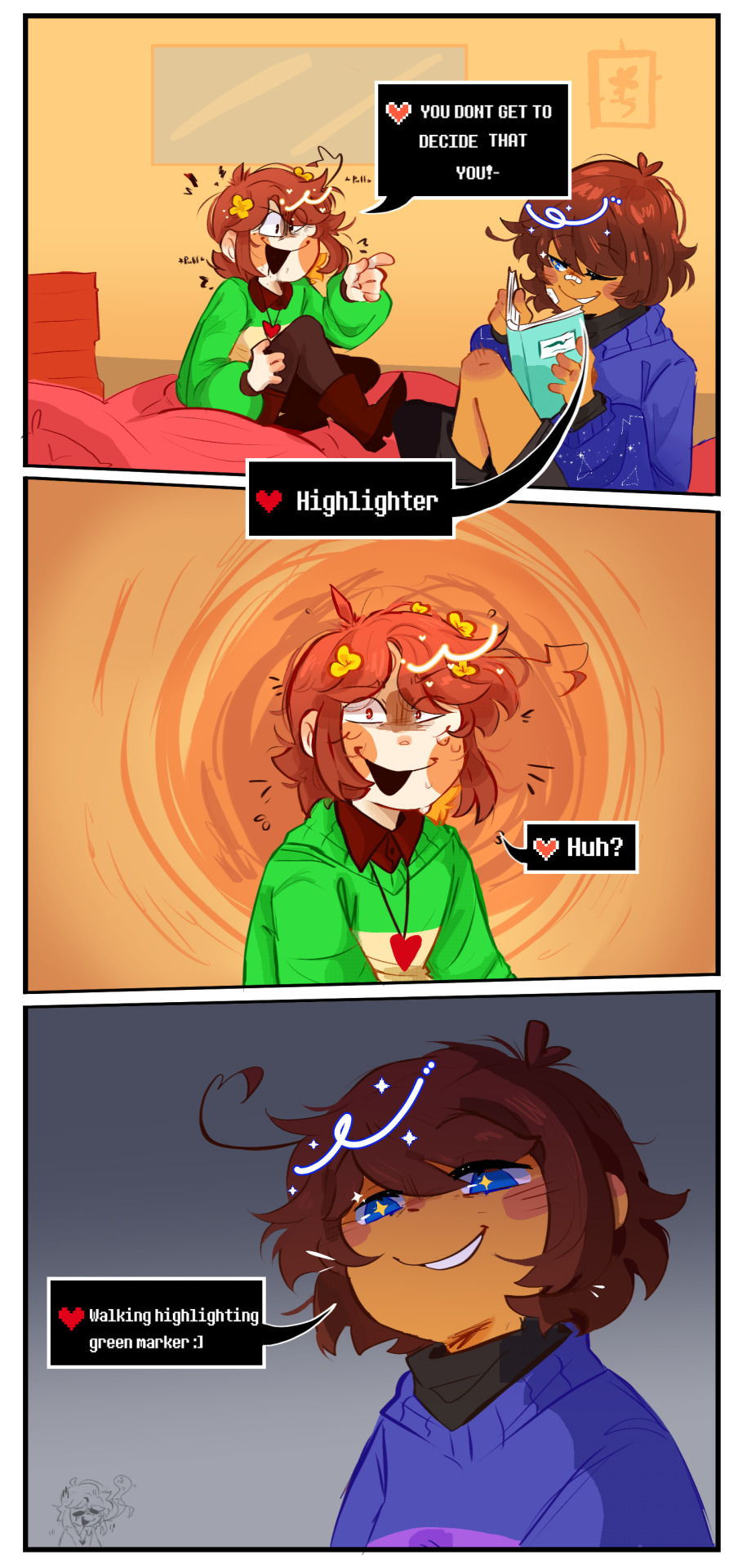
sequal comic to frisk calling chara original neon sweater ugly :)
context
#undertale#undertale fanart#frisk#chara#chara dreemurr#comic#my art#kiti art zone#ill be honest#i never done an actual comic in my life#so if this feels a bit sloppy??#my fault#experimenting and trying new things uknow?#also if you find this unfunny its ok#i also think it is but i find it way too silly not to draw#hope you like it tho :)#also im tired of the cinnamon roll frisk#they are their own type of menace#they bully chara with stupid remarks#thats my hc
2K notes
·
View notes
Text
My entire fyp is filled with content for a movie I haven't seen yet
1 note
·
View note
Text
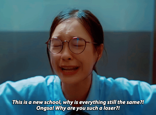

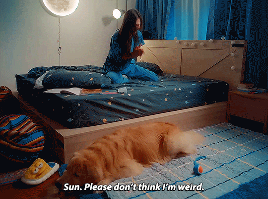
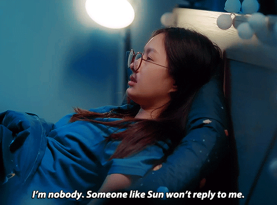
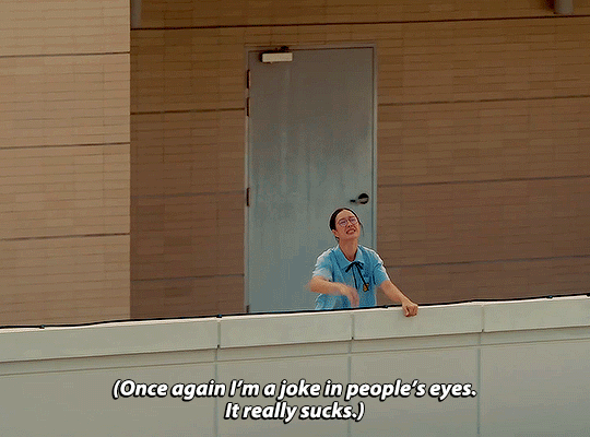

"If you look closely, you'll see that Latte is the only being Ongsa talks to."
23.5 (2024)
#23.5#23.5 the series#23.5 degrees#23.5edit#milklove#gledit#mine*#milk pansa#oh the abject horrors of being a teenage girl#[gathers ongsa gently into my arms and gives her all the warmth and comfort she deserves]#im sorry for how unkind i was to my teenage self; im sorry for unkind you are to yourself#i know her being unpopular and weird is played over the top for laughs but there is such a genuine#sadness and loneliness woven through it#having a sister who is popular and a leader and capable to a fault and a cousin who has her sight far beyond high school#and her peers and is so comfortable behind her high walls and within herself (also to a fault)#while you yourself are so starved and hungry for connection with your peers and to be liked but just seem so incapable of making that work#so incapable of getting out of your own way#is just so... god#its so universal and so heartbreaking and also i wanted to make this set#because at the end of the show ongsa will have her friends and a girlfriend and confidence in herself and hopefully#love and kindness for herself ❤️#in case you were wondering; why yes i will project all my own teenage issues onto this show because yes ongsa is a mirror thank you 🥰
189 notes
·
View notes
Photo
jaya....? (sike. its skybound bad end au. in which jay fails miserably but “nya” never dies. can you imagine?)
#jay walker#ninjago jay#ninjago nya#technically delara.#ninjago#jaya#lol..................#skybound#my art#im not that satisfied with this piece but man. the concept tho#CAN YOU IMAGINE? IT REALLY SAD. IT WOULD BE SO FUNNY.#imagine being the guy who fucked up so bad. everything was your fault. youre the cause of everything that went wrong#all your friends are dead. youre still trapped in a prison of your own making#and you cant fix anything anymore. its too late and you dug too deep into your own grave#but worst of all shes still in front of you#the reason why you made a whole mess of things#the girl you still havent gotten over#but shes also gone. shes right in front of you but thats not her. YOU did this to her#she stands before you as a symbol of mockery of all your failings and mistakes#like its really funny to her#like you couldnt be any more pathetic#:)!!!!!!!!!!!!!#normal about skybound??? nope!!!!!!!! im not!!!!!!!!!!!!!!!!!!!!
2K notes
·
View notes
Last Seen Blogs
ramblingsofadragon
A Chandelier in Pieces

hishoukoku
殿下。你这可真是…要了我的命了
who-watches-the-watcherss
As i mess with your head.

bankiqmagazine-blog
Bank IQ
slump-mp3
a whole mess