#and in the fandom itself
Text
Zepotha will never be Goncharov because when it comes down to it, tumblr culture is collaborative, while tiktok culture is merely iterative, and those are not the same thing.
#also because tumblr has a very specific way that it interacts with the media it loves#like make no mistake; when we made Goncharov we were a little bit making fun of ourselves#and the way we project high emotion and significance onto even the smallest details#(also the way we want everything to be gay)#tiktok isn’t doing that. they think the joke is the fake movie itself. but the fake movie isn't really the point.#the point is the fake FANDOM#goncharov
28K notes
·
View notes
Text

MAGP07
SAM: I got a weird email from “John” with a random name and an address
MAGP09
LENA: You are to visit a man by the name of “Nigel Dickerson” and hand him this envelope which contains a name and address
Gwen is gonna be this podcast's Fun Times person
#she will be the first to be kidnapped i guarantee#tmagp#tmagp spoilers#the magnus protocol#sam also got the message from jon no less. thats also something good in itself as we the fandom know!#also i have a feeling the fandom is gonna switch between these. we are known momster 'appreciators'#1k
4K notes
·
View notes
Text
#tried to think of something to say as a caption#but i think the video speaks for itself#spiderman atsv#across the spider verse fanart#across the spiderverse#atsv fanart#atsv fandom#spiderman fandom#spiderverse#spiderverse fanart#atsv#hobie brown#spider punk#pavitr prabhakar#miles morales
4K notes
·
View notes
Text
NO LONGER ACCEPTING REQUESTS as it is past the 28th!!
thank you to everyone who donated, and I’ll complete the requests that are currently pending but will not be taking any more.
hi! to help encourage donations, i’m offering drawings to anyone who donates or sends an e-sim to gaza. here is a tutorial on how on the gaza e-sims website and here is another one on tumblr. check the notes of this post for discount codes if you’re into that. i will be doing this until the 28th of february!
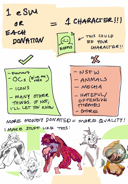
alternatively, you can donate to any one of these instead:
Pious Projects (twitter)
Help Gaza Children (proof of impact)
Care for Gaza (twitter)
Medical Aid for Palestinians (twitter)
Help Ahmed and his family evacuate (his account)
Help Mohamed and his family get medical help and evacuate (post)
Palestine Children's Relief Fund (twitter)
Anera (twitter)
Help a family of 13 evacuate
Urgent support for medical professionals
OR donate to any other legitimate fundraiser!
i am only accepting donations made from 10th feb onwards! send me a screenshot of your receipt with timestamps through DMs or email me at [email protected] (but cover your personal details), along with the character you would like. sending one or two reference images is also highly encouraged!
there’s no lower limit to donations that i’ll draw for! a dollar or two is still money, and every little bit helps. that said, I won’t be spending over 5 hours on any one drawing so that i don’t burn out. im going to try and do as many of these as i can, but if i am uncomfortable with your request i will refuse it (but that almost certainly won’t happen tho)
#crowcraft#i havent done requests in ages so I’m nervous! but I really really want to do what I can#not sure how to tag this properly but:#donations for gaza#Palestine#free palestine#gaza#donation commissions#esims for gaza#esims commissions#commissions open#requests#IM A SMALL BLOG PLS REBLOG THIS IF U WANNA. IT HELPS#I’ll queue this to reblog itself through the night so the americans see it. ok im going to bed#OH FANDOM TAGS FOR THE ART HERE. OOPS#cotl#cult of the lamb#wha#witch hat atelier#ocs#lmk#lego monkie kid
730 notes
·
View notes
Text
Okay, so here are our options:
1. David Tennant is the Fourteenth Doctor because the Jodie Whittaker's Doctor regenerated into him.
2. Ncuti Gatwa is the Fourteenth Doctor because Ten3 does not count.
3. Sacha Dhawan is the Fourteenth Doctor because Jodie Whittaker's doctor regenerated into him.
4. Jodie Whittaker is the Fourteenth Doctor due to the existence of the War Doctor.
5. Peter Capaldi is the Fourteenth Doctor due to the existence of the War Doctor and the time David Tennant regenerated into himself.
6. Matt Smith is the Fourteenth Doctor due to the existence of the War Doctor, and the time David Tennant regenerated into himself, and Jo Martin’s Doctor.
7. David Tennant is the Fourteenth Doctor due to the existence of the War Doctor, and the fact that he regenerated into himself, and Jo Martin's Doctor, and the existence of TenToo.
8. TenToo is the Fourteenth Doctor for the above reasons.
9. Donna Noble is the Fourteenth Doctor for the above above reasons.
10. Both David Tennant and Ncuti Gatwa's Doctors' true numbers are unknowable due to the existence of The Timeless Child.
11. Both David Tennant and Ncuti Gatwa's Doctors' true numbers are unknowable due to the existence of The Timeless Child, and the uncountable amount of times The Twelfth Doctor died and was reborn in Heaven Sent.
12. Both David Tennant and Ncuti Gatwa's Doctors' true numbers are unknowable due to the existence of The Timeless Child, and the uncountable amount of times The Twelfth Doctor died and was reborn in Heaven Sent, and all Doctors seen in noncanon materials are actually canon (Peter Cushing films, Scream of the Shalka, Curse of the Fatal Death, etc...)
13. Both David Tennant and Ncuti Gatwa's Doctors' true numbers are unknowable for all of the above reasons and also because pseudo-Doctors such as The Valeyard and The Dream Lord are also The Doctor.
14. The above is true, but The Doctor is simply a title, and anyone who claims to be The Doctor is also The Doctor. Jackson Lake is The Doctor. Clara is The Doctor. Missy is The Doctor. Graham is The Doctor. Every actor who has played The Doctor are also The Doctor.
15. The above is true, but due to The Egg Theory everyone else is also The Doctor. We are all The Doctor.
16. None of the above is true because no Doctor after the Revival is canon.
17. None of the above is true because no Doctor after the First Doctor is canon.
18. None of the above is true because there is no Fourteenth Doctor. The number was skipped for some reason.
19. The numbering system is flawed and useless to current canon, and we should switch to identifying Doctors by their actors, as we do with The Master. (Example: Hartnell!Doctor)
20. The above is not true because we would still need to find a way to differentiate the 3 - 4 Doctors played by David Tennant.
21. All of the above is technically true, and Russell T Davies should put it up to a poll and see who wins, and we must all commit to the democratic vote.
#doctor who#fourteenth doctor#david tennant#ncuti gatwa#sacha dhawan#jodie whittaker#the power of the doctor#power of the doctor#tpotd#potd#doctor who spoilers#dw spoilers#tpotd spoilers#potd spoilers#note: this is in no way making fun of any people who are upset that ncuti gatwa is not the fourteenth doctor#i wholeheartedly agree that all of this could have been handled better#and that it's unfair to count ten3 if we don't count war etc#this is mostly just a satirical post to poke fun at the show itself#and its complicated canon#and also a genuine concern with the split in the fandom over this question#lodger speaks
8K notes
·
View notes
Text
Very interesting to me that a certain subset of the BES fandom's favourite iterations of Mizu and Akemi are seemingly rooted in the facades they have projected towards the world, and are not accurate representations of their true selves.
And I see this is especially the case with Mizu, where fanon likes to paint her as this dominant, hyper-masculine, smirking Cool GuyTM who's going to give you her strap. And this idea of Mizu is often based on the image of her wearing her glasses, and optionally, with her cloak and big, wide-brimmed kasa.
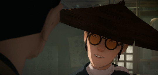

And what's interesting about this, to me, is that fanon is seemingly falling for her deliberate disguise. Because the glasses (with the optional combination of cloak and hat) represent Mizu's suppression of her true self. She is playing a role.

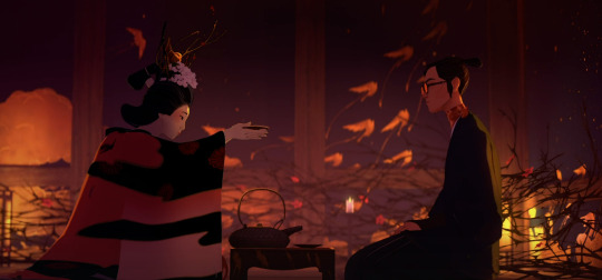
Take this scene of Mizu in the brothel in Episode 4 for example. Here, not only is Mizu wearing her glasses to symbolise the mask she is wearing, but she is purposely acting like some suave and cocky gentleman, intimidating, calm, in control. Her voice is even deeper than usual, like what we hear in her first scene while facing off with Hachiman the Flesh-Trader in Episode 1.
This act that Mizu puts on is an embodiment of masculine showboating, which is highly effective against weak and insecure men like Hachi, but also against women like those who tried to seduce her at the Shindo House.
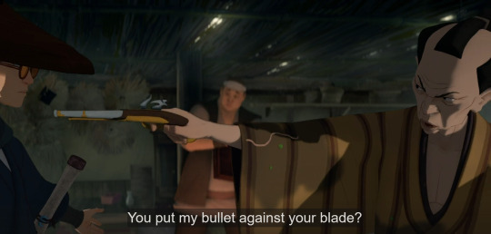

And that brings me to how Mizu's mask is actually a direct parallel to Akemi's mask in this very same scene.
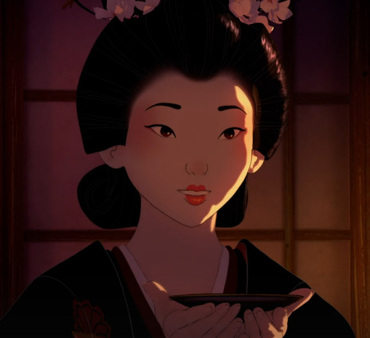
Here, Akemi is also putting up an act, playing up her naivety and demure girlishness, using her high-pitched lilted voice, complimenting Mizu and trying to make small talk, all so she can seduce and lure Mizu in to drink the drugged cup of sake.
So what I find so interesting and funny about this scene, characters within it, and the subsequent fandom interpretations of both, is that everyone seems to literally be falling for the mask that Mizu and Akemi are putting up to conceal their identities, guard themselves from the world, and get what they want.
It's also a little frustrating because the fanon seems to twist what actually makes Mizu and Akemi's dynamic so interesting by flattening it completely. Because both here and throughout the story, Mizu and Akemi's entire relationship and treatment of each other is solely built off of masks, assumptions, and misconceptions.
Akemi believes Mizu is a selfish, cocky male samurai who destroyed her ex-fiance's career and life, and who abandoned her to let her get dragged away by her father's guards and forcibly married off to a man she didn't know. on the other hand, Mizu believes Akemi is bratty, naive princess who constantly needs saving and who can't make her own decisions.
These misconceptions are even evident in the framing of their first impressions of each other, both of which unfold in these slow-motion POV shots.
Mizu's first impression of Akemi is that of a beautiful, untouchable princess in a cage. Swirling string music in the background.
Akemi's first impression of Mizu is of a mysterious, stoic "demon" samurai who stole her fiance's scarf. Tense music and the sound of ocean waves in the background.

And then, going back to that scene of them together in Episode 4, both Mizu and Akemi continue to fool each other and hold these assumptions of each other, and they both feed into it, as both are purposely acting within the suppressive roles society binds them to in order to achieve their goals within the means they are allowed (Akemi playing the part of a subservient woman; Mizu playing the part of a dominant man).
But then, for once in both their lives, neither of their usual tactics work.
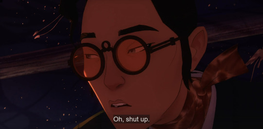
Akemi is trying to use flattery and seduction on Mizu, but Mizu sees right through it, knowing that Akemi is just trying to manipulate and harm her. Rather than give in to Akemi's tactics, Mizu plays with Akemi's emotions by alluding to Taigen's death, before pinning her down, and then when she starts crying, Mizu just rolls her eyes and tells her to shut up.
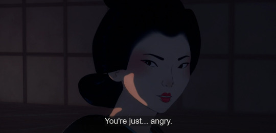
On the opposite end, when Mizu tries to use brute force and intimidation, Akemi also sees right through it, not falling for it, and instead says this:
"Under your mask, you're not the killer you pretend to be."
Nonetheless, despite the fact that they see a little bit through each other's masks, they both still hold their presumptions of each other until the very end of the season, with Akemi seeing Mizu as an obnoxious samurai swooping in to save the day, and Mizu seeing Akemi as a damsel in distress.
And what I find a bit irksome is that the fandom also resorts to flattening them to these tropes as well.
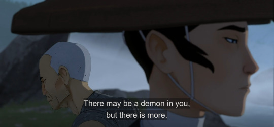
Because Mizu is not some cool, smooth-talking samurai with a big dick sword as Akemi (and the fandom) might believe. All of that is the facade she puts up and nothing more. In reality, Mizu is an angry, confused and lonely child, and a masterful artist, who is struggling against her own self-hatred. Master Eiji, her father figure who knows her best, knows this.
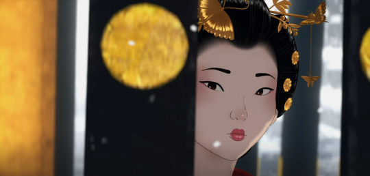
And Akemi, on the other hand, is not some girly, sweet, vain and spoiled princess as Mizu might believe. Instead she has never cared for frivolous things like fashion, love or looks, instead favouring poetry and strategy games instead, and has always only cared about her own independence. Seki, her father figure who knows her best, knows this.

But neither is she some authoritative dominatrix, though this is part of her new persona that she is trying to project to get what she wants. Because while Akemi is willful, outspoken, intelligent and authoritative, she can still be naive! She is still often unsure and needs to have her hand held through things, as she is still learning and growing into her full potential. Her new parental/guardian figure, Madame Kaji, knows this as well.
So with all that being said, now that we know that Mizu and Akemi are essentially wearing masks and putting up fronts throughout the show, what would a representation of Mizu's and Akemi's true selves actually look like? Easy. It's in their hair.

This shot on the left is the only time we see Mizu with her hair completely down. In this scene, she's being berated by Mama, and her guard is completely down, she has no weapon, and is no longer wearing any mask, as this is after she showed Mikio "all of herself" and tried to take off the mask of a subservient housewife. Thus, here, she is sad, vulnerable, and feeling small (emphasised further by the framing of the scene). This is a perfect encapsulation of what Mizu is on the inside, underneath all the layers of revenge-obsession and the walls she's put around herself.
In contrast, the only time we Akemi with her hair fully down, she is completely alone in the bath, and this scene takes place after being scorned by her father and left weeping at his feet. But despite all that, Akemi is headstrong, determined, taking the reigns of her life as she makes the choice to run away, but even that choice is reflective of her youthful naivety. She even gets scolded by Seki shortly after this in the next scene, because though she wants to be independent, she still hasn't completely learned to be. Not yet. Regardless, her decisiveness and moment of self-empowerment is emphasised by the framing of the scene, where her face takes up the majority of the shot, and she stares seriously into the middle distance.
To conclude, I wish popular fanon would stop mischaracterising these two, and flattening them into tropes and stereotypes (ie. masculine badass swordsman Mizu and feminine alluring queen but also girly swooning damsel Akemi), all of which just seems... reductive. It also irks me when Akemi is merely upheld as a love interest and romantic device for Mizu and nothing more, when she is literally Mizu's narrative foil (takes far more narrative precedence over romantic interest) and the deuteragonist of this show. She is her own person. That is literally the theme of her entire character and arc.
#blue eye samurai#mizu blue eye samurai#akemi blue eye samurai#blue eye samurai meta#just in case... im gonna tag this as#mizukemicritical#akemizucritical#though this post isnt actually criticising the ship itself but rather fanon's portrayal of the ship and the characters#for that reason lemme also tag this as#wank.mp3#feel free to disagree of course but please be civil#and if you need to rant about how wrong i am without any convincing evidence kindly feel free to make your own post. peace and love <3#fandom.rtf#meta dissertations.pdf#shut up haydar#edit: for full disclosure. i do rather dislike this ship. but obviously it's fine for anyone to enjoy it. please do! have your fun!#it's just that as usual! popular fanon and fandom around a ship is what has completely deterred me from any sense of enjoyment of it#it's a shame too because i was very open and even eager for some mizu/akemi romance in the future#but out-of-character fanon + the rudeness of certain fans has definitely soured it for me#but that doesn't mean people can't enjoy it obviously! ship and let ship!!!#plus it has its appeal which i DO STILL see and enjoy!!!!#i would even go as far as to call them soulmates because their narratives and characters are LITERALLY intertwined!!!#but. yeah. my gradual distaste for this ship is indeed very unfortunate.
652 notes
·
View notes
Text

TGCF Vol 3 (eng), Chp. 43 - 44 (First "Kiss") Part 1 / 5 (next >)
First part of the comic is finally done! I chose this scene because I know the donghua/manhua will almost certainly censor it and also I feel like there's a lot of beautiful but also inaccurate depictions of this kiss and I just wanna do the full scene justice, including Xie Lian's reaction on the beach. I'm trying to stay as close to the novel as possible but some dialogue will be slightly altered to fit the flow of the comic. I should have planned it to be more vertically oriented to fit tumblr better but hell I don't actually know anything about making comics.
CW for those who don't know where this is going: The next part of this comic includes relatively non-consensual kissing. The purpose is the exchange of air & to keep the smoke spirit from entering, but Xie Lian does struggle against it in the beginning. If this might trigger or upset you, don't read any further.
A direct novel excerpt of this scene is under the cut.
[comic panel numbers]
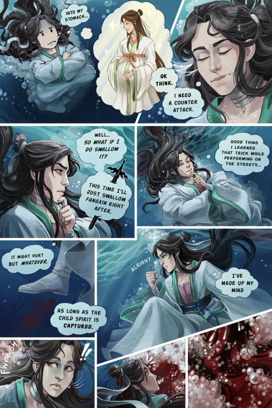
[1] It didn't take long before his throat itched, and that cloud of black smoke was retched back out! [2] Xie Lian covered his mouth with his sleeve, coughing nonstop and choked by tears. [3] His mind raced to find another countermeasure. Even after the cloud of black smoke was forcibly vomited out, it still swirled about and relentlessly clung to his body. [4] Xie Lian pushed himself onto the windowsill, raised himself up, and leapt into the lake outside.
[5, 6] With a splash, Xie Lian plunged deep into the heart of the lake. [7] He held his breath, crossed his arms and legs, and assumed a meditative position, letting his body slowly sink to the bottom of that freezing lake. Once his heartbeat returned to normal, he looked up and could somewhat make out the black fog swirling above, blocking off the surface of the water. [8] Once he emerged, he'd have to gasp in a deep breath, and in doing so, he would surely suck the child spirit into his stomach. [9] A grown man with a fulsome baby bump wasn't the least bit funny to imagine.
[10] However, his leap into the water had only been meant to give himself some time to think. It didn't take long for Xie Lian to come up with a counterattack.
[11] So what if I swallow it? I'll just swallow Fangxin right after.
[12] He'd learned that trick when performing on the streets. [13] Although it might hurt, whatever -- as long as the child spirit could be captured.
[14] With his mind thus made up, Xie Lian released his arms and started swimming upward. [15, 16] A muffled sound of sloshing water came from above, and suddenly a vast expanse of burning, vivid crimson red flooded his vision. [17] A tangle of winding raven-black locks obscured his sight, though nothing could be seen through the splashing water and schools of air bubbles.
#tgcf#heaven official's blessing#hualian#tian guan ci fu#xie lian#hua cheng#hualian first kiss comic#my art#this is one of those pieces that im very frustrated with#i dont hate the art itself really but i hate how I laid it all out#I REALLY don't know how to do paneling well#prayer circle no fandom drama amen#hhhh im weirdly nervous posting this lol
630 notes
·
View notes
Text
why Aurora's art is genius
It's break for me, and I've been meaning to sit down and read the Aurora webcomic (https://comicaurora.com/, @comicaurora on Tumblr) for quite a bit. So I did that over the last few days.
And… y'know. I can't actually say "I should've read this earlier," because otherwise I would've been up at 2:30-3am when I had responsibilities in the morning and I couldn't have properly enjoyed it, but. Holy shit guys THIS COMIC.
I intended to just do a generalized "hello this is all the things I love about this story," and I wrote a paragraph or two about art style. …and then another. And another. And I realized I needed to actually reference things so I would stop being too vague. I was reading the comic on my tablet or phone, because I wanted to stay curled up in my chair, but I type at a big monitor and so I saw more details… aaaaaand it turned into its own giant-ass post.
SO. Enjoy a few thousand words of me nerding out about this insanely cool art style and how fucking gorgeous this comic is? (There are screenshots, I promise it isn't just a wall of text.) In my defense, I just spent two semesters in graphic design classes focusing on the Adobe Suite, so… I get to be a nerd about pretty things…???
All positive feedback btw! No downers here. <3
---
I cannot emphasize enough how much I love the beautiful, simple stylistic method of drawing characters and figures. It is absolutely stunning and effortless and utterly graceful—it is so hard to capture the sheer beauty and fluidity of the human form in such a fashion. Even a simple outline of a character feels dynamic! It's gorgeous!
Though I do have a love-hate relationship with this, because my artistic side looks at that lovely simplicity, goes "I CAN DO THAT!" and then I sit down and go to the paper and realize that no, in fact, I cannot do that yet, because that simplicity is born of a hell of a lot of practice and understanding of bodies and actually is really hard to do. It's a very developed style that only looks simple because the artist knows what they're doing. The human body is hard to pull off, and this comic does so beautifully and makes it look effortless.
Also: line weight line weight line weight. It's especially important in simplified shapes and figures like this, and hoo boy is it used excellently. It's especially apparent the newer the pages get—I love watching that improvement over time—but with simpler figures and lines, you get nice light lines to emphasize both smaller details, like in the draping of clothing and the curls of hair—which, hello, yes—and thicker lines to emphasize bigger and more important details and silhouettes. It's the sort of thing that's essential to most illustrations, but I wanted to make a note of it because it's so vital to this art style.
THE USE OF LAYER BLENDING MODES OH MY GODS. (...uhhh, apologies to the people who don't know what that means, it's a digital art program thing? This article explains it for beginners.)
Bear with me, I just finished my second Photoshop course, I spent months and months working on projects with this shit so I see the genius use of Screen and/or its siblings (of which there are many—if I say "Screen" here, assume I mean the entire umbrella of Screen blending modes and possibly Overlay) and go nuts, but seriously it's so clever and also fucking gorgeous:
Firstly: the use of screened-on sound effect words over an action? A "CRACK" written over a branch and then put on Screen in glowy green so that it's subtle enough that it doesn't disrupt the visual flow, but still sticks out enough to make itself heard? Little "scritches" that are transparent where they're laid on without outlines to emphasize the sound without disrupting the underlying image? FUCK YES. I haven't seen this done literally anywhere else—granted, I haven't read a massive amount of comics, but I've read enough—and it is so clever and I adore it. Examples:


Secondly: The beautiful lighting effects. The curling leaves, all the magic, the various glowing eyes, the fog, the way it's all so vividly colored but doesn't burn your eyeballs out—a balance that's way harder to achieve than you'd think—and the soft glows around them, eeeee it's so pretty so pretty SO PRETTY. Not sure if some of these are Outer/Inner Glow/Shadow layer effects or if it's entirely hand-drawn, but major kudos either way; I can see the beautiful use of blending modes and I SALUTE YOUR GENIUS.
I keep looking at some of this stuff and go "is that a layer effect or is it done by hand?" Because you can make some similar things with the Satin layer effect in Photoshop (I don't know if other programs have this? I'm gonna have to find out since I won't have access to PS for much longer ;-;) that resembles some of the swirly inner bits on some of the lit effects, but I'm not sure if it is that or not. Or you could mask over textures? There's... many ways to do it.
If done by hand: oh my gods the patience, how. If done with layer effects: really clever work that knows how to stop said effects from looking wonky, because ugh those things get temperamental. If done with a layer of texture that's been masked over: very, very good masking work. No matter the method, pretty shimmers and swirly bits inside the bigger pretty swirls!
Next: The way color contrast is used! I will never be over the glowy green-on-black Primordial Life vibes when Alinua gets dropped into that… unconscious space?? with Life, for example, and the sharp contrast of vines and crack and branches and leaves against pitch black is just visually stunning. The way the roots sink into the ground and the three-dimensional sensation of it is particularly badass here:

Friggin. How does this imply depth like that. HOW. IT'S SO FREAKING COOL.
A huge point here is also color language and use! Everybody has their own particular shade, generally matching their eyes, magic, and personality, and I adore how this is used to make it clear who's talking or who's doing an action. That was especially apparent to me with Dainix and Falst in the caves—their colors are both fairly warm, but quite distinct, and I love how this clarifies who's doing what in panels with a lot of action from both of them. There is a particular bit that stuck out to me, so I dug up the panels (see this page and the following one https://comicaurora.com/aurora/1-20-30/):

(Gods it looks even prettier now that I put it against a plain background. Also, appreciation to Falst for managing a bridal-carry midair, damn.)
The way that their colors MERGE here! And the immense attention to detail in doing so—Dainix is higher up than Falst is in the first panel, so Dainix's orange fades into Falst's orange at the base. The next panel has gold up top and orange on bottom; we can't really tell in that panel where each of them are, but that's carried over to the next panel—

—where we now see that Falst's position is raised above Dainix's due to the way he's carrying him. (Points for continuity!) And, of course, we see the little "huffs" flowing from orange to yellow over their heads (where Dainix's head is higher than Falst's) to merge the sound of their breathing, which is absurdly clever because it emphasizes to the viewer how we hear two sets of huffing overlaying each other, not one. Absolutely brilliant.
(A few other notes of appreciation to that panel: beautiful glows around them, the sparks, the jagged silhouette of the spider legs, the lovely colors that have no right to make the area around a spider corpse that pretty, the excellent texturing on the cave walls plus perspective, the way Falst's movements imply Dainix's hefty weight, the natural posing of the characters, their on-point expressions that convey exactly how fuckin terrifying everything is right now, the slight glows to their eyes, and also they're just handsome boys <3)
Next up: Rain!!!! So well done! It's subtle enough that it never ever disrupts the impact of the focal point, but evident enough you can tell! And more importantly: THE MIST OFF THE CHARACTERS. Rain does this irl, it has that little vapor that comes off you and makes that little misty effect that plays with lighting, it's so cool-looking and here it's used to such pretty effect!
One of the panel captions says something about it blurring out all the injuries on the characters but like THAT AIN'T TOO BIG OF A PROBLEM when it gets across the environmental vibes, and also that'd be how it would look in real life too so like… outside viewer's angle is the same as the characters', mostly? my point is: that's the environment!!! that's the vibes, that's the feel! It gets it across and it does so in the most pretty way possible!
And another thing re: rain, the use of it to establish perspective, particularly in panels like this—

—where we can tell we're looking down at Tynan due to the perspective on the rain and where it's pointing. Excellent. (Also, kudos for looking down and emphasizing how Tynan's losing his advantage—lovely use of visual storytelling.)
Additionally, the misting here:

We see it most heavily in the leftmost panel, where it's quite foggy as you would expect in a rainstorm, especially in an environment with a lot of heat, but it's also lightly powdered on in the following two panels and tends to follow light sources, which makes complete sense given how light bounces off particles in the air.
A major point of strength in these too is a thorough understanding of lighting, like rim lighting, the various hues and shades, and an intricate understanding of how light bounces off surfaces even when they're in shadow (we'll see a faint glow in spots where characters are half in shadow, but that's how it would work in real life, because of how light bounces around).
Bringing some of these points together: the fluidity of the lines in magic, and the way simple glowing lines are used to emphasize motion and the magic itself, is deeply clever. I'm basically pulling at random from panels and there's definitely even better examples, but here's one (see this page https://comicaurora.com/aurora/1-16-33/):

First panel, listed in numbers because these build on each other:
The tension of the lines in Tess's magic here. This works on a couple levels: first, the way she's holding her fists, as if she's pulling a rope taut.
The way there's one primary line, emphasizing the rope feeling, accompanied by smaller ones.
The additional lines starbursting around her hands, to indicate the energy crackling in her hands and how she's doing a good bit more than just holding it. (That combined with the fists suggests some tension to the magic, too.) Also the variations in brightness, a feature you'll find in actual lightning. :D Additional kudos for how the lightning sparks and breaks off the metal of the sword.
A handful of miscellaneous notes on the second panel:
The reflection of the flames in Erin's typically dark blue eyes (which bears a remarkable resemblance to Dainix, incidentally—almost a thematic sort of parallel given Erin's using the same magic Dainix specializes in?)
The flowing of fabric in the wind and associated variation in the lineart
The way Erin's tattoos interact with the fire he's pulling to his hand
The way the rain overlays some of the fainter areas of fire (attention! to! detail! hell yeah!)
I could go on. I won't because this is a lot of writing already.
Third panel gets paragraphs, not bullets:
Erin's giant-ass "FWOOM" of fire there, and the way the outline of the word is puffy-edged and gradated to feel almost three-dimensional, plus once again using Screen or a variation on it so that the stars show up in the background. All this against that stunning plume of fire, which ripples and sparks so gorgeously, and the ending "om" of the onomatopoeia is emphasized incredibly brightly against that, adding to the punch of it and making the plume feel even brighter.
Also, once again, rain helping establish perspective, especially in how it's very angular in the left side of the panel and then slowly becomes more like a point to the right to indicate it's falling directly down on the viewer. Add in the bright, beautiful glow effects, fainter but no less important black lines beneath them to emphasize the sky and smoke and the like, and the stunningly beautiful lighting and gradated glows surrounding Erin plus the lightning jagging up at him from below, and you get one hell of an impactful panel right there. (And there is definitely more in there I could break down, this is just a lot already.)
And in general: The colors in this? Incredible. The blues and purples and oranges and golds compliment so well, and it's all so rich.
Like, seriously, just throughout the whole comic, the use of gradients, blending modes, color balance and hues, all the things, all the things, it makes for the most beautiful effects and glows and such a rich environment. There's a very distinct style to this comic in its simplified backgrounds (which I recognize are done partly because it's way easier and also backgrounds are so time-consuming dear gods but lemme say this) and vivid, smoothly drawn characters; the simplicity lets them come to the front and gives room for those beautiful, richly saturated focal points, letting the stylized designs of the magic and characters shine. The use of distinct silhouettes is insanely good. Honestly, complex backgrounds might run the risk of making everything too visually busy in this case. It's just, augh, so GORGEOUS.
Another bit, take a look at this page (https://comicaurora.com/aurora/1-15-28/):

It's not quite as evident here as it is in the next page, but this one does some other fun things so I'm grabbing it. Points:
Once again, using different colors to represent different character actions. The "WHAM" of Kendal hitting the ground is caused by Dainix's force, so it's orange (and kudos for doubling the word over to add a shake effect). But we see blue layered underneath, which could be an environmental choice, but might also be because it's Kendal, whose color is blue.
And speaking off, take a look at the right-most panel on top, where Kendal grabs the spear: his motion is, again, illustrated in bright blue, versus the atmospheric screened-on orange lines that point toward him around the whole panel (I'm sure these have a name, I think they might be more of a manga thing though and the only experience I have in manga is reading a bit of Fullmetal Alchemist). Those lines emphasize the weight of the spear being shoved at him, and their color tells us Dainix is responsible for it.
One of my all-time favorite effects in this comic is the way cracks manifest across Dainix's body to represent when he starts to lose control; it is utterly gorgeous and wonderfully thematic. These are more evident in the page before and after this one, but you get a decent idea here. I love the way they glow softly, the way the fire juuuust flickers through at the start and then becomes more evident over time, and the cracks feel so realistic, like his skin is made of pottery. Additional points for how fire begins to creep into his hair.
A small detail that's generally consistent across the comic, but which I want to make note of here because you can see it pretty well: Kendal's eyes glow about the same as the jewel in his sword, mirroring his connection to said sword and calling back to how the jewel became Vash's eye temporarily and thus was once Kendal's eye. You can always see this connection (though there might be some spots where this also changes in a symbolic manner; I went through it quickly on the first time around, so I'll pay more attention when I inevitably reread this), where Kendal's always got that little shine of blue in his eyes the same as the jewel. It's a beautiful visual parallel that encourages the reader to subconsciously link them together, especially since the lines used to illustrate character movements typically mirror their eye color. It's an extension of Kendal.
Did I mention how ABSOLUTELY BEAUTIFUL the colors in this are?
Also, the mythological/legend-type scenes are illustrated in familiar style often used for that type of story, a simple and heavily symbolic two-dimensional cave-painting-like look. They are absolutely beautiful on many levels, employing simple, lovely gradients, slightly rougher and thicker lineart that is nonetheless smoothly beautiful, and working with clear silhouettes (a major strength of this art style, but also a strength in the comic overall). But in particular, I wanted to call attention to a particular thing (see this page https://comicaurora.com/aurora/1-12-4/):

The flowing symbolic lineart surrounding each character. This is actually quite consistent across characters—see also Life's typical lines and how they curl:

What's particularly interesting here is how these symbols are often similar, but not the same. Vash's lines are always smooth, clean curls, often playing off each other and echoing one another like ripples in a pond. You'd think they'd look too similar to Life's—but they don't. Life's curl like vines, and they remain connected; where one curve might echo another but exist entirely detached from each other in Vash's, Life's lines still remain wound together, because vines are continuous and don't float around. :P
Tahraim's are less continuous, often breaking up with significantly smaller bits and pieces floating around like—of course—sparks, and come to sharper points. These are also constants: we see the vines repeated over and over in Alinua's dreams of Life, and the echoing ripples of Vash are consistent wherever we encounter him. Kendal's dream of the ghost citizens of the city of Vash in the last few chapters is filled with these rippling, echoing patterns, to beautiful effect (https://comicaurora.com/aurora/1-20-14/):

They ripple and spiral, often in long, sinuous curves, with smooth elegance. It reminds me a great deal of images of space and sine waves and the like. This establishes a definite feel to these different characters and their magic. And the thing is, that's not something that had to be done—the colors are good at emphasizing who's who. But it was done, and it adds a whole other dimension to the story. Whenever you're in a deity's domain, you know whose it is no matter the color.
Regarding that shape language, I wanted to make another note, too—Vash is sometimes described as chaotic and doing what he likes, which is interesting to me, because smooth, elegant curves and the color blue aren't generally associated with chaos. So while Vash might behave like that on the surface, I'm guessing he's got a lot more going on underneath; he's probably much more intentional in his actions than you'd think at a glance, and he is certainly quite caring with his city. The other thing is that this suits Kendal perfectly. He's a paragon character; he is kind, virtuous, and self-sacrificing, and often we see him aiming to calm others and keep them safe. Blue is such a good color for him. There is… probably more to this, but I'm not deep enough in yet to say.
And here's the thing: I'm only scratching the surface. There is so much more here I'm not covering (color palettes! outfits! character design! environment! the deities! so much more!) and a lot more I can't cover, because I don't have the experience; this is me as a hobbyist artist who happened to take a couple design classes because I wanted to. The art style to this comic is so clever and creative and beautiful, though, I just had to go off about it. <3
...brownie points for getting all the way down here? Have a cookie.
#aurora comic#aurora webcomic#comicaurora#art analysis#...I hope those are the right tags???#new fandom new tagging practices to learn ig#much thanks for something to read while I try to rest my wrists. carpal tunnel BAD. (ignore that I wrote this I've got braces ok it's fine)#anyway! I HAVE. MANY MORE THOUGHTS. ON THE STORY ITSELF. THIS LOVELY STORY#also a collection of reactions to a chunk of the comic before I hit the point where I was too busy reading to write anything down#idk how to format those tho#...yeet them into one post...???#eh I usually don't go off this much these days but this seems like a smaller tight-knit fandom so... might as well help build it?#and I have a little more time thanks to break so#oh yes also shoutout to my insanely awesome professor for teaching me all the technical stuff from this he is LOVELY#made an incredibly complex program into something comprehensible <3#synapse talks
740 notes
·
View notes
Note
Besides the movie (if there is), was there anything else that made you create this amazing comic?
Actually..ahahfjgj aCTUally, the movie wasn't what inspired this comic at all.
Fanfics and comics, however....
#I mean#come on#those 3 minutes is cool#but not enough for me#but fanfics#they add so much depth and context#they made me love the future timeline#and I always draw stories about things I love so~#I think it kinda means that this comic was created because of the fandom#not because of the franchise itself#poetic#in a way
863 notes
·
View notes
Text
one piece fans' constant misgendering of yamato is so ridiculous. like, the most common argument against him being a man is that the sole reason why he identifies as male is because he kins oden super hard and wants to be him, which makes his gender identity entirely predicated on his attempt to emulate oden. that's a purposely obtuse reading of his character to me, but even if you completely buy that premise, it's like. okay? even if it were just because of oden, it wouldn't change the fact that he wants to be a man and is comfortable when he's treated as one. even his asshole villain father who HATES the guy yamato is so passionately kinning with all of his being has enough sense to recognize and respect that but some fans don't
#one piece#it's basically in a non issue on the series itself too so it's annoying how it became such a big deal on fandom#all because he is drawn with a traditionally feminine look and guys found him hot 😐
645 notes
·
View notes
Text
i get annoyed when white people on this site act like tumblr is completely fine if you just 'avoid discourse', when discourse can literally mean calling out all the casual racism around you like its never 'peaceful' here for people of colour. Acting like tumblr is some special site where you can just get away from all the drama of other social media sites sure is a privilege i would like to have.
'Just curate your content!' doesnt work when its basically all the content thats the problem.
#lmao i was just getting straight up slurs in my anons wild times#fandom racism#whump community racism#i mean you can def curate to some extent but it doesnt solve the problem itself
2K notes
·
View notes
Text
So this is interesting...
The CotL Twitter page tweeted this:
Not too long after tweeting this:
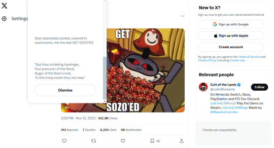
And wouldn't you know it, the "what should we do with Sozo in the next update" TikTok is gone now. And the top comment on that TikTok? "Revive him and make him an eldritch mushroom horror boss." So with this in mind, combined with the Haro speak that is clearly about Sozo hidden in the above tweet's alt text, along with what typically happens at the end of boss fights in this game...
Follower Sozo real?!?!
#cult of the lamb#cotl#cotl sozo#sozo#the fandom will implode on itself if that happens#in the best possible way#and I'm all here for it
794 notes
·
View notes
Text
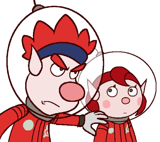
Dingo and the Baby
Pikmin 4 speedrunners intentionally losing at every Dandori and Night minigame just to let Dingo do it for them (He doesn't know)
#i hc them as best friends#fam guy reference in caption#pic itself is reffed from that one kh3 scene#this is still a doodle to me bc of messy lineart#but hey its colored#shitpost#doodle#pikmin#pikmin 4#dingo pikmin#pikmin 4 mc#pom pikmin#what the fandom calls them
885 notes
·
View notes
Text
Idk if anyone’s done this but it’s ALL I think about when I see these two shipped in anyway😭
History repeats itself guys
Editor note: I DONT ship this, I just find it funny sorry for the confusion???
#art#digital art#adventure time#fiona and cake spoilers#fionna and cake#adventure time fionna and cake#simon petrikov#winter king#onceler fandom#onceler#oncest#history repeats itself#adventure time fionna#adventure time simon#bad drawing#doodles#onceler fanart#adventure time ice king#ice king#simon x winter king
586 notes
·
View notes
Note
sebek is literally the PERFECT character for a slow burn, many misunderstanding, romance. Not in a "I can fix you" way but in a "there is so much more to you that you don't see and you will soon love to learn about yourself" way am I making sense? Idk if I'm wording that right
let the people who read this to understand it by their own term
#literally the whole diasomnia boys are slow burn to me because i really had the least interest in them#tho i guess it's bcs the japanese twitter fandom itself cannot fed me with too much art of them anyway bcs their story had not dropped yet#mod posting#i do want sebek to see more of himself than malleus for great seven sake#don't make malleus ur personality! i want to see YOUR personality!!
164 notes
·
View notes
Text
BIGASS IMAGE TO GRAB YOUR ATTENTION
ok hi
so you MIGHT know disney is currently a pressure target due to their monetary contributions to the ongoing conflict! (idk what will get this post censored sorry) it's ok if you didnt. now you know!
let me just say, if you're the kind of armchair activist that only just goes around harassing fans of things instead of actual activism. ngl you're a prick. this isn't gonna help ANYONE and will either make the person A, think "wow this person is a jerk, i'm not gonna listen to them", or B, feel forced to apologize for being excited for one of their favorite, neglected series getting a remake and feel miserable.
this isn't how we get things done. this isn't how we make positive change. misery HALTS the motivation needed to drive change.
what we NEED to do is organize something to pressure disney to withdraw their funding. to let them know, yes! we are interested in your product. HOWEVER, due to what you're doing we unfortunately can't support you.
if we're loud enough, it may create a snowball effect of more people contributing. if anyone has any ideas of how we (individually or as a group) can pressure disney by telling them we won't support their product, please let me know!!
and if we win?
well, we'll have a game to look forward to :]
#epic mickey#epic mickey rebrushed#disney#mickey mouse#oswald the lucky rabbit#the mouse and the rät 🐀#sorry this is so messy i dont know how to write these but!!!#seeing how many of yall love epic mickey but hate disney. we might have a sizable base to start the snowball effect. THE FANDOM ITSELF.#and yes this is opportunistic but hope for a better future is the first step okay. you have to believe its possible before you reach for it
226 notes
·
View notes
Last Seen Blogs