#and drawing for fun will not...do...anything useful lol
Text
My Favorite Cheap Art Trick: Gradient Maps and Blending Modes
i get questions on occasion regarding my coloring process, so i thought i would do a bit of a write up on my "secret technique." i don't think it really is that much of a secret, but i hope it can be helpful to someone. to that end:

this is one of my favorite tags ive ever gotten on my art. i think of it often. the pieces in question are all monochrome - sort of.

the left version is the final version, the right version is technically the original. in the final version, to me, the blues are pretty stark, while the greens and magentas are less so. there is some color theory thing going on here that i dont have a good cerebral understanding of and i wont pretend otherwise. i think i watched a youtube video on it once but it went in one ear and out the other. i just pick whatever colors look nicest based on whatever vibe im going for.

this one is more subtle, i think. can you tell the difference? there's nothing wrong with 100% greyscale art, but i like the depth that adding just a hint of color can bring.
i'll note that the examples i'll be using in this post all began as purely greyscale, but this is a process i use for just about every piece of art i make, including the full color ones. i'll use the recent mithrun art i made to demonstrate. additionally, i use clip studio paint, but the general concept should be transferable to other art programs.


for fun let's just start with Making The Picture. i've been thinking of making this writeup for a while and had it in mind while drawing this piece. beyond that, i didn't really have much of a plan for this outside of "mithrun looks down and hair goes woosh." i also really like all of the vertical lines in the canary uniform so i wanted to include those too but like. gone a little hog wild. that is the extent of my "concept." i do not remember why i had the thought of integrating a shattered mirror type of theme. i think i wanted to distract a bit from the awkward pose and cover it up some LOL but anyway. this lack of planning or thought will come into play later.
note 1: the textured marker brush i specifically use is the "bordered light marker" from daub. it is one of my favorite brushes in the history of forever and the daub mega brush pack is one of the best purchases ive ever made. highly recommend!!!
note 2: "what do you mean by exclusion and difference?" they are layer blending modes and not important to the overall lesson of this post but for transparency i wanted to say how i got these "effects." anyway!
with the background figured out, this is the point at which i generally merge all of my layers, duplicate said merged layer, and Then i begin experimenting with gradient maps. what are gradient maps?
the basic gist is that gradient maps replace the colors of an image based on their value.

so, with this particular gradient map, black will be replaced with that orangey red tone, white will be replaced with the seafoamy green tone, etc. this particular gradient map i'm using as an example is very bright and saturated, but the colors can be literally anything.

these two sets are the ones i use most. they can be downloaded for free here and here if you have csp. there are many gradient map sets out there. and you can make your own!
you can apply a gradient map directly onto a specific layer in csp by going to edit>tonal correction>gradient map. to apply one indirectly, you can use a correction layer through layer>new correction layer>gradient map. honestly, correction layers are probably the better way to go, because you can adjust your gradient map whenever you want after creating the layer, whereas if you directly apply a gradient map to a layer thats like. it. it's done. if you want to make changes to the applied gradient map, you have to undo it and then reapply it. i don't use correction layers because i am old and stuck in my ways, but it's good to know what your options are.

this is what a correction layer looks like. it sits on top and applies the gradient map to the layers underneath it, so you can also change the layers beneath however and whenever you want. you can adjust the gradient map by double clicking the layer. there are also correction layers for tone curves, brightness/contrast, etc. many such useful things in this program.
let's see how mithrun looks when we apply that first gradient map we looked at.

gadzooks. apologies for eyestrain. we have turned mithrun into a neon hellscape, which might work for some pieces, but not this one. we can fix that by changing the layer blending mode, aka this laundry list of words:

some of them are self explanatory, like darken and lighten, while some of them i genuinely don't understand how they are meant to work and couldn't explain them to you, even if i do use them. i'm sure someone out there has written out an explanation for each and every one of them, but i've learned primarily by clicking on them to see what they do.
for the topic of this post, the blending mode of interest is soft light. so let's take hotline miamithrun and change the layer blending mode to soft light.

here it is at 100% opacity. this is the point at which i'd like to explain why i like using textured brushes so much - it makes it very easy to get subtle color variation when i use this Secret Technique. look at the striation in the upper right background! so tasty. however, to me, these colors are still a bit "much." so let's lower the opacity.

i think thats a lot nicer to look at, personally, but i dont really like these colors together. how about we try some other ones?

i like both of these a lot more. the palettes give the piece different vibes, at which point i have to ask myself: What Are The Vibes, Actually? well, to be honest i didn't really have a great answer because again, i didn't plan this out very much at all. however. i knew in my heart that there was too much color contrast going on and it was detracting from the two other contrasts in here: the light and dark values and the sharp and soft shapes. i wanted mithrun's head to be the main focal point. for a different illustration, colors like this might work great, but this is not that hypothetical illustration, so let's bring the opacity down again.

yippee!! that's getting closer to what my heart wants. for fun, let's see what this looks like if we change the blending mode to color.

i do like how these look but in the end they do not align with my heart. oh well. fun to experiment with though! good to keep in mind for a different piece, maybe! i often change blending modes just to see what happens, and sometimes it works, sometimes it doesn't. i very much cannot stress enough that much of my artistic process is clicking buttons i only sort of understand. for fun.
i ended up choosing the gradient map on the right because i liked that it was close to the actual canary uniform colors (sorta). it's at an even lower opacity though because there was Still too much color for my dear heart.

the actual process for this looks like me setting my merged layer to soft light at around 20% opacity and then clicking every single gradient map in my collection and seeing which one Works. sometimes i will do this multiple times and have multiple soft light and/or color layers combined.
typically at this point i merge everything again and do minor contrast adjustments using tone curves, which is another tool i find very fun to play around with. then for this piece in particular i did some finishing touches and decided that the white border was distracting so i cropped it. and then it's done!!! yay!!!!!
this process is a very simple and "fast" way to add more depth and visual interest to a piece without being overbearing. well, it's fast if you aren't indecisive like me, or if you are better at planning.

let's do another comparison. personally i feel that the hint of color on the left version makes mithrun look just a bit more unwell (this is a positive thing) and it makes the contrast on his arm a lot more pleasing to look at. someone who understands color theory better than i do might have more to say on the specifics, but that's honestly all i got.

just dont look at my layers too hard. ok?
1K notes
·
View notes
Text
Vee's Studies!
(scroll to the end for timelapse :3)
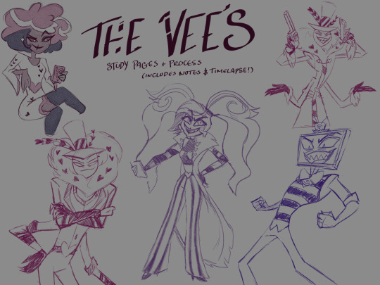
I'm like, kind of obsessed with them lmao. While I've drawn Vox quite a lot (I've been working on a Vox animation thing over the last month-ish) I hadn't done much of anything when it came to Val and Vel. I knew I'd want to do something with them all later on, but I wanted to get a good understanding of their designs, shape language, and the differences between the three of them so I can play a lot more when it comes to doing them (heh) in my own style.
So, since I was most familiar (and most obsessed with out of the three lol), I started with Vox :3

While I've been working on the animation project, it had kind of been an 'adjust-as-I-go'/'let's-bullshit-this' process, rather than doing the work of understanding why certain things looked more correct than others, so I still learned a LOT from this one study. (Plus the scene makes me wheeze and I happily took the excuse to use that moment as his study reference haha)

Obviously Val is... an asshole, to really undersell it. But this is hell, his character is interesting and his design is immaculate. I think I had the most fun with studying him tbh. Without his santa wings-coat he- *coughs* - yeah. Uh. Good design. I can actually believe that Angel fell for him at one point. Manipulative bastard - sorry tangents. ANYWAY! XD
VERY fun to draw, and a very good balance within these designs of showing off character attributes but also not taking themselves too seriously (The HATS these boys wear! *wheeze* did Velvette just give up fighting them on it? I've gotta know haha)

I missed color too much by this point to make them all match perfectly, and frankly - trying to draw canon Velvette without hue differentiation is AWFUL she has so many details and overlapping elements. If I ever have to draw Vel from 1x03 again I might cry.
Something about her 1x03 look actually makes me feel viseral irritation just by seeing it (like, even b4 I made myself draw it), but then I see her in 1x08 and I wanna draw her forever???? She's so fucking cool? So fucking cute????? The duality of man ig lmao
Anyway, the TLDR is that actually being conscious of how things are represented when drawing a character can lead to surprisingly immense insight... I feel like I not only understand so much more about how to represent their characters, but also a much firmer grasp about how the shape language in the show works.
These designs are immaculate and I had so much fun. I actually have a lot more I could say about this, but my period came today and I'm tired and this post is already massive so I'll leave things here for now! But yeah! Hopefully more Vee's in the future bc I love them!
Wishing you all well! <3
#my art#digital art#fanart#hazbin hotel#hazbin hotel fanart#hellaverse fanart#hazbin hotel vox#valentino hazbin hotel#velvette hazbin hotel#vox fanart#valentino fanart#val fanart#velvette fanart#character studies#vees fanart#the vees#the vees hazbin hotel
37 notes
·
View notes
Text
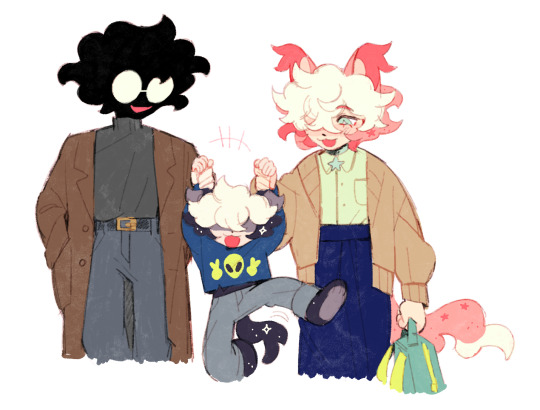

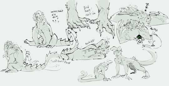
doodles of my fav sillies
anton belongs to @poicyss
#my brain is a barbie dreamhouse and theyre all just living in it#im especially fond of the second one because my mom used to hold me like that all the time <3#im drawing them a lot lately because im being crushed by the horrors and have to compensate for it somehow#homemade comfort blorbos......#watch me draw anton inconsistently bc i can never decide if i wanna draw him close to how he actually looks#or yassify him and give him soft fluffy hair and kind eyes and defined features. head in my hands#i dont really have a lot of drawing ideas for them bc they dont have like. a canon storyline or anything methinks#its just stuff me and bow toss around and giggle abt thru messages lol. maybe ill draw infant vincent one of these days#i just come up with stuff and draw them doing it. it makes me feel warm and fuzzy inside#cuz like anton works for lobocorp as an abnormality BUT hes super duper chill and cute and does his funny little tasks so its fine#AND hes unkillable. auggie is an oc ive had since like 6th grade and i smushed them together. and vincent was for fun but i got attached#i dont have much of a read on anton either bc i think hes meant to be more of an insert character??? if im using that right#on one hand i dont think too hard abt anything being ooc since im not taking it seriously. on the other hand i just hold them in my hands#and stare into space until i can come up with something to draw since i dont have much to go off of. but its fun to build on small tidbits!#i think bow called it an au so i guess??? its an au????? im not really sure. bow if youre reading this im just willy nilly#the only thing i know for sure is that they boink like rabbits. im talking gomez and morticia levels of boinking#maybe ill go back and look at my old doodles for them and redraw em lol#myart#my art#my oc#oc#friend oc#augusta#anton#vincent#sillies family#doodles
416 notes
·
View notes
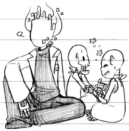
Photo
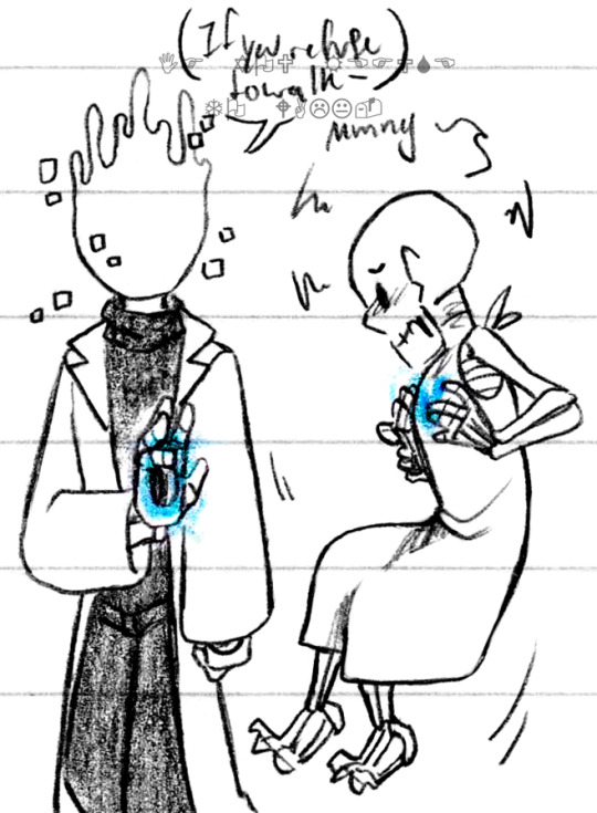
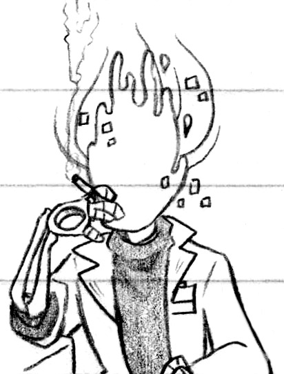


Off to make mischief and terrible decisions for everyone (Patreon)
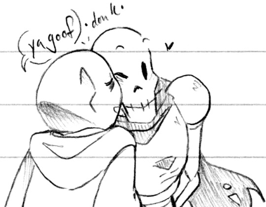
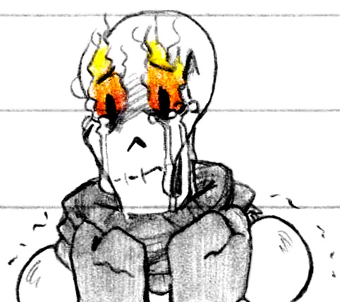
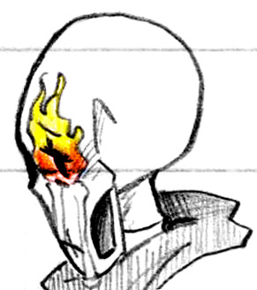
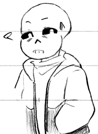
#Doodles#UT#Handplates#Gaster#Papyrus#Sans#Help they keep appearing#Where have I heard that one before lol#Genuinely! I wasn't expecting to keep drawing them but my pencil kept moving and they kept showing up on my paper!#Especially Gaster but the other two plenty as well#Got to employ a bit of my favourite coloured pencil ♪ I Will find a way to use my blue on nearly anything#Luckily for me they come prepackaged with blue magic so that was easy enough#Wiggly baby Papyrus does Not want to go >:( At least he's not being hurt :(#Some smoking Gaster ♪ I still quite enjoy drawing smoke honestly - fun to get to do so with a character who actually smokes haha#You can see I also added swoopy-swoops to his Lost Soul head - I like it much better for being such a small detail#I think it looks weird in black rather than white but against a white background-#Without them he feels....hmm something. Something old that I don't want#Not like the Classic Lost Soul head tho haha - similar but not quite the same!#I love his design ahh ♪ He's really so pretty but so much of that is in his details! Like the way he wears his clothes or holds his body#I'm always a sucker for that style of turtleneck as well haha ♫#Perhaps his turtleneck keeps the smoke in chest from escaping longer :0 Yet another reason to wear them!#Shot of the little family before things went Completely terrible - before the plates and all that#I'm rather pleased with his hand pose there actually :) Keep an eye on your kids Gaster you've only got the one eye to do so!#And then some silly ones lol - I am desperately curious if animated skeletons would have a hyoid bone#It's not as though hyoid bones are specific to humans! They're just A Type Of Bone! Surely skeletons would have All their bones right?#But in the human skeleton it's not resting against another bone it's just floating there tethered by muscle and sinew#Would it float? Would it rest inside the lower jaw? Would it attach to the neck vertebrae??#It'd probably get caught on his turtleneck a lot easier than like - getting it caught on his neck bones for example#They have a kind of fused canine-teeth-like structure as well they're like a weird set of tongue-teeth lol#It's just fun to imagine ♪ Similar to how the rest of the skeletal body like - magnetizes? to itself :)
328 notes
·
View notes
Photo
hey there.
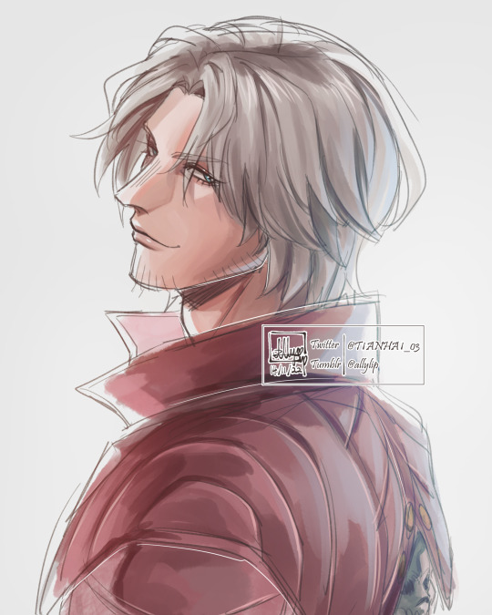
#took a short break from social media... and by that i mean twitter....#school work was piling up and it got overwhelming so i thought throwing twitter aside for a few days can help lol#i missed drawing him hes more fun and easier to draw than anything im doing for school.... screw studying i wanna look at him all day... uuu#devil may cry#dante(dmc)#allyart#i can feel my art style changing right before my eyes#this is what drawing things and not using your own style for it for 5 days does to an artist
919 notes
·
View notes
Text

poe thoughts and scribbles for my aching soul
#He’s a really old oc#based off my plush rabbit when I was 10 so my first oc ever next to Craig and hope who were made at the same time.#i used to draw him as any thing I was obsessed with as a kid like digimon or Pokémon and still call him poe#cause I was also obsessed with Calvin and Hobbes and I would imagine him like Hobbes for fun and bring him everywhere and make comics of#poe hanging out with me as a scary cool monster who secretly turned into a plush rabbit like Barney the dinosaur#and that’s like his origin story LMAo I didn’t do imaginary friends or anything like that#I’d just grab a plush toy or poe and pretend I was in an adventure with them. But poe was my personal comfort one causw my abuela got him#for me and he would be gripped allot when I was sad or upset so he was my coping toy#another would be a big red dragon I have since I was five too. And I would be silly and be like that’s poes girlfriend and she is PFGN#and now with my eclipse toy hehe :) but yeah poe origin lore from my backyardigan kid times#GOD THAT SHOW ALSO MADE ALLOT OF INFLUENCE TOO LOL DOKFJF I was a massive daydreamer lol#but now poe has his own insane story now it was silly when I was a kid but it’s cool now I swear I prommy im not cringe (disclaimer I am PF#anyway that’s crazy#art#my art#my ocs#poe#monster#monster oc#furry#kinda#creature#wife ocs#harbinger#hope#Craig#hes their dad dadadada#Tired dream guardian monster raising to literal eldritch entity children in a summary pretty much
56 notes
·
View notes
Text
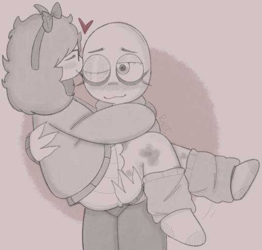
haven’t posted here in a while so here’s a quick doodle of me and my husband i made a couple days ago!! he’s all i’ve been able to think about lately <3
#the pose is a bit stiff- sorry. i haven’t had the energy to draw much of anything really blehh#just wanted to sketch smth out cause i love sal sm..#i wanna be more active in the selfship community + reblog other people’s stuff n all that. but i’m so tired 24/7#plus i keep forgetting i have this blog lol#╰┈➤ ❣️ // like real people do#╰┈➤ ✏️ // my art#f/o x s/i#f/o community#selfship#selfship art#selfshipping art#self insert#selfshipping#sal looks really off here for some reason ignore that#romantic f/o#i love being able to use like 500 tags it’s so fun#part of me wants to use the main salad fingers fandom tag but i’m not sure if people would like that very much 😭😭#i should've made his head a bit smaller but it's okay ig
15 notes
·
View notes
Text
with suits like those they may as well be hosting a TV game show
#failboat#jaymoji#first off: never ask me to draw anything sparkly ever again#second idk what kind of background to do so idk just look at the guys#i hope this is accurate i didnt use any references lol#also another thing i thought it'd be fun if i shaded them in the opposite colors#love love purple and yellow (totally jealous of jay why cant i have a sparkly purple suit :( )#actually i have like a black n gold suit that's sparkly but in a different way and it has small hints of blue n purple. it's so gender#it'd be even more gender paired with a t-shirt#so tempted to draw myself in it. might do that next
122 notes
·
View notes
Text
A project I did for drawing class :)
#furry#furry art#sfw furry#safe fur work#art#digital art#drawing#fox#dog#golden retriever#pretty much the only requirement for the assignment was that there had to be a window#no rules about what else is in the drawing or what medium to use or anything#so like why not draw furry art for school lol#i dont usually do like full scenes like this it was fun#might try doing backgrounds more often
49 notes
·
View notes
Text
yassifying official comics
#this was so fun#little rendering exercise#rose was so much work for real#couldnt do anything ab her weird long arms#and dont look too closely at her bod lol#chodo draws#doctor who#doctor who fanart#doctor who comics#dw#ninerose#ninth doctor#rose tyler#nine x rose#timepetals#god you KNOW i want ppl to see this if i use the timepetals tag
173 notes
·
View notes
Text
Besties besties guess who just got toonsquid
#keese draws#oc posting#oc art#oc#ocs#furry#furry art#toonsquid#this is just a test so a few bits are a lil choppy but it’s ok cause I had fun :3#I was going to watch a tutorial first but I didn’t and learned the hard way that I should have#not in a it’s too complicated way but in a I’m stupid way lol#it took me too long to notice that animation layers and drawing layers both exist at the same time wow imagine (<- procreate user)#gonna have to make more custom texture brushes for my sanity but we’ll get to that when we get to it#right of the bat tho toonsquid is already way way easier to use to me than anything else I’ve tried#I’m very excited to do more with it >:3
12 notes
·
View notes
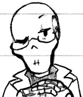
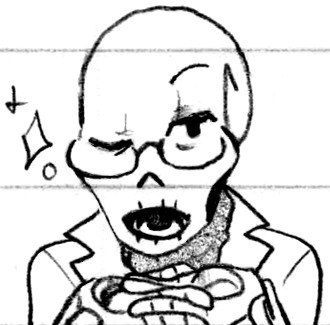
Photo


How is skeleton shaped (Patreon)
#Doodles#UT#Papyrus#Sans#Some redraws! I just don't feel like scanning the originals so they'll stay contextless for now lol#I apparently used to draw Papyrus' scarf/cape with a little squiggly bit down the middle of his chest as well :0 I think it looks silly now#The donk-pecks I was talking about! :D Give your sibling a family kiss ♪ As much as skeletons can anyhow lol#Papyrus was being silly and then leaned down fully expecting it lol - another thing smol and I do a lot haha#Sometimes doing the cat thing of headbutting for attention lol#Sad skele doodles! Oh no! D: Best boy is the saddest around </3#I used to draw Papyrus' mouth as having teeth behind his teeth so I gave it another go - I think I'm good on it now lol I like his weird jaw#I don't know if I based the original eye-glows off anything specific :0 I wasn't as particular about my notes back then haha#He is still very fun to draw crying tho poor lad :')#Originally the second one of Papyrus with his eyes glowing had Sans comforting him with a forehead donk - even in this redraw!#But I got the angle wrong so I removed him and then had brainworms about it lol#Something something the player (the artist) controlling the appearance/experience and moving the pieces (the characters) around as they like#I already know all that! I've been metaphorically playing with dolls for years years years! It just never stops being weird#It's like being aware of my own breathing and blinking - it's ''natural'' and normal and there's obviously nothing wrong with it lol#There's just a level of awkward....Feeling surrounding awareness lol - intentionality! It's not like I can stop just because I'm aware of it#It's just so whimsical /neutral - if Sans had turned out how I wanted him to he'd be there comforting his brother! But because I...#As stated I have brainworms please excuse me lol#The level of weird feels between the various mediums is really interesting to me tho :) Being a player or reader or watcher or artist!#They all feel different - more or less in control of what happens to them and yet never fully without culpability hehe#Obviously as an artist it feels the most in control - even to my own empathetic detriment! (It's not that serious lol)#The difference between being a player and a reader is a lot closer than being a watcher tho imo it's like a spectrum of responsibility#Though that's kinda also just how I feel about media consumption in general lol - I guess one of those is technically media production#Anyway! Lol#I don't know where I got the idea that his hoodie is two-tone other than the separation of his pockets?#It is a cute design! Dunno if I'll keep it going forward just for convenience but I'm not mad about it lol
23 notes
·
View notes
Text
You don't understand. My little guy. Constant. My little guy.
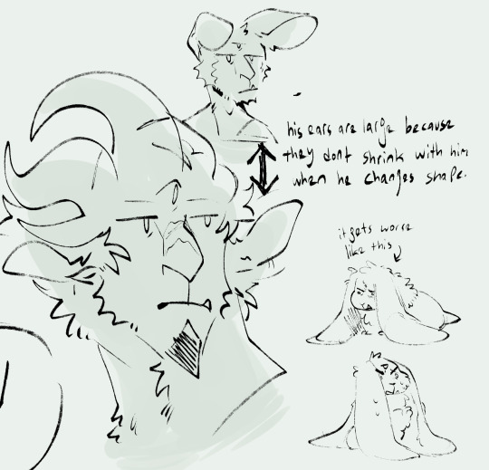
#my curious little guy#my guy who turns into an owlbear 80% of the time and into a spider or a deep rothé the rest of the time#the 'cursed to put my hands on everything' line is the root of a good half of their decisions#they always the annoying questions. they touch the cursed items. they eat the dubious food. they lick the spider.#always ask* i forgot a word lol#the rest of their personality is trying to be nice to people and Persuading#persuading people with money to part with it. persuading people to give them info. persuading shopkeepers to give you freebies#we gotta justify that persuasion proficiency!#they're not an intimidating guy! they don't lie... much. they just Look At You and then you're telling them about cheating on your wife#and they're nice to people of course. buuut if you're going to be an asshole first....#they made that goblin kiss their feet y'know#my constant who is probably chatty because i make them do the rounds at camp & talk to all the companions every evening#even when they don't have anything to say. just. go over. say hi.#'well met.' 'speak.' 'i did miss that face you know.' 'soldier?' 'lay of sorrows guide us. did you want something?'#and then we leave because i don't want them to stay at camp or join me on the road#BUT i talk to them! i say hi! i have to be nice to them!!#my constant who's been wearing armour that makes them look very broad shouldered and manly and menacing#but who really is Some Druid. Some Potter! as in they do pottery. it's their job.#who should be wearing fun little outfits where the armour class doesn't matter#i want to do something fun with their hair and their horns in my drawings#since the game doesn't give you As Many Options As The Sims 4 With 4.6gb Of CC#wow i have a ramble tag now#wow i have an ocs tag now
2 notes
·
View notes
Text
POV she parachuted down and landed on you and now you have a concussion
an adaptation of Mushroom Umbrella
once again much cheating and tracing but I got it done! that's what's important to me and I am happy. look at my wonky girl!!
#love nikki#love nikki dress up queen#my bad art phase#<- feel free to block this tag!#I left out so many of this outfit's pieces but I've convinced myself I like it better this way.#I'm certain now that I'm faceblind. spent so much time fussing with the eyes and they still look odd and I genuinely cannot comprehend#what to do with them#anyway I'm not going as fast but I'm still dedicated to my horrible little anime ladies#dedicated enough that I look a pic of myself in my underwear to get this pose right... insanity!#previously I'd been using a poseable figurine but her hips and shoulders can't be anything but square... didn't work for what I wanted#hey also FUCK drawing hair!!!! I hate it!!! I completely gave up and fully traced it lol#but I am doing these drawings for self entertainment and not for Serious Arts so I'm fine with being a dirty dirty tracer#I'm learning things and having fun :)
33 notes
·
View notes
Text
relevant twitter meme wins wahooo
#mostly relevant if you're doing visual art & then a handful of these are fairly digital specific. which is mostly what i do so here we are#giving it a Kinda / Sometimes / Sure; Enough with the slightly smaller stars here. aptly done w/a trackpad lol#''desk''#by now fortunately Usually remember to intermittently save. by ''remember'' it's more having adopted a half reflexive ctrl s during pauses#meanwhile i've found it convenient to the drawing process itself to flip the canvas horizontally plenty so i don't forget to do that#if anything sometimes i end up working on things Flipped for so long that i permanently flip the whole canvas lol got used to it like that#meanwhile not really hard on myself also fortunately but still Nonzero; aren't we all always; even if successfully swatting it aside so#honorarily....also thank fuck i don't [forgets own art style] As Much b/c lord that's annoying#definitely diminishes as you're honing / getting in experience anyways like ofc you become more familiar w/your own style & make it more#of what you like / want it to be anyways + familiarity with how you are actually executing that lol#little a friday night fun wahoo!! not drawing now but i was last night...will i lie to myself & try to do smthng ''quick'' later? perhaps#i ought to Actually be using references more but all the small individual processes of the process of obtaining them thwarts me#like creating a desktop shortcut for my writing [then] wip to cut down on the processes in like [file explorer; search; open]
6 notes
·
View notes
Note
I just came across your sburb land art, I'm absolutely stunned by it all, everything feels like it fits exactly with the rest of homestuck! would you have any advice/techniques to share for drawing in the style? stylistic details you feel are oft missed in fanart, etc?
Uh well I’m def not one to judge the way others draw world art lol that’s for sure, it can kinda be anything you want right? I don’t actually look at a lot of fanart tbh so I can’t say if anyone is missing anything at all or forgetting anything def not gonna go police how others should do art
I know there’s like major through line of that mspa kinda style is using a G-pen or something similar to get those clean crunchy pixels without any extra noise. Also panel sizes your usually going to work with around 650 pixels (length or width doesn’t matter that’s just generally what classic HS panel sizes are). If you have that you can pretty much do whatever you want. These are tools anyone can use though just if you want that kinda of style.
Other than that I guess just basic art tips people might not think about when drawing any environment
-implementing perspective
-setting up a focal point
-making colors fade closer to grey or blue the farther away they are from your vision (or whatever color the land’s sky is)
-using purples or blue for shadows on multiply layers and whatever colors your light sources are on overlay layers or glowdodge layers
Also to be fair I went to college for concept art in game design this is just stuff I picked up there- anyone can do it tho, there’s no like secret sauce
#when I don’t look at fanart so I don’t know what people are missing if anything hdjsjdjshdsj#my advice is less advice more just hey here some stuff I like doing/use#I’m just a nerd who draws fantrolls and has figured out my own comfort zone with the mspa kinda style#it just takes practice I guess#Iv just also had a lot of time to practice but anyone can do it tbh#most I can pass on is like tools and tips Iv learned#idk have fun Sburb worlds are trippy and weird do whatever you like with em#eyo? Bob Ross actually has some stuff people use use tbh lol whole things of how he does mountains….yeahhhh#clock rambles
6 notes
·
View notes
Last Seen Blogs

vscongnghiep
Vệ Sinh Công Nghiệp
clayniverse
My clay stuff
camaicheo
oarfish
camaicheo
oarfish

bluurrrr
Blurred_____