#and a monochromatic colour scheme
Text
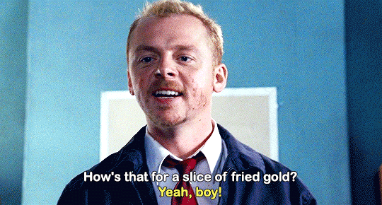
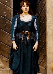
today's outfit was an "i put off laundry for an irresponsibly long amount of time and this is the last of my clean, weather-appropriate clothes" type of deal with a couple accessories slapped on top but. damn, i somehow look fine as hell

#this is not an outfit i'd've worn otherwise bc i tend to stray away from neutral monochromatic colour schemes#so this was a fun lil accident#this was my last pair of pants and i had just a couple shirts left#ignore how gross my mirror is. yes i know it needs cleaned.#eliot posts#also i keep forgetting to schedule a haircut and i don't wanna bother re bleaching my roots til after i cut it#and i don't wanna dye it again til i bleach my roots#so my hair is a. fun shade.
21 notes
·
View notes
Text
Hero’s journey - timelapse ✨
I flip my canvas a lot while I work so these timelapses are sometimes confusing :-D
#posting this even though nobody asked for it#i don’t usually work in greyscake but i wanted to try working with gradient maps#works well when you have a monochromatic colour scheme#but you learn a lot more when you don’t use quick cheats like me lmfaoooooo#art#timelapse#jitterbugbear art#vid#sorry about the flashing - i also turn layers on and off a lot so that looks awful in timelapses#tw flashing
8 notes
·
View notes
Text
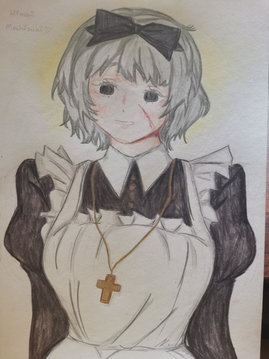
Another maid? I think the maid style is very pretty
#maid outfit#maid#Art#Hmm I wanted to add more colours but I also likes the monochromatic colour scheme ya know?#Anime
0 notes
Text
Fantasy Guide to Interiors

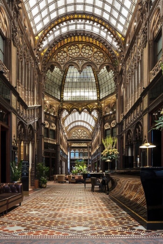
As a followup to the very popular post on architecture, I decided to add onto it by exploring the interior of each movement and the different design techniques and tastes of each era. This post at be helpful for historical fiction, fantasy or just a long read when you're bored.
Interior Design Terms
Reeding and fluting: Fluting is a technique that consists a continuous pattern of concave grooves in a flat surface across a surface. Reeding is it's opposite.
Embossing: stamping, carving or moulding a symbol to make it stand out on a surface.
Paneling: Panels of carved wood or fabric a fixed to a wall in a continuous pattern.
Gilding: the use of gold to highlight features.
Glazed Tile: Ceramic or porcelain tiles coated with liquid coloured glass or enamel.
Column: A column is a pillar of stone or wood built to support a ceiling. We will see more of columns later on.
Bay Window: The Bay Window is a window projecting outward from a building.
Frescos: A design element of painting images upon wet plaster.
Mosaic: Mosaics are a design element that involves using pieces of coloured glass and fitted them together upon the floor or wall to form images.
Mouldings: ornate strips of carved wood along the top of a wall.
Wainscoting: paneling along the lower portion of a wall.
Chinoiserie: A European take on East Asian art. Usually seen in wallpaper.
Clerestory: A series of eye-level windows.
Sconces: A light fixture supported on a wall.
Niche: A sunken area within a wall.
Monochromatic: Focusing on a single colour within a scheme.
Ceiling rose: A moulding fashioned on the ceiling in the shape of a rose usually supporting a light fixture.
Baluster: the vertical bars of a railing.
Façade: front portion of a building
Lintel: Top of a door or window.
Portico: a covered structure over a door supported by columns
Eaves: the part of the roof overhanging from the building
Skirting: border around lower length of a wall
Ancient Greece
Houses were made of either sun-dried clay bricks or stone which were painted when they dried. Ground floors were decorated with coloured stones and tiles called Mosaics. Upper level floors were made from wood. Homes were furnished with tapestries and furniture, and in grand homes statues and grand altars would be found. Furniture was very skillfully crafted in Ancient Greece, much attention was paid to the carving and decoration of such things. Of course, Ancient Greece is ancient so I won't be going through all the movements but I will talk a little about columns.
Doric: Doric is the oldest of the orders and some argue it is the simplest. The columns of this style are set close together, without bases and carved with concave curves called flutes. The capitals (the top of the column) are plain often built with a curve at the base called an echinus and are topped by a square at the apex called an abacus. The entablature is marked by frieze of vertical channels/triglyphs. In between the channels would be detail of carved marble. The Parthenon in Athens is your best example of Doric architecture.
Ionic: The Ionic style was used for smaller buildings and the interiors. The columns had twin volutes, scroll-like designs on its capital. Between these scrolls, there was a carved curve known as an egg and in this style the entablature is much narrower and the frieze is thick with carvings. The example of Ionic Architecture is the Temple to Athena Nike at the Athens Acropolis.
Corinthian: The Corinthian style has some similarities with the Ionic order, the bases, entablature and columns almost the same but the capital is more ornate its base, column, and entablature, but its capital is far more ornate, commonly carved with depictions of acanthus leaves. The style was more slender than the others on this list, used less for bearing weight but more for decoration. Corinthian style can be found along the top levels of the Colosseum in Rome.
Tuscan: The Tuscan order shares much with the Doric order, but the columns are un-fluted and smooth. The entablature is far simpler, formed without triglyphs or guttae. The columns are capped with round capitals.
Composite: This style is mixed. It features the volutes of the Ionic order and the capitals of the Corinthian order. The volutes are larger in these columns and often more ornate. The column's capital is rather plain. for the capital, with no consistent differences to that above or below the capital.
Ancient Rome
Rome is well known for its outward architectural styles. However the Romans did know how to add that rizz to the interior. Ceilings were either vaulted or made from exploded beams that could be painted. The Romans were big into design. Moasics were a common interior sight, the use of little pieces of coloured glass or stone to create a larger image. Frescoes were used to add colour to the home, depicting mythical figures and beasts and also different textures such as stonework or brick. The Romans loved their furniture. Dining tables were low and the Romans ate on couches. Weaving was a popular pastime so there would be tapestries and wall hangings in the house. Rich households could even afford to import fine rugs from across the Empire. Glass was also a feature in Roman interior but windows were usually not paned as large panes were hard to make. Doors were usually treated with panels that were carved or in lain with bronze.
Ancient Egypt
Egypt was one of the first great civilisations, known for its immense and grand structures. Wealthy Egyptians had grand homes. The walls were painted or plastered usually with bright colours and hues. The Egyptians are cool because they mapped out their buildings in such a way to adhere to astrological movements meaning on special days if the calendar the temple or monuments were in the right place always. The columns of Egyptian where thicker, more bulbous and often had capitals shaped like bundles of papyrus reeds. Woven mats and tapestries were popular decor. Motifs from the river such as palms, papyrus and reeds were popular symbols used.
Ancient Africa
African Architecture is a very mixed bag and more structurally different and impressive than Hollywood would have you believe. Far beyond the common depictions of primitive buildings, the African nations were among the giants of their time in architecture, no style quite the same as the last but just as breathtaking.
Rwandan Architecture: The Rwandans commonly built of hardened clay with thatched roofs of dried grass or reeds. Mats of woven reeds carpeted the floors of royal abodes. These residences folded about a large public area known as a karubanda and were often so large that they became almost like a maze, connecting different chambers/huts of all kinds of uses be they residential or for other purposes.
Ashanti Architecture: The Ashanti style can be found in present day Ghana. The style incorporates walls of plaster formed of mud and designed with bright paint and buildings with a courtyard at the heart, not unlike another examples on this post. The Ashanti also formed their buildings of the favourite method of wattle and daub.
Nubian Architecture: Nubia, in modern day Ethiopia, was home to the Nubians who were one of the world's most impressive architects at the beginning of the architecture world and probably would be more talked about if it weren't for the Egyptians building monuments only up the road. The Nubians were famous for building the speos, tall tower-like spires carved of stone. The Nubians used a variety of materials and skills to build, for example wattle and daub and mudbrick. The Kingdom of Kush, the people who took over the Nubian Empire was a fan of Egyptian works even if they didn't like them very much. The Kushites began building pyramid-like structures such at the sight of Gebel Barkal
Japanese Interiors
Japenese interior design rests upon 7 principles. Kanso (簡素)- Simplicity, Fukinsei (不均整)- Asymmetry, Shizen (自然)- Natural, Shibumi (渋味) – Simple beauty, Yugen (幽玄)- subtle grace, Datsuzoku (脱俗) – freedom from habitual behaviour, Seijaku (静寂)- tranquillity.
Common features of Japanese Interior Design:
Shoji walls: these are the screens you think of when you think of the traditional Japanese homes. They are made of wooden frames, rice paper and used to partition
Tatami: Tatami mats are used within Japanese households to blanket the floors. They were made of rice straw and rush straw, laid down to cushion the floor.
Genkan: The Genkan was a sunken space between the front door and the rest of the house. This area is meant to separate the home from the outside and is where shoes are discarded before entering.
Japanese furniture: often lowest, close to the ground. These include tables and chairs but often tanked are replaced by zabuton, large cushions. Furniture is usually carved of wood in a minimalist design.
Nature: As both the Shinto and Buddhist beliefs are great influences upon architecture, there is a strong presence of nature with the architecture. Wood is used for this reason and natural light is prevalent with in the home. The orientation is meant to reflect the best view of the world.
Islamic World Interior
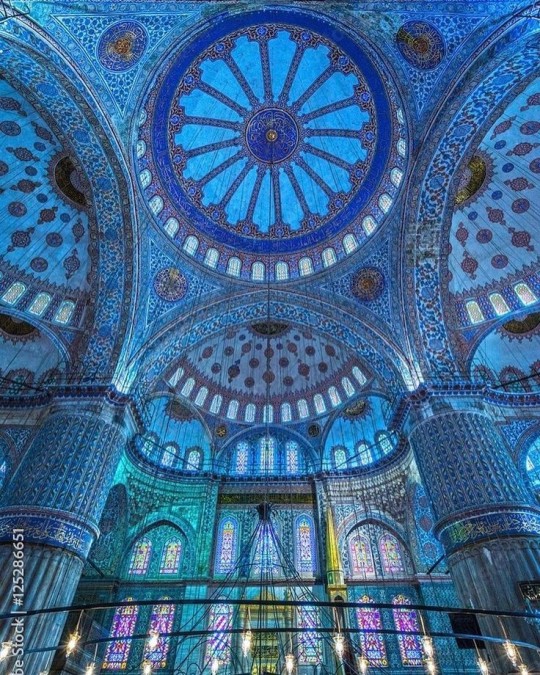
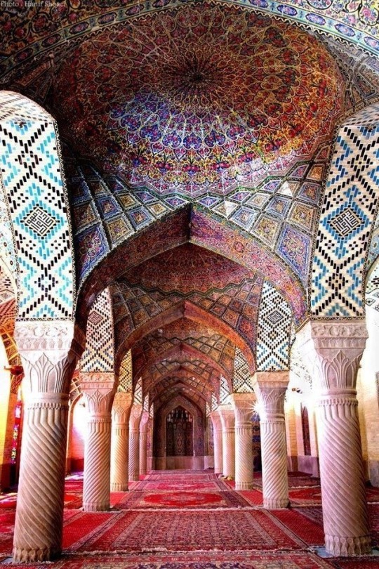
The Islamic world has one of the most beautiful and impressive interior design styles across the world. Colour and detail are absolute staples in the movement. Windows are usually not paned with glass but covered in ornate lattices known as jali. The jali give ventilation, light and privacy to the home. Islamic Interiors are ornate and colourful, using coloured ceramic tiles. The upper parts of walls and ceilings are usually flat decorated with arabesques (foliate ornamentation), while the lower wall areas were usually tiled. Features such as honeycombed ceilings, horseshoe arches, stalactite-fringed arches and stalactite vaults (Muqarnas) are prevalent among many famous Islamic buildings such as the Alhambra and the Blue Mosque.
Byzantine (330/395–1453 A. D)
The Byzantine Empire or Eastern Roman Empire was where eat met west, leading to a melting pot of different interior designs based on early Christian styles and Persian influences. Mosaics are probably what you think of when you think of the Byzantine Empire. Ivory was also a popular feature in the Interiors, with carved ivory or the use of it in inlay. The use of gold as a decorative feature usually by way of repoussé (decorating metals by hammering in the design from the backside of the metal). Fabrics from Persia, heavily embroidered and intricately woven along with silks from afar a field as China, would also be used to upholster furniture or be used as wall hangings. The Byzantines favoured natural light, usually from the use of copolas.
Indian Interiors
India is of course, the font of all intricate designs. India's history is sectioned into many eras but we will focus on a few to give you an idea of prevalent techniques and tastes.
The Gupta Empire (320 – 650 CE): The Gupta era was a time of stone carving. As impressive as the outside of these buildings are, the Interiors are just as amazing. Gupta era buildings featured many details such as ogee (circular or horseshoe arch), gavaksha/chandrashala (the motif centred these arches), ashlar masonry (built of squared stone blocks) with ceilings of plain, flat slabs of stone.
Delhi Sultanate (1206–1526): Another period of beautifully carved stone. The Delhi sultanate had influence from the Islamic world, with heavy uses of mosaics, brackets, intricate mouldings, columns and and hypostyle halls.
Mughal Empire (1526–1857): Stonework was also important on the Mughal Empire. Intricately carved stonework was seen in the pillars, low relief panels depicting nature images and jalis (marble screens). Stonework was also decorated in a stye known as pietra dura/parchin kari with inscriptions and geometric designs using colored stones to create images. Tilework was also popular during this period. Moasic tiles were cut and fitted together to create larger patters while cuerda seca tiles were coloured tiles outlined with black.
Chinese Interiors
Common features of Chinese Interiors
Use of Colours: Colour in Chinese Interior is usually vibrant and bold. Red and Black are are traditional colours, meant to bring luck, happiness, power, knowledge and stability to the household.
Latticework: Lattices are a staple in Chinese interiors most often seen on shutters, screens, doors of cabinets snf even traditional beds.
Lacquer: Multiple coats of lacquer are applied to furniture or cabinets (now walls) and then carved. The skill is called Diaoqi (雕漆).
Decorative Screens: Screens are used to partition off part of a room. They are usually of carved wood, pained with very intricate murals.
Shrines: Spaces were reserved on the home to honour ancestors, usually consisting of an altar where offerings could be made.
Of course, Chinese Interiors are not all the same through the different eras. While some details and techniques were interchangeable through different dynasties, usually a dynasty had a notable style or deviation. These aren't all the dynasties of course but a few interesting examples.
Song Dynasty (960–1279): The Song Dynasty is known for its stonework. Sculpture was an important part of Song Dynasty interior. It was in this period than brick and stone work became the most used material. The Song Dynasty was also known for its very intricate attention to detail, paintings, and used tiles.
Ming Dynasty(1368–1644): Ceilings were adorned with cloisons usually featuring yellow reed work. The floors would be of flagstones usually of deep tones, mostly black. The Ming Dynasty favoured richly coloured silk hangings, tapestries and furnishings. Furniture was usually carved of darker woods, arrayed in a certain way to bring peace to the dwelling.
Han Dynasty (206 BC-220 AD): Interior walls were plastered and painted to show important figures and scenes. Lacquer, though it was discovered earlier, came into greater prominence with better skill in this era.
Tang Dynasty (618–907) : The colour palette is restrained, reserved. But the Tang dynasty is not without it's beauty. Earthenware reached it's peak in this era, many homes would display fine examples as well. The Tang dynasty is famous for its upturned eaves, the ceilings supported by timber columns mounted with metal or stone bases. Glazed tiles were popular in this era, either a fixed to the roof or decorating a screen wall.
Romanesque (6th -11th century/12th)
Romanesque Architecture is a span between the end of Roman Empire to the Gothic style. Taking inspiration from the Roman and Byzantine Empires, the Romanesque period incorporates many of the styles. The most common details are carved floral and foliage symbols with the stonework of the Romanesque buildings. Cable mouldings or twisted rope-like carvings would have framed doorways. As per the name, Romansque Interiors relied heavily on its love and admiration for Rome. The Romanesque style uses geometric shapes as statements using curves, circles snf arches. The colours would be clean and warm, focusing on minimal ornamentation.
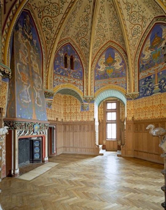
Gothic Architecture (12th Century - 16th Century)
The Gothic style is what you think of when you think of old European cathedrals and probably one of the beautiful of the styles on this list and one of most recognisable. The Gothic style is a dramatic, opposing sight and one of the easiest to describe. Decoration in this era became more ornate, stonework began to sport carving and modelling in a way it did not before. The ceilings moved away from barreled vaults to quadripartite and sexpartite vaulting. Columns slimmed as other supportive structures were invented. Intricate stained glass windows began their popularity here. In Gothic structures, everything is very symmetrical and even.
Mediaeval (500 AD to 1500)
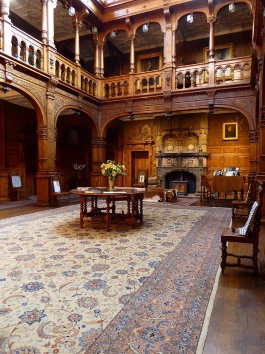
Interiors of mediaeval homes are not quite as drab as Hollywood likes to make out. Building materials may be hidden by plaster in rich homes, sometimes even painted. Floors were either dirt strewn with rushes or flagstones in larger homes. Stonework was popular, especially around fireplaces. Grand homes would be decorated with intricate woodwork, carved heraldic beasts and wall hangings of fine fabrics.
Renaissance (late 1300s-1600s)
The Renaissance was a period of great artistry and splendor. The revival of old styles injected symmetry and colour into the homes. Frescoes were back. Painted mouldings adorned the ceilings and walls. Furniture became more ornate, fixed with luxurious upholstery and fine carvings. Caryatids (pillars in the shape of women), grotesques, Roman and Greek images were used to spruce up the place. Floors began to become more intricate, with coloured stone and marble. Modelled stucco, sgraffiti arabesques (made by cutting lines through a layer of plaster or stucco to reveal an underlayer), and fine wall painting were used in brilliant combinations in the early part of the 16th century.
Tudor Interior (1485-1603)
The Tudor period is a starkly unique style within England and very recognisable. Windows were fixed with lattice work, usually casement. Stained glass was also in in this period, usually depicting figures and heraldic beasts. Rooms would be panelled with wood or plastered. Walls would be adorned with tapestries or embroidered hangings. Windows and furniture would be furnished with fine fabrics such as brocade. Floors would typically be of wood, sometimes strewn with rush matting mixed with fresh herbs and flowers to freshen the room.
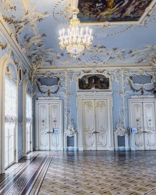
Baroque (1600 to 1750)
The Baroque period was a time for splendor and for splashing the cash. The interior of a baroque room was usually intricate, usually of a light palette, featuring a very high ceiling heavy with detail. Furniture would choke the room, ornately carved and stitched with very high quality fabrics. The rooms would be full of art not limited to just paintings but also sculptures of marble or bronze, large intricate mirrors, moldings along the walls which may be heavily gilded, chandeliers and detailed paneling.
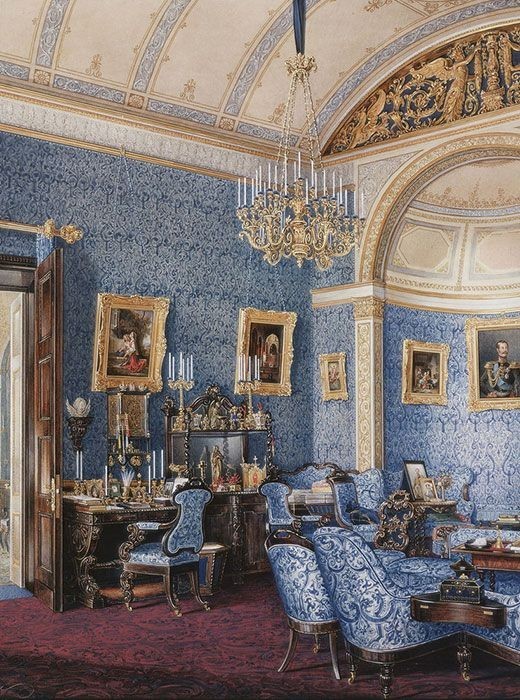
Victorian (1837-1901)
We think of the interiors of Victorian homes as dowdy and dark but that isn't true. The Victorians favoured tapestries, intricate rugs, decorated wallpaper, exquisitely furniture, and surprisingly, bright colour. Dyes were more widely available to people of all stations and the Victorians did not want for colour. Patterns and details were usually nature inspired, usually floral or vines. Walls could also be painted to mimic a building material such as wood or marble and most likely painted in rich tones. The Victorians were suckers for furniture, preferring them grandly carved with fine fabric usually embroidered or buttoned. And they did not believe in minimalism. If you could fit another piece of furniture in a room, it was going in there. Floors were almost eclusively wood laid with the previously mentioned rugs. But the Victorians did enjoy tiled floors but restricted them to entrances. The Victorians were quite in touch with their green thumbs so expect a lot of flowers and greenery inside. with various elaborately decorated patterned rugs. And remember, the Victorians loved to display as much wealth as they could. Every shelf, cabinet, case and ledge would be chocked full of ornaments and antiques.
Edwardian/The Gilded Age/Belle Epoque (1880s-1914)
This period (I've lumped them together for simplicity) began to move away from the deep tones and ornate patterns of the Victorian period. Colour became more neutral. Nature still had a place in design. Stained glass began to become popular, especially on lampshades and light fixtures. Embossing started to gain popularity and tile work began to expand from the entrance halls to other parts of the house. Furniture began to move away from dark wood, some families favouring breathable woods like wicker. The rooms would be less cluttered.
Art Deco (1920s-1930s)
The 1920s was a time of buzz and change. Gone were the refined tastes of the pre-war era and now the wow factor was in. Walls were smoother, buildings were sharper and more jagged, doorways and windows were decorated with reeding and fluting. Pastels were in, as was the heavy use of black and white, along with gold. Mirrors and glass were in, injecting light into rooms. Gold, silver, steel and chrome were used in furnishings and decor. Geometric shapes were a favourite design choice. Again, high quality and bold fabrics were used such as animal skins or colourful velvet. It was all a rejection of the Art Noveau movement, away from nature focusing on the man made.
Modernism (1930 - 1965)
Modernism came after the Art Deco movement. Fuss and feathers were out the door and now, practicality was in. Materials used are shown as they are, wood is not painted, metal is not coated. Bright colours were acceptable but neutral palettes were favoured. Interiors were open and favoured large windows. Furniture was practical, for use rather than the ornamentation, featuring plain details of any and geometric shapes. Away from Art Deco, everything is straight, linear and streamlined.
#This took forever#I'm very tired#But enjoy#I covered as much as I could find#Fantasy Guide to interiors#interior design#Architecture#writings#writing resources#Writing reference#Writing advice#Writer's research#writing research#Writer's rescources#Writing help#Mediaeval#Renaissance#Chinese Interiors#Japanese Interiors#Indian interiors#writing#writeblr#writing reference#writing advice#writer#spilled words#writers
3K notes
·
View notes
Text
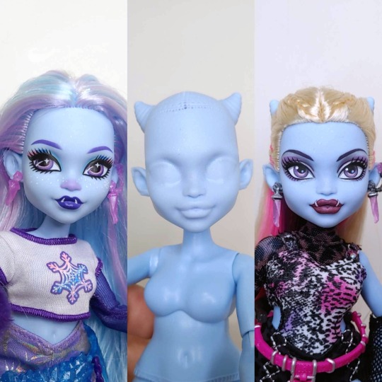
Abbey Bominabvle is one of my favourite characters because of her no-nonsense personality but caring nature. Her ability to balance being kind but maintaining her strength makes her interesting for a doll character.
I was excited for her G3 doll because she's now taller and has horns, but I was honestly disappointed in my one having a wonky eye and polypropylene hair. Plus, I did wish her arms were more muscular, in the same vein as the She Ra doll, but that's my opinion.
While I have issues with how pink is used in G3, I think Abbey's G1 benefitted heavily from it, as it was a good way of breaking up her monochromatic look. With her G3 design not having as much pink to break things up and a much heavier focus on purple, I think it muddied up her design a bit.
I wanted to just add to my collection as is, but the wonky eye and really low-quality hair fibre disappointed me, so she just sat in a box until I wiped and detailed her.
I decided to give her platinum blonde hair because I feel like the blonde breaks up the colour scheme, and I gave her hair streaks in hot pink, lilac and aubergine saran from @customndollhairAU.
I didn't want to recreate the G1 style for her face, so I went off in my direction, and I'm pretty happy with her face now.
83 notes
·
View notes
Text

Babygirl you are so strange and offputting
(ID under the cut)
[Image Description:
A digital drawing of michael distortion from the magnus archives. It is a simple sketch, and uses a monochromatic red colour scheme. He has long spindly hands and fingers, and long overgrown fingernails that end in spirals. He is resting his chin on his left hand, and his right hand is crossing over the top of his left forearm, fingers and nails dangling downwards. He is wearing a pinstripe suit with large cuffs and cufflinks. His eyes are wide and he has a sinister toothy grin. His teeth are pointed. The style used is exaggerated, but still semi-realistic.
End ID]
#a bonus michael for you all#themostat’s art#the magnus archives#magnuspod#tma#body horror#michael shelley#michael distortion#the distortion
259 notes
·
View notes
Text
i know wholes colour scheme is typically monochromatic gray but can we consider watercolour blue-purple-red whole.
15 notes
·
View notes
Text
…𝚂𝚞𝚖𝚖𝚊𝚛𝚢: In which you discover that, as Heizou puts it, ‘Our destiny is something we choose’.
…𝙶𝚎𝚗𝚛𝚎: Fluff.
…𝚆𝚊𝚛𝚗𝚒𝚗𝚐𝚜: None.
…𝙻𝚎𝚗𝚐𝚝𝚑: 1,995 words.
…𝙰𝚍𝚍𝚒𝚝𝚒𝚘𝚗𝚊𝚕 𝚒𝚗𝚏𝚘𝚛𝚖𝚊𝚝𝚒𝚘𝚗: Gender-neutral reader, soulmate AU.
… … … … … … … … … … … … … … … … … … … … …
…𝙲𝚊𝚜𝚎: ‘𝙲𝚑𝚊𝚛𝚌𝚘𝚊𝚕.’
Red strings and timers. Birthmarks and tattoos and first touches when colour springs into the world. Fate.
Wine-red hair and eyes the colour of olives; or so that’s what people said, who had found the colour in their world. Winks and teases and smiles which make grey roses unfurl on your cheeks.
(Not fated.)
The red string was someone else’s, and led to somewhere you didn’t know. The birthmark remained a mystery, even after your first meeting so many years ago. The world stayed monochromatic as ever when you brushed fingers, shaded grey like a charcoal sketch, disturbed only by the fine crimson thread. No colour, no markings, no connected string.
No star-crossed lovers, because fate had decreed it so.
And yet… you found yourself imagining, sometimes, that if fate didn’t exist, and that if the fine thread twining around your finger led to nobody, what could be. If those teases and smiles were meant for you.
You’d known each other since childhood; when you were that young, it hadn’t mattered much who your fated one was. Children were hardly seeking that sort of love, after all. And for a while, the direction of the red string and the perpetual charcoal vision didn’t bother you.
As you grew older, you began to despise them. Not because they existed, necessarily, but because they led elsewhere. You started wishing that your birthmark matched his—those sweet little moles beneath each eye—and that when you’d first met, colour had bled into your world like it did when you find them.
But you didn’t want to find them; you were happy with him, with his mischievous smiles and quick wit and effortless ways of making you fluster.
He’d declared once, when you were young, that he’d like to marry you when he grows up. The adults had smiled pitifully, because they knew it couldn’t be. And somewhere, though you despised to admit it, you knew it too.
It was odd, loving somebody you weren’t meant to. Like there was a fishhook embedded somewhere deep in your stomach, gently tugging you in a different direction, goading you to seek out the one. A constant notion of not being quite complete, as though you’d lost part of yourself long ago and wouldn’t be whole again until you found it. And yet, you couldn’t bring yourself to follow it, because over it you felt the very real thundering of your heart each time he threw you a playful wink.
It wasn’t pleasant. Archons, it wasn’t pleasant. In comparison to the hook’s ethereal, otherworldly tug, these feelings were grounded. You could feel the nervous sweat heading on your palms and uncomfortable heat burning across your cheeks, and the unsteady lurch of your heartbeat which made your whole ribcage seem to jitter. Some people said they felt butterflies around the one they loved; you felt snakes, twining in your stomach, coiling and uneasy, and a furious buck in your chest, pounding its hooves incessantly against its bone cage. It hurt, loving one who wasn’t destined for you, and you loathed destiny for it.
You wondered, on occasion, whether he felt the same.
Because what did it mean to be a star-crossed lover if the constellations didn’t align?
… … … … … …
“What do you think of destiny?” you finally asked Heizou one day when you were staying over at his place. It was getting dark outside, and your curiosity always seemed to grow stronger at night. Maybe his did, too: most of your most insightful conversations happened once the sun had gone down. As childish as it sounded, it felt like fate couldn’t find you in the darkness, and you could spill your thoughts to each other without worrying about its schemes. But even in the past, this was the one question you had avoided, always skirting away whenever the urge arose to ask it.
Heizou tilted his head, lips pursed in thought. “I know that it exists, to some extent,” he said eventually, “because there’s not exactly a lack of evidence for it.” He lifted up his little finger to demonstrate. The fine crimson thread tied around its base was the only colour you could distinguish from the constant grey. “But… I don’t think it matters all that much.”
You raised an eyebrow. A spark of hope ignited and was harboured fiercely in your chest. “Why not?”
“Well…” he blew out through his cheeks and leant back in his chair, “Call me crazy, but I think everyone should be responsible for who they decide to love.” He paused for a moment, eyes flicking almost imperceptibly to you, then back to the ceiling. “Even if a person’s destined for something else, that doesn’t mean they just have to accept it.”
“You’re not tempted to find out who your soulmate is?” As much as you dreaded to ask the question and risk inciting an answer which stung, your curiosity passed the words off your tongue before you could stop them.
Heizou shrugged, nonchalant. “To find out who they are? Sure, I don’t see why not. Get into a relationship with them based purely on the fact that we share some red string? Nah, not really.”
Underneath your happiness, you felt a stab of guilt upon feeling so relieved, but didn’t dwell on it.
“And how about you?” he queried, sitting back up in his chair. “What does my partner in crime have to say on the matter?” He surveyed you with a playful gaze from behind a pair of eyes like bright silver.
“I agree with you,” you said. “Even if it’s fated, it seems a bit careless to throw yourself into a relationship with someone you just met purely based on that fact.”
Those bright eyes creased with a smile. “I knew I could count on you to be reasonable.”
“And I expected no less of you,” you replied in jest.
“I have always had a knack for wisdom,” he agreed with a grave nod of his head.
“Oh, how difficult it must be for you, being so clever.”
“And how difficult it must be for you to be always so dreamy,” he remarked under his breath.
“What?”
“What?”
“You said something.”
To this, Heizou did not reply, but winked at you instead. Your cheeks warmed uncomfortably.
“So, um…” you began after a moment, suddenly hesitant, “do you have any intentions of ever getting into a relationship— with your soulmate or anyone else?”
Heizou quirked a brow at you, the corner of his lip tilting upwards with a smirk. Placing his chin on his hand, he said, “My, you seem very interested in my love life recently, y’know. Care to tell me why?”
There went that furious blaze again across your face, and the buck kicking against your poor ribcage. You coughed and suddenly became very interested by your shoes. Come to think of it, there were some darker grey scuff marks on the sides which you hadn’t noticed before; oh, and and the fronts were slightly frayed—
“In case you’ve been wondering, I don’t care that my string doesn’t join up with yours.”
This made your head snap up. Heizou had leaned forwards in his seat, an unfamiliar lining of tenderness to his voice—and was that a darker shade of grey faintly dusting his cheeks?
“I think destiny is worth defying for some people. Or maybe… maybe it doesn’t really exist at all, and we just think these stupid strings have meaning, and it’s ultimately up to us who we spend our lives with.”
Your throat bobbed with the effort of making a grating swallow. A fast pulsing began to drum in the back of your head. The fishhook in your stomach tugged harder at you, trying to pull you away, but you steadied yourself. “What… what’re you saying?”
He reached out a hand, twining your little fingers together. The red threads led in different directions, scarlet against the ever-present grey. It’s not meant to be, they seemed to say. The look in Heizou’s irises was almost doleful as you both traced their individual lengths with your eyes, bound never to meet of their own accord.
Then he smiled, like it didn’t bother him.
“I’m saying…” he tilted your chin upwards so that your eyes tore from the string and met his instead, “our destiny is something we choose.” He leaned closer as he spoke until he was practically mumbling against your lips. “And I choose you.” He glanced up at you through hesitant eyes. “Is that… okay?”
It took all you had to stop a grin splitting your face in two. “It’s okay,” you whispered into the space between you. Heizou made no attempt to hold back his own grin, and you could feel the smile on his lips as he pressed them to yours.
It wasn’t bliss, but it was all you could have asked for.
When you pulled away, the world was still monochrome, but it didn’t irk you the way it once had.
“If destiny does exist, it might not be so happy with us defying it like this, you know,” you said with a breathless chuckle.
“Yeah, well,” Heizou landed a playful tap on your nose, “with as cute a couple as we’d make, I doubt it could stay mad at us for long.”
“Still want to marry me, then?” you teased. He flushed and a nervous chuckle slipped from his lips.
“You… still remember that?”
“How could I forget? As your partner in crime, I ought to remember every word the detective says.”
He shook his head and breathed out a laugh. “There’s no getting past you, is there?”
“Nope,” you agreed. His lips spread into a shy grin and he sighed, shoulders falling, before raising his eyes to you once more.
“You know I’ve had a crush on you for the longest time, right? Ever since we were kids.” He cleared his throat. “And, I mean… I wouldn’t be opposed to marrying you someday.”
“We’ll see about that,” you replied with a chuckle, returning the tap on his nose. “Don’t get ahead of yourself, now.”
“I’m afraid it’s too late for that, because I’m already ahead-over-heels for you.”
Your smile fell into a frown, and you squinted warily at him. He winked again, sending a jolt of electricity through your chest.
Archons, you adored him.
“Never do that again.”
Heizou shrugged, declared “worth a shot”, and kissed you again. You almost had a heart attack. “Forgive me?” he asked after pulling away.
“…I forgive you,” was your begrudging reply.
“Heh. I knew you couldn’t resist my charms.”
“Bastard.”
He laughed, then caught himself and said, “Hang on a minute.” To your confusion, he’d begun rummaging around in his coat pockets. Moments later, he pulled out a small bundle of colourless thread. “The shop assistant told me this one was red,” he explained, and began unwinding it. Once finished, he offered one end to you and tied the other around his pinkie. “I know it doesn’t exactly replace the real thing, but… I thought it might be nice. Just to pretend that we’re, y’know, fated and all that.”
“Fated by our own doing,” you smiled, inspecting the thread around your smallest finger. It pinched a little, unlike the ‘true’ one fixed around your other, which felt like nothing at all. “I like that. Thank you, Heizou.”
“No need,” he smiled. “I’ve been carrying it around for long enough.”
“…And how long might that be?”
“A couple of years, give or take,” he admitted guiltily and raised a hand to rub his flushed neck. “Probably give,” he added, flashing you a boyish grin.
At that moment, with this bashful admittance of dedication, you realised that you may never find the end of that string, or the birthmark which matched your own. You may live your whole life in a pencil sketch of greys and blacks and whites, never once knowing a colour beyond red. The fishhook in your stomach would always be there, and you would never feel complete.
But if that meant a life lived beside Heizou, spending it in a charcoal world with a hole in your heart meant nothing at all.
87 notes
·
View notes
Text
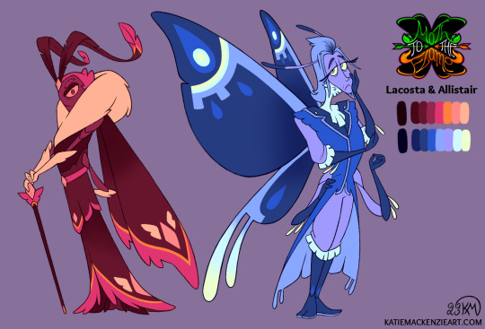
Outside of my ongoing commission work it has been a slow art month, but I still wanted to post something in December for my art summary so I picked one of my WIPs to finish up today :) I’ve been chipping away at the redesigns for Kiida's parents for a while but was close enough to done already so here you go!
Since I have a better grasp of what I want their characters to be, I debated on whether I should give them slightly less monochromatic colour schemes compared to the first iteration, but considering what they represent in the story I think they still work to both match and contrast Kiida. I’ll be posting my art summary soon but for now, Happy New Year everybody!
#art#artists on tumblr#Akysi#Art by Akysi#Katie MacKenzie#Katie MacKenzie Art#oc#original character#character#design#character design#moth#butterfly#insect#bug#Lacosta#Allistair#Moth to the Flame#MttF
20 notes
·
View notes
Text

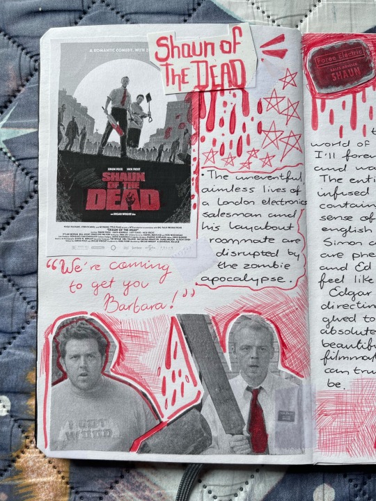
Shaun of the Dead (2004), Dir. Edgar Wright, Starring Simon Pegg, and Nick Frost.
A romantic comedy, with zombies.

For a while now, I have kept movie entries in my personal journal, it feels like a tangible way to commemorate and preserve a movie I feel deserves such attention, and even before I started that habit, I was intimidated by the entries for The Cornetto Trilogy.
All three movies were just so special and influential to me, and physical writing has a tendency to, y’know, get fucked up, so it was a struggle figuring out a way to both preserve my love for these films on my journal, and make it look mildly cute. Safe to say, I think I’ve achieved said balance.
This is the entry for Shaun! I tried to feature a lot of blood splatter/bloodstain motifs, in accordance to the movie obviously, and you might think the b&w colour scheme of the printed images was intentional, but the sad and almost hilarious truth is that it was a limitation! My printer is a laser printer, and those can’t do colours. So I tried to reach a monochromatic style with these entries, where I highlight one single colour that I think is reminiscent of the movie. For Shaun, it was obviously red.
I am not a movie critic (even if I like to think I am), so the personal thoughts section of the entry may come off as shallow or void of detail, I’m sorry about that! But if we’re honest, at this point in time, my love for these films should not be a point of doubt, even if my written thoughts are lax at best.
I remember the first time I actually *heard* of Shaun of the Dead, it was via a kill count video on youtube, and even then I was intrigued by it, all the love and praise I had heard directed towards it was something that drew me in, I didn’t actively search out the movie just yet, I just kept it as a mental memo that I’d get to later.
Then, on one magical night, and by pure fate, I stumbled upon the film on cable TV, I was channel hopping and seeing the title on the screen made my eyes light up, this was my chance to see what all the *fuzz* was about. So I didn’t hesitate and I changed the channel from VH1, to experience the Shauning. My life changed at that instant.
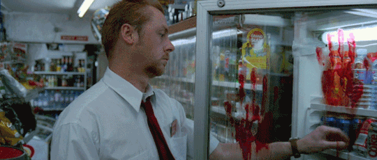
Shaun of the Dead was the most charming and charismatic film I had seen up until that point, I had heard about how flawlessly it was edited and how well every single joke landed, but experiencing said praises in the flesh was phenomenal, and Simon’s role as Shaun was instantly memorable and you could say he was the thing that hooked me in. He was so cynical and snarky, yet caring and loving of the band of misfits he was surrounded by. Though Nick as Ed was also an incredibly charming experience.

I remember just being completely entranced by everything surrounding the film, the movie kept going on and on and I kept finding stuff to love about it. The fact that it was clearly a movie that didn’t take itself too seriously as to be a de facto horror movie, yet it still conveyed emotions in a serious and profound way just really stuck a chord with me, and I’m sure everyone already praises this particular quality, but the quick, snappy and dynamic directing and editing choices characteristic of Edgar Wright are just lovely.
They manage to make the movie feel novel and it hooks you in, without risking making it feel overwhelming and too distracting. And I haven’t even mentioned the score and songs featured in the movie! While the film is perfect on a purely visual standpoint, the accompanying music on every scene elevates the overall feel of the scene you happen to be watching. Whether it be the mundane feeling of Shaun’s daily life, or the dread of the slow realisation that something ain’t quite right in London, or the inspiration and undying will to keep surviving and overcoming.
Frankly, I could go on and on and on about how much I adore this film, about how much it helped me deepen the love I have for filmmaking, and how much it even inspired to purchase filmmaking. But let’s be blunt, you guys probably don’t want to read my ramblings any longer, (but if you do for any reason, do let me know! I love feeling like my opinion matters in any way).
So, Shaun of the Dead! If I could, I’d screen you to any person who even breathes in my direction, I love you so much and I’m sure I’ll rewatch you as soon as I get the TV to myself.
10/10.
#the cornetto trilogy#simon pegg#nick frost#edgar wright#shaun of the dead#journal#movie journal#movie#writing#this is a soliloquy at this point#incoherent ramblings#ramblings#screaming at the void#talking to myself
45 notes
·
View notes
Text
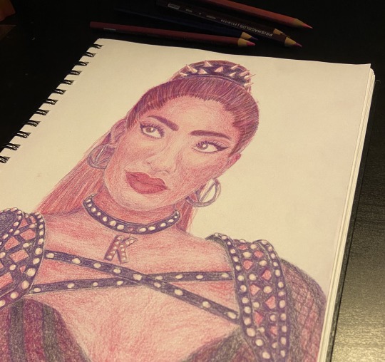
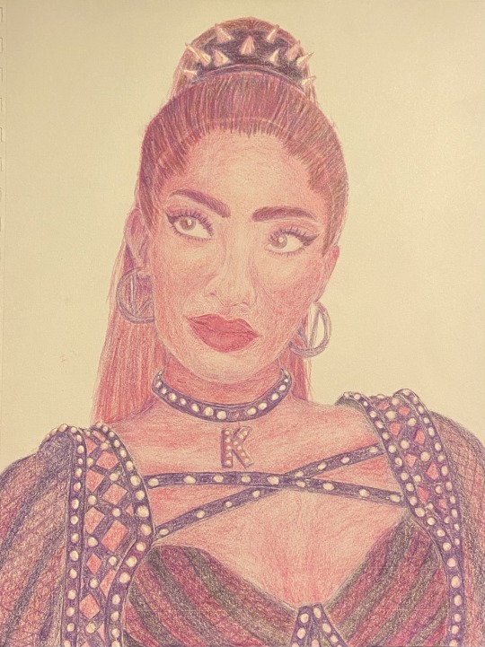
This was my first portrait I did with pencil crayons and I think it came out pretty good. Tried using somewhat of a monochromatic colour scheme.
Also do you guys call them coloured pencils or pencil crayons?
12 notes
·
View notes
Text
Roll for build challenge
Inspired by @hiphiprenee over on tiktok I made my own Roll for build list. I am mostly using her lists but I have modified them, since I am not building for content, I want houses I actually want. You are all welcome to use or modify it all you want.
You can either roll everything beforehand or do a few rolls and build, and then give yourself another challenge. Roll either a physical die or a online dice roller.
I have tagged my build I do with this as #roll4build on the gallery and I am macthekat82 on there as well.
Type of build
Micro home (4-32 tiles)
Tiny Home (33-64 tiles)
Small home (65-100 tiles)
Starter home (max §20.000 + 2000 per bed)
Regular home
Lavish home
Open concept or closed concept?
Open concept (Even)
Closed concept (odd)
Household type
Single sim
Couple
Family
Roommates
Style
Cape cod
Contemporary
Shotgun
Mid-century modern
Victorian
Tudor
Georgian
Mediterranean
Cottage
Container or mobile home or pre-fab
Colonial
Craftsman or arts-and-craft
Ranch
A-frame
Bungalow
Abandoned
Tropical
Farmhouse
Roll for twice
Dealers choice
Colour scheme
Earth tones
Natural materials
Pastel
Cool tones
Jewel tones
Monochromatic
Bold
Duo chromatic
If you want more of a challenge do as many of the following as you feel like.
Exterior features (roll twice)
Pond
Vegetable garden
Sandbox
Patio
Porch
Driveway or garage
Shed
Hot tub or pool
Fire pit
BBQ area
Play area (monkey bars, swing set etc)
Craft area
Tower, spire or turret
Chimney
Second structure
Basement
Greenhouse
Farm animals
Roll one more time!
Dealers choice
Interior style (reroll if you don’t have the items for it)
Cottage chic or cottagecore or English country
Southwestern
Minimalist or modern or Asian Zen
Mid Century modern
Farmhouse - modern or traditional or French Country
Maximalist or Bohemian
Transitional Style (traditional + modern elements)
Eco friendly
Traditional japanese
Shabby chic or coastal
Very gendered
Hollywood Glam or Hollywood Regency
Rustic
Industrial
Child friendly or child centered
Scandinavian
Mediterranean or middle eastern
Art Deco
Grandma chic
Dealers choice
Bonus room/area
Office
Storage room or pantry
Gym
Art studio
Nursery
Game room
Home theater
Music room/studio
Craft room
Guest bedroom
Greenhouse
Hidden room
Spice roll
No CC
Travel
So many plants
Ups another child
A dark secret
They really love cooking
Pets are the best!
Obsection!
A big collection
SPORTS!
A lot of clutter
A supernatural lives here
51 notes
·
View notes
Text
youtube
Hello again, podcast side of Tumblr.
This time around, I did a video on Ethics Town, a relatively new cosmic horror podcast about a British valley town where nothing is quite as it seems. Right now Ethics Town is a terribly underrated series, so this video is both my analysis of it, and also my attempt at getting more people to listen to it.
Anyways, yeah, watch the video if you want, or not, it's up to you I guess. If you want to, though, I really do suggest you take the less than four hours and actually listen to the podcast, it's well worth your time.
SPOILERS FOR ETHICS TOWN SEASON ONE BEYOND THIS POINT. CONTINUE READING AT YOUR OWN RISK.
/ / / / / / / / / /
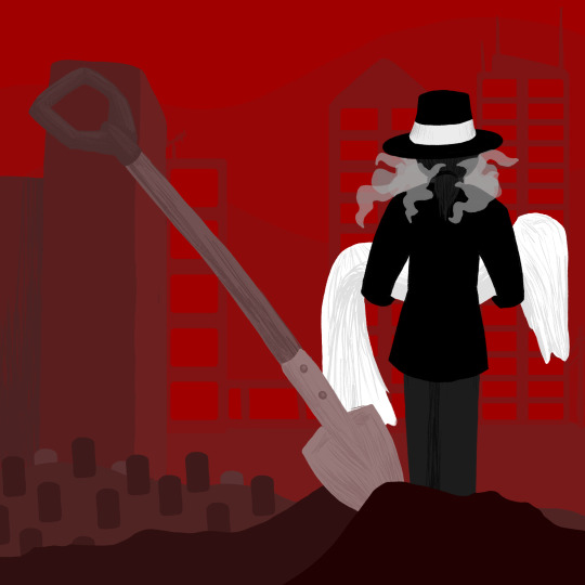
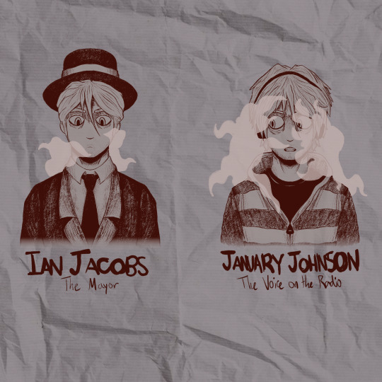
As with the last post, I also want to share the art from the video. For the first one, I wanted to do something that captured the feel of the Ethics Town logo, which is all black and white and red, so I stuck with a pretty monochromatic colour palette here. The image depicts the Mayor of Ethics, Ian Jacobs, moving the wrapped body of Natascha Flynn to make space for a nearby factory's planned expansions. It was one of two scenes I considered, and I think this was the much better option. The skyline in the background, while not perfect, is meant to mimic the same skyline seen on the Mayor's hat in the logo. The other weird detail here is that everything was done linelessly, which was very weird for me, because I thought it created an interesting look.
Oh, also, yes, I did give Ian a ponytail.
The other art piece is a sketch of Ian Jacobs and January Johnson, because I wanted to experiment with how much I could push their designs before they stopped looking like the same person. I also wanted to have their outfits at least be a little similar, so both of them have outer coverings closed around the middle of the chest around a shirt beneath, and both Ian and January have black headware. I considered giving January a white band on his headphones, but it just wound up getting lost. Another notable difference is in the hair, which I imagined here as blonde, probably in a more platinum direction, though you can't tell that very well from the greyscale. Ian's hair is pulled back in the aforementioned ponytail while it's left loose when he's acting as January. January also has a little more stubble, and his eye bags sag a little more. Finally, even though I only really had two colours to work with, I wanted to try expanding on how he acts within each role using the clothing. January's clothes are lighter, thanks in big part to the grey and white striped hoodie, which is designed to make him seem more emotionally truthful than he actually is. Underneath that light tone, though, is a plain black tee, which ties him to the darker colour scheme of Ian and also hints at the fact that, below his friendly and approachable personality hides the dark secret that he is, in fact, the Mayor who has been making such terrible decisions. Going back to the sweatshirt, the grey and white striping is also slightly reminiscent of the stripes on prison jumpsuits, which is a way of representing his feeling of being trapped into bad decisions and being ensnared by Ethics and his secret role as Mayor. Speaking of the Mayor, Ian is a lot simpler. I considered giving him a big, slightly cartoon-y MAYOR sash, but I wound up preferring how he looks without it. Generally, I tried to keep his wardrobe darker and more formal, and, of course, I had to include the fancy hat we see on the logo of Ethics Town. I also reduced the amount of vape cloud around him for two reasons. First, the in-story reason, is that Ian has accepted who he is and the role he plays in the "narrative" of Ethics, so I imagine he's a bit less stressed. It also works really well metaphorically, though, because he's not disguised anymore. When we see Ian at the end of "The Identity Issue," the mask is fully off. Artemis knows exactly who he is, which means that his identity doesn't have to be clouded by as much smoke. Oh, also, it's a cosmic horror podcast, so if I didn't put something tentacle-esque around the main antagonist, there would be problems.
And I think that about covers it. I had a lot of fun listening to the podcast and making the video, and I hope it can bring joy to y'all as well. Catch y'all next time around for The Buried Explained!
#Ethics Town#Ethics Town Podcast#Ethics Town Spoilers#fiction podcast#podcast recs#horror podcast#audio drama#cosmic horror#podcast recommendations#podcast#oh also art i guess#philosophy#morality#ethics#youtube#youtube video#Ian Jacobs is one of the best written characters in fiction#January Johnson#Yeah still don't know how to use Tumblr#Also I forgot about a detail but I asked them if it was intentional on Twitter and apparently it was so yeah Ian is derived from Janus/Ianu#Youtube
23 notes
·
View notes
Note
I love your art so much! Do you have any of your brushes for sale, or any tutorials, especially on colour?
Hi!! Thank you so much! 💕
Honestly, my go-to brushes are all procreate brushes with slight adjustments (like stabilization, etc.) my personal preference is brushes that kind of mimic graphite pencils. The best thing you can do is find a brush that suits you & get very comfortable using it! Specific brushes won’t necessarily improve your work, it’s all about practice! (But yes, a nice brush does help!)
I do have a video on my favourite brushes:
I’ve never really made any tutorials, but I’m happy to try and relay what I know and what I’ve learned so far!
Colours are a big part of illustration! I could probably ramble on for hours, honestly—in any case, it’s always helpful to know fundamentals of colour theory. Once you learn and apply it, it becomes intuitive! I’m gonna stick to RGB colours because CMYK is it’s own thing (printing!)
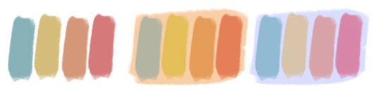
There’s a handful of basic terms like hue (pure colours), shade (adding black to a colour), tint (adding white to a colour), tone (adding gray to a colour) and also opacity (transparency) that help us understand and define the complexity of colours.

My colour choices are more often than not a gut feeling—but that does come from practice! There’s loads of colour palettes available online like this one, but if you wanna come up with your own, there’s some neat ways to do that using a colour wheel! Colours can broken down into primary, secondary and tertiary colours. We can also categorize them as warm or cold. With this we can make colour schemes!
Some basic schemes!
Complimentary: two colours, opposites on the colour wheel
Analogous: three colours side-by-side
Triadic: three colours that form a triangle, evenly spaced
Monochromatic: using one colour (using different shades)
(Bonus) Monochromatic with accent colour : using one colour as a foundation and having an accent colour (similar to analogous, but one colour is used for a majority of the piece while the accent colour is used sparingly)

It’s also important to keep in mind that values (a colour’s range from dark to light) will look different on different colours. Sometimes, you’ll put two colours together and think “huh, something about this feels off” and it turns out, the colours just happen to be very close in value and melt together. Switching your piece to grayscale just to check on your values every so often can help with contrast and muddiness! A light tone on a darker tone will look brighter than it really is. Colours can also influence each other and trick your eyes.

Environment is also a big part of choosing your colours for a piece. Determining what the setting is important! A sunset will make a drawing warmer, while a scene set in the night will usually have colder tones. Using only local colours (true colours, like green grass or blue sky) vs non-local colours (atmospheric perspective, accent colors that give depth, etc) can help enhance your drawing too. Don't be afraid of artistic interpretation!
Also, there’s always the option to use gradient maps (at least on procreate & photoshop but I’m sure it’s available in csp and other programs) where you draw in grayscale & apply a gradient map. The gradient map basically applies a color to every value (e.g all the shadows become blue and the highlights become orange) it can look really nice (and help out if colours just aren’t working that day yk)

Another thing, when I’m drawing (and this is specific to me!) I tend to start with pretty desaturated colours. Once my illustration is done, I’ll duplicate & merge my layers to do colour edits. Most programs give you the option to play with curves or colour balance—menus that allow you to play around with the hue of the shadows, midtones and highlights. I tend to make my shadows more cyan-blue, my midtones a little warmer and my highlights warmer as well. Of course, this depends on the mood of the piece, whether it’s warm or cold, lighter or darker, etc!
You can always make adjustment layers on top of your work; a low opacity yellow, magenta or blue (or anything your heart desires) overlay to tie all the colours together.
I hope this helps a bit!! Happy to answer more questions to the best of my knowledge :^)
99 notes
·
View notes
Note
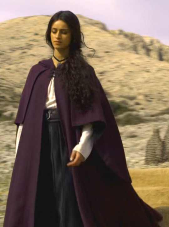
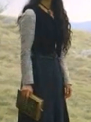
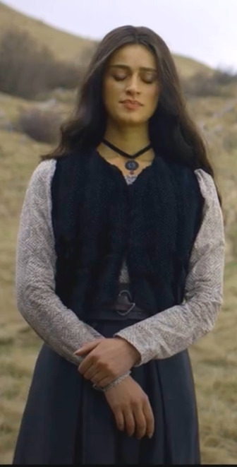
why do so many of Yennefer’s outfits that I’ve seen (including her bra) look modern? Wouldn’t she be wearing something else?
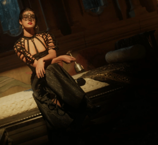
They can't stick to monochromatic colour scheme- considering various options regarding cuts, layers or structure the history of clothing offers, would be way too much!
So yes, her clothes looks either like something my grandma would wear, or rags they scavenged on a raid on local trift store. I don't know where the budget went, but it sure as fuck wasn't Yennefer's wardrobe.
I hate you anon, btw. Now I have to go through all of that to see how superficial my impression is... although I'll only do first five episodes, considering when did the ask arrive (and my mental health).
That fucking purple cloak. Or another one, it doesn't matter. Either way TWN world apparently works in completely different way if purple isn't both conspicuous and expensive. Probably why we saw so much of it on average peasants in previous two seasons...
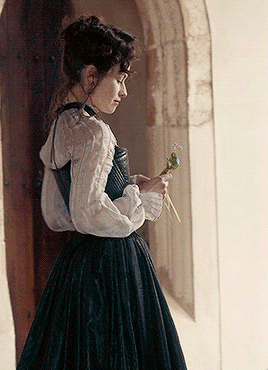
The broke nerd all class makes fun of (Are those platform shoes?!) or local goth witch high schooler, who's probably gonna lecture you on energies and angels? From up close my guess would be a bit older- that's some 20-ish teacher fresh from uni, trying to look respectable. My grandma would like the blouse very much. It's exactly her style.
This looks like vaguely "historical" cosplay you can find in trift stores or even your own wardrobe. It's also good to know average sorceress on the run can still get her mani-pedi comparable with present-day treatment.
Sorry for the quality, the lighting isn't very good and I'm not in mood to spend even a little more time on this, but this dress looks A LOT like the one from 01×05. So does the mask. (Budget cuts? Lack of creativity? Yennefer saving it for some twenty years in case she'd need to make Geralt feel nostalgic?)
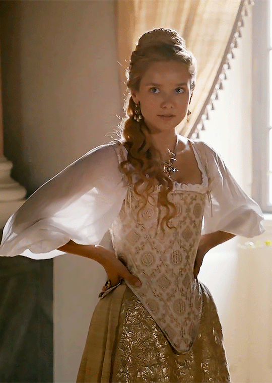
Strong businesswoman jacket or What you want to wear to impress your peers and make them agree with you!

Some sort of nightgown? Sexy lingerie straight from the catalogue?

And we got to my "favourite"!
What the fuck is this rag? It looks like somethig Yen used to wipe the floor with, then proceeded to tie a knot or two and ta-daaa! Comfortable dress for every occasion's here! A ball or leisure? It's prefect for anything! (Unless you possess fashion sense, or gods-forbid sense of aesthetics.)


IS THAT A FUCING BRA?!
Couldn't they at least pretend to try?!

I guess Netflix couldn't afford seamstresses, so their brilliant costume designer decided to lend them something of her own.
This isn't even attempt at vaguely historical fantasy. Just some ugly loose whatever... Yen's tops, Yen's shoes... It certainly doesn't look like she's wearing stays EVER.
Compare with my favourite historically totally innacurate series:


#reply#The Witcher (TV series)#season 3#Yennefer of Vengerberg#Lucinda Wright#TWN critical#Why would you want to become costume designer for pseudo historical fantasy#if you're not interested in history AND lack imagination?!
22 notes
·
View notes
Text
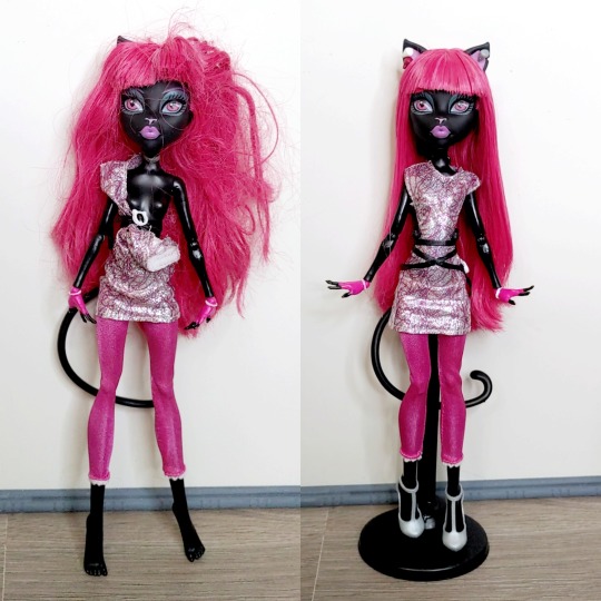
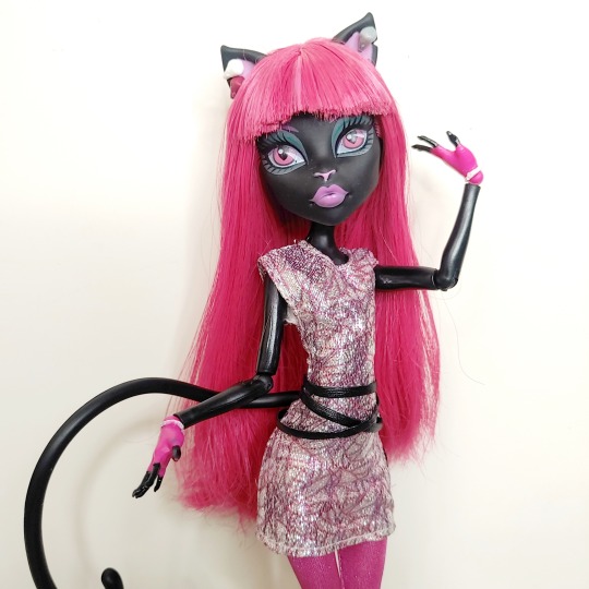

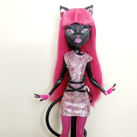
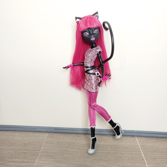


So it's no secret my favourite versions of MH characters are the basics dolls since I prefer to imagine the character what they would wear on a day to day basis rather than some big event type outfit that the latter G1 characters eventually wore. I ended up searching for a New Scaremester Catty Noir mainly because it's my favourite look of hers and I wanted a casual version of her after watching Boo York lol.
I actually got this doll for a really good price because of how severe her condition seemed but it seems like the previous owner got impatient with undoing her belt and gave up getting the dress off.
I just undid the belt and cleaned her up as normal and I'm really happy I got this doll in my collection now. I ended up styling her belt as was seen in her promo pictures as the production doll just had the belt wrapped tightly around the waist.
I always liked this casual look of Catty's because as a Jem fan you can really see the Jerrica Benton influence on her look, plus I really adore monochromatic colour schemes more than anything.
I genuinely wished G1 had more lines after New Scaremester where the newer characters had more everyday looks because I was holding out on picking up characters thinking they would get their moment like Catty and Gigi but now I'm just chasing after that kinda high.
59 notes
·
View notes
Last Seen Blogs

coreygoers
Untitled

thatonegood
That One Good

hellnohugo-blog
Hell No, HUGO!

domainfq
DomainFQ.com

speedyfantriumph
SpeedyFanTriumph