#Tutorials
Text
I did promise to show my process of making backgrounds so here it is 🙆♀️✨
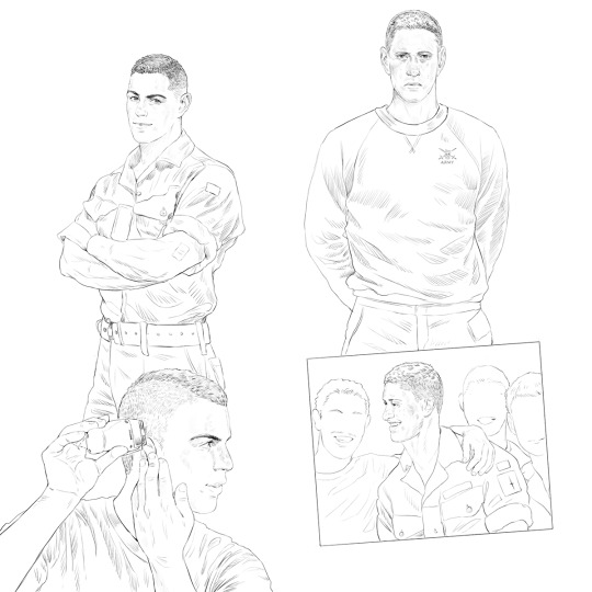
to start off--here's the line layer before I begin adding anything:
I still think this composition is a bit weird, but...eh 🤷♀️
next, I compile all of the references I've spent numerous hours foraging for:

these are all from basic google searches; for this piece, I looked for images relevant to the theme, so we have some vintage military manuals, illustrations, even a real army application form that I filled out in Johnny's name 😅 sources for these can vary, but I've had good luck perusing ebay listings for a lot of these scans 👍
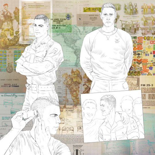
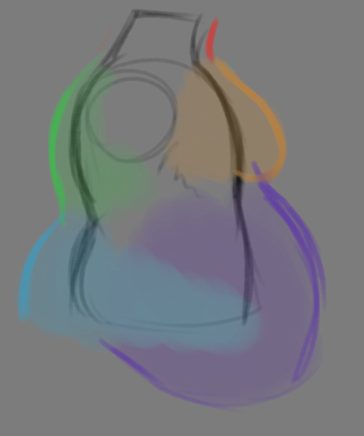
next, I kind of just...scatter them around the page, seeing what fits where, keeping the figures as the focus but letting the background fill out around them:

I then start adjusting them more, utilizing various overlay options (hard light/ pin light/ multiply/ color burn are usually my go-to ones in PS) it takes some fiddling to see what looks best:

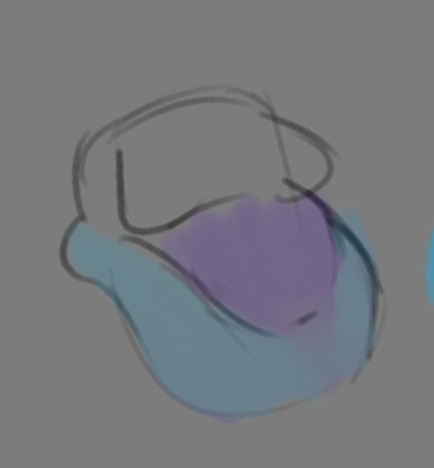
then I add a few more personal additions for flavor ✨

next, I adjust the colors a bit:
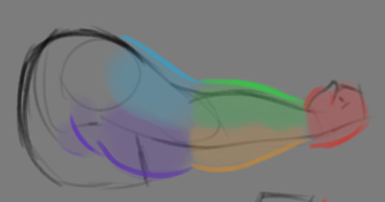
then I adjust the colors even more, bringing out the electric blue and pink to make it pop
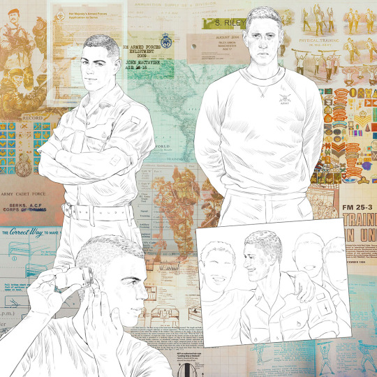
here's the full bg without the figures:

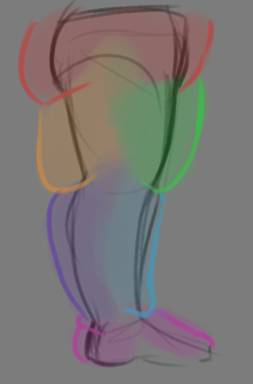
and here's the completed piece:

as you can see, I did add a few more elements in the end, as well as adjusting the colors further with the addition of the fully rendered figures 🙆♀️
all in all--this is pretty much how I create all my backgrounds, like a fun little scrapbooking project~
303 notes
·
View notes
Text

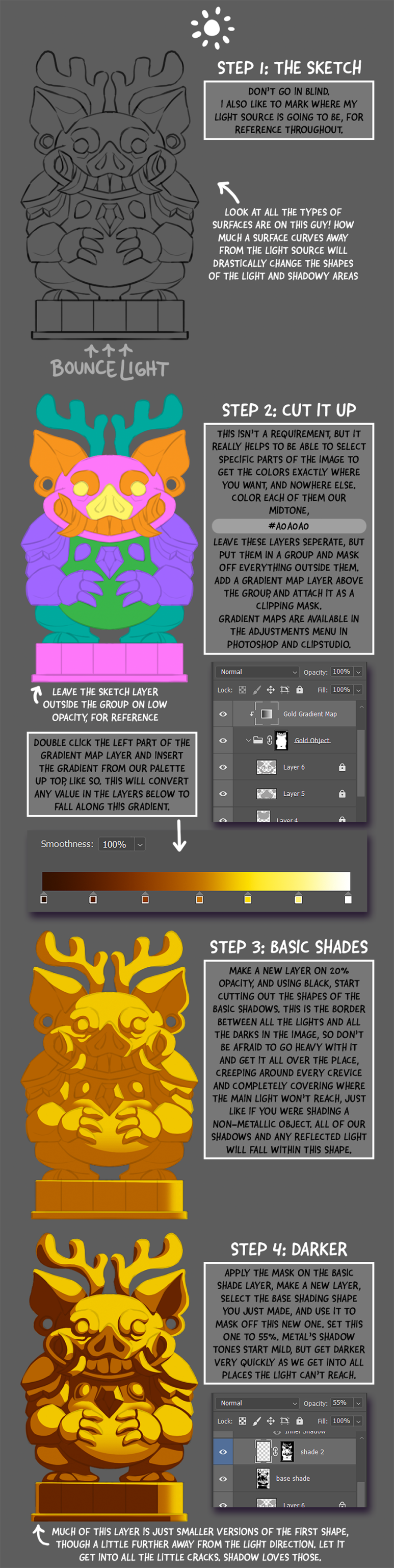
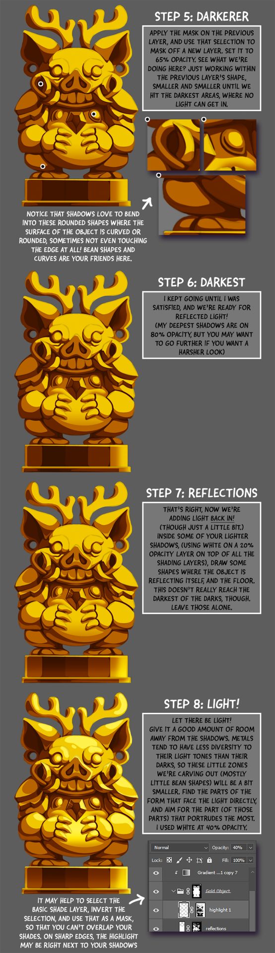
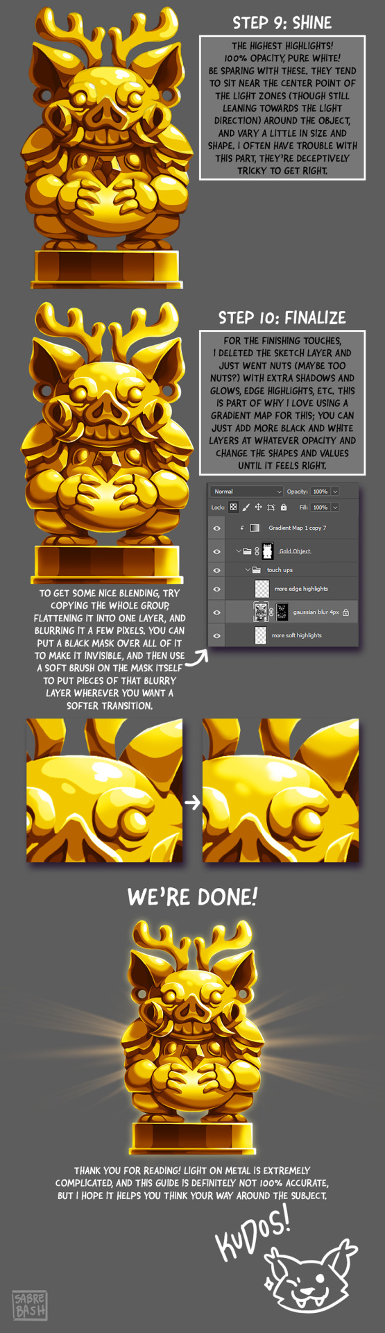
I have to draw a lot of gold and metal for my work, but wasn't happy with any of the metal tutorials i could find around. I prefer really specific instruction, so after some research i put together what i think works as a generalist's guide/tutorial. Not perfectly accurate, but i hope it's helpful!
#tutorial#tutorials#art#painting#artists on tumblr#reference#art reference#useful#art tutorial#art resources#tips#longpost
26K notes
·
View notes
Text
#asmr relax#asmr#oddly satisfying#diy#tutorial#do it yourself#tutorials#crafts#diy ideas#diy projects#easy diy#origami#video tutorial#craft#diy videos
106K notes
·
View notes
Note
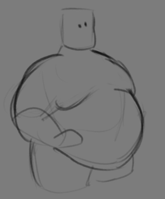
If you don't mind my asking, how do you go about drawing fat? :3
JUST THE EXCUSE I WAS LOOKING FOR
So, for me personally, a lot of the time when I draw fat characters, I'm not looking to specifically capture the specifics of fat as much as the feel of fat. Bulkier, rounder shapes in the right places that has a feeling of weight to em! A lot of that is intuition and simplification at this point, but it all works on the same frame as just any ol' person. Like take this-

For example. This is the basis for any body shape, not just the more average one that it may imply. Sure- it can be that average body shape:
But also a fat one too!

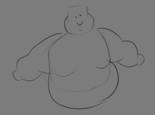
And a big part of that is knowing where fat usually tends to bunch up on the body, so lets take a look piece by piece! (Please keep in mind this is very simplified, and not completely precise in some parts)
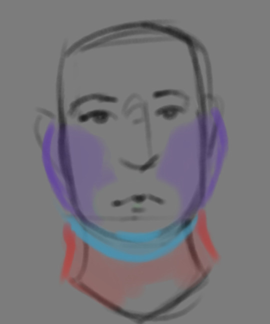

THE FACE: Cheeks (in purple) and especially the chin (in light blue) are the places where a lot of the fat is gonna wanna gather and round out on your face! Additionally, theres a small pocket of fat beneath the cranium on the backside of your head. It's small, but it is there. I believe fat can build up elsewhere like the bridge of your nose and forehead, but generally speaking, you're gonna have a whole lot more buildup in other places first.
THE TORSO: A lot of the fat built up on the torso is gonna be sent to your tummy. More cushioning for vital organs, mostly out of the way, it just makes sense. Additionally, the lower backs fat builds up and joins with a patch of fat on your sides that forms what is typically referred to as the love handles to make that double belly look. Along with this, the immediate next target for the torso is the breasts, followed by the upper back!
THE ARMS: For this limb, a VERY notable amount of the fat present builds up on the tricep and bicep areas, lessening once you get towards the flexor and extensor areas. You can almost think of the arm as a sort of triangular shape, wide side starting from the shoulder and tapering towards the hand, which itself mostly builds up fat around the back of the hand and the fingers. The shoulders themselves don't build up too much fat unless you got a lot
THE LEGS: And finally, you can think of the legs having pretty similar curves to what you're probably already used to thinking. The front of the thighs getting a big buildup, along with the back of the calves, the other parts being flatter in turn. As far as the feet go- similarly to the hands, the top of the feet, along with the heels get most of the buildup, as fat on your soles would impede mobility. The glute, hip and crotch area will also especially build up fat, lending to the same triangular shape that you can see in the arm!
A big thing to note with fat is that it tends to taper off towards joints. Your knees, elbows, shoulders, hips, and all the other places are gonna have significantly less fat so that you remain mobile and flexible, as that's important!
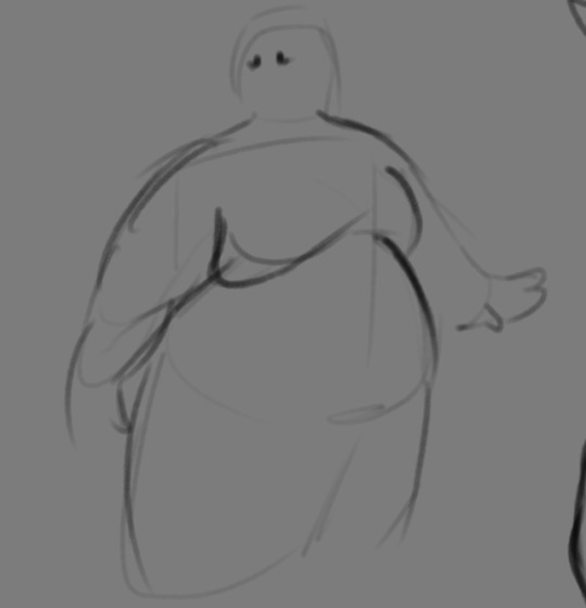
Now that we have an idea of where fat builds up on the body, you might have something that looks kinda like this
Which yes, does demonstrate a solid understanding of the places fat builds up, lacks the weight you're probably trying to convey, which brings us to out next point! Fat is well... heavy! Gravity is what gives fat much of it's shape, especially as you tread towards larger and larger bodies.
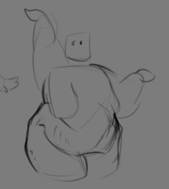
This is demonstrated really well on the arms especially-


Those big ol' bits of fat'll really start to sag when left hanging, and they will squish like hell if they run into something. I like to think of these bits of fat as big ol' ovals that squash and stretch depending on if there's an obstacle in their way or not


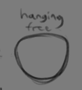
These are the important shapes to remember when it comes to the weightiness of fat! If you take all of this into mind, you should be getting something a lot closer to that shape you've been after!

Oh, and always remember that fat bodies come in all variety of shapes and sizes! Play around with a whole lot, and seek out all the resources you can! it'll really lend to your knowledge when it comes to this kinda stuff!
And as I always recommend when it comes to learning art- look at what your favorite artists do with fat bodies. See what you really like about the fat bodies they draw and try to replicate it in your own work, I promise you it's one of the most helpful things ever.
This is like the most basic of basics when it comes to drawing fat bodies though. If there's any additional thing about fat bodies, or maybe you want clarification on something, don't be afraid to ask! If there's enough to cover, I'll make an addition to this post!
#hat answers#my art#design talk#tutorials#yeah im unfortunately pretty tired so this gets a liiiitle rambly at the end but i think this covers like the basic basics#i hope this was helpful at all#and again dont be afraid to ask questions and stuff#if theres enough traction/questions on this i will most definitely try to clear up as much as i can in an addition to the post#whoops this took a bit!
3K notes
·
View notes
Text


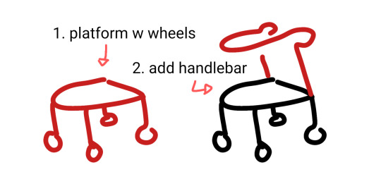
wheelchair, cane + forearm crutches, walker 90% chance if you're hesitant to draw mobility aids you're overthinking it. start somewhere. obviously these are not detailed references.
wheelchairs and walkers should be proportioned like chairs. in most cases canes are held on the opposite side of the painful leg because you want to put weight on the cane instead of the leg (dr house lied to you) but depending on the reason for the cane this can change!
[ image id: a title image that reads "learn how to draw mobility aids very fast" followed by three simplified drawings of different mobility aids broken down into two steps each. the changes made in each step are colored red.
the second image shows a wheelchair, with the steps "1. seat with footrest", showing a simple chair shape, and "2. wheels", which adds two large wheels to the back and two small wheels to the front.
the third image shows both a cane and forearm crutches, with the steps "1. stick", showing a single line of color, and "2. add handle", which shows a hand grip and a forearm rest on two different sticks. and additional label below this step reads "handheld stick height is where the hand rests at the hip" and "forearm stick height is the forearm".
the fourth image shows a walker, with the steps "1. platform with wheels", showing a backless chair shape with a wheel on each leg, and "2. add handlebar", which shows a handle raised above the seat. end id ]
✨ edited to remove italics for screen readers + also pointing out that I missed the handle on the forearm crutches! always use real reference photos when you can, this is just a starting point to help you understand the basics if you're not familiar :3
#are they perfect renditions? no. but first attempts at drawing anything rarely are#and tbf id rather people start drawing them and draw them badly than never draw them at all#art ref#tutorials#mobility aids#wheelchairs#canes#forearm crutches#walkers#sorry if there are typos blame the blindness#patch me through to palaven command
6K notes
·
View notes
Note
Hello! I remember seeing a tutorial for wrinkles / clothing physics here but i cant seem to find it... where could i see it again? Im having a hard time drawing clothing physics / wrinkles haha 😅
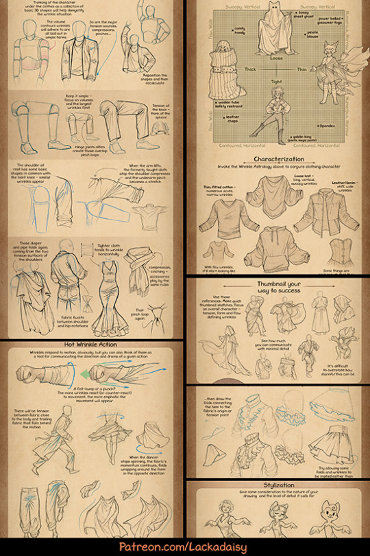
I haven't shared it publicly, but here's a preview image of it.
It's available in full to my Patreon supporters, though.
It's also in the Lackadaisy Essentials art book, which can be acquired through the BackerKit campaign currently in progress.
4K notes
·
View notes
Text
One of the better examples of integrating video game conventions of play into the narrative is how the game mechanics tutorials in the opening stages of Final Fantasy VII (the original) flip the customary script and have Cloud, the player character, be the one explaining things to other characters, thereby establishing the unspoken expectation that his narrative function is to be the guy who knows what the fuck is going on and lending greater weight to the eventual revelation that he has no idea what the fuck is going on.
#gaming#video games#game design#final fantasy vii#final fantasy#cloud strife#tutorials#swearing#final fantasy vii spoilers#final fantasy spoilers#spoilers
2K notes
·
View notes
Note
hi, I'm a big fan of your art! especially the good omens ones, they make me cry.
one question, how do you draw eyes? i am a beginner when it comes to drawing, so any tips or...?
Hey!
Thank you so much! Happy to hear you like my work!
When drawing eyes I usually go about it like this:
It helps me to imagine the character I'm trying to draw with a mask. This especially helps when trying to draw an expressive set of eyes and eyebrows! David Tennant is the best example for this:

The shape of an eye can be simplified with just four lines, like this:
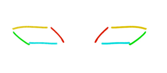
These four lines can be manipulated to whatever shape of eyes your character has. One line can be longer or rounder.
This is what it would look like:
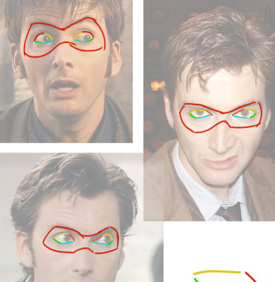
(sorry for doing this to you, david)
And once you've understood these basics, you can draw some eyes!

Hope this is somewhat helpful!
1K notes
·
View notes
Text
fiber arts tutorial links!
I’ve gotten quite a few asks about spinning, fiber prep, and dyeing, and since I’m utterly incapable of answering a question without writing an essay, they often turn into tutorials. I’ve compiled them here for easy perusal ! More will be added as I find and/or write them.
SPINNING
The basics of getting into drop spindles
A comprehensive guide on how to spin on drop spindles
Processing fleece on hair combs to get perfect hand combed top (a cheap fleece processing tool)
How to get your yarn off your spindle
How and why to block handspun yarn before using it
Niddy Noddy sizing
Blocking linen and cotton yarn
How to tell if your handspun yarn is over or undertwisted
Moving from park and draft spinning to suspended spinning
Debugging: roving twists and knots around the edges while spinning
Debugging: compressed roving
The visuals of 2 ply vs. 3 ply
Whittling supported spindles
Very short video-centric guide for supported spinning
FIBER PREP AND/OR DYEING
Steps of fleece processing, including the many methods and tools you can use
What prep to dye in
20 questions of natural dyeing
Dyeing with onion skin
How to clean a blending board
All about mordants
KNITTING
Knitting with chronic pain (more advice from others in notes)
3K notes
·
View notes
Text
Collection of Free Art Tutorials
I don't usually make text post on this blog, but a nice artist I know was asking for tutorials a while back and I forgot to send some to them while in school. So here's a post on it since it's easiest to grab and go this way. :)
This list focuses on the basics. I'm focusing on the foundations of art, so medium is generally irrelevant and you can use physical or digital with these. You'll have to google more specific tutorials on things like character design and such.
One of the biggest pieces of advice I can give to you is strangely, introduce things to yourself one at a time. In art class, we took whole topics week by week. For high school, we did a few exercises then spent a week drawing/painting and doing your piece(s). For basic art 1 & 2 in college, we did 1-2 exercises and then did 1-2 drawings, followed by HW (which we turned in next week) and sketchbook practice (which she'd check at midpoints). For basic art lessons with a tutor, we did practice then our own art. You can see the pattern here - the point is don't be distressed if you don't get everything at once, or the lesson in 2 weeks, or the lesson in 3 years - we practice and do a lot over time, and you'll pick up on things you need to improve naturally and through help with others. Take time to be proud of your art in mini steps too, even if it's not the best! You tried and attempting to climb an obstacle over and over again before finally leapfrogging it is still progress to it.
Overall tutorials:
DrawABox.com is a site that's dedicated to art exercises and practicing when you can. They talk about the basics of art as well as how practice is important. It can get tough at times and it's ok to stop and do a balance of say those practices and doodles if you choose to try and do all of it's stuff - but you don't have to either. It's just a nice basic education done by some art nerds who like going hard.
Ethering Brothers - these guys are famous for their 40billion tutorials. If you need help on a specific idea, search their gallery and you'll likely find something.
Thundercluck's Art Fundamentals - She did a good huge ass tutorials on how things work, and it's the least overwhelming of the 3 I got in this section, so I suggest it as one of the first to look at for digital stuff.
Art Instructions Blog - Another good & simpler website that goes great into fundamentals. They focus more on traditional art but if you're digital, you can replicate most of the techniques - art fundamentals and subjects cover all mediums. Very important
Drawsh - Particularly notes on Construction: construction is the basics of building an illusion of a 3D image on a page. Figuring out how to build shape gives depth to your work, and learning how to see in 3D lets you be able to draw an item then move it around in your head (sometimes, when you're good enough, don't be afraid to pull out a reference or use live subjects). Construction is how to figure out the foundation of your drawing, and good planning = better picture!
This link starts at the back, hit newer post to go forward.
There's a lot on anatomy and other nitty gritty details for when you want to practice those as well.
Griz and Norm's Assorted tips - Long time artist talk about various tips and tricks they use in art and how to avoid certain pitfalls. It's eclectic but great to look through.
James Gurney's Blog - He's got a lot of thoughts, a lot of tips, and a lot of adventures he catalogues. It's the least organized out of these but fortunately he has plenty of tags and most post have something neat going on. He's fantastic!🥰
BEFORE ALL OTHER BASICS….
How to Make Your Art Look Nice: Mindset
There's a lot of artist with different perspectives on how to approach art and your mindset while doing it, but the general consensus is that it's a process and sometimes you have to remind yourself to enjoy art!
Line
How to draw straight lines without a ruler. …but for the love of all that's good do NOT feel bad about using one! This talks about how to hold your pencil and how to do some good freehand stuff, some good practice.
5 grips for holding a Pencil for Drawing - This goes for pencil, pen, tablet, etc.. Get comfortable and figure out what's right for you and your pictures. I'd like to note that paintbrush holding will overlap, but some will differ.
A few line drawing exercises that help with line confidence.
Types of line drawings & what they are.
Contour Line & exercises with Mrs. Cook - Contour lines are one of the first art exercises I do in all the drawing classes I've taken. The good news is that they're surprisingly fun & look neat, even the blind contours!
Good deep thoughts on lines and how to use them.
Line Weight Tutorial
Lineart Weight Tips!
How to show variation in your line art: part 1 & part 2.
Some teacher's Drawing 1 & 2 lessons put online.
Light, Shadow, & Value
An introduction to tonal values.
Why values are important. The main reasons are that they give depth to a piece, and values literally shape our world.
Tonal Values: Everything you need to know
How does light work & the basics on Light
Light & Shadow in Art - much more in depth of the above! Highly recommended if you have time to spare.
Understanding grayscale/monochrome art. Great for shading & planning.
A guide to Cross Hatching (and hatching in general) - As a side note, crosshatching is one of the early things taught as it marries Line + Value into a nice neat package and helps add form with just a pen.
Crosshatching for Comics
Learn more about coloring by working in grayscale
How to Make Your Art Look Nice - Contrast!
Using lighting to make your art look nice.
Some light & shadow classifications.
Edges - notes on how they work in shading.
Color
A side note - color theory doesn't differ much, but color MIXING will change between mediums. If you're doing traditional colored pencil, you're overlapping 2 or more pigments on top of each other. If you're doing traditional paint, you're mixing & creating a solution/emulsion (depends on the pigment and binding) of pigments with the particles reflecting light in different ways. In digital, overlapping colors & blending colors depend on how the program you use calculates it if you're not just putting 2 color side by side. This just means you have to adjust your mixing when you switch between them. :)
Slawek Fedorczuk's Light & Color Tips - also shows how to guide through a scene.
The Color Tutorial Part 1 & 2 by Sashas - A personal favorite.
Color Studies 1-6 by Sheri Doty
Amazingly nice breakdown on how color works in simple terms.
Sarah Culture's Tips on Color
The value of underpainting
A few notes on reflective light.
Experimental color techniques with Alai Ganuza: first post, second, & third.
Color zones of the face charts
Composition
Good Tips on Composition
Here's an example of how you can search the Etherington Brothers' stuff and get like 10 tutorials and tips on one subject. Composition & Cover Design, Shadow Composition, Two Line Composition - plus more.
How to make your art look nice: Thumbnailing!
And don't be afraid to make silly thumbnails or sketches.
Composition Examples - charts like these are great when you can't think of something yourself. There's no shame in using them.
Flow and Rhythm
Formulas for landscape composition.
Perspective
Perspective Drawing Tutorial by Julie Duell
Linear & Atmospheric Perspective Guide
One Point Perspective City Tut by Swingerzetta
Niso Explains Perspective - these are great for drawing figures in perspective!
Putting characters into scenes and drawing backgrounds
Backgrounds that make your character stand out!
Using background detail to guide the eye.
Odds and Ends
I shit you not, probably 1/3rd of my color, value, & structure knowledge comes from pixel art since I've done so much of it and it is all about challenging yourself to do the most you can with limitations. Check out lospec's tutorial database for fun and see how it compares to art techniques you're doing - even if you never try a medium, it's always interesting to see how it works. :D
How to Make Your Art Look Nice: Reference Images & Style, Pushing Proportions, and developing style.
Foervraengd talks about how he expanded his comfort zone with concept art & landscape drawing.
Luna Art talks about what they're thinking when doing concept art.
Repeating visual motifs in character design looks cool.
Eric's Thoughts on Drawing Backgrounds and Props.
Show vs. Tell: Why Visual is Not Optional in comics.
The Lost Vocabulary of Visual Story Telling Day 1, Day 2, Day 3, & Day 4.
Traditional Animation's 2 Digital Library books, The Know-How of Cartooning by Ken Hultgren & Advanced Animation by Preston Blair are two books from the golden age of animation they have up on their site for free viewing!
Animation resources dot org has a lot of cool stuff. Here's Nat Falk's How to Make Animated Cartoons (part 1). Their pages on Instruction & Theory are a good start.
Books
Good news: the internet archive has a TON of resources. Make sure to check around and toggle filters, it's a bit weird with organization. For example, a book can be under art or drawing - techniques, depending on who catalogues it.
Andrew Loomis is someone artist tend to die-hard reccomend. His work is collected here & here on the internet archive (one is Andrew Loomis, the other is Loomis, Andrew - thanks). I own Figure Drawing for All It's Worth and I recommend checking all of his stuff out, especially if you're having trouble with bodies and hands.
The Animator's Survival Guide by Richard Williams is mandatory in animation classes for good reason - it's fantastic!
Perspective for Comic Book Artist by David Chelsea is great for any type of artist. So is Extreme Perspective & Perspective in Action.
Scott McCloud's Understanding Comics, Reinventing Comics, & Making Comics. The first one is on the internet archive, the second two are likely avaliable at your library or at a bookstore as they're pretty popular.
Speaking of comics, Drawing Comics the Marvel Way has been a favorite of comic artist for years no matter what comic book companies and artist you like, it's a good introduction.
Anything by or endorsed by James Gurney, Color and Light: A Guide for the Realistic Painter is one of my favorites (this is his official page but you can get them elsewhere for cheaper too).
Art resource blogs with good tagging systems: @artist-refs , @help-me-draw , @helpfulharrie , @art-res , @drawingden , & @how-to-art
Lastly, I suggest if you find something you like online for free, SAVE IT! Whether it is through the Wayback Machine, screenshotting a whole webpage, reblogging/retweeting something, or putting it on pinterest, digital media is fickle and tends to go up in smoke when you least expect it. I have a partially organized Pinterest board that helped me find most of the stuff I wanted to keep. Figure out what works for you and save what you can.
926 notes
·
View notes
Note
Helllo! I am always truly amazed by your art and it never fails to put me in a trance with all the extra things in the backgrounds of them too! I do wonder how you went about studying anatomy and such, it always is such a tedious task for me to focus on and learn about each muscle if I want to draw some beautifully handsome military men, you know?!
ahh thank so much! I try to add some special stuff to each piece, so I'm glad it's appreciated 🥰
as for anatomy, I haven't done that much *actual* study (don't ask me where the latissumus dorsi is 😔) I'm more of a visual learner. This can be achieved through figure drawing exercises, or just learning how to *perceive* (by this I mean--what is it you're actually seeing as opposed to what you expect to see?) Understanding proportions and weight and pose are all very important, and these come more from analyzing real-life people as opposed to a medical diagrams.
I think getting a good idea of where various muscles are is a good start, but I often find that when drawing a figure 'less is best'
an example here:
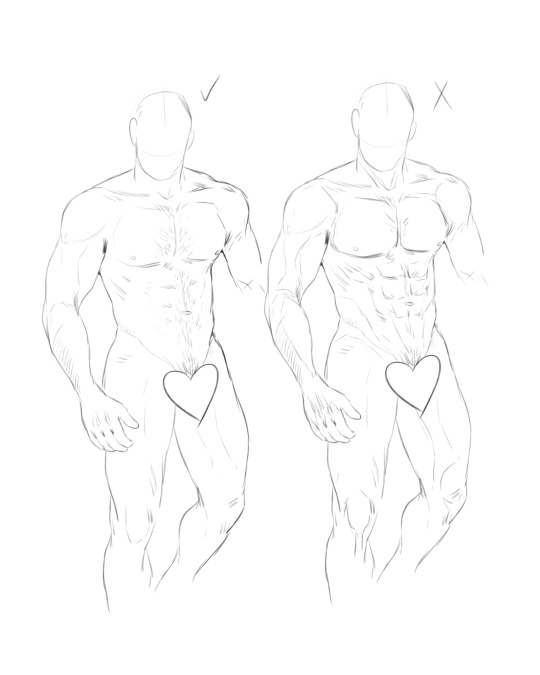
Sometimes, *too much* anatomical detail makes a drawing look exaggerated and more like someone's peeled his skin off, lol
I lean towards a more subtle approach to musculature, choosing which areas to highlight and which to let fade into the rest of the form.
Biggest piece of advice--use references! ALWAYS! I don't care if I've been drawing for years, I almost always have a reference on hand that I constantly refer back to. It's necessary if you want to draw something realistic, or else you might just start inventing new body parts 😭
And if all else fails--just throw some hair all over it to hide the mistakes 💅
#asks#tutorials#sorry I tried to explain this as best as I could#I'm just not very good at teaching art 😔#still--the best thing you can do is draw A LOT#and you will get better at it 💪
100 notes
·
View notes
Text
Who wants to make a peller box?
Guess what! I finally gathered my pages of scribbled notes, my camera of haphazard in-progress pictures, and finally compiled a set of instructions for making one of these bad boys!
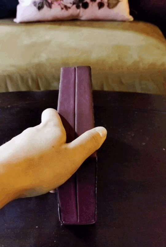
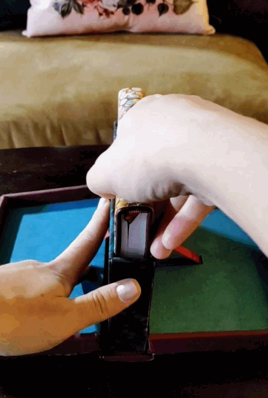
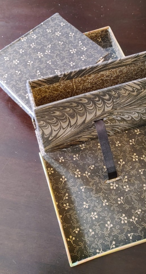
And not only that, but I've got two versions of this baby. I like mixing and matching my unit families because sometimes 1/32 inch sparks joy and sometimes 14 mm is just so convenient, but especially since all of my chipboard comes in english thicknesses, here's a version of the process for my fellow imperial units weirdos:
And here's one for the sensible folks of the world, raised on a base-ten system rather than dividing everything in half and then in half and then in half-- I won't subject you to inches, when there's a workaround, but I was tempted! Have your localized version of the story and have fun with it:
Mad credit of course goes to Hugo Peller, who developed these things in the first place, but also to Jack Fetterer, who preserved a set of notes from a 1990 class, which, as far as I can tell, are the most complete set of instructions available online. But I'm an engineer, I couldn't be satisfied there, I had bludgeon it into a system of equations, sorted by usage and material. And I also go into some of the hiccups I ran into trying to follow those class instructions, like being a green amateur at leatherwork, or not having the equipment to saw plywood boards in my apartment. These instructions still do make some unfair assumptions about the base knowledge level of anyone who wants to give this a try, like using bookcloth rather than plain cloth, but I may try to loop back and adjust that soon.
I can't claim any kind of expertise in this type of work, but I beat my head against an interesting problem, and it's time to share what I got out of it! And, secret goal, I want to help more people make more cool things, and maybe improve on my process in ways I can absorb and chew on in the future. Save my work, change it, I dare anyone who sees this to improve it!! I want it to be better. Credit would be cool, and of course the actual experts I leveraged for this deserve all the credit in the world, but that's not my priority. I want the world to have more exciting things in it, and I want more people to have exciting skills. Go forth and go nuts!!
6K notes
·
View notes
Photo


bowser and luigi face tutorials!
technically bowser’s muzzle has a few more bumps in it but this is a simpler version
you can also use this muzzle for bowser junior if you do it more like a bean or a heart with a round bottom part instead of an apple shape
#art mine#2022 art mine#digital art#shapeshiftinterest#games#mario#luigi#bowser#bowuigi#flowers#monsters#art references#tutorials#LGBTQA
7K notes
·
View notes
Text
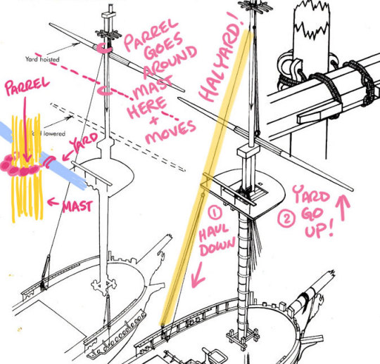
A while ago Falynn K. asked this question on Twitter:
"So on a tall sailing ship you have the mast, and you have the yards across it--is the yard/spar actually attached to the mast, by like i dunno, a pin or something, or is it strictly roped/lashed to it?"
This is a totally reasonable question! A lot of folks who haven't sailed square riggers might think that the yard stays put, but in fact it needs to move up and down the mast so the sails can be fully set. (Y'know how everyone's always talking about halyards? They literally haul the yard up. You're welcome.)
So to answer the question: yards are held loosely to the mast by a looped line strung with large wooden beads called a parrel. The beads roll up the mast as the yard is raised and lowered. Here's a drawover that hopefully clarifies a little:
Once you start explaining things about tall ship anatomy it's hard to stop, so there's a bit more context for how the sails work:
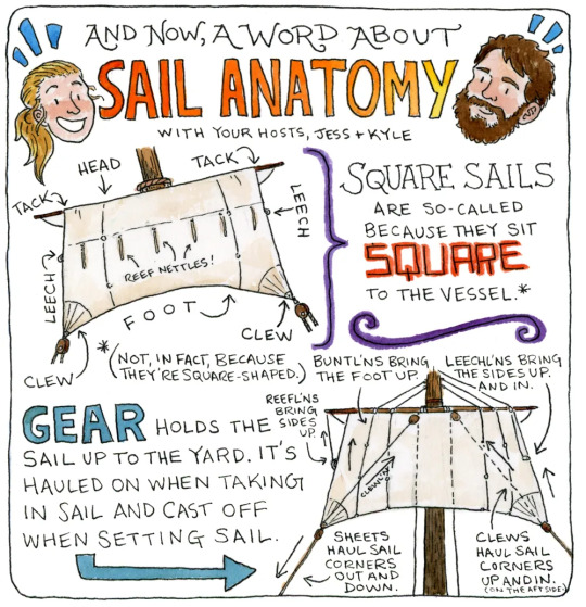
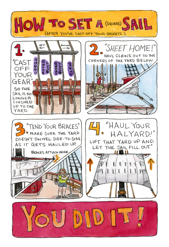
(These are pages from my comic A Week at Sea with OHP, which you can read online here or grab as a print minicomic here.)
Hope this is helpful!
#boat stuff#tutorials#ship mechanics#age of sail#art tips#tall ships#square rig sailing#oliver hazard perry#tall ship#sail training
2K notes
·
View notes
Photo
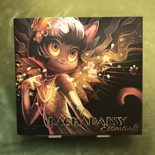


Lackadaisy Essentials art books...
...are finally in the warehouse! Kickstarter backers, you should begin receiving your books this month.
Meanwhile, Iron Circus is selling a very limited number of extra books. These will come with a signed bookplate, and will ship immediately after the Kickstarter backer books are fulfilled. (Likely in July.)
Find them in the Iron Circus Shop here!
I believe we’re at about 100 left as I type this.
The Essentials is a large hardcover book, clothbound with a gold foil title and dust jacket. It contains ~140 pages of character art spreads and bios, mini-comics, tutorials and full color illustrations!
-----------------------------------------
**Note: This is the best chance to get the book as a solo item. If you’re wanting to get all of the new Lackadaisy hardcover books (Volume 1, Volume 2 and Essentials), I suggest waiting for the BackerKit campaign in July. They’ll be available as a set.
#lackadaisy#lackadaisycats#lackadaisy essentials#art book#books#comics#tutorials#character art#webcomic#illustration#cats#1920s
2K notes
·
View notes
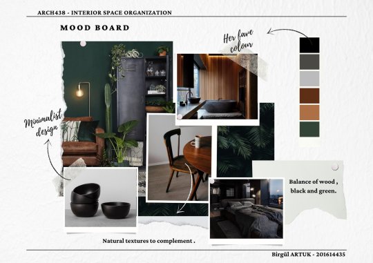
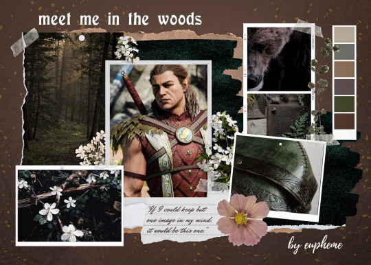
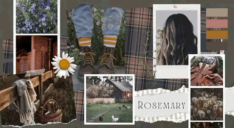
Text
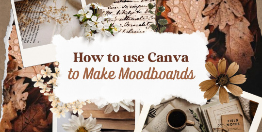
—HOW TO USE CANVA TO MAKE MOODBOARDS

I got a kind message asking how I make moodboards in Canva, so I wanted to do a little tutorial! Canva is a free graphic design app/website, and I use it for everything.
To start - open the app/page and use the search bar at the top to search for a template. I usually use: photo collage, scrapbook, aesthetic moodboard - all of these will pull up pre-made templates for you to use.
[I have a couple linked below that I’ve used and liked, or have bookmarked to try:]
one | two | three | four | five | six | seven | eight
Anything with a crown is for Canva Pro members - you used to be able to use the templates as a free member (just not the paid assets) but that changed recently. The linked templates above are all free ones that you can use right away.
PHOTOS:
Once you’re in the template, you can press the + in the bottom corner to bring up the menus. The Elements tab have items you can add in (more on that later) - for now you want to go to Uploads, and add the photos you want to use. I mostly get mine from Pinterest and Google Images.
[If you are writing an x reader fic and are looking for tips for creating an inclusive moodboard, there are some awesome resources here: one | two !]
After that, go back to your template and click on the different photo frames, and use the Replace button in the toolbar - it will let you replace the template photos with your own. Double tap to move and resize your image within the frame, (and there are also filters you can use if you want!)
When working on moodboards, I like to move things around. You can replace the frames they use by clicking on the item and then clicking the Trashcan. Then go back to the + menu, and then Elements, and scroll down to Frames. You can scroll through them all, but my fave keywords to use in the search bar is: polaroid, torn, and ripped.
Once they’re added, you can move them wherever you want. There’s a button on the toolbar that says Position, and you can shift the object forward/back between the items around it.
DETAILS:
Once you add your photos, then comes the details! You can change the background color and add/change the fonts (or upload your fave font to use!) Try out all the tools on the toolbar to see what you can do, there’s a lot of options.
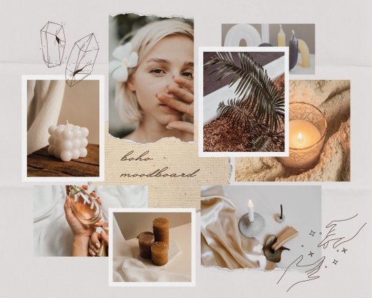
I love love layering with my moodboard, so I will go back to the + / Elements tab, and then search for things to layer in. My fave searches for Graphics recently are: ripped paper, grunge patterns (to use in the background), star patterns, dried flowers, and dried leaves.
You can use the Position tool on them to fit them in-between or in front of your photos. I usually use them to hide harsh edges or in places that look a little empty.
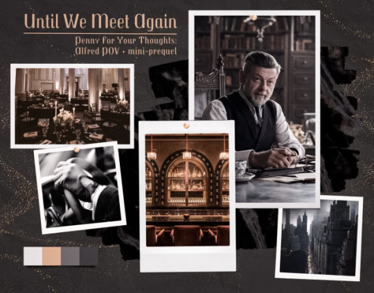
I also like adding fabric texture to the backgrounds, to fill the space between the photo frames. There isn’t an easy way to do this - the best way I figured out is to find an image of the texture you want, and then to add a photo frame with a torn or jagged edge in the very back (and then use your new texture there). You can duplicate and move it, to cover the space (you can see some examples below - the beige flower pattern in the Din one, the black velvet for Alfred).
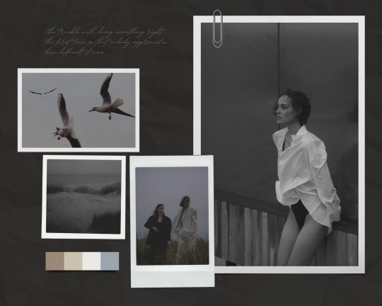
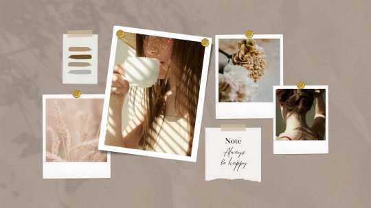
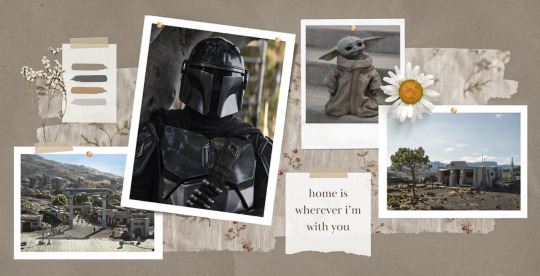
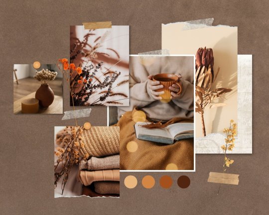
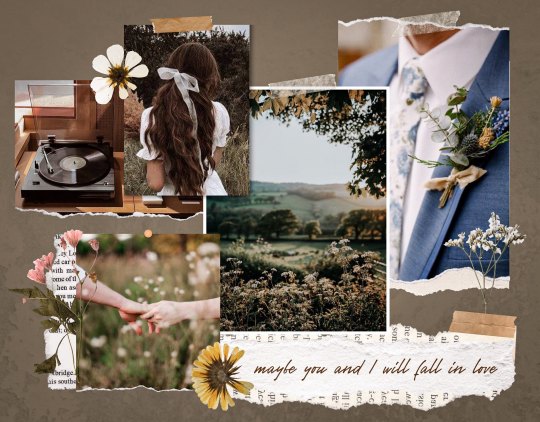
Here are some examples of the original templates, and then what my finished ones look like. You can see what I swapped out, moved, and added:
original image | my moodboard

EDITING:
Once I am happy with the design I download it, and then edit. I love this part - pop it into your fave editing app, and play around with the exposure/contrast/hues/sharpness. I will mess with the color balance & vibrancy as well - this can really take a moodboard I like, to one I love.
Here’s some gifs I made showing before /after editing - both are pretty before but I think the after has an oomph that I really appreciate.

[When you finish with one and want to use the same template, you can click Make a Copy, and it will duplicate it. I began with templates but everything I do now are copies of heavily/edited templates or ones I’ve made from scratch. But for starting off, I think a template is the way to go!]
And that’s it!! I would really suggest just opening it up and seeing what you can do. Not all of mine turn out great, but each time I think I get a better handle on all the different options and what my moodboard style is.
I really hope this helps! And feel free to tag me if you post any you make, I’d love to see them (or drop me an ask if you have any questions!) 💖💕
#please give this a reblog if it was helpful! 💖#and just a note the 4th example is an OC x Character fic moodboard#moodboards#graphics#tutorials#aesthetic moodboard#resources#fic moodboard#fan fic meta#fic writing#writing resources
662 notes
·
View notes
Last Seen Blogs
sarcastany
Any
alexus--renee
Alexus Reneè
salvitacane
I Love Old School !
lutawolf
This is Mature Content Land
jibuyuka
自分と愉快にすごすために