#Syllabus
Text

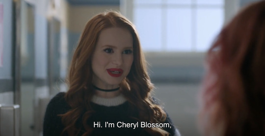
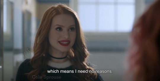
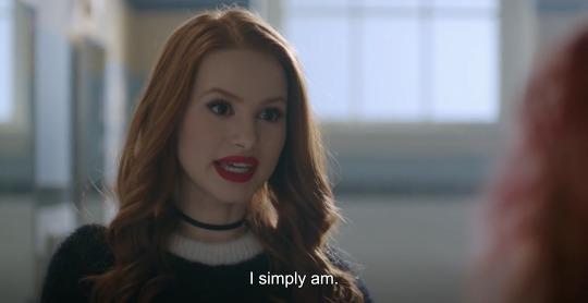

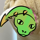
cheryl blossom / philip pullman 👍
#shes obviously lying through her teeth in this scene AND i actually think riverdale does a pretty good job at /#/ historicizing & contextualizing rather than fetishizing the behavior of different characters#that said. i just think its fun when everyone's like yeah i'm in a comic. i'm a walking talking archetype. what about it#why are you acting the mean girl in the context of riverdale is a tautological question that produces a tautological answer;#cheryl is the mean girl because every teen drama has one. if she ever managed to quit someone else would be assigned to fill the part :)#syllabus
331 notes
·
View notes
Text
304 notes
·
View notes
Text

Wild Women in Music and Literature, (syllabus), Angela Davis and Chinosole, Cross–Cultural Women's Literature and Culture, Women Studies 760 – Spring 1991, San Francisco State University, San Francisco, CA, 1991 [Constellations of Black feminism in UC Berkeley's archives – Stories of UC Berkeley Library. Carton 3:13, Barbara Christian papers, BANC MSS 2003/199 c, The Bancroft Library, University of California, Berkeley, CA]


#education#syllabus#school#angela davis#chinosole#june jordan#barbara christian#barbara christian papers#the bancroft library#university of california library#1990s
22 notes
·
View notes
Text

1/100 DOP (mon. aug. 28)
°•𖦹•°
now that sylly week is over, it’s time to lock down and get to work! i’m really liking my classes so far. if you know anything about me, you know that my intro to oceanography is the class i’m looking forward to the most.
i’m still working on forming a new workout routine, but that should be set by the end of this week. hoping to have at least one of my two transfer applications submitted by tonight!
°•𖦹•°
🎧: sober- childish gambino
📝: opia (n.): the ambiguous intensity of looking someone in the eye, which can feel simultaneously invasive and vulnerable.
#sylly week#syllabus#syllabus week#studyblr#studyspo#uniblr#collegeblr#courtneycant#courtneycantstudy#stemblr#ecoblr#bioblr#marineblr#courtneycant-study#courtney-cant-study#courtney-cant#uky#university of kentucky#studentblr#academia#chaotic academia#academia aesthetic#study aesthetic#100dop#100 days of productivity
17 notes
·
View notes
Text
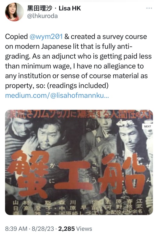
#Japanese literature#modern Japanese literature#syllabus#investigate#(not mine… just sharing from twitter)
16 notes
·
View notes
Text
SYLLABUS - abstraction
14 notes
·
View notes
Text
my exams ended a while ago but i thought i'd post all of that before it gets deleted
#student#studyblr#studying#syllabus#desi schools#im dying#study#studygram#exam season#final exams#exams are killing me#student life#exams#study techniques#schedule#study method#notion#to do lists#organisation#stay productive#to do list#study motivation#study timetable
19 notes
·
View notes
Text
Syllabus: Feature Creep ( and how to avoid it )
Let me introduce you to a term from software- and -game development: Feature Creep

Feature creep is the excessive ongoing expansion or addition of new features in a product,[1] especially in computer software, video games and consumer and business electronics. These extra features go beyond the basic function of the product and can result in software bloat and over-complication, rather than simple design.
( Feature Creep: Wikipedia )
To sum it up in the context of worldbuilding and design:
Feature Creep is what happens when a designer overloads their project with ideas, which ultimately ends up making the final design confusing. You'll often find that your design also loses its ability to communicate your ideas properly, as it drowns itself in its excess of inspirations and references.
But what does this look like in, say: character design?

This is Luso from Final Fantasy Tactics A2. On the surface, the character is competently illustrated. Everything is very nicely rendered with a good sense of structure and a high amount of detail ( if you're into that ). The proportions are fine, the style is very clear.
It is a nice drawing.
But upon further inspection, we start to notice just how many features the design actually has: Armour pieces, complex patterns, numerous dominating shapes and so. many. props. The palette, while not immediately clashing is also incredibly confused, spanning from just about any primary colour in the colour wheel, all contrasting one another, making it hard for your eye to find a place to rest when looking over the design.
If you were to take a look at the design and tell me what it was supposed to invoke thematically, what would you tell me?
- Well it's a mage ( mage book ) that is also a knight ( sword ) but mostly its a warrior with some kind of special proficiency in keyblades(??), but also there are some touches of nature and luck ( clover, ladybug on the belt, green, patterned cloth ).
You'd have a really hard time convincing me that the design is invocative of any one of its ideas.
(If you were part of the art community back in the 2000s to 2010s you'll also definitely remember all the memes about the angel-wolf-demon-goddess-mermaid-dragon OCs and all the derivatives of that particular line of design. Some faultily called these the markers of a Mary Sue character. Though I'd argue that Feature Creep can show up in any well written character regardless. Even those who are made by professionals, who are well aware of what they're doing: like Luso, for an example )
Feature Creep is, however, a typical marker of a developing designer or young artist who want to explore multiple ideas at the same time. Morally, there's nothing wrong with that. You can make as many hybrid creatures as you want. It is all in good fun.
But if you want to sell people on a design or a story, you're going to need to edit them down a bit.
Economy in ideas
Animated features and shows are probably among the mediums that approach their designs with the most limited amount of ideas.
That doesn't mean their designs are boring though, oftentimes they're actually incredibly effective since the limited amount of ideas allowed in a design means that designers can pour much more care into integrating the ideas into the final design.
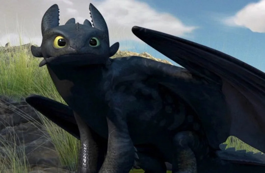
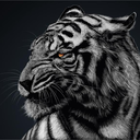
Let's take a look at one of the animation industry's latest greats: How to Train Your Dragon.
When Dreamworks artists sat down to design the dragons for HTTYD, they decided to go against the current trends.
The western hemisphere has long been plagued by samey designs, as the likes of Drogon ( Game of Thrones ) Draco (Dragonheart), Saphira (Eragon) and Smaug (The Hobbit), who has solidified the European take on the mythological creature into the cultural conscious. The designs in themselves are not bad at all, but when HTTYD suddenly took flight with its completely reworked ideas for what a dragon could look like - it was a breath of fresh air.
For toothless the designers seemed to have applied nothing more than two main ideas to their design. A black dragon with anatomical cues from an axolotl but the mannerisms and certain facial features of a black cat.
This design invoked a sense of familiarity. It was simple, iconic, slightly strange to those who hadn't been familiarized with the axolotl yet, and clearly communicated a sense of pet-like behaviour through its feline gestures.

Staying in the vein of feline creatures; Pokemon is perhaps even more restrictive in their idea economy ( at least for the most part ).
Many of the first generation pokemons were 'merely' combinations of animals mixed with either elemental concepts, such as the many evolutions of Eevee ( Flameon, Jolteon, Vaporeon, etc ), or Pikachu, a Rabbit that bears electric symbols incorporated into its design.
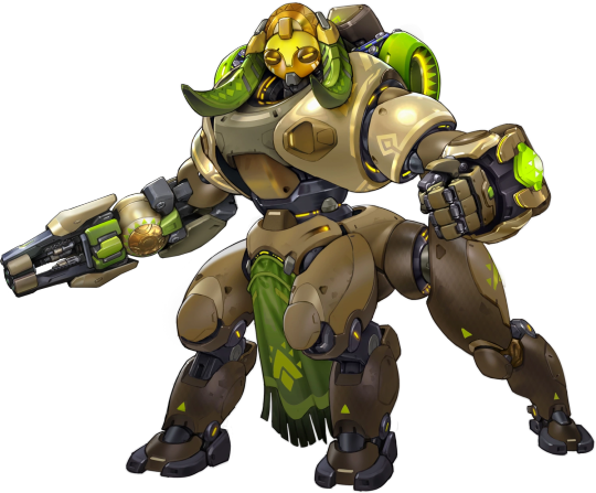
For something slightly more complex we can look to Blizzard's Overwatch game. Where a number of desigsn are inspired by combining real life stereotypes of certain cultural-historical peoples or occupations ( cowboys, ninjas, DJs/musicians, arctic explorers ). One example of such is the centaur-hero Orisa. Which combines the anatomical features of a quadroped creature with a human half on top. But with an added idea of incorporating patterns and assets that have been debated to be of Baluba origins. A tribe originating from Central Africa.
As you can see, designers usually stick to around 2-3 main ideas and then pepper in little extra details that are at least adjacent to their main ideas. It keeps the reading of the character consistent, and you're not at risk of overloading your designs with needless elements. If you're looking to make a character that is actively trying to look confusing, of course you can throw as many ideas in there as possible, but for when you need your design to convey a cohesive read to your audience ( which is supposedly most of the time ) you will do well in picking only a few ideas and incorporating as thoroughly into your design as possible.
How to chose your ideas
There aren't any hard and fast rules as to why you should pick some ideas over the other. It mostly comes down to your preference as a designer and storyteller. I personally prefer following these three milestones, as they ensure that your ideas are relevant to your design and provide the potential for visually interesting designs.
Pick those ideas that can provide the most thematic relevance
The most obvious choice is that which relates to your design's main idea.
An example for props:
You need to make the prop looks modern to your audience. Therefore you chose ideas that incorporate smooth, sleek shapes into the prop's design ( reflecting the modern design trends of today ). Maybe you'll combine the soft, rippling shapes of waves on the sea with the shape of a chair or couch, to eliminate the need for edges that could make your seat seem "clunky" and 'out of style anno 2022'.
Example for characters:
Your character likes fish, therefore you incorporate a number of blue-ish greenish colours into the pallette. Maybe you even add a few 'fin-like' shapes to the silhouette or outfit.
Pick the most interesting ideas
Perhaps you're picking between two aquatic ideas. Let's say: Ships and Seamonsters. Which one do you feel provides the most potential for fascinating solutions to your design?
If you're making a sailor-character, perhaps the Ships are more interesting to you. If you're making a mermaid, looking to seamonsters might be a pretty cool idea.
Pick those who contrast the most
Humans -love- contrast! it brings interest nearly by default in anything from character design, to environmental concept art, storywriting and art styles. It makes us curious as to how things work and why they are the way they are. Which is ample ground for you to do some interesting worldbuilding or character writing.
If you are to design a submarine, you could just make a submarine. But what if it was in the shape of a seagull? A bird that only enters the water for fish once in a while. Hell, what if your main character; a young scholar who is very much not comfortable being underwater, had slight bird-like features to really emphasize how out of their element they are.
These are just three parameters which I use to sort my ideas. Sometimes I also do stuff for the hell of it, but for the most part I like to put a lot of thought into how my ideas contribute to the design. For the most part, I'll try to connect my ideas to the world and the story as much as possible to make the whole experience seem more cohesive.
What you value in your ideas is up to you, perhaps your art style demands that you use certain ideas to stay consistent. Maybe you prefer designing with certain palettes or shapes. That's fine.
No artist picks and chooses their ideas for the exact same reasons. Everyone has biases. But it is important that you are aware of your choices. Moreso important that you are aware that you don't squash too many ideas into a design.
Remember, every idea is a good one, maybe it's just not always relevant in the context you got it in. So save the unused ideas in a note somewhere - it might become useful later!
Mod Wackart ( Donate )
( Linktree )
92 notes
·
View notes
Text
when the internet says a word has less syllables than you pronounce it with
2 notes
·
View notes
Text
CW: Christianity, homophobia, transphobia, queerphobia
Hi hi! So a couple of years ago, I started listing down all of the resources that helped me to go from being a non-affirming/queerphobic Christian to being a queer and queer-affirming Christian (oops lol). I'm now putting this reading list/syllabus out there in case anyone else might find it helpful (you know, in the spirit of the commons and "from each according to their ability"). The reading list is free to download, and feel free to distribute and to modify it as you like.
There are other better lists of resources out there, but what motivated me to put together my own reading list was that in my own journey towards becoming queer-affirming, I found that for me to reconcile Christianity and queerness, it was necessary to reconstruct my understanding of God's character, my understanding of how to read the Bible, as well as my understanding of the nature and history of Christianity. In short, being anti-queer rested on a number of other assumptions and beliefs.
As such, this reading list not only addresses the matter of how to interpret the few Bible verses related to being gay or trans, but hopes to help the reader envision a worldview in which being queer-affirming is just the obvious choice. For example, there are resources about the theology of sin and judgement, the theology of systemic oppression, the theology of children, and more.
I know that for some people, changing their minds to affirm queer people can be as simple as realizing that love is love, but for the stubborn and systematically-minded people like me, I hope this reading list can be of benefit. And, whoever you are (queer or not, queer-affirming or not, Christian or not), I hope that this list may help you to remember that you yourself are so so loved 🏳️🌈
#queer#queerness#queer theory#queer theology#lgbt#lgbtq#gay#trans#christianity#christian#christian theology#deconstruction#deconstructing#progressive christianity#reading list#syllabus#curriculum
9 notes
·
View notes
Text
literally talking to the walls of my room like. riverdale's internal logic relies on the explanatory power of one's origins to an absurd degree, framing the actions of the protagonists as prescribed by their generational predecessors to such an extreme that the town's founding years not only provide meaning, context, and motive to current events as is typical in an archetypal place-based narrative but futhermore exert a horrifying control over the characters, compelling them to repeat or rebel against the actions of long-dead townspeople to whom they are only distantly related. these scenes from the past, when included in the show, are filmed using the same actors as the present-day scenes, producing the past as not only reminiscent of but in some aspects identical to the present. blood and bloodlines are used by various characters as explanatory schemas for the behavior of different characters throughout; riverdale is a place overdetermined by its own origins to the point that our protagonists spend years trying and usually failing to escape the combined generational curses of an entire town whose entire history consists in the repetition of its own genesis ad nauseum. does this seeming over-reliance on origins exaggerate the process to the point of effective parody, or does it merely & more straight-forwardly reinforce the [genetic] origin as privileged locus of [fictional] meaning?
a potentially conflictual reading of riverdale's historical "origins" is that they are invented or produced through the act of jughead's narration of riverdale as text; this reading posits that there is no "before" the pilot of riverdale, save what jughead invents to give additional meaning to the events which make up his plots. riverdale is his puppet show; everything in the text has been filtered through his point of view, which is to say that everything acquires the exact same level of (un)reality, whether it's a comic book character come to life or the sins of one's ancestors. in this framing, the true origin, and the key to whatever meaning might be made of this text, is the moment jughead's narration begins in the pilot with "our story is about a town.." in foregrounding jughead's ongoing acts of authorship and creation which function to continually produce the narrative & all it contains, riverdale destabilizes epigenetic origin as a locus of meaning by framing it as in some way artificial, invented, unreal; however, it does this by substituting another, no less authoritative, specifically authorial origin in its place.
and there is still a THIRD possible genealogy through which we can read riverdale as understanding itself, namely the genealogy of the cinematic canon. we well know that riverdale is constantly referring back to earlier moments in the history of film, from 70s noirs to 80s coming of age movies to 90s thrillers to etc. etc., not so much situating itself within this history as aiming to encompass all of the various stages of the medium's development. this argument could be broadened to include the histories of other prominent cultural forms, namely the novel and the comic strip; the meaning in riverdale might be said to be primarily derived from comic conventions, the principles of character creation and economy of image that have governed strips for decades and which now cause riverdale characters to wear outfits that have no in-world meaning except to refer back to their original iconic wardrobes, e.g. archie and jughead's S and R t-shirts.
which of these frames has the most explanatory power? which best helps us to understand or analyze why events in riverdale play out the way they do? i think in most cases one needs some combination of the three to be able to even begin getting at what's going on, which suggests that at least part of riverdale's project is the destabilization of the genealogical narrative via the introduction of several distinct, at times competing, narrative origins. riverdale is a story whose meaning is located simultaneously in the past, the act of narration, and the development of cinema and comics as mediums. while this structure does not necessarily step outside of the dominant symbolic framework that looks to origins in order to generate the meaning of a text, it is in typical riverdale fashion that the show wants to do everything at once, meaning in this case that rather than privileging one frame through which we are meant to make sense of the show's content, we are given to several possible readings which are all compelling in their own ways & when taken together succeed in troubling the final authority of any one interpretation.
#took a break from the liveblog this week to watch some other programs but she is still HEAVILY. on my mind#the jughead paradox is going to blow this whole thing wide open btw#syllabus
184 notes
·
View notes
Text
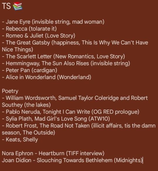
I've added on so here is the list again: ✨️
4 notes
·
View notes
Text
3 notes
·
View notes
Text
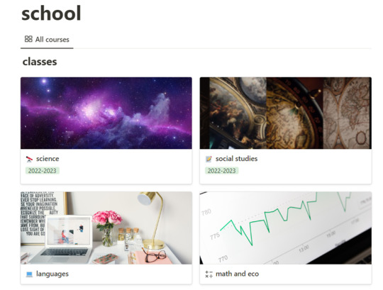
uni
do you ever just get your syllabus for the next semester and realize how great the idea of being a sugar baby sounds?
#academia#uni#college#school#syllabus#moon#dark academia#chaotic academia#classic academia#helpme#imdying#screamingandcryingrn
7 notes
·
View notes
Text
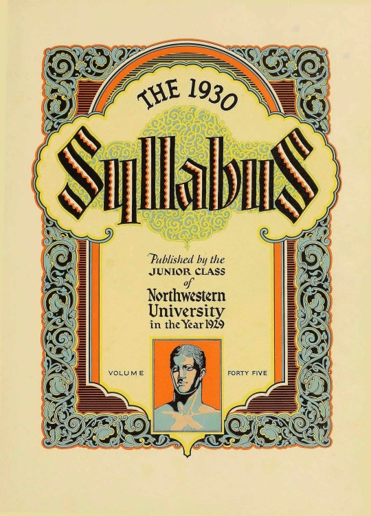


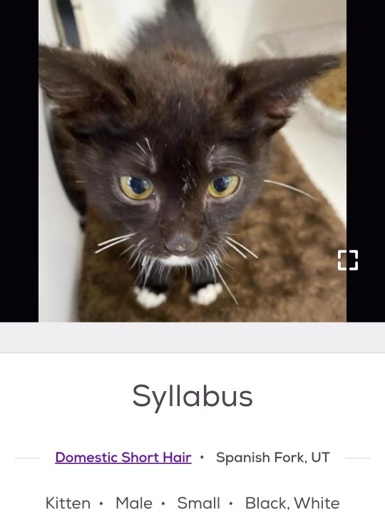
1930 Syllabus Yearbook. Northwestern University. Evanston, Illinois.
2 notes
·
View notes
Text
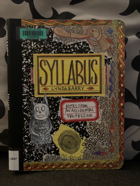
Syllabus by Lynda Barry
11 notes
·
View notes
Last Seen Blogs

mi-koo
`
ignikinetic-blog
Devlin O'Clery
wickedcriminal
this is the story of becoming a hero the hard way
mightbetter-blog
That's it.

arantarisu-yamu
•アランタリス•