#LOT polish airlines
Text

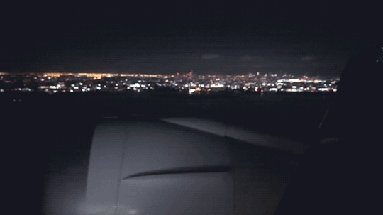
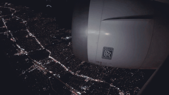

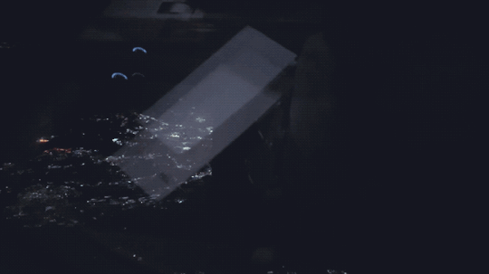
From a recent flight.
LO27 (9/13/23)
#airplanes#travel#flying#Airbus#Boeing#Airbus A380#Boeing 787#airliners#aviation#Emirates#LOT Polish Airlines#mine#gif#gifset
95 notes
·
View notes
Text
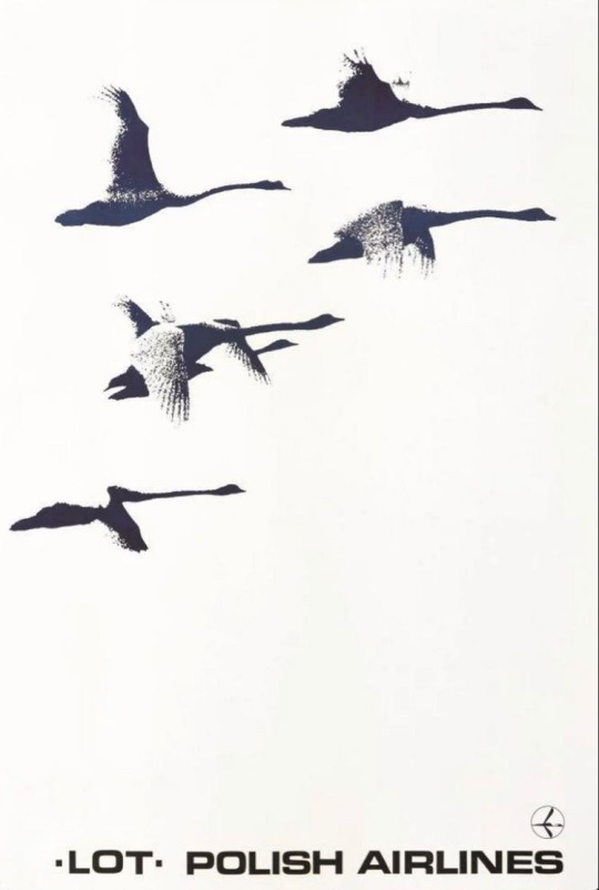
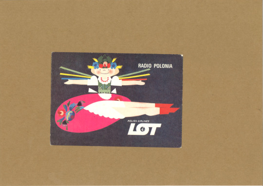
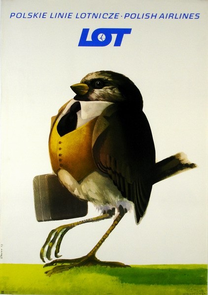
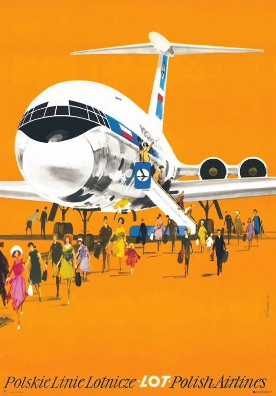
LOT • Polish Airlines
~ Zbigniew Malicki (Polish, b. 1944), circa 1976
13 notes
·
View notes
Text

New super attractive blond flight Captain takes to the sky with LOT
#pilot girl#cockpit cutie#airline uniform#stunning blond#Polish airline#smart woman#white shirt#collar and tie#flowers#LOT
26 notes
·
View notes
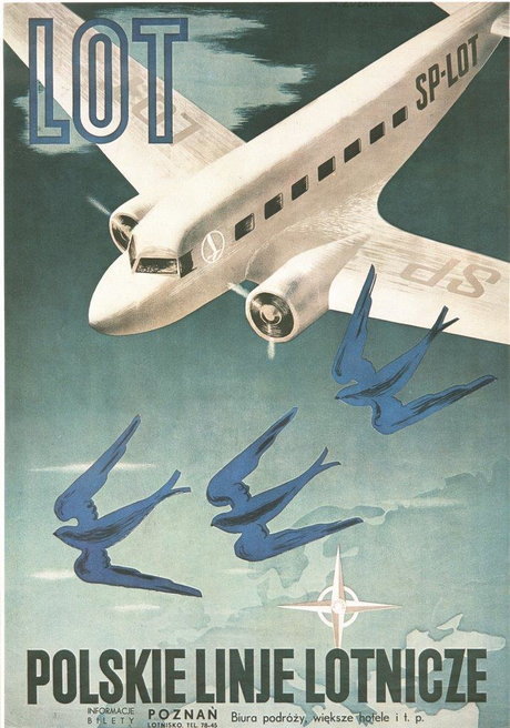
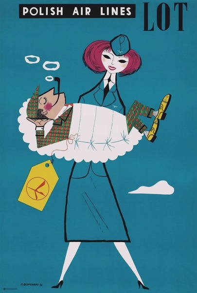
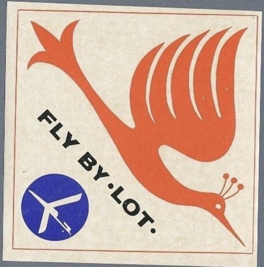
Text

1958 next time I fly by LOT. Polish Airlines LOT
Source: Pinterest / fabienne jerot
Published at: https://propadv.com/airlines-poster-and-ad-collection/lot-poster-and-ad-collection/
5 notes
·
View notes
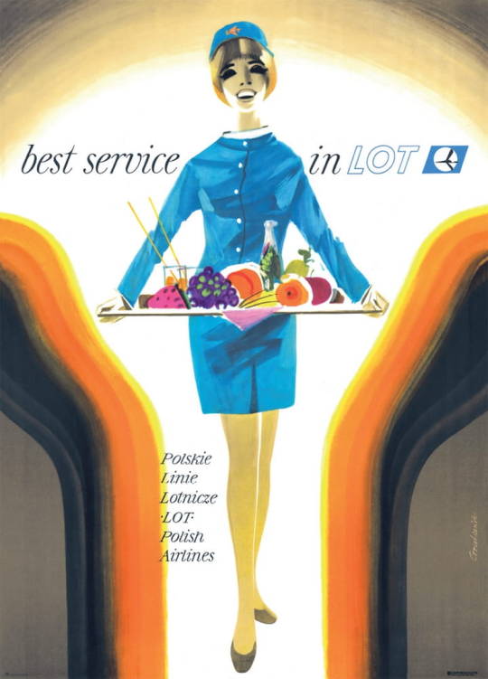
Photo
2 notes
·
View notes
Text
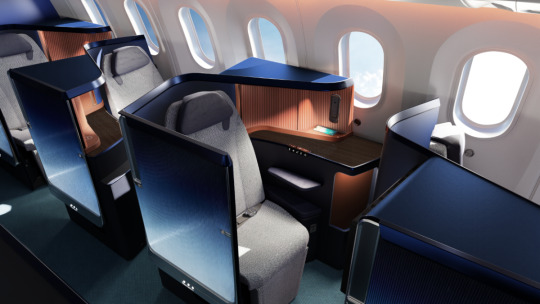
LOT Polish receives massive upgrades, makes for a competitive European product
On a recent flight through Warsaw to Chicago i was able to experience LOT Polish Airlines business class product, and I have to say, apart from a slightly dated cabin, the product was near excellence. There will be a review of that on my site soon, as well as a full video trip report on my recently updated YouTube channel (subscribe if you haven’t already so you can see when this report will go…
View On WordPress
#Airline#aviation#Business class#design#Economy#european#featured#LO#lot#new seats#news#polish#Premium Economy#Recaro#star alliance#transportation#upgrade
0 notes
Photo
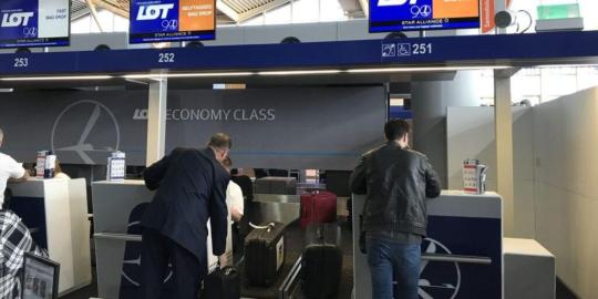

Check-in Procedures for LOT Polish Airlines
0 notes
Text

28.06.2023
Seven-hour lay-over in Warsaw. End me now.
#179of365
0 notes
Photo

LOT Flight Deal: From Just 165PLN Travel from Warsaw to London
Visit Now To Get Latest Coupons: https://shoptopdeal.com/store/lot-polish/
0 notes
Text


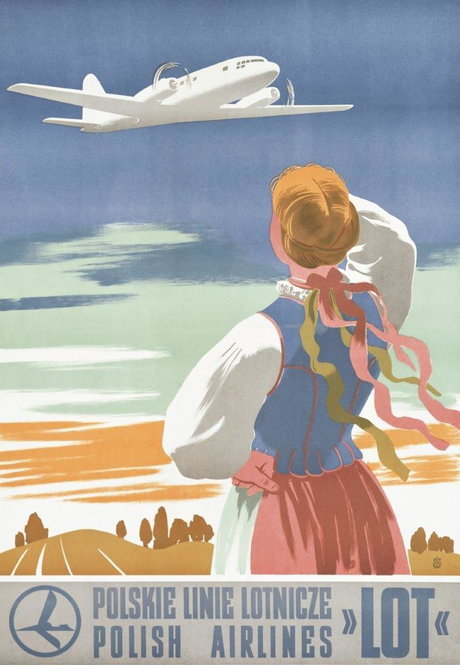
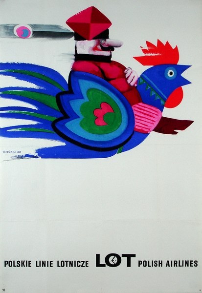

vintage Polish posters promoting Polish Airlines LOT
#there are so many more amazing ones#for the movies as well. polish movie posters from communist times are known worldwide#you can google if you want!#posters#vintage#vintage posters#art#eastern europe#poland#polish#posted by me
420 notes
·
View notes
Note
400 request! Leon x female reader. How they meet or first impressions.
(Also omg I’m so happy you write about resident evil too!)
Thank you, anon! I'm happy I write about Resident Evil too x
Travel Pillow
Leon Kennedy x female reader, fluff
Looking at the rain smacking against the tarmac through the plane window, you’re not convinced you will be taking off any time soon, despite the airline’s confidence when they’d opened the boarding gate 20 minutes ago. The last of the passengers are finding their seats in the small plane, only two seats either side of the aisle. You feel a knee bash against your thigh and you turn, seeing a handsome man with light brown hair framing bright blue eyes, jeans with a white tee and a semi-smart black jacket stood over the empty seat, looking apologetic.
“Sorry.” He rubs the back of his head, scolding himself for a bad first impression on the pretty girl he is going to be sitting next to for the next three hours. “I swear they make the leg room on these tin cans smaller and smaller every time.”
“No harm done. And, yeah, I agree - trying to get you to splurge for the emergency exit.”
“Mm, and my work won’t cover that expense.” He tugs off his jacket before he sits down, banging his knee against the upturned tray table on the seat in front and winces. “Yep, should’ve got some knee pads.”
You laugh at that and he smiles, sensing it’s genuine in nature. Makes a change.
“Name’s Leon.” He offers you his hand and you take it, giving it a shake and offering your name in return.
“Take it you’re traveling for business, then?” You probe – he’s easy on the eyes and much more interesting to look at than the rain out the window.
“Was.” He leans back, buckling up his seatbelt. “On the way home now. You?”
“Moving - starting a new job on Monday.”
“Oh, wow. Moving via plane?”
You shake your head. “Got a guy driving my stuff over in a few days. Only got the job offer Wednesday.”
“Huh,” Leon mulls. “They sound pretty keen for you.”
“Yeah, well-”
The PA system pings, interrupting you. There’s a crackle of static before a voice rings out.
“Good evening, this is your captain speaking. I’m afraid we have a storm warning rolling in and, currently, we are unable to take off. As we are still at the gate and it will be a little while before we can depart, we are going to ask you to disembark.” Groans ring around the plane. “Please be sure to take all your hand luggage with you and be sure to pick up your complimentary drinks voucher from the cabin crew.”
“Bets on it excluding alcohol?” Leon asks, unbuckling his seat belt and getting to his feet as your fellow passengers follow suit - grumbling about the delay, grabbing their bags. “Got anything in the overhead?”
“Yeah.” You get to your feet, having to hunch over a little as the side of the plane slopes. “Black duffel bag.”
“I got it.”
“What a gentleman.” You smile, watching as he raises his arms above his head to reach for your bag, your eyes lingering on the way his biceps tense.
“I may have an ulterior motive.” He smirks, pulling the bag down and hanging it off his shoulder with ease. You hadn’t been exactly subtle while you had admired his arms.
“Oh?”
“Hoping you might partake in a non-complimentary drink with me.”
“I think I can manage that.”
--
“So, what do you do?”
You’d grabbed a cosy table for two in the corner of the airport bar, a clear view of the departures board in sight in case any news came through about your delayed flight. The complimentary drinks voucher had excluded alcohol, so you had ended up with two drinks in front of you – a soda from the airline that you’d quickly polished off, and one from your handsome seat-mate that you made sure to take your time over.
“Me?” Leon shrugs a shoulder. “I work for the government – just boring bureaucratic nonsense, wrapped up in a lot of red tape. How about you?”
“Software.”
“Guess you’re pretty skilled to be in such high demand.”
“Something like that. Just a niche area. Money was too good to say no.” It wasn’t strictly a lie.
“And, if I can be so bold, no-one to leave behind?”
“Bingo.”
“Well, I feel that. No-one for me to return home to. Work keeps me too busy – can be away a few days to a few months.”
“Ah, so you don’t always flirt with women you meet on planes?”
“No,” he shakes his head, “This is just an elaborate apology for bashing your knee earlier.”
“Gotcha.” You take another sip of your drink. “So, how long have you lived in DC?”
“A few years now, on and off.”
“Good, then you can tell me all of the bad coffee shops and tourist traps I need to avoid.”
Leon shakes his head, grinning all the while. “I can’t hand over that information, you’ve gotta work your way through sucky cups of coffee like every other fine resident that came before you.”
“Please?” You pout, tilting your head and he’s so tempted to give in with how adorable you look.
“Cute, but no. You’ll understand one day.”
“Not even a clue?”
“Uh-uh, I’m sorry.”
“No, you’re not.”
“Yeah,” he lifts his glass to his lips, trying to hide his smile. “I’m not.”
“Is there anything you can tell me about DC, then?”
He ponders for a moment. “They really like brunch.”
“Maybe…” you rest your hand on the table, wondering if you could reach out and touch his, “..you could take me for br-“
“Passengers for delayed flight AA4628 are asked to head towards gate 34 to commence boarding.” The PA system announces from above your heads. “That’s passengers for delayed flight AA4628 are asked to head towards gate 34 to commence boarding. Thank you.”
“Guess we better head back.” Leon downs his drink and gets to his feet, heaving your bag back over his shoulder.
“Mm,” you agree, downing the rest of your own and your question, and following him back to the gate.
--
The drink must’ve gone more to your head than you thought, especially after a frantic few days of packing, late nights from trying to get everything in order before you moved across the country because you don’t remember the plane even taking off.
You wake up to your ears popping as the plane begins its descent and slowly open your eyes, wondering why the seat in front of you is at an angle. It’s then you realise you’re not upright in your own seat, instead cuddling up into someone’s chest, almost nuzzling your cheek into them, an arm draped around your shoulders.
You shoot up, the arm sliding off and you see Leon besides you, smiling sleepily, “Hey, sleepyhead.”
“I am so sorry.” You can feel your cheeks burn as you worry if you drooled, or snored or…
“What, for using me as a pillow?” He chuckles. “It’s fine. For the record, I fell asleep too so it was mutually beneficial.”
“Oh. Good.” You nod, settling back into an awkward silence as the plane continues its descent towards the tarmac and you turn your attention to the window, looking down at the place you’ll be calling home for however long.
As the plane lands and begins taxiing to the gate you wonder if you should ask Leon for his number, or give him your own. It would be nice to know someone in DC, after all. You pull your phone out your pocket, about to ask when an air stewardess appears at Leon’s side, whispers in his ear and he smiles, nods in thanks and unbuckles his seatbelt to stand, before he hesitates and turns to look at you, noting your look of confusion.
“Seems work’s been waiting for me since our delay. My boss has pulled some strings to get me off the flight first, so…” He swallows, disappointed - though he knows he shouldn’t be. He knew from the moment you started talking, despite the feeling in his stomach, that it was fantasy where he could pretend that after you’d arrived in DC, the two of you could exchange numbers and he’d take you out for the good coffee, brunch and dinner, buy you flowers, kiss you under the streetlights…
Idiot, he reprimands himself. You’re a sweet girl, too sweet for the world he’s involved in.
“It was nice to meet you.” He smiles. “Good luck with the new job.”
“Oh.” You can’t hide your disappointment as he finally stands, the air stewardess waiting to lead him back up the aisle. “Thanks. Nice to meet you too, Leon.”
He nods, once, and you watch him walk away.
--
You hesitate outside your new work, the building looming over you. You still don’t know how to feel about this, but how can you reject a job offer from the President of the United States?
You bin the cup of coffee you’d bought from a cart in the park on the way here – mistake, curse Leon for not giving you any heads up – and walk inside, navigating through security and reception, before being told to head up to floor three where an Ingrid Hunnigan is waiting to brief you, standing by the elevator doors. She’s a smartly dressed woman, curly hair tied up in a bun and studious glasses, though she greets you with a smile and a handshake.
“Welcome to the DSO. Glad to have you – I’ve been admiring your work over the weekend.”
“Oh, thank you. I’m… It’s good to be here.” You correct.
Hunnigan doesn’t press, instead gesturing you forward. “Sorry, I promise we’ll do a whistlestop tour another time, but you’re going to be hitting the ground running this morning – we have an intel briefing at 0915.”
“We?”
“Mm – me, you and Agent Kennedy.”
You’re led to a small meeting room and told to take a seat, but Hunnigan remains standing by the door.
“Coffee? Since I haven’t had chance to give you the tour, it’s the least I could do.”
“Oh, yeah. Thank you.” You reply, taking a seat.
“Be right back.”
You fiddle with the hem of your shirt, looking around at the room – not that there’s much to take in, it’s a small, circular table with six chairs around it, a projector hanging from the ceiling and some adaptor cables poking out the middle for someone to connect a laptop.
The door opens a couple of moments later and you turn your head, eyes widening at the figure who enters.
Leon looks equally surprised for a moment before a smirk crosses his lips and he strides in, taking the seat opposite. He leans back in his chair, crosses his arms and quirks an eyebrow.
“Software, huh?”
--
You wake up to your ears popping as the plane begins its descent, your face resting on Leon’s chest, his arm wrapped around your shoulders and head resting atop your own – an all too familiar routine when you travel together by plane. You nuzzle your cheek into his warmth, feeling too content to open your eyes just yet when you feel him move and place a kiss upon your crown.
“Afraid it’s time to wake up, sweetheart”
“Mm, five more minutes. We can’t be landing already, we only just left the gate.” You protest.
His chuckle vibrates through your cheek. “You were out like a light before we even took off. I’m beginning to worry you only keep me around as your personal travel pillow.”
Sighing, you sit upright, trying to rub the crick out of your neck. “That, among other reasons.”
“What other reasons?”
“Hmm,” you pretend to muse, cupping his face in your palm and press a soft kiss to his lips before pressing your forehead against his. “Cos I love you.”
“Love you more.”
--
Comments, likes and reblogs make my whole day! x
Masterlist . Requests welcome . Commissions/Ko-Fi
345 notes
·
View notes
Text
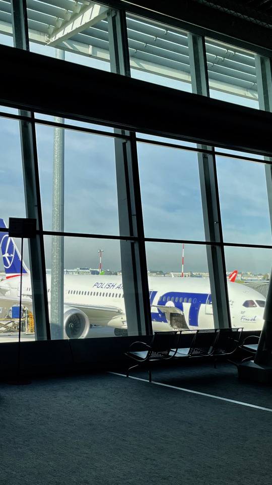
WAW/EPWA
11 notes
·
View notes
Text
Fly by • LOT•
0 notes
Text
Toru Oikawa headcanons

Friendly reminder that English is not my first language. You can check my Masterlists both in English and Polish here. Consider supporting me on Ko-fi.
Other headcanons from this series can be found here.
• Relationship with Toru would be a bumpy and winding road, one that is sometimes nice and pleasant and then turns around and leads you through the worst forest you have ever seen in your life. I think Oikawa would fall in love with someone who blew his mind with their indifference towards him. It doesn't matter if you were a childhood friend or someone he happened to meet at highschool. It would be important for him whether you don't treat him like his fans do.
• Winning the hearts of the girls he could have easily wouldn't be a challenge at all. And the best things always require effort and work. He follows this philosophy in volleyball and it would be no different in the case of love.
• You can hit him on the shoulder and in the head with books for every stupid comment but if he sets his sights on you, you can be sure that he won't give up. A relationship with him would consist of flirtations that you wouldn't take seriously and rare, serious moments when you would feel that what he was saying was sincere and came from the heart. Of course, someone or something would always have to interrupt you.
• Have you styled your hair? He will destroy it. Is this a new hair tie? Now it's his, he'll keep it for good luck. Who gave him permission? He gave it to himself. Same case with casually adding -chan to your name...
• Hajime would be the greatest wingman in your relationship. For a long time he would say that Toru needs to take care of himself because he doesn't deserve you but eventually he would realize that you couldn't live without each other. He wouldn't push either of you to confess but he would certainly discreetly try to give you as much time alone as possible. And it's not easy to find excuses for so many Aobajosai members...
• Toru knows what he wants. And although you would have to wait to hear it in a serious and mature way, it would have been worth it. He would go for a walk with you somewhere on the boulevards, by the water with a nice view. Surrounded by the dim, night lights, he would tell you how he felt. And these would be sincere words. Different from those that he feeds many people on a daily basis. Thoughtful and adequate as always but not superficial, hidden in the depths of his mind when he thinks about your smile in his free time.
• Oikawa likes it when you take off his glasses and then kiss him. He jokes that it's a bit like a scene from a movie. And it's even better when your friends are watching. Let them be consumed by jealousy. One time Kageyama asked you if you were sure you knew what you were getting into.
• Half of the serves since you became a couple are dedicated to you. At training, in high school, he will shout about it loudly, as long as you are anywhere nearby. In more serious matches, when he got into the Argentine national team, he simply put two fingers to his lips and blew a kiss towards the audience. Half the fans were dying of delight before they finally realized you were in the bleachers.
• Sometimes it's hard to balance a career as a professional setter with daily responsibilities. You travel with Toru but for most part, your relationship is a long-distance type. You talk a lot on the phone and on video calls. You get as many discounts on airlines as possible to see each other as often as you can.
#oikawa toru x reader#oikawa tooru#haiykuu!!#haikyuu x reader#headcanons#25/7#haikyuu#oikawa x reader#toru x reader#kageyama tobio#hajime iwaizumi
100 notes
·
View notes
Text
No. 55 - Finnair [+ Centenary Livery]
So I know I'm in the process of writing a bunch of longer posts and thus haven't posted in absolutely forever, but I had to let something cut the line very quickly because in this case it was somewhat time-sensitive. I've missed the actual date by two months, but if I get in a post while it's still 2023 (...in my timezone, at least, so sorry to actual Finns busy enjoying 2024) I think that counts, and this entire blog is about what I think, so that means it counts.
On 1 November 2023 Finnair became the sixth airline to turn 100 years old, consistent with its status as the sixth oldest airline in continuous operation. I wish I'd started this blog earlier in the year, or prioritized differently, because Aeroflot and Czech Airlines also turned 100 in 2023, but...well, I didn't. You'll probably see them both in 2024 instead. Finnair, however, was requested by @kuivamustekala - particularly their centenary liveries. Requested a long time ago, even. So I'm going to hope that late is better than never and throw Finnair one last birthday party to wrap up 2023 by looking at where they started, where they are now, and what they've been doing to celebrate.
1923: PROTO-FINNAIR
Finnair, obviously the flag carrier of Finland, was founded in 1923, but its first service was in early 2024, using a Junkers J.13 (fitted with obligatory floats, as there were no suitable airstrips in Finland at the time).
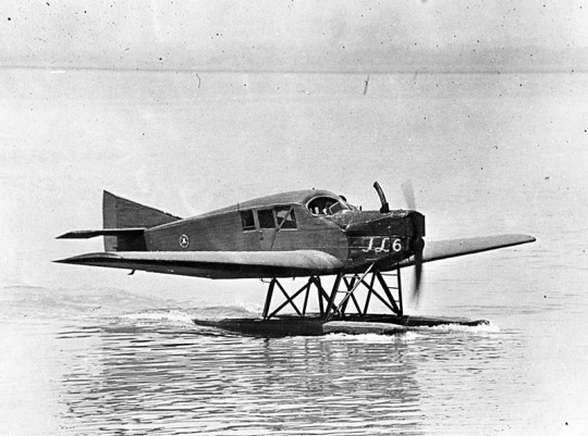
image: Joseph Eaton via US Navy National Museum of Naval Aviation
This is actually the US license-built version, the Junkers-Larsen JL-6, but I couldn't find any pictures of actual J.13s on floats.
Unfortunately, Finnair was founded under the name 'Aero', which is probably the actual single worst name for an airline I have ever heard. We can jest and joke about things like Jet2 and Fly Air, but I sincerely do not think I have ever seen anything with worse SEO than an airline named 'Aero'. Even for 1923 this was fairly dire - back then, as for much of history, airlines were generally named for the area they served. Aero may have been a private company, rather than state-owned, but that didn't mean they couldn't name themselves for the area they served - private airlines have always done this and still do. Incredibly enough, there was a second 'Aero' founded in Poland in 1925, but that was quickly merged into what would become LOT Polish Airlines, shedding the name like a chrysalis.
Bafflingly, even when the Finnish government bought the airline in 1946 (they still own a majority share of it today) they didn't bother to change the name. They did begin writing 'Finnish Airlines[1]' on the fuselages, but as far as I can tell this appears to have been more of a stylistic flourish of sorts than an actual rebrand, or maybe even a clarifying subtitle on the very nonspecific name. In 1953 they began marketing under the much catchier 'Finnair', but the company remained legally named 'Aero' until literally 1968 and the fuselages still read 'Finnish Airlines'.
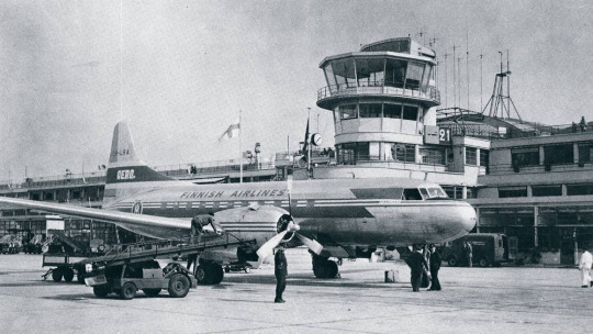
image: Finnair
An Aero/Finnish Airlines Convair 340, photographed in 1953 in a livery which included both the large 'Finnish Airlines' wordmark and 'Aero' on the tail.
Early Finnair, like most early airlines, didn't have a particularly standardized livery for its fleet, and even where it did it's not very well documented. Finnair unfortunately has some of the poorest documentation for livery evolution of any large airline I've discussed so far, which really surprised me. That said, it's when the name became Finnair that things begin to be easier to find, and so that's where I'll begin.
1968: CLASSIC FINNAIR

This original logo[2], introduced in 1968, was designed by Kyösti Varis - at least, that's what every logo database I looked in said. I actually couldn't find either Finnair or Varis confirming this[3], but I still think it's probably true. Unlike designers like Vic Warren and Lindon Leader, who wrote and gave interviews about their designs for major airlines, Varis appears to have other preoccupations. He is enormously successful and prolific, to the point where his website doesn't even mention Finnair. According to the timeline he provides he would have either been creating this logo freelance or in his very last days at Advertising Agency SEK (probably the latter, since they did the two subsequent iterations), and based on his history as a typographer I think it's safe to say the letterforms are his creation as well. Also according to his timeline, he is younger than Finnair! And we almost have the same birthday.
I like the original Finnair branding. It's not ostentatious, but it's nice and sleek, with that forward slant I love in airline branding and a long unbroken line (both in the 'F' logo and in the even heights of the letters in the wordmark). It looks aerodynamic and the rounded, blocky letters have a hint of that 60s futurism while not being gimmicky. It's kind of incredible looking at it next to the '91-'94 FedEx wordmark, which occupies the opposite end of the sliding quality scale of TRON-looking text. The design as a whole is simple enough to easily reproduce but distinct enough to easily recognize. The shade of blue chosen is a fair bit lighter than the blue of the Finnish flag, but visually pleasing enough. They basically keep iterating on this general concept for the rest of their history, which I think is fantastic - no need to get rid of something that's working for you. It's nice to see an airline not feel pressured to reinvent its logo and livery every 20 years. That's about it for the logo[4] - what about the livery?
As mentioned prior, Finnair's liveries, before quite recently, were very poorly documented. Variants definitely existed between different types and different periods in the company's history, but the broad strokes of the branding seem to have remained almost startlingly intact for around thirty years.
image: Letterform Archive
The cover of a style guide from 1985. If it's changed from the 1968 original, I can't tell how.
But I'm really here to talk about one thing: the liveries.
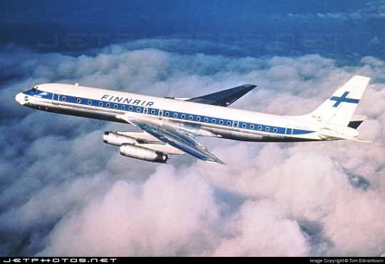
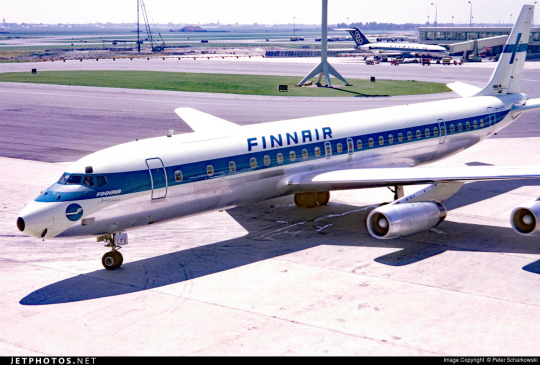
The above image was from Finnair's own archive and was taken in 1968[5], making it contemporary with the introduction of the Kyösti Varis branding, as well as lining it up with the 1969 addition of DC-8s, like the pictured airframe.
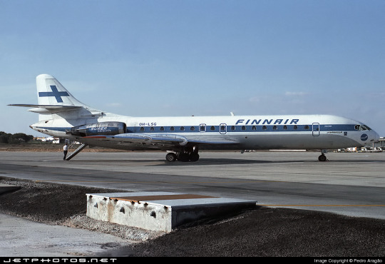
For the majority of Finnair's history, their livery is always going to look something a little bit like this. Primarily white, with a thick blue cheatline (in what I call the domino-mask style, where it's vertically centered around the cockpit windows) that lightly flips up at the very end and a blue cross on the tail to represent the Finnish flag.
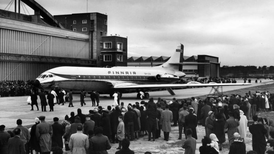
Finnair says this image is from 1960. If so, the livery was already well on its way to existing prior to 1968, with my guess being that it was introduced in 1960, along with the first jets in Finnair's fleet - the pictured Sud Aviation Caravelle, which pioneered the swept-wing, aft-engine format later seen on immensely popular jets like the DC-9 and Tu-134 - the latter of which was commissioned specifically because Nikita Khrushchev was so impressed with the Caravelle's aft engines and the quiet cabin experience they provided. It's a plane with a lot of unique visual features, featuring a nose that looks almost slanted downwards (a copy of the de Havilland Comet nose), a cruciform tail (instead of the more efficient T-tail used for future rear-engined designs), and triangular passenger windows. Most crucially, though, it was more or less the first short-range jet on the market. This made it perfect for an airline like Finnair, which at this point didn't really go that far from actual Finland.
This 1960 photograph provides a very strong blueprint for what was to come. It's the first iteration of the livery to say 'Finnair' instead of 'Finnish Airlines', and it's introduced a modern-for-1960 single-rule cheatline, although this early version was flipped horizontally, curling up at the front to frame the cockpit windows instead. (I think the white paint also cuts off behind it, leaving the space in-between the cheatline and painted nose blank metal, but in black-and-white it's somewhat hard to tell.) I do think I prefer the modern version. The use of the white downward curve with no blue hemming it in creates a really nice effect where it blends with the unpainted metal underside, due to the metal being right where you would expect to see a shadow anyway. (This effect is why I'm not quite sure where the paint ends on the Caravelle, and am just guessing based on which parts are noticeably reflective.) I definitely prefer the change made to the tail, where the single line of trim at the end of the rudder was replaced with a white canvas for the Finnish flag.
While I do tend to have a slightly pessimistic outlook on primarily-white liveries, I will say that if you're going to have a primarily white plane, and you are the flag carrier of Finland, this is a fairly understated and stylish way of incorporating it. While I probably would have done it on the main body, over where the first set of doors is, instead of on the tail, I think this is far from the end of the world. What they have is a nice, elegant taper where the tip seems to point directly at the tailplane, and it looks neat and intentional. A lot of airlines tend to just awkwardly slap a logo on their tail, which often looks really sloppy due to poor alignment or even just out-of-place entirely, and Finnair avoids that while keeping the tail from being completely blank. Having an element on the tail that's more horizontal than vertical, like the old 'AERO' rectangle or the tail rectangle on the one decent livery Lufthansa ever had.
If you look in the background, you can see that wow has the Olympic Air livery looked like that for a long time! But that's a story for soon.
Additionally, some details were added on the nose. You can see on this DC-8, photographed in 1969, that the nose features an e-girl cheek stamp of the Kyösti Varis logo. Next to it is the name of the aircraft - in this case, Jean Sibelius - in really difficult-to-read thin text. (Finnair unfortunately appears to have stopped naming their planes by the late 1970s, but at one point they would frequently be named for Finnish people and places.) The 'domino mask' goes quite a bit beyond the cockpit windows to create a wider line from the side. I wish that the logo could have been integrated some other way, because the extra little blue thing just looks cluttered, but I can't imagine how they would do it without just replacing the cheatline. I mean, that would have been an option - indeed, it's what I would have done[6] - but assuming that they keep this general look I think the logo just can't fit in on the livery. The engine nacelles, maybe? Though that would still present issues on the Caravelle, where the engines are directly over the cheatlines. I also wish they would have made it a bit easier read the name, because I like to know what the plane's name is - thankfully, some later paint jobs actually do this before, tragically, Finnair stops writing names on their planes at all.
I believe this to be the strongest iteration of the classic Finnair livery, and it was pretty obviously optimized for the DC-8. Modern airlines tend to not bother adjusting their liveries between types, creating some absolute travesties of proportion, but Finnair boldly went in the opposite direction by modifying it for each airframe and yet still having it look worse.
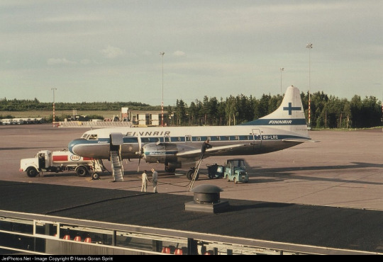
The sharpest deviation arises in the CV-440 version of the livery. This image is from 1971, just two years after the DC-8 liveries would have carried their first passengers, and it's wildly different. The cheatline is lowered sharply, sitting below the cockpit windows and wrapping around to contour the body of the airplane. There's a certain je ne sais quois to the domino mask that I find myself missing here. This design also has an unnecessary second 'Finnair' added to the tail, which kind of looks awkward stacked on top of the existing cheatline besides being redundant, and the Finnish flag on the tail is somewhat awkwardly made free-floating. It feels a lot less sleek and a lot more arbitrary.
On the other side of the plane the cheatline goes down quite a bit farther than on the jet models, probably because they thought it would be a better way of negotiating the Convair's rather bulbous nose, and I actually think I prefer the wide, upturned variant. This version, if anything, is too close for my taste to the livery VARIG operated in a similar timeframe. There are a lot of differences, yes, but in the 70s having one big solid cheatline on a white body and metal underbelly was the equivalent of the Lufthansa Line, so if you toed said line, be it cheat or Lufthansa, you risked becoming easily mistakeable for any airline with too similar of a color scheme. And blue-on-white was maybe the most common color-scheme at the time.
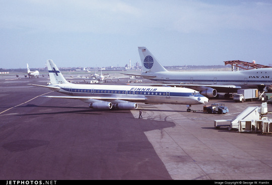
I doubt Finnair shared many tarmacs with VARIG, but here they are with Pan Am, and they could also expect to run into airlines like Sabena, Icelandair, and probably a half-dozen I've never heard of, all competing to be the one the others get mistaken for. It's a tricky position to be in.
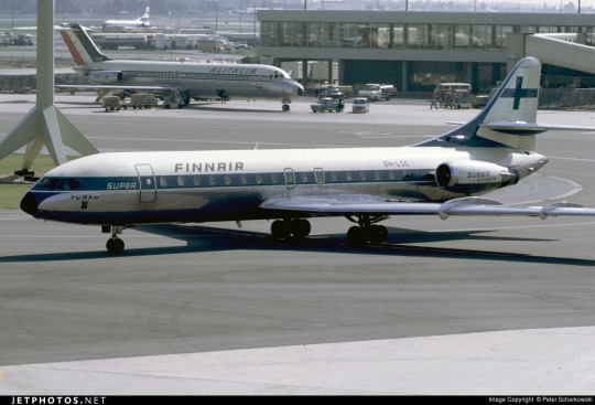
I do quite like the livery on the left, maybe even more than the DC-8 one, but I can't seem to find any other airframes painted like this. I'm not sure why this one is.
These images are from 1971 and 1969. They are both the same model of airplane - the Super Caravelle or Caravelle 10B. Their liveries are completely different. And that's just how it was back then - not even standard within the same airline, somehow still trying to stay distinct from dozens of other non-standardized blue-on-white cheatlines.
When evaluating classic Finnair, I have to keep myself tempered in both directions. When I think it's clean and well-proportioned I have to remind myself that it's just a complete nothingburger. When I think it's a lazy and cowardly non-design I have to remind myself that, no, at its best classic Finnair does look like it was designed with some thought, and it does have some traits that feel at the very least interesting enough to merit not being totally dismissed.
But...look, I have to give classic Finnair a D+. Because they tried, and they did something, sure, but it's ultimately not something especially memorable and the implementation is just spotty.
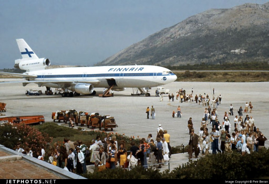
Even given a canvas like the DC-10, they fumbled. The DC-10, in my opinion, was a big test for them. And I do mean big. In the DC-10 is a plane with all the space in the world to add visual elements, and a space where just a couple lines can go from a detail to a fin that towers over anything that isn't a 747, showing off the Finnish flag as if someone had flown it from a building mast. The third engine, which I feel like a lot of airlines really struggle with on the DC-10, gets a nice horizontal line of writing that's not intrusive but helps prevent it from feeling like a giant gap. The wordmark gets larger, is moved forward, gets to really own the space it takes up instead of being squeezed in. And...they made the cheatline just....a really thin flat line that looks bad and stiff and boring. There's nothing setting them apart from Icelandair, and Icelandair's livery from this point in time was so boring that my only comment on it was that it looked like they forgot to paint the rest of the plane. You can do white planes well, but Finnair just really doesn't get there.
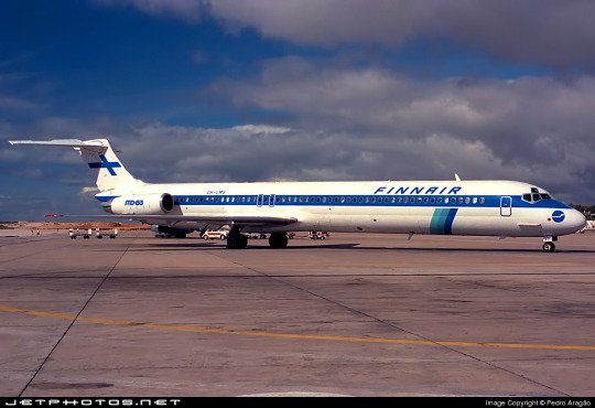
...hey, Finnair? You can't just decide to do belly stripes but worse, Finnair, you're literally next door to like two thirds of SAS and that livery was designed from the ground up. They have a couple of near-misses with SAS's toes but this is the one that makes me actually go 'is this allowed?'. It seems to have been exclusive to their late-80s MD-80 fleet, but it's just incredible to me that it ever happened. (That said, those three shades of blue are so nice together and I wish they had ever brought them back. I understand the appeal of sticking to the stark contrasted blue-on-white of the flag, but there's so much potential out there!)
1997: NEW TYPE, NEW LIVERY
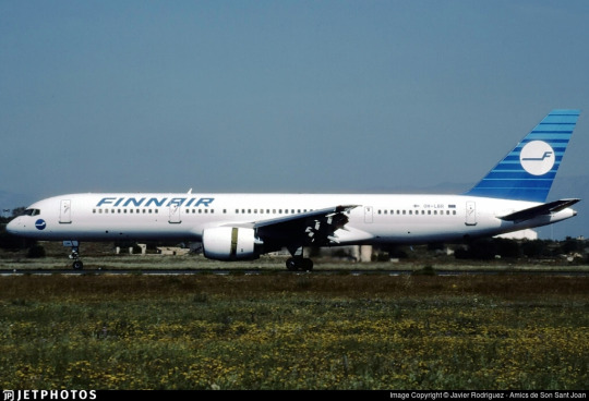
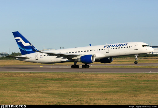
I really like the 757. It deserves a better livery than this.
Removing the cheatlines was a very trendy choice to make. This is the sad beast I call the Deltalite - a Deltalike but without the painted nacelles and belly that are usually slight redeeming factors. There's such a beautiful design on the tail that could have been put on the whole fuselage, honestly, and that's sad, but even on the most granular of levels...why keep the little cheek stamp if you have the logo visible on the tail now? Weird choice. Being so desperate to do the Deltalite thing everyone else is doing that you get rid of your country's flag on the tail is just a bad choice of priority, I think. There's not much to say about this. Honestly, I'd drop it to a D-. There's enough happening that it would lose something by being painted into Star Alliance colors, but it wouldn't lose terribly much.
2000: NEW FINNAIR

Oh, Finnair. Why? Did no airline resist the siren song of getting way too into airbrushing in the early 2000s?
Maybe I just have whatever the opposite of nostalgia is for the early 2000s, but this just makes me sad. They've made the wordmark look worse, overcomplicated the simplicity of the logo, and gone ham with the gaussian blur.
Look, it's not all that bad. The shades used on the actual plane are noticeably darker, and the colors at least don't look half bad now. And they've even bothered to paint the engines this time around! But...come on. You've changed 30 years of something that was working just fine for...this? Something which maybe climbs up to a flat D?
The 2000 brand overhaul, including the logo, was done by Finnish agency SEK & Grey. They're nearly as old as Finnair and have worked for brands as prominent as Coca-Cola and Kellogg's, but their about page puts Finnair front and center. They have an entire page describing their Finnair work.
Despite claiming to have included humanity and warmth and movement, I see none of this. I'll admit upfront I generally dislike what's dubbed 'Nordic' design. It's not the minimalism which I dislike but the banality.
What does any of this have to do with Finnair? What here represents the history of one of the world's oldest airlines? What here really speaks to the Finnish people? Why is just designing something generic and making sure it's all crisp (when you're photographing it fresh out of the plastic, before it's been tripped over and stepped on and yanked down staircases and accidentally sat on and stained with tea) considered a substitute for designing something that people will see years down the line and get nostalgic for? I'm nostalgic as hell for Alitalia, an airline that doesn't exist anymore. I still use the bag from an amenity kit I got on Alitalia nearly ten years ago to store small essential things like toothbrushes and medication while traveling, but I wouldn't know it was Alitalia by looking at it, because it's lovely and convenient and ergonomic but it's literally just grey. It evokes nothing, and it doesn't even say 'Alitalia' on it anywhere. Nothing here could ever be considered ephemera or memorabilia. I could steal Finnair's look at the Gap.
2010: SORRY, HERE'S NEW FINNAIR FOR REAL THIS TIME

SEK & Grey gave it another shot. This one's a lot better.
I like the change in the logo, first off. And this, the word 'Finnair', is the logo, but I'm comparing it to the earlier wordmark. 2000's attempt felt like it was taking the original and just trying to sand off the corners to make it more modern, but the 2010 take on it actually shapes each glyph into a neat little space-age thing that creates this curved shape by way of a lot of straight lines, in a way that feels visually pleasing and interesting. I enjoy the square holes in the A and R, the return of the crossbar on the N, and the extreme range of widths which gives the letters a real weight to them. This isn't a typeface - these glyphs exist in the context of the word FINNAIR in this exact configuration and one of four colorways. Finnair does have a proprietary typeface, Finnair Sans, and it looks nothing like this because this is not a font, it's a logo.
I think it is a shame that this is the logo now. I really liked the F. And they haven't gotten rid of it, but it's now been relegated to an official subordinate position, according to their branding guide:
The official Finnair logo is the text version of the logo, and it is primarily used. The F emblem is used as an additional symbol.
Look, I'll always think it's a shame when your main logo is just the name of your company. Some airlines do it, and it feels like an empty space to me. It can be satisfactory but not outstanding. When you start out with a nice little symbol and then take it away, though, I do feel somewhat robbed.

It stings extra because I really like the way the new F looks. It has that long brushstrokey look and it almost makes me think of Hebrew characters. The way it tapers now really adds to the feeling of movement I get from it, and it's a great base for a livery. Now that it's darker, even though this does bring Finnair into competition with airlines like SAS, LOT, TAROM, Lufthansa, and even Ryanair when it comes to dark-blue-on-white, it also contrasts better with the main body, and it's still light enough that you can recognize it as blue. Anyway, it doesn't take a genius to know how to integrate this into a livery. Long line for the fuselage, go up to match the tail...
Finnair. Are you serious, Finnair?
Look! I get it! Billboards are in now, it's fine, I get it. it's probably the nicest billboard I've seen in a while, font-wise. It feels comfortable on the fuselage and it feels like it earns the space it occupies. The F is nicely centered on the tail, cuts off at a pleasant point. But...why?
I really can't be too mean about this. I want to be meaner than I actually can justify, because I think if any other airline made their plane this featureless I would hate it but Finnair's billboard livery is actually nice enough and everything is placed well enough that it's not at all unpleasant to look at. It's an acceptable livery. If maybe 25% less planes were basically all white it would shoot up in my esteem. I don't really like the fact that they put the little Fs on the inside of the wingtips of their A350s, but that's really my only nitpick. It's just sort of...bringing a really fantastic loaf of bread to a potluck when you were asked to bring baked desserts. You've done a very good job, but you didn't quite get the assignment.
It's a bit hard to critique the modern Finnair livery in detail because I think it's executed fine. There's nothing really wrong with it except that it has a logo that could lend itself to all sorts of interesting shapes, it has 30 years of variants of a very specific design to draw on, and it's chosen to go tabula rasa just to be all clean and minimal instead of doing any of the interesting things it could have with this new start.
I want to dislike this take on the Finnair livery, but at the end of the day I just don't. I think it's completely satisfactory. A lot of airlines try to get this look and somehow end up seeming cluttered for it. Finnair is one of the only instances I can think of where a white fuselage with just a wordmark has looked okay. It isn't ugly. It hasn't failed at the thing it's trying to do, but I think that it should have tried to do something else.
At the same time, though, this is the most Finnair that Finnair has ever been. The blue cheatline and the Deltalites were stumbling over well-trod ground. The modern livery, at least, isn't sloppily tail-heavy and seemingly thoughtless.
I give modern Finnair a C. This took an excessive amount of deliberation, but it really is...good enough. It's satisfactory. It's fine! I would have taken a completely different direction, but they have done a good job with their sort of lackluster idea. It's alright. We'll check on them again in another hundred years and see where they're at.
2023: CENTENAIRY
A century is a very long time. Finnair is older than my oldest grandparent. Finnair is older than over a dozen sovereign countries. Finnair is older than aerodromes in Finland. It's older than every currently operating airline except KLM, Avianca, Qantas, Aeroflot, and Czech Airlines. As of the first of November, Finnair is in triple digits.
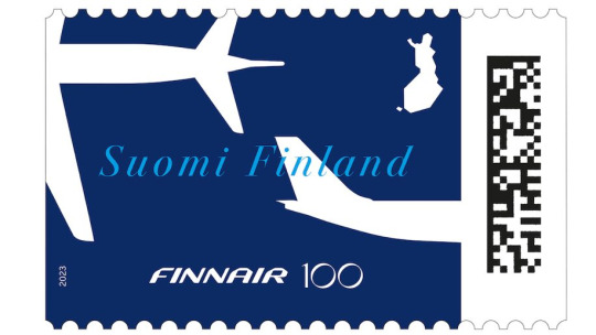
I adore this centenary stamp Finnair has put out, celebrating the long relationship between aviation and the mail. It's not complex, but it's not barren, either. It combines the dark blue of the modern livery with the light blue of the classic one, all with the white silhouettes of airplanes elegantly soaring over an outline of Finland. The outstretched white wings on the deep blue have the grace of a giant fish swimming beneath a glass-bottomed boat.
But of course it isn't just stamps. Finnair is an airline. Airlines do special liveries. Qantas and KLM both slapped a big 100 sticker on an airplane for their big anniversaries. Finnair has of course done something similar.
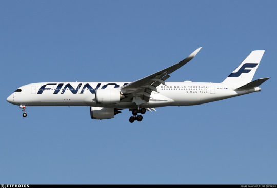
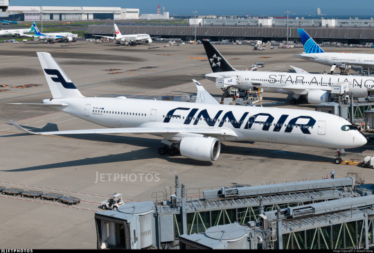
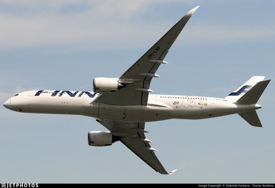
Three airframes - the pictured A350-900, OH-LWR, and two A320s - OH-LXK and OH-LXM - have had a 'bringing us together since 1923' sticker applied. Matching the rest of Finnair's branding, it's certainly quite minimal, but it's a nice gesture. It's not what people have been talking about. That's OH-LWO and OH-LWP, both A350-900s, who have been given something more substantial to wear.
youtube
I'm going to assume that after its renaissance on tumblr a few years back most people reading this are familiar with the Moomin franchise. I definitely am, because when I was in my larval stage my mother first taught me to read Russian using an omnibus book of Moomin stories. Creator Tove Jansson apparently designed both the shape of the eponymous white critters and the sound of the name Mumintrollen itself are designed to evoke a feeling of softness, and it's clear why these characters are so beloved.
It isn't the first time Finnair, which frequently collaborates with Finnish brands and highlights its Finnish roots, has featured Moomins.
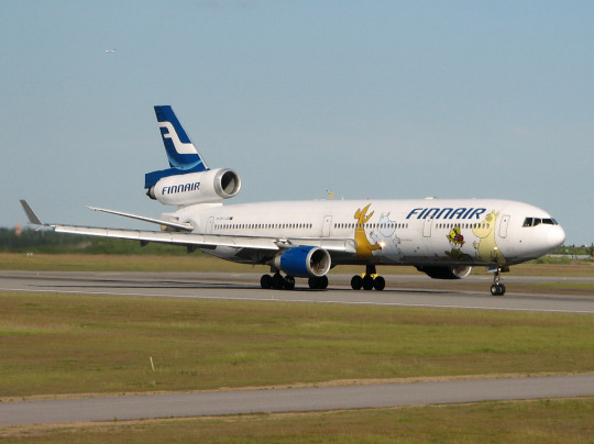
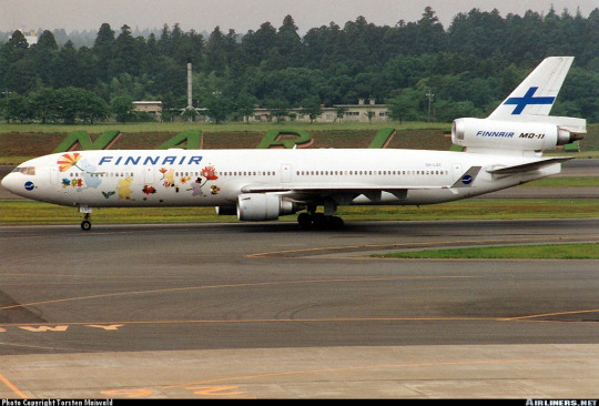
image on left: Antti Havukainen
In the 1990s, the airline first flew a Moomin jet. They had another in the 2000s. Both were withdrawn from service before 2010. It's been a while now since Finnair flew their last MD-11, but when celebrating their 100th birthday, a milestone that the vast majority of airlines will never see, they chose to do it by way of a soft Moomin embrace.
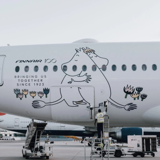
image: Changi Airport
And, I'll be honest, I think it's very sweet. It got an actual, sincere little smile out of me.
100 years is a really long time. In 1923 aviation was unrecognizable. What we would now consider an airliner didn't really exist yet - space for ten passengers, closed cockpits, and metal fuselages were the exceptions rather than the rule, and the Ford Trimotor was two years from its first flight. Cabin crew were barely even a concept. Airplanes, for all intents and purposes, were considered a type of boat. A nonstop flight across the Atlantic was a ridiculous concept. In a report published by the US National Bureau of Standards, it was said: 'there does not appear to be, at present, any prospect whatever that jet propulsion of the sort here considered will ever be of practical value, even for military purposes'. There were no aerodromes in Finland, so a small company called Aero attached floats to a plane just large enough for four passengers and took them from Helsinki to Tallinn.
Look how far we've come.
Footnotes:
[1]: The Finnair website's history page, which I used as a source for much of the background and several images in this post, renders it as 'Finnish Air Lines', but on the airplanes themselves it clearly has no space, so I've corrected that seeming error for them. I don't know why this discrepancy exists, because as far as I know during this period they were marketing themselves as Aero so this text would only have existed on the livery itself.
[2]: Actually, I very occasionally see this version where the F logo isn't fully surrounded by the circle and the F in the wordmark doesn't have the rounded top, and I don't know which came first or if the less round version is just somehow...not real? I did try to figure this out, I swear, but at some point I realized I am literally not a professional logo historian, and nobody is going to be let down if I don't brute-force an answer despite not even speaking Finnish, and I should finish writing the post before it's 2024.
[3] The closest thing to an official source I can find is the descriptions of two listings for the centenary stamp including a quote from designer Ilkka Kärkkäinen attributing it to him. I don't at all doubt that he did design it, but I always like to find concrete attribution for things if I can and would hate to spread misinformation and the sparseness of confirmation here is something I find very strange. My best guess is that there's plenty of good sources on it in Finnish but nobody has bothered to make it as clear in English.
[4] Admittedly this is a stretch, and I certainly don't think it was intentional, but it does remind me of the longship prow used in early SAS liveries. This motif was introduced in 1946 and continued to see use after the Finnair logo was introduced. The overlap is fairly limited in that SAS never used the longship in their logo (...I kind of want to talk about their logos one of these days) and the Finnair livery you'll see shortly doesn't look like SAS's at all, plus SAS has the extra pink on their liveries, but I couldn't get it out of my head that they do look sort of alike.
[5] The absolute hero who uploaded it to jetphotos mentioned that Finnair had given him the photograph while planning to dispose of it, and this makes me wonder if the lack of documentation is just because Finnair doesn't hold onto their old materials, which makes me very sad. A lot of companies, more broadly, didn't bother to keep records until somewhat recently, but in Finnair's case it seems to be particularly egregious. As someone literally studying to be an archivist it makes me exceptionally sad to see history lost just because nobody cared enough to preserve it.
[6] Maybe they didn't want to look like backwards SAS. Who can say?
#tarmac fashion week#finnair#grade: c#grade: d+#region: finland#grade: d#grade: d-#region: northern europe#era: 1960s#era: 1970s#era: 1980s#era: 1990s#era: 2000s#era: 2010s#era: 2020s#special liveries#commemorative liveries#requests
50 notes
·
View notes
Text
🔅 After Shabbat - ISRAEL REALTIME - Connecting to Israel in Realtime
PASSOVER is Monday night!
▪️CRAZY ISRAELI POLITICS.. (1) Former Prime Minister Olmert does not rule out a return to politics at the end of the seven-year no-politics-allowed period from the day of his conviction for bribery.
(2) Former Prime Minister Ehud Olmert: "If other countries did not cooperate with us, we would have only intercepted 75% of the missiles from Iran.” (( One, likely not true, two, what kind of former prime minister shares information that strengthens your enemies? ))
▪️HAMAS LEAVING QATAR.. Following Qatar leadership's incessant anger and pressure on the leaders of Hamas regarding negotiations on the hostage deal, the Wall Street Journal reports the Hamas leadership is leaving its political headquarters in Qatar, for an unknown destination. One of the destinations that the group is considering is Oman. Another possibility is Turkey as the Hamas leader met with Turkey’s president today.
▪️AIR TRAVEL.. Polish Airline LOT restores flights to Israel.
▪️US TO SANCTION IDF NETZACH YEHUDA BATTALION??? The US Secretary of State will announce within days the imposition of sanctions against the Netzah Yehuda Battalion because of allegations of violence against Palestinians. The American sanctions will prohibit the transfer of American military aid to the battalion, prevent its soldiers and officers from taking part in training with the United States Army, or participating in activities that receive American funding. (Reporter Barak Ravid)
(( This is more bizarre “we show balance” activity from the administration - Netzach Yehuda’s normal duty station is Judea-Samaria, and right wing Israelis are screaming about the IDF treating the Palestinians with kid gloves. ))
▪️US FUNDING.. combined Ukraine, Israel, Taiwan funding bill passes US House, moving to US Senate but supported by president.
15 notes
·
View notes
Last Seen Blogs

brittsnowpacks
Twitter Packs

xlionmanx
eNdOfThElINe
acupfulofpossibilitea
A Cup Full of Possibilitea

dnbangla
DN Bangla

amitkalra
Untitled