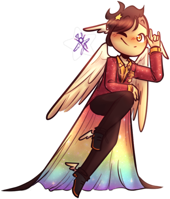
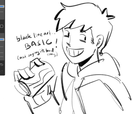
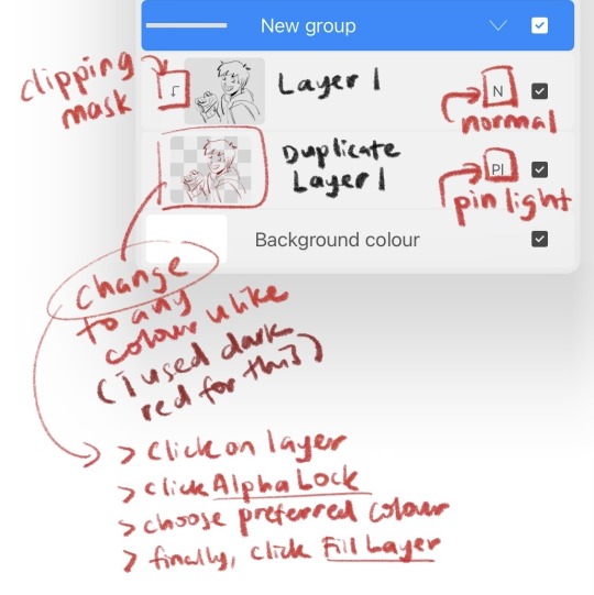
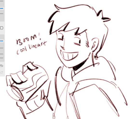
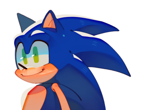
#If you think this is lineart no it's not<33 (¿
Note
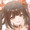
just wanted to pop in and say that i ADORE your style. that anemarin drawing you did just THE SHAPES AND LORD THE MARKING DETAILS ON TAMARIN??? ABSOLUTELY SUPERB just WOAAUGH i love that little, sorta grainy? texture some of your coloring has and your linework is amazing <3
GUH,, THANK YOU SO MUCH <3 The Anemarin drawing took me a while to get down right so thank you sm eheh,,,
To get the texture I just slapped Kyles Very Nice Paper Texture over it and added an overlay pfh, textures are fun and I use this paper texture a lot for doodles,,, Thanks for noticing, it always feels so cool to know people catch those small details <3!!
#oh I think I also put the Noise filter on it I did a lot of playing with it pfhb I know Chromic Abberation is also on the lineart#think the last I posted art w/ Kyles Paper was the Moon Winter & Kinkajou one lmao#EITHER WAY!! thank you so much it makes my day knowing people appreciate my art so much a <33#I always feel bad because I dunno if im responding to compliments that well but genuinely thank you v much ahuGH <3333#ask
9 notes
·
View notes
Text
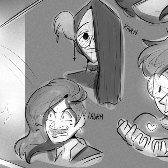
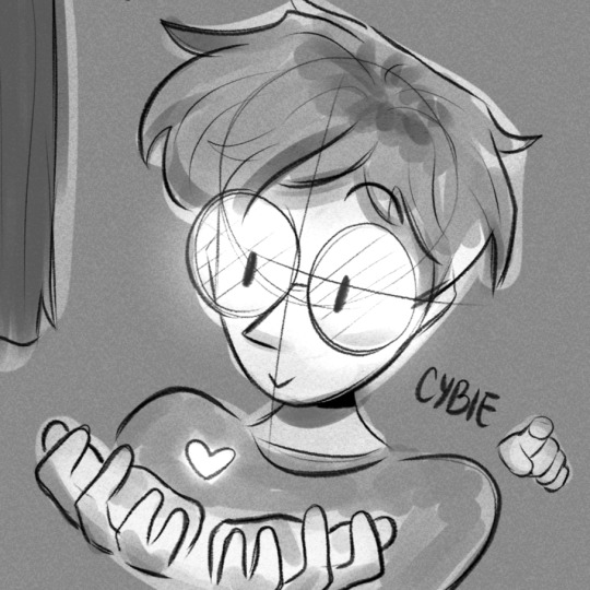
Fionna and Cake
Finn and Jake!
A F&C Swap Au! :))
Pt 1? Re-Drawings!
presenting the idea!(? 🥹
("pt 2" out! some "posters")

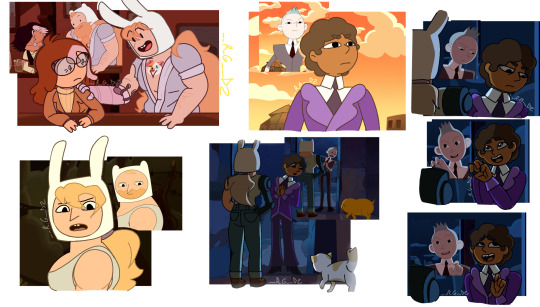


Hello!! I bring u smthing super special to me today!! <3 is a— project? that I have waaaaay time ago!! And finally after being so lazy I finished it!! <33
I bring u— Finn&Jake! A Swap!Au of F&C of course :)) A thing I was SOOO EXCITED to show!! <3 Is something I plan to carry more than just some drawings! ;)) I have a lot planned!!
But for now...
This is just a post to Present to you the idea! And if this Post gets support, I hope it is like that- I'll bring more information about the Au! And characters! Bc they change, duh— hehE-
Extra sketchsss!!!
Hehee <3 pretty simple but I thought they were necessary—?
Ok, Now, clarifications:
1— I KNOW I'm not the first one in swap Fionna w Finn, I KNOW I am NOT the first one in swap Betty and Simon, and I KNOW I am not the first one in swap Scarab and Prismo either, Im pretty conscious about that
💛- But! I think Im the first one in actually do Fionna as Finn :bb Bc— Honestly I think I just saw ppl drawing Finn w Fionna's normal life, but not Fionna w Finn's magical life 🤔 u know— all buff and w Cake's... tattoo 🙃🤧
And! I think, or feel, like I am the first one in combining all this Swaps in just one SwapAu!! :DD So- yuh—
2!!— Guys! I know some re-drawings might look kinda weird and kinda not like AT Style, But the thing is this:
💛I have the Sketchs of all this since NOVEMBER of last year, Then in December I just was doing the linearts, And just now I finished all this... So, dont worry, that for future drawings of all this Au, will be better!! Will look better, and be more close to AT/F&C actual style since I improved w it!! <3👍
And 3!!— Dont worry if some designs doesn't convince ya! (cofcofSwapPrismocofcof) Some will definitely change in the future! :)) (cofcofWinterQueenCOFCOF—) but they have this "issue" cause of Clarification 2 I could say.. (In the moment I did the sketchs, all this wasn't planned too well... so I didn't put much effort into the designs...?)
And I think that's all I could say by now :))
Remember this is something just made for fun!
Hope u like this Au! bc- Honestly it means a lot to me for some reason..
And hope to bring u more information! Not soon though— I need to rest a little hehE— All this post was a "stress" in my head for all this time.... BUT IT WORTH IT‼️💛💛 WOOO SUPER PROUD OF THE RESULTS!! BUT FUTURE ONES WILL BE EVEN BETTER!! WOOOO—
well— ehem—
See ya!!! 💛
#fionna and cake#prismo#prismo the wishmaster#fanart#adventure time#fionna campbell#cake the cat#jake the dog#finn the human#betty grof#scarab the god auditor#the scarab#digital art#prohibitedwish#we could say—?#marceline#💛'sart#FAJ!SwapAu
253 notes
·
View notes
Text
THE MAP IS OUT!! Here's my individual part for it, along with my credit image! I'm so happy to have been able to work with such cool collaborators on this project, this was so fun! :D <33
WIP and fun facts below the cut!
First pass of my part!

General Notes:
- All of us had a cut-off frame so Sammy (our MAP host!) had space to transition shots! the stick in my cut-off is my oc Lixy <3
- As always, I don't have an actual animation program. Each frame of this was individually drawn in Clip Studio, saved as PNGs, and meticulously arranged in a video editing software. it took a while and a headache. the software crashed 4 times hdkjh </3
- The process was sketching, lining, then compiling it all together! Line art took the most time (because i don't like lineart hkjdh)
- Fun fact, all of the sketches (seen in the wip above) were all drawn on my first plane ride ever :> <3
- The background is Alan's animation program that I took from a screenshot from AVA 6 :> I didn't want to do anything too complex for it ;w; <3
- All of the slide transitions were done manually! It may look like tweening, but I don't have a program that can do tweening lmao :'> <3 Each of the slidings was individually 3-6 frames of moving them across the frame, a single frame of stretch for movement, then a settling frame before the next stick slid in.
- Green is doing air guitar as they slide in :3 <3
- My Blue design has a hat that can magically change into a Witch hat (when potion making), Chef hat (when cooking) or Sunhat (when gardening <33
- Purple looks nervous after he crashes into everyone, like they're expecting to be in trouble, but smiles and laughs when everyone else does. You can see Blue with their hands up, reassuring Purple.
- Originally Yellow didn't move as much in the final laugh scene, but I saw the first frame of the person after me (@/sleptonce!) which had Yellow in a little crouch :> i adjusted Yellow to match the next frame a little better!
- Also Yellow's hair is flipped from the way I usually draw it because I felt it worked better this way hgkjh <3
- (I totally didn't forget my Second's design has green eyes and had to edit those frames very quickly hfkjh <33)
- The only colors that aren't the stick's original colors are when Blue's hat falls on Purple, and Red's yellow bandana <3 (These are also the only movement animation in the blinking sequence!)
- Adding Alan's cursor was a literal last minute decision, he was never in any of the sketches, I literally added him in 15 minutes before submitting my part hgkjh <33 I think after my shot, Alan helps gently pick them up <3
- My suit in the credits is mostly red and orange, because my favorite sticks are Red and Second! <3 The rainbow cape reflects how I enjoy the color gang the most though hkjdh <33
Thanks for reading!! :D <33
#Alan Becker#Animation Vs Minecraft#Animator Vs Animation#AvM#AvA#my avm art#avm red#avm second coming#avm orange#avm yellow#avm green#avm blue#avm purple#starlight originals#lixy
179 notes
·
View notes
Note
hello hi!!! grfhvhghr i am in love with your artwork so much you cant believe-- i wanna ask if you have any tips on how you lineart and colourpick?? no pressure to answer tho, have a great day/night!! again, love your art <33
hi!! thank you for your kind words!! since i got asked about these a lot, im answering this for all the other ask asking about lineart and colour tips too! You can see some previous post here.
also i could only give out tips that work for my drawing style - which is heavy lineart / colours pop up the line (believe it or not it's American comic book style. ppl cant understand why my art doesnt really look like usual anime/ Asian webtoon style, even though it is still clearly anime / Asian webtoon style, but when i told them it's because im drawing these by studying American comics, no one believes it either lmao.
i do study but i do my own things too, so most of my art inspo is really unexpected to ppl, but they r really where i learn things from, cuz i dont even go to art school TT_TT).
Changing the brush size will help you achieve thick/thin lines better without having to put pressure on your wrists. Keep your hold relaxed and let bigger brush size give you the thick strokes.
I like messy sketch, to me the sketch is just an outline shape to fill details in when i do the line, it also gives more freedom to wriggle as i draw! cuz i dont really plan out everything from the start, just wing it as i go, so a lot of my work is actually very spontaneous.
that leads to this point: when you do the lineart you should start deciding which colour style you want from it to adjust the details amount. the ink shadow blocks in my art aren't there randomly, i adjust them to best complement the shape language and colours.
for piece where i want the line/shadow to...idk hit (?), the colours are almost flat with textured brush adding depth to them, so the inking is the shading, thus there are more details in the lineart / ink blocks.
for the video above and piece like this where i want the colours to be clear and pop out, the use of ink blocks are minimized and i do the shading during colouring process. but! the ink blocks can still make some places pop very nicely! just use in moderation!
when doing the base it's good to keep the colour on the left side of the colour wheel (low saturation), but as you do shading and lighting, try to spread out evenly so it won't look washed out.
toggle around with hue and saturation slider as you go! the key is always adjusting! you're making hundreds of decisions at once, being conscious of your choice in why a line or a colour should be in a certain way will help improve your process a lot! (i think you can tell which art i turned off my brain and just draw for stress relief ........ which is also a valid way to draw and sometimes the result might surprise you! but for more serious stuffs i try to be aware of most of the move i make. it's problem solving, yeah?)
i find that one way to keep your art from appearing too...yellow in the end (which is sth that haunted my ass for a long while) is always aim for cold tone, so if you accidentally make it warm either way in the end it won't be too warm (and yellow :cry:)
well that's all the stuffs i can think on top of my head. sorry i can't give more advice on colour picking cuz it's sth i don't really know how to give advice on???? i think my colours now are still pretty lame haha........ if there are still any questions i'd gladly answer within my ability, though im very slow to answer ask ( i do read and be happy at all of them tho!)
#art tip#ask#anon#albi’s art#ALSO I AM SERIOUS ABOUT THE BRUSH SIZE THING SAVE YOUR WRISTS NOW. TODAY. DONT LET IT HURT THEN TRY TO FIX IT LATER#aughhhhhhhhh *rub my wrists*
291 notes
·
View notes
Note
hello, popping in to say that your art style is lovely and gives me so much serotonin!!!! the sketchy vibes are so good!!!! on an unrelated note if you ever draw quinlan vos i think i will collapse into a very small puddle!! your art is just so MWAH
AWWE THANK YOU !!! <33
i gave up on lineart a while ago hahaha. it's a lot more fun to see where the sketches go tbh !!

unrelated note, i have quite a few ideas that involve quinlan >:]c but just for you, here's a little doodle of him :D !!
#quinlan vos#he is the drama#tcw#also just ugh thank you !!! im so glad people like my art hehe#i LIVEEE for others validation (character flaw)#i hope people look at my art and go “wow that would make a really good chew bone”#lukka's commlink
79 notes
·
View notes
Note
hi I'm sorry if if this is weird or something but you're my favourite artist and I love ur art sm and I want to be as good as you are (or at least a little good) but I don't know where to start, and I was wondering if you had any tips? (Sorry for bothering you, I hope you don't mind)
hii <33
ty for all the compliments and dw bae, you’re not being weird at all lmao xx
i want to start by saying that i’m very very flattered, but art is sometimes tricky bc i’m rarely satisfied with the results, and sometimes the disappointment leads to art blocks or breakdowns, which are completely normal.
so, my first tip would be: even if you don’t like your art, keep drawing. you can take breaks of course, but remember that improvement comes with practice!!
second tip: copy. a lot. wether it’s a real life picture, a painting, somebody else’s art, try to analyse the piece, think about what you like about it, study or trace the general shapes, and try to replicate: it will help you develop your own art style. (i used to copy the drawings from the books i read as a child, i had a whole folder of them. in this phase, sharing on social media is often debated if you use other ppl’s art so i advise against that)
once you know what you want your art to look like, watch tutorials. i think trying different styles can further help you with stylistic choices, so even if you want a more cartoonish art style, watching a couple of tutorials about realism can help with the understanding of anatomy, which doesn’t hurt.
however, i think most ‘do this’ and ‘don’t do this’ tutorials you see on tik tok or ig are bullshit. ‘don’t use pure black for lineart!!!” comic book artists use black. ink is black. there are shading techniques all revolving around black lineart. it’s not a matter of ‘don’t do it’, it’s more of a ‘do this if you want this effect’.
experiment, try many many things. i went through millions of art styles, making (sometimes subtle) changes: i went through a more real-ish style to full on anime, and now i’m copying realistic paintings.
life is too short to settle for a single art style.
#hope i was helpful#if you have questions feel free to ask in the comments or even dm me#it’s always nice helping new artists#nothing answers
23 notes
·
View notes
Text
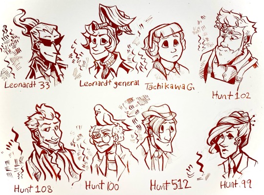
I’ve been drawing with dip pens lately so I did a nib study using my ghost trick redesigns.
for anyone that’s interested here’s some notes on the nibs under the cut.
Leonardt 33 - Easily the one of the most flexible pen nibs I have. Technically this is designed for calligraphy, specifically spencerian, so the sideways movement isn’t great and there’s little control when doing hatching. Really dramatic swoops with high pressure that aren’t entirely appropriate for character portraits but I kinda dig what it did to Sissel’s hair. Will probably use it for special effects like fire and smoke and stuff.
Leondardt 33 - This one is actually intended for drawing so naturally it has a fairly consistent line weight with a low flex. The hatching marks are kinda scratchy but not in a bad way. Would probably work really well for continuous contour and styles of lineart that are more sketchy, loose, and dynamic than my normal character art style. Would prob use for larger pieces or figures closer to the camera cause the line weight is generally a bit too thick for the usual size I work with.
Tachikawa G - This is a nib made for drawing manga specifically and it’s really easy to use for drawing. Some of the calligraphy nibs really take some thought and careful motor control to look good but this one was forgiving. I see myself using this a lot for really casual art. It was kinda hard to do hatching or filling with this one tho, which was kinda surprising. Very gentle line variance, makes really clear shapes. You can see in the other characters than too high flexibility can make it hard for the brain to turn lines into form so this really mellows it out. Prob best to use this nib to block out the lineart then hatch/fill/detail with others.
Hunt 102 - this is a speedball job made for mapping and oh my god do I love this nib. It’s just so 👌👌👌 on the details??? the line variance perfectly matches the brushes I use on photoshop and it’s just. mwah. it holds onto literally so much ink despite being so tiny. interestingly hatching is unstable but two or three lines together seem to be just fine. Kinda sad that jowd’s hair is a little hard to focus on cause of the variance but with a little practice I can prob find ways around that cause I already know I’m gonna love using this nib for heads and faces. Filling is a bit patchy but otherwise I think this is gonna be my go-to detail nib. (also no jowd isn’t in overalls that’s supposed to be an art apron but with only like the top portion showing it’s hard to tell.)
Hunt 108 - ok this is Supposed to be a drawing nib as well as a calligraphy nib and it does mimic brush strokes but I’m pretty heavy handed so it’s hard Not to make those super thick lines. Not bad with details and has enough control to make thickening up the outline super easy, but really easy to mess up. This nib did Cabanela dirty by flexing a bit too much when I was doing his mouth so I had to correct it with a white pen. Spreads the ink too thin in areas for solid filling. I can see this working really well with mixed media, like with watercolor, and once I get some more colored ink I’ll use it for coloring.
Hunt 100 - idiot stupid rat bastard of a pen nib. ok the art looks fine right? can’t be that bad, right? it took me so long to make that because the ink just. wouldn’t come out. so this nib is another mapping nib and it’s super delicate so it breaks really easily. I broke my first one bc I’m heavy handed, so I ordered another like ‘ok I’ll be more careful with this one’. it broke again. I don’t even know how. Ideally I’d use it for small spaces or reeeally fine details but I can’t even get it to work long enough to try. speedball can meet me in the pits.
Hunt 512 - A calligraphy nib that’s actually really easygoing to draw with. There’s not much line variance, so the hairlines have a lot of control. Makes for really good hatching. Also does really great long, thin lines. Sideways movement is kinda meh but it does the job. Definitely the cleanest looking of all them, tho the lack of variance makes it a bit boring to look at. Gonna use this one for shading and textures or for drawing on really rough paper.
Hunt 99 - like the first nib this one is really dramatic, and it’s supposed to be a calligraphy nib, but it has a lot more weight control than the hunt 108. Also the fine lines are easier to control. A lot of ink comes out so it might not be great on paper with risk of bleeding, and it takes a while to dry compared to others, but it would be good for filling since it can cover a large opaque space while having good control over the shape and points. Could also use for different warping/texture techniques.
Other notes:
I used smooth illustration Bristol for the paper, since ink looks more vibrant and swooshy on it and also some of these nibs can Only be used on smooth paper.
Also used terracotta India ink, which is kinda on the thick end but still looks good. matches with the colored lineart in Ghost Trick lol
got all of my pen nibs from Paper & Ink Arts cause u can order a nib for like less than a dollar fifty each. You can also get paper, nib holders, and ink for a good price too.
if u wanna start with dip pens PLEASE prepare your nibs before drawing. stick them in a potato for like 10 minutes. please trust me on this you will have a bad time otherwise.
ok thanks for reading through my Very Indulgent experiment.
#ghost trick#my art#idk maybe this is a bit unconventional for fanart#but I think a lot of ppl only ever post super polished art and not the experimental stuff#which gives ppl who want to start drawing the idea that every drawing has to be a finished one#and that everything you post has to get likes#sometimes art is about the journey#. . . ok my cat just died so maybe I’m being all maudlin and philosophical to cope but still#this is also here cause I could find jack shit useful reviews for pen nibs#so Hopefully this can help ppl that want to try dip pens but don’t know how#feel free to reblog if you want to reference or share the info on nibs lol#character design#traditional art#nib review
62 notes
·
View notes
Note
hi, your art style is so cool!! i love it
as a beginner artist, i was wondering if you had any helpful tips for procreate or anything? the art world is kinda daunting lol😅
thank u so much!! ive been feeling down ab my art so seeing this in my inbox was like a sweet treat LMAOO 🎀
so back to the q…. im afraid i dont have any mind blowing tips. its normal to feel overwhelmed as a beginner, but everyone starts somewhere! i say familiarize urself with basic procreate shortcuts (loads of tutorials online) and always play around with their settings! it should be helpful for the learning process along the way.
for eg ermm i used to abuse the gradient maps settings to pretend i know shit ab colouring 😭💀 i still do tbh, except now i understand how it actually works and i can easily get the colours that i want.
some of the things i learned:
1. cool lineart (i always use this as a part of my render process)
2. art is subjective, pick any that you think suits your preference/is fun to use
for brush, do you prefer it round or textured? lots of pressure sensitivity or none? i like my brushes textured and with a good amount of pressure sensitivity. for blending, do you prefer the transition colour to appear smooth or textured/messy? i sometimes mix between both to give a sense of harmony, but i like it textured more. it all comes down to what feels right to you. pick a few artyles that you like and incorporate it into ur own! pretty basic tip but thats the best way that i know. just pretend ur a mad scientist trying to find cure for like cancer or sumn
3. personal opinion: brush type matters
dont listen when someone says the type of brush u use doesnt matter. yes you can draw with any brush. yes all brushes work the same way 🤯🤯🤯. but theres gotta be that ONE brush that just hits the spot for you, as if its made specially for Your Hands….. unfortunately theres no shortcut to finding Your Brush. it took me 4 years of endless experimenting to find mine.
if ur curious on what brushes i use, i have it listed in my carrd. however i still experiment a lot and dont rly bother to update it, but those should be what i use the most/my top favs !
★ ★ ★ ★ ★ ★
i dont think this covers everything, but this is all i could think of from the top of my head. just lots of trials and errors really, and dont be afraid to make a mess!!! i hope this answers ur question :33 all the best!
8 notes
·
View notes
Text
since you both are asking about my setup/process, here it is in one post 😆 (also tysm <33)
fyi I use photoshop with a wacom tablet w/ pen tilt recognition, but I can't remember where I got each brushes since I've been gathering them over the years :s


for brushes, I used several things:

Custom brush that I semi made :p used a brush shape from someone's set, enabled the pen tilt setting, and added a texture. Used it for sketching/drawing, adding details, or even draw a whole art with it.
Textured brush that I like to use for adding (directional) shapes. (see: jama jurabaev's drawings)
Simple round brush w/ scattering on as smudge tool.
Mixer brush, which adds a nice texture as you blend, but requires more brush strokes for it to look good.
5 & 6. A smudge tool & a mixer brush I usually use but can't since the portraits were a bit small for them to show their effect :')
and I guess tutorial?

sketch & base with brush 1
changed sketch to linear burn with 50% fill or lower (much better result than reducing opacity). you can also change the color to something lighter if the base is dark.
add some base colors using brush 2 (or brush 1)
blend a bit with the smudge tool & mixer brush
color pick & add mid-tones using brush 2. Add general shape/structure with the mid tones. I'll also add highlights but I didn't do that here
starts blending & rendering, adding some darker colors wherever it's needed. I'll also remove some bits of the lineart if they get in the way. Otherwise, I like to keep them where they're needed c: the linear burn helps since it also adds color that go along with the base.
on a new layer on top, smudge some areas (mostly on the eye) with that mini icon enabled so that it samples all layers.
paint over: adding some additional details w/ brush 1 and touch up some areas that need more blending. Hair strands, eye catchlights, highlights, all that stuff that go over the lineart.
levels + overlay + color dodge. That's usually it!
additional steps would just from me trying to achieve a certain mood w/ layer styles & adjustment layers.
color dodge tip: use black base!
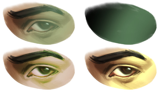
if you want the layer to only affect dark/light areas, use the underlying layer feature :] sometimes it's useful if you want to add bloom but keep the darker areas intact.
Iii think that's about it, hehe
39 notes
·
View notes
Text
it is she, Dahlia
like every time i draw someones oc, @nervarts, sorry i kept ya waiting for so long
i am still trying to work on a second head drawing adn maybe full body but no promisses on any of them cuz now that im back and drawing i have a shit load of ideas
showing both color and just lineart adn shading cuz i still feel like without coloring it looks better
@nervarts lemme know what you think<33
#artists on tumblr#art#beginner artist#my art#artwork#digital art#original art#art improvement#character art#other people's ocs
14 notes
·
View notes
Note
as a poc i’m so glad ur considering putting in more representation for us!! <33 you’ve been my fav for years now so it makes me happy to see!! it’s also nice to see improve w/ your art, and to see you grow more as an individual :D
also, if you’re considering braids for any blk character, may i suggest hair clips or beads? i feel like that’s rlly great for your style and aesthetic it feels very fitting n would be hella cute
You're very welcome! And awwe stawwp you're to nice!
AND OOOO YES THANK YOU, I was literally thinking about it when I was typing it HAHA! Hopefully soon I'll be able to get to it because like I said before, I've been havin' fun experimenting with my art style 💖
(A while ago I actually tried to have an attempt but couldn't figure out how to lineart rose curls 💔 But I'll get it eventually 🙏)
13 notes
·
View notes
Text

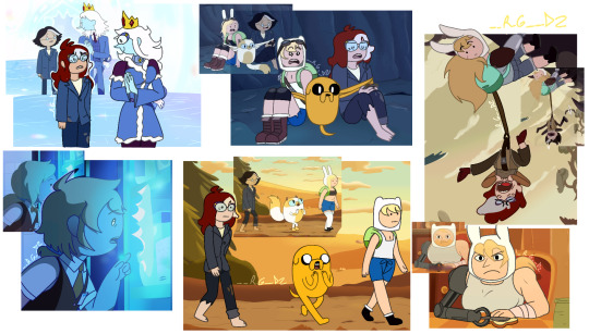
A very fateful hunt :]
@thedomesticanthropologist all my questions about pleiades ended up being mostly fluff because I didn't even colour them normally! but hehehe I love sivvus one more drawing of him complete which means I can start the next! the grind doesn't stop. Literally had never attempted to draw a horse in my life before this nonsense so thank you sivvus for expanding my skills
I have two silly bonues:
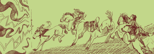
just the lineart because I think it's very fun these elves CANNOT ride without dramatics
and MY modern au sivvus :33
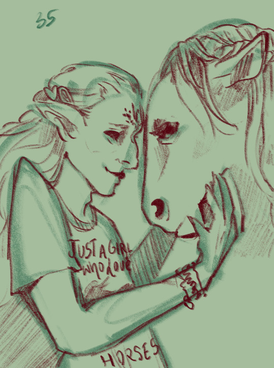
he's got ALL The horse silly bandz
#I would've coloured horse girl sivvus but it is 3am#anyways I love him <3333 may my sivvus obsession never stop#bg3 tav#sivvus the snob#tism archive#I had to choose a Horse Breed for plei in makign this and he is SUCH a lipizzaner#exact same brand of spooky as sivvus#big eyes but sometimes TOO big you know what I mean?#the more I draw him the more I improve at making him pretty and unnerving at the same time I'm LEARNING
8 notes
·
View notes
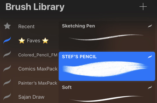
Note
I love your art style so much - just saw from one of your tags that you use procreate - I honestly thought you use paper from the wonderful textures you create! I’d love to hear anything you want to share about your digital drawing techniques, brushes etc.
thank you Rhys!! your art style is great too :)
yes I 99% use procreate now, *sometimes* I still do draw on paper though, I love pencils a lot and always will <33
SO, tbh the apple pencil + a nice textured screen protector go a long way toward preserving that “drawing on paper” feeling w/ digital art, but I’ll walk you through my (pretty simple) process anyway: I usually make the bottom-most layer a “paper” layer, set at a pretty low opacity so my background color can come through. you can use any old photo as your texture layer, I think I just googled “free paper textures” lol.

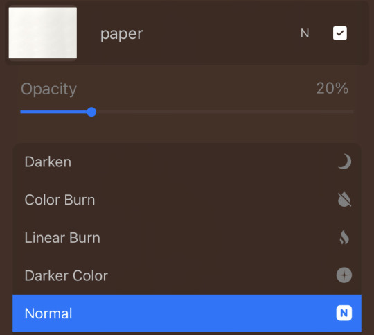
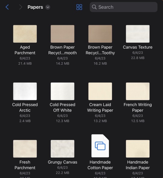
and as far as brushes go, I really mostly just use one brush! it was a free download with my paperlike screen protector, called “Stef’s pencil,” it’s just a kinda soft pencil brush that I use for pretty much everything—lineart, coloring/painting, even erasing. I have a lot of experience using soft pastels irl, and this brush really reminds me of that texture, so as much as I try to branch out and experiment with other brushes, it will probably always be my favorite :)
(I’ve also answered a similar question before, from curiouscat, but it was more about coloring/color palettes—I’ll link it here!)
10 notes
·
View notes
Text
Loose Messy Doodles Before I Mimir Later
This isn't my usual sketching style but I was too lazy to fix the lineart enough to fill them cleanly so I just went yeet
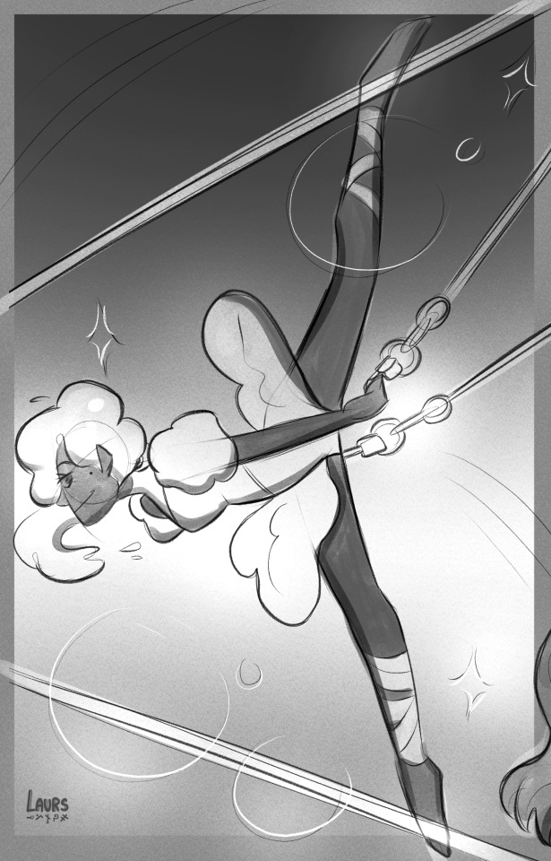
Thank you very much @kandidandi for the song you sent in my askbox. I can't stop listening to it now and just thinking of this cotton candy haired trapeze lady grgrgr even tho you associate it with WWITS (love ya for that/p), my brain went elsewhere ADJSJSKSJ
OCs, I haven't drawn OCs in a while uhhhhh got too deep into fandom shit heh

Moots art yippee!! @/eyenaku and @/cyberscraps respectively <33
Sending these to their askboxes so tagging them won't be necessary
39 notes
·
View notes
Text
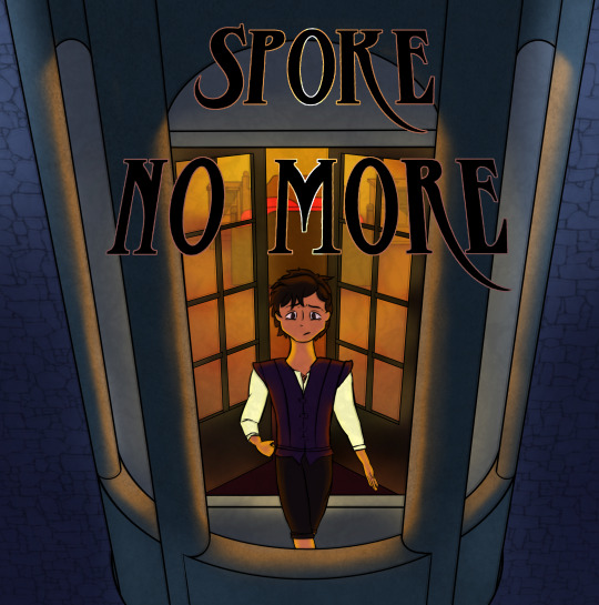
My take on a webcomic/comicbook cover for the SaSi fic Spoke No More for this year's @tss-storytime Big Bang! The fic it's inspired by was written by the masterfully eloquent @i-will-physically-fight-you. Go read her incredible fic over here. (and thank you for your patience Kat <33 xoxo)
The vibes playlist I made/listened to while drawing: https://open.spotify.com/playlist/2mv5b4oXT7l7wLLhQehFvk?si=4345ab52f83b450e
I'm past the posting date by two days but the extra time helped me get through this super convenient hurricane (sarcasm) and finish the rendering. And I think it was worth it ??? I had a lot of fun with the perspective, though I wish i'd done the lineart differently. Overall a success I think! 'specially because I've not done a full piece like this in roughly a billion years
Stay tuned, if you like, to see some webcomic panels I'm working on for specific scenes! I'm really excited to work on them, I love this series a heckin ton. The art style will not be consistent, most likely, because I love messing around with different lighting and styles. It'll be fun B)
#grey's art#i will be messing around with things >:D#spoke no more#sanders sides fanart#grey's zone#tss storytime 2023#big bang#sasi#virgil sanders#sanders sides
17 notes
·
View notes
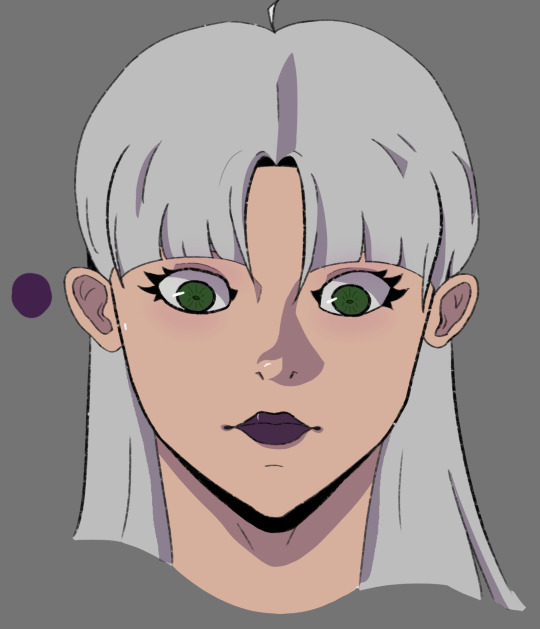
Note
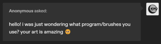
Hello!! I absolutely love your art!! it's helping me find my own art style and confidence! Do you have any tips on shading or lineart :D?
hi tysm !! of course:D
most of the time i love to use vibrant n soft colors on my art, the way i shade these are pretty simple actually ! just take the base color and little by little start moving the the color wheel to the sides, to then, and change the tone of the color doing a curve shape.

and the result should look like this ! and if you want to make it look a little more fancier, u can try adding some highlights too.
i personally use white above w a slightly darker color than the base below it, to then change the layer mode to 'subexponer color', which gives the effect u can see here:D

and for lineart, do whatever you feel comfortable with !! try different brushes, with or without texture, give your lines volume or maintain them consistent, and if u want, you can even paint it !! there's so many ways to give ur lineart personality. experiment and stick w the one you think fits ur style better ^_^
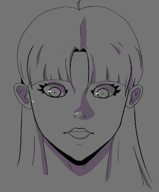
here are some examples of the drawing w different things done on the lineart.

the fisrt image's lineart is colored to match the base colors. and, in the second one, the layer of the lineart was duplicated, and it's above the original, then changed to multiply mode, w opacity at 70%
and since we're talking about lineart, here's a version of the example done w a different brush !! + the sketch -sadly i was a little bit lazy to finish this one hfjdhf-

hopefully this helped u !! thank u so much for asking :D<33
303 notes
·
View notes
Last Seen Blogs
foxianix
emanator of fluffy tails

fluxcinema
FLUX
justreallytir3d
I’m Crying
kohane-chan4
あなたなしでは生きてゆけない

fuckyeahpipesofpan
Pipes of Pan