#I like to composition and the colors but the execution itself wasn't great
Note
Hi! Are we going to get more Professor listener with Guzma? I loved yesterday's audio, it was so good!!
Ps. Great work on the new thumbnails! They look amazing and I'm seeing your videos everywhere on my YouTube home page!
I really like that scenario with Guzma and I think we miiiiight just see a return to form for ya boy. I think doing a Big Red style "plot but not plot" scenario with him and this professor listener would be very doable and easy to have fun with! I have some ideas for more and I do love the secret lovers trope so...sounds like it could be a thing! It would also be a great set up for people to submit scripts with vague attachment to that general scenario, which I think help people get a little direction when brainstorming.
The thumbnails were exhausting, but they are absolutely working as intended. The recent Guzma video had a 5% higher than usual click through rate, which is huge because my average is already good.
Something I think worth stating: I love the color coding + structure of my old thumbnails. I was really proud of them for what they were, but on YouTube in 2022, they do not work. They are boring. Were they convenient? Yes. Very convenient. But they very simply did not work.
I think I can absolutely build on adding some brand identity to the new thumbnail style. I think that's ideal (and I won't go change every single thumbnail to match it this time lol), but the immediate and significant improvements are very clear to me.
It HURT MY SOUL to ditch the clever titles, but it doesn't inspire people to click. It just doesn't. You have to use keywords and hooks to get people to watch your shit. Some of those thumbnails are fucking cringe, trust me, it was not easy. I identified the issue with my thumbnails a LONG time ago but didn't have the spoons to try and change anything. I got comfortable.
And you know what happened?
My numbers started dwindling. Less engagement. Less conversions. Less interest. Even if the content itself has actually improved, I wasn't doing a good job at marketing it. I am confident in my work, I see huge strides forward I've made...but what good is it if I slack on actually getting it out to people and doing the YouTube thing well?
The fact is, there are ASS UGLY thumbnails out there and those videos do well despite it. But if there's a general pitch for the content within, it's significantly more effective than what I was doing. It's not a small margin.
There's some additional plans I have in mind for the thumbnails, but it'll take a little time. We've retroactively made old artwork work for the composition and space, but I think a big plus will be having super high quality busts of the characters w/ a few different expressions to further differentiate the videos. I'm hoping to bring a background artist onto the team and that'll let me get even spicier with the thumbnails and have actual relevant backgrounds for the thumbnails rather than stock images.
So...lots of things went into the planning and execution of the change, quite a bit to consider...and it's working. That's the big thing like, if the change negatively impacted videos or didn't lead to any improvements, then yeah I'd probably be kicking myself and frustrated. It was a very clear issue and the solution was very positive.
Anywho. Just wanted to put that out there. lol
35 notes
·
View notes
Note
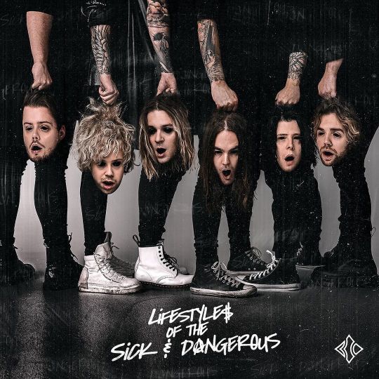
abby, can we have an arty analysis of the album cover (now it's confirmed) 🙏🏻🎨🖼🤲🏻
dunno about an analysis but I'll happily give an uneducated art rant ✨😌
what stands out to me first is that using a band feature photograph it's a step out of line from their previous album covers, which in the past have been 2 designed graphics and a stock photo. but it's not like band feature covers are out of character for them either - they've done a lot of those with their singles (I didn't even realize they did it this much until now lmao). it's not uncommon for bands to use a mix of covers, but I've noticed most bands do have their preferences in terms or illustative vs. photograph covers, and whether or not the band itself is featured in it. so far BC has definitely favored band photos for single covers, but leaned towards design heavy covers for the main album releases.


that being said, LOTSAD follows Violent Pop really closely with the black and white color theme, heavy texture filter, fairly similar font choice, and most of all opting out from having the band name on the cover and counting on the logo to do it's thing. if the album name wasn't there and you told me the LOTSAD cover is just the cover for Violent Pop Deluxe Edition, I'd probably believe you.
in terms of the photo itself - I like the composition and the visual flow. it has Kiril's signature style (which Niko confirmed on ig literally while I was writing this lmao), and the result is great. there is however some things with the editing that I'm sure work perfectly fine in most people's eyes, but I'll nitpick it anyway.
first is the fact that it's impossible to mangle someone's face like that, stretching it from natural live proportions into a hanging mask, without messing with the skin texture and lighting. which means there's some little spots where the lighting bothers me or I think there's been some airbrushing. tho not much, because most of it gets blended with the scratchy texture filter. which is my second point - I'm not a fan of the texture overlay. it can be an artistic choice, BC does love their heavy editing, and it does include the words "sick & dangerous", so it was clearly created specifically for this cover. but filters are also a quick way of hiding photoshop mistakes, so something this heavily edited always makes me squint to see if it's something that was actually planned from the start, or if there's some photoshop fuckups it's being used to hide or distract from. knowing how much stretching people's faces does undeniably fuck shit up, I think here it's a case of both. it's fine, it fits BC's aesthetic and is hell of a lot easier than trying to reintroduce the old skin texture to every part you've had to edit. Ossi did a good job with what he had to work with and what he was asked to do, and I do appreciate the texture overlay being personalized for the album.
overall it's an awesome cover, it's extremely on brand for them, and well executed 🔥
20 notes
·
View notes