#I like the redesign but I didn’t know how to color it
Text
Five years ago today, She-Ra and the Princesses of Power premiered on Netflix. I had seen a few preview articles about it, and liked what I saw. Those articles mostly focused on She-Ra’s, Adora’s, Glimmer’s, Bow’s, and Catra’s redesigns, and I thought they were fabulous. I loved Adora’s new red jacket and bouffant hair style. Glimmer’s entire redesign was inspired, and I loved that they made Bow black so we could have more diversity in the main cast.
It was She-Ra’s and Catra’s redesigns that caught my eyes the most, though. They made Catra an actual catgirl, and not just in the anime sense where she's just a cute girl with cat ears and maybe a cat tail. She was a full-on furry. It was a brilliant design choice. Honestly it’s no wonder that so many were instantly drawn to her.
And of course, She-Ra herself. I loved her new look, and her huge ass new Sword of Protection. In fact, I loved it so much that I drew this picture of her before the show even came out:
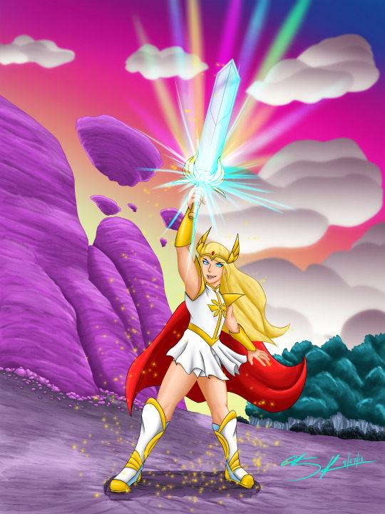
Then the show came out, and needless to say, I fell in love. And honestly, it changed my life.
I know, I know. That sounds very hyperbolic, and to an extent it is, but in a lot of ways, I’m absolutely serious.
Alright, I have to back up a little. Back when I was in college, and for a few years after, a couple of friends and I tried to make a webcomic called The Devil’s Gate. It was minorly successful but eventually floundered. Then I met some people and we tried to make a video game, which also failed. After those few years, I found myself on my own and trying to rework the concept of my webcomic. Making comics, creating stories, those have always been my dream, and I was desperately trying to figure out a story I could make work, something that I believed in. But it never truly got off the ground. By the end of 2015 I had given up on the comic, realizing that after working on it for years in different forms that I needed to step away from it.
I didn’t really know what to do after that. I was still doing my quick daily doodles, but I wasn’t writing, I wasn’t drawing anything of note. I felt emotionally and physically drained of my creativity. I was honestly getting to the point where I thought it might be time for me to give up on trying to be creative or making things all together.
She-Ra and the Princesses of Power came out on November 13, 2018, but despite looking forward to it, I didn’t actually watch it when it came out. It wasn’t until that weekend that I decided to check it out.
I was instantly hooked. I binged through the entire season in two days, and did plenty of crying and cheering. And then rewatched it immediately. I was in love. I was obsessed. It had been a long time since anything grabbed me like SPOP did. I loved the characters. I loved the colorful, sci-fi-fairy tale world of Etheria. I loved how unapologetically feminine it was. And most of all, I loved how queer it was.
I hadn’t done a ton of shipping before SPOP. I’ve been down bad for harlivy for what feels like my whole life, and I was angry when Mika and HG didn’t get together in Warehouse 13, but more often than not I had just been conditioned not to look for queer things in mainstream culture, and even barely in subculture.
That is to say, when I was smashed in the face with Catradora I was surprised how much I glommed onto it immediately. I was absolutely taken with Adora and Catra and their relationship. Both characters were so relatable, and despite not quite being text (although the subtext was so loud and obvious it might as well have been text), it was impossible to not read their feelings for each other as romantic.
It wasn’t just Catradora, even if that was a lot of it. Spinnerella and Netossa being canon from the start was wonderful. How much Glimmer and Bow screamed “BISEXUAL DISASTERS” from the start was adorable. Scorpia’s crush on Catra was as cute as it was sad in its one-sidedness.
I had never really been in a fandom. That is, yeah I’ve liked things, loved things even, but I never found other people to talk about it at length, never found discords just for that thing, never read or wrote fanfic, barely ever drew fanart.
But, I watched SPOP, and then I watched it again. And then I drew Catra. And then I drew Adora. And then I drew them again. And suddenly I was on AO3, a site I never frequented, reading Catradora fics. And then I had an AO3 account. That December I participated in Catradora Week 2018 (I’d never heard of this kind of thing) and drew two pictures for it and wrote my first fanfic.
By the end of February I had drawn more in the three months since the show had premiered than I had in the previous year. I was working furiously on a long, multi-chapter fanfic, and writing more words than I had in the previous couple of years combined.
I was inspired again.
In the 18 months that SPOP ran for, I drew more than I had in years, I wrote hundreds of thousands of words. I felt so rejuvenated and happy about my creativity and free for the first time in years.
It’s hard to put into words exactly how it felt. I was so close to giving up my art and writing, which honestly, would have been giving up a part of myself. An important part of myself. It’s not overstating that SPOP saved me, or at least my creative spirit.
I also learned about the wonders of being in a fandom and fandom things like fan weeks, big bangs, zines. And I made some wonderful friends that I cherish to this day.
Even as I inevitably moved onto other hyperfixations, my love for She-Ra hasn’t diminished. Plushie Catra and Adora sit next to me on my desk every day. Catradora art still hangs on my wall.
The inspiration that SPOP ignited in me hasn’t died either. It’s carried me through a tremendous level of creativity that I’ve been riding since the premiere. It let me create a ton of fan art for SPOP, and then RWBY and then the Witch From Mercury, and I’ve written a ton of fanfics for RWBY and Supergirl. And perhaps the best, that inspiration has helped me create more OC stuff in the last couple years than I had in a long time.
I owe She-Ra and The Princesses of Power so much. I am so happy that it exists and that it happened when it did. I’ll always cherish it.
And for real, Netflix, SPOP spin-off movies WHEN?!
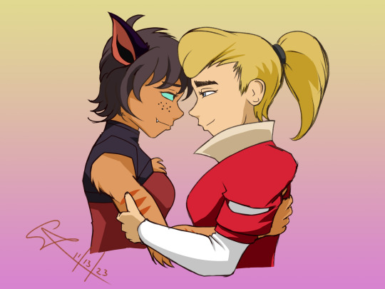
#art#she ra#adora#catra#catradora#sk's art#shera#spop#she ra and the princesses of power#shera and the princesses of power#she-ra and the princesses of power#she-ra#fifth anniversary#netflix#netflix she-ra#wlw#lesbians#sapphic#lesbian love#lgbtq+#lesbian
350 notes
·
View notes
Text
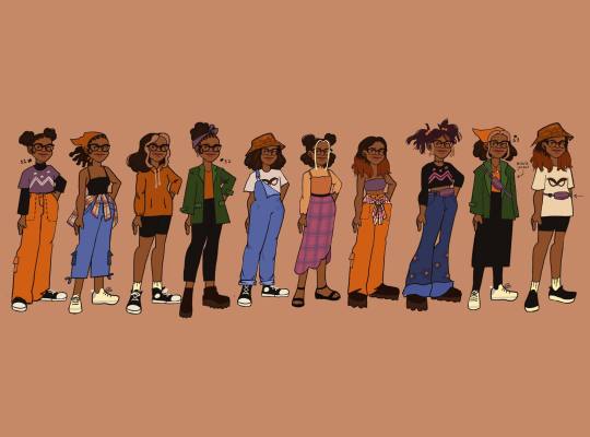
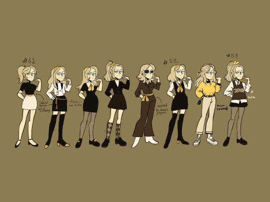


some designs i came up with for the girls in miraculous. the idea was 'what if they could have multiple outfits like sailor moon, as told by ginger, or totally spies?' and 'what if their clothes reflected their story arc?' however, i kind of gave up on them because i no longer have time to work on it as much as i would like to, so below this are copy+paste from my wip instagram account. lowkey its fanfiction-y lol
Alya:
Alya redesigns! tbh don’t know if they’re cohesive but 🤷♀️
S1: dresses for comfort & is geeky - think DrWho/Marvel/Tumblr. Obsessed w superheroes & has dedicated blog for each one, & that includes LB. Beginning of her & Maris friendship, starts to dates nino halfway s1.
S2: Mari influences her way of dress, still geeky but experimenting w clothes. Ladyblog becomes popular, interested in finding out her secret ID. Is also investigating akumas, HM, The Who/what/where/whys. Lowkey figures out who ladybug is but doesn’t say anything. Has been given fox miraculous at least a couple times.
S3: notices changes in Maris behavior & confronts her. Becomes fox miraculous holder full time, helps LB figure out who HM is & shares all the info she’s found. CN lowkey pushed to the side, causing friction, bc wrapped up w finding out who HM is ig. Constantly wears a Fanny pack now for trixx. Goes w comfortable but stylish clothes (ig lol idk) also at this point is BFF w Mari
Chloe:
S1: wears preppy designer brands to impress mom, despite living in diff countries. Basic mean girl, her only friends being Sabrina and Adrien - whose a childhood friend & lowkey helped him attend school. Both know how it feels to “lose” a parent & Adrien has seen a softer side of her. Probably has a crush on him ig. Maris bully, jealous of her talents at sewing & making friends easily, & prob her knit tight family.
S2: still preppy but w 60/70s inspo. Given bee miraculous a couple times, has resisted akumas - info she uses to help others later.
Helping ppl & being somewhat nice makes her feel good & likes the appreciation from others+LB. Maybe Mom moves back to Paris w half sister, Zoe - might be significantly younger than Chloe idk. Didn’t like her at first but warms up to her as season goes on. Sees lil sister copying her & their mom, has an epiphany ig. Connects dots on akumas & feelings & tries to be better.
Should Zoe exist tho??? idk
S3: preppy but more casual. She’s nicer but still sarcastic, has made a few new friends, treating Sabrina better. Still trying to get moms approval tho & follows her around, even to fashion things w the Agreste. Notices Gabriel is acting strange, more distant towards Adrien, doesn’t notice what he’s doing or where he’s going. pt queen bee ig, probably given towards the very end of the season tbh by Adrien/CN after being ignored by LB bc of RR involvement w finding out HM id. AND noticing Chloe change significantly in the past several months (?) does Adrien reveal to her IDK he is still loyal to LB but eH
Mari:
1st Mari is shy, her outfits are safe & she kind of disappears in a crowd. She just became 🐞 & isn’t 💯 with her role yet. She’s designed and made her own clothes but doesn’t wear them outside of the house bc Chloe, oof
2nd she’s now comfortable being 🐞 & that boosts her confidence as Mari, she’s wearing more bold colors & outfits that she may or may not have designed herself 👀
3rd 🐞 is now the guardian of the miraculous box, has bigger responsibilities & problems to deal with. Being 🐞 has creeped into her daily life. Doesn’t have time to design/make clothes so wears w/e, but tries to appear happy.
Kagami:
i like the idea of kagami being prim and proper looking all preppy at the beginning, but after making friends she starts to rebel by modifying her school clothes w accessories but eventually wears w/e she wants w a punkish vibe. lowkey worried about falling into a trope so idk
666 notes
·
View notes
Text
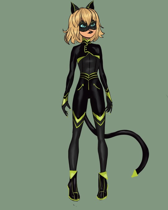
Kitty noir redesign, I had a lot of fun with this one. I changed a lot including her hair, shoes, markings, eye color, mask, lipstick, and general color scheme.
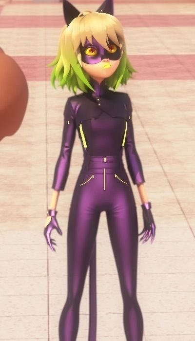
In my opinion the original design was a mess. I don’t know if it was intentional or not but there was a lot going.
Because there was a lot going on in the og design I did make the redesign pretty complicated with a lot of patterns and green accents. I kept her hair cut mostly the same though I took away the green ombré and fixed her bangs a bit. I kept the waist line of the original pants and the little half jacket thing. I changed pretty much everything else.
First off I don’t know why they made her purple but she can’t be black kitty without being black so I made her suit black.
I also didn’t like how this costume broke the precedent they had set of there being no exposed skin. Kitty noir had her ankles wrists and backs of her hands exposed so I changed it to be more like the other suits.
I don’t know why they made her eyes yellow but I felt like they clashed with her hair and skin tone so I made them the same blue color as Zoe’s eyes.
I added some stripe details to her mask added more green ( as opposed to yellow I don’t know why they made her accents yellow ) to the overall design and gave her green claws. I figured adding so much more green would set her apart from chat noir and lady noir.
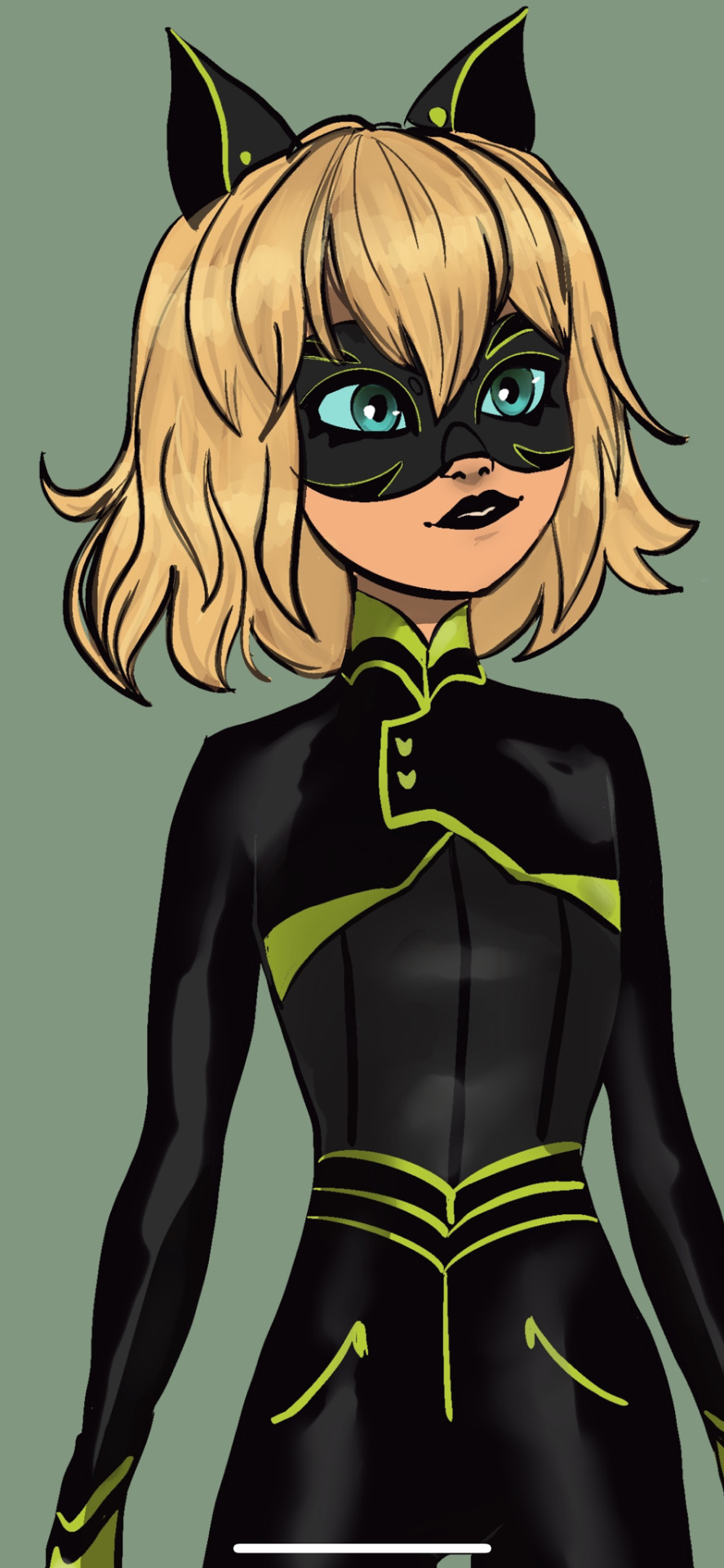
Finally I gave her black lipstick because that neon yellow green color was the part I most disliked about her design ( though the show does consistently give characters awful lip colors). Since I think they were trying to be alternative or something with the yellow green color I figured black would also be alternative and also more cohesive and readable.
Anyway I feel like the black cat miraculous is one of the easiest to design for and they made so many interesting decisions for Zoe. Especially with the color scheme which was pretty far from the established black cat color scheme.
#miraculous redesign#mlb fanart#miraculous ladybug#miraculous ladybug redesign#black cat miraculous#kitty noire#kitty noir#zoe bourgeois#plagg#miraculous lb#scarabella#scarabella and kitty noir#kwami swap
267 notes
·
View notes
Text
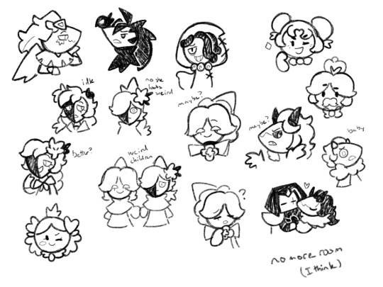
So we have part 2 of stylized Cookies, pretty much all from today other than bird girls
I feel like I did better yesterday, but also I haven’t seen yesterday’s drawing since yesterday, so I don’t really remember if it was
I was planning on drawing the Hollyberry family, but because I got stuck on Jungleberry (I deleted her so you can’t see), that didn’t end up happening. Funny enough, I was also like “I have no clue what to do for White Lily and Pure Vanilla so they’re probably not gonna be drawn for a while”, but what got me to draw more today was ideas for White Lily, and Pure Vanilla came along later
To be honest, White Lily and Pure Vanilla probably still need some tweaking before I color them. I’m still not really sure what I’m doing with White Lily’s hair, and for Pure Vanilla I feel like I haven’t done enough outside of the eyes and the hat. Maybe it’s because I gave him an oval head? I wasn’t really sure what head shape to give him other than it not being one I already used
Speaking of their eyes, White Lily’s are supposed to be pink with white irises, and Pure Vanilla is supposed to have no irises, but solid yellow and blue. Which when I was drawing looked somewhat unsettling, which is funny because since I draw so many Cookies, that’s usually normal now
Also also, I now want to make a purelily kid that combines their features, aka White Lily’s half shadow face and Pure Vanilla’s small non iris eyes. They’d look like the comedy mask. And probably also somewhat like Shadow Milk
As for the Hollyberry family, I think Holly herself looks good, and the other two look alright. Princess probably needs more tweaking. I wanted to give them a running trait of not just dot eyes, but leaves in their hair. I’m thinking that every Hollyberrian has leaves in their hair, since they’re berries. I am struggling with Royal Berry and Princess’, since the best place to it their leaves is where they have something else, aka their crown and heart pins
To be honest I want to make it so that Princess is half berry half candy, so that maybe she could not have to have the leaves, but I like Jungleberry and don’t want to get rid of her or turn her into a candy, so oh well
I drew Red Velvet because I was struggling with White Lily and Pure Vanilla. I gave him a triangle head because someone somewhere on my first page said something about Golden Cheese having a triangle face because the Cakes, so why not give the half cake Cookie a triangle head as well?
Also with Red Velvet I definitely took liberties in redesigning him, like with the hair and horns, but I don’t think he looks necessarily bad? As least not by the end
I also drew him with Dark Choco because darkvelvet is a thing I know. Though to be honest, while I draw it, I’m not sure how much I like it. Like in theory I like it, it’s not bad, it’s just that I don’t think I get it. Like as far as I can tell they can only be doomed by the narrative because Dark Choco leaves, but maybe I’m interpreting Red Velvet’s character wrong. It’s been over a year since I watched his story. And also I’m not sure what draws people to the ship? Like darklico for example I can get for various reasons, but I don’t know about darkvelvet
Oh yeah, Licorice is here too. Forgot about that. Well I tried to make his head oval shaped because it’s sort supposed to look like a skull? Or a cartoony skull. Same with his eyes and mouth, they’re supposed to be somewhat skull-y. I didn’t draw his actual skulls though because I’m lazy and it’s a small drawing. I think he turned out pretty good though
I think maybe next page I should focus on more random characters outside of the Ancients. Maybe that’ll help the creative freedom
Anyways yeah, I think that’s it for now
#one thing fun about doing these is that when I redraw the characters#I can make it so I don’t have to draw what I don’t want to draw#sorry I’m somewhat distracted right now#my brother was just telling me about something that happened with our dog#and my mind’s somewhat still on it#anyways#cookie run#cookie run kingdom#stylized cookies#golden cheese cookie#black raisin cookie#licorice cookie#hollyberry cookie#royal berry cookie#white lily cookie#pure vanilla cookie#red velvet cookie#princess cookie#my art
77 notes
·
View notes
Text
“The hellhounds originated from Gluttony and Beelzebub created them that’s why she looks like that. She’s suppose to be like the animal tamer of Lucifer’s circus.”
Okay but like Viv, none of that is made clear in your actual show. People had to actively ask if she was suppose to be the one and only Beelzebub and now your relying on Twitter fans to make theories on why your characters look certain ways or are allowed to do certain things, people who don’t follow you on social media aren’t gonna know shit about how this world works. I like subtle world building and hints, and I think the ideas of Beelzebub representing an animal tamer is fun (even if wrath makes more sense to me), but when the rules of how the hierarchy system and rings work is already so confusing and relies entirely on you looking it up online it just looks like you wanted to make another random furry design. Why are hellhounds represented by gluttony? We were never shown an instance of this before and the episode doesn’t even say that they’re in the gluttony ring at the start (which is just another Earth with a yellow sky this time how creative).
I’m not saying I want the show to spoon feed us everything, but just a little context and set up in the actual show instead of random things just happening all the time with no explanation would be nice? Like yeah it might get explained more later on in Hazbin, but why then did you make this entire spin-off show come out first taking place in these other locations and with these demon lords if you weren’t gonna set the ground rules of your universe for the audience? That’s exactly what’s causing people online to scramble to come up with explanations for you about why you have discrepancies like Tex and Beelzebub not being a big deal but Stolas and Blitz are, your relying entirely on diehard fans to wave away your shitty writing and world-building cause you never take even a single moment in your show to have a character say anything that would clew us in on how it all works. There’s too much exposition in writing, and then there’s never giving any so you just have to make guesses or listen in on streams to figure out what society your characters are even suppose to be navigating.
Also for the “A bee/fly would have been unoriginal and ugly, she doesn’t have to follow the Bible lore” people, have you considered the fact it’s just a messy design? Like I don’t even hate it on it’s own, she looks really pretty in the fanart I’ve been seeing. But putting aside the fact she’s just a wolf/fox girl, she has so many unnecessary markings, her actual hair combined with the honey hair looks so unnatural and awkward, the bug traits don’t stand out, her outfit is basically only a slight redesign of Loona’s and as people have pointed out makes no sense on her chest with the supposed undershirt. You just can’t tell what your suppose to be looking at when you first see her, it’s just noise, which is fine for an oc, but this is an actual animated show where your suppose to be communicating something. The problem isn’t she’s not fat, I’m glad they didn’t do that for her in a show with everyone else skinny it would’ve read bad, it’s that she only stands out because they slapped bright colors neon colors onto her, nothing about this design is clever. It’s just pretty aesthetics, no substance.
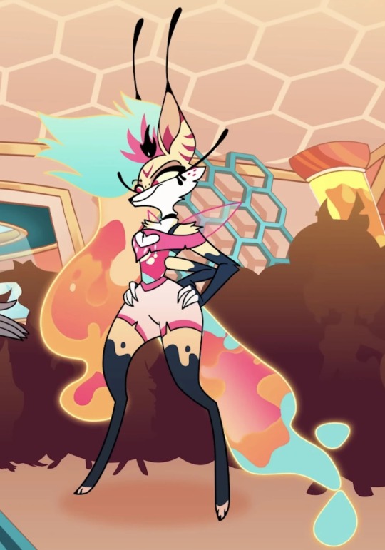
Also I’m sorry, they could’ve made her entirely a bug and still have been hot, why are people assuming we are saying she should’ve been ugly when we say we wanted a more insect-like design? I’ve seen loads of gorgeous bug designs for Beelzebub, people aren’t disappointed cause she’s hot they’re disappointed cause it makes no sense.
329 notes
·
View notes
Note
Summer prompt 16 with Jamie Tartt<3
Sorry this is so late omg
2023 Summer Blurbs
When you first got together with Jamie, you’d expected nothing to come of it. Sure, he was insanely attractive and surprisingly sweet, but you knew of his reputation, knew of the girls he typically dated for a few weeks before some big dramatic split. When he’d called you up again the next week, you’d assumed it would be a physical relationship only.
Instead, he was sweet and caring and payed attention to everything you said, taking you to your favorite small bookshop and carrying around all the books you were interested in without complaint. Unlike the first night you’d spent together, Jamie only kissed you softly at your doorstep before he headed off. It was all you could think about for the rest of the week, and you knew he must have done it on purpose.
Now, months later, you’re snuggled up together on his back porch as you watch the sunset, discussing rug colors for your redesign of the living room.
Jamie is one of those people who has so much love to give, but he often keeps that part of himself tucked away from the world. You’re one of the select few who are able to see him like this, all cozy and happy and debating the pros and cons of every single option even though you know if you’d say you like a certain choice more than others, he’d stop at nothing to make that happen for you.
As much as you know you should focus on what he’s saying, focus on choosing a rug because they’re more expensive than you thought, you can’t help but get distracted by how much you love Jamie. Really, how can anyone expect you to focus when he’s so close to you, when he looks so perfect and happy and comfortable.
You can’t help but gently card your fingers through his hair just to see the way he pushes back into your hand. You can’t help but place a soft kiss on his cheek just to see the way he turns a little pink as if you’ve never touched him before. You can’t help but to scooch impossibly closer just to see the way he holds you a little tighter and places a kiss on the crown of your head before carrying on about rugs.
“I guess we could always ask Roy, Keeley’d make him do it,” he says, and you didn’t realize just how much you weren’t paying attention so you simply hum in response.
“Dani and Colin said they’d help with my boxes,” you add, taking a shot in the dark and hoping you’re talking about the same thing.
“Good, ‘cause Roy’ll be slow since he’s all old and shit,” and you can’t help but to laugh at how Jamie never stops teasing him, even when he’s not around.
The conversation dies off after that, the two of you settling into a comfortable silence and watching as the pinks and yellows change into deep reds and oranges and purples. You don’t know what Jamie’s thinking, but you can’t help to imagine it’s the same thing as you - I’m so lucky to be here with you.
#jamie tartt#jamie tartt x reader#jamie tartt x you#jamie tartt fanfiction#jamie tartt fic#jamie tartt fluff#ted lasso#ted lasso fanfiction#2023 summer blurbs
166 notes
·
View notes
Text
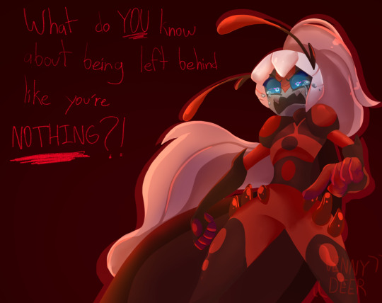
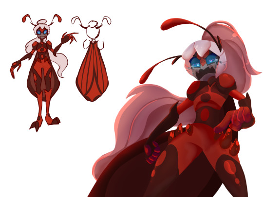
Am….yeah so Antibug Redesign
To let it clear, all of the akumas in my version are going to look like monsters and some how humanoid
Also for Antibug I didn’t want to her to be just a recolor of Ladybug, the last time I redesign her I give her another outfit instead of just give her my Ladybug’s redesign outfit with the colors in invert

But now the I decided to go crazy with the design I wanted to play along with her and this is was the result
And surprise, she isn’t a ladybug anymore, she is based in a red weevil, the bug got my attention of how similar in colors looks almost like a ladybug
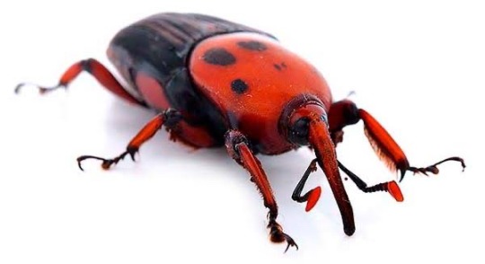
And the another reason why I did choose this bug is because unlike ladybugs, who are know to eat plagues to protect plants, does guys are the opposite of that, they are plagues
So yeah hope you like this re-imagination of Antibug
328 notes
·
View notes
Note
an query about cable!!! how did you figure out his outfit!!! what parts of his character shone out first!!! thank u i love him and u
ooo!! well, when i first made cable for class, he looked like this:
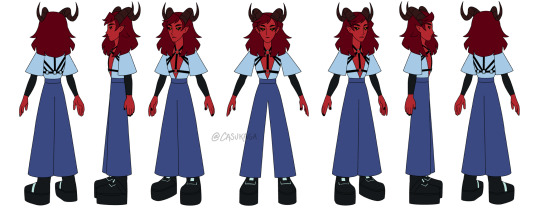
i knew i for sure wanted to give him a harness bc i thought that would be real cool (and also to suggest he’s a little,, y’know 🥴)
and then when i decided to play cable for the campaign, i wanted to redesign him to better fit the world. at the time, i had no idea what his backstory would be, and i texted my sibling, “i need to redesign cable for a dnd campaign” and they were like, “please make him slutty” in reference to his outfit. and i was like,, actually, y’know what? YEAH. so i decided to apply that to cable’s character and backstory, hence i made him work at a brothel, and i designed his fit like this LMAO.
so that is where my brain went. leather? chains? belts? alright!! and a collar of course. the horn jewelry was also a given because i looooove tiefling horn jewelry, and making it gold goes with him being red. i also wanted to give them makeup and heels. i love someone who just exudes confidence in what they wear, and i needed cable to have an “i know i’m pretty and i wear what i want, fuck you” attitude aUGSHSJ
i also knew i wanted to give them tats, but didn’t decide how heavily tatted he’d be until i saw someone on twitter with a bunch of tats, and i was like— yes i need cable like this immediately.
these were early dnd cable scribbles from may last year!!
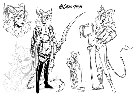


over time i started taking out some unnecessary elements and refined his design, so now they just look like this.

i’ve decided that, with cable’s overall fashion, he just likes wearing anything that shows off his body—like slim fitting outfits, or fits where he gets to show a lot of skin. black and gold are his favorite colors, so they especially like wearing anything black / gold. he’s also not immune to glitter or sparkles.
so yeah, that’s my guy :3
48 notes
·
View notes
Text
Ninjago movie influence appreciation post: ✨
The Ninjago movie influenced the show a lot yet there are still a lotta parts which aren’t talked about as much as they should be~
The redesigns are either great or okay | A lotta the people who hated them when they came out have either left the community or just accepted that this is how ninjago is gonna look. Which isn’t a bad thing, personally I love the redesigns cause they all look more grown up.
Each ninja got a specific weapon | Before the movie the main four had their usual weapons but Lloyd and Nya had the same weapons as Kai. It’s not bad on its own but making each ninja have a specific weapon just adds a little more individuality to them, plus it created a great situation in Dragons Rising where the new ninja can get their own special weapons too :>
The original plot for S8 SUCKED | the original idea was for it to be a direct continuation of Hands of Time, but due to the movie they were forced to add Garmadon. Most people don’t like Hands of Time but both the haters and the enjoyers can agree that the original S8 plot is mediocre at best. IMO it might’ve killed the series, ninjago was starting to go into a rut where not everyone enjoyed the new seasons, and another Hands of Time might’ve been the end of it.
Color coordination | maybe it’s the impeccable autism but I love how the ninja have very clear colors now. The OG’s (besides Cole) didn’t change that much and Nya got to be (almost) consistently the gun metal gray ninja, which would’ve been awkward if they didn’t swap Cole to having black and orange as his main colors. It’s just simpler and I like how Nya isn’t a coin toss every season now.
Garmadon got to come back | yes it does diminish his sacrifice in ToE but at the same time he’s a very dynamic and good character in the show. He brings out Lloyd’s personality more, he’s a great metaphor for the struggle to being a good person, and he’s consistently the snarkiest character in the roster. At least in Crystalized where him belittling Lloyd and the overlord is what gets me through the slug that is the crystastrophe.
If there’s anything else that the Ninjago movie did that was good for the show please inform me I’d love to know more (:
#ninjago#ninjago movie#lego ninjago#Lego Ninjago movie#lloyd ninjago#ninjago jay#kai ninjago#ninjago cole#ninjago zane#ninjago nya#ninjago garmadon#ninjago s8#ninjago hands of time#ninjago crystallized
55 notes
·
View notes
Text
Let’s address this issue…
Hey wassup I’m back, after deleting two posts because apparently my account is only used for “helluva boss shitting” I guess…
But I want to say something that really makes me a little concerned… about Viviziepop’s character designs.
Ok, lemme just say this… I don’t think Viviziepop is a good character designer AT ALL. Her main problem for me is not the colors, not the pencil thin bodies, but the fashion the character was born in, that’s right the FUCKING fashion.
Vivzie pop has a problem with designing characters that don’t look like exactly how she describes them, for example. Beelzebub, Beelzebub looks NOTHING like the actual Beelzebub, but I’m not talking about her today..
I’m going to be talking about Mimzy, a background character/non-speaking cameo that was shown in Hazbin Hotel.
(Just in case nobody knows her, here)

So, you’re probably saying, “Domino what are you saying? What are you tying to prove here?” So imma get straight to the point.
Listen, I don’t want to be a historical nerd here but this needs to be said, Mimzy is not an accurate flapper, instead, she is very stereotypical.
Don’t get me wrong, her design is very beautiful, and I’m so glad that we have a plus sized character from Viv. But her fashion is absolutely bullshit.
And it literally says in the wiki that she’s born in the 1920s, like I’m sorry but nothing about her will be real in the 1920s??? She’s literally a stereotype, she looks like those girls that have no fucking idea what they’re doing and buys a “flapper girl 1920s by spirit Halloween” costume, and then puts it on and calls it a day, like VIV PLEASE.
Alright, let’s get to the part where I critique her, as a vintage fan or 1920s fan, this is what I’m going to say nicely to her, and to educate other people who might be interested on what REAL flappers look like back in the day.
Flappers wouldn’t usually show much skin, the rule was that the shirt had to go down to where you can’t see the knees, shoulders were not shown that much and flappers didn’t wear as much accessories as Mimzy is wearing (necklace, feather hat, long gloves).
Flappers had very saggy loosely dresses, THAT was there fashion style, they liked to look like a potato bag, but what I usually see is that the stereotypical ones are very tight? Going along with Mimzy? Like girl, they did not wear those things they would not accept you if you wore that.
I also notice that Mimzy’s boobs are shown due to the tight inaccurate dress she is wearing, typically flappers didn’t show their boobs like that, since their dresses were very loose, nuh uh honey, flappers would use these bras to lower their breast size, kinda like a binder!
And tbh, I’ve never seen an irl flapper picture that had a feather hat thingy on their head, I can’t exactly explain if that’s accurate or not but hey! If ya know, tell me.
So my conclusion comes here…
Vivzie, if you want to make a character look like the period they were born/died in, please do it correctly, please look up references or talk to a vintage lover DO. SOMETHING. But please, don’t just look at one pic on google and say “oh uuuuhhh that’s so accurate! So imma uhhh add it on!” Because that’s not exactly how it works.
Hazbin Hotel fans, Mimzy is not an accurate description of what a flapper woman is, please check yourself before you go make a flapper Hazbin oc.
Still confused? Here are some amazing photos that I found!
Yes!!! ✅

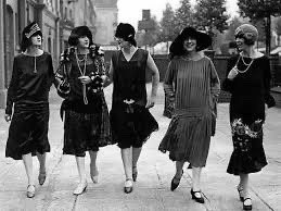
Hell nah!! ❌

If guys have any questions, don’t be afraid to ask! And if you’re interested in a Mimzy redesign, I’ll be gladly to do it XD
This was just a critique to Vivzie! No hate to her of course! I really hope we see her get a redesign that she deserves.
(I do have a problem with Alastor’s design too LOL)
#helluva boss critical#hazbin hotel critical#hazbin hotel mimzy#mimzy#hazbin hotel#critique#hazbin hotel critique#flapper#1920s fashion#1920s aesthetic
110 notes
·
View notes
Text

bliss redesign based off one I made in my teens
thought process + various other bits and bobs under the cut
I was 15 and annoyed by everything that moved when this character first came out, so in my own head I was very much making a Point with this redesign. Hence, I made very minimal changes. I wanted to work with what was already there and basically just make the existing design more thought-through. Little breakdown ahead (keeping in mind i myself am very much An Amateur who doesn’t know shit and am just ranting about my opinions and i also haven’t seen a single second of the 2016 reboot so i don’t know much about Bliss to begin with)
1. one of my Biggest pet peeves with Bliss is that the powerpuff girls each have bangs that are simple, memorable, and iconic while also being unique from each other and being reminiscent of irl little girls hairstyles. It’s very neat and clever and I like it a lot
and then Bliss has this confusing jumble of shapes that looks like it changes in style halfway across her forehead
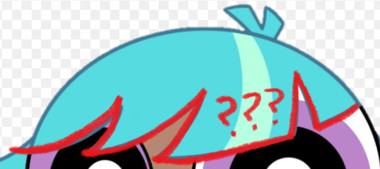
i have absolutely no idea what the intent is here. My only guess is maybe it’s meant to look weird on purpose like she was trying to cut it herself or something (I suspect it’s something like that since she seems to have normal looking bangs as a little kid from what I can see) but it doesn’t really come off that way if that’s the case. It just looks like baby’s first PPG OC where you Understand that it’s meant to be hair and that it is made out of shapes but have 0 understanding of hairstyle or character design in general. Heck I might have put this exact hairline on a character in the past at the age of like 8
So in my redesign she’s got 5 even notches across her bangs, not thee most exciting change but it does the job I think. It is pretty reminiscent of Blossom but they look different enough from each other that I wasn’t too worried about it
2. low-hanging fruit time, Bliss’s hair color is horrible on the eyes. I’m bewildered at the decision to do this, especially since there is just so much of it, I struggle to think of how she could exist in any scene without hogging all the viewer’s attention constantly. That said, I understand they wanted her to have an unnatural hair color to really signal that she is a Fresh new Teen character from the late 2010’s, which is. Whatever, that’s fine, so she gets purple hair now. I kept the streak for the same reason, especially since she’s got a lot of hair, so no harm in a little extra interest in there.
I also learned recently that her hair glows sometimes? which i did Not know when first drawing her but well i think the darker color helps anyway. It adds some contrast for when she’s normal vs when she’s glowing and makes the latter appear more,, idk threatening or powerful or whatever the mood generally is when she’s doing that.
I did re-add that toothpaste blue to her eyelids though. I like to think it’s also the color of her lasers. It’s a cute color, just not as like 70% of this character’s palette
3. real talk I was drawing this from memory and didn’t mean to change the way her hair flares out from her head. realistically I think the original is fine, maybe just a little boring but fine, so that part of the redesign was an accident. Only thing is, it’s in the exact same position in every screenshot I’ve seen? It doesn’t seem to whip around when she’s flying or anything which looks weird and probably looks weirder in motion, especially since it takes up so much space onscreen. Idk it’s a strange decision, esp since the original show liked to use the ppg’s hair to emphasize their movement, so I’d just bring more movement into her hair. I mean if nothing else it’d make her look cooler.
very very rough little visual of what I mean
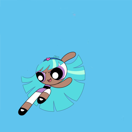
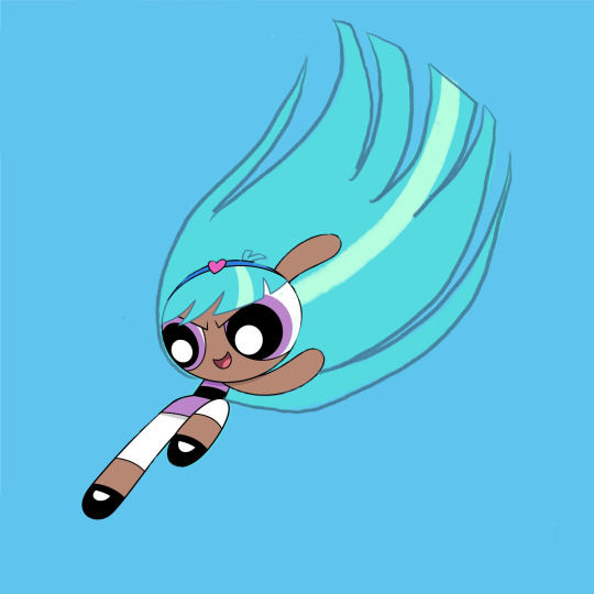
I also ended up making it shorter in my redesign—again, not really intentional, but I think it’s better that it eats up a little less of her silhouette
4. Her headband is largely the same, I didn’t hate the idea of her having an accessory, so I just toned down the colors. I’m not personally a fan of the powder blue and that pink heart is very bright and just doesn’t go with the rest of her (once again the color of her hair is doing it no favors). I also moved the heart over. Not necessarily needed I think, but I feel like it reads quicker as a headband and not a weird crown that way+introduces some asymmetry into her design that I think is nice.
5. my biggest gripe other than her bangs are her hips. I’m not against adding anatomy to this character design to make her read visually as older than the girls, but it’s so awkwardly done and distracting. I feel like it even interferes with her line of action more often than not (which is not helped by her unmoving hair).
Part of the issue is she still has the teeny tiny torso, just… with those square-ish hips slapped on, which makes her legs look all gangly and stretched out. I tried to balance out the proportions more in my redesign, as well as change the hips to a flared skirt. I think it helps differentiate her from the girls and still implies hips underneath, it just also functions as a less clunky transition from her torso to her legs.
Lengthening her torso also allows the stripe to look more like a belt above the skirt, which I think helps to sell her as “similar, but not the same” from the ppg
6. Her leggings(? Idk Im not a fashion person) aren’t a bad idea I think. like a more mature version of the girls’ stockings, but I think the white makes them look really distracting. It would help to make them a darker color I think, but since I wanted to keep them reminiscent of the girls’ socks I kept them white and just shortened them.
7. Not really sure what Bliss is wearing on her feet. I think they’re Mary Janes, but they’re drawn a bit different from the girls’ and I honestly think it’s too babyish a shoe for her to wear. I’m not sure what she’s actually wearing in my redesign either honestly, but the goal was just to make them look like the girls’ Mary Janes while clearly being something different.
8. Uh her signature color is something I’ve contemplated changing a lot but to be real I think it’s fine. I feel it was a very bad idea from a marketing standpoint because people were hype about Bunny and would obviously be mad they didn’t get her once the character actually dropped (and in the long-run she would just end up being overshadowed by the character everyone has already assigned that color to) but I’m personally not bugged by her being purple beyond that. If I were to draw them together though I think Bunny would have a more pinky shade of purple and Bliss leans more blue.
Loosely on the same topic, because of Bliss I’ve had a running headcanon that “only child” types of powerpuffs tend to come out purple. Kind of like how trios tend to have a red, blue, and green. It’s a fun little piece of fake lore to rotate around in my brain
Anyway with all that out of the way, here’s some redesigns I decided to have some fun with. Wasn’t being too precious about recognizability or simplicity or anything like that, but I did run out of steam partway through. There’s also one based off Whoopass Bell bc idk, why not

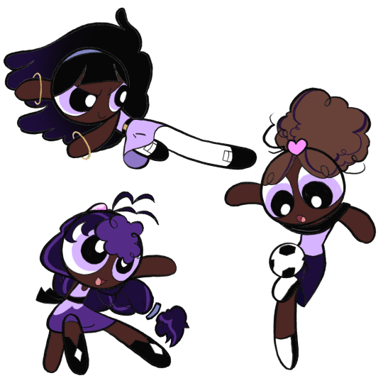
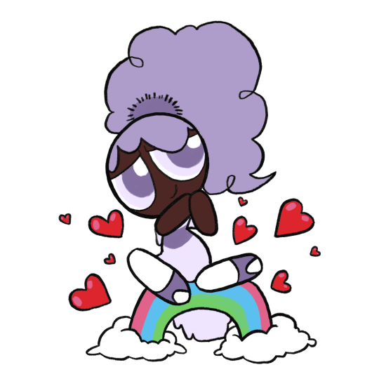
Finally, here’s some OCs I only ever drew once before out of a desire to give Bliss her own teen girl archetypes to form a team with. This is Bee and Beetle, who I’ll probably definitely forget about again immediately after posting this

#ppg Bliss#the powerpuff girls#my art#powerpuff oc#under the cut anyway#trying to do an interesting background#i got bit by a drawing bug and felt the strong need to finish this post today#i’ve been meaning to put together some art and a little ramble about bliss for a while#largely because idk if or when i’ll ever actually talk about her again#i also skimmed through this post once or twice so sorry if it’s incoherent#anyway this took a long ass time i need to take a nap or something
35 notes
·
View notes
Text
my own attempt at “redesigning” some hazbin characters
(extra notes: i decided that everyone wears red for the most part because that’s the uniform color for the hotel. that’s part of why i didn’t change certain things like husk’s or vaggie’s clothing colors. - i’m 17 with the only character design knowledge being my own personal ocs, so of course, take my criticisms with a grain of salt! - everything is a bit poorly edited in terms of recoloring because i did this on ibispaint for fun.)
here are all the (re)designs together. under the cut is more info about my thought process and side by sides.
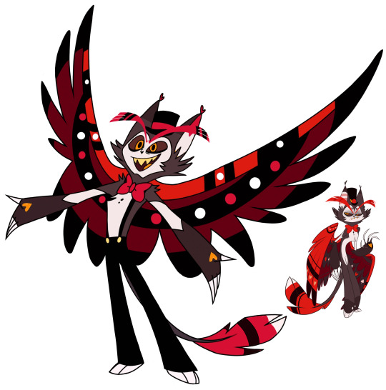
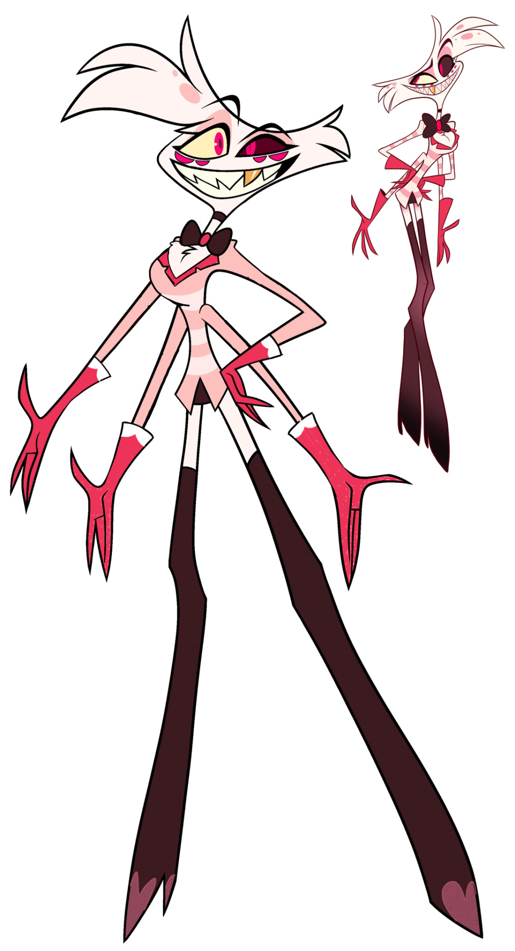
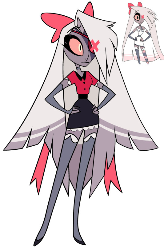
1. Husk
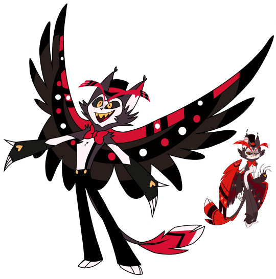

- The only things I changed were his pupils, the colors, and his tail tip stripes.
- I used his pilot colors because I realized they have a much warmer feel to them instead of the final design which made him look all greyed out and dead. Good for an old man, I suppose, but not good for when the inner wing is colored almost the same way as his fur, his pants, etc. Having these colors so dead makes him blend into himself too well, but changing the inner wings did a lot, I think.
- Gave him heavier lines under his eyes like eye bags, to replace the heavy fading eye bags that were in his pilot design.
- Got rid of the hearts next to his eyebrows. It felt like a bit much.
- In terms of his actual design other than the colors, I’m not mad about it! I actually adore the new pants and such. It was just the colors I had an issue with.
2. Angel Dust
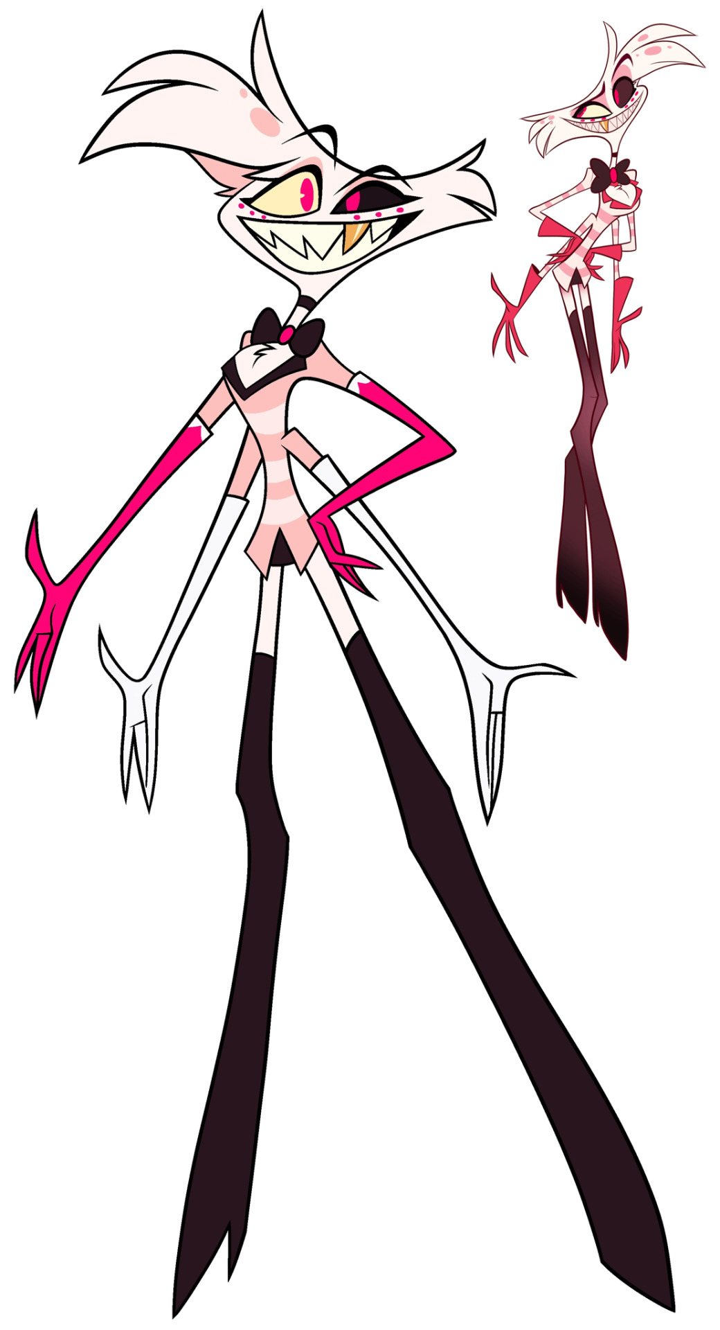

- God, he’s so ugly to me.
- He looks a lot like his pilot design, but for good reason. I realized that the pilot design also had more warm colors and not bright neon pink, so I used those colors instead. I really just.. changed all the colors.
- I hate his fucking gloves. I hate them a lot. So I replaced them with his usual short gloves, but gave them back the little white tips in the show design just to be fair. I have no idea why they decided to make the lower pair of gloves white, as it just looks like they aren’t wearing any gloves at all, alongside them having no pattern like the top gloves. It’s the weirdest design choice in the entirety of this design, to me.
- I made his extra eyes actually look like extra eyes instead of teeny tiny dots.
- Gave him his tit fluff back. Like, why’d they get rid of that? It’s apart of him, bro…
- Gave him pupils, cause he looks better with them than without them. I even gave him two different ones, just for fun!
3. Vaggie
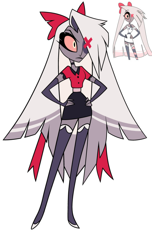

- Like Husk, I don’t actually hate Vaggie’s design. It’s the only one I have zero complaints about, actually. But I decided to mix in some of her pilot colors and traits to give her some sort of soft look, to mix in the loving girlfriend Charlie knows but also the ex-exorcist that she still is.
- I recolored her stockings, her choker, her (arm things?), and made her bow rounder, to try and tie in the idea that she’s wearing a uniform but also still wearing these softer things to be more comfortable. Again, just attempting to make her look less aggressive.
- Gave her an eyepatch so the X over her eye would make a bit more sense, design wise. Because we don’t see any form of scarring under there, I don’t think? I could be wrong. Would also explain how everyone else notices the X.
- I don’t know what the light pink middle was about, so I changed it to black.
- Recolored her sleeve frills to be white and gave her the same white frills on the bottom of her skirt. Honestly, I just thought it looked nicer.
#edits#redesigns#hazbin hotel redesign#hazbin hotel redesigns#tw vivziepop#cw vivziepop#vivziepop critical
28 notes
·
View notes
Text

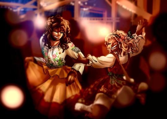

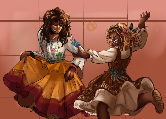
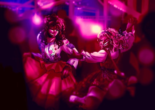

I’m in a prison of my own creation.
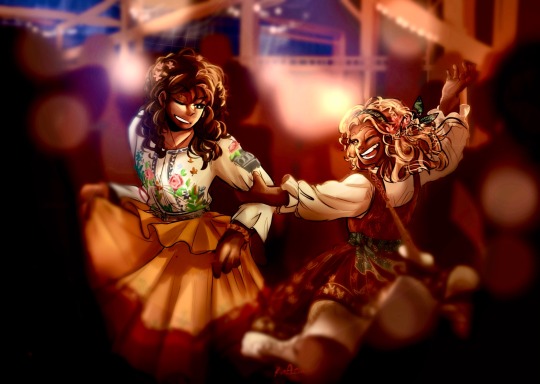
I started working on this a few months ago, put it on hold and then blasted this thing with color. It’s hard to draw people dancing when you don’t know how to dance yourself and more so when you don’t go out to touch grass to dance with others.
Anyway, I stated before I really liked Maude Ivory in the book, it’s a shame we didn’t get much of her in the movie. In the book, I’m pretty sure Maude Ivory was described to be a lot shorter, that’s on me (but listen I remember 11 to 9 year olds, they shoot up like weeds it felt like I was living in a world of skyscrapers when I was 9)
(If I draw her again, I’ll be sure to make her shorter)
Few other notes:
- Based on what I’ve read, Lucy Gray definitely feels like Maude Ivory’s favorite
- Her hair was so hair to design cause I just had a lot of options in my head. I’m still getting used to drawing curly hair (and had to leave for a few days to get it right 😅)
- Lucy Gray mentioned in the book that “Polka dots make me happy” so maybe I’ll redesign Maude Ivory’s dress to have polka dots
- In the book, Lucy Gray mentions that Maude Ivory hasn’t gotten much sleep since LG was sent to the games, even after returning, so if you zoom in, they both have some eye bags
- I tried doing this thing where if you cover half of their face for just one eye and eyebrow, it shows a different emotion (subtle but still different). I tried doing that for Maude Ivory, lmk if it worked
- It’s my headcanon that since the Covey love color but don’t have that much clothing to spare, they just embroider everything which is why LG’s shirt looks like… I don’t want to talk about it
(When you spend an hour embroidering the dresses and it gets blurred…)
(While coloring her dress one thought in my mind was “why is her dress reminding me of the Vietnamese flag 😅….)
#the ballad of songbirds and snakes#bosbas#maude ivory#coveylovecolorsoitookittotheextreme#lucygraysupremacy#maudeivorysupremacy
25 notes
·
View notes
Text

My lady noire redesign.
I don’t think the original design was necessarily bad but I did have a few issues with it.

For one I don’t love the braid instead of the belt, mostly because the belt moves like a tail on chat noir and I don’t remember the braid working the same way so it’s not as expressive ( I might be wrong but I think it just hangs), and while it was kinda cute I had the idea to have like small black ribbons on her pigtails that resemble whiskers so I scrapped the braid entirely. For the tail I made a sash/belt thing instead.
Another thing I really didn’t like was how she had itty bitty claws that you could barely see. I want her to have big sharp claws at least as big as chats.
As for the colors I like the green in that it is part of the black cats color scheme but I think the blue would make it more her own. We’ve also seen with kitty noir that the eyes don’t necessarily need to be green. I did make a green version since I do kind of like it. I honestly don’t know what I prefer.
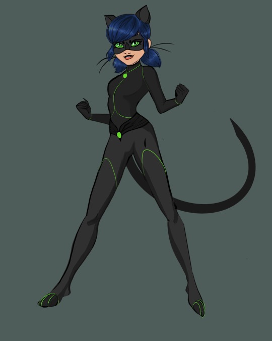
Finally I did not like how boring and plain her suit is especially compared to chats which has all sorts of textures and details (wrist cuffs, bell, boots, belt, pockets, sectioned parts, etc)
So I added a few more details plus some interest to the mask.
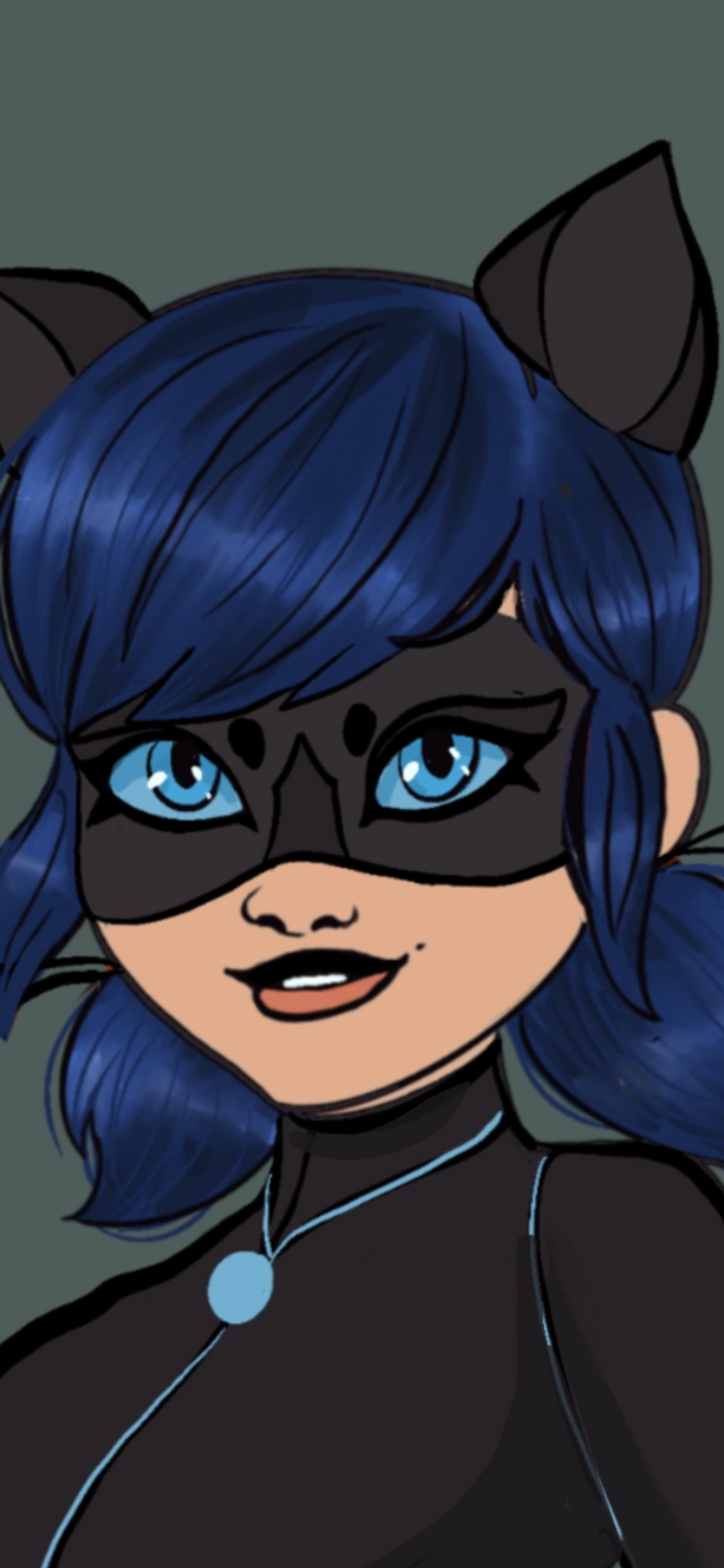
I also made her top lip black, kinda Kim possible style.
Overall I’m pretty happy with my redesign, she feels more like marinette to me.
#miraculous redesign#ladybug and chat noir#mlb fanart#ladynior#lady noir redesign#ladynoir#art#marinette dupen chang#mlb marinette#ladybug redesign#reflekdoll#kwami swap
166 notes
·
View notes
Text

So today I just drew a whole page of my old character Vanilla Powder Cookie
I was on the page with Snow Fungus, and one of the characters there was Vanilla Powder, with her design seen in the top left there. I was looking at it, and I was like “I’m not sure it makes her look like a proper small child”, and since I’ve been trying to figure out how to make a character look distinctly like a child, I decided to redraw her on a new page just for her
And surprisingly, for once I actually finished one of these
So now I feel like listing some things about her, some of which isn’t exactly new, but I still feel like reiterating
So as you can tell, she’s Pure Vanilla’s daughter, one that he had before he got his Soul Jam and his kingdom was founded. She was a baby or toddler when it was founded, so she spent almost her entire life as the Vanillian princess. In addition, she’s the direct ancestor of the Custard family (though I don’t know what her kid’s name would be). However, she unfortunately is not around during current day, as she was baked up to a thousand years prior to current day, so she crumbled a long time ago. Though she lived a long life and simply died of old age, so things didn’t go that bad for her
Oh, also I feel like I should show the original version of Vanilla Powder, just for posterity

She looks entirely different, I think for the better
The younger version of her is mostly just based on the previous version, with an entirely new outfit. I feel like the outfit looks closer to something a kid would wear, but I’m not sure
Then I decided to finally give her a proper adult redesign, and I think I did quite well, much better than the original
I mostly used this one picture from a development commentary for her outfits
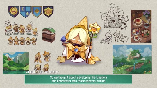
Her three cones were because I wanted to convey her status as the princess in some way. They were originally all next to each other, but I felt like they didn’t look particularly special like that, so I instead but the side two further down on her head. But then they reminded me more of hair clips like what Saiki K has, so now I’ve decided they’re possibly magic things that help her control her magic. And also they come off when she uses it. She probably got them as a teenager
Also her eyes are now brown since it fit better with vanilla extract (aka what I think Pure Vanilla is supposed to be), and also because while she’s the Custard ancestor, she’s from long before them, so she doesn’t have to keep the same blue eye color as them. Also, I’ve now decided that Vanilla Bean, aka my OC that’s Vanilla’s dad, has brown eyes. Though I do wonder if I should have given her blue eyes, to break up all the browns and yellows. That’s what the blue on the page is for
Edit: so I ended up changing her eyes to that blue. It’s not PV’s blue because I didn’t really think his light blue works on her. I think it looks nice
Also in her original design, she was going to have a design that looked ambiguously like she could be a purelily kid, but by this point she’s mostly just based on Pure Vanilla, the hair style’s really the only thing somewhat similar to White Lily
I think that’s about it for her, I hope you like her!
#cookie run#cookie run kingdom#pure vanilla cookie#cookie run oc#vanilla powder cookie#my ocs#my art#redesign
76 notes
·
View notes
Text
Y8 Ismelda & Merula Redesign Concepts
Masterlist | Ismelda Redesign | Y8 Penny | Y8 Skye | Y8 Andre
Alright everyone! Here are my concepts for Ismelda and Merula because I don't like how JC designed their post Hogwarts look. Well, Merula was alright her hair was just awful. I originally was just gonna do a touch up for her hair but I went all the way and gave her a new outfit too 🙃
Ismelda's redesign pretty much follows what I had planned for her role in my version of Hogwarts Mystery. Her design also stays close to how I made her redesigns for her Hogwarts look.
Okay now Merula! Girl what did they do to your hair?!
Again, wasn’t planning on making her design but I looked back on the datamines and first thought “i see merula still doesn’t know what a comb is” then I thought “what the absolute hell is that color choice?”
This could have clearly worked out if they didn’t make her hair so damn shiny! So for my redesign, above you can see that I made her hair a little longer. Specifically the locks at the front and towards the back it’s more layered and wild. I fixed that ugly dead starfish of hers as well and made it appear more as highlights. And I got rid of the bright yellow because it does not match with that dark shade of brown.
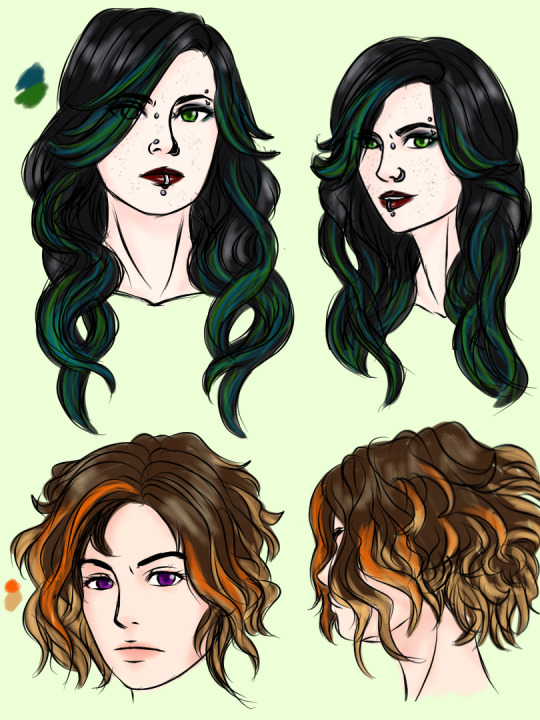
I kind of overdid it with Ismelda, but hey she looks good. I mentioned in one of the datamine posts that I feel like Ismelda would be good working at a tattoo parlor so her design has quite a few tattoos and piercings. In my revamp for her, Ismelda eventually gave up on trying to be like her sister and started exploring her own style. And Ismelda would totally fit for this aesthetic!

Now for the outfits!
Honestly Ismelda's design was so boring, I’m sorry I know some like simplicity but I don’t. She could use some color AND leather would have looked good on her (c" ತ,_ತ) so would chains and a choker. And I was right. And Merula, again, wasn’t planning on giving her a redesign. But once I started on her hair, I thought of a new outfit too! Not a heavy redesign but an altering of her canon design.

#ariparri#merula snyde#ismelda murk#hogwarts mystery#hphm#harry potter hogwarts mystery#post hogwarts#y8 spoilers
33 notes
·
View notes