#Best artist canvas
Text
cant tell you how bad it feels to constantly tell other artists to come to tumblr, because its the last good website that isn't fucked up by spoonfeeding algorithms and AI bullshit and isn't based around meaningless likes
just to watch that all fall apart in the last year or so and especially the last two weeks
there's nowhere good to go anymore for artists.
edit - a lot of people are saying the tags are important so actually, you'll look at my tags.
#please dont delete your accounts because of the AI crap. your art deserves more than being lost like that #if you have a good PC please glaze or nightshade it. if you dont or it doesnt work with your style (like mine) please start watermarking #use a plain-ish font. make it your username. if people can't google what your watermark says and find ur account its not a good watermark #it needs to be central in the image - NOT on the canvas edges - and put it in multiple places if you are compelled #please dont stop posting your art because of this shit. we just have to hope regulations will come slamming down on these shitheads#in the next year or two and you want to have accounts to come back to. the world Needs real art #if we all leave that just makes more room for these scam artists to fill in with their soulless recycled garbage #improvise adapt overcome. it sucks but it is what it is for the moment. safeguard yourself as best you can without making #years of art from thousands of artists lost media. the digital world and art is too temporary to hastily click a Delete button out of spite
#not art#but important#please dont delete your accounts because of the AI crap. your art deserves more than being lost like that#if you have a good PC please glaze or nightshade it. if you dont or it doesnt work with your style (like mine) please start watermarking#use a plain-ish font. make it your username. if people can't google what your watermark says and find ur account its not a good watermark#it needs to be central in the image - NOT on the canvas edges - and put it in multiple places if you are compelled#please dont stop posting your art because of this shit. we just have to hope regulations will come slamming down on these shitheads#in the next year or two and you want to have accounts to come back to. the world Needs real art#if we all leave that just makes more room for these scam artists to fill in with their soulless recycled garbage#improvise adapt overcome. it sucks but it is what it is for the moment. safeguard yourself as best you can without making#years of art from thousands of artists lost media. the digital world and art is too temporary to hastily click a Delete button out of spite
23K notes
·
View notes
Text
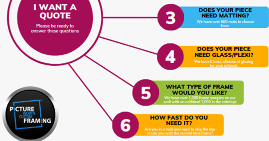
It Really Saves Time...
Want A Quote?
When clients are in need of a quote for custom framing services, they often turn to Google for assistance. They will typically type in search terms such as “best custom framing near me” or something similar. This is a smart approach as it allows them to quickly find local businesses, like ours, that offer the custom framing services they require. Clients can easily compare…
View On WordPress
#Conditional Frame Repair Glass Replacement Canvas Re-stretching Insurance Quotes For Art Ready-made Picture Frames#3 piece wall art#80 x 100 canvas#Aaron brothers framing#Aaronbrother#Aaronbrothers#Acrylic frameless frames#Acrylic shadow box#art crating#Art frames near me#Art framing Houston#Augmented Reality#Best artist canvas#Best custom framing#best framing#best framing Houston#best framing near me#best framing Spring#best picture framing houston#best picture framing near me#best Woodlands framing#Black picture frames set#blog#Bradleys framing#Buy framed art#canvas#canvas collage group#Canvas finance#Canvas framing#Canvas framing near me
0 notes
Text
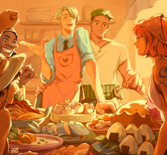
thanks for the light
I was just trying to figure out how procreate works but then the op brainworms got to me and 35 hours later here we are! can you tell I miss home-cooked meals :')
(no reposts; reblogs appreciated)
#my art#artists on tumblr#fanart#one piece#opla#zosan#blackleg sanji#op sanji#roronoa zoro#nami#usopp#monkey d. luffy#i was like wow procreate is so cool for letting me check time spent on each canvas...35 HRS and 22 MINUTES????#tbf it's spread out over 3 weeks BUT STILL#guys...the file name for this is nakama.png and im so emotional about it#something something comfort food and family and this is what love looks like and now im sobbing#im so predictable it's the found family that gets me every time#and the scene where they all announced their dreams with a foot on the barrel?? i swear i teared up a little#also this is lowkey the most complicated thing i've ever made im so proud#nothing but the best for these strawhats <3
15K notes
·
View notes
Photo

“No, wait,” says Finnick. “Let's do it together. Put our faces right in front of his.”
Well, there's so little opportunity for fun left in my life, I agree. We position ourselves on either side of Peeta, lean over until our faces are inches from his nose, and give him a shake. “Peeta. Peeta, wake up,” I say in a soft, singsong voice.
His eyelids flutter open and then he jumps like we've stabbed him. “Aa!”
Finnick and I fall back in the sand, laughing our heads off.
When I recently reread the series, this moment was just pure gold. It was so funny and silly but it also felt so earned among the rest of the books and it’s such a great way to start off their alliance. They deserved this moment so much.
Also, it’s not mentioned that they’re making faces but I couldn’t resist and had so much fun with it. :D
EDIT: OMG I just realised I screwed up the reading direction! I have no idea how that happened and I noticed just when I was about to post it. Well, it’s a manga now?! 🙈
#The Hunger Games#thg#katniss everdeen#Peeta Mellark#finnick odair#everlark#catching fire#my fanart#artists on tumblr#it's my first real attempt of a comic and it was both harder and easier than I thought#but I like how it turned out#EXCEPT FOR THE READING DIRECTION#gosh I'm an idiot#why don't I just flip the canvas you ask#because flipping the canvas as every artist can attest can only be done by the best of the best without it looking wonky#so it is what it is
1K notes
·
View notes
Text
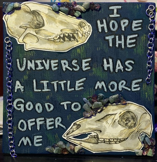
i hope every chance i’ll ever be given hasn’t been destroyed yet.
#gems r adventurine and citrine for some reason the glue turned the citrine brown ?#i wish i could sell this but it is WAY to fragile to be shipped or anything surely#anyway i’m thinking like.. definitely the ‘best years’ of my life r over and i ruined them. and lost all my good friends. idk#goblincore#corvidcore#traditional art#canvas art#my art#skulls#crystals#poetry#Part of one at least#collage#collage art#painting#artists on tumblr
162 notes
·
View notes
Text
had a reverse "graphic design is my passion" moment when a woman came in to my place of work, saw a poster i made, and tried to convince me to quit and follow my dream of being a graphic designer. explaining to her that i do not want to be a graphic designer did not seem to change her mind.
#like it was a fine poster i made it on canva lol#she was on her own artistic journey i think#i wish her the best
83 notes
·
View notes
Text
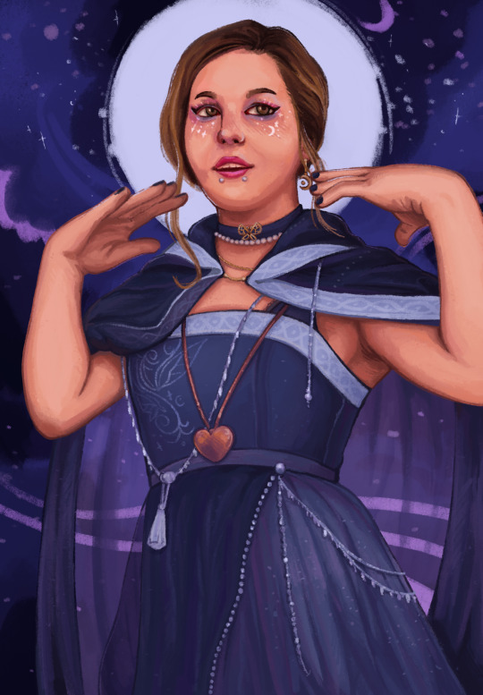
having an epic tee hee moment @stardial
#digital art#anethia collectibles#artists on tumblr#LEARNING HOW TO DO SOME STUFF.....#IM NOT THE BEST AT LIKE. MAKING FACES LOOK LIKE PEOPLE YET#BUT UMMMMM???????? DRAWRING.#also i fully swapped the canvas. and i forgot to flip it back so. get rotated
163 notes
·
View notes
Text
Sometimes, a rebellious phase can get you into many sticky situations. Needless to say, 'sticky' is exactly the word for this situation.✨
@ivor-outlaw and their brain worms transferring to me. It's a blessing really.
Tattoo Artist AU where Chay has an itch he just can't scratch... or at least not in front of his hot tattoo artist, he can't.
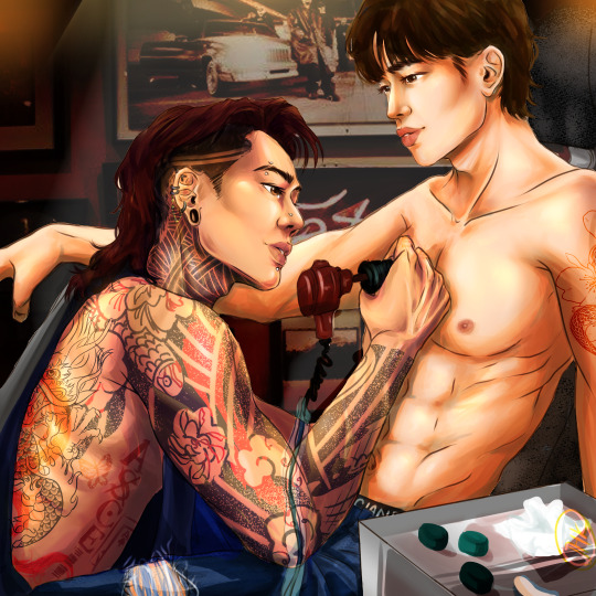
#my art#fanart#kinnporsche the series#macauchay#macau theerapanyakul#porchay kittisawasd#kinnporsche#gay#my poor baby macau#fanfic#tattoo#tattoo artist#best canvas#old ass wip that i was unsatisfied with for months and then i just gave up and now i don't care enough about that happens to it#tattoo artist au#chay would also like a few piercings in a few censored places
48 notes
·
View notes
Photo
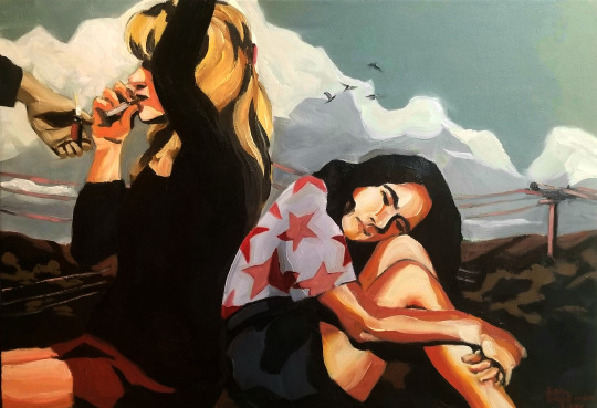
Chug-a-lug, Donna
Oil on canvas, 32 x 22 inches
Ko-fi link if you’d like to help out.
Image ID under the cut
[Id/: Laura Palmer and Donna Hayward are sitting back-to-back against a calm mountain scene during the beginnings of a sunset. A large storm cloud floats behind them with four birds flying to the right of the frame. Telephone wires stretch from end-to-end of the scene. Laura’s left arm is lifted above her head, obscuring most of her face. In her right hand is an unlit cigarette pressed between her lips. A hand from the far left side of the frame holds a lit red Bic lighter, level with Laura’s hand. Donna is hunched over, resting her head on her knees and wrapping her arms around her shins. The expression on her face reads either boredom, annoyance, loneliness, or all three. Laura is wearing a black sweater and a small red skirt. Donna is wearing a purplish-white shirt with a deep-pink star pattern, and dark gray shorts./]
#twin peaks#sam's art#artists on tumblr#oil painting#oil on canvas#oil paint#Laura Palmer#Donna hayward#what I was SUPPOSED to have finished by february for the anniversary#alas...#donna you really were her best friend weren't you?#(for the love of god don't look at this on mobile)#(its burns my retinas)
124 notes
·
View notes
Text
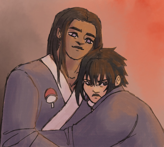
nejisasu doodle! a universe where the hyuuga's slavery bs doesn't get ignored and Neji and Sasuke are better off for it (and also they're married)
#digital art#naruto fanart#artists on tumblr#hyuuga neji#uchiha sasuke#doodle#nejisasu#sasuneji#i personally have hit them with the aspec and qpr beam#but it can be read as romantic lol#sasuke is totally a huge ass brat in a happier world#but like in an adorable and funny way#i really wanted to draw sth digitally so i just went through my sketchbook and drew a scene i liked#also i experimented with brushes a bit because normally i start with a flat ass no texture colour layer#and i think csp did not like that because when i first exported the file it was like 21 fucking MB#like normally my pngs end up around 5 MB#and the canvas was the same size#i figure since there was no real continuous plane of colour more information has to be saved? anyway i scaled the png down by like 50 perce#this is inspired by an au of mine in fact the sketch i adapted was for that au but i decided fuck it#vanilla characers (-ish) it is#yall i cant fucking believe how the hyuuga side branch is treated in the series#and how sasuke is treated!! kakashi fr acts like hes a spoiled brat when his entire family was murdered and he was fucking tortured#and has been alone since he was like 7#yeah he is a bit of an ass but spoiled??#also kakashi fr saying in the prelims that the hyuuga are konoha's best clan like excuse me what dojutsu do u have in ur eyesocket??#its wild ive been reading naruto parallel to writing my fanfic for the first time and its certaintly... something#also the sandaime going like each person in the village is my preicous person uhuh each person except all of the uchiha apparently#and except the hyuuga side branch. and all the people sent on traumatising missions#and all the people he lets danzo kidnap and brainwash#and naruto who he let grow up all alone. and all the people he sends to die fighting for a perpetual cycle of violence :D fun stuff!
10 notes
·
View notes
Text
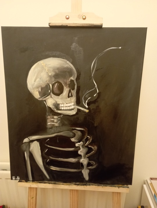
my new painting
I'm so proud of itttt
I tried to copy Van Gogh, it didn't turn out good but I still love it
#artist on tumblr#art#oil paint#oil painting#painting#skeleton#cigarette#skeleton with cigarette#cigarette skeleton#paint on canvas#vincent van gogh#Copy#i did my best#copy paste
15 notes
·
View notes
Text
i need 2 get back into painting fish
#said in the ‘gary i need’ voice#or painting in general . i want 2 get into plein air#and go to like . arizona or smth and paint the landforms . soo red and orange and rocky and dusty and ❤️🫶#the round brushstrokes on tht 1 would be so much fun~_~#its such a tiresome medium though.like all the set up and cleanup and stuff#i refuse to learn abt oil precautions so i just stick to acrylic but even then it dries so fast and its like.mindgame trying to decide what#to focus on in the little time u have . and god forbid u paint on a layer too soon and u lift it off the canvas#HELLLLLLL. but the end result is always so worth it . like holding a physical piece.its 3d .its REALL#fish r so much fun to paint bc 1 u get to pay attn to their morphology but 2 they jave the best textures#im not averse to painting fur but i lovee . the interplay btwn light and fish skin. its so epic and awesome#the only other artist ik of in my family is my uncle & he METALWORKS!!! FISH !!! ITS SOOO FREAKIG COOL#i want to learn from him so bad . guh.GUAHHHHH. anyways i just think its funny that the two of us r fixated on recreating fish#crosses my arms .#okhh.. i also wnt to get into mosaics . god.GOAODDD#did i talk abt this 1 alr.. reread the b1p arc w the mosaic and fresco work and it makes me so sick why couldnt i go to art college and make#frescoes and mosaics .woe is me or whagever . no but its so tempting 2 just buy some tesserae and get 2 it ..#i saw a pigeon mesh mosaic n it like lit that fire under me . what we need js like one giant art collective#that magically provides all the supplies in the world for free and we hold hands and make art in 20 different disciplines 2000 different wys
7 notes
·
View notes
Text
What Can PWCF Do For Me? Sports Shadowboxes!
Sports shadowboxes by Picture Worth Custom Framing are truly exceptional. The craftsmanship and attention to detail in their work are remarkable. The variety of sports memorabilia they can expertly frame, from jerseys to medals, is impressive. Their ability to create custom designs tailored to each client’s preferences is commendable. Overall, Picture Worth Custom Framing’s sports shadowboxes are…

View On WordPress
#Conditional Frame Repair Glass Replacement Canvas Re-stretching Insurance Quotes For Art Ready-made Picture Frames#24x36 replacement glass for frame#24x72 frame#3 piece wall art#80 x 100 canvas#Aaron brothers framing#Aaronbrother#Aaronbrothers#Acrylic frameless frames#Acrylic shadow box#art crating#Art frames near me#Art framing Houston#art sale near me#Augmented Reality#Best artist canvas#Best custom framing#best framing#best framing Houston#best framing near me#best framing Spring#best picture framing houston#best picture framing near me#best Woodlands framing#Black picture frames set#blog#Bradleys framing#Buy framed art#canvas#canvas collage group
0 notes
Text

Another fix, this time for Elena Armas’ The American Roommate Experiment.
There are several frustrating things at play in this one for me: the lack of a defined colour palette, the inconsistent style of artwork, the faceless people and overly realistic shadowing on clothes (indicating that the people in these drawings were originally just photos, traced over and filled with basic colour), the randomly cluttered in assortments of motifs and vectors… it gives it a confused, cluttered feel.
I tried to follow the good old rule of thirds here while also establishing a more structured colour palette, giving the author’s bottom third a little cityscape to provide setting context. I removed the pizza and the gramophone entirely, replacing them as a feature with the little brass apartment key and adding the paper manuscript sheets for the lead’s romance book as a more obvious and compelling motif. I shifted the text down and filled the top third with the legs of the two character vectors (to avoid having to try and make the faces look less empty and slender man-esque) and I switched out the colour of the lady’s pants to draw the same pink through the cover art and lead the viewer’s eye down the page.
What do we think?
#Canva cover art#booklr#bookblr#Booktok#tiktok#tiktok books#romance authors#romance#romance novel#contemporary romance#book illustration#illustration design#I should probably put a disclaimer on these soon so no one comes to hate on me#this is not shade against the artists who created the original cover art#I am sure that they are doing the best they can with the briefs they are given#and likely have their hands tied by whoever ends up filtering their art through dozens of marketing hands and briefs and whatever#all power to them#this is more an exercise in personal vindication#and if anyone wants me to put together a cover for their book please hit me up#happy to do commissions#also happy to try and fix other book covers that you hate so send them#over to me#graphic design is my passion#lmao#Elena armas#cover redesign#the american roommate experiment
8 notes
·
View notes
Text
recently I've been feeling like there's been a real rut in my art and that I've hit a plateau. so out of pure boredom I gathered up all of my physical sketchbooks I could find (12) and I decided to look at the very first one which coincidentally I also did when I was...12 years old. and looking at it and comparing it to my recent art it made me feel so much better about the plateau I've found myself in. eventually there will be a time when I look back on the art I've created now and say yeah I have improved so it brings me a bit of relief
#ive been doing this whole art thing for 8 years now..even longer if you want to count 1st grade art class and i decided i was a pure genius#but ive been comparing myself a lot to other artists and feeling like my art has been going no where#which isn't the best thing to do#so it was good to take the trip down memory lane bc it was a reminder that i am getting better and that my pace is fine lol#who knows what my art will become in another 8 years!!!#anyways i finsihed sketchbook 11 two days ago and i was quite happy bc that sketchbokk lasted over 4 fucking years so lets think about that#10 other sketchbooks i used in 4 years...WHY😭#bee vibes#im becoming too introspective i think its the realization that i hit 20 next month sinking in and im officially no longer TEEN.#i want to tie that into my art too so many feelings there#one of the ways to feel good is ive just been holding my pencil like someone holding a paintbrush up to the canvas to compare proportion#and it was reallyy fun#felt really fluid
2 notes
·
View notes
Text
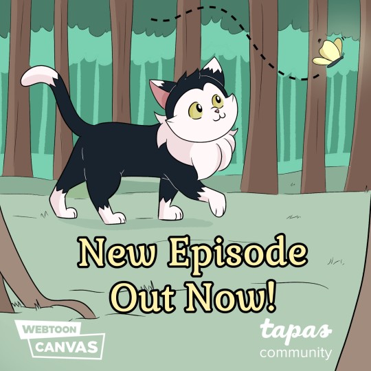
New episode of Faroff now available on Webtoon and Tapas!
#webcomic update#cat#cat adventure#extra floofy#webtoon#webtoon canvas#artists on tumblr#original characters#original#faroff comic#kitty cat#best girl
20 notes
·
View notes
Last Seen Blogs

pioneerlists
Untitled
lovely-redroses
Lovely-RedRoses/Bri~
wusiji
Untitled

wavebandcommunications
wvbandcoms
incendiaglacies
Randomness