#Background image remover tutorial
Text
1-CLICK BACKGROUND REMOVE | PHOTOSHOP AI TUTORIAL | 10 IMAGES
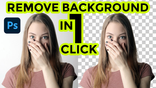
Photoshop AI has done magic, now you can remove the background from your images with just one click using Photoshop AI. In this video, I've tried 10 different images of varying styles to demonstrate how the remove background tool works in real-time and see if it is doing the job as promised by Adobe, and trust me, the results will definitely amaze you. Not only does it efficiently remove backgrounds, but it also seamlessly refines hairs in photos which once was a very complex task. I can confidently say that this feature is a game-changer for photo editing enthusiasts. Give it a try and see for yourself!
Watch Tutorial Now
#graphic design#tutorial#creative#photoshop#remove background#remove background from image#how to remove background#1-click background remove#photoshop ai#photoshop tutorial#adobe photoshop tutorial#one click background remove
2 notes
·
View notes
Video
youtube
How to Remove Background in Corel Draw 2024 || कोरलड्रा में White बैकग्र...
#youtube#How To Crop Image in Any Shape#How to cutout photo in corel draw#How to remove background in coreldraw#how to remove background in corel#how to remove background in coreldraw x3#how to remove background in coreldraw 2024 in hindi#How to cut an object in Corel Draw X24#Make File for Laser Machine in Corel Draw#Easy and Quick Way to remove Image Background in CorelDraw#Remove Image Background in CorelDraw#Remove image background corel draw by Creative Art#CorelDraw Tutorial For Beginners
0 notes
Text
Neck joint and color correction technique
youtube
#color correction#neck joint#neck joint service#photoshop neck joint#neck joint photoshop#neck joint and color correction technique#color correction service#ghost mannequin technique#how to neck joint in photoshop cs6#neck joint photoshop tutorial#color correction image#color correction tutorial#color corrections#photoshop color correction#color correction photoshop#color correction tutorial in photoshop#symmetrical neck joint service#background remove#youtube#beauty#hairstyle#remove background#Youtube
0 notes
Text
#keep shadow#photo edit#shadow masking#create shadow#background remove#background remove service#masking image#graphic design#clipping path#color correction#drop shadow service#drop shadow tutorial#original shadow#image edit
0 notes
Text
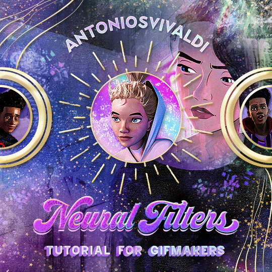


Neural Filters Tutorial for Gifmakers by @antoniosvivaldi
Hi everyone! In light of my blog’s 10th birthday, I’m delighted to reveal my highly anticipated gifmaking tutorial using Neural Filters - a very powerful collection of filters that really broadened my scope in gifmaking over the past 12 months.
Before I get into this tutorial, I want to thank @laurabenanti, @maines , @cobbbvanth, and @cal-kestis for their unconditional support over the course of my journey of investigating the Neural Filters & their valuable inputs on the rendering performance!
In this tutorial, I will outline what the Photoshop Neural Filters do and how I use them in my workflow - multiple examples will be provided for better clarity. Finally, I will talk about some known performance issues with the filters & some feasible workarounds.
Tutorial Structure:
Meet the Neural Filters: What they are and what they do
Why I use Neural Filters? How I use Neural Filters in my giffing workflow
Getting started: The giffing workflow in a nutshell and installing the Neural Filters
Applying Neural Filters onto your gif: Making use of the Neural Filters settings; with multiple examples
Testing your system: recommended if you’re using Neural Filters for the first time
Rendering performance: Common Neural Filters performance issues & workarounds
For quick reference, here are the examples that I will show in this tutorial:
Example 1: Image Enhancement | improving the image quality of gifs prepared from highly compressed video files
Example 2: Facial Enhancement | enhancing an individual's facial features
Example 3: Colour Manipulation | colourising B&W gifs for a colourful gifset
Example 4: Artistic effects | transforming landscapes & adding artistic effects onto your gifs
Example 5: Putting it all together | my usual giffing workflow using Neural Filters
What you need & need to know:
Software: Photoshop 2021 or later (recommended: 2023 or later)*
Hardware: 8GB of RAM; having a supported GPU is highly recommended*
Difficulty: Advanced (requires a lot of patience); knowledge in gifmaking and using video timeline assumed
Key concepts: Smart Layer / Smart Filters
Benchmarking your system: Neural Filters test files**
Supplementary materials: Tutorial Resources / Detailed findings on rendering gifs with Neural Filters + known issues***
*I primarily gif on an M2 Max MacBook Pro that's running Photoshop 2024, but I also have experiences gifmaking on few other Mac models from 2012 ~ 2023.
**Using Neural Filters can be resource intensive, so it’s helpful to run the test files yourself. I’ll outline some known performance issues with Neural Filters and workarounds later in the tutorial.
***This supplementary page contains additional Neural Filters benchmark tests and instructions, as well as more information on the rendering performance (for Apple Silicon-based devices) when subject to heavy Neural Filters gifmaking workflows
Tutorial under the cut. Like / Reblog this post if you find this tutorial helpful. Linking this post as an inspo link will also be greatly appreciated!
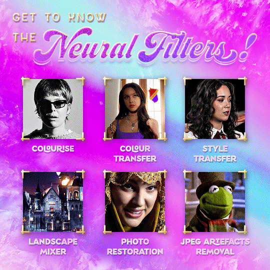
1. Meet the Neural Filters!
Neural Filters are powered by Adobe's machine learning engine known as Adobe Sensei. It is a non-destructive method to help streamline workflows that would've been difficult and/or tedious to do manually.
Here are the Neural Filters available in Photoshop 2024:

Skin Smoothing: Removes blemishes on the skin
Smart Portrait: This a cloud-based filter that allows you to change the mood, facial age, hair, etc using the sliders+
Makeup Transfer: Applies the makeup (from a reference image) to the eyes & mouth area of your image
Landscape Mixer: Transforms the landscape of your image (e.g. seasons & time of the day, etc), based on the landscape features of a reference image
Style Transfer: Applies artistic styles e.g. texturings (from a reference image) onto your image
Harmonisation: Applies the colour balance of your image based on the lighting of the background image+
Colour Transfer: Applies the colour scheme (of a reference image) onto your image
Colourise: Adds colours onto a B&W image
Super Zoom: Zoom / crop an image without losing resolution+
Depth Blur: Blurs the background of the image
JPEG Artefacts Removal: Removes artefacts caused by JPEG compression
Photo Restoration: Enhances image quality & facial details
+These three filters aren't used in my giffing workflow. The cloud-based nature of Smart Portrait leads to disjointed looking frames. For Harmonisation, applying this on a gif causes Neural Filter timeout error. Finally, Super Zoom does not currently support output as a Smart Filter
If you're running Photoshop 2021 or earlier version of Photoshop 2022, you will see a smaller selection of Neural Filters:

Things to be aware of:
You can apply up to six Neural Filters at the same time
Filters where you can use your own reference images: Makeup Transfer (portraits only), Landscape Mixer, Style Transfer (not available in Photoshop 2021), and Colour Transfer
Later iterations of Photoshop 2023 & newer: The first three default presets for Landscape Mixer and Colour Transfer are currently broken.
2. Why I use Neural Filters?
Here are my four main Neural Filters use cases in my gifmaking process. In each use case I'll list out the filters that I use:
Enhancing Image Quality:
Common wisdom is to find the highest quality video to gif from for a media release & avoid YouTube whenever possible. However for smaller / niche media (e.g. new & upcoming musical artists), prepping gifs from highly compressed YouTube videos is inevitable.
So how do I get around with this? I have found Neural Filters pretty handy when it comes to both correcting issues from video compression & enhancing details in gifs prepared from these highly compressed video files.
Filters used: JPEG Artefacts Removal / Photo Restoration
Facial Enhancement:
When I prepare gifs from highly compressed videos, something I like to do is to enhance the facial features. This is again useful when I make gifsets from compressed videos & want to fill up my final panel with a close-up shot.
Filters used: Skin Smoothing / Makeup Transfer / Photo Restoration (Facial Enhancement slider)
Colour Manipulation:
Neural Filters is a powerful way to do advanced colour manipulation - whether I want to quickly transform the colour scheme of a gif or transform a B&W clip into something colourful.
Filters used: Colourise / Colour Transfer
Artistic Effects:
This is one of my favourite things to do with Neural Filters! I enjoy using the filters to create artistic effects by feeding textures that I've downloaded as reference images. I also enjoy using these filters to transform the overall the atmosphere of my composite gifs. The gifsets where I've leveraged Neural Filters for artistic effects could be found under this tag on usergif.
Filters used: Landscape Mixer / Style Transfer / Depth Blur
How I use Neural Filters over different stages of my gifmaking workflow:
I want to outline how I use different Neural Filters throughout my gifmaking process. This can be roughly divided into two stages:
Stage I: Enhancement and/or Colourising | Takes place early in my gifmaking process. I process a large amount of component gifs by applying Neural Filters for enhancement purposes and adding some base colourings.++
Stage II: Artistic Effects & more Colour Manipulation | Takes place when I'm assembling my component gifs in the big PSD / PSB composition file that will be my final gif panel.
I will walk through this in more detail later in the tutorial.
++I personally like to keep the size of the component gifs in their original resolution (a mixture of 1080p & 4K), to get best possible results from the Neural Filters and have more flexibility later on in my workflow. I resize & sharpen these gifs after they're placed into my final PSD composition files in Tumblr dimensions.
3. Getting started
The essence is to output Neural Filters as a Smart Filter on the smart object when working with the Video Timeline interface. Your workflow will contain the following steps:
Prepare your gif
In the frame animation interface, set the frame delay to 0.03s and convert your gif to the Video Timeline
In the Video Timeline interface, go to Filter > Neural Filters and output to a Smart Filter
Flatten or render your gif (either approach is fine). To flatten your gif, play the "flatten" action from the gif prep action pack. To render your gif as a .mov file, go to File > Export > Render Video & use the following settings.

Setting up:
o.) To get started, prepare your gifs the usual way - whether you screencap or clip videos. You should see your prepared gif in the frame animation interface as follows:

Note: As mentioned earlier, I keep the gifs in their original resolution right now because working with a larger dimension document allows more flexibility later on in my workflow. I have also found that I get higher quality results working with more pixels. I eventually do my final sharpening & resizing when I fit all of my component gifs to a main PSD composition file (that's of Tumblr dimension).
i.) To use Smart Filters, convert your gif to a Smart Video Layer.
As an aside, I like to work with everything in 0.03s until I finish everything (then correct the frame delay to 0.05s when I upload my panels onto Tumblr).
For convenience, I use my own action pack to first set the frame delay to 0.03s (highlighted in yellow) and then convert to timeline (highlighted in red) to access the Video Timeline interface. To play an action, press the play button highlighted in green.

Once you've converted this gif to a Smart Video Layer, you'll see the Video Timeline interface as follows:

ii.) Select your gif (now as a Smart Layer) and go to Filter > Neural Filters
Installing Neural Filters:
Install the individual Neural Filters that you want to use. If the filter isn't installed, it will show a cloud symbol (highlighted in yellow). If the filter is already installed, it will show a toggle button (highlighted in green)
When you toggle this button, the Neural Filters preview window will look like this (where the toggle button next to the filter that you use turns blue)

4. Using Neural Filters
Once you have installed the Neural Filters that you want to use in your gif, you can toggle on a filter and play around with the sliders until you're satisfied. Here I'll walkthrough multiple concrete examples of how I use Neural Filters in my giffing process.
Example 1: Image enhancement | sample gifset
This is my typical Stage I Neural Filters gifmaking workflow. When giffing older or more niche media releases, my main concern is the video compression that leads to a lot of artefacts in the screencapped / video clipped gifs.
To fix the artefacts from compression, I go to Filter > Neural Filters, and toggle JPEG Artefacts Removal filter. Then I choose the strength of the filter (boxed in green), output this as a Smart Filter (boxed in yellow), and press OK (boxed in red).
Note: The filter has to be fully processed before you could press the OK button!
After applying the Neural Filters, you'll see "Neural Filters" under the Smart Filters property of the smart layer

Flatten / render your gif
Example 2: Facial enhancement | sample gifset
This is my routine use case during my Stage I Neural Filters gifmaking workflow. For musical artists (e.g. Maisie Peters), YouTube is often the only place where I'm able to find some videos to prepare gifs from. However even the highest resolution video available on YouTube is highly compressed.
Go to Filter > Neural Filters and toggle on Photo Restoration. If Photoshop recognises faces in the image, there will be a "Facial Enhancement" slider under the filter settings.

Play around with the Photo Enhancement & Facial Enhancement sliders. You can also expand the "Adjustment" menu make additional adjustments e.g. remove noises and reducing different types of artefacts.

Once you're happy with the results, press OK and then flatten / render your gif.
Example 3: Colour Manipulation | sample gifset
Want to make a colourful gifset but the source video is in B&W? This is where Colourise from Neural Filters comes in handy! This same colourising approach is also very helpful for colouring poor-lit scenes as detailed in this tutorial.
Here's a B&W gif that we want to colourise:

Highly recommended: add some adjustment layers onto the B&W gif to improve the contrast & depth. This will give you higher quality results when you colourise your gif.
Go to Filter > Neural Filters and toggle on Colourise.
Make sure "Auto colour image" is enabled.
Play around with further adjustments e.g. colour balance, until you're satisfied then press OK.
Important: When you colourise a gif, you need to double check that the resulting skin tone is accurate to real life. I personally go to Google Images and search up photoshoots of the individual / character that I'm giffing for quick reference.
Add additional adjustment layers until you're happy with the colouring of the skin tone.
Once you're happy with the additional adjustments, flatten / render your gif. And voila!

Note: For Colour Manipulation, I use Colourise in my Stage I workflow and Colour Transfer in my Stage II workflow to do other types of colour manipulations (e.g. transforming the colour scheme of the component gifs)
Example 4: Artistic Effects | sample gifset
This is where I use Neural Filters for the bulk of my Stage II workflow: the most enjoyable stage in my editing process!
Normally I would be working with my big composition files with multiple component gifs inside it. To begin the fun, drag a component gif (in PSD file) to the main PSD composition file.
Resize this gif in the composition file until you're happy with the placement

Duplicate this gif. Sharpen the bottom layer (highlighted in yellow), and then select the top layer (highlighted in green) & go to Filter > Neural Filters

I like to use Style Transfer and Landscape Mixer to create artistic effects from Neural Filters. In this particular example, I've chosen Landscape Mixer
Select a preset or feed a custom image to the filter (here I chose a texture that I've on my computer)
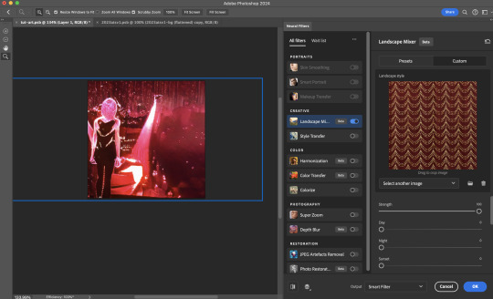
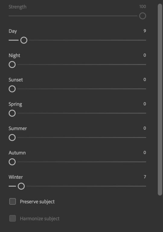
Play around with the different sliders e.g. time of the day / seasons
Important: uncheck "Harmonise Subject" & "Preserve Subject" - these two settings are known to cause performance issues when you render a multiframe smart object (e.g. for a gif)
Once you're happy with the artistic effect, press OK
To ensure you preserve the actual subject you want to gif (bc Preserve Subject is unchecked), add a layer mask onto the top layer (with Neural Filters) and mask out the facial region. You might need to play around with the Layer Mask Position keyframes or Rotoscope your subject in the process.
After you're happy with the masking, flatten / render this composition file and voila!

Example 5: Putting it all together | sample gifset
Let's recap on the Neural Filters gifmaking workflow and where Stage I and Stage II fit in my gifmaking process:
i. Preparing & enhancing the component gifs
Prepare all component gifs and convert them to smart layers
Stage I: Add base colourings & apply Photo Restoration / JPEG Artefacts Removal to enhance the gif's image quality
Flatten all of these component gifs and convert them back to Smart Video Layers (this process can take a lot of time)
Some of these enhanced gifs will be Rotoscoped so this is done before adding the gifs to the big PSD composition file
ii. Setting up the big PSD composition file
Make a separate PSD composition file (Ctrl / Cmmd + N) that's of Tumblr dimension (e.g. 540px in width)
Drag all of the component gifs used into this PSD composition file
Enable Video Timeline and trim the work area
In the composition file, resize / move the component gifs until you're happy with the placement & sharpen these gifs if you haven't already done so
Duplicate the layers that you want to use Neural Filters on
iii. Working with Neural Filters in the PSD composition file
Stage II: Neural Filters to create artistic effects / more colour manipulations!
Mask the smart layers with Neural Filters to both preserve the subject and avoid colouring issues from the filters
Flatten / render the PSD composition file: the more component gifs in your composition file, the longer the exporting will take. (I prefer to render the composition file into a .mov clip to prevent overriding a file that I've spent effort putting together.)
Note: In some of my layout gifsets (where I've heavily used Neural Filters in Stage II), the rendering time for the panel took more than 20 minutes. This is one of the rare instances where I was maxing out my computer's memory.
Useful things to take note of:
Important: If you're using Neural Filters for Colour Manipulation or Artistic Effects, you need to take a lot of care ensuring that the skin tone of nonwhite characters / individuals is accurately coloured
Use the Facial Enhancement slider from Photo Restoration in moderation, if you max out the slider value you risk oversharpening your gif later on in your gifmaking workflow
You will get higher quality results from Neural Filters by working with larger image dimensions: This gives Neural Filters more pixels to work with. You also get better quality results by feeding higher resolution reference images to the Neural Filters.
Makeup Transfer is more stable when the person / character has minimal motion in your gif
You might get unexpected results from Landscape Mixer if you feed a reference image that don't feature a distinctive landscape. This is not always a bad thing: for instance, I have used this texture as a reference image for Landscape Mixer, to create the shimmery effects as seen in this gifset
5. Testing your system
If this is the first time you're applying Neural Filters directly onto a gif, it will be helpful to test out your system yourself. This will help:
Gauge the expected rendering time that you'll need to wait for your gif to export, given specific Neural Filters that you've used
Identify potential performance issues when you render the gif: this is important and will determine whether you will need to fully playback your gif before flattening / rendering the file.
Understand how your system's resources are being utilised: Inputs from Windows PC users & Mac users alike are welcome!
About the Neural Filters test files:
Contains six distinct files, each using different Neural Filters
Two sizes of test files: one copy in full HD (1080p) and another copy downsized to 540px
One folder containing the flattened / rendered test files
How to use the Neural Filters test files:
What you need:
Photoshop 2022 or newer (recommended: 2023 or later)
Install the following Neural Filters: Landscape Mixer / Style Transfer / Colour Transfer / Colourise / Photo Restoration / Depth Blur
Recommended for some Apple Silicon-based MacBook Pro models: Enable High Power Mode
How to use the test files:
For optimal performance, close all background apps
Open a test file
Flatten the test file into frames (load this action pack & play the “flatten” action)
Take note of the time it takes until you’re directed to the frame animation interface
Compare the rendered frames to the expected results in this folder: check that all of the frames look the same. If they don't, you will need to fully playback the test file in full before flattening the file.†
Re-run the test file without the Neural Filters and take note of how long it takes before you're directed to the frame animation interface
Recommended: Take note of how your system is utilised during the rendering process (more info here for MacOS users)
†This is a performance issue known as flickering that I will discuss in the next section. If you come across this, you'll have to playback a gif where you've used Neural Filters (on the video timeline) in full, prior to flattening / rendering it.
Factors that could affect the rendering performance / time (more info):
The number of frames, dimension, and colour bit depth of your gif
If you use Neural Filters with facial recognition features, the rendering time will be affected by the number of characters / individuals in your gif
Most resource intensive filters (powered by largest machine learning models): Landscape Mixer / Photo Restoration (with Facial Enhancement) / and JPEG Artefacts Removal
Least resource intensive filters (smallest machine learning models): Colour Transfer / Colourise
The number of Neural Filters that you apply at once / The number of component gifs with Neural Filters in your PSD file
Your system: system memory, the GPU, and the architecture of the system's CPU+++
+++ Rendering a gif with Neural Filters demands a lot of system memory & GPU horsepower. Rendering will be faster & more reliable on newer computers, as these systems have CPU & GPU with more modern instruction sets that are geared towards machine learning-based tasks.
Additionally, the unified memory architecture of Apple Silicon M-series chips are found to be quite efficient at processing Neural Filters.
6. Performance issues & workarounds
Common Performance issues:
I will discuss several common issues related to rendering or exporting a multi-frame smart object (e.g. your composite gif) that uses Neural Filters below. This is commonly caused by insufficient system memory and/or the GPU.
Flickering frames: in the flattened / rendered file, Neural Filters aren't applied to some of the frames+-+
Scrambled frames: the frames in the flattened / rendered file isn't in order
Neural Filters exceeded the timeout limit error: this is normally a software related issue
Long export / rendering time: long rendering time is expected in heavy workflows
Laggy Photoshop / system interface: having to wait quite a long time to preview the next frame on the timeline
Issues with Landscape Mixer: Using the filter gives ill-defined defined results (Common in older systems)--
Workarounds:
Workarounds that could reduce unreliable rendering performance & long rendering time:
Close other apps running in the background
Work with smaller colour bit depth (i.e. 8-bit rather than 16-bit)
Downsize your gif before converting to the video timeline-+-
Try to keep the number of frames as low as possible
Avoid stacking multiple Neural Filters at once. Try applying & rendering the filters that you want one by one
Specific workarounds for specific issues:
How to resolve flickering frames: If you come across flickering, you will need to playback your gif on the video timeline in full to find the frames where the filter isn't applied. You will need to select all of the frames to allow Photoshop to reprocess these, before you render your gif.+-+
What to do if you come across Neural Filters timeout error? This is caused by several incompatible Neural Filters e.g. Harmonisation (both the filter itself and as a setting in Landscape Mixer), Scratch Reduction in Photo Restoration, and trying to stack multiple Neural Filters with facial recognition features.
If the timeout error is caused by stacking multiple filters, a feasible workaround is to apply the Neural Filters that you want to use one by one over multiple rendering sessions, rather all of them in one go.
+-+This is a very common issue for Apple Silicon-based Macs. Flickering happens when a gif with Neural Filters is rendered without being previously played back in the timeline.
This issue is likely related to the memory bandwidth & the GPU cores of the chips, because not all Apple Silicon-based Macs exhibit this behaviour (i.e. devices equipped with Max / Ultra M-series chips are mostly unaffected).
-- As mentioned in the supplementary page, Landscape Mixer requires a lot of GPU horsepower to be fully rendered. For older systems (pre-2017 builds), there are no workarounds other than to avoid using this filter.
-+- For smaller dimensions, the size of the machine learning models powering the filters play an outsized role in the rendering time (i.e. marginal reduction in rendering time when downsizing 1080p file to Tumblr dimensions). If you use filters powered by larger models e.g. Landscape Mixer and Photo Restoration, you will need to be very patient when exporting your gif.
7. More useful resources on using Neural Filters
Creating animations with Neural Filters effects | Max Novak
Using Neural Filters to colour correct by @edteachs
I hope this is helpful! If you have any questions or need any help related to the tutorial, feel free to send me an ask 💖
#photoshop tutorial#gif tutorial#dearindies#usernik#useryoshi#usershreyu#userisaiah#userroza#userrobin#userraffa#usercats#userriel#useralien#userjoeys#usertj#alielook#swearphil#*#my resources#my tutorials
364 notes
·
View notes
Text
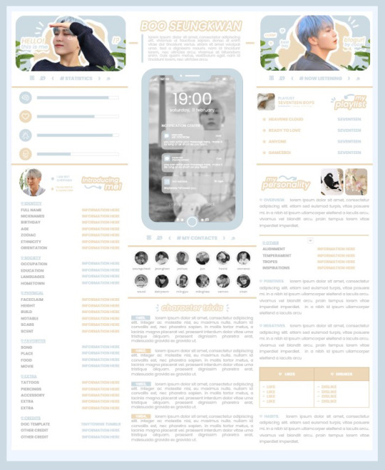
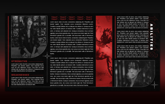
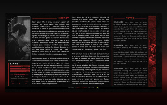
* ( ❀ ˆ꒳ˆ˵ ) ♡ Ꮺ 𝗧𝗜𝗡𝗬𝗧𝗢𝗪𝗡𝗦 — 𝟩𝖯𝖬 ੭

— introducing 7pm , the latest original google doc from tinytowns ! this document is designed to display the basics of a single - muse in one page &. captures a fun & youthful vibe with the inclusion of simplistic yet busy design , bright colours &. doodles ! features statistics , a playlist , basic info section along with character trivia & personality info ❀ the contacts section can be used as an exclusives section if desired ! space is left at the end of the doc so you can adjust easily & not have any of those annoying blank pages but it would be wise to take note of image positions as they are prone to moving. this doc can be considered moderate to difficult to edit due to the amount of edits that you will need to make in photoshop or photopea - but if you don't mind that then the document should be relatively simple to edit ❀ you can find the document link in the source code or under the cut , along with a known position issue + how to fix it , psd temps provided for this document , a video tutorial for adding your gif into a circle &. icon credits ! ( ˘͈ ᵕ ˘͈ ♡) ~
❀ PSD DOWNLOADS ( REQUIRED ! )
GIF CIRCLE - HERE
PHONE TEMPLATE - HERE
TOP IMAGES - HERE
♡ note : you will need to download the title cards to change the color , but if you don't mind the color then you don't need to - also , for full transparency on my end , i did need to touch up a few of the pngs after saving because the top text overlapped with the bottom text. be aware of that ! fonts used are poppins &. sant joan despi !
NAME TITLE - HERE
TRIVIA TITLE - HERE
INTRO TITLE - HERE
PLAYLIST TITLE - HERE
PERSONALITY TITLE - HERE
♡ note : you must change the color via layer style -> stroke for the title cards &. then save as png after deleting the background layer .
❀ KNOWN ISSUES
01. as a gdocs creator i use an external add-on called page resizer which is helpful for customizing the sizing of my canvas , as docs limits us with pre - set sizes. while this is nice to use , i'm aware that it can specifically cause an issue when you change the color of your background page. to fix this you must actually download the page resizer add-on through extensions -> add-ons -> get add-ons &. you should search for page sizer & download the one by nat burns. then you can access the sizer through extensions -> page sizer -> set page size &. what should be set for this document is a width of 9 &. a height of 12 !
this should fix the document , but i also know that sometimes , for what ever reason , the height &. width will flip. if that happens just make the height &. width opposite; so instead of a width of 9 , put 12 & for height , put 9 instead of 12.
02. i cropped the title cards in the document so that you wouldn't be trying to click something &. accidentally click on the titles ! however this means that when you replace image on the title cards they might go off center &. crop halfway through the word. just double click the title card that's bugging out & drag it to about the center of the black box. then it's fixed !
❀ DOCUMENT DOWNLOAD
7PM - HERE !
do not remove the credit , redistribute or profit off of my work.
❀ TUTORIAL
#01. go to file -> make a copy , in order to edit .
#02. to change the top two images double click on them &. a window should appear - in there you're going to click on it once &. hit replace image. the psd for this has been provided so it should be sized correctly !
#03. to change the title cards ( ex. boo seungkwan , my playlist , introducing me etc. ) you just need to click on them once &. hit replace image - please refer to #2 in the known issues section above this if you're going to do this though !! many thanks.
#04. to change the phone you're going to download the psd provided above &. when you've finished editing it you will click on the phone in the doc one time &. hit replace image !
#05. to change the thin color lines around seungkwan's name card you will press them once &. click edit - from there a window should open up &. you will click on it again & find the bucket tool which has a small yellow ( or blue if you clicked the long one ) line under it. that is where you change the color !
#06. the statistics represent intelligence , empathy , friendliness &. fighting skill ; to adjust the levels or colour you're going to double click &. a window will appear. from there you can either change colors with the bucket &. pencil tool ( pencil = outline color ) or you can shift the bars by clicking on the coloured parts of them and literally just dragging them.
#07. to change the playlist cover &. title you'll double click &. adjust inside the window by replacing image &. renaming things. the actual songs on the playlist can be typed normally !
#08. to change the gif circle , personality , &. contact images you again just double click &. replace image inside those windows. for the gif circle you must use the psd.
#09. to change the little bulletpoints beside the gif circle you will double click &. edit the text inside the window.
❀ VIDEO TUTORIAL 4 GIF CIRCLE
watch the tutorial right HERE !
make sure your timeline is checked ( the first thing i showed )
ignore the mistake i made while trying to show you where to end your gif LMFAOOO . . . im clumsy <3
to highlight all of your layers / frames click on the first one , then press shift + click on the last layer.
to bring up the list of options ( when i click convert into smart object ) you just right click.
❀ CREDITS
brain icon - Brain icons created by Vitaly Gorbachev - Flaticon
heart icon - Heart icons created by Chanut - Flaticon
support icon - Sport team icons created by Freepik - Flaticon
boxing icon - Boxing icons created by Freepik - Flaticon
plant png - josh ca.la.brese on unsplash
battery icon - Battery icons created by Stockio - Flaticon
wifi icon - Wifi icons created by Uniconlabs - Flaticon
signal icon - Signal icons created by Freepik - Flaticon
speech icon - Comment icons created by Freepik - Flaticon
close icon - Close icons created by ariefstudio - Flaticon
instagram icon - Instagram icons created by Prosymbols Premium - Flaticon
camera icon - Photo camera icons created by Kiranshastry - Flaticon
torch icon - Ui icons created by yaicon - Flaticon
#google docs#template#supportcontentcreators#gdocs#rph#google docs template#oc template#rpc#free rph#free rpc#docs#roleplay template#oc sheet#rp template#free#muse template#tinytowns#m: gdocs#m: original
1K notes
·
View notes
Note
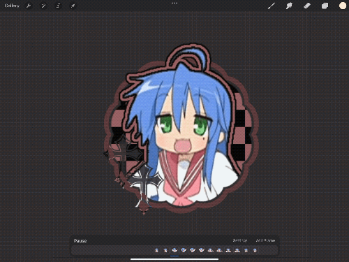
hi ^-^! Can you do a tutorial on how to make this icon? I would like to learn :3
https://64.media.tumblr.com/64eb5472b1d49fc941ccefbae558846e/cb2b70c34ebba0a7-b4/s1280x1920/d9e44a125324b309a533a1e56be842355046d740.gifv
Hello! I apologize in advance for my poor explanation skills, and also for how convoluted this process can get 😭 But I saw this as a worthy challenge, so here’s how you too can make a gif icon where the character comes out of the frame like this and this:
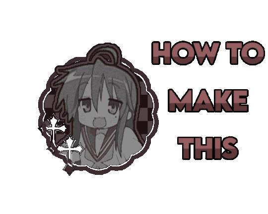
This is going to be very long so the full tutorial is under this cut!
Programs I use: IbisPaintX and Procreate*
*full disclosure, procreate is exclusively for iPad and costs 10 USD. however every thing I do in procreate you should also be able to do in Photopea
1. First things first, after finding the gif you’ll want to use, you’ll need to download each individual frame. By importing it into either procreate, photopea, or any program that’ll allow you to view individual frames, you’ll be able to save each frame
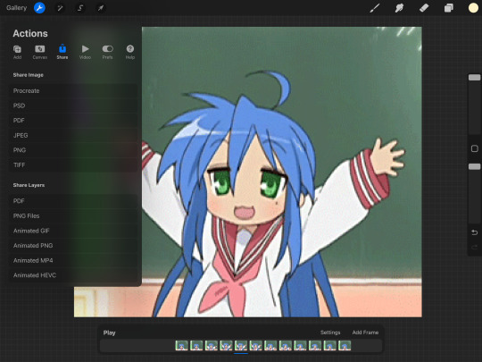
A note about gifs: The best gifs to use are ones with less frames due to the fact you’ll be editing the individual frames. Not to say you can’t use gifs with higher frame counts, however it is much more time consuming the more frames there are
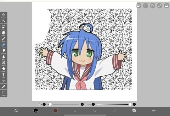
2. Next you’ll have to remove the background from each frame. You can remove the background by hand, but I like to use this website to help make things a bit easier. Just pop your frames into it and download each one

It is unfortunately not always accurate and often misses things on images where the background isn’t clearly defined or is lower quality, and you most definitely will have to do touch ups on your frames For example here, for some reason, the first two frames (on the left) were left with a semi transparent gray background and in the image in the middle, you can see sizable areas where the website missed. And also as of recently there as been practically invisible dots it leaves where the background once was that stroke filter picks up some how. You’ll need to hit each frame with the magic wand tool or similar to remove these dots if you plan on adding strokes

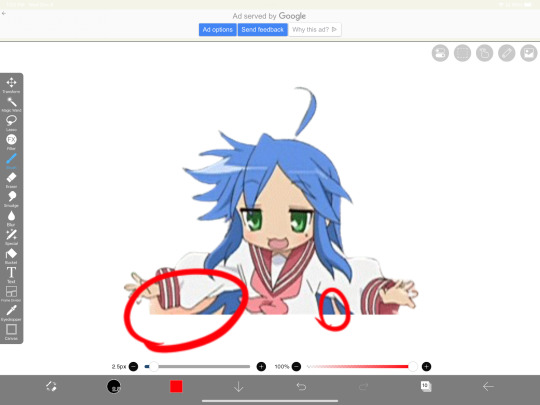
3. Now add all your frames into your program and stick them in a folder. Then, reposition the frames on top of the image mask you are using (in ibis, make sure all frames are visible and select the folder before repositioning the frames, in other programs, you should just be able to select multiple layers and move them that way). Once you’ve repositioned them, duplicate the folder then select clipping on the bottom folder like shown in the right image (I know I forgot to duplicate the folder then 💀)

4. Now here’s where the tedious stuff comes in. Make sure you number your frames, because it’ll help you out a lot. In the top folder, erase the bottom part of your gif that you want to be in the frame (I’ll call this the clipping layer) but keep the top where you want to be coming out of the frame intact (this’ll be the overlapping layer). Repeat this process for all of the frames
Note: Try to use a simple shaped frame for these kinds of icons. However, if you choose to use something with a more complex shape, be weary of where you erase! You will need to be more precise with shapes like these depending on where you want things to go
And if you haven’t edited the frame itself, you should do so now
5.5. After that, you can leave things off there and skip this step if that’s what you’re going for! However, if you want to add things like strokes, it’ll get a lil more complicated
Firstly, I duplicate my clipping layer and then select stroke (both). You can also use stoke (outer) or whatever your program has, but this is my personal preference. I then duplicate that layer and keep applying stroke till I get what I want (if you use stroke (outer) duplicating your layer isn’t necessary). I think merge my stroke layers together, but I keep it separate from my main frame
That way I can duplicate my stroke layer and add it to my overlapping layer. Then I erase the unnecessary parts shown on the left. You may need to clean up the stroke on certain frames or reapply it depending on the position of things and what you’ve erased and what not. It takes a lot of trial and error. You can also apply the stroke before you make your overlapping layers, however when I was making this graphic I fucked it up in the process of making this tut and had to remake it so that’s what I did the second time around 💀 if you were wondering why I didn’t just do that in the first place, now you know


6. Now it’s time to export your layers as a psd and import it into procreate/photopea! You’ll now have to merge your clipping layer into your image mask then merge your overlapping layer on top of it to create one layer. Repeat this for all the frames and you’ll be finished!

Tada! Now you can add filters and whatever else if so desired. And that’s my process for making these kinds of graphics! There’s definitely an easier way of doing this but that’s just what I’ve got figured out for now. Don’t hesitate to ask any questions for the things that make zero sense lol
256 notes
·
View notes
Text

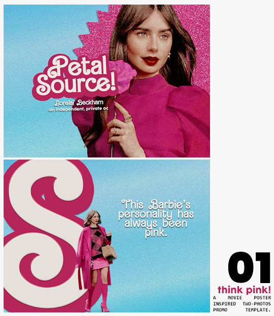
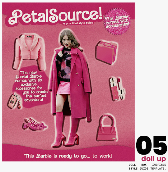
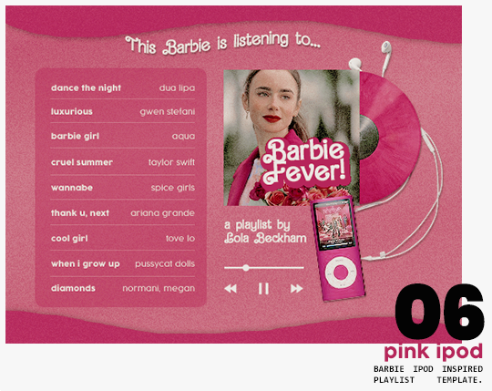
⋆ barbie fever . . . by petalsource .
. . . a complete blog makeover inspired by barbie .
hi, barbies! today, i bring you a complete makeover fully inspired by our favorite pink lady, barbie herself, to allow all of you to bring your own characters into her world in plastic!
feel free to tweak and adjust to your needs, add different background colors and overlays, but kindly do not claim as your own or use it for commercial purposes. feel free to tag me on your creations with this on #petalsource! seriously... i can't wait to see what comes of this!
💐 click the source link to get it as a package or individually on deviantart or payhip !
and . . . keep reading to find more details about the graphics, hq live previews and important tips to use the templates !
✩ about the items!
➷ think pink! -- a two-picture promo template inspired by the iconic 2023 movie posters. you'll need: two pngs of your faceclaim of choice, and the custom fonts (listed below). the glittery polygon of the first picture is available in 7 different glitter colors! high quality examples.
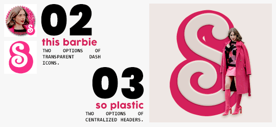
➷ this barbie -- two options of transparent dash icons; one matching the "initial" poster and one matching the "glittery polygon" poster. high quality examples.
➷ so plastic -- two options of centralized headers; one matching the "initial" poster and one matching the "glittery polygon" poster. to use it at its best quality, disable the "stretch header image" option when uploading the header. high quality examples.
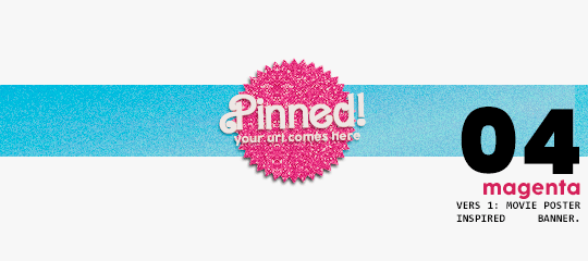
➷ magenta -- version 1.0: pinned post (or miscellaneous) banner inspired by the 2023 barbie poster. version 2.0: pinned post (or miscellaneous) pair of banners mimmicking the layout of a barbie doll box. one banner goes on top of the postbox, insert pinned post or text, and the other banner goes on the bottom! high quality examples.
➷ doll up -- lookbook template inspired by the barbie doll box, featuring a "doll" picture and six customizable objects / accessories. you'll need: full body png of your faceclaim of choice, custom fonts (listed below), and 6 pngs of random objects or clothes to "come with" your doll. i've added a short tutorial down below on how to find and use some easily! high quality examples.
➷ pink ipod -- playlist template inspired by the barbie ipod, featuring a cover art and nine songs. high quality examples.
you can purchase all items as a package (deal price) or individually!
✩ important tips & useful information!
➷ needed fonts: bartex, cocogoose.
➷ object pngs + removing background of images: i found a super useful pinterest board with photos that can be used on your graphics: oxfordcommah's object pngs. additionally, the clothes png search on p*nterest is really diverse, and you can narrow your interests like "pink clothes png" or "vintage shoes png" and find a lot of options. once you found your images, go to remove.bg and paste their urls in there. it'll remove the background of those images for you and you can just paste them on your template and have fun!
➷ used coloring psds: the beautiful and super pink psds i used on the previews were not made by me and are NOT included in the downloads. in case you want to use them, they can be found here: dreams, 003.
➷ styles: the download includes two styles, one for a subtle drop shadow used in a few layers and one for the plastic box effect in the lookbook template. you can install them by opening the styles tab on photoshop > the four lines > load styles > find the barbie styles on your downloads!
➷ in case you have any questions, pop into my inbox or ims and i'll be happy to help you!
#template psd#template psds#barbie psd#character psd#character psds#𓂅 ♡ ⋆ 𝐦 ‚ templates .#i really really really hope you guys like this!!! i had so much fun doing it
275 notes
·
View notes
Text
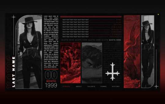
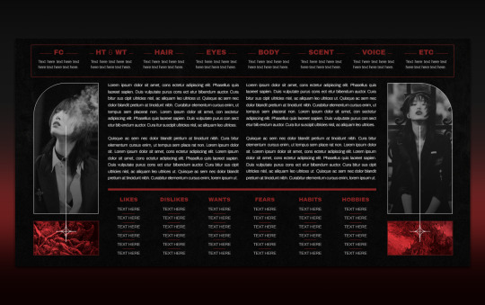

012 . PONDEROSA — [ 𝚕𝚎𝚖𝚘𝚗 𝚍𝚊𝚢𝚍𝚛𝚎𝚊𝚖 ] ...... DOWNLOAD NOW
Gothic, dark, Wednesday, The Sandman, vampires, demons, I don't know what I was on making PONDEROSA. For those who love red and moody, this is like EUREKA's evil cousin. Along with this template, you receive a free docs tutorial on how to edit it with detailed instructions. It's not complicated but it might teach you some new tricks. Edit it in any way, shape, or form just please don’t remove my credit and link to lemondaydream.
These are meant to be only used by one person per purchase. Allowing others to make copies off of your copy is stealing. Please read the instructions on how to prevent this.
how to use
After accessing the full Google doc through the link on the PDF, select “file” and then “make a copy”
Do not remove the credit from the top and bottom of the template
how to edit
This template comes with its own tutorial, read those instructions first if you have questions. They are on the PDF that is emailed to you.
The easiest way to edit and change any of the images is to right-click on the image and then click “replace image” in order to change it. Do not copy and paste images into the doc, it will ruin the formatting.
Some images might need you to first right-click on the image and click "select image" if it does not automatically create a bounding box. After this step, you can change it to be "in front of text" and then proceed with the instructions above. Just make sure to change it back to behind text after.
This document has "Drawing" elements! To edit the "drawing" simply right-click, "select image," and the box that pops up underneath has a button that says "edit." Edit will bring you to a pop-up window that will allow you to change the images by clicking replace image at the top right of the toolbar when clicking the picture.
Do not resize or paste any images into the doc, only use the method above.
The pictures on this doc are of Sora Choi colored with the PSD Circles by divinefem (darkened with a 40% opacity layer of black) The PSD is not included, please go support this fantastic creator to grab your own if you want (in notes). The background texture and red images are made from elements found on Pinterest, most of them recolored by me.
Changing the fonts may cause tables to shift and resize, be careful in doing this, and remember, ctrl+z is your friend, if something messes up, immediately undo. Do not recommend doing this.
The tables are structured in a way that will move pages and elements if their limit is exceeded, if you need more space, I highly recommend linking to a continuation at the end of that space.
Thank you so, so much for your support!
Likes and reblogs always appreciated!!
#google docs template#google doc template#Google Docs#rp template#rp resources#character template#docs template#rp docs template#rp doc template#rp resource#google#docs#template#character#character sheet#character sheets#OC template#discord rp#discord#gdoc template#discord oc#muse template#discord template#discord rp template#[ 𝚕𝚍 ] templates
888 notes
·
View notes
Text
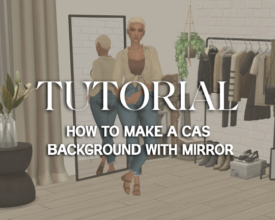
Tutorial: How to Make a CAS Background With Functional Mirror
Overview
This is something that has been highly requested so I hope this tutorial will be helpful for the sims 4 cc community!
This tutorial will have 2 parts for creating 2 different types of CAS "room" backgrounds. Part 1 (The Easy Way) uses a template I created for you to use your own 2D images/screenshots with a simple rectangular mirror. Part 2 (The 3D Room) will result in a better quality background, but it’s not a beginner friendly project so I don’t recommend trying it if you’ve never made any cc before. I will not cover the basics of cc making here, only what’s relevant to making a CAS bg using my template specifically. The Sims 4 Studio forum has a ton of great tutorials for everything else.
In my own research & experimentation, I noticed that (as far as I can tell) EVERY other CAS room with a functional mirror seems to be derived originally from LittleDica's CAS room [link] I want to acknowledge credit to LittleDica for their CAS background which I studied as a reference. But to be clear this tutorial and my templates are NOT derived from another creators' work; I created mine from scratch and it took a lot of time and effort. My version is much more simple and more compatible with Sims 4 Studio because there are no extra mesh groups or diffuse maps. I also made a great effort to make the reflection in the mirror more realistic for the size of the room. I hope you will be able to use this resource to create your own beautiful CAS backgrounds! ♥
Also in case you missed it, you can download my CAS background used in the preview [here] (it is slightly different from the template package.)
Requirements:
Sims 4 studio
Image editor (Ideally photoshop)
my templates (attached below)
—————
Part 01: The Easy Way
The easiest way to create a CAS background with mirror is to use my attached templates.
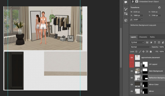
The PSD template is the best option, but for those of you that don’t have Photoshop, there is a PNG version as well.
You will need 2 images; one for the main background, and one that will be reflected in the mirror. The large top area is the main background, and the smaller rectangle at the bottom is what will be reflected in the mirror behind your sim.
In the image editor, paste your images and resize them to fit into the outlined areas.
For framing your screenshots, it’s important to understand that the mirror is actually just floating in space in front of a flat background. That means you’ll have to fake the perspective a bit and that may require some trial and error to get right. I recommend taking multiple screenshots at a variety of angles so you have options to work with. Use the model sim as a guide to help you with placing your background image. (Don’t forget to hide the model sim and UV layout when you’re done!)
Save as .PNG or .DDS and import it into the template package in Sims 4 Studio.
That’s it! My goal was to make it super easy for you. Remember to only use one CAS background in your mods folder at a time since it's an override. Also note that it is not compatible with 'cas blob remover' since the instance for the dropshadow is now used as the mirror.
TOU — PLEASE READ:
I give permission to the Sims community to use my template files and modify them as needed to create your own CAS backgrounds. This took months of work, researching and experimenting, so please respect the effort I put into creating this resource by agreeing to these simple terms:
Don’t re-upload my files.
Don’t claim my work as your own.
If you use my templates for your cc, please share credit with my username (Lijoue) and link to my Patreon page.
If you make any money from cc created with my templates, please consider making a donation via my Patreon. It is greatly appreciated.
download template files here
Part 02: The 3D Room
to be continued…
This part will take more time to finish because there’s a lot more steps involved in creating a 3D CAS room. In the meantime, the template should be enough of a starting point for those of you that already know how to make cc objects, since I already handled the hardest parts. Just understand that the mirror reflection is not automatically calculated, meaning that if you move the mirror in the mesh, you will need to change the Mirror Plane Normal and Mirror Plane Offset in S4Studio Warehouse to match the new angle or position. Otherwise it may look unrealistic or worse, it could reflect the eerie wasteland world that the CAS room is set in. (pictured below)
#sims 4 creator#sims 4 tutorial#the sims cc#ts4 maxis cc#maxis match cc#sims 4 maxis match#ts4 tutorial#sims 4 studio#ts4 custom content#ts4 cc#cas backgrounds#sims 4 cas
100 notes
·
View notes
Text
Hello silly hamsters 🫶 looking at my asks (and dms) it seems like a lot of people don't know how to make basic line dividers so I hope to change that!
✨Simple line divider tutorial below✨
So to start off, you don't need much and it looks more confusing than it actually is!
You need an app that lets you color a space - for example Picsart, canva, procreate, photoshop, or you simply google a color and screenshot it.
(Left: Canva. Right: Picsart)

It doesn't matter which dimensions you use here but I use my standard of 1000x40 pixels which I use for my thick - non line- dividers.
You need to save this picture and use a site that lets you resize it. For example ezgif. This is a site i use for various things like making gifs and also removing background from images and gifs.
Here you will upload the picture and choose the size you want it to be cropped to. Personally I have my width for simple lines at 1000 but the height will depend on its purpose. (Size variations further down)
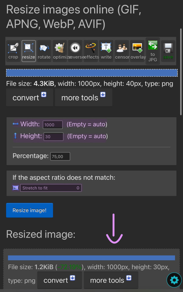
You can then simply save and use the resized image to your liking. You made it too thick? No problem. Simply change the height and click on "resize image!" again. Don't be afraid to play around and try out different sizes!
The sizes i use for the thick lines are 1000x12 and for the thin ones 1000x6!
Size examples:
1000x40

1000x30

1000x20

1000x12

1000x6

1000x3

#rhy speaks ♡#divider#line dividers#tutorial#divider tutorial#helpful#cute dividers#simple dividers#if you want to know anything else graphics wise don't be scared to ask!#I'll gladly make more tutorials or drop my sites
71 notes
·
View notes
Note
hello. it’s me again who asked for the ripped paper tutorial. i can’t wait to try it out later!! are you able to make a tutorial on how you put the text on the ripped paper? thank you so much ☺️
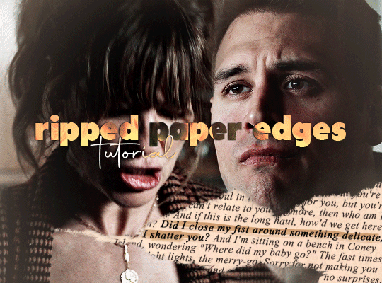
hello! sure! i'll explain how i made the ripped paper effect from this gifset in more details under the cut 😊 (it’s a different method than what i did on my previous tutorial here)
i apologize in advance for my lack of coherence, i’m not always the best at explaining stuff, especially not in english haha
first things first: make your gif, color it, sharpen it etc etc, and put all of it's layers in a group. i called mine “blended gifs”. oh and make sure you are in timeline mode, not frame animation!

then you want to import the ripped paper texture(s) you want to use onto your canvas and position them the way you want them to be on top of your gif, like this:
(i am using these textures for most of this gifset)

what you want to do next is create a mask of this torn up area so the gif layers only show up around the "hole". to do that, select the texture layer and press "ctrl" while clicking on the texture's thumbnail. this will create a selection of your ripped paper texture (you'll see a flashing dotted line showing your selection).

btw: the ctrl + click method works only if the image/texture has transparency like this texture does.
[if you want yo create your own torn/ripped shape with 2 or more textures, you can place them on top of each other and create a mask by doing ctrl + selecting the thumbnail of the first one, then while still holding ctrl, also hold the shift key and click on the second texture’s thumbnail (and the third, fourth, etc). this will add the shapes to the same selection and then you can create one layer mask with all of the shapes selected together.]
with that selection still active, you want to select your gif's folder you created earlier and click on the add layer mask button.
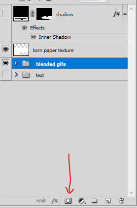
this will create a mask for the ripped paper edges on your gif, the group layer should look like this:
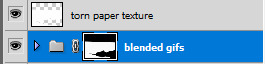
now disable the torn paper texture (by clicking on the eye next to it, you won’t need that torn paper texture layer again), and your gif should look like this so far:
as you can see, there's a transparency issue, and we're losing the top part of the gif. to fix that, you need to brush some white color onto the mask.
to do that, hit ctrl and select the group's mask thumbnail again, you will see the same selection as earlier show up. with the selection ready, select the brush tool in the color white (and 100% opacity), and go brush/paint some white over the whole layer mask. this should fix the transparency issue and the gif should look like this:
once you're done, hit ctrl + D to make the selection disappear, and still with the layer mask selected on the gif's group, with the brush tool paint some white at the top so we get the top of the image back. it should look like this:


(you can also brush more white or black to add/remove parts to this layer mask if you want to, it’s what i did for the original gif, actually.)
now you should be ready to put whatever you want in that ripped edges “hole” you’ve created.
what i did for this gifset is i found a random paper texture on google and used it as a background for my text. make sure you put this background texture under the gif folder, so it will only show up in the “hole”. (i put my texture in a group i renamed “text” because i love my psd compositions to be tidy lol)


then i just typed the text i wanted and positioned it the way i wanted it to look. the text layer should be over the paper texture but still under the gif folder:


to finalize the look I color corrected the paper to be a bit more bright and added some highlight on the text, here you can do whatever you want to make the text look the way you want it to look.
i also added a bit of dropped shadow on the edges of the ripped paper. to do that I selected the mask (ctrl + click the smart mask thumbnail), created a new color fill layer (the color is not important). this will create a layer with a layer mask of the selection. i then selected the smart mask thumbnail and hit ctrl + i to invert it, so my mask is not only the inside of the “hole”. then i put this layer on top of everything, and the fill at 0%. finally i added an inner shadow in the layer style options (by double clicking on that color fill layer).


and that is the final result!
i hope that wasn’t all too over the place or not too detailed? i wasn’t sure how familiar with photoshop you are 😊
@nightmaarebeforechristmas here u go!
#*ps help#resource#photoshop#agentplant#userdean#tutorial#usermadita#omgari#userrainbow#alie replies#anonymous#completeresources#allresources#resourcemarket#useryoshi
657 notes
·
View notes
Text
clipping path and background just pen tool
#clipping path#pen tool#clipping path tutorial#clipping path service#how to use pen tool#image clipping path#pen tool photoshop#clipping path tutorial in photoshop#background remove#clipping path photoshop#create clipping path#jewelry clipping path#clipping path tutorial in photoshop bangla#photoshop clipping path tutorial#remove background#use pen tool#background remove & clipping path pen tools use#clipping path bangla tutorial#product clipping path
0 notes
Text
Written version of @thornowl's baking texture-based items for 4t3 conversion tutorial. (Part 2)
Tumblr's pics limit suxxx... Anyway, first part is HERE.

STEP 5: BAKING ALPHA.
Create new image for alpha. select TS4 body group.
Select TS4 body group. Go to Node editor, in the Image texture node change Color socket to Alpha and connect it to Color socket of Diffuse BSDF:

13. Select TS3 body group, In the Image texture node change your old image, that we used for bake, to a new image:
14. Use Shift + click to select first the TS4 group and then the TS3 group:

15. Go to the Render tab, settings are the same as the previous one, press Bake and wait:
16. Fuck yeah, we are ready... at least for one swatch (I have 20 of them, but that's not important right now). Now we need to save that image and remove with it all the black stuff from the texture in Photoshop.
STEP 6: CREATING MULTIPLIER AND MASK IN PHOTOSHOP.
Open your both baked textures. in my case alpha image is having transparency, that isn't normal:

2. You can easily fix it, just use paint bucket tool with black color (#000000) for the background :
3. After that, open your multiplier and create mask for the layer:
Open Layer tab → Layer mask → From transparency:
4. Open the Channels tab, our mask is supposed to be the fourth channel, Select it and make visible:
5. Open fixed alpha image, select it with Ctrl+A, copy and paste:

6. I actually saved the original texture, as additional non-recolorable preset, but you need to make your stuff recolorable. And I tweak the texture with Black&white and Curves, so I can make it gray and created mask with Match color adjustment:


7. I don`t want to create specular and normal map for this but you can check tutorials for it on @sims3tutorialhub, but I created simple thumbnail with this template. After that I opened TSRW, created project from afAccessoryGloveBurglar clone and imported all textures. For whatever reason, TSRW doesn't show texture-based accessories (like gloves and socks), so you need to check it in-game.
It's the end of the tutorial! I want to thanks @thornowl for creating original video and wish all beginner (and experienced) creators the best of luck <3
83 notes
·
View notes
Note
Anon here!! How did you make the heart graphic for the power rentry?

hi!! i’ll put it under the cut since there’s quite a few steps. lmk if you need a more specific tutorial or images for any of the steps!!

1) finding the base
find the shaping mask you wanna use. you can look up “shaping mask png” or “mask png” on pinterest to find some. this is the one i used:
2) removing the background
to remove the background, use the selection layer in ibis paint x. to find this layer, go to the layers panel and it should be the one all the way at the top. it is titled “selection layer.” to remove the white background, select the bucket tool and select the white background. it should turn blue. then switch from the selection layer to the layer you’re removing the background from. look at the top middle of the screen. there should be a square composed of dotted lines that looks like this:
click on it and select “cut.” this will remove the white background. click on it again and select “remove selection area.” now you’re ready to continue!
3) creating a cleaner base layer
you might want to do this if you plan to add a stroke, as once the background is removed from the mask, it tends to leave some remnants behind. this makes the stroke look choppy and pixelated. to do this, take the paint bucket tool on a new, blank layer, and fill in the black part of the base with black. then, delete the base layer underneath the new layer. the hearts will become transparent (to see this better, change the canvas from white to transparent in the layer menu) and the base will hold its shape. you can also remove the hearts in the previous step, but this tackles two birds with one stone and (in my opinion) looks cleaner.
4) filtering manga panels
to make the manga panels pink, i looked up “pink manga polarr code.” pretty much any one will do, but this is the one i used:
for the rest of this step, you’ll need the app polarr. once you get the app, go to the edit section of the menu on the bottom. click “open photos” and insert the manga panels you wish to change the colors of. then, click “filters” and “import filter.” from there, click “import qr code” and click on the filter in your gallery. the filter will go into polarr, and you can just click instant export or you can save it and then export it. it’s up to you.
5) masking the panels
import the images you just filtered into your canvas. now we’ll use a clipping layer to have them take the shape of the base. click on the image layer you want to do this with, and then hit the clipping option in the layer menu. this will have it take the shape of the base.
6) coloring the hearts
now we’ll add a new blank layer atop the clipping layers. i color picked the pink color from the image, and then used the bucket tool to fill in each of the hearts.
7) adding the extra pngs
for this step i used the sticker option in picsart and a transparent canvas to collect the pngs. i believe i looked up “pink png” in the search bar, but i’m not sure. then i imported them into the ibis paint x project and positioned them where i wanted them to go. download transparent pngs of the project (one of each image you added). toggle the eyes on and off so that you can save the different versions (not individual layers. i just mean if you added two manga panels, make sure you get one with one manga panel and one with the other).
8) creating the gif
search up ezgif animated gif maker. it should be the first option that comes up. for this, i typically switch to “manually ordered upload” opposed to “alphabetically ordered opload” (the default) so i have more control over the order of the images in the gif. once you upload them into the site and you get to the editing menu, set the delay time to 100 and click the box that says crossfade frames.
andddd you’re done!!! i hope this was somewhat comprehensible and i didn’t miss any steps xD
139 notes
·
View notes
Text
How I color manga panels: a tutorial
I'm no expert at doing recolors, I'm simply an artist who's occasionally too lazy to do my own lineart, and uses that of my favorite mangaka's so I can focus on other styles to simply have fun with my colors. I always try and choose panels or pages that are high quality, to avoid too much pixelization. Often I end up sourcing these from scanners or google images.
As far as programs, I use Krita (a free software). This all can be done with the standard brushes and tools that come with the software. But for some of the coloring, I have brushes from brush packs i like to use, as well as a few brushes I have customized myself. The main ones I use are from David Revoy, so if you want a recommendation for a great free brush pack, that's mine.
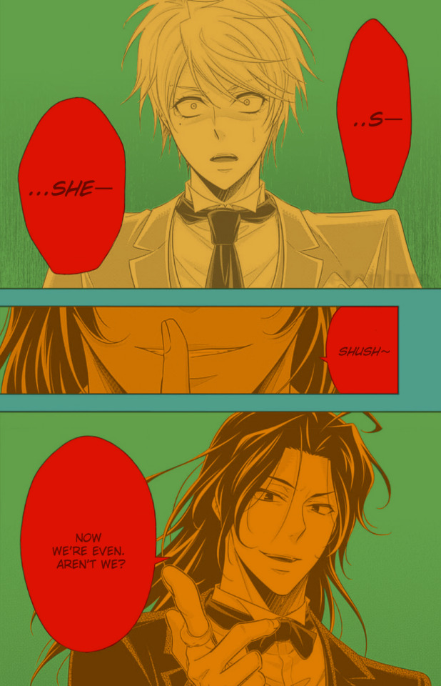
For this example I'll be using this panel from Chapter 58 of Moriarty the Patriot (I believe this would be Volume 15 of the manga) that I posted earlier here.

I'm not including the step where I crop the image, but I personally chose to remove some of the white borders that are needed for a traditional volume's page borders. Since I'm doing digital art, I don't always include them.
My next step is always to outline and fill the individual base layers. This includes the speech bubbles, each character, any independent props, the panels themselves and the backgrounds. There's no correct way to do this, but personally I use a brush to outline the object, then fill tool to well. Fill it, as well as the rectangle tool for the panels or straight lines I need to do.
For layers, I usually put all of these color base layers in a single group that's set to multiply, and change the opacity of the base panel so that I can fill the blacked out areas with a solid color easily, here you can see I was working with the base panel at 50%, but honestly i just kind of turn it down to whatever I think looks good.
The colors I use for this step are usually brightly saturated rainbow colors so it's easy to tell the different elements apart from each other. So you end up with something that ends up looking rather horrific like this:
From here, I usually create a copy of the base panel to put over the top of the colors. This way I can have transparency for the colors on some of the blacked out parts, but don't loose some of the nuance of the shading entirely. Moriarty the Patriot is a very black heavy cell style, which is the style I find the "panel above, panel below" method works best on. However as I work on the colors, I tend to toggle between having it on or off.
It's about here where I start doing my coloring. Of course this will depend on your coloring style and art habits, however personally, I like to start with the characters. I use those colored layers as the base layer I can clip my coloring layers to.
I will often turn off the layers that I'm not currently using so I don't have to deal with eyestrain, and will change the base layer to something more suitable (often a grey or light tan) so my color theory doesn't get all messed up. The bright colors in previous steps are to make sure they're visually separate. Now they've been established, I don't have to worry about that.

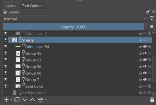
I don't usually label my layers, but for the sake of the tutorial I have to make it clearer which layer grouping is which.
I find in this step because of the multiply layer the colors can be a bit washed out, so I tend to either use much more saturated colors than I usually do, or switch to another layer style like Linear Burn of the overall color group to make the colors pop more. Ultimately though this comes down to personal preference. If your coloring style is very de-saturated, you might not have any problems with it. (I do suggest making your base color white, so the coloring of the base panel isn't off, you'll see in the screenshots above I forgot to when working on Sherlock. Ignore my mistake)
For the parts of the image where it's primarily blacked out (such as Sherlock's hair or coat) I don't bother shading at all, and only do the highlighting, as the black takes care of the darkest tones anyways.
During my coloring, I also add a separate grouping above everything for adding rendering and details above the panels. This includes things like the eye highlights (which I always do in pure #000000 white) and making certain parts of the heavily blacked out areas pop more.
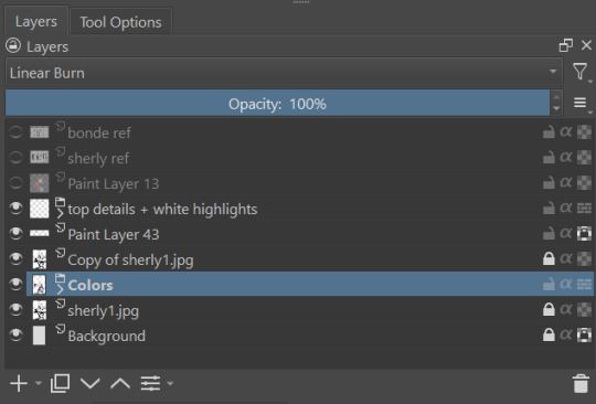
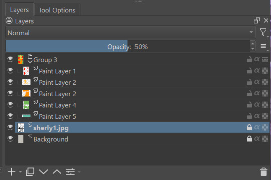
(those refs and paint layer 13 are what I'm using to color pick off of, and keep the shading colors consistent throughout the piece. There's probably a better way to do it, but I just paste them directly into the image and then delete them at the end, paint layer 43 is a color dodge layer, and so has to be outside of the layer grouping to work)
Comparison of the art without:

And with the top details and white highlights:

It's a pretty subtle difference, but I find it's the little things that truly make the piece. Especially with the strands going over the face, they need just a bit more to make them really pop. I also just really like my fancy eyes which is hard to do without the top layer.
Insert several hours of coloring here, and about another hour just trying to figure out what gradient to use for the background, and you end up with the the base colors. From here I usually mess with overlay layers as well to get the colors to all look fancy and nice together without having to do color theory (pro tip /lh).
I forgot to grab screenshots while doing the background, but for the top panel I essentially just used the [deevad 5c screentones] brush and a transparency mask to add a screentone gradient, and totally didn't google "splatter overlay" or something like that and picked something off of google, and added some borders.
Because both the base manga panel and manga panel over the top are both not at full opacity, if there is text in the page or panel (such as this one) I like to copy the just the text part of the panel and add it as full opacity in the "colors" folder to make sure it's legible and matches up the rest of the colors.
And after all that, its basically done. I'll sometimes continue to mess around with certain aspects to make sure I like how it look, but that's essentially it. This is when I add my signature, and then it's queued to post!

#krita#long post#eyestrain#art tutorial#tutorial#digital art#my art#manga recolor#manga edit#manga pannel#manga coloring#sherlock moriarty the patriot#moriarty the patriot fanart#yuukoku no moriarty#moriarty the patriot#james bonde#james bonde mtp#artists on tumblr#art resources#art help#art tips#drawing tips
59 notes
·
View notes
Last Seen Blogs

jbarth214
Untitled
spiritsncrystals
Dia Du Morium
theapothecaryssketches
The Apothecary's sketches
artificed-blossom
ROLL THE DICE