#4 HOURS OF EDITING BUT NOW ALL THE TAGS ARE NICE AND NEAT <3
Text
WE DID IT
IM SO TIRED
-mod sw
#GOD#4 HOURS OF EDITING BUT NOW ALL THE TAGS ARE NICE AND NEAT <3#we had to delete some SUPER old posts bc they werent letting us edit them#and also some were reblogged from some uh Unsavory ppl so we deleted any of those that we caught#mod sw#text#mod talk
0 notes
Text
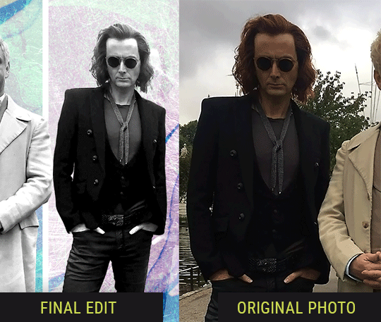
Editing tips, I guess?
Hey uhhhhh, so I've gotten lots of new followers over the past few weeks and wanted to do some kind of thank you?? Also, I have seen a fair share of "omg HOW" in the tags on my edits (which??? always make my day?? my week??? my life????)
Anyway, I thought I'd share some of my ~techniques with y'all? So here goes:
(lmao this got really fuckin long so cuuuuuut)
1. Make EVERYTHING a Smart Object
Okay, maybe not EVERYTHING, but seriously. Do it. It will save ur editing life. You ever shrink something down and then an hour later change your mind and decide you want it bigger? If you're not using a smart object, it’ll get blurry when you scale it back up and you’ll be fuCKED!
To make a layer/group a smart object, just right click on it in the layers panel and select "convert to smart object". This makes Photoshop store the layer's original data in a separate space for safe keeping (an embedded .psb file, to be exact) -- so you can shrink it and enlarge it as many times as you want without any lossiness.
As soon as I paste/place a screencap, texture, or whatever into my document, the first thing I always, ALWAYS do is convert it to a smart object!!
Why, you might ask?? Continue to item No.2 :)))
2. Harness the POWER of Smart Objects!!
The reason I am obsessed with Smart Objects is because I am obsessed with making any edits as non-destructive as possible. If you use “Image > Adjustments > Levels/Selective Color/etc” on a regular layer, that’s a destructive edit. Same goes for any Filters (such as blur/sharpen) and transforms (Warp, distort, perspective). You lose the original data that was there and the only way it can be undone is with ctrl+z. Might not seem like a huge deal at first, but if you keep chugging along for an hour and decide, “hmm, maybe i went too hard on that levels adjustment after all...” your only options are deleting the layer and starting over, or uh... hoping it’s still in your history panel.
However, it's really easy to avoid destructive edits when you use smart objects!! Because all those adjustments, filters, and transforms become “Smart Filters”. Smart Filters have all the non-destructive advantages of performing these adjustments via adjustment layers, but have the added bonus of ONLY effecting the layer they’ve been applied to, instead of cascading down and effecting all the layers beneath. (Which can be a good thing sometimes, but that’s a whole other topic)
Smart filters are attached to their ‘parent layers’, and can be hidden, deleted, or modified (by double-clicking their names) at any time:

Can I hear a wahoo???
Other cool things about Smart Objects:
You can copy a Smart Filter with all its settings to another layer by alt+click+dragging it over
You can change the order in which Smart Filters are applied by clicking and dragging them around
You can edit a smart object independently/in a sort of 'isolated' mode by double-clicking on its thumbnail!! I like to use this for edits that are specific to a given screencap-- like cutting out the background and any initial adjustments, like levels and selective coloring. Once you’re done editing the contents of the smart object, hit ctrl+s and it will automatically update in the main document!
But really, the biggest thing for me here is psychological. I know I’m much more willing to try things and experiment when I know that I can easily go back and tweaks things at any time. Otherwise, I’d stick with adjustments I don’t really like all that much simply because it would take too much time/effort to redo them.
3. Don't even THINK ABOUT using the eraser tool or I will STOMP YOU to death with my hooves!!
Use a layer mask instead. Please I am begging you. It all comes back to making your edits as non-destructive as possible. If you erase something, it's gone forever. When you mask something, you can make changes to which parts are visible/not visible as often as you want.
For the newbies or the otherwise unacquainted, a mask is a greyscale ‘map’ attached to a layer (or layer group) that controls its opacity. Black areas give the layer 0% opacity, white areas will give it 100% opacity, and you can use shades of grey to achieve partial transparency. You ‘draw’ on these layers with the your trusty brush and paint bucket tools.
You can create a mask by selecting a layer and then clicking the little mask icon at the bottom of the layers panel (it’s the one with the little circle inside the box). Draw black on the parts you want to hide, and if you erase too much on accident? Just paint back over it with white!
I love masks, and sometimes i will throw an already masked layer inside a layer group and apply a second mask to said group. This way I have two masks that can be edited independently from each other. Like layer mask-ception.
So anyway, yes. Eraser tool? Don’t know her.
4. Try using channels to create masks!
This is a technique that works REALLY well for cutting out complex shapes, such as wispy hair (or feathers!) -- provided there's strong contrast between the subject and the background, and the background isn't too busy.
This is also a fantastic method for capturing alpha transparency. For example: If you have a neato paint stroke/splatter/watercolor texture you want to use as a mask, but has a solid background that’s getting in the way of things. This method will capture all the semi-opaque areas flawlessly!!
While editing your image (which you had better have made into a Smart Object!!!) do the following:
Switch from the "layers" panel to the "Channels" panel.
Toggle through the R, G, and B channels, and decide which one has the most contrast for the areas you are trying to mask.
Ctrl+Click that channel's thumbnail. This will create a selection marquee.
Switch back to the layers panel
Click on the target layer/group (the one you are trying to mask)
Click the mask icon at the bottom of the panel (the one with the circle inside a box)
Release the selection and invert the mask if necessary
If you're using this method to cut out a subject from its background, you probably won't want alpha transparency. In this case, select the mask thumbnail and use a levels adjustment on the mask itself to bump the contrast until you have more of a cutout effect!
It sounds like a lot of steps, but it’s really simple! So I made this handy GIF: (click to view from beginning)
Sometimes you won’t want to use this method for the entire image, but just a specific part. For example, if you’ve cut out a character with some other method (magic wand, manual brushwork), but are having a hard time with their hair in particular. Use this method to create the selection, but instead of converting the whole selection into a mask, use the brush tool to apply the mask only where you need it! You can invert the selection itself with shift+ctrl+i.
5. Outlining text
The font I used here is Salomé, which is actually a solid typeface with no outlined version. But you can make virtually any font into an outlined version if you so desire!
There's two possible methods here, actually:
The Easy Way:
Add a stroke layer effect to the text layer (by selecting the layer, clicking the little “fx” button at the bottom of the layers panel, and choosing “Stroke...”)
As far as settings go, aligning the stroke to the inside usually yields the best result/maintains the integrity of the letterforms.
Make the color of the text itself match the background.
If necessary, use the lighten/darken blend modes to create the illusion of transparency.
If you need true transparency (which I didn't until I decided I wanted to apply a gradient over the text), you'll have to try something else-- The Also Easy But Less Than Ideal Way:
Right click the text layer in the layers panel and select "convert to shape".
Now you can edit the fill/stroke the same way you would any other vector shape.
Again, you’ll want to set the stroke alignment to ‘inside’. For vector shapes, those settings are a little hidden. You’ll wanna open up that little dropdown in the toolbar with the line in it, and click “More Options”.
This is semi-destructive, so if you're working with a lot of text you might have to edit later, consider duplicating and hiding those text layers first so you'll have a 'backup' of it.
And while I’m on the topic of text...
6. Try breaking up your text layers!
I know a lot of people like to draw a neat little text box to put their text in, and then they center it all nice and neat and probably use a small font size to make it subtle and stuff... and that’s cool. Everyone’s got their different styles and things they like to emphasize in their edits and there’s absolutely merit to that sort of thing (case and point: the bulk of my dear @herzdieb’s work), but. Listen.
I love typography. I love a good typeface. The stroke widths, the letterforms, the ligatures, the serifs... I get like, horny on main for a good typeface. I like to make the text on my edits BIG, so that those details can shine. I also like doing interesting things with the text. Jumbling words/letters around, distorting them, deconstructing them and just... letting the text really ~interact with the rest of the composition instead of just kinda politely floating on top of it.
I’m not saying you have to do that kinda stuff. Or that I think neat little floaty text boxes are boring, or lazy, or whatever. It’s just... personally, I get really inspired by type. Fun type treatments are one of those things I LIVE FOR, something of a ~signature of mine, and I encourage everyone to just... try it? To use text as more of an integral Design Element and less of a... idk. A caption?
So if you have a quote, or even just a word... put each word (or letter) on its own text layer. And then: make ‘em different sizes. Make the words so big they don’t fit on the canvas. Rotate each one at a fun angle. Scatter them around. Go nuts. Use masks to chop parts of the letterforms off. Make ‘em overlap. Just have at it. Or, as the kids these days are saying: go absolutely fuckin feral.
If that really just isn’t your style, or doesn’t work/make sense for the edit you’re doing, fine. Delete all the layers and just do a text box or whatever. But. I’m tellin u.
Give it a try.
At least once.
Just... a lil taste.
7. Understand the difference between lighten/darken vs screen/multiply
For a while in my photoshoppin' youth, my understanding of these blend modes basically amounted to "darken makes things darker, and multiply makes things really darker", and vice versa for lighten/screen. But there's an important difference between how these blend modes work, and if you understand them, you can use them more... strategically? I guess?
Darken and Lighten are kinda misnomers tbh, because they technically don't really darken or lighten anything. What they actually do is make it so that only the areas of the layer that are darker or lighter than the content of the layers beneath them are visible. This produces some pretty nifty layering effects that you can't achieve with screen and multiply.
Here’s an example: (if you’re reading this on a phone with the brightness dimmed down you probably won’t be able to see the differences)
Without any the texture applied, you can really see the noise/graininess of Crowley’s jacket in the screencap. You can also see the ‘seam’ where Crowley fades into the background-- the jacket is a green-ish black, while the background it’s fading into is more of a purple-black.
With the texture set to ‘Screen’, the whole image becomes lighter across the board. Crowley’s jacket gets lighter, and so does Aziraphale’s jacket and the pink cloud thing. This does little to nothing to obscure the poor image quality and disguise that ‘seam’.
But with the ‘Lighten’ blend mode, ONLY the dark parts of the image appear lightened, and not only do they appear lightened, but they get kinda equalized. Notice how the patchy jpeg artifacts on Crowley’s jacket disappear, how that color seam smooths out, and how the brightness of Aziraphale’s jacket and the pink cloud doesn’t change at all.
This isn’t to say that lighten/darken are better and that you shouldn’t use screen/multiply. They each have their uses. But most often, I find myself using lighten/darken because the way they work is honestly really helpful? And just cool af?
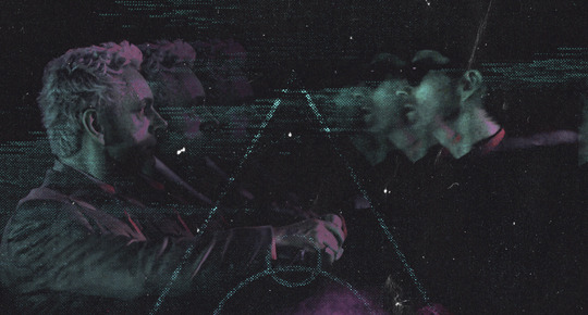
8. Masking individual frames on gifs
If you ever feel like torturing yourself by making a gif that has frame-by-frame masking, my advice is don't try to mask each frame from scratch. You'll get patchy/wobbly results from the masks being slightly different on each frame.
Instead, mask the first frame, then alt+click and drag that mask onto the next frame. Make any minor adjustments to the new mask as needed, and repeat for each frame. This saves time and more importantly, keeps the masking consistent on areas with little to no movement, which makes a HUGE difference in how smooth the final product will be.

If you look at the edges of the animation, they’re nice and steady and consistent. It’s only the parts that have a lot of movement (like the back of his neck) where you can see any ‘ghosting’/wobbly-ness happening.
Sometimes the mask will move when I copy it to the next frame. Like, for the whole document. It gets nudged 20 pixels down or to the left or s/t every time. I have yet to figure out why, but I’m betting it has something to do with shooting myself in the foot with the frame 1 propagation settings at some point during editing?? ANYWAY, when this happens, just unlock the mask from its layer (click the little chain icon between their thumbnails) and move it back into place.
In these cases, I also like to pick a spot with a hard edge (such as the shoulder in the above gif) as a reference point of where it needs to be moved to. It kinda sucks having to do this for every frame, but you already signed up for some suckage when u decided to mask every frame of a gif, so I mean... 👀
9. Don't be afraid/too intimidated to do manips as needed!
Manips can be tricky if you're really striving for realism. There's light sources and color grading and perspectives to reconcile!! But when you're doing an artsy Edit with a capital E, odds are those kinds of discrepancies will be thoroughly camouflaged by all the levels, black and white, etc adjustments you're doing!
Something I run into often is, "I like this screencap, but the top of their head/hair is chopped off :(" But if I go back through all the screencaps from the scene, there's usually another frame where the camera is planned/zoomed out enough that I can steal the rest of their head/limb from it! And since it's from the same scene/shot, the lighting and color grading should already be a perfect match!
A super simple example:
So I wanted to use this picture of David and Michael for this edit, but 1) They’re standing on the wrong sides for their characters, and 2) part of David’s arm is covered up by Michael’s.
Of course, the easiest course of action would be to just mirror the photo so they’re on the correct sides, but 1) mirroring faces tends to yield wonky results, and 2) that still wouldn’t give me a perfect, free-standing cutout of Crowley to place wherever I want in my composition (as opposed to being forced to awkwardly position him off the edge of the canvas to hide the fact that the other arm is missing)
Fortunately, it only took all of like, two (2) minutes to draw a crude selection around his good arm, copy and paste it into a new layer, flip it around, and add any necessary masking to get the shape right.
My point here isn’t to teach y’all how to do manips, or to pass this off as an impressive example of one. Because it’s really, REALLY not. My point here is to demonstrate that even something as tiny and simple as this can really open up your options for what you can actually do with an edit/composition.
So next time you’re feeling limited/inconvenienced by the crop of a screencap, just... you know. Consider whether or not it’s worth attempting a quick and dirty manip to fix it.
Another Example:

Sometimes you’re torn between two screencaps. You like one element from Screencap A but also want some other element from Screencap B. What to do? Just frankenstein ‘em together. Layer one on top of the other, get them lined up, and mask out the necessary parts.
It’s easy to get hung up on stuff like “Uh... should Crowley’s shoulder be doing that?” but let me assure you that like... the people looking at the final product are none the wiser to your butcherwork and will not notice. Especially if you’re going to add a bunch of contrast and color adjustments later on. (in fact, sometimes I’ll apply those adjustments first so I’m not distracted by any discrepancies that are going to come out in the wash anyway)
“I dunno... 🤔🤔 doesn’t seem anatomically correct... 🤔🤔🤔🤔” thought no one.
Point is... point is... dolphins you can get away with a LOT more than you think you can. Don’t let the desire to make these kinds of manips perfect get in the way of just... making them good enough. The bar isn’t that high, I promise.
10. Know what inspires you
What types of edits get you EXCITED? What kind of work do you see on your dash and go, "oh, I'm reblobbin' THAT!!1!"
I know for herzdieb, she's all about emotional pieces. She likes matching words/lyrics/poetry to on-screen moments and punching you in the feels with both. She hears a song, or reads a poem, and the lightbulbs go off for her, and she does her thing.
As for myself, I just live for the aesthetics of an edit. The colors, the fonts, the composition. I almost never know what text/screencaps I'm going to use when I start an edit. I just see a font I like, or a color palette, or a texture, and think, "I wanna use that!"
And once you know what inspires you, collect that inspo! I hoard textures and fonts. I have them organized into neat lil folders. When I wanna make an edit, that’s where I start. I just browse through them all until one or two start calling my name. Herzdieb collects songs and quotes and poems. Maybe your thing is color palettes, or aesthetic-y photos. Or whatever.
The point here is make the kinda stuff you like/want to see. Not the kinda stuff everyone else is making or the kinda stuff you notice gets the most notes.
11. Be able to let go of things that aren't working
I often begin an edit with a rough idea of the style, colors, or layout I'm going for. And I almost always end up doing... something totally different.
So don't get too fixated on what your initial ideas are. Be open to experimenting and just let the edit be what it wants to be. If something looks nice, do it. If it doesn't, don't try to force it just because, "well, I was inspired by this piece that did xyz and I wanna try it too".
When you see a certain effect that inspires you, just keep it in mind as a possible solution for the next time you make something-- don't make it into a benchmark, or some imaginary 'goal' you have to meet for This Edit You Are Working On Right This Moment. In fact, sometimes the elements I end up ditching are the very ones I started with, that initially sparked my inspiration. And that's okay. Inspiration can be a moving target, and if your vision for something changes, let it.
You wanna know what inspo reference I was looking at when I started that “Temptation Accomplished” edit?
Fucking this: https://search.muz.li/YTdiNjkwN2Rh
You might be thinking, “how the fUCK was that the inspiration??!! Your edit looks nothing like that at all!” ...and you would be 100% correct, and that is 100% my point. I spent a good hour or two trying to incorporate that cutout text layering effect before finally accepting the fact that it just wasn’t working for the edit I was making. And it wasn’t until then that it actually started to come together.
12. Be patient, and take the time to explore all your options!
I’m not gonna lie, y’all. I spend hours on my edits. I usually complete them over the course of 2-3 days/sittings. I rarely have a plan. 99% of the time I'm just throwing things at the wall and seeing what sticks. When I get stuck (when, not if), it helps to step away from it and come back later with a fresh perspective/set of eyes.
Every single edit I've posted, I have at some point felt like giving up on because I thought it looked like garbage (and not just because I was being self-deprecating/doubting myself, but because at those points, they simply weren't finished/something about the composition just wasn't working for me)
Work through those moments, and if necessary, take a break/sleep on it. It's always after I've exhausted my early ideas that the really good ones start to come to mind!
Here’s how the character poster edits I did progressed:

In Classic Me™ Fashion, I literally started off with just... textures I liked, and a font that I liked. Now, there were obviously a lot more ‘steps’ involved in both designs, but hopefully at the very least this gives a sense of how things get from point A to point B.
So uh... thanks 4 comin 2 my TED talk. I hope u learned at least one (1) cool new thing or maybe just feel vaguely inspired by this rambling mess?
158 notes
·
View notes
Text
Tag Thingy!
The one who tagged me: The paw-some @youronetruepotatocat
Those who shall bear the tagged sigil: @giraffealamode @fussy-prince @furry-gamer17 @littlejavi @psi-daydreamer @nekosquidboy @thenekopastel @fabiolaheartilly
Disclaimer: No need to do this. Do as you please or if bored XD.
1. Name/Nickname: Name’s David, although no specific names are given outside a few friends from which I get a nick or two; things like kirby guy, mankey and such.
2. Gender: Male
3. Star sign: Butterfly, Star Butterfly~ (In reality, Leo).
4. Height: 1.68cm, 5′5″ for mah american friends.
5. Hogwarts House: Sssssssssslytherin <3.
6. Favorite animal: Foxes, Monkeys and cats.
7. Hours of sleep: About 7 I think; it’s becoming a new standard.
8. Dogs or cats: Cats are the greatest pet to grace our existence, as we came to the world not to be served, but to serve ;P.
9. Number of blankets: *The Count’’s voice* Three, three blankets for a twin bed, ha ha ha~. It’s the thin sheet that serves as a layer between the bed and the warm blanket, the previously mentioned warm blankets, and the thick one used to cover everything. Think of it as the top of a burger bun; fluffy and made to be instagrammed a lot (since I take my game pictures there XP).
10. Dream trip: Considering I somehow became the heir to Scrooge McDuck fortune or something, I guess I would visit France along two or three friends. A trip is nice and all, but having someone to share it with is what makes it really magical X3..
11. Dream job: School counselor, I would love to help the younger generations on their path to become better people and on their academic success. If not, a librarian; I may not read a lot, but my neatness would keep a library in perfect order. Sadly, both of those require a master’s degree and I can only go the distance so far... Teacher assistant shall be the next best thing I suppose, or working at a hospital ^w^.
12. Time: 12:00PM.
13. Birthday: August, the 17th. The day the sun shined upon my humble hometown and made narwhals fly too.
14. Favorite bands: Daft Punk and Crush 40 are the only bands I recall getting more than two CD’s from so… I’m more of a remix / orchestra / solo artist kind of guy.
15. Favorite solo artists: Owl City, Troye Sivan, Toby Fox, String Player Gamer, Pogo, Mary Elizabeth McGlynn; insert others XD.
16. Song stuck in my head: “Big Band! Kirby” (The smooth jazz rendition of Aqua Star from Kirby 64 and Save Point from Super Star are just sooooo good <3.)
17. Last movie I watched: High Speed! -Free! Starting Days- if we count what I see in home, for theater releases please see Black Panther.
18. Last show I watched: Sonic Boom -Season 2- Finally catching up to it! XD
19. When did I create this blog: May 2012, and the people who introduced me to it left it 5+ years ago XD.
20. What do I post/reblog: Personal opinions, aesthetics, gaming favorites, yaoi ships, the nintendos, Game Grumps, Kingdom Hearts, Sonic the Hedgehog, other SEGA IP’s, sh*tposting, NSFW yaoi/shota, occasional shots of IRL me and my gaming addictions, coffees, psychologies... basically, anything that I want to share or express, along with things I hold dear <3. I’ll give it points that most of the NSFW stuff is something I wouldn’t talk to you about IRL, but here’s like the only place I can loosen up a bit XP.
21. Last thing I googled: “Butter Building.” I was looking for good fanart of the famous Kirby level. Did not find much visually speaking, but musically it was a treasure of remixes galore <3.
22. Other blogs: Nope. Everything is in one place only, hence why I post NSFW here too XP.
23. Do I get asks: Mmm, usually when I do ask games only. Once every blue moon I get an ask out of the blue, but hey, if you want to ask me something, feel free. I don’t bite, not even growl XD.
24. Why I chose my url: DavyRush has been an online nickname I have since high school. I wanted consistency on that sense (and also, to not have someone claim the name and people confuse me with them X’D).
25. Following; 832 b-blogs! I’m calling out a purge soon, omg XD.
26. Followers: I’m racking 286! Out of them I probably like now on a more personal level about 20 at most XD. Thanks to all the sempai for noticing me ///w///.
27. Lucky number: 6. No less, no more.
28. Favorite instrument: Piano is probably the only instrument I know of that can cause fear and joy, sadness and happiness. Violins are cool too, but piano, mmm~.
29. What am I wearing: A Kirby Planet Robobot shirt, a blue sweater and brown pants. Either I’m a color palette gone wrong or I am making Van Gogh proud right now XDDDD.
30. Favorite food: Sushi, pastas and chicken. Basically anything with rice, chicken or fish (except mole cause... chocolate and spicy on chicken? I have mixed a few odd things in the past but... c’mon XD).
31. Nationality: 100% Mexican; the only American thing I have is a passport, really XD.
32. Favorite song: Press Garden Act 2. Listen to it with your eyes closed and you’ll see, no, FEEL it <3.
33. Last book read: ... does “The Legend of Zelda: Oracle of Seasons/ Oracle of Ages Perfect Edition” manga counts? XD
34. Top 3 fictional universes I’d like to join:
Kingdom Hearts: Traveling through various Disney worlds, living in Daybreak town, trying to unravel the secrets of the universe, fighting heartless and more importantly, a way to be in The Grid without taking a slot on this list. Yeah, I would love to do that, please XD..
Animal Crossing: Literally a tiny paradise, filled with friendly animals and plenty of things to do. Sometimes I still pop the game open just to take a virtual coffee and see the ocean. It really feels like a break from reality, and to live in such a serene world would be a bliss <3.
Any Tales world: A place where magic exists, the world seems ever expanding, and everything ain’t as black and white as in other video games. Sometimes we are forced to fight, sometimes the bad guys have good intentions, but we can always count on the good times, the jokes, looking awesome and drama, drama galore XD.
CONGRATS! on making it to the bottom. If you would like to do this ask yourself, please feel free to do so and don’t feel left out of the tags, please ;w;!
9 notes
·
View notes
Text
11 Questions
RULES:
1. Always post the rules
2. Answer the questions given by the person who tagged you
3. Write 11 questions of your own
4. Tag 11 people
I was tagged by @secretlysora !! I love answering questions but I don’t get them very often. So this is a nice change haha, thank you (〃ω〃)
Brianna’s Questions:
1. How many hours of sleep do you get each night?
Depends on the time of year haha. When I’m in school I think the average is about 5-6 hours, and on breaks I try to sleep in so maybe 6-8 hours then? I go to bed late and wake up relatively early (either because of school, or my mom wakes me up) so I don’t get a lot of sleep tbh
2. What’s your favorite time of day, and why?
I think nighttime would be my favorite time of day because that’s when I “go to bed”. I use air quotes because I really just stay up and play games or read stuff on the internet. It’s pretty nice because the house is super quiet, and I get to do whatever as long as my phone has enough battery haha
3. What are three things you’ve always wanted to do?
frig that’s a tough one uhhhh
1) I’ve always wanted to have one of those quintessential college moments with the local coffee house/ slam poetry place. The one example that comes to mind is like in the Xtremely Goofy Movie when they just go to the coffee house , and it’s like a really cool place near campus where they can chill and hang out y'know
2) I’ve wanted to try out ice skating tbh. I used to have quite a few friends growing up that we’re either really good at it, or at least visited the rink a lot, and that got me interested. There were even a couple opportunities for me to go through school, but the timing didn’t work out so I couldn’t go. Less people I know go, now that we’re older, but it still seems like an interesting thing to try out
3) ??? Idk lol
4. What was your favorite memory from last year?
I really liked getting to tour colleges with my dad last year. One of the trips we went to Arizona and Chicago (cause I got accepted to ASU and DePaul), and as part of the trip we would check out what the area has to offer. Y'know, to make sure it’d be a nice place to live while I’m staying at college. Chicago was my favorite place, aesthetically speaking. I took so many pictures when we were there.. Plus we got to check out the museums, which is always fun. We walked down from our hotel to the planetarium (because I friggen LOVE space), grabbed a Chicago dog for lunch, then after went to the Natural History museum. Personally the area is a little too densely populated for my taste, but from the few days we spent over there, it was really nice.
5. If you could be any age for a week, what age would you choose to be?
I’m pretty happy with my age rn tbh (18). I am considered to be an adult by the law, so I can do stuff like get tattoos or lotto tickets if I wanted, but at the same time I don’t have all the responsibilities of an adult yet because I’m still kinda on the young side.
6. What is a habit you’re proudest of breaking, or one you want to break?
One I’m proud of breaking is how much I used to rely on the people around me. Of course when times are bad I ask for help, but in general I think I’m becoming more comfortable in myself?
One habit I want to break is biting my nails. I’ve tried to break it a few times since I was a kid, but usually something stressful comes up and I end up biting them again. I guess in order to do that I’ll have to manage my stress first? ha..
7. When you were really little, what did you want to be when you grew up?
The two things I wanted to be when I was a kid was either a veterinarian or a singer. I remember when I was in elementary they had us do a project where we wrote letters to people who had the professions we wanted, and ask them for advice if we had the chance to do that job later. For the vet I wrote to a local clinic, and for the singer I wrote to Billy Joel because Green Day was one of my favorite bands of the time. As I got older though, I realized I’m slightly better than average at singing, and I don’t have the heart to be a vet (I get really upset when animals are injured). So instead I’m working towards being an animator haha…
8. What do you love the most about yourself?
(tbh this is another hard one for me to answer? ha)
uh I like how neat my handwriting is. Since middle school I’ve written a lot of stories on the side, personal ideas and whatnot. My methods of writing meant I would physically write my ideas out, type them and print, then write over with edits and more details, type them and print, and repeat until I either was satisfied with that copy or I got bored with it. So since I wrote so much in those scenarios, my handwriting got better and better over time. I’ve gotten a lot of compliments since high school about how neat it looks, as if it were printed, and that’s pretty cool.
9. What are you looking forward to this year?
I’m looking forward to taking Astronomy in my next semester of college ♪( ´▽`) and more art classes so I can practice more haha
10. What are your favorite hobbies?
I love writing and drawing. I don’t draw as much as I should, but once I get back from my trip (in two weeks?) then I’ll make a regimine again. Maybe do a color pallet spam again heh. As for writing, I have a bunch of personal stories I’ve been meaning to work on, but didn’t have the attention span because I was focusing on studies (totally worth bc last semester I got a 4.0 woohoooo). But like with drawing, I want to come up with a schedule so I can make some progress on my stories. (Or maybe.. I could even finish one)
11. What’s something you can’t live without?
Social contact hhhhh. I know usually the go-to for people is electronics, like the phone or the computer, but I’ve had both of those taken away and it’s not that big of a deal. What is a big deal for me though is not being able to talk to people. Even if it’s just saying ‘hi’ to each other, and that’s it, all day that’s cool. But not having the option even to do that kills me. Similar situation with physical contact.. Usually it only happens when I talk with specific people though. Like if I lost contact with both neko-chan and my bf at the same time I’d probably die right then and there
My Questions:
1. What is your ideal future?
2. What is one goal you want to accomplish within the next year?
3. What fictional character do you think resembles you the most, and why?
4. What type of music do you like to listen to in order to make you feel better?
5. What was your favorite T.V show when you were growing up?
6. What was your first introduction to social media? How long ago was that?
7. If you could have any animal in the world as your pet, what would it be and why?
8. What is the most important thing to you right now?
9. Is there someone or something that has dramatically changed your life?
10. What is your favorite time of the year, and why?
11. What is your favorite type of drink, and what is the ideal scenario you’d have it in?
I don’t have 11 people to tag ʅ(◞‿◟)ʃ so I’m gonna just tag @crookedlovestory @bbpoltergiest @peanutbutter-jellysquid (If you guys are interested in answering the questions, go ahead. If not, I’ll just say hi and hope you have a good day lol)
2 notes
·
View notes
Photo

Review: PillDrill Medication Management System
Editor Diane on deck! Frustrated with your med management setup? We’ve got a neat, nicely integrated system for you here.
First, a quick overview:
Category:
medication management, caretaker aids
Good for:
organization, habit-keeping, record-keeping, reminders, institutional use
Design: 4/5
★★★★☆
Functionality: 4.5/5
★★★★½
Bang for your Buck: 5/5
★★★★★
Overall: 4/5
★★★★☆
This product is best for fairly specific needs and could use additional development to really live up to its potential, but I still really enjoyed using it and would heartily recommend it to the right user. I would recommend the pill strips on their own, too.
Read on to find out if this is your own personal holy grail!
Disclosure: I have been given this product as part of a product review through the Chronic Illness Bloggers network. Although the product was a gift, all opinions in this review remain my own and I was in no way influenced by the company.
So. There’s a lot to discuss here.
As a starter, let me introduce my partner Ash! They are agender and use the singular they/them pronoun. We’re polyamorous, and I live with them and our other partner Steve.
Ash is a lot sicker and less mobile than I am, so I and the able-bodied Steve tag-team on helping them out. I got the PillDrill specifically for Ash, so I’m reviewing from the perspective of someone supporting a partner, and also based on the feedback they’ve given me.
Now that that’s out of the way, let’s dig in!
What is it?
PillDrill is a system meant to fully address medication management. It has a small “mission control” hub, 1, 2, 3, or more pill strips, scan tags you can put on your individual medication bottles, and a cute little mood cube you can use to quickly log how you’re feeling at any time.
The concept here is to use the hub to scan medications as you take them. The pill strip pods are scannable, and you can attach lettered tags to individual bottles with straps or adhesive. The hub can accept a scan of these or the mood cube, and can prompt you to make certain scans with beeps and flashes.
Tying all of this together is a little app that you and a caretaker, friend, or family member can download to keep track of everything. Since you won’t always be right in front of your hub, you can also log a dosage from the app by medication name, pill strip, or letter. The app will send you scheduled reminders if you like, and send an alert to someone if you are a specified number of hours late in taking them.
The app keeps track of when you log any medication, which is helpful if you need to space your dosages carefully. It keeps your history so you can easily look back and see your adherence to your schedule, or how often you’re using rescue medications.
What we liked
This system is feature-rich and pretty while still being modular and flexible. Don’t want reminders? Just log your meds when you take them! Don’t want to bring others in on your medication management? Don’t need to! Not really into scanning or the hub? Just buy the pill strips!
Ash and I did a lot of trial and error with the system, figuring out what did and didn’t work for them. In the end, they found that they like having the hub around by their nest on the couch, but mostly log doses on their phone. They don’t care about me or Steve being looped in on what they take, but I did find their mood notifications really handy and used their medication history/”med cabinet” in the app to make sure I filled their meds up correctly each week. They found medication reminders a bit too stressful (the hub beeps and flashes and their phone lights up), so we turned those off really quickly.
The pill strips are absolute keepers. They’re nice and easy for Ash to open despite painful joints, and—fitting in with the modular approach—each day’s pod pops out for easy carrying. Very handy. The pods are surprisingly spacious, too! Ash was worried their enormous host of dinner medications wouldn’t fit, but they (just barely) do.
Ash's pill strips are in the places they are mostly likely to take a certain dosage, so Steve and I find the individual pods extremely helpful when Ash asks us to fetch their meds from another floor of the house; there’s no worry of us moving an entire pill case to the wrong spot and forgetting to put it back. When they go out for a meal, they bring their pod along with ease (although this does mean there’s a weekly “where-did-you-leave-that-one-pod” moment).
As you may have gathered, I just love the pill strips as a concept, and think they really stand out on their own as an individual product. Do read on to the next section for some of my concerns, though.
The mood cube, too, is a really great addition to the system. The hub is a bit like a clock radio, so you could keep it by your bed or wherever you nest up during the day, and just scan the cube whenever you notice it. Ash doesn’t let on about how bad they’re feeling—mostly by habit, but also because they don’t emote unless they feel socially obligated to. The mood cube was so great, because I could get passive updates over the course of the day without bothering them with “how do you feel on a scale of 1-10″ or any other such silliness.
While we didn’t end up using the other features, I absolutely see how they could be useful for the right person! I love that the PillDrill seems to have been designed with different experiences in mind.
What we didn’t like
I actually have a pretty long laundry list of things we didn’t like in the PillDrill. They aren’t dealbreakers, but they do somewhat detract from the product as a whole.
The pill strips make me a bit uneasy for travel. I definitely would recommend them to someone who is mainly taking their meds at home, but a trade-off of easy-opening pods is that the closures aren’t very strong; if your pods were being jostled in your purse every day, you’d probably have a few spills. Ash was hesitant to try carrying them because of this, but the shortness of the trips they generally take with the pods seems to minimize the risk.
The strips also have nice magnetic straps you can pull over them to keep them in place when you travel, but I’m still not convinced they wouldn’t pop open in your luggage under the right circumstances.
Note: If you’re looking for a good on-to-go pill case, I highly recommend looking into the Sabi Folio, which I love and have been using for the last 2 years. Here’s a review I wrote a while back for Ethos Disability, if you’d like to learn more.
I also noticed that some pods stay in the strips better than others. They’re supposed to pop into the strip pretty securely, but we have a couple days that can’t quite stay in, which bugs me just from an aesthetic perspective. This is a production issue and could probably be fixed in future versions.
I think the app is where this product needs the most work.
There were a bunch of little things that bothered us, so I’ll just throw them in a little list:
There’s no way to assign doses to pill strips. This means that if you log a day’s pod, you’re not logging exactly what you took that day. This is a real miss, since folks will probably want to keep track of when they start and stop certain medications. The alternative is to log each medication one at a time, which is ridiculous when you take so many medications.
You can’t name pill strips. They just go by Strip 1, Strip 2, and so on. Kind of rough when you have a bunch of them.
Notification overload. When you take a bunch of meds all at once, you get this cascade of reminders. You can fix this by setting up a pill strip instead of individual meds, but the above two items make that a little less viable. A short-term fix would be to group those reminder notifications.
No mood-only notifications. I don’t care when Ash takes their meds—that’s their business—but I do want to know how they’re feeling. Unfortunately, I can only get these with “meds taken” notifications, so I experience a notification overload on my end, too.
Better mood gradation needed. Ash’s health has been ranging from “bad” to “awful” lately, and they’ve expressed a real desire for better gradation in that area; the data we’re collecting here isn’t so useful. I know cubes are useful and cute, but maybe PillDrill can take a cue from the dice used for tabletop RPGs.
No time stamp editing. Right now, you can’t edit the timestamps, meaning that if you forget to log your meds and try to do it later, it won’t show an accurate time. Ash takes a number of meds that restrict when they can eat before and after, so it’s pretty important that they keep track of when they were taken. They’ve been foggy enough that they might be able to remember they took something 15 minutes ago, but will forget that a few minutes after and not know when it’s safe to eat yet. This could be a big barrier for folks who use rescue meds they need to space out by a certain number of hours.
No way to export medication lists. This is pretty self-explanatory—it would be great to be able to share the contents of your “med cabinet” in the app with a doctor. As it is now, you’ll either need to take screenshots or keep a separate list. This makes the “comprehensive solution” feel a bit less comprehensive.
Symptom tracking would be pretty cool. We’re both hoping to see this in a later release of the app, as it’s the obvious next step.
Who will benefit from this system
Overall, it seems like this system was designed primarily for foggy stay-at-home folks with or without caretaker(s). It also seems like it would be great in an institutional setting, given the at-a-glance medication adherence features and ability for a caretaker to add multiple patients to their app.
Anyone with a bunch of different medication times will love the reminders, and folks who generally take their doses at home will love the pill strips to death.
Otherwise, it’s all about what you’re into!
Want one of your own?
Look no further! Head over to the PillDrill site to pick up the whole system, or just the beautiful pill strips.
Enjoy, y’all! ❤
#spoonie#chronic illness#disability#invisible illness#medication management#patient#caretaker#medication#organization#reminders#pilldrill#review#product#sponsored
11 notes
·
View notes
Text
How to Create Beautiful Instagram Stories (and 10 Amazing Templates to Use)
More than 15 million businesses now use Instagram worldwide and over half of those businesses are creating Stories every month.
Stories are an incredible way to connect with your audience in fresh and authentic ways. Who knows, maybe they’ll even become the new News Feed.
But creating attractive Instagram Stories can be challenging and time-consuming.
We’d love to help with that!
We’ve teamed up with the team at Adobe Spark, an awesome free design tool, to share 10 Instagram Stories templates you can use to quickly create your Instagram stories.
We’ll share how we create outstanding Instagram Stories graphics in under 10 minutes each.
Instagram Stories: 10 ways your business can use Stories (plus 10 free Adobe Spark templates)
There are so many different ways to use Instagram Stories.
At Buffer, we use Stories to:
Discuss our latest blog posts
Take our community behind the scenes
Share social media stats and data
And much more
To help you get the most out of Instagram Stories, we’ve created 10 easy-to-edit Instagram Stories templates that you can use to right away.
How to use these Instagram Stories templates:
Click on the ‘Use this template’ button under your chosen template
You’ll then be taken to Adobe Spark to edit the template (you’ll need to create a free account to do this)
Once logged in, edit the template as you wish: change the background, caption style, etc.
Download the finished graphic and you’re ready to post to your Story
Let’s jump in!
1. Storytelling
Use this template
One common use case for Instagram Stories is to show behind-the-scenes content. For example:
Restaurants show how their dishes are prepared
Musicians show how their music is recorded in their studio
Sports teams share training sessions with fans
Fashion experts demonstrate how to put together the perfect outfit
SaaS platforms could provide an inside look at their company hack-day
This template could be used to introduce a story to your audience — like an opening title. If you want a bit of inspiration, here are 11 storytelling formulas you can refer to.
2. How-to tutorials
Use this template
This is our favorite way of using Instagram Stories — to educate. We’ve used Instagram Stories to share how to curate content, set benchmarks, and much more.
If you want to share some tips or teach your followers how to do something (such as how to use your product), you could try using this template.
For example, we often get questions about the perfect size for Instagram Stories (1080px X 1920px) or how to advertise on Facebook. We’ll take these questions and turn them into short Stories tutorials.
3. Blog post promotion
Use this template
Blog post promotion is another thing we often do with Instagram stories.
Instead of simply asking people to visit our blog, we like to highlight the key points via Stories. Repurposing content across channels is a great way to ensure it reaches as much of your audience as possible.
If you write how-to guides or create how-to videos, you can adapt the how-to tutorial template above to promote your content.
4. Lists and countdowns
Use this template
I learned this strategy from Airbnb. I’ve seen them share lists of the best places to live, workspaces in Airbnb homes, and more.
You might be interested in sharing:
Various ways to use your product
Surprising stats and facts about your industry
User-generated content
You can also try fun and entertaining lists such as “top books for marketers” or “top things we learned in social media this month.” People love a good list!
5. Limited time offers and promotions
Use this template
As Instagram Story lasts for only 24 hours, making it a great way to promote time limited sales. This is a strategy often used by online clothing retailers.
For example, Black Sheep Cycling launched their new limited edition cycling kit through Instagram Stories and sold them out in 30 minutes.
You could use this template to share your offers with your followers.
6. Giveaways and discount coupons
Use this template
To entice followers to watch their Instagram stories, brands sometimes host exclusive giveaways or give out discount coupons in their Instagram stories.
Again, this is great for online retailers who drive sales through social media promotions. You could use a unique discount code specifically for your Instagram stories to track how much sales your Instagram stories generate.
At Buffer, we’ve used this technique to help encourage reviews to our podcast.
First, we thanked all of our weekly listeners for being a part of the show and then we showed a picture of Buffer socks and shirts.
Next, we asked people to respond to our Stories with a if they have listened to our podcast or a if they’ve reviewed our podcast.
Everyone was entered for a chance to win swag!
7. Data, research, and statistics
Use this template
Do you know any interesting (or surprising) statistics about your industry that your followers might be interested in?
Mentioning a cool stat can be a great way to get the attention of your followers before you share something important (such as an announcement or a blog post).
8. Quotes and inspiration
Use this template
Several social media influencers such as Gary Vaynerchuk often share motivational quotes on their Instagram Stories.
It doesn’t only have to be a motivational quote. You could share a quote from your most recent blog post or a quote from your CEO — if it’s relevant to your followers, it’s often work sharing.
9. Introduction for an Instagram takeover
Use this template
An Instagram Stories takeover has a nice advantage over a traditional Instagram post takeover, in that your guest can post as many stories as they like without filling up your nicely-curated gallery.
Before you let your guest post on your account, you might want to promote the takeover or introduce the guest, and that’s where this template will come in handy.
You could also use this template if you want to host a question and answer session with your followers through Instagram Stories. Let your followers know what the session is about and invite them to DM you questions.
10. Announcements, news, and updates
Use this template
We have shared several fun announcements using Instagram stories: the launch of our podcast, the launch of our online social media strategy class, our celebrations for Social Media Day, and more.
You could use this template to build up the anticipation for your announcements and then to reveal the surprise through a subsequent story.
How to design your own Instagram stories in under 10 mins
Adobe Spark is one of our favorite free design tools for creating graphics. With the app, I managed to create this graphic in just four simple steps:
Here’s how I did it.
(Feel free to grab a free Adobe Spark account to follow along!)
1. Select the Instagram story template
Adobe Spark has a handy template for Instagram Stories, so you know your post will be perfecly sized.
(If you are wondering, the ideal dimensions for Instagram Stories are 1080px wide by 1920px tall.)
To find the template, create a new post, select “More sizes”, and choose “Instagram Story”.
Enter the caption for your story and hit “Continue”.
Adobe Spark will generate a design with your caption. (Sometimes, it looks great enough to be used without further edits!)
2. Set your background
Next, pick a background for your Instagram story. (Or you can stick with Adobe Spark’s suggestion if you like it.)
With Adobe Spark, you can set the background as a plain color or an image.
To use a plain color for the background, select your preferred color from the side panel and Adobe Spark will remove the suggested image.
To use an image, click on the image and then click “Replace” above it. Adobe Spark has a search function for you to find free images (that are tagged as Creative Commons-licensed) to use.
We often use a simple colored background because text can be hard to read on some images. That said, when designed properly, Instagram Stories with an image as the background can look very appealing.
Here’re a few quick tips for using an image as the graphic’s background:
Choose a relevant image that has few things in it and preferably with a clear background such as the sky or sea
Place your text on the part of the image with a clear background
Use a photo filter and use a bright color, such as white, for your text
For this example, we’ll use an image for the background. Here’s how I set an image as the background:
3. Edit your caption
Next, spice up your caption.
With Adobe Spark, there are six different ways you can edit your caption.
Shape
Color
Font
Spacing
Alignment
Opacity
If you are not sure how to design your caption, no worries at all. Adobe Spark has a neat feature that suggests different designs for you. All you have to do is turn the dial.
(To go back to previous suggestions, simply turn the dial in the opposite direction.)
Once you have found a design you like, you can still make adjustments to it such as changing the color or the font.
If you want to add more text to your graphic, click on the green plus icon above the graphic and then, “add text”.
4. Download
Finally, to download the graphic, click “Share” at the top of the page and then, “Download” on the left.
Transfer it to your mobile phone and you’ll be ready to post your newly-designed Instagram Stories graphic. You can find this graphic by swiping up or tapping the image icon when you’re in your Instagram Stories camera mode.
If you are using an iPhone, you can also use Adobe Spark’s iOS app to download your graphic to your mobile phone directly. (The Android version is coming soon.)
Optional: Draw, add stickers, and more
If you like, you could also add more details to your graphic using the Instagram app before posting it. Draw, add stickers, add hashtags, and more to make it look more fun.
Also, adding hashtags and location tag helps people who aren’t following you discover your Instagram stories.
Additional tools and resources
There are many other great design tools and resources available if you wish to create Instagram Stories videos or customize your Instagram Stories graphics further.
Here are a few options:
1. Video tools: Stories Ad
Stories Ad is a free tool for creating “stunning Stories in less than 2 minutes”. It provides 12 professionally-produced video templates you can use to create Instagram Stories videos.
Follow the instructions on the web editor, and it will send your video to your email inbox.
Other video tools: Flyr, Animaker, and After Effects
2. Mobile apps: Storeo
(Image from Molly Marshall Marketing)
If you like use long videos for your Instagram stories, you might love Storeo. Storeo is a mobile app that slices your videos into clips of 15 seconds — the maximum length of an Instagram Stories video. It will save you lots of time from manually editing your videos into 15-second clips yourself.
For $9, you can remove the watermark on the clips.
Other mobile apps: Flyr, Over, and Flipagram (Hat-tip to Molly Marshall for these app recommendations.)
3. Marketplaces: Creative Market
You can also get Instagram Stories templates designed by talented creators for about $10 to $20 on Creative Market. Many of these templates are Photoshop files so you’ll need a basic knowledge of Photoshop to customize the template for your purpose.
Other marketplaces: 99designs and TopTal
What’s your favorite Instagram Stories tip?
Using templates can be a great, easy way to create amazing Instagram stories in minutes. I’m grateful to the team at Adobe Spark for creating these wonderful Instagram Stories templates we have shared with you in this post.
I’m sure using templates is just one of the many ways to save time while creating Instagram stories. Do you know of any other tips for creating Instagram stories quickly?
If you are going to use any of these templates, we would love for you to share any one of your graphics in the comments below!
—
Image credit: Unsplash
How to Create Beautiful Instagram Stories (and 10 Amazing Templates to Use) posted first on http://ift.tt/2qbaJ0t
0 notes
Text
How to Create Beautiful Instagram Stories (and 10 Amazing Templates to Use)
More than 15 million businesses now use Instagram worldwide and over half of those businesses are creating Stories every month.
Stories are an incredible way to connect with your audience in fresh and authentic ways. Who knows, maybe they’ll even become the new News Feed.
But creating attractive Instagram Stories can be challenging and time-consuming.
We’d love to help with that!
We’ve teamed up with the team at Adobe Spark, an awesome free design tool, to share 10 Instagram Stories templates you can use to quickly create your Instagram stories.
We’ll share how we create outstanding Instagram Stories graphics in under 10 minutes each.
Instagram Stories: 10 ways your business can use Stories (plus 10 free Adobe Spark templates)
There are so many different ways to use Instagram Stories.
At Buffer, we use Stories to:
Discuss our latest blog posts
Take our community behind the scenes
Share social media stats and data
And much more
To help you get the most out of Instagram Stories, we’ve created 10 easy-to-edit Instagram Stories templates that you can use to right away.
How to use these Instagram Stories templates:
Click on the ‘Use this template’ button under your chosen template
You’ll then be taken to Adobe Spark to edit the template (you’ll need to create a free account to do this)
Once logged in, edit the template as you wish: change the background, caption style, etc.
Download the finished graphic and you’re ready to post to your Story
Let’s jump in!
1. Storytelling
Use this template
One common use case for Instagram Stories is to show behind-the-scenes content. For example:
Restaurants show how their dishes are prepared
Musicians show how their music is recorded in their studio
Sports teams share training sessions with fans
Fashion experts demonstrate how to put together the perfect outfit
SaaS platforms could provide an inside look at their company hack-day
This template could be used to introduce a story to your audience — like an opening title. If you want a bit of inspiration, here are 11 storytelling formulas you can refer to.
2. How-to tutorials
Use this template
This is our favorite way of using Instagram Stories — to educate. We’ve used Instagram Stories to share how to curate content, set benchmarks, and much more.
If you want to share some tips or teach your followers how to do something (such as how to use your product), you could try using this template.
For example, we often get questions about the perfect size for Instagram Stories (1080px X 1920px) or how to advertise on Facebook. We’ll take these questions and turn them into short Stories tutorials.
3. Blog post promotion
Use this template
Blog post promotion is another thing we often do with Instagram stories.
Instead of simply asking people to visit our blog, we like to highlight the key points via Stories. Repurposing content across channels is a great way to ensure it reaches as much of your audience as possible.
If you write how-to guides or create how-to videos, you can adapt the how-to tutorial template above to promote your content.
4. Lists and countdowns
Use this template
I learned this strategy from Airbnb. I’ve seen them share lists of the best places to live, workspaces in Airbnb homes, and more.
You might be interested in sharing:
Various ways to use your product
Surprising stats and facts about your industry
User-generated content
You can also try fun and entertaining lists such as “top books for marketers” or “top things we learned in social media this month.” People love a good list!
5. Limited time offers and promotions
Use this template
As Instagram Story lasts for only 24 hours, making it a great way to promote time limited sales. This is a strategy often used by online clothing retailers.
For example, Black Sheep Cycling launched their new limited edition cycling kit through Instagram Stories and sold them out in 30 minutes.
You could use this template to share your offers with your followers.
6. Giveaways and discount coupons
Use this template
To entice followers to watch their Instagram stories, brands sometimes host exclusive giveaways or give out discount coupons in their Instagram stories.
Again, this is great for online retailers who drive sales through social media promotions. You could use a unique discount code specifically for your Instagram stories to track how much sales your Instagram stories generate.
At Buffer, we’ve used this technique to help encourage reviews to our podcast.
First, we thanked all of our weekly listeners for being a part of the show and then we showed a picture of Buffer socks and shirts.
Next, we asked people to respond to our Stories with a if they have listened to our podcast or a if they’ve reviewed our podcast.
Everyone was entered for a chance to win swag!
7. Data, research, and statistics
Use this template
Do you know any interesting (or surprising) statistics about your industry that your followers might be interested in?
Mentioning a cool stat can be a great way to get the attention of your followers before you share something important (such as an announcement or a blog post).
8. Quotes and inspiration
Use this template
Several social media influencers such as Gary Vaynerchuk often share motivational quotes on their Instagram Stories.
It doesn’t only have to be a motivational quote. You could share a quote from your most recent blog post or a quote from your CEO — if it’s relevant to your followers, it’s often work sharing.
9. Introduction for an Instagram takeover
Use this template
An Instagram Stories takeover has a nice advantage over a traditional Instagram post takeover, in that your guest can post as many stories as they like without filling up your nicely-curated gallery.
Before you let your guest post on your account, you might want to promote the takeover or introduce the guest, and that’s where this template will come in handy.
You could also use this template if you want to host a question and answer session with your followers through Instagram Stories. Let your followers know what the session is about and invite them to DM you questions.
10. Announcements, news, and updates
Use this template
We have shared several fun announcements using Instagram stories: the launch of our podcast, the launch of our online social media strategy class, our celebrations for Social Media Day, and more.
You could use this template to build up the anticipation for your announcements and then to reveal the surprise through a subsequent story.
How to design your own Instagram stories in under 10 mins
Adobe Spark is one of our favorite free design tools for creating graphics. With the app, I managed to create this graphic in just four simple steps:
Here’s how I did it.
(Feel free to grab a free Adobe Spark account to follow along!)
1. Select the Instagram story template
Adobe Spark has a handy template for Instagram Stories, so you know your post will be perfecly sized.
(If you are wondering, the ideal dimensions for Instagram Stories are 1080px wide by 1920px tall.)
To find the template, create a new post, select “More sizes”, and choose “Instagram Story”.
Enter the caption for your story and hit “Continue”.
Adobe Spark will generate a design with your caption. (Sometimes, it looks great enough to be used without further edits!)
2. Set your background
Next, pick a background for your Instagram story. (Or you can stick with Adobe Spark’s suggestion if you like it.)
With Adobe Spark, you can set the background as a plain color or an image.
To use a plain color for the background, select your preferred color from the side panel and Adobe Spark will remove the suggested image.
To use an image, click on the image and then click “Replace” above it. Adobe Spark has a search function for you to find free images (that are tagged as Creative Commons-licensed) to use.
We often use a simple colored background because text can be hard to read on some images. That said, when designed properly, Instagram Stories with an image as the background can look very appealing.
Here’re a few quick tips for using an image as the graphic’s background:
Choose a relevant image that has few things in it and preferably with a clear background such as the sky or sea
Place your text on the part of the image with a clear background
Use a photo filter and use a bright color, such as white, for your text
For this example, we’ll use an image for the background. Here’s how I set an image as the background:
3. Edit your caption
Next, spice up your caption.
With Adobe Spark, there are six different ways you can edit your caption.
Shape
Color
Font
Spacing
Alignment
Opacity
If you are not sure how to design your caption, no worries at all. Adobe Spark has a neat feature that suggests different designs for you. All you have to do is turn the dial.
(To go back to previous suggestions, simply turn the dial in the opposite direction.)
Once you have found a design you like, you can still make adjustments to it such as changing the color or the font.
If you want to add more text to your graphic, click on the green plus icon above the graphic and then, “add text”.
4. Download
Finally, to download the graphic, click “Share” at the top of the page and then, “Download” on the left.
Transfer it to your mobile phone and you’ll be ready to post your newly-designed Instagram Stories graphic. You can find this graphic by swiping up or tapping the image icon when you’re in your Instagram Stories camera mode.
If you are using an iPhone, you can also use Adobe Spark’s iOS app to download your graphic to your mobile phone directly. (The Android version is coming soon.)
Optional: Draw, add stickers, and more
If you like, you could also add more details to your graphic using the Instagram app before posting it. Draw, add stickers, add hashtags, and more to make it look more fun.
Also, adding hashtags and location tag helps people who aren’t following you discover your Instagram stories.
Additional tools and resources
There are many other great design tools and resources available if you wish to create Instagram Stories videos or customize your Instagram Stories graphics further.
Here are a few options:
1. Video tools: Stories Ad
Stories Ad is a free tool for creating “stunning Stories in less than 2 minutes”. It provides 12 professionally-produced video templates you can use to create Instagram Stories videos.
Follow the instructions on the web editor, and it will send your video to your email inbox.
Other video tools: Flyr, Animaker, and After Effects
2. Mobile apps: Storeo
(Image from Molly Marshall Marketing)
If you like use long videos for your Instagram stories, you might love Storeo. Storeo is a mobile app that slices your videos into clips of 15 seconds — the maximum length of an Instagram Stories video. It will save you lots of time from manually editing your videos into 15-second clips yourself.
For $9, you can remove the watermark on the clips.
Other mobile apps: Flyr, Over, and Flipagram (Hat-tip to Molly Marshall for these app recommendations.)
3. Marketplaces: Creative Market
You can also get Instagram Stories templates designed by talented creators for about $10 to $20 on Creative Market. Many of these templates are Photoshop files so you’ll need a basic knowledge of Photoshop to customize the template for your purpose.
Other marketplaces: 99designs and TopTal
What’s your favorite Instagram Stories tip?
Using templates can be a great, easy way to create amazing Instagram stories in minutes. I’m grateful to the team at Adobe Spark for creating these wonderful Instagram Stories templates we have shared with you in this post.
I’m sure using templates is just one of the many ways to save time while creating Instagram stories. Do you know of any other tips for creating Instagram stories quickly?
If you are going to use any of these templates, we would love for you to share any one of your graphics in the comments below!
—
Image credit: Unsplash
Thank How to Create Beautiful Instagram Stories (and 10 Amazing Templates to Use) for first publishing this post.
0 notes
Last Seen Blogs

tvdelijahkol-blog
TVD - Elijah - Kol

hakim-ghali
نفسك مطيتك

richnerd3rd
Four Eyes: The World Through Spectacles

oyeankush
Ankush Thakur