studiesinconnoisseurship
Studies In Connoisseurship
Investigations into Who did What by Julian Pritchard.
29 posts
Don't wanna be here? Send us removal request.
Last Seen Blogs
tro2per-blog
FiftyFive55

allowed-to-take-up-space
Go Forth And Conquer The World

treeplays
✨HEY! LISTEN!!!✨

alkolavka
Без названия

magyarrrsrac
0-24 perverz
Text
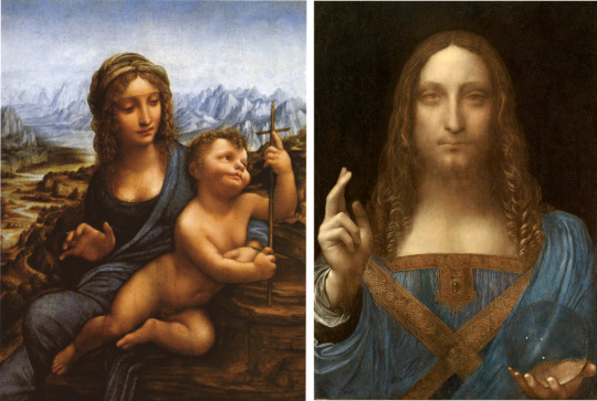
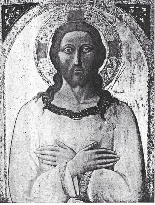
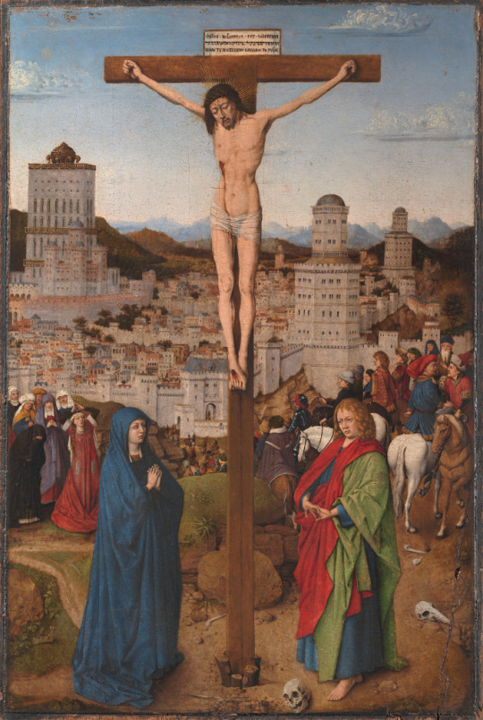
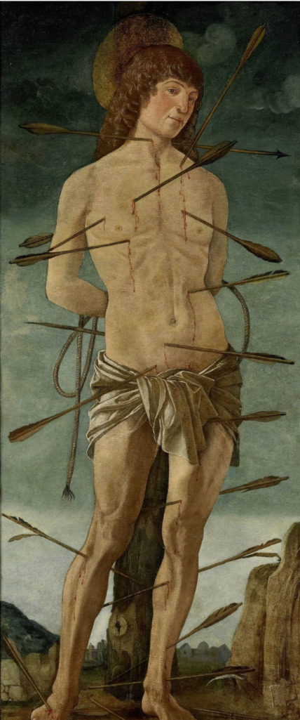
Salvator Mundi - master of the dead eyes
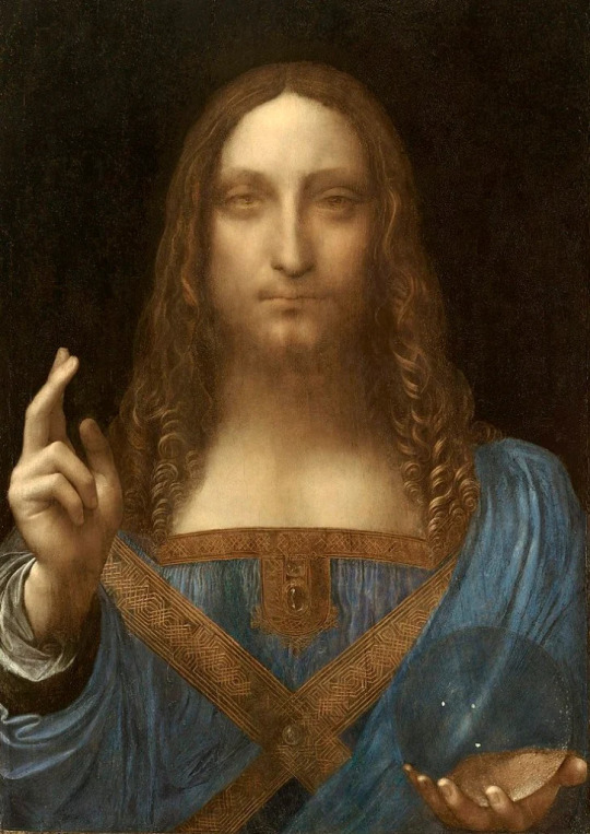
Salvator Mundi, various attributions (Louvre Abu Dhabi)
The Salvator Mundi painting, widely touted as a Leonardo, seems to have disappeared into the limbo of the Saudi Royal family’s treasury where it will doubtless lie, like an ingot of gold in a vault, unseen by most and unappreciated by its owner except as proof of the great wealth required to secure it. Frequent mention, however, is still made of this picture, and while that continues, so does the undesirable confusion that is spread by any demonstrable misattribution. This Brief Study is intended to provide that demonstration.

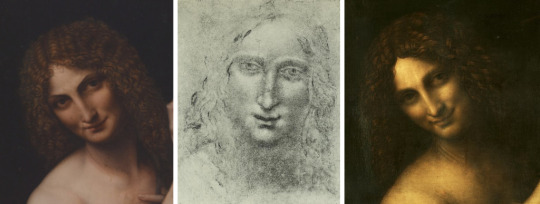
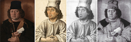
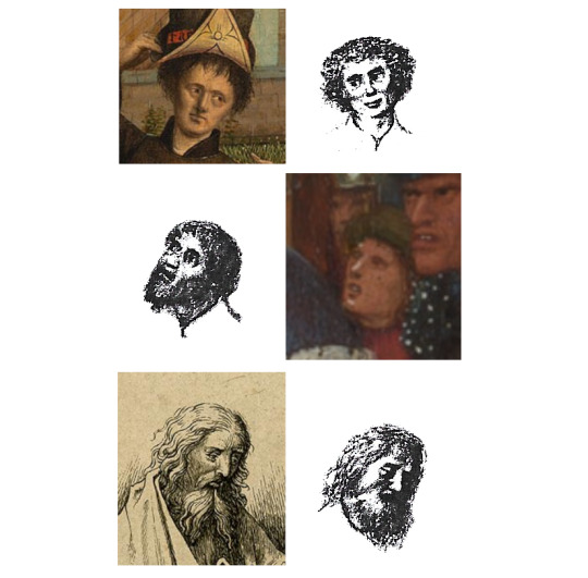
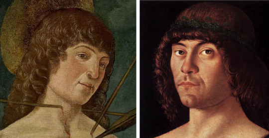
From left: Head of the Young John the Baptist (Drawing from a private collection, featured in an auction catalogue from 1934 as ‘School of Leonardo’) ; Salvator Mundi ; Head of a Woman (Musee du Louvre?)
Drawings, as always, are helpful. Here are two, to set beside the Salvator Mundi: on the left of it a drawing of a young John the Baptist, on the right a drawing of a young woman, possibly at the Louvre. It is enough to compare, and find similar, the eyes, the nose, the mouth, the treatment of hair. If likeness means anything, it ought to obtain in a juxtaposition such as this. As soon as it becomes clear that these two images are products of the same hand, it becomes clear also that the artist who made the drawing cannot be Leonardo, who never drew like this, and therefore Leonardo cannot be responsible for the painting either.
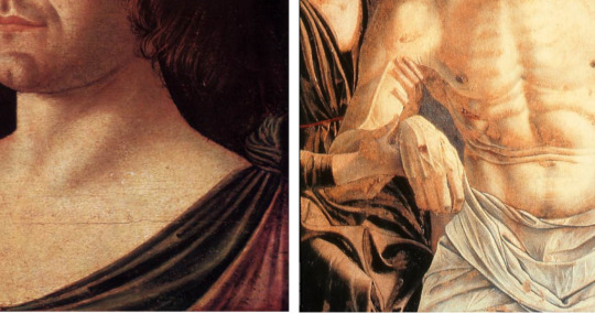
Of course the Salvator Mundi is Leonardesque. It is by an inferior artist (perhaps Salai, as once suggested by Suida) who has latched onto the ‘sfumato’, or smoky mysteriousness, that is displayed – for some tastes, to excess – in the late Leonardo Saint John the Baptist at the Louvre and copied by this artist in a painting at the Walters Museum. This mysteriousness, the smoky atmosphere implied in the etymology of the Italian word, is indulged in by this artist as if it was all that mattered in Leonardo’s art. The result is that Christ stares out at us, like a ghost from another world, with those strange, ‘dead’ eyes.

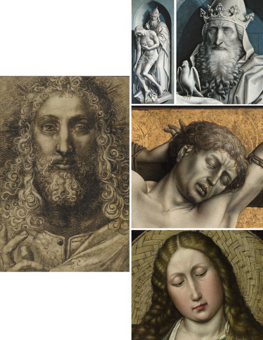
Left: St John the Baptist by the follower of Leonardo – Walters Museum, Baltimore ; right: Leonardo’s original – Musée du Louvre
Comparing the earlier drawing with the two paintings of John the Baptist
Comparing the earlier drawing with the two Baptist images either side, one by the copyist, the other by Leonardo, reveals as much as the difference in colour, the ‘Salvator’ eyes, nose and mouth.

Both attributed to the School of Leonardo, Left: ‘Head of a Youth’ – Ambrosiana, Milan ; Right: Portrait of a Lady – Columbia Museum of Art, South Carolina)
Another drawing , of an androgynous-looking youth at the Ambrosiana, shows the same rather long eyes whose lids are more prominent than anything between them . This might almost be a study for the no less ghostly Portrait of a Lady at Columbia Museum of Art in South Carolina. The same artist’s draughtsmanship (or lack of it) is seen in a drawing (Mona Vanna) and a painting both featuring a naked Mona Lisa. A weak sense of form is disguised by a quantity of perfunctory smudging of charcoal or graphite. His admiration for Leonardo is matched by his failure to understand how necessary a proper grounding in observational drawing was to Leonardo’s painted work. A similar failure attended the followers of Turner.

Left: Mona Vanna, attributed to Leonardo ; Right: Female Figure, attributed to Salai
If we return to the Salvator Mundi, we can observe the unconvincing treatment of drapery folds and the way in which ornamented braidwork is not adequately integrated with the rest of Christ’s robe, but lies across it in two, rather than three, dimensions. When our eye moves to the orb, it is equally dissatisfied by the lazy depiction of it, with no attempt at highlight. The orb is as dead as the eyes.

The draperies, braidwork and orb from Salvator Mundi tell us this is not Leonardo’s work
Colour is always a significant indicator in paintings. In this case we have a near-Prussian blue with chestnut browns trailing off into a deeper brown penumbra. This is the palette of the Lansdowne Madonna (‘Madonna of the Yardwinder’), a more impressive work than the Salvator Mundi but displaying a similar tendency to wrap figures in a haze of sfumato.
Left: The Lansdowne Madonna – Private Collection – features the same colour palette and ‘sfumato’ as the Salvator Mundi
Clearly I do not hold this artist in much esteem. Plutocrats are welcome to spend a fortune on his work, but the rest of us should keep our eyes peeled for quality and not allow our vision to be blurred by the ‘Leonardo mystique’ and the floaters of dubious attributions. What this case highlights, not for the first time, is the regrettable necessity for connoisseurs to apply themselves to mediocrities. In an ideal world they would not need to, but they often have to because one person – an originator whom others follow – has ascribed a work by an inferior artist to a vastly superior one. These words, inferior, superior, imply what is at stake: a difference of quality. The exercise I have conducted here will have some value if it succeeds in demonstrating that difference. A painter who has little sense of form cannot disguise the fact, try as he may, with ‘mystery’ that has no depth or substance; it is hollow and spectral, like the dead eyes. If we cannot definitely name him, let us nickname him the Master of the Dead Eyes.
#leonardo#leonardo da vinci#salvator mundi#connoisseurship#studies in connoisseurship#art history#attribution#painting#louvre
6 notes
·
View notes
Text
Rogier and Campin: Mistaken Identities
Connoisseurship, by its nature, will often involve mistaken identity, work by one artist being taken for that of another. This Study looks at a case that can be illustrated by work attributable to two famous fifteenth centruy artists, Rogier van der Weyden and Robert Campin, within one collection, that of the London National Gallery, and the relation of these pictures to others elsewhere.

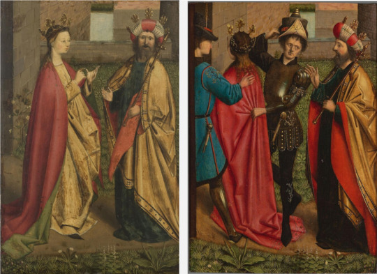
When juxtaposed, it is easy to see the similarities between faces in Rogier's Altarpiece at Beaune and portraits in the National Gallery, attributed to Campin. Such a degree of likeness makes it hard to see how there could be disagreement that they were all painted by the same hand. Stylistically, everything corresponds, even the craquelure
In the above juxtaposition, the left-hand face of each pair is a face out of the Beaune Altarpiece, the Last Judgment, still at Beaune in Burgundy, that everyone seems agreed is the work of Rogier van der Weyden. The right-hand face of each pair is of the Man and Woman, respectively, portrayed in two separate panels at the London National Gallery where they are ascribed, not to Rogier, but to Robert Campin. The two artists were famous in their day for the outstanding quality of their work, and they both presided over large workshops.
The Altarpiece at the Hotel-Dieu, Beaune. Open, it shows The Last Judgement
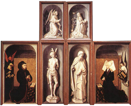
Closed, the polyptych shows the donors kneeling before statues of saints
Here is another Portrait of a Man that can also be seen at the National Gallery. It is the portrait of a known person, Alexander Mornauer.

Portrait of Alexander Mornauer, attributed to "the Master of the Mornauer portrait", National Gallery, London
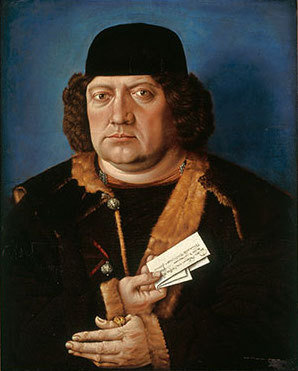
The Mornauer portrait before cleaning, showing a 'Holbein blue background, and reworking of the hat
He was given a plain blue ‘Holbein’ background that has been removed, as being a later addition, to reveal one that is of much more interesting texture and of a sort of puce colour. The painter of this picture is simply called ‘The Master of the Mornauer Portrait’, thought to be from ‘South Germany’.
If we now place this Mornauer portrait between two other images, the Portrait of a Stout Man from the Thyssen Collection in Madrid (ascribed to Robert Campin) and the two onlookers beside the Bad Thief to the Left of Christ from the panel at Frankfurt (Staedel Institut), generally considered a work by Campin, do we not see similarities, in this second case, nearly as compelling as the very different similarities in the first?

Left to Right: The Mornauer Portrait; Portrait of a Stout Man, attrib. Campin, Museo Thyssen, Madrid; detail and full image of The Bad Thief to the Left of Christ, attrib. Campin, Staedel Museum, Frankfurt
The Mornauer portrait clearly predates both the Thyssen Head of a Man and the Frankfurt Crucifixion, which one takes to be late work by the artist; that said, we can see an earlier manifestation of the same extraordinarily bold facial modelling, the same eyes and eyebrows, the same fine brushwork in the brown hair and the hairs of fur, and, in the detail of the two onlookers to the Crucifixion, very similar and distinctive hands displaying all their veins and joint-creases.
Much work remains to be done on the oeuvres of two men who were clearly the stars of the generation after the Van Eycks, but what these comparisons already suggest is that their styles are very distinct from each other. It appears that two portraits have got linked with Robert Campin when they are much more likely to be by Rogier van der Weyden, and a fine work by Campin in the same Gallery has gone unrecognised, relegated to ‘South Germany’. There is evidence here of the muddle that surrounds these two names.
I do not believe that we have many works anywhere by Robert Campin, but what there is strikes me as of remarkably high quality. His hyper-realism may not appeal to all tastes today, but it belongs to its time and makes a superlative link between Jan van Eyck and Dürer in the tradition that leads on to Holbein, and eventually Ingres. Of work by Rogier van der Weyden we have more, including two masterpieces, the Beaune Altarpiece and the Madrid Deposition, but his work likewise has to be distinguished from that of numerous artists of his time, mostly of lesser talent, who spent their careers in workshops such as those headed by himself and Campin.
Left to RIght: The Mornauer Portrait; Portrait of a Man, attributed to the same artist, Kupferstichkabinett, Berlin; in BW; Reflectogram of the Mornauer Portrait, revealing the same style of folds in the clothing and vein details in the hands
I wish to draw attention at this point to two drawings. The first is a portrait of a man of middle age with black curly hair, wearing a hat and holding his hands together with the two thumbs abutted. This remarkable image is held at the Kupferstichkabinett in Berlin and attributed to the same hand as the Mornauer. The penmanship in the modelling of the man’s shirt is superlative and the vividness of his presence is all the greater for the addition of watercolour to his face, neck and hands.
The connection, as I see it, with Campin is made by a very helpful infrared reflectogram of the Mornauer portrait in a publication (2010) by the National Gallery, entitled A Closer Look: Deceptions and Discoveries. The underdrawing of that painting is so close to the treatment of the folds in the sleeves of the shirt in the drawing that I think it very likely that they are by the same artist. Note the veins in the hands of both painting and drawing; Dürer could not have observed them better.
Left: 'Le Christ Bénissant', attrib. Toussaint Dubreuil, the Louvre; Right from Top: Detail from Campin's Throne of Mercy; Detail from Campin's Bad Thief; Detail from Campin's Madonna by a Firescreen, National Gallery, London
The second drawing - an image at the Louvre entitled Christ Blessing - I also think is by Campin, though probably from a different period of his career. Here the penmanship is bolder and looser than in the drawing just mentioned, but the dense cross-hatching and other mark-making is very similar. Below are some juxtapositions that help to link this drawing with the Mornauer portrait and other Campins in the treatment of facial features, hands and hair-curls.

Left to Right: Faces of Mornauer; Christ; the Stout Man

Hair and fingers from the Bad Thief (left) and Christ Bénissant (right)
Hand details: VIrgin and Child, Campin (top); Saint Veronica, Campin (left) both Staedl Museum, Frankfurt; The Mornauer (middle); The Bad Thief (bottom)
That two paintings by Rogier van der Weyden can be taken for work by Campin when the two artists are so completely different is concerning. The focus of the present Study has been limited to three paintings in the London National Gallery, the stylistic connection of two of them, the paired portraits of A Man and A Woman, with Rogier’s Beaune Altarpiece, and a third, the Mornauer Portrait, with Crucifixion and other panels at Frankfurt. On the evidence even of these few works we can see Campin as a master capable of projecting a very powerful image with hyper-realistic attention to texture and fine detail. The Rogier portraits are realistic too, but less forceful and arguably more sympathetic depictions of individuals with faces easily associated as those of husband and wife.
Clearly there is scope for a wider discussion of the oeuvres of these two very important painters. I hope a future Study can attempt to address that much more complex issue
#campin#rogier#rogier van der weyden#beaune#Dutch Painter#painting#connoisseur#connoisseurship#studies in connoisseurship#art history
2 notes
·
View notes
Text
Vermeer : A Postscript
In the text of my Study in this series that is about Vermeer I include a reproduction of a now lost picture of a servant clutching a letter as she looks down towards a child holding a bowl. If that work was a Vermeer, I wondered why there are no surviving ones that contain young children. The house he shared with his wife, Catharina, was full of them at different times. I speculated that perhaps it was because they were so lively and never still; the girls would become suitable models when they were young women.
I now wish to put forward a further possible Vermeer. It is a sad image of a young girl who is certainly still because she is on her death bed.
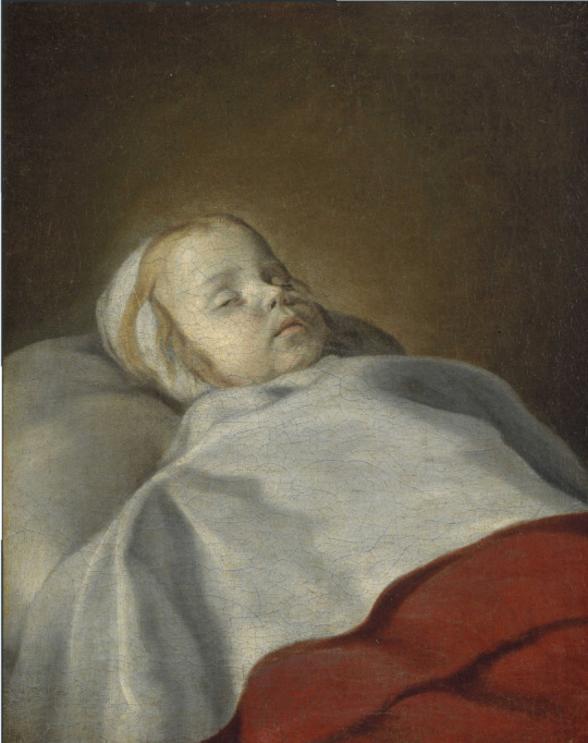
This poignant, tender and very beautiful picture is at the Musee des Beaux Arts at Besançon in France, where it hangs unattributed as a Portrait of a Dead Child, Flemish from the 17th century. Obviously it is a very personal painting, the work of a grieving parent. The artist brings us to the very edge of the bed where his child lies. Her eyes are nearly closed, the shape of them like the eyes of the boy in a drawing, below, at Berlin. Her hair is a pale flaxen colour, a lighter version of the yellow so often used by Vermeer, in the Lacemaker, for example, or the Girl with a Pearl Earring. There is a slight halo around her head. The folds of pillow and coverlet have a ghostly pallor, soft and unfocussed, like a mantle of snow. Most remarkable of all is the absence of ordinary daylight, the same absence one finds in Vermeer’s Servant asleep at a Table (at the New York Metropolitan Museum), except that the servant is merely asleep, but the child is gone into the darkness above her bloodless face, ashen now like the bedsheet. Under that sheet is a deep red blanket forming a triangle in the lower right corner of the picture.
It is the particular red of this blanket that alerts me to the possibility that the picture is a Vermeer. There are pictures by him that have no red in them at all, but this red, in deeper and lighter shades, is nevertheless a feature of his palette that recurs quite often. It is the red, for example, that we find in the jacket of the girl reading a score in The Girl Interrupted at Her Music at the Frick Collection in New York, and again in the Girl Drinking with a Gentleman, at Berlin. It is the colour of the roof tiles in The View of Delft, at the Mauritshuis, and of the skirt of the woman with her back to us, who stands at the virginals in the Royal Collection’s Music Lesson. Somewhat lighter, it is the red of the woman’s satin dress in the Couple with a Wine Glass, at Brunswick, and in two early works, the Edinburgh Christ in the House of Mary and Martha (where Mary wears it) and in the Dresden Procuress, in the jerkin of the man who fondles her breast. At Besançon the colour is deep and it speaks to us differently: in the presence of death it is an assertion, and reminder, of life, and life blood.
The comparisons made below, between the Besançon Dead Child, focus on two aspects of the former, the red of the blanket and the brownish background. Clearly the colours in reproductions vary in their fidelity to those in the originals; so, if there is merit in my attribution to Vermeer, it behoves those more acquainted with the originals, such as the curators of the current Vermeer exhibition at the Rijksmuseum in Amsterdam, to make their judgement accordingly. The hue of a red, or any colour, may be deeper or lighter. My argument relies on the red in question being essentially the same as what we find in his pictures, only in differing strengths. The colour of walls in Vermeer shows wonderful variations according to the degree of light falling on them. At Besançon there is, appropriately, a very subdued, ‘dead’ light, not the lively one that enters through a window.
Clockwise from Top Left: View of Delft (Mauritshuis); Portrait of a Dead Child (Musee des Beaux Arts, Besançon); The Wine Glass (Gemäldergallerie Berlin); At the Procuress (Staatlichekunstsammlungen Dresden); Girl Interrupted at her Music; Officer and the Laughing Girl (Frick Collection)

Clockwise from top left: The Geographer (Städel Museum Frankfurt); Portrait of a Dead Child; Girl Reading a Letter (Gemäldegalerie Alte Meister Dresden); Young Woman Seated at a Virginal (National Gallery London); At the Procuress; Centre: Study of a Boy’s Head (Berlin Printroom)
As for the identity of the child, if this is indeed a Vermeer she must be one of the four daughters born before a son arrived in 1654; the approximate date of the picture, ‘circa 1650’, suggested by the Besançon Museum is therefore a reasonable guess.
The craquelure, it may be added, is also compatible with an attribution to Vermeer. The painting is on canvas and rather larger than one might expect (58 x 47.5 cm) for so intimate a scene.
I should add, by way of a concession to sceptics, that the argument here is not an easy one to make, because the very restricted content of the picture offers little with which to build it; around the head of the child only bedclothes and a blank wall. A blank wall by Vermeer is nevertheless different from a blank wall by Nicholas Maes or Pieter de Hooch.The case for attribution to Vermeer rests on features described above, and I hope they are enough when taken with what seems to be the case, that no other attribution has been suggested within mid-seventeenth century Netherlands that meets the obvious quality of this work.
The description just made, of the background in the picture as a ‘blank wall’ is not really correct; it is not a background, nor is it a wall, but rather an overtaking nothingness, the visual representation of absence and loss. Because Vermeer and his wife were fecund and had many children does not mean that the loss of any one of them was not a very sad occasion which he, as a painter, might well have wished to mark. If this painting is by him, as I am inclined to think, then it is further evidence that family was at the centre of his art, as of his life. He painted and celebrated the visible, the world of living light and shadow; sleep and death remove us from it, but what the sleeping servant and the dead child cannot see is still there to be seen and to be witnessed, albeit in a manner appropriate to those states, in a ‘dying of the light’.
#vermeer#lost paintings#dutch painter#painting#art history#studies in connoisseurship#connoisseurship
1 note
·
View note
Text
Hidden by Masolino
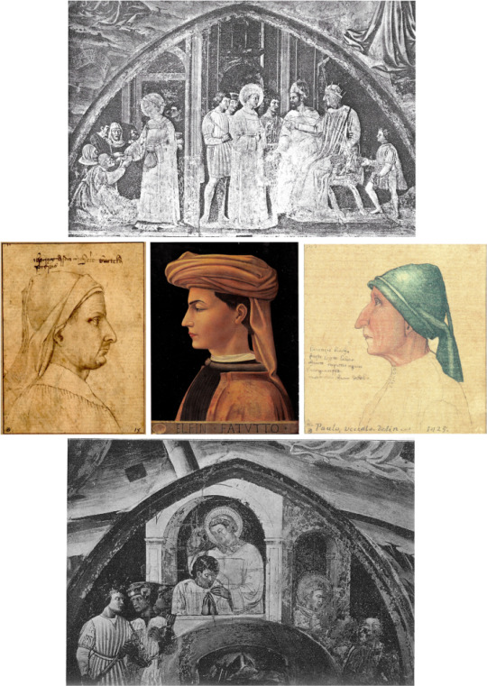
School photos, those wide-angle records of all the staff and pupils in a year, sometimes include a child who is partly concealed by another and consequently harder to identify. Similarly, in the long conspectus of artists at a given time, there are places where one partly conceals another. The collegiate church at Castiglione d’Olona, to the north-west of Milan, is such a place. To Renaissance specialists it is well known for having been frescoed in the 1430s by Masolino, the painter who had earlier worked alongside Masaccio in the Brancacci Chapel of the Carmine church at Florence. However, there was another artist decorating the walls at Castiglione d’Olona. I doubt that anyone knows his name, but I will devote this Shorter Notice to bringing him out from behind Masolino because I think he was the better artist and certainly the more modern in the context of his time.
Collegiate Church at Castiglione Olona, Lombardy, Italy
As I have said in my Studies on Masaccio, Masolino was in many ways a late Medieval artist trying to adapt to the new art that was sweeping through Florence in the latter part of his career. This other artist is no Masaccio, but he seems much more confident of his powers within that developing trend. He was also the creator of a rather memorable cast of characters rendered on stage in painted scenes and studied close-up in beautiful line drawings. I regret that I do not possess enough images to adequately represent his work at Castiglione d’Olona – a consequence of Masolino hogging the attention of scholars and therefore publishers and photographers – but there are enough to at least make clear that the artist he eclipses is worth looking at.

Frescoes on the ceiling at Castiglione d’Olona, Above: the more colourful of which are by Masolino and, Below: Monochrome images of the lower frescoes, which were painted by this other artist

The principal scenes are from the life of two early Christian martyrs, Saint Stephen who died in the First Century, and Saint Lawrence, martyred at Rome in 258. We can begin with the Trial (disputa) of Saint Stephen, a scene in which the Saint, looking to our right, stands like a preacher in a pulpit, but a pulpit that, as he was denounced by Jews as a blasphemer and had to defend himself, is also a dock. To left and right of him are his denouncers. Behind him we see an arcaded church interior, the columns given leafy capitals.
The scene is poorly preserved, but one feature of it is still clear, and that is the artist’s draughtsmanship, his drawing with a brush. This sets him apart from Masolino: drapery folds in Masolino are not represented as lines, but they very clearly are in this and all the other scenes depicted by the artist we are considering.

Left to Right: Tuscan Man, Albertina Museum, Vienna ; Head of a Man (attrib Uccello), Ashmolean Musuem, Oxford ; Man in Profile (attrib Uccello) Louvre, Paris
Fortunately there are drawings plausibly by him which attest to his skill as a draughtsman. Four are at the Albertina in Vienna, one is at the Ashmolean Museum in Oxford, another in the Louvre. One of the four at Vienna is a portrait of the Prior of a Florentine church, SS Michele e Gaetano. Interestingly, the head, drawn in pen and ink, has a brownish wash and is set against a backdrop described as ‘shaded with red chalk’. All have remained assignable only to the ‘Tuscan School. first half of the fifteenth century’, but I want to assign them to this artist. With a delicate but assured hand he draws the profiles of men with aquiline noses, ‘crows’foot’ creases about the eye, incisive lips and jutting chins The Oxford one is partly colour-washed, but not in a way that detracts from the linear elegance and purity of the image.It should be compared with the profile of the Emperor Decius pointing his accusing finger at Saint Lawrence.
Left to Right: Portrait of a Young Man (attrib Uccello) Musée des Beaux-Arts, Chambéry ; Head of a Man, Albertina, Vienna ; Young Man in a Scarlet Turban (attrib Masaccio), Isabella Gardner Museum, Boston
At the Musée des Beaux-Arts de Chambéry in France is a profile portrait of a Young Man, attributed by some to Uccello, by others to Masaccio. This also I want to claim for our artist. It has his linear clarity all over it ( perhaps a little too markedly in the eyebrows), and that purity of line is manifest in a drawing in the Albertina at Vienna which may not be a study for the Chambéry painting, or even be of the same young man, but definitely exhibits the style and demonstrates, I suggest, a refinement of sensibility the more evident when the painting is juxtaposed with a similar painted portrait from the Isabella Gardner Museum in Boston, quite likely Masolino’s work but in any case careless and clumsy by comparison.
Left: Madonna of Humility, Alte Pinakothek, Munich and Right: Madonna and Child, Kunsthalle, Bremen (both attrib Masolino)
A second characteristic of the Chambéry picture is its palette. This has a nut-brown, autumnal warmth to it which we can pick up on elsewhere, for instance in the Madonna and Child at the Alte Pinakothek at Munich where a similar tawny gold appears in the dress of the Virgin under her blue robe. This very attractive painting has often been assigned to Masolino, but juxtapose it with Masolino’s Bremen Madonna (at the Kunsthalle in Bremen) and it is clear that a quite different hand is at work – the hand, I am sure, that is responsible for the Chambéry and other pictures we are considering.The lack of colour reproductions of our artist’s work at Castiglione d’Olona is regrettable, but beneath one that shows Masolino’s Nativity we catch the top of the Saint Lawrence before the Emperor Decius and can see at once how much deeper and browner the palette is, when compared with Masolino’s pastel one of pale yellows and pinks.

In this image from Castiglione d’Olona we can see a change in colour palette between the upper frescoes and those below
On the subject of the brown palette, there is a fresco in Santa Maria Maggiore in Florence of Christ alone on the Cross; here the figure of Christ is modelled in pale brown, the Cross is brown (with a darker brown grain), the plain background is dark blue over brown, and the decorative border, arched at the top, is white over brown. A fine drawing for a crucified Christ (ex Coll. N. Colville, whereabouts unknown) appears to be a study for something similar.
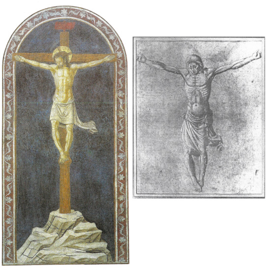
Left: Fresco at Santa Maggiore, Florence and Right: drawing, possibly a study for a similar fresco, whereabouts unknown
That same nut-brown colour of the Chambéry picture recurs in the background of a Madonna and Child flanked by two Angels in the Augustinian church of Santo Stefano at Empoli. The angels with their multicoloured wings are sisters, as it were, to those of the Madonna at Munich. The blue robe of the Madonna in the latter work falls like a cascade of water from the hood round Her face down into more and more complicated folds that are lovely to look at but leave one wondering where Her right knee and leg actually are.The rhythms here are essentially Gothic, as in , say, Gentile da Fabriano.At Empoli the artist has moved forward from such Gothic indulgence and the forms are more solid and suggestive of a later date.
Madonna and Child with two Angels, Augustinian church of Santo Stefano, Empoli
Three works that perhaps antedate the Munich picture are a damaged, much-weathered tabernacle in Piazza Santa Maria Novella in Florence – another Mother and Child, with four Saints – a fresco fragment of an Apostle from Santa Maria del Carmine in Morrocco, Italy, and the delightful picture in the London National Gallery of Saint Dorothy holding the hand of a boy Christ. The complication in the drapery of Dorothy’s outer robe is reminiscent of what we find in the Munich Madonna. Close in style is a panel of unknown whereabouts showing Mary enthroned with the Child holding a scroll, the two of them flanked by John the Baptist and another Saint, with a vase of flowers between them By contrast all is more straightforward and more solid in yet another Madonna and Child that was sold by Drouot in Paris in 1927.
Clockwise from Top Left: St Dorothy, National Gallery, London ; Tabernacle in Piazza Santa Maria Novella, Florence ; Frescoe fragment, Santa Maria del Carmine, Florence ; Two panels of unknown origin depicting the Madonna
One more Mother and Child picture, a Madonna of Humility at the Fitzwilliam Museum in Cambridge, belongs somewhere in the series, but it is, apparently, both unfinished and much altered.The artist’s linear delicacy, in treatment of hair and drapery folds, is eloquent in spite of the condition and strange colouring.
Madonna of Humility, Fitzwilliam Museum, Cambridge
All the above items – illustrations 15 to 21- can be taken to represent, in respect of Castiglione d’Olona, an earlier, Florentine phase of the artist’s career. We can begin to move it on by considering first a Figure of Christ with hands crossed over His breast, now at Minneapolis. This has much in common with the Munich Madonna but the modelling of Christ’s face links it also to an unusual panel in the Uffizi that memorialises three painters of the Gaddi family, Taddeo, Zenobi and Angelo.The profiled head of Angelo, on our right, is a strong reminder of the Chambery Portrait of a Young Man, the associated Albertina drawing, and some of the young male heads in the fresco scenes at Castiglione d’Olona. One begins to recognise the type: clear eyebrows, a sharpish nose, tightly closed lips, and a definite chin. This is what we find also in the Ashmolean and Vienna drawings mentioned earlier.
Facial features in a portrait of Christ, above, are reminiscent of those found in a protrait of the Gaddi family at the Uffizi Gallery, Florece, below

Top and Bottom: Frescoes from Castiglione d’Olona ; Centre from Left: Tuscan Man, Portrait of a Young Man, Head of a Man, as before
To summarise: this artist, like Masolino, begins in the late Gothic style but appears throughout to be the better draughtsman, as evinced by the pure-line drawings and by the drawn nature of his work as both painter of panels and decorator in fresco. This superior competence allows him to delineate heads (often in profile) and whole figures with a sensitive precision and a sharper suggestion of character. Once seen, the Ashmolean Man with Aquiline Nose is not easily forgotten. I make no claims for the artist being any kind of undiscovered genius, but I find it pleasing if connoisseurship can bring out of the shadows someone whose work is worth reassembling in so far as that is possible, given the lottery of survival and the conflicted world of attribution. It remains to hope that some photographer will soon supply a better record, in colour, of the frescoes this nameless artist contributed to the decoration of the church at Castiglione d’Olona, and thereby give more prominence to one of the more interesting contemporaries of Masaccio in that early fifteenth century period of revolutionary change.
1 note
·
View note
Text
Hubert van Eyck
The boldest claim for connoisseurship is that it can sometimes resurrect an artist from the version of death that is oblivion or neglect. There is one outstanding example of this, outstanding in both senses, because the artist was no mediocrity but a pioneering genius. His name is Hubert van Eyck, the bachelor brother of Jan van Eyck. Hubert died in 1426, at what age is unknown.
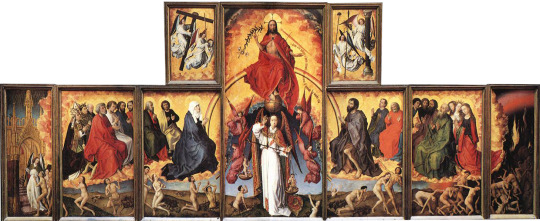
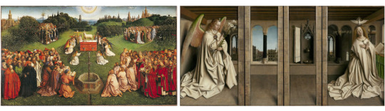
Apportioning work to Hubert and to Jan inevitably begins and ends with consideration of the famous Ghent Altarpiece, The Adoration of the Lamb, which was painted for St Bavo's Cathedral at Ghent and has remained there ever since, bar one stolen panel replaced with a replica.

The Ghent Altarpiece, open (St Bavo’s Cathedral, Ghent, Belgium)

The altarpiece, closed view

The division of labour for the altarpiece’s many panels
Hubert’s story is one of posthumous eclipse: Jan’s work simply covers over and obliterates his brother’s. When eminent scholars have wondered if Hubert’s hand is even discernible in the Altarpiece, his very existence begins to be questioned. Jan’s work, meanwhile, becomes so extensive that one can scarcely believe it possible that so much meticulous, labour-intensive painting could be done in one lifetime by one man. Accepting, as I do, that Hubert did exist and did paint parts of that Altarpiece, I need to say at the outset that I find no particular difficulty in recognising which parts are his and which parts are Jan’s. I believe that Hubert painted all the lower panels of the opened Altarpiece and the four arched panels of it closed. The rest, for me, is Jan’s. Did he take over, and complete, what Hubert had begun?
As we shall see later, another difference between the brothers is that Jan cares about individuals; it is he who paints the portraits of the donors on the Altarpiece and has left us a handful of other painted portraits. Hubert includes many people in his work, but they belong to a repertoire of types, chosen and combined according to need. Survival involves much accident, but i am not sure that he has left us more than one independent portrait.
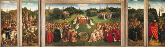
Hubert’s panels from the opened altarpiece, including the Adoration of the Lamb
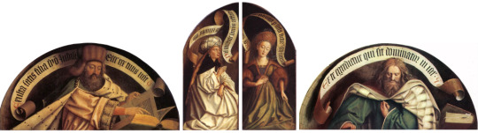
Hubert’s panels from the closed altarpiece
There are different elements involved in this distribution and in the distinction drawn by it between two brothers who were both miniaturist in their technique but very different in other ways. Jan’s vision of the world was monumental in the sense that he could create grand figures that occupy a space sculpturally, but the space that they occupy is typically an indoor one This is often quite confined, but even where it is not - say in a church - it is of a kind to make a backdrop to figures which have a looming foreground presence. Such figures serenely dominate the space in a manner that is regal, befitting the Queen of Heaven, Angels, Saints, Sometimes, like real sculptures, they fill niches. By contrast, Hubert’s essential identity as an artist is that of a landscapist The space between him and the horizon is a need of his spirit; he does not want to be confined by walls or to see what delights him only through windows.
The Brothers in side-by-side – Hubert’s talent for creating small forms in big spaces, like the Adoration of the Lamb, stands in contrast to Jan’s preference for setting big forms in small spaces. Both of the above images feature cities in the background, but Jan has set his Annunciation in an enclosed space.

Virgin and Child – ‘The Ince Hall Madonna’ (National Gallery of Victoria, Melbourne)
Jan, then, is a chamber artist, like Vermeer. Take his early Madonna Enthroned, a small picture at Melbourne’s National Gallery of Victoria. The light visits her through the window and illuminates particularly a bit of wall to her right: this passage is pure Vermeer, two hundred years before he, too, immortalised the female presence in an indoor space lit from without. Already in the illuminations of the Turin Hours which I follow Kenneth Clark in giving mainly to Hubert - he is evincing a totally different take on the world, one that revels in a storm at sea, a calm lakeside, or the long line of a coast. He can make us feel the cold salt air and see the waves rolling in onto a low shore where a Duke and his entourage have landed and ride up the dunes on their way to his castle. Faced with painting figures in a room or a church, however, and one immediately senses that Hubert, at that stage, is less at ease, his discomposure evident in a relative lack of both atmosphere and compositional unity.

Miniature illustrations from the Turin Hours. Clockwise from top left: Agony in the Garden; The Cavalcade (destroyed); Baptism; Office of the Dead; Miracle of Sts Julian and Martha. All surviving works Palazzo Madama, Turin
LANDSCAPE
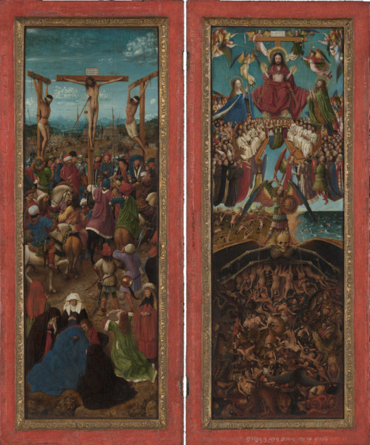
The Crucifixion and The Last Judgement (Metropolitan Museum of Art, New York)
Further evidence of Hubert’s interest in landscape can be seen at the Metropolitan Museum in New York; here we find the Channel coast again, the rollers coming in onto long stretches of what are now Belgian beaches. The sea is a Prussian blue - a shade that Hubert particularly loves - with drowning souls in it pleading to be saved, like their luckier compatriots on land, from the horrors of Hell beneath. In the left-hand panel is an early version of a typical Hubert landscape: middle distance warmth of foothills and human habitation receding to a far range of blue mountains fading into blue sky, and all in clearest visibility (atmospheric sfumato still unborn). Both panels are crowded with people dead and alive, but the landscapes complement the crowdedness with an airiness and spatial largesse that is all-inclusive and ruffled only by some fretted cumulus and fretted waves. There are many colours, but they answer each other across the panels as might happen in a pair of stained-glass lancets. The correlations are not only chromatic but formal: the rising foothills of the left panel continue into the white lining of the Virgin’s blue robe in the right panel, and the darkness behind the arms of Death spread over into the left panel.
It is Hubert’s gift to give to crowded, jostling humanity so much space around it and so much air above it. As in the lake and coastal scenes of the Turin Hours there is conveyed to us the breathed atmosphere of a huge encompassing space that is beyond, yet all around, whatever is happening in the human world. He is very sensitive to this essentially calming influence of the natural world that is also, for him, a sacred one.
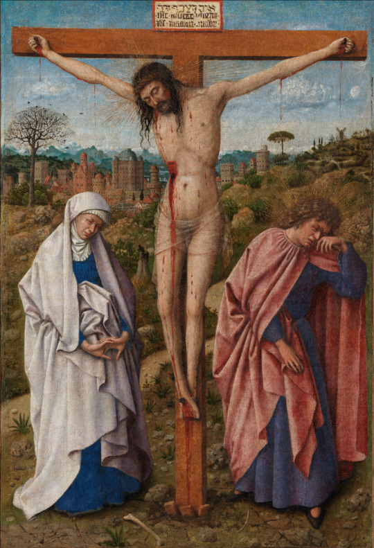
Christ on the Cross with the Virgin and Saint John ( Gemäldegalerie, Berlin)
In Berlin’s Gemäldegalerie there is a small Crucifixion with just Mary and John either side of Christ, she downcast and resigned, clasped hands out-turned, John turned away, weeping. The lovely landscape behind seems wintry, echoing the elegiac mood with a tall bare-branched tree; a city lies low amid uneven, intractable terrain, with a backdrop of remote mountains. Close up to the picture plane, the human scene is emotionally near, the viewer forming a fourth witness to a Passion whose outpouring is visible blood, invisible tears. The suffering, with that much haemorrhage, must be over, and the end is a resignation that makes a kind of peace with the larger world, shorn and naked now, but assured of resurrection. The picture illustrates perfectly Hubert’s ability to match landscape with human drama and emotion.
Crucifixion, National Museum of Poznan, Poland
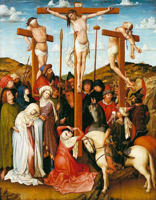
In another Crucifixion, at National Museum in Poznan, Poland, crowded onlookers react in their different ways to the anguish on the Crosses. Again the landscape is important; no mountains, but a backdrop of partly wooded hills below a sky of scudding cumulus moving along with an event that is still unfolding, a Passion not yet spent.
Crucifixion, Ca d’Oro, Venice (attrib Hubert v Eyck or school of J v Eyck)
A late Crucifixion at the Ca d’ora in Venice shows the same out-turned hands we saw in Berlin, this time on John. This Crucifixion represents a substantial departure from earlier ones. Christ seems lifted high above Mary and John, while the city has come alarmingly close, a threatening source of crowds who are standing around, a little down from the hill of Golgotha. A group of women on the left look up at the back of Christ, while men on the right, on horseback, look in other directions as if the show they came to see is finally over. As for the city, it encourages Hubert to flights of architectural fantasy. Three structures of Babel-like height and mass tower over the huddled houses, more out of scale than even the real-life cathedrals were in Hubert’s day or the skyscrapers in ours. Either side of lonely Pathos, Hubris is rising ever higher.The division of women to the left of the Cross, men to the right of it, signals a contrast, almost a contest, between compassion and indifference; but the triangle made by the feet of Christ and the hands of Mary and John - reversing that made by the arms of Christ and the crossbar of the Rood - marks the personal, almost private and familial nature of the event at this late stage when onlookers begin to look elsewhere.

St Francis Receiving the Stigmata, Philadelphia Museum of Art
Detail of rocks
In the Johnson Collection at Philadelphia's Museum of Art we are with Saint Francis kneeling among rocks before his vision of the crucified Christ. The theme of wakefulness and sleeping that was there in the Gethsemane of the Turin Hours has returned with a difference. Here colour is used to suggest, not the contrast between people and their surroundings, but a Franciscan harmony between them. The Saint is clothed in the brown habit of the wilderness in which he prays, while his Brother, linked to him by the cords of their shared vows, is lost in sleep or meditation. What unites this image with the far cooler and more distanced Gethsemane is the treatment of rocks, well in advance of Leonardo’s studies, but no less beautifully observed.

Left: St Christopher Carrying the Infant Christ, Phildelphia Museum of Art; Right: Copy of a lost drawing attributed to J v Eyck of the same scene, Louvre Museum, Paris
Rocks bring us back to Philadelphia, to an exquisite small Saint Christopher carrying the Christchild through shallow water between towering cliffs sprouting trees and bushes. Behind the Child is a lake with distant mountains. Most notable here is the painting of the foreground water - a painterly achievement not attempted in the associated drawing at the Louvre. Such an understanding of water, its surface and depth, the way it moves under pressure of wind and current, is astonishing at so early a date, though we already saw it at Turin, in the Storm on Galilee. There seems to be nothing in the natural world of which Hubert has not made himself master, always on a small scale and with that miniaturist technique that he shared with his brother. We see a mediaeval inheritance being used to quite new ends, and taken to the height of realistic fidelity in a medium that we have to remind ourselves was still in its infancy, What he does is breathtaking in its virtuosity, but also very affecting in its sensitivity and delicacy of touch. he applies his brush as finely as the bow of the most accomplished string player.

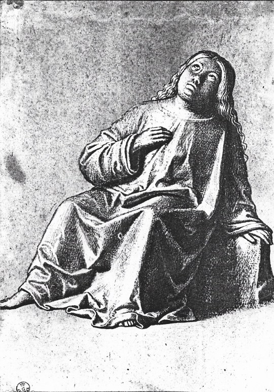
Three Maries at the Tomb, Boijmans Museum, Rotterdam
In connection with landscape the last work I want to consider before the Ghent Altarpiece is his painting at Rotterdam's Boijmans Museum, the Three Maries at the Sepulchre.Here, more than ever, we see him using landscape and sky to reinforce a human story. It is not so much a nocturne as an aubade, an evocation of night becoming dawn, well before the sun is up; the sky begins to lighten but night still pervades. The soldiers are asleep, the women are awake; the Angel. like Aurora, female, winged. It is a ghostly hour. The weapons of day, the active life of men, are laid aside as diagonals around the rectangle of the Sepulchre. Beyond that is the still-slumbering city, its towers pushing up into the sky like pinnacles of rock, the bedrock on which the whole scene rests. Like the magician that he is, Hubert can cast a spell of nocturnal obliviousness over what in daylight would be local colours, leaving only certain reserved accents of white in the middle band of the composition - the women’s headdresses, Angel’s robe, a man’s socks - to denote the wakefulness heralded by the whitening sky and a Resurrection on Earth within the Resurrection of Light.
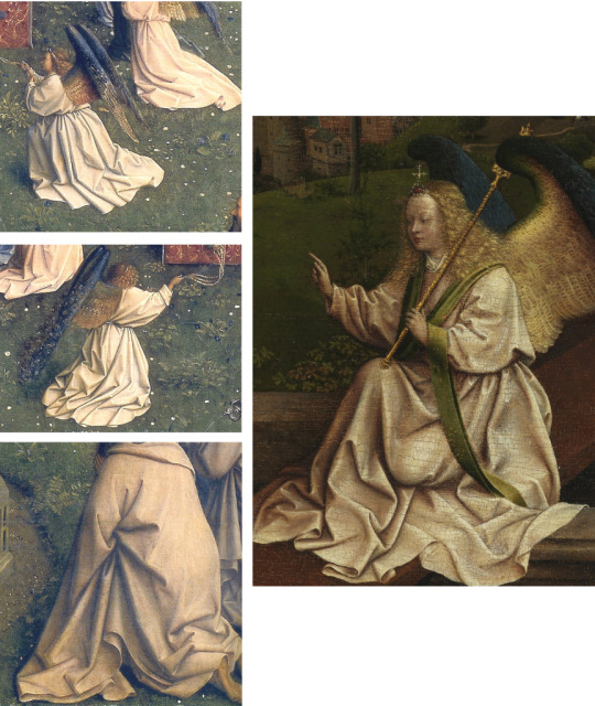
Drapery details from Ghent’s altar of the lamb can be compared with those of the angel’s robes in the Three Maries
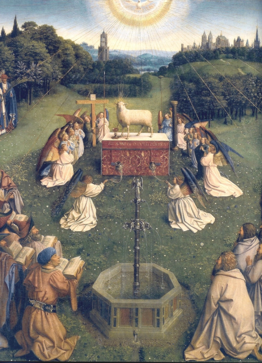
We have arrived now at that heavenly vision that is Hubert’s contribution to the Ghent Altarpiece.The daisies around the feet of Saint Francis, at Philadelphia, return in the grassy bank around the Altar of the Lamb, and there too the drapery of those angels falls in folds like those of the Angel on the Sepulchre at Rotterdam. As in the panels in New York, we find groups crowded together but here transformed into outdoor choirs in a landscape that holds them generously; there is ample space between them in which our eye can move around freely, like a bee, alighting on ever more extraordinary detail. The landscape is idealised, yet recognisably a northern one, of rolling hills and woods between prosperous, aspiring towns, all transformed into a Paradise Garden where every leaf and petal counts and towns become Jerusalems, Cities on the Hill.
On Hubert’s landscape sensibility I have surely said enough to convey how exceptional I think it was and to highlight especially (since landscape was not yet an independent genre) his ability to make it echo sympathetically the pathos of a Crucifixion or other human enactment. His brother also had very considerable gifts when landscape was required, but this particular marriage of mood is not evident in his work; his forte is indoors. If Jan could not have painted The Women at the Sepulchre, Hubert could not have painted the Arnolfini picture. If Hubert’s favourite subject was the Crucifixion in a landscape, Jan’s was the Enthroned Madonna in a room, The contrast between their powers is what my division of labour in the Ghent Altarpiece makes eloquent, There exist some polyptychs, later and elsewhere, that are a mixture of two-dimensional painting and three-dimensional sculpture. The Ghent Altarpiece is all painting, but something of that difference is there: Jan’s large figures possess the physicality of sculpture in the round, while Hubert shows himself as more purely a painter. Nothing in Hubert’s contribution reminds one of that; it consummates his love of space and landscape, while the figures, of which there are many, exhibit a variety of facial types significantly different from Jan’s.It is to these that I now turn.
LANDSCAPE WITH FIGURES
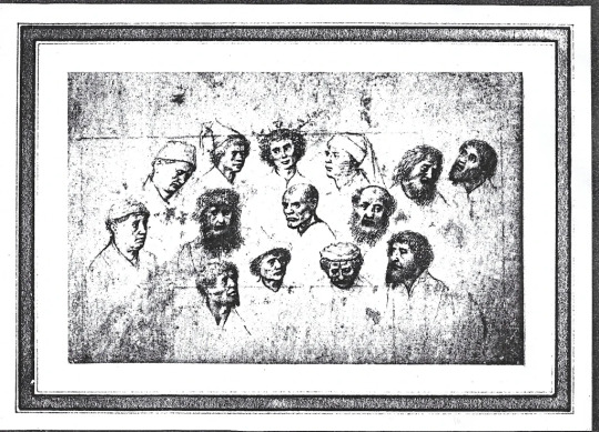
A series of studies of fourteen heads of men, some thought to be for ‘The Adoration of the Shepherds’, variously attributed to J v Eyck and Gerard David
It is fortunate that in the Berlin Print Room there is a sheet of drawn heads that provides exactly what we need. Given the similarities which I shall illustrate, there is no doubt in my mind that this sheet is by Hubert and not by Gerard David or any later artist.
It is helpful to number these heads, so that we can refer to them individually in relation to paintings. Head number 4, for example, reappears as the central figure in a panel at the Boijmans Museum at Rotterdam depicting Saint Catherine led away to her Martyrdom.
in one of a pair of panels at Rotterdam attributed to the ‘Southern Netherlands School’ but much more convincingly to Hubert, albeit in a relatively early phase of his career as a painter of individual panels. This is one of a pair, the companion being Saint Catherine preaching to the Emperor, at the Philadelphia Museum of Art. Already in these panels we encounter certain Hubertian traits, elaborate metallic tiaras and complicated headgear, the beginning of that fascination with flowered lawn, the springing leaves of grass touched in with the fine tip of the brush, and also hand gestures, witness the left hand of the Saint in the other panel at Rotterdam and the right hand of the Virgin Annunciate in Washington.
Left: St Catherine Preaching to the Emperor, Philadelphia Museum of Art, and its apparent pair, Right: St Catherine Carried Away to be Beheaded, Boijmans Museum, Rotterdam

Comparing the hands of the Virgin the Annunciation at Washington with the hands of the Emperor
Heads numbers 10 and 14 are basically the same head at different angles, and he is a character who appears, wearing dark prussian blue, above the sea in the righthand panel at New York, in the head of Saint John (in green), and several times on the opposite side of the same panel, above the bishops. Number 7, the central head of the drawing, appears on the left panel, on the extreme right, below the left leg of the righthand thief on his cross.
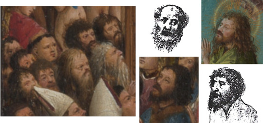
The heads from the earlier chalk study appear in the Crucifixion and Last Judgement panels
These correspondences suggest to me that the Berlin drawing may be contemporary with the New York panels, but the types, which are not Jan’s, recur in different contexts later, which is why I regard the drawing as a helpful index to Hubert’s characterisation.It only represents a few types (or ‘tronies’); the full repertoire, as demonstrated at Ghent, is more extensive. Number 9, to mention another that is very common in Hubert’s work, is well represented at the Albertina in Vienna by the drawing of Saint Andrew holding his Cross.
More heads can be found in St Catherine Carried Away, the Last Judgement and in a drawing depicting St Andrew
All this is not to say that Hubert only did landscapes and Jan only interiors, as we can see in these two examples: the first is Hubert’s tall Annunciation in the Mellon Collection at the National Gallery of Washington and on Jan’s side the Louvre Madonna with Chancellor Rolin.
The Annunciation, attrib Jan van Eyck, National Gallery of Art, Washington
Madonna of Chancellor Rollin, Jan van Eyck, Louvre
Neither Hubert’s smiling Angel nor his Virgin is as Jan would have painted them. The general brownness of the cathedral’s architecture and pavement (reminiscent of the ‘pensive’ brown of the Saint Francis) beautifully conveys the dim stillness of the lofty church, the privacy of reflection, and how revelation, in that ambience, is a matter of inward illumination. The Virgin does not face the Angel nor us, she tilts her head and looks to our right, her gaze on the axis of the dove’s silent swoop. The illumination is in the robe and wings of the Angel, the same colours that are in the stained glass of the window above the Virgin’s head. As in the landscapes, the dim, airy interior of the church matches exactly the mood and moment of the scene enacted; natural and supernatural , visible and invisible, fuse into one.

Facial features in Veronica’s Veil at the Phildelphia Museum of Art can be compared with those of the Virgin from the Annunciation at the National Gallery in Washington
Before leaving this Annunciation it is pertinent to mention a Head of Christ, presented as a Veronica Veil, in the Johnson Collection at Philadelphia, which I give to Hubert. I leave the eyes of the reader to match its features with those of the Virgin.
Drapery is something connoisseurs have to get to know in all its rhythmic convolutions, and nowhere more so than in Netherlandish art where the representation of it reaches astonishing levels of virtuosity in some artists and is always subtly different through whatever hand it is expressed. The ridges and valleys of falling and spreading drapery begin to constitute a landscape in themselves. It is important, therefore to consider Hubert’s own treatment of it which is not greatly different from his brother’s, but subtly so.

Left: Lost illustration of the Virgin and Child from the Turin Hours; Right: The Mystic Marriage of St Catherine, Germanisches National Museum, Nuremberg
Back at Turin, one of the illuminations in the Hours is this one of the Virgin with her Child surrounded by female Saints. The drapery, spreading like foam on a beach onto the flowery meadow, is archetypical of Hubert: very fluent and supple with quite wide spaces between the ridges. We can see this more confidently expressed in a splendid drawing from Nuremberg, of the Mystic Marriage of Saint Catherine.The sparse folds and rhythms are more pronounced because much later, perhaps even contemporary with his work on the Ghent Altarpiece; the types, female and male, that flank the central group in the drawing are recognisable in the various groups of its painted figures. In the Ince Hall Madonna at Melbourne Jan comes closest to Hubert in the fall of folds that swirl about her, but his drapery later on becomes much more like the painted equivalent of lime wood carving as in the large figures at Ghent.This reflects the difference already noted: Jan tending increasingly towards sculptural monumentality, Hubert remaining more essentially a painter.

Left: Madonna at the Fountain, Hubert van Eyck; Right: Madonna at the Fountain, Jan van Eyck, Koninklijk Museum voor Schone Kunsten, Antwerp
I have made the point that Hubert was more interested in landscape, Jan in the indoor world. This is nicely illustrated by each of them painting a version of the same subject, the Virgin and Child standing by a Fountain. Hubert places Mother and Child wholly outdoors, grass and flowers at her feet and a bosky background of trees and shrubbery behind a low brick wall. Jan has the Virgin stood on a rich backdrop of brocade that is held up by angels. Yes, there is a rose hedge, low wall, flower-spangled lawn, but it is noticeable how the gold foliage on the brocade is assimilated to the real foliage and real flowers behind and below. Similarly at the top there is assimilation of the angels’ red and gold to the red and gold of the brocade whose edging continues into the edging of their wings. In other words an indoor prop, the brocade, signals that the Virgin and her Child are only half outdoors.
The Annunciation, Metropolitan Museum of Art, New York
A picture that may well belong to the period of the Hubert Madonna at the Fountain is the Annunciation at the Metropolitan Museum in New York, with Mary standing at the doorstep of a lofty portal. Notice the similar treatment in both cases of trees, wall, plants and lawn, as well as the heavy-looking drapery folds in the figure of Mary.
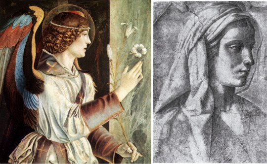
Left: Queen Isabel (St Elizabeth) of Portugal (attrib Massys et al), Gemäldegalerie, Berlin; Right: Cumaen Sibyl from the Ghent Altar
At the beginning of this Study I proposed a very simple division of Hubert’s and Jan’s contributions to the Ghent Altarpiece: all the lower tier of the opened polyptych is Hubert’s, plus, when it is closed, the four arched panels at the top. The latter are interesting because at the Gemäldegalerie in Berlin there is a little-known, little-discussed panel of the Holy Elizabeth of Portugal, attributed at times to Quentin Massys and also, vaguely, to a Portuguese-Spanish master, and dated around 1500. To my eye it belongs in an earlier period and its rightful home is in the work of Hubert van Eyck. The head should be compared with that of the Cumaean Sibyl, the lettering with that of her scroll (or any of the scrolls), the tiara with that on the Angel of the Annunciation, the radiance of the aureole with Hubert’s radiances throughout his career.
Portraiture features prominently in the work of Jan van Eyck. We have five separate portraits as well as those of Arnolfini in the London Marriage picture and Chancellor Rolin in the painting of him and the Virgin at the Louvre. It is not apparent from extant work that the same is true of Hubert. The Berlin drawing of heads is a drawing of types, some the same seen from two angles, and as such it represents part of a repertoire of visualised characters who can be introduced into crowd scenes. I may be wrong, but I doubt if many of the heads in the Ghent Altarpiece are portraits. There is, however, one independent portrait that seems different from the Jan portraits and that is the Man in the Blue Cap at the Brukenthal National Museum in Romania. The closest comparison is probably with the heads of the nearest banner-holders on horseback in the Ghent Altarpiece. The vivid Prussian blue is a staple of Hubert’s palette at least as far back as the panels in New York.

Left: Detail of riders from the Ghent panel; Right: Man in a Blue Cap (attrib J v Eyck), Brukenthal National Museum, Sibiu, Romania
Naturally, much more could be said (and by others has been) about that complex masterpiece. My concern has been to mark the difference in style and scale between the contributions of the two brothers. They worked in the miniaturist tradition, but they applied their miniaturism - their technical ability to represent very fine detail- in quite different areas. The paradox in Jan’s work is that he actually thought big, not small, in the sense that he conceived large, monumental figures first, and then bestowed on them a wealth of pin-sharp, jewel-like detail. He liked them to fill and dominate the space he gives them, even to the point of making them seem too small for it, as in the Angel and the Virgin in the Ghent Annunciation, both of them large presences in a low-ceilinged room.
Left: Detail from the Ghent Annunciation; Centre: The Virgin of Canon van der Paele, Groeningemuseum, Bruges; Lucca Madonna, Frankfurt
Hubert is the converse of Jan: his figurative scale is smaller, as befits a landscapist, but his spatial scale is vast, as we have seen. Along with the Limbourg brothers and Jean Fouquet, Hubert stands at the beginning of the long story of European landscape art. Part of what distinguishes Hubert in this tradition is what I would call his sympathetic landscape, one that reinforces the human story. When landscape eventually, but gradually, becomes an independent genre, this accord gets lost; not entirely because Poussin is a master of it. In a Claude landscape Aeneas seems an introduced character, adding an extra mythological element to an idealised pastoral; the same is true of Hannibal or Polyphemus in a Turner. In Hubert’s day Man and Nature could be seen together in a vision that sacralises both. That vision involved huge distances, great depth of aerial perspective. After the flatness and abstraction of the twentieth century we have difficulty, pictorially, giving expression to such spatial awareness; a nostalgia can creep into our appreciation of Hubert’s art. We must find new ways.
In view of Hubert’s prodigious talent it is fairly shocking that his art has been so eclipsed by Jan's, so comprehensively overlooked. There should be as many monographs and picture books, articles and exhibitions about him as there are about Jan, but there are not. Ask any person of average visual culture about Jan and the name and some works - probably the Arnolfini picture - will be familiar. Ask about Hubert and the response is a mystified, interrogative ‘Hubert?’ The essential purpose of this Study has been to remove that question mark. Like the remarkable Master of the Pieta de Villeneuve (at the Louvre) Hubert is a great artist whose fate has been to have his work confused with that of another great artist, in the Master’s case with Enguerrand Quarton, in Hubert’s case with his brother. It is in this sense that I claimed for connoisseurship the power, sometimes, to resurrect. The resurrection, however, is not instant or miraculous but a patient, collective process that, once begun, must continue.
Cityscape from the Ghent Altarpiece
Just to scroll back through the coloured illustrations of this Study is to be reminded of medieval illuminations, their bright, unfaded, undarkened colours, and of course their miniaturism. Yet in other ways Hubert looks forward, not backward, moving clear-sightedly out of the Middle Ages into the humanism of the Renaissance and on towards all that followed in our European landscape art. We owe him, I think, a huge debt.
On the subject of debt, I wish to acknowledge here what I owe to Emily Wetherell who has helped me so much, and so tactfully, with this Study and many of its predecessors. Not only has she been the technical assistant to a technophobe, she has done a great deal of picture research, checking the locations and current attributions of pictures and drawings, as well as making numerous suggestions about how to improve the text. Crucial to the visual argument of all these Studies, however, is the juxtaposition of images, and she has contributed materially to making clearer those comparisons and connections that are at the heart of any serious connoisseurship.
#studies in connoisseurship#hubertvaneyck#vaneyck#jan van eck#hubert van eyck#art history#connoisseurship#miniatures#turin hours#illumination
1 note
·
View note
Text
Balkanizing Bellini pt 4

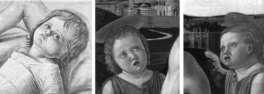
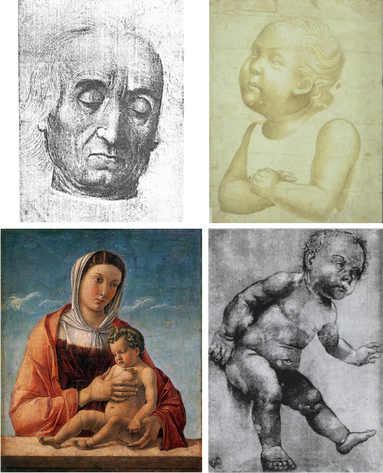
Study for Figure of the Infant Christ (attrib Giovanni Bellini), Ashmolean Museum Oxford
To introduce a fourth ‘Giovanni Bellini’ artist, I choose this drawing, an exceptionally strong and beautiful one, in the Ashmolean Museum at Oxford. As expected, it is catalogued as by Giovanni Bellini and the attribution has not been challenged. We are shown the Christ Child with raised knees, his head looking up at us from what is destined to be His mother’s lap. His short tunic, heightened with white, has a broad sash round his upper torso; every crease in it is finely modelled. In the upper part of the sheet is a separate study of raised legs, with shadows behind the feet.
*With such strength of modelling evidenced in a largely monochrome drawing, it can make sense to sometimes use black and white reproductions of paintings to better bring out this quality in the artist’s work; one can often see the form in it more clearly without the distraction of colour. In this study I have included some monochrome images alongside the colour reproductions to best illustrate this.
Left: Polyptych of St Vincent Ferrer, Basilica of SS Giovanni e Paolo, Venice ; Right: St Christopher carrying Christ from the Polyptch

Left: Close up of the Infant Christ on St Christopher's shoulder from the Polyptych; Right: Detail from Ashmolean Study
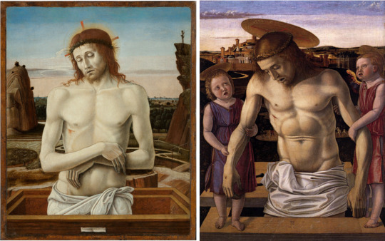
Clearly this is the type of the Child borne on the shoulder of Saint Christopher in the Saint Vincent Ferrer polyptych in the Basilica of SS Giovanni e Paolo in Venice, the same polyptych whose three predella panels we encountered in the discussion of the third ‘Giovanni Bellini’ painter, and must therefore disregard in our study of this fourth one. The six principal panels, three square above three arched, give us a good idea of this artist’s mature style and furnish us with a useful reference-source for further attributions. The Pieta, of Christ supported by Angels, at top centre, leads easily to a number of other things: to a Pieta in the Museo Civico at Rimini, to the Pieta at the Brera Gallery in Milan, to the Christ Blessing at the Louvre in Paris, and to a very impressive Head of Christ in the Kroller-Muller Museum at Otterlo in the Netherlands
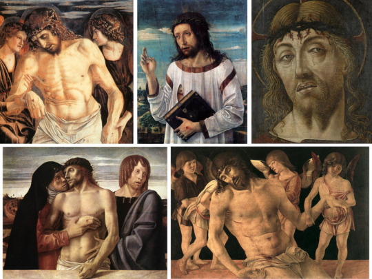
Clockwise from Top Left: The Dead Christ supported by Angels from the Polyptych ; Christ Blessing (attrib Bellini), Musée du Louvre, Paris ; Christ of Mockery (attrib Vittore Crivelli), Kröller-Müller Museum, Otterlo ; The Dead Christ supported by Angels (attrib G Bellini), Museo della Città, Rimini ; Pietà (attrib G Bellini), Pinacoteca di Brera, Milan
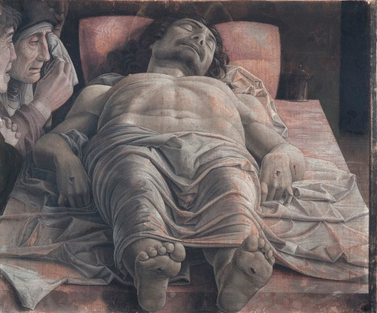
What is common to these images is principally a portrayal of Christ that is peculiar to this artist and not to be found in other ‘Giovanni Bellini’ painters looked at so far in these Studies, nor, as may appear subsequently, in any of those remaining to be considered. It is difficult to characterise this portrayal in words, but there is an asceticism expressed in the ‘hard’, chiselled planes of His face that brings us closer to Mantegna and the face of his Lamentation of Christ (as seen from His feet) in the Brera at Milan. Both men have conveyed a mood of silent acceptance of suffering and of death, and silent compassion with it. This lends itself naturally to a subdued and sombre palette, as if colour were drained out with the exhaustion of the breath of earthly life. The narrow range of subject-matter - variations on the Pieta theme - is indicative of the painter’s wish to focus on this ‘dead end’ of the Passion Story.
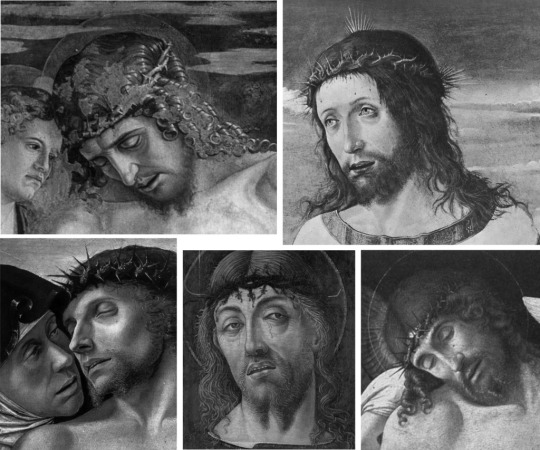
Details from the above paintings, highlighting the chiselled planes of Christ's face
The dead Christ and Three Mourners (Mantegna) ; our artist's work bears some similarities with this, more so than with other works by Bellini
The head of Saint Sebastian in the panel at the top and right of the Saint Vincent Ferrer Polyptych has, to my eye, a sufficient generic likeness with that of an Unknown Man in a drawing, below, from Besancon. I have not found any ‘home’, as Berenson would say, for this fine work except in the oeuvre of this artist, and it certainly exhibits all the strength of modelling that characterises his art.

Portrait of a Man, Musée des Beaux-Arts et d'Archéologie, Besançon can be compared with St Sebastian from the Polyptych of St Vincent Ferrer
One has only to consider this portrait drawing to realise that this is an artist of great ability. To speak of assistants in the Bellini Workshop as if there was one great master in charge and minor talents at work around him is to grossly underestimate those talents, anonymous though they are and may remain. Their number is unknown and changed over time, but they were artists with varying temperaments and varying preferences when it came to subject-matter. It is hard to imagine the painter of the Madonna of the Meadow being regularly assigned Crucifixions - he was clearly a Madonna specialist - while this fourth artist, by contrast, must have been an obvious choice for the later scenes of the Passion.

The Calvary (attrib G Bellini), Musée du Louvre, Paris

Spacious landscapes and warm cool colours found in both the Brera Pietà and The Calvary
For me, one of the loveliest of this artist’s works is in the Louvre, The Calvary with Mary and Saint John. The sentinel figures either side of the Cross stand close to the picture plane, They perfectly balance the figure of Christ, but are separate enough to allow the eye to pass on into the spaciousness of a dawn landscape of sleepy brown hills, untravelled roads, grey-blue water of river and lake, grey-blue mountains in the distance. Trees - some breaking the skyline - provide markers plotting spatial relations. Everything is carefully composed: tall tree to left, tall tower to right, the Rood down the middle; its crossbar at the top, along which Christ’s arms are stretched, echo the flat line of cloud. All the colours, warm and cool, are subdued to the red robe of John and the blue one of Mary. Overall the mood is quiet, sombre, still.
This Louvre Calvary brings us back to the mood described earlier, regarding illustrations 6 to 11. It situates the Crucifixion in a landscape that seems to reinforce the solitary nature of the foreground vigil. Such emotional isolation of the Passion of Christ (when all the crowds and public spectacle are gone) is what appears to most engage the imagination of this artist, and it returns us to a picture such as the Brera Pieta which ‘bears witness’ by bringing the viewer as close as possible to the protagonists, eschewing all distraction, rather as Caravaggio was to do much later, and some war photographers do to this day.

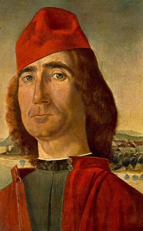
Portrait of a Humanist (possibly Raffaele Zovenzoni or Peter Luder, attrib G Bellini, da Messina, Veneziano et al), Museo Castello Sforzesco
I suggest also a fine Portrait of a Young Man at the Castello Sforzesco museum in Milan. Note, as characteristic of this artist, the thin, pale outlining of the top of the upper lip and how this is continued into the pronounced fluting below the nostrils. This is all closely paralleled in the Brera Pieta where Mary shares as well the Young Man’s dimpled chin. His warm flesh-colour and the strong structure of the face with its prominent cheek bones fit well with what we have already encountered. Finally, what little we see of the toga-like robe knotted on his left shoulder has folds comparably treated in the robe of the left angel in the Pieta of the Saint Vincent Ferrer polyptych. It could be that the Young Man was the model for a Saint Sebastian, now at the Rijks Museum in Amsterdam and ascribed there to Francesco Bonsignori.
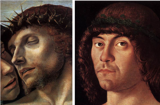
Distinctive lines of the lips and cleft chins present in both the Brera Pietà and the Humanist
Folds of brown cloth from the Humanist (left) and the Polyptych (right)
Saint Sebastian (attrib Bonsignori), Rijksmuseum, Amsterdam
Facial similarities between the Humanist and Saint Sebastian

From Left: The Annunciation detail from the Polyptych ; The Greek Madonna, Pinacoteca di Brera, Milan ; Lochis Madonna, Accademia Carrara, Bergamo (all attrib G Bellini)
If we return to the Saint Vincent Ferrer polyptych in Venice (always ignoring the predella panels) and focus on the panel at top right showing Mary praying as she faces, across the Pieta, the Announcing Angel, it is possible to add to add to our oeuvre for this artist two fine Virgin and Child paintings, one with a Greek inscription that is in the Brera Gallery at Milan, and a later one known as the Lochis Madonna in the Accademia Carrara at Bergamo. The basis for these additions lies mainly in the facial type that is common to both and shared with the Mary Annunciate of the polyptych.
The Lochis Madonna is particularly rewarding for its literally arresting composition: the calm, pensive Mother restrains a very energetic Child who recoils from her as if startled by something she is not aware of - that prophetic premonition of the Passion, perhaps, that is more often suggested by symbols. This recoil to the right is countered by the veining of the marble making little ‘waves’ that run up to the left while, under the ledge, they flow to the right. Rhythmically and dynamically the folds of drapery on both Mother and Child are carefully disposed to form a thoroughly original design that makes this one of the best of all Bellinian Madonnas.
Left: Detail of an Angel from the Polyptych Right: Drawing of an Unknown Woman, whereabouts unknown
Thinking of these Madonna paintings in conjunction with the Angel of the Annunciation in the Saint Vincent Ferrer polyptych I am tempted to add a boldly modelled chalk drawing of an Unknown Woman, her head half-turned to our right. This was exhibited a long time ago as by ‘Giovanni Bellini’ in a 1966 exhibition at Monte Carlo of drawings from the Collection of H de Marignane. Where it is now I have no idea.
Two early 'Pietà's, Left: Museo di Poldi Pezzoli, Right: Museo Correr (both attrib G Bellini)
Comparing the Study of Infant Christ from the Ashmolean with the angels from the Correr Pietà
Finally here are two pictures of Christ stood in the Tomb, one, in the Poldi-Pezzoli Museum at Milan, where His arms are crossed, the other where they are held by two child angels, in the Correr Museum at Venice. I am reluctant to posit any chronology, but stylistically these do look earlier than the works considered above, though I can see similarities between the supporting Angels in the Correr picture, especially the right-hand one, and the Ashmolean drawing with which we began. The maturity that came later is evident if one compares these works with a comparable subject, a Dead Christ supported by Two Angels, at Berlin. There the Angel to our left is much closer to the Angel of the Annunciation of the Saint Vincent Ferrer polyptych.

Left: Berlin Pietà (attrib Bellini), Gemälde Gallerie, Berlin ; comparable to the previous Pietàs

Details from the Polyptych (left) and the Berlin Pietà (right)I
t is more than likely that in the future other works by this artist will be added to the tally, but for now I hope his separate identity has been established beyond reasonable doubt, and that what I attribute to him demonstrates a major talent, capable of producing drawn and painted images of exceptional plasticity. Strong modelling is at the service of the equally strong emotional themes of Christ’s Passion, most notably the Pieta. The frequency of those subjects suggests where his expressive potential lay.

Henry Moore was inspired by the Brera Pietà (left) to create a series of sketch studies, including this one from the Henry Moore Foundation
It was this emotional charge, combined with the sculptural modelling that must have impressed Henry Moore sufficiently to make him want to draw for himself (in 1975) the juxtaposed heads of Mother and Son in the Brera Pieta. That Moore thought the artist was Giovanni Bellini was natural enough, but in truth the name of the artist did not matter to him; he simply identified with the representation of a subject dear to him by a fellow artist of another age. The identity of the artist only matters if we care to identify the particular hand at work, and the imagination that dictated the form and style of what we see. As connoisseurs we need not to be fixated upon names. A distinguished artist like this one may never have a name attached to him, but what is left of his life’s work can live on, if we can indeed distinguish it.
#Giovanni Bellini#anonymous artist#renaissance art#accademia venice#brera#painting#art history#connoisseurship#studies in connoisseurship#passion of the christ#pieta#henry moore#mantegna#saint sebastian#saint christopher#besancon#kroller muller museum#ashmolean
3 notes
·
View notes
Text
Balkanizing Bellini pt 3
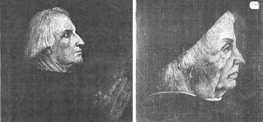
In the Correr Museum at Venice is this Portrait of a Man in a Red Cap. As we see it now, the Man is off centre, looking sideways down on us; with his long face, long neck and jutting lip, he is quite a superior and forbidding presence, the kind that makes one feel judged. His cap is worn aslant, so it almost reaches his right eyebrow.
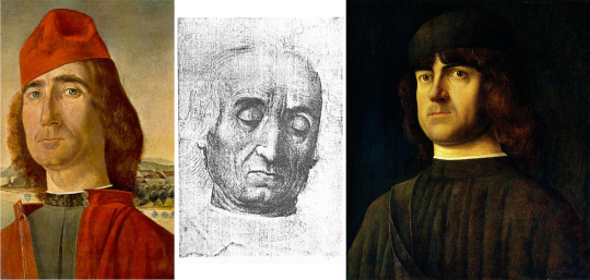
From Left: Portrait of a Man with a Red Cap, Museo Correr, Venice ; Silverpoint drawing of an old man's head looking down (from a sale at Sothebys December 1920) ; Portrait of a Man, National Gallery Washington D.C.
If we look at his eyebrows, nose and thin mouth, I think there is a striking similarity with the facial features in a silverpoint drawing sold by Sothebys in 1920. The structure of the face is also similar, and rendered, in the drawing, with fine stroking movements of the metal pencil that follow the rhythms of the flesh while telling us clearly where the bone is.The man is old and has downcast eyes. A younger man with eyes like those of the Man at the Correr Museum appears in a painting at the National Gallery in Washington D.C. and variously ascribed , to Alvise Vivarini, Bellini and Antonello da Messina. This, too, I would ascribe to the artist we are concerned with.
Left: Man praying ; Right: Profile of a old man (whereabouts unknown. Images: Witt Library)
Focussing on the mouth in Illustrations 1 and 2, and on the nose in the old man, I think one can extrapolate from a frontal view what a side one would look like, and thereby add two profile portraits of men, one at the Accademia in Venice, the other at Marseilles.
Left to Right Top: Old man looking down ; Drawing of a child with arms folded, from an image of St John, Musee du Louvre, Paris ; Bottom: Frizzoni Madonna (attrib Bellini) Museo Correr ; Drawing of the Christ Child, Uffizi Gabinetto Florence
Remembering the silverpoint ‘stroking’ in the drawing of the old man takes one to a drawing of a boy, probably the child Saint John, in the Louvre, and that in turn takes us back to the Correr Museum and a Mother and Child painting, the Child held on a parapet with blue sky and a bit of cloud behind the Mother. Another drawing, for a Christchild, at the Uffizi, exhibits the same, characteristic stroking draughtsmanship. An indicative aspect of the Correr Madonna is its colour scheme: a rose overmantel that is bleached by the light, and a deep maroon undergarment, the Madonna’s hair in much the same hue.These colours, together with the long, separated digits of the hands should be borne in mind when we look at the next item.

The Transfiguration (attrib Bellini) - Correr Museum
Amazingly, the Correr Museum yields a third and much more ambitious painting, The Transfiguration of Christ, that reveals, in the two figures to our left, one above the other, the same combinations of colours as in the Madonna.

Two drawings from the Uffizi (attrib Giovanni Bellini)
When we look at the treatment of drapery in the figure of Peter and of the still-sleeping Apostle, confirmation that the picture is by the same artist comes in a drawing at the Uffizi of a sleeping Apostle with his head against a tree, drawn in that now familiar, stroking style , and another, also at the Uffizi, of a youth sitting on a rock and looking upwards in wonder.

Whereabouts unkown (Images from Witt Library)
Two further paintings, one of a group of women around the Mother and her Child, the other of the Baptism of Christ, reveal considerable gifts of composition with a noticeable preference for arcs that link draperies and limbs.
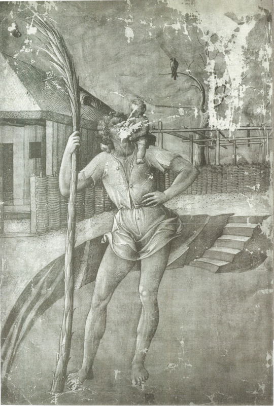
St Christopher with the Christchild - Musee du Louvre (image from Witt Library)
Our next stop is a finely finished drawing in the Cabinet des Designs at the Louvre which shows Saint Christopher with the Christchild holding his head, legs either side of his neck. It is unfortunate that the drawing has suffered damage that literally defaces both of them, Saint and Child. However, there is plenty of evidence throughout that we are looking at a drawing by the artist we are interested in, and not Jacopo Bellini.Consider, among other things, the Saints left hand vis-a-vis the Correr Madonna’s right one.
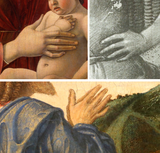
Details of hand from Frizzoni Madonna (top left) ; St Christpher (top right) and the Agony in the Garden - National Gallery London (bottom)
How this Louvre drawing relates in time to the National Gallery’s Agony in the Garden I have no idea, but it does contain descriptive features to be found in the London picture.

Details of steps and tress from the Agony in the Garden (left) and St Christopher (right)
On the left side of the painting is a leafless tree with twisted branches like arms in agony. On the right side is a river that passes over a bridge connecting a higher bank with a lower one by means of steps leading down. In the lower right corner is a palisade of loosely woven branches. All these details are present in the Saint Christopher drawing. The latter’s minutely worked textures made of long thin strokes and flecks and dots are entirely consistent with everything already encountered
Christ, praying on the rocky knoll faces a vision in the sky of the naked Child holding the cup. This Child with his pronounced tummy resembles two similar children, amoretti, in a painting at Chicago (Ryerson Collection).

Details from the Agony in the Garden (left) ; Two Putti (right, attrib Mateo di Giovanni) Art Institute of Chicago ; Arion riding a Dolphin (right) Ashmolean Museum
Another naked child relatable to the style of this artist is Arion playing music on the Dolphin’s back, in the Ashmolean Museum at Oxford. I believe that this very charming picture, with its evocative sea- and mountain-scape, is also eligible for inclusion somewhere within this artist’s oeuvre.
Before returning to the Agony in the Garden, already alluded to, mention must be made of the three predella panels of the Polyptych in the Basilica of San Giovanni e Paolo, because everything points to those being from his hand. There is much in them - too much for this Study to describe in detail - that illustrates the artist’s narrative style, composition, palette, typology and other matters.
Scenes from the Polyptych of San Vincenzo Ferreri (predella) Basilica dei Santi Giovanni e Paolo, Venice
We can fittingly end in the London National Gallery in front of the Agony in the Garden that is more A Vision in a Landscape.

The Agony in the Garden (attrib Giovanni Bellini) National Gallery London
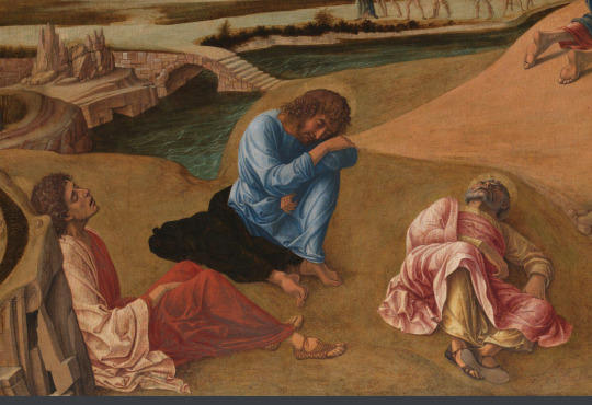
Detail of Sleeping Apostles
The composition is not quite like any other. What we see is a wide valley lying between hills crowned with hill-top towns. A river runs through the valley, and a road that winds upwards beyond a rocky outcrop in the foreground on which Christ is praying. Behind him, to our left, his three companions sleep, not huddled together but separately. These sleeping figures should be compared with those in the Correr Transfiguration for colours and treatment of drapery. The sun has yet to rise over the rim of an equally sleepy earth, but already it touches with orange the undersides of clouds passing over the blue sky.. Seen from behind, the figure of Christ on his rocky prie-dieu is faced to that sky and the private vision he sees there of a naked child holding a cup. The circumambient air is fused with the emotional atmosphere of an hour charged with menace as well as beauty; it is the hour that soldiers of the State have always preferred for making their arrests. Something quite inevitable is going to happen.
The airiness may remind us of Claude Lorrain, but I think also of Hubert van Eyck and his evocation of an earlier hour in the Holy Women at the Sepulchre painting at Rotterdam. The painter of this picture had Hubert’s gift to combine the objective truth of a landscape with the charge of a human story within one space, one time.
Three Marys at the Tomb, Hubert van Eyck - Boijmans Museum Rotterdam
As is the case with all old masters as old as this one, we only have a fraction of what he did over his lifetime, so it is hard to do more than I have tried to do here, which is to assemble works that seem to have characteristics in common. Had we all that this painter did, I would be surprised if the Agony in the Garden did not stand out as exceptionally fine. None of the items above that one might regard as its antecedents seems to be on the same level of achievement, though they point towards it stylistically. Clearly he was not the painter of the portrait of Doge Leonardo Loredano, and even more certainly he was not the painter of the Madonna of the Meadow - those two contrasted artists I have so far distinguished in my project to sort out the muddle that is “Giovanni Bellini’. He is a third artist in an ongoing series.
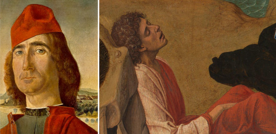
#correr museum#bellini#national gallery washington#Vivarini#antonello da messina#witt library#accademia venice#frizzoni madonna#uffizi#louvre#old masters#renaissance art#st christopher#agony in the gardenn#ryerson collection#basilica di san giovanni e paolo#national gallery london#holy women at the sepulchre
0 notes
Text
Young Man at Dulwich

Portrait of a Young Man (attrib Piero di Cosimo) - Dulwich Picture Gallery
One of the smallest exhibits at the Dulwich College Picture Gallery in South London is this head and shoulders portrait of a Young Man, cut, it appears, from a larger painting. It has been ascribed in the past to Raphael and currently to Piero di Cosimo, but neither attribution is very convincing. While not in a hurry to give a name to the painter of this picture, I think it is certainly possible to find other work that is plausibly by him.
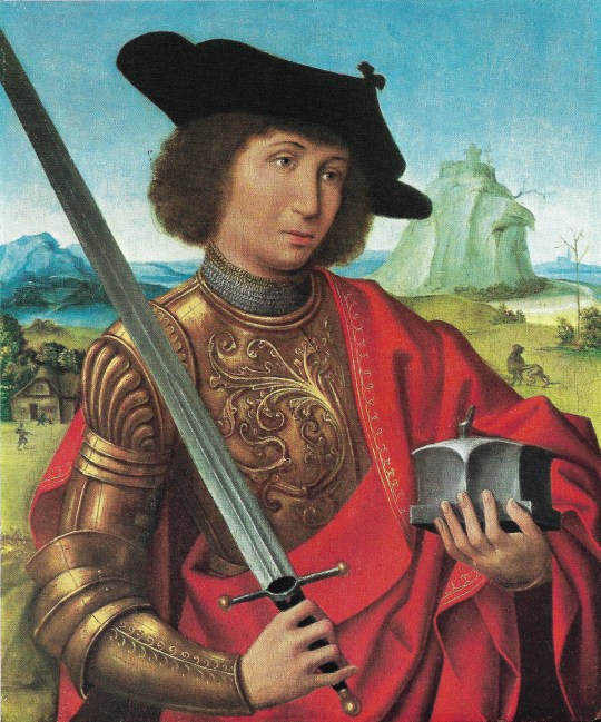
A Man in Armour (attrib Master of Frankfurt) - unkown location
A Spring Exhibition held at the Leonard Koetser Gallery (Flemish, Dutch and Italian Old Masters) in 1968 included this Man in Armour, attributed, I am not sure why, to the Master of Frankfurt. Set this beside the Young Man at Dulwich, and there seems to be a remarkable likeness between the two youthful faces, their Southern, even olive, complexion, their features, their hair. What they also share, chromatically, is a combination of cloudless (or near-cloudless) blue sky and a red in the costume.
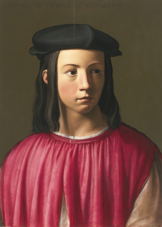
Portrait of Giovanni Gaddi wearing a black cap, Florentine School C16th
The red at Dulwich has become more crimson in the tunic of another young man, Giovanni Gaddi , wearing a black cap, in a picture sold by Sothebys in London, 15 December, 2012, Lot 18.

St George, ex Marquess of Lothian (attrib Domenico Ghirlandaio)
A fourth Young Man, in a picture from the Marquess of Lothian’s collection sports a tunic even more floridly decorative than that of the Man in Armour.
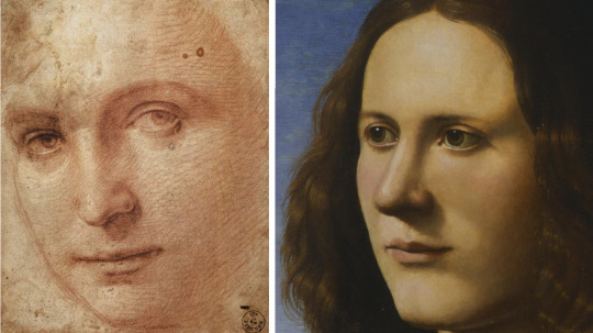
Head of a Youth (attrib Raphael) -Uffizi Gabinetto - can be compared to the Young Man at Dulwich
At this point it is helpful to introduce a drawing from the Uffizi Gabinetto, not by Raphael but arguably by this Dulwich artist. Two more Young men conform to the type now established by the drawing and paintings cited.
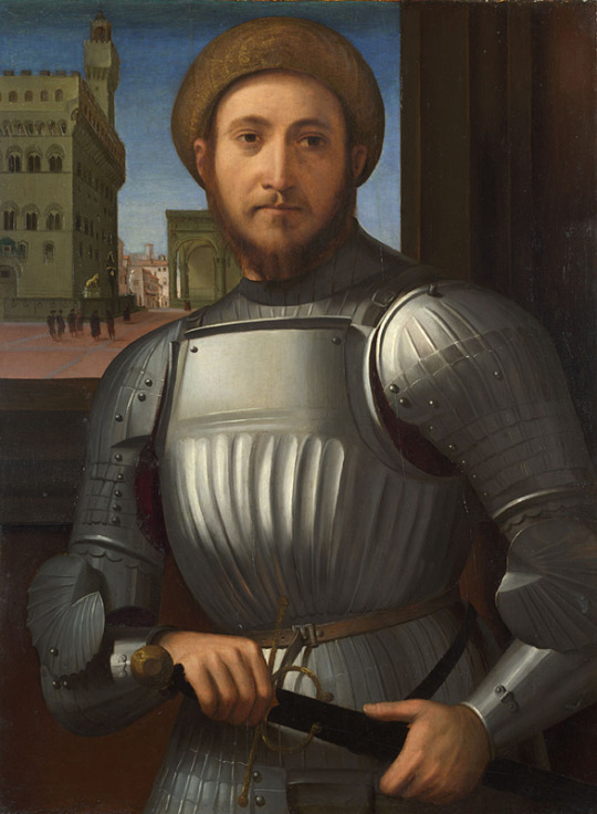
Portrait of a Man in Armour (poss attrib Francesco Granacci) - National Gallery London
Although the red is absent, I can well believe that a bearded young Warrior portrayed with the Piazza Signoria in the background, in this painting at the National Gallery in London is also by the same artist. Clearly he loved a blue sky, loved armour, and loved youth. Unsurprisingly, when he painted the Archangel Michael he made him a young man with a fantastical plumed headdress.The Dulwich face reappears in the heads of both Tobias and Angel in a picture of that subject sold by Christies (25 march 1927 Lot 164).
Left: The Archangel Michael (attrib Igegno) Right: Tobias and the Angel - both locations unknown

Close-up comparisons of the faces from the two paintings with that of the Young Man at Dulwich
The Dulwich artist did not only paint young men; there is a photo at the Witt Library (from the archive of The Burlington Magazine) of a Head of a Woman who has the eyes and mouth and other features now familiar.
A painting of a Head of a Woman attributed to Pontormo and featured in Burlington Magazine - location unkown
With reasonable confidence other paintings and drawings can be adduced, including the four paintings below. With time faces and hands have become longer, backgrounds more mountainous, drapery more dramatically flowing, but the same clear eyes and direct gaze remain.

Left: St James the Greater and Right: The Personification of Friendship - both locations uncertain
Left: San Martino and the Poor Man (attr Circle of Raphael) - Museo Civico Amadeo Lia, La Spezia and Right: Man Playing a Lute (attr Bacchiacca) - Kress Delgado Museum of Art
I pause in any case, to leave further research to identify more of this artist’s oeuvre, which in that period would have included more in the way of religious works. Something of his character as a portraitist has emerged for me, and is attractive, if not especially original, in its depiction of young men. Here are two more: one from the Johnson Collection at Philadelphia and another, of unknown location that harks back to Dulwich.
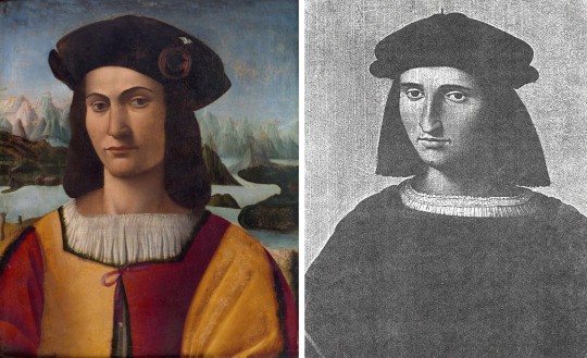
Left: Portrait of a Young Gentleman Before a Landscape (various attrib) and Right: Portrait of a Young Man (attrib Aspertini) - location unkown
For us, for the moment, the historical importance of this artist may lie in his portraiture, because in that department his gifts were sufficiently recognised in his day that he was able to paint not only his ruler, Lorenzo de Medici, but also Machiavelli, with whose portrait this Study concludes. That signature red comes back again.
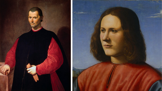
Left: A painting of Niccolo Machiavelli (attrib Santo di Tito) uses the signature red colour as found in the Dulwich portrait
#dulwich picture gallery#Santo di Tito#machiavelli#Portraits#renaissance art#raphael#la spezia#kress delgado#personification of friendship#pontormo#igegno#tobias and the angel#granacci#national gallery#uffizi#giovanni gaddi#florentine art#old masters#piero di cosimo#connoisseurship#art history#lost art
1 note
·
View note
Text
Balkanising Bellini - pt 2

Madonna of the Meadows - National Gallery London
This second Bellini Study begins, like the first, in the London National Gallery ( the collection that I happen to know best) with this, the Madonna of the Meadow, as it has come to be known. It hangs near the portrait of Doge Loredano (see part one), but it is by a very different artist.
There are aspects of the picture that prefigure Raphael: the fitting of Mother and Child into a triangular or pyramidal template, a palette centred on a binary blue and pink (with the blue predominating), and a composed background with solid geometric structures reinforcing calm. All of that is here, but ‘here’ is the Veneto: a fertile plain with oxen below a hill-town blocking the distant mountains. It is winter still, the earth bare and brown, an air too chill for a naked child to be exposed to, but bright and clear. Tall towers, trees and poles play off their verticals against the horizontal meadow and the lazily trailing cumulus. The Virgin inclines her eyes pensively over praying hands; the Child, in that surrendered pose that still delights a parent, lies unheld in the trough between her knees.
For all the clarity of what we are shown, the picture has no hard edges; there is a soft, relaxed air, a sense of Nature continuing its quiet life around the closed and downcast eyes as if it did not need to be seen but, if seen, is full of harmonies and pleasant details. Looking at the flesh of the Child’s body, one sees none of the Loredan painter’s tautness of skin over bone; there are no more bones here than in a Renoir, all is soft and pudgy.
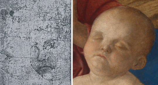
Head of an Angel (attrib School of Bellini) Lanna Collection Prague ; detail from Madonna of the Meadows. Both show a softness in structure and few marks in detailing the facial features
I find exactly this cherubic softness and lack of underlying structure in a drawing once in the Lanna collection at Prague. A study for either an angel or, more likely, a Christ-child, it is done with very few marks, just enough to outline the face with its fat cheek and indicate eyes, nose and mouth. Minimal as this information is, there is a certain charm in the way the child looks out on us, the sweetness that again brings Raphael to mind.
Reconstructing a putative oeuvre may be likened to stringing beads to make a necklace; the beads are not necessarily in chronological order, but they ought to be seen to ‘hang together’ visually. In this case a suitable next bead is the Toilet of Venus (or Nude with a Mirror) at the Kunsthistorisches Museum in Vienna.
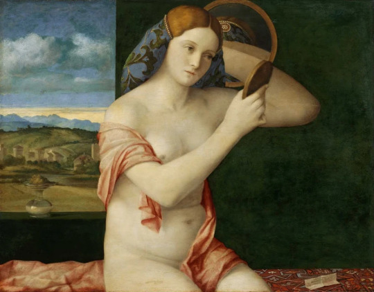
Nude with Mirror - Kunsthistorisches Museum Vienna
In Venus we see a face of regular features, sweet, bland, somewhat expressionless – much like the Madonna’s in London – with hair, centrally parted, that waves a little, but lies flat and close to the skull. Her body, with its white skin evenly toned, looks essentially boneless under a soft envelope of flesh that is not pink even in her cheeks, though draped with a pink mantle. Pink and blue, the combination central to the London picture, is again prominent. The sky and landscape are different: we seem to be nearer the mountains and witnessing dawn, not day. The off-centre pose is original, but at the same time awkward because the arms, especially her left one, are too big and the second mirror, behind her, exaggerates this by reduplicating the forearm and thereby widening it further. Unfortunate also is the position of the hand-mirror which hides the crease of her bent arm just where we need to see it.
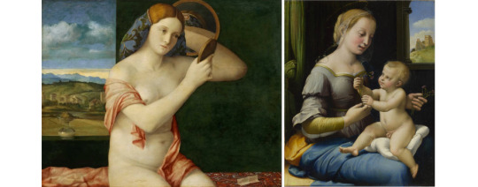
As with the Madonna of the Pinks (right) the Toilet of Venus features little attention to details of depth and volume and the underlying form
As in the London picture, the modelling of drapery is rather perfunctory and decorative; it is hard to gauge the volume of its folds. Such faults as these are remedied in later work, but they demonstrate the pitfalls that attend a lack of interest in underlying form. Baby Jesus could tumble out of His mother’s lap because the artist has not thought about what is under it.

The Infant Bacchus, Washington National Gallery
A painting with a similar background of greeny-brown terrain backed by blue mountains and blue cloud suggesting dawn is the Young Bacchus with Brazen Urn at Washington. The same remarks may be made about soft, puppy flesh, blue drapery and a pretty face with no cheekbones. Passing over the oddity of a child Bacchus, I observe how the trees are thin-stemmed, of spindly growth and do not hold to the ground even where we can see where they meet it. Such trees recur throughout the artist’s career; we can see one in a mythological drawing at the Fogg Museum in New Jersey. which illustrates also his light-touch treatment of drapery.

XV Century Venetian, unattributed artist - Fogg Museum, Harvard University
So far we have seen a Virgin and Child picture and two subjects from classical mythology, Venus and Bacchus. From the evidence of extant work it appears that this artist was in demand for Mother and Child pictures and within Bellini’s workshop was probably known for producing them.
Madonna of the Meadow is one in a whole series of variations on that theme. In one after another we see the same sweet pensiveness of the Mother, the same soft flesh in the Child, and always a backdrop of the Veneto countryside with perhaps a variant of the same hill-town, a white oxen, someone on horseback, spindly trees, fluffy clouds. Naturally there is development that allows one to say that this example must be earlier or later than that one. In earlier pictures, for example, the Child has only a fine fuzz of hair; in later ones a full head of curls.

Clockwise from Top Left: Madonna and Child, Pinacoteca di Brera, Milan ; Madonna and Child with Saints, whereabouts unknown ; Willys Madonna, Museum of Art of São Paolo ; Madonna of the Meadows ; Madonna and Child, Metropolitan Museum New York - all attrib Bellini and workshop

Clockwise from Top Left: Madonna and Child, Metropolitan Museum New York ; Alzano Madonna, Accademia Carrara Bergamo ; Virgin and Chlld, National Gallery London ; Madonna and Child, The Burrell Collection Glasgow ; Madonna of the Small Trees, Gallerie dell'Accademia Venice
It does not seem necessary to comment on these pictures individually. Among the earlier ones in the series one might pick out the Madonna of the Meadow as particularly successful; among the later the picture at Bergamo. I see all of them as celebrations of an ideal world of calm continuity centred on generation of new life that is bonded to an existing life: its towns, villages, agriculture, landscape and seasonal activities – in short, all that is comprised in the word ‘paese’.
See too many of these calm, pious images, and one can begin to experience deja vu. This is hardly the painter’s fault; he was satisfying a demand and doing so very successfully. Venetian clients must have been delighted to have their faith linked to pride in the fertile countryside beyond their city. The sense of family is stronger still in a work like the Sacra Conversazione, a holier version of our family photo marking a new arrival.

'Sacra Conversazione' or The Barbarigo Altarpiece, San Pietro Martire Milan ; detail of the Doge Agostino Barbarigo kneeling before the Madonna (left) can be compared with the drawing from the Uffizi archives (right)
Urban pride is satisfied too, in this grand scene where, as in an audience chamber, the Doge, Giovanni Barbarigo, is presented to the Virgin and Child throned beneath a canopy. Tellingly, even here the flanking ‘windows’ give onto landscape, not the lagoon. Probably from the same period is a drawing at the Uffizi of a kneeling man.
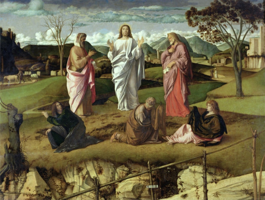
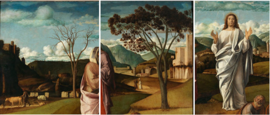
The Transfiguration Museo e Gallerie Nazionali di Capodimonte, Naples ; details from the painting
Of sacred work by this artist the major surviving work is the large Transfiguration at the Capodimonte Museum at Naples.This is undoubtedly a grand and accomplished work, impressive in many ways, though not, I suspect, as appealing as the best of the Madonnas. This may be because there is something very staged about the staccato placing of the six figures and about the landscape which surrounds them. Was the dramatic nature of Christ’s declaration beyond what the artist felt comfortable in presenting? The constituents of the landscape, all of them familiar from the backgrounds to his Madonnas, here seem more like props on a choreographed set and too unambiguously symbolic. There is a leafless tree to the left, a tree in leaf on the right; the latter with a trinity of stems twined together. The best part of the painting is in the foreground of rock in whose fissures beautifully observed plants are growing, and in the paling in front to which the cartellino is attached.That diagonal was a daring but very effective introduction, leading our eye to the right, so it follows a zigzag past the buildings and tree towards distant mountains, but also going behind the standing figures, through to the left of the picture on a route that returns us to the central scene. There is much artifice in this picture and a certain grandeur of conception, but I wonder if less contrivance might have made the subject more emotionally affecting.
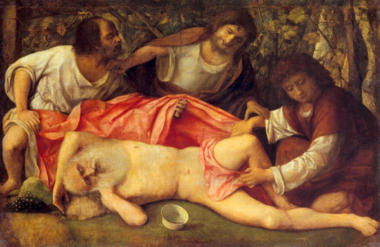
The Drunkeness of Noah - Musée des Beaux-Arts et d'Archéologie de Besançon
In the museum at Besancon is a painting of the Mocking of Drunken Noah which succeeds where perhaps the Transfiguration fails. Earlier and less ambitious, it notably dispenses with blue, but the pink is there and plays an important role in the composition. Flesh is warm, and the whole scene brought close and physical. The three young mockers link in a rightward movement that then bends back on itself as the third lad draws the veil over Noah’s genitals. The concerted energy of the youths is nicely contrasted with the sprawled drunkard dead to the world, his abandoned drinking bowl tilting beside him. A wild backdrop of rocks and trees and an enveloping shadowiness are likewise eloquent of wild abandon. On a small scale everything works together.
This is a picture about licence, about a self-indulgence laughed at, not condemned. It introduces us to a whole other side to this artist’s imagination, one that could hardly be guessed at in front of yet another Madonna col Bambino. Beside the drunkenness of Noah the child Bacchus seems too young, too innocent, to know about transgression of norms, and Venus too chaste to be a convincing embodiment of vanity. Licence, however, becomes a patent licentiousness when we turn to a drawing in the Louvre, clearly by this artist: a drunken Silenus is about to be hauled to his feet by gleeful satyrs, one with pan-pipes, while an ass pushes in to witness the scene. It is an excellent composition, all the figures drawn in that blurred, fuzzy style of his; it would have made a good painting, and perhaps it did.
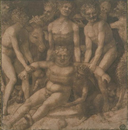
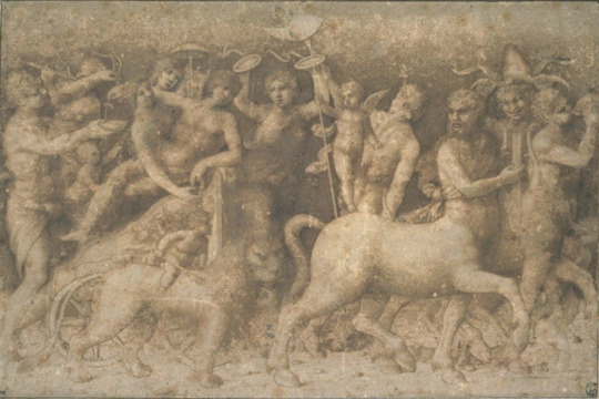
Top: Silenus drunk, being carried by fauns and satyrs ; Bottom: The Triumph of Bacchus - both Musee du Louvre
The same style and the same atmosphere pervade another, more ambitious drawing showing a lion and a centaur beneath a frieze of debauched men, women and well-developed putti. In the context of the period none of this subject-matter is at all surprising; it only becomes so in the context of this particular artist, when so many other works by him inhabit a completely different world. The ‘split’, if one can call it that, seems more of one in him than it does in, say, Mantegna.


Top: The Feast of the Gods - National Museum of the Arts Washington D.C. ; Bottom: Detail of Bacchus from 'Feast' and 'The Infant Bacchus'
The bacchanalian streak is worth highlighting if only because it gave rise to one of the most famous of ‘Bellini’ pictures, the Feast of the Gods at Washington. In it a motley encampment of divine revellers is gathered for a picnic in a clearing between a wood and a wooded crag. The powerful landscape dominates; ‘romantic’ avant la lettre, it is not tamed like the Veneto. The figures, it could be said, are clad in too many colours, and their grouping is not as felicitous as it would be in either a Titian or a Poussin, but the whole remains an important and impressive source for mythological compositions to come, even as it springs from a source in its own maker’s art, as we have seen. In some ways it is a reprise, a fancy-dress gathering-together of earlier ideas. The garlanded child Bacchus is back again with his brazen pot.
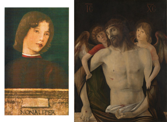
Portrait of a Boy, Barber Institute Brimingham ; The Dead Christ, National Gallery London

Close-up details from the above paintings
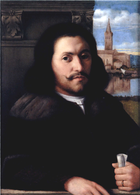
It remains to ask if this artist painted portraits, as so many did. The only one that I can confidently ascribe to him is this Portrait of a Youth at the Barber Institute at Birmingham. There is, however, a portrait of a much older man, at Nancy, given to Bartolommeo Veneto, which seems to have some of the right attributes to be by the subject of this Study. I cannot be very precise in defending my guesswork, but something about the face and lips together with the sky and background suggest to me this artist rather than Capriola or anyone else. The Birmingham youth resembles a young face behind Christ in a Pieta in the London National Gallery. The artist therefore did tackle a subject from the cycle of the Passion; yet the contrast between him and the painter of Doge Loredano remains pronounced: it is quite hard to imagine this second painter in my sequence choosing to paint a Crucifixion. The bones, in a man on a cross, stick out. I have achieved my purpose here if I have demonstrated that, if one of these men might actually be Giovanni Bellini, they certainly cannot both be; nor can others in his workshop whom I hope to portray.
0 notes
Text
Two Saints
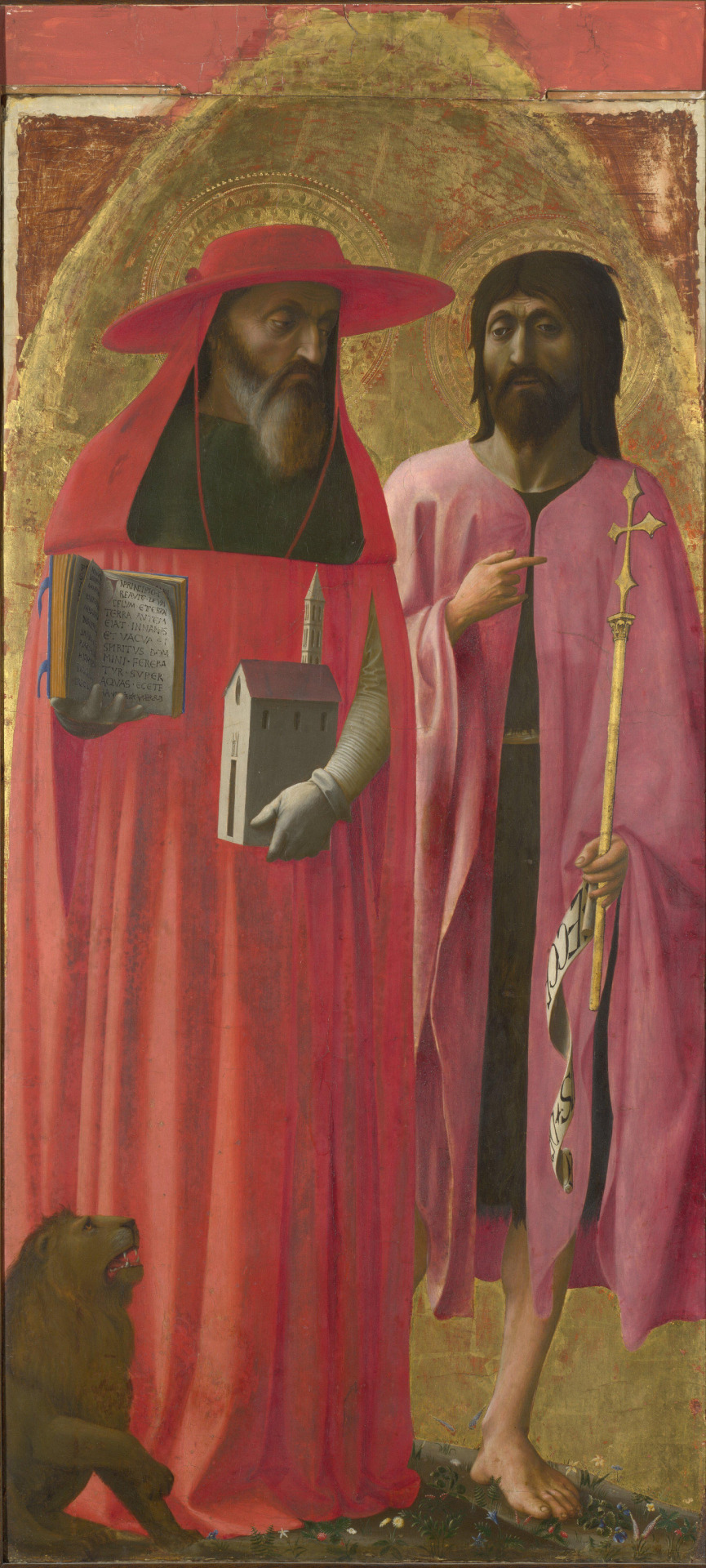
Saints Jerome and John the Baptist (attrib Masaccio) - National Gallery London
Unlike many works that have been ascribed to Masaccio, this large panel in London’s National Gallery depicting the two Saints, Jerome and John the Baptist, is a work for which one can have some respect; the heads are particularly fine. My concern, nevertheless, is that the picture should not be associated with Masaccio – as it was by Kenneth Clark and still is by the Gallery and many others – but with someone else. It is important to identify its creator correctly, not least because we are looking here at a work that still displays a great deal of what is essentially a linear and Gothic style belonging to the old century but surviving, as we know, into the new one in the work of older artists touched, to varying degrees, by the new ideas. There is nothing ‘old style’ about Masaccio; he and a few others were forging the revolution with which his own art is rightly identified.
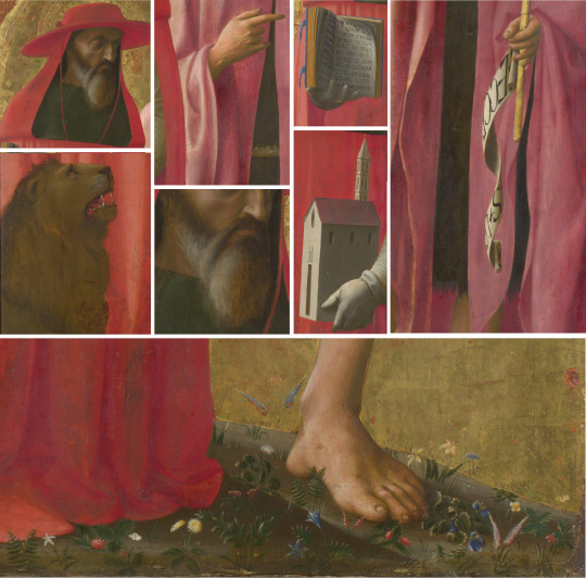
In that endeavour linear elegance is not a priority; yet everywhere we look in this panel, that is exactly what we find. Consider the beautiful curves made by Jerome’s cowl leading up into his cardinal’s hat with its downward loop of red ribbon. Consider the fluently waving lines of John the Baptist’s robe as it hangs off his pointing right hand; or the twist of the Ecce Christus scroll unfolding from the bottom of the staff in his other hand. Sassetta could not have done this with more relish in the linearity of stilled movement. Or take the pages of the book, or the lettering, or the precision in the drawing of the church. Remark the successive wave-profiles of the Baptist’s hair, the long, delicate streakiness of his and Jerome’s beard; the small, brush-tip details – ear, eye, muzzle, teeth – of the lion seen in heraldic profile, or the almost equine (and structurally incorrect) contour of the ankle and heel of the Baptist’s left foot. As for the ground they both stand on, can we really imagine Masaccio painting those delicate little flowers, the millefiori of a Gothic tapestry?
We can resort, of course, to an argument that says a studio assistant was responsible for this or that, but the truth is that there are so many non-Masaccio elements in the panel that such an argument would quickly exclude him altogether, leaving us with a work whose overall appearance betrays no obvious collaboration.
The linearity I have noticed is ubiquitous; yet it does not explain everything here, and what is both charming and not perfectly satisfying is that the artist has also learned something from the new art of Masaccio and the sculptors – enough to get the heads, hands, book, model church and leg all lit and modelled consistently from a source to our left in a manner that creates a semblance of three-dimensional form; these parts (the heads particularly) stand out from the rest. Semblance, however, is the word: the modelling of the robes against the flat gold background is, and clearly always was, too shallow to give substance to the bodies beneath them. We are not allowed to believe that Jerome has knees, a waist, a chest. The foreshortened hand, mostly three fingers and a thumb, seem to appear out of nothing, instead of connecting visibly with a forearm, an elbow, eventually a shoulder. Because of this disconnection there is little sense of a hand capable of safely grasping a book or a model. Similarly the Baptist’s fingers curl round the staff so lightly that we wonder the staff does not slip through them to the ground.The heads, though still very linear, are so much more convincing that they stand out for us in a way that threatens the balance in a work held together, very largely, by a harmony of line and colour.
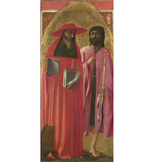
All in all, there is nowhere near enough of Berenson’s ‘tactile values’. If we are harsh, Jerome could be a head stuck on a pole, and we need much more underlying and connecting structure in the body of the baptist to be convinced of his walking forward down the hill. Letting us glimpse such a tiny part of his right leg otherwise hidden by Jerome’s robe (which tells us nothing of the position of Jerome’s feet) is an awkwardness Masaccio would have instinctively avoided.
For fairness these derogatory remarks need balancing, There is a thoughtfulness conveyed by the notable downturn of both mens’ upper eyelid which combines with the pointing hand to give the portrayal of these two figures almost the conversational closeness of two friends walking down a sloping meadow. The lion – more like a dog – looks steeply up towards the Baptist who with parted lips may be thought of as speaking, and gives the impression of a quasi-human alertness and understanding. This is attractive. Whatever we think of the formal, representational arrangements in the picture, there is an emotional, sympathetic harmony emanating from the composition and supported, as indicated, by the shared linear rhythms and a warm, close-toned palette. It emphatically does not derive from a sense of three-dimensional bodily reality such as would be evident if the commission for this panel had been given to Masaccio; his Brancacci Expulsion scene is enough to remind us of that.
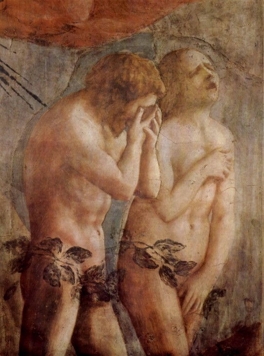
The Expulsion of Adam and Eve - Capella Brancacci, Santa Maria del Carmine, Florence
So who was the commission given to? Who did paint what we see? I believe the answer to be Lippo Fiorentino. He is an old painter of the generation of Spinello Aretino, whose career, now vague to us, stretches back into the fourteenth century but ended, significantly for him, in that great pictorial laboratory that was the Carmine Church at Florence and its adjoining hall. This panel would belong to this final phase in which the influence of the young genius would have been both unavoidable to some degree and at the same time difficult for a much older, conservative artist to absorb. The National gallery panel reveals both aspects; indeed it illustrates the cusp of that adjustment and accommodation between old and new more clearly within one work than a Masaccio can. History may seem to be made by the great innovators, but its transitions can be illustrated by a panel such as this, at any rate when we try to fit the revolutions into a story of evolution.

The Virgin and Child with Sts Michael and John
Lippo Fiorentino cuts a shadowy figure certainly, but some things emerge from the shadows that support an attribution to him of this London picture. In the Oratory at Montemarciano in the Val d’Arno there is a Virgin and Child between Saint Michael and Saint John the Baptist. By juxtaposing the heads of the Montemarciano Baptist and the London one, a striking resemblance results, particularly in the delineation of the eyes; these are long and narrow, contracted by the width of heavy lids above and below, especially above. note also the dipping crease-lines in both foreheads, and under the bearded chin a pronounced ‘V’ down to the clavicles. The linearity already emphasised is clear in the fine lines of the hair and beard.
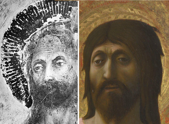
Similarities in the face shape, eyes and forheads of St John in the London painting and in the one at Montemarciano
Some of these features reappear in a Flagellation fresco at the Carmine in Florence. Recognisable are the long eyes, the finely feathered eyebrows and no less fine, pencil-thin strokes in hair, stubble of beard, and sideburns. The lips of Christ, like those of the London Baptist, resemble a limp rubber band. The young lad on the left, brandishing his flail, has the signature long eyes and knitted brow, with hair that, though curly and not straight like the London Baptist’s, similarly breaks the profile at intervals. Everything is defined by its outline, witness the flail-grasping hand or the London hand that holds the staff.
Fresco depicting the Flagellation of Christ - Santa Maria del Carmine
Details comparing the faces and hands in the fresco at Santa Maria del Carmine with those in the portrait of the two Saints
A standing image of Saint Cyril, a damaged fresco also at the Carmine in Florence offers a comparison with Saint Jerome in the London picture and shows how insecure is the grasp of the hand in both cases.
Fresco from Santa Maria del Carmine depicting St Cyril (left), which shows the same insecure hand grip
It is fortunate that we appear to have a portrait by Lippo Fiorentino. I cannot say where it is now, but it passed through Sothebys sale-room in 2008. The painting has been unsatisfactorily attributed to later, mid-century artists (Baldovinetti, Cosimo Rosselli), but the features already identified as characteristic of Lippo are on display here and too prevalent to leave much doubt that it is by him. We see the same long eyes, the same delicate strokes in both the hair and the eyebrows, very similar treatment of falling folds in the tunic as we find in Jerome’s robe, and importantly, a comparable palette, rich crimson turban over winey red, the man;’s youthful face – according to an inscription, that of Francesco Datini, founder of a church at Prato – could almost have been a model for the the young lad of the Carmine Flagellation.

Portrait of Francesco Datini (sold at Sothebys 2008)
What is, I hope, sufficient to make a convincing attribution of the London picture is too little to arrange in chronological sequence as the surviving oeuvre of Lippo Fiorentino, but what he did at the Carmine, especially a large Triple Crucifixion with flying angels above and mounted soldiers below, which fills one side of the hall adjoining the church, marks his last phase of activity. At the castle of Vincigliata there is a fresco fragment depicting a crowd of men and horses, which can also be reasonably assigned to him as a late work.
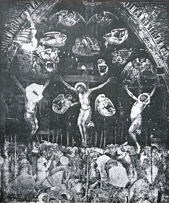
Fresco of the Crucifixion - Santa Maria del Carmine
Fragment of a fresco currently at the Castello di Vincigliata
On the evidence of the frescoes and panel painting discussed here it is hard to discern much influence from Masaccio. The overall impression one gains is of a style belonging to the very late medieval period rather than that of the early Renaissance. This is reason enough for dropping any mention of Masaccio from the description of the London picture. Lippo Fiorentino is less close to him than Masolino, and Masolino is not as close as many have thought. Once again, as with Raphael and Foschi, we have a wishful attribution to a famous name of a work by a competent, interesting minor artist of the period. The lesson to be drawn is to keep hold of what it is that we treasure most in the famous name, and make that our criterion. Then we can ask a question such as: given that Masaccio painted the standing mother holding her child, in the Brancacci Chapel, is it credible that he could ever have painted a Saint holding a staff, or a model of a church, in such a way that those objects could easily fall to the floor? It remains surprising how often the virtues that we routinely extol in great painters are discounted or forgotten when attributions are made to them.

The Distribution of Alms and the Death of Ananias - Capella Brancacci, Santa Maria del Carmine
0 notes
Text
Sicily's Triumph of Death
Triumph of Death – Palazzo Abatellis, Palermo
Palazzo Sclafani, Palermo
The Triumph of Death – il Trionfo della Morte – is a huge fresco filling most of the end wall of a large and lofty hall in Palazzo Abbatellis, the National Gallery of Sicily in Palermo. It was not painted for that room, but for a wall of the courtyard of another palazzo in the city, Palazzo Sclafani, still standing and still to be seen, though not visited, close to a public garden east of the Cathedral. That palazzo was built in 1330, originally for a Count, Matteo Sclafani, but exactly a hundred years later, in 1440, the City Administration (the Senate), wishing to rationalise its hospital provision and have one big hospital rather than seven small ones, requisitioned the palazzo, by then in a poor state, and set about converting it into the main hospital for the city. This development evidently included commissions for artists, and one of those was given to the painter of the Triumph. It is unfortunate that the commission document has never been found, but we can be thankful that aerial bombardment of Palazzo Sclafani in 1943 did not destroy, only damaged, the fresco, which was soon after removed, restored and displayed where it now is.

Details from Triumph of Death (clockwise from top): Death rides of a skeletal horse; The Fountain of Life; Death’s Victims; Lute Player
The painter’s choice of subject was a natural one for the courtyard of a hospital in those days. Sclafani’s palazzo dated from the time of the Black Death, but in Sicily, as in mainland Italy and the rest of Europe, Death in the form of plague had galloped back into people’s lives unpredictably and most often fatally ever since. Skeletal Death rides his skeletal horse full tilt across the fresco; his victims lie in a heap at the bottom of the picture. There is, however, Life, a Fountain of Life, beside which a harpist plays his silent music. Elegant ladies converse with animated gestures of shared alarm; there are men to the left, young and old, but, one observes, no children. Above the men a menacing wolfhound and another dog strain at the leash. Death, in short, threatens Life, for the mitred as for the unmitred, but Life is there. Memento Mori, you who enter this place and may not leave it alive; but remember, too, that you have lived, and life, with all its music and conversation, will continue after you.
Such is the general message. I have chosen this work as the focus of my latest Studies in Connoisseurship partly because we are living through a global pandemic. The hospitals of Palermo, as of many other cities in Italy and beyond, have once more been filled with very ill people dying, or threatened with dying, as life outside them struggles to continue.
As a connoisseur my motive is different. The fresco, unsurprisingly, has captivated many visitors and inspired some writers, but the fact that without a surviving contract or other document from the early 1440s we still do not know who painted this work surely plays its part in our fascination: we see it as a unique phenomenon, sui generis. This of course is unreal: someone painted it. Sicilians wonder if he was Sicilian. The last owner of Palazzo Sclafani lived in Spain; could he have proposed a Spanish artist? Some, bizarrely, have suggested that the painter may have come from the Netherlands. If he was Sicilian, did he afterwards leave the island to seek his fortune, like Antonello da Messina, on the mainland? Or did he come from the mainland, invited by the hospital’s rector, Pietro Speciale, or someone else who was commissioning works of art for it? A work like the Triumph of Death does not appear from nowhere; what other works by its creator preceded it?
I cannot answer these questions, but privately I have shared the quest for answers over many years, and I think I can at least contribute to our understanding of this anonymous artist by adding other works that may reasonably be attributed to him. As with all exercises in connoisseurship, what is ‘reasonable’ is what can be argued visually through juxtaposition of images.
First, a general observation should be made about the work from an aesthetic point of view. Iconographically, the Triumph of Death is well known and quite a lot has been written about antecedent examples of the theme, at the Campo Santo at Pisa, in the work of Orcagna, and elsewhere. In this case, however, the horse and the rider are not enough to pull the composition together, because all around them are disparate groups of figures and animals and objects that relate awkwardly to each other and fail to bond into a coherent whole. Whatever else he was, this artist cannot be said to be a great composer. Seen from a distance – as the fresco can be – it reminds one of some large and similarly incoherent tapestries. This is a serious defect which no doubt excludes it, as a whole, from the very highest rank of artistic achievement.

Details from Triumph of Death (clockwise from top left) – Death’s Horse; The King; a Survivor of Death; Death’s Victims
The words ‘as a whole’ are to be emphasised, though, because as soon as we draw close and our eyes take in the details (as would those of anyone standing or walking under the arcade of that hospital courtyard in 1442), they are everywhere amazed by what they discover in the sphere of draughtsmanship. There the artist excels, both in ‘disegno’, his brilliant invention of representational forms, and in the extraordinary refinement and elegance of his line, whether in the tail of the hound, the head of the horse (like something out of Guernica), in the aristocratic ladies or, most originally of all, in the heads of the dead tumbled together at the bottom. It is the quality of this artist’s drawing, rather than his colour or composition, that makes it less important that all the colour reproductions offered here are of questionable fidelity.
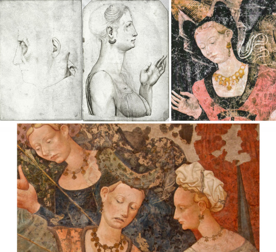
Comparing drawings at the Louvre (top left and top centre) with details of the noble women from Triumph of Death
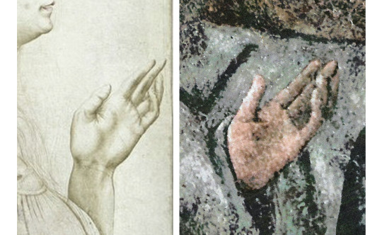
Comparing the similar hand gesture of the drawing of a Lady (left) and a Survivor of Death (right)
To pick out the draughtsmanship is, I believe, to pick up the key that can unlock the mystery of what else this artist did. Over many years of intermittent study I have kept a look-out for any drawings that might be associated with him by virtue of their extreme linear elegance combined with a certain oddity. Among the drawings in the Vallardi Album at the Louvre are a few that are not by Pisanello, and among these is a pair of profiles, one of a mature Lady, the other of an older Man. The one of the Lady is the more developed and the more remarkable, for the fine lines of the hair and the purity of contour in her profile. Compare this drawing with the depiction of the aristocratic ladies in the Trionfo, especially the one seen in profile who likewise wears an eardrop, and I think a definite similarity is observable. It is confirmed when we turn to the raised left hand of the Lady in the drawing. Artists describe hands and their gestures in such interestingly different ways: this one favours two fingers (first and second) straight, two fingers (third and fourth) bent. Anyone who tries to put their own fingers into the same position will soon realise that it is not natural and not sustainable; but there it is, not only in the drawing but in the Trionfo, exactly in one instance, and to varying degrees of bentness in many more. To anyone acquainted with the history of connoisseurship this could be a textbook illustration of Giovanni Morelli’s ‘method’.
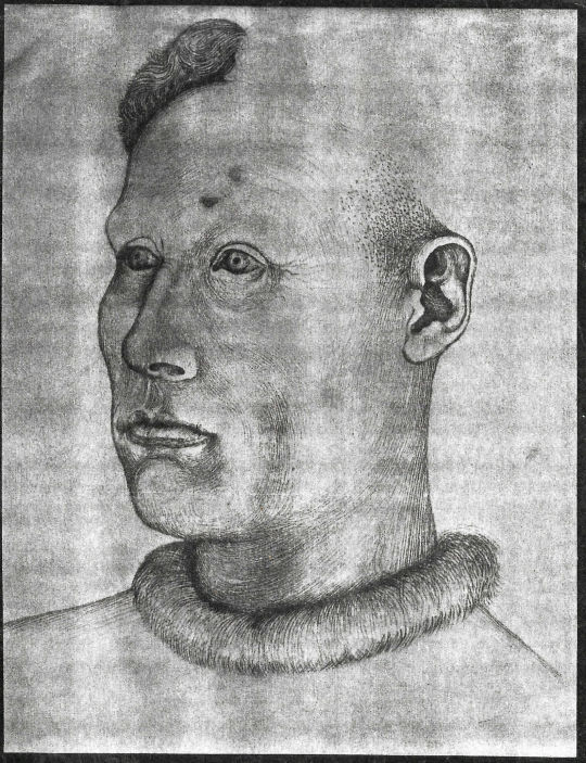
Drawing of a Man with a Fur Collar (Staatliche Graphische Sammlung München)

Comparing the Louvre Drawing (left) and Munich drawing (right) with faces from Triumph
At the Print Room at Munich (Staatliche Graphische Sammlung) there is another drawing, this time of a Man with a Fur Collar seen close-up, his head turned to our left, his neck emerging from a fur collar encircling it. this is not finished, but those fine lines drawn in long parallel strokes that distinguished the tresses of the Lady in the Vallardi Album are also here, along with a very particular shape given to the eye (upper lid and corner nearest to the nose) and to the ear, philtrum> and lips. These features are most clearly matched in the face of the young man on the extreme left of the Trionfo, and that of his companion.
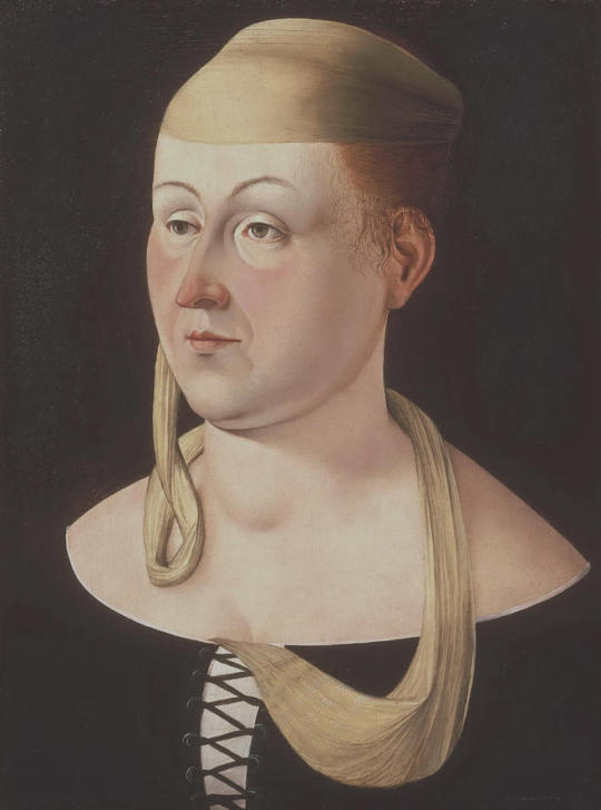
Portrait of a Lady – Johnson Collection, Philadelphia

Comparing the Drawings from the Louvre (Top Left and Bottom Right) and Munich (Bottom Left) with the Painting of the Lady at Washington
At this point in my quest for drawings by the Trionfo Master the trail goes cold. There is, however, a painting in the Johnson Collection at Philadelphia, attributed, unconvincingly in my view, to Ercole de Roberti, which exhibits exactly the eye-shape, ear-shape, lips and philtrum of the Munich drawing, as well as the sharp, rounded eyebrows of the Vallardi Lady and the ear of the Vallardi Man.The Johnson painting has morphological similarities with the Trionfo, but it seems to belong to a later period, and there is reason for thinking that it does. It may indeed be the link between the Trionfo and a whole body of much later work by this artist, not in Sicily but in Ferrara.

Comparing faces with fresco in Palazzo di Schifanoia of Virgo recumbant with her Decani (bottom panels)
In the Salone dei Mesi of the Palazzo di Schifanoia in Ferrara it is possible to distinguish fairly clearly the work of Francesco del Cossa, but there is another artist, credited with many of the Months whose identity has always puzzled art historians. He has been called the ‘Maestro di Ercole’ or the ‘Maestro degli Occhi Spalancati’, but these names have not led to much development of an oeuvre for an artist of such weird imagination and invention, a man capable, as Cossa was not, of creating extraordinary images like the figure of Virgo, for August, the giant lobster, for June, or the sign of Libra, for September.
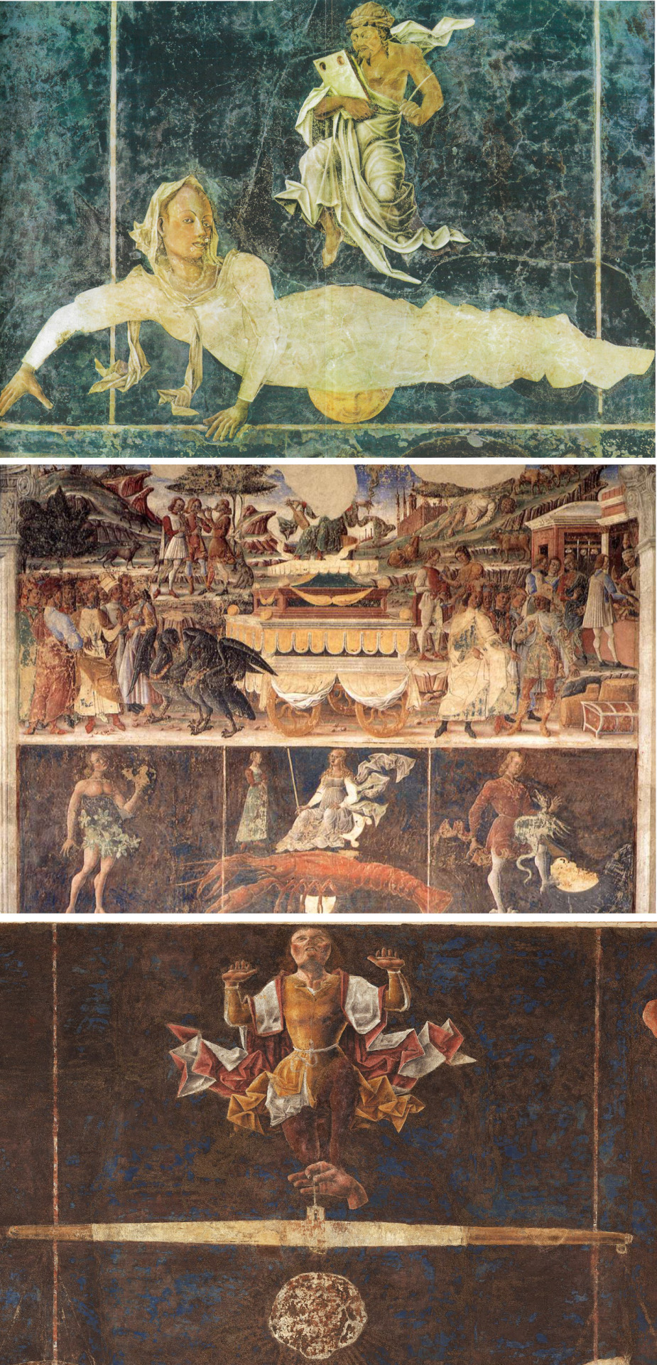
Scenes from the Fresco at Palazzo Schifanoia: Virgo in the Allegory of August (top); The Lobster from the Allegory of June (centre); Libra from the Allegory of September (bottom)
From Palazzo Sclafani to Palazzo Schifanoia is not only a leap of geography; there must also be a gap of many years, perhaps a quarter of a century. It is frustrating and unsatisfactory that there is, as yet, so little to fill that gap. I do believe, nevertheless, that Palermo and Ferrara are connected in the career of this painter. The argument depends as always on a juxtaposition such as this one: the Munich drawing, the Johnson portrait, the heads of Virgo.
Detail of Virgo (top left) to compare with the Lady in Philadelphia (top centre) and the Man in Munich (top right), and comparisons of the horse from Triumph of Death (bottom left) and horses from the Allegory of March (bottom right)
From August we can move to other Months in the astrological zodiac, and discover that the eccentricity manifest at Palermo has not deserted this artist, but it has changed. In the many years that have elapsed he has developed, for example, a bizarre way of representing drapery – like sharply creased paper folded one way and then another – and rocks – like laminated tombstones. Despite the lapse of years there is a horse’s head whose structure can still remind us of the one at Palermo.
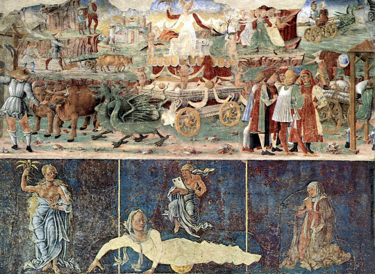
The Allegory of August, Triumph of Ceres and representation of Virgo – Palazzo Schifanoia

The Allegory of September (top) and detail of Mars in bed with a Nymph (bottom) – Palazzo Schifanoia
There is also a change of theme. The work at Palermo is dominated, very obviously, by Death, his work at Ferrara quite largely by Sex, especially so in August. The bare-breasted figure of Ceres brandishes the reaped corn and then, recumbent, sprawls luxuriously across three divisions while looking out seductively at the spectator. In September Mars is in bed with a nymph, Ylia, and the figure of Libra is set between two figures of a physique reminiscent of male ballet dancers, their calves developed like athletes on Greek pots. Sex, yes, but also, to complete the trinity, War. There is now a definite martial streak to the artist’s imagination, no doubt fuelled by the idea of ‘triumph’ and expressed in images of Mars, Vulcan’s Forge, armour.
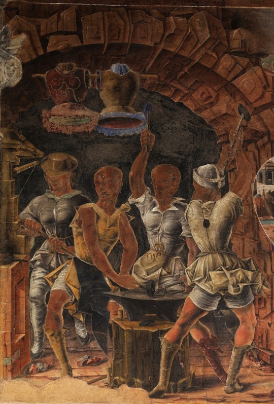
Detail of Vulcan’s Forge from The Allegory of September
His contributions to the Triumph scenes are at least as ill-composed as the Triumph at Palermo, but under them, in the Months, he wisely sets his figures and creatures against plain dark backdrops. We remember them all the better for their standing out pale, even white, against the deep blues and browns. At Palermo this had only begun to happen in the upper left quadrant and behind the horse.
Clearly I and others must look diligently for other works by this artist that will allow us to see how he developed between the two periods of activity and what he was doing before the first one. The drawings that I have proposed as his must belong to the earlier, Palermitan phase of his career, but how did he draw in later years? His name is more likely to be discovered by historians and archivists. I would like him to be a Sicilian – the island has too few major artists besides Antonello da Messina – but I must declare a doubt that he was. We need the evidence in any case to tell us whether he was brought to Palermo from the mainland or was native to the island at the time of the Sclafani commission. Without the facts we are left in ignorance. If the thesis presented here, of a connection between Palermo and Ferrara, should find acceptance, I hope that it will have armed us with a little more understanding of his character as an artist. He has an abundance of character. As painter, as draughtsman, as inventor of images, he appears to be one of the great eccentrics of European art, and one that can speak to us, of life and death and love, in another dark time.

#triumph of death#sicily#italian art#palazzo schifanoia#palazzo sclafani#palermo#studies in connoisseurship#connoisseurship#art history#art secrets
56 notes
·
View notes
Text
Man With A Wine Glass
Among the early French paintings in the Louvre is a fifteenth century portrait of a Man with a Wine Glass
The Man with a Wine Glass – Musée du Louvre
In the past this picture has been associated with Jean Fouquet, but that has never seemed quite right, and its authorship has remained mysterious. Who painted it is intriguing because the portrait is very well painted, the sitter has an unusual, arrestingly memorable face, and, it must be said, there is a charm, especially to Frenchmen, in the depiction of a man who enjoys his glass of red. If not unique, it is certainly a rarity for an artist to include such a thing in a single-image portrait.
In this Shorter Notice I would like to suggest, not a name for either painter or sitter, but the beginnings of an oeuvre into which this attractive painting fits. One can begin, safely enough, with another portrait of a much younger man, formerly in the Liechtenstein Collection at Vaduz and illustrated in Grete Ring’s pioneering A Century of French Painting. The date 1456 is elegantly and helpfully inscribed on the brown background to the face that looks straight into ours.

Portrait of a Young Man – Liechtenstein Museum, Vienna
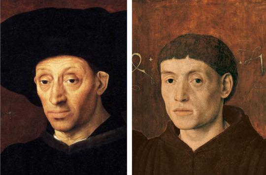
In that face, if we compare it with that of the man with the wine glass, we can see the same physiognomic features, the set of the eyes, the ear, the nostrils, the full lips (especially the lower), the well-pronounced cheekbone and general emphasis on bone structure; we also have the same placing of the left hand, and the same colour scheme of black on brown that provides such undistracted focus for the beautiful modelling of the flesh in face and hands.

The Crucifixion (attrib Simon Marmion) – Philadelphia Museum of Art
From these two items I move on (not necessarily in time) to a Crucifixion panel in the Johnson Collection at Philadelphia. There are so many good things in that collection that one could overlook this, but I think it is a version of its subject that is worth looking at in its own right as well as in relation to the artist we are considering. An impossibly long-legged Christ looks calmly down with half-closed eyes directed at no-one. He is flanked by two groups of three – John, rose-clad, between the two Maries in blue on our left – and on the right three centurions, one of them black-skinned, wearing elaborate headgear and standing on the path in poses that make a pattern against it of legs and feet. All the participants look in different directions, the two groups separated very clearly from Christ on His cross who divides the composition vertically, but about whom a sandy lane winds off towards the city and then continues further into the distance. The flesh of Christ has the pallor of the dawn sky that ascends into a blue that echoes the Virgin’s robe. The city’s towers and spires break the long curve of a hill; crags to the right, trees to the left rise into cumulus at the corners. Skull and bones litter the foreground at the foot of the Cross. Chromatically light and roseate, the picture is both spacious and economically organised. There is a refinement and elegance in it, wherever one looks.
All very well, but what is the connection with the two male portraits? It is not, I concede, immediately apparent. One needs a close-up of the group of men, and then a close look at the heads of the two white-skinned ones.
Detail from The Crucifixion
Here one begins to see the particular combination of features already listed as shared by the two portraits: the long nose of the man facing us and the long nose of the man with the wine glass; in both a full lower lip, high cheekbones, springing eyebrows, fleshy ear. then there is the juxtaposition of black and brown on the legs of the facing man, the legs and boots of the middle man, the legs, grieve and shield of the black man. Recalling the calligraphy of the 1456, we can find a lot of very fine lines, white or gold, of a comparable thinness in the superficial decorations of the mens’ accoutrements. Note also the position of the middle man’s fingers on the hilt of his lance and the careful painting of the fingernails there and in the hand of the other man pointing downward. It is the presence of all these features together that is telling, rather than any one on its own.

(Left) Unknown Artist – Musée des Beaux-Arts, Rennes ; (Right) 1456 Portrait
At Rennes in France there is a drawing that links with all three works so far discussed. The full lips are there, the shape of the eyes, the fanciful headgear.
As I hope to explain, there are reasons for thinking that the works cited above – the Johnson Crucifixion, the two male portraits and the drawing at Rennes – are all later works by the artist. What I take to be earlier work throws up the common challenge for connoisseurs in the simple fact that artists develop, so their style is not totally consistent. To ‘allow for development’ is to recognise a lapse of time, often difficult to gauge, in which changes are occurring though there are still tendencies suggesting that the same hand is at work. Conversely, their absence would lead one to think that another artist is responsible.

Crucifixion of St Peter (left) and St Anthony with Donatrix (right) both Metropolitan Museum of Art, New York
Here, then, is a pair of pictures in the Metropolitan Museum of Art in New York : a Crucifixion of Saint Peter, and a scene with Saint Antony, the first with a male donor kneeling, the second with a female one at a prie-dieu. Looking at the head of the male donor, we may not at once see a connection with the young man of ‘1456’, but on closer acquaintance the commonality of features does become clearer and one sees that by that date the artist had become much more assured while remaining fundamentally the same. It is no accident that the position of the booted legs and feet of the man to the right of Saint Peter should be the very same pose adopted by the middle of the three men to right of the Johnson Crucifixion.
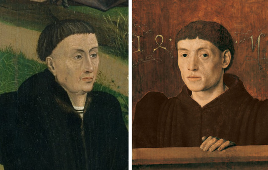
Detail of Donor from the Crucifixion of St Peter (left) and 1456 portrait (right)

Details from the Crucifixion (left) and The Crucifixion of St Peter with a Donor (right) showing the same stance
Looking first at the faces of the male and female donors and that of the man on the left of the group behind Saint Peter, and then at the gestures and digital disposition of the hands in both panels, I am reminded of the photo of a probably lost Portrait of a Woman with one hand to her breast and the other, unusually, fingering fruit in a bowl (illustrated below). If this picture is untraceable, at least its unforgettable image survives. How well it would hang beside the Man with the Wine Glass; the Woman with the Fruit Bowl!
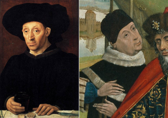
Man with a Wine Glass and detail from the Crucifixion of St Peter
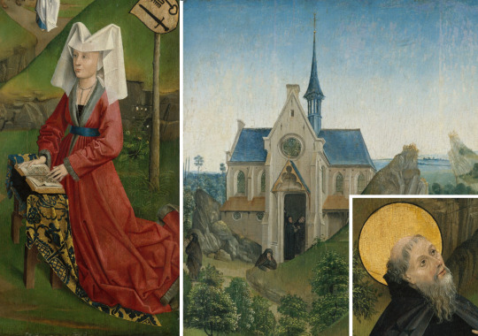
Details from St Anthony with a Donatrix
Connoisseurship is always going to be work in progress, subject to addition and subtraction, modification and correction, but I hope that the assemblage above is sufficient, and sufficiently right, to suggest a painter who was not Fouquet but almost certainly French, his long low hills perhaps indicating a northern origin, Normandy or Picardy..Call him a petit maitre if you will – he was not in Fouquet’s league – but he was a painter with a distinct vision served by considerable talent. He had a notably refined line and a particular palette; he could compose groups in ample spaces; he had a strong grasp of the bone structure in a face, a penchant for still life (wine glass, bowl of fruit), an almost foppish love of costume accessories, a delight in wild flowers and grasses.These are all attractive qualities. The Johnson Crucifixion is a fine work that could be better known. However, in the end one comes back to the most endearing work of his, the Man with a Wine Glass. In that age of great portraits it holds its own.
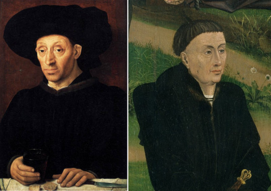
#art history#connoisseurship#jean fouquet#1456#Louvre#15th century#anonymous artists#art mysteries#man with a wine glass
0 notes
Text
Balkanising Bellini – part one
Quests in connoisseurship begin most usefully with the juxtaposition of a painting and a drawing. Here is such a juxtaposition: the famous portrait, labelled IOANNES BELLINUS, Giovanni Bellini, depicting the Doge of Venice, Leonardo Loredano, in the London National Gallery; and next to it, a portrait drawing of an Unknown Man, ascribed to the Venetian School, in the museum at Besançon.

Portrait of Doge Loredano (National Gallery London) ; Unknown Man (Musée des Beaux-Arts Besançon)
To my eye it is a certainty that the same artist was responsible for these two items. What the above pairing establishes is that he was an artist with characteristics equally visible in his painting and his drawing. In either case we can observe the long sealed mouth with a thin upper lip, noticing how it ends on each side with a bracket-like crease. We can consider the modelling of the upper, bonier part of the nose, shadowed on its right flank, and move on to the eyes, each with an upper and lower lid forming two parts of a convex cover that has opened so far and could close and seal up the eye itself. This convex form, the eye and its lids, is set deep within the concave socket described by the eyebrow above, the embankment of the nose, the cheekbone, and the bone where the temple comes down at the eye’s edge and the ‘crow’s feet’ lines appear in sitters of this age.
What is most apparent, and most to be emphasised, is the manner in which the skin, modelled in light and dark, is drawn tightly over a fine bone structure. In the painting there is particularly strong lighting round the cheekbone and temple, but in both the drawing and the painting we apprehend immediately where the hard bone is; we feel that we could tap, and hear, the chin, the cheekbones, the top of the nose and the temple of each man. A bonus of such modelling is the beautiful profile to the edge of the face: the taut line from the forehead in towards the eye, out to the cheekbone, in again at the level of the mouth, and out again for the last time before shelving in towards the chin.
With all this tight clothing of flesh over bone goes a distinctive expression: a calm, steady appraisal by someone who holds himself erect and still, whose lips are sealed but whose eyes are open, surveying us and the world with a judicious gaze reflecting, one infers, a mind not swayed by recklessness or sudden passion. In both cases the line that runs down the middle of the face, through nose, philtrum and chin, continues to descend, below the neck, in the line of the dogal toggles and in the stronger edge of the Besancon man’s lapel. These men are anchored.
The man in the drawing appears to be the same as the subject of a portrait once in the Marchwood collection at Ashford in Kent, that Bernard Berenson ascribed to Lotto.

Unknown Man ; Portrait of a Venetian Dignitary (Marchwood poss Charnwood Collection, Kent)
What, if anything, could we now add to this pair, and be similarly sure of the same hand being at work?
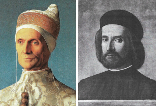
Doge Loredano (National Gallery London ; Portrait of a Man in a Beret (Goudstikker Collection Rotterdam)
At Rotterdam, from the Goudstikker collection, comes a fine portrait of a younger-looking man wearing a beret. He has a lot of hair on and around a face that bears an expression similar to that of the Doge and the man in the Besancon drawing. As he looks at me with that calm, appraising eye, I feel no doubt that he was the product of the same hand. Particularly interesting, however, is the resemblance of this face to that of another man in a beret, the one whose head we see behind the standing figure of Saint Mark Preaching in the painting of that title in the Brera Gallery at Milan. This is an extremely helpful connection because it leads us away from single heads, painted and drawn, to a big crowd scene that is full of heads, and therefore a valuable source of comparisons as we proceed.
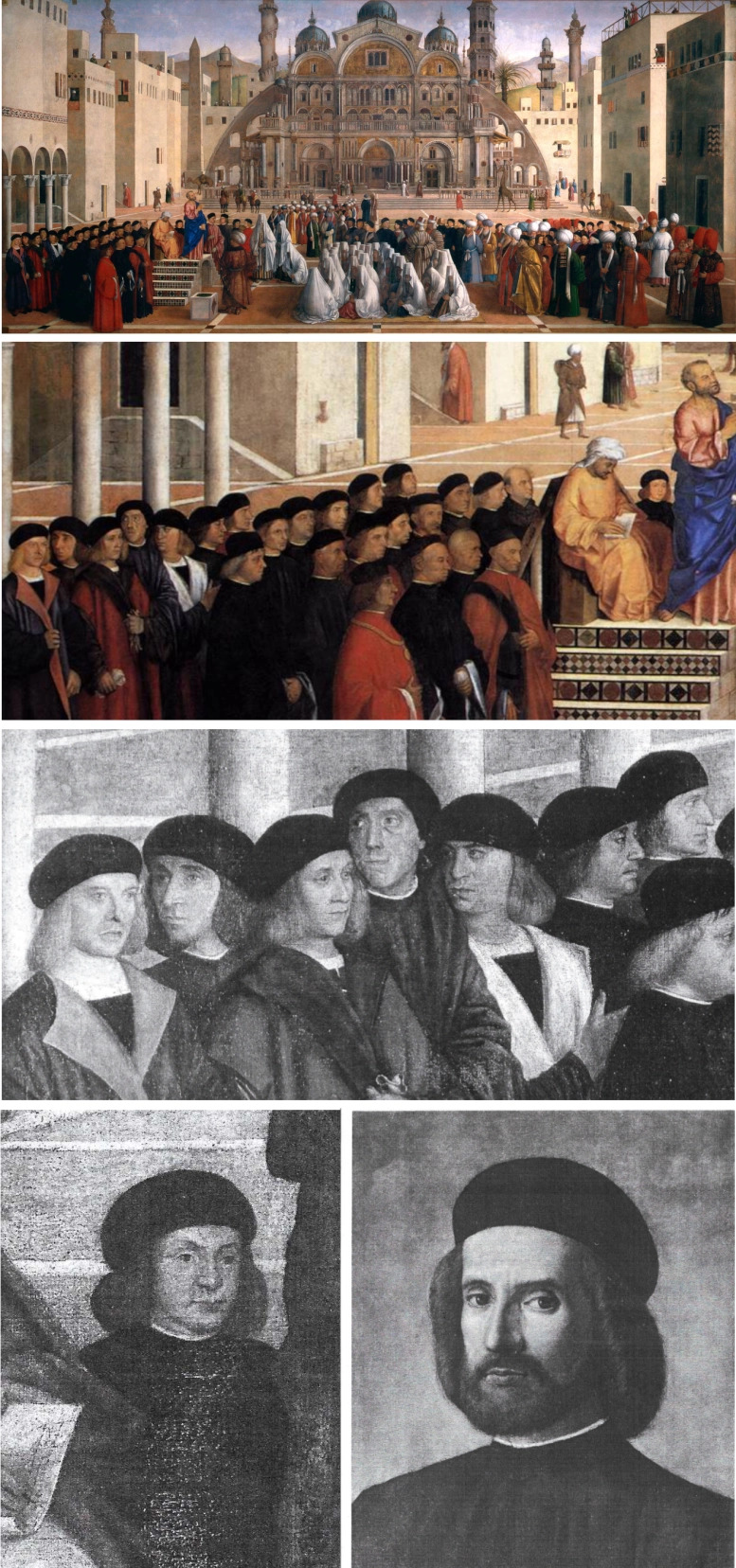
Top – St Mark Preaching ‘Predica di San Marco’ (Breara Milan) ; Centre and Bottom Left – Details from St Mark Preaching ; Bottom Right – Portrait of a Man in a Beret (Goudstikker Collection)
If we turn to the far left of the Brera picture, we find among the ranks of men in berets some who might have sat for the artist singly. In Berlin there is a drawing of a man looking three-quarters to our right. His nose is similar to that of a monk, in a painting from the Houston-Boswell collection in London, and formerly at San Diego, California (since sold), is a painted portrait of a man seen above a parapet with a background of sky and clouds.

Clockwise from Top: Detail from St Mark Preaching ; Portrait of Paolo Morisini (ex-San DIego) ; Portrait of a Monk (Private Collection) ; Portrait of a Man (Kupferstichkabinett Berlin)
Over on the right of the Saint Mark Preaching we see bearded Turkish elders in tall ‘busby’ hats, one of them wearing a robe with a pattern broadly comparable with what we see in the Loredano portrait. These conversing men call to mind a drawing, Three Turks, at Windsor. That drawing is related to a group at the left of another ceremonial scene, the Reception of the Venetian Ambassadors at Cairo. The character of the drawing and the structure of the faces are all of a piece with what we have already discussed.

Top Left: Three Mamluk Dignitaries (Royal Collection Windsor) ; Top Right, Centre Right: Details from St Mark Preaching ; Bottom: Detail from The Reception of the Ventian Ambassadors at Damascus or Cairo (Louvre)
We are starting to see connections between the Loredan portrait, various individual male portraits and portrait drawings, and at least one large crowd scene containing numerous other male portraits. The Saint Mark Preaching is said to have been finished by Giovanni at the request of his brother, Gentile Bellini. Are we entitled to conclude that Gentile, having painted (with or without help all the architecture at the back and sides of the Square, and thus set the stage, left his brother to put in the crowds that form such a distinct and stylistically coherent band across the lowest third of the picture? This is what our links with figures in that band begins to suggest. An oeuvre is building here that seems to connect with Giovanni Bellini, yet not at all with many famous pictures that bear his name in books and on gallery walls. Nothing, so far, indicates that we are looking at the work of the painter of The Madonna of the Meadows, for example, or the (different) painter of The Agony in the Garden; both of those paintings hang near the Loredan portrait, and both are assigned, like it, to Giovanni Bellini.

Clockwise from Top Left: Doge Loredano ; Madonna del Prato (National Gallery London) ; Agony in the Garden (National Gallery London)
Looking again at the Loredan portrait, at the modelling around the eyes, the lined temple, the general structure of the face, I think of a Madonna and Child with Saint Jerome in the Castelvecchio Museum in Verona, in particular the head of Saint Jerome, but also in the face of the Virgin: the same strongly hooded eyes of the Doge either side of a straight, narrow nose, and a definite chin. I see, in the naked body of the Christchild, that tight covering of flesh over bone; and in the brocade backdrop the large pattern now familiar from the Loredan portrait and certain robes in Saint Mark Preaching.

Juxtaposition from Top – Madonna and Child with St Jerome (Castelvecchio Verona) ; Centre – Pencil Drawing of the Madonna (Mueller Sale Amsterdam 1929) and Detail of the Madonna and St Jerome ; Bottom – Doge Loredano and Detail of St Jerome

Portrait of Doge Loredano with Venetian Lagoon (possibly since restored)
I detect our master’s hand, not Mansueti’s, in this picture, and I see no ‘Florentine master’s hand, but his Venetian one in a drawing for a Madonna’s head – so like the Verona one – sold by Mueller in Amsterdam (21 Nov. 1929, Lot18) which has a sketch for a Christchild’s leg, lower left, all in a style compatible with the other drawings we have considered.
From that drawing and that Verona painting we can move to another painting – again, alas, only known from a Sale catalogue – a Portrait of a Lady in a Rich Dress. The facial type in this portrait (Medlycott Sale, Sotheby, London 3 July 1929, Lot 27) is that of the Madonna, but note should be taken also of the pattern across her bust which is closely paralleled in the horned cap of both Doge Loredano and Doge Mocenigo, the latter as seen in profile in a portrait from the Howard Young Galleries in New York and another Loredan (now definitely an old man) in a painting sadly destroyed by fire at Dresden in 1945. Set beside the latter a drawing in the Uffizi, and one can see what time does to a face. Compare at this point the nose of Mocenigo and that of an Unknown man in a drawing at the Uffizi. Compare also the head of Saint Peter in a panel ascribed to Giovanni da Udine at a Berlin sale (Kaufmann, 4 Dec 1917) with that of London’s Loredano; and thirdly, the head behind St Peter with the head of the Lady in a Rich Dress.

Clockwise from Top Left: Portrait of a Lady in a Rich Dress (Sothebys 1929) ; Head of a Man (Uffizi) ; Saint Peter with John the Evangelist and St Paul (last sold Berlin 1917) ; Doge Giovanni Mocenigo (Frick Collection New York) ; Doge Mocenigo (last sold Howard Young Galleries New York)
Returning to the Verona painting, but with a focus on the Child I see a connection with a Crucifixion panel from a Florentine collection (Count Niccolini da Canugliano). This work has the blue-white-bronze palette characteristic of the artist; but in the figure of Christ there is the same spare physique as the Child has, considerably elongated but with no fat on it, the flesh stretched over the skeleton in that rather Ghiberti-like manner of modelling. Something of this recurs in another Crucifixion in the Corsini gallery at Florence and in a Christ in the Tomb at Stockholm.
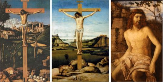
Crucifixion (Palazzo degli Alberti Prato) ; Crucifixion (Corsini Collection Florence) ; Christ Crowned with Thorns (National Museum Stockholm)
A drawing that I have omitted, in the Louvre, is relevant at this point. It shows a Saint in the habit of a monk, holding a tall slender cross in his right hand. Comparison should be made with the Windsor drawing of the three men conferring: the strong black-to-white transition from one side of the cheek-bone to the other, and from the lit to the shadowed side of a fold, links these and other drawings and paintings by this artist. Note also how he favours a tall figure – here emphasised by being seen sotto in su – and the tall stem of the cross, tall as the cross, and the figure on it in his Crucifixions. The Louvre Saint is – and here comes the climax of our investigations – the type of St Francis in what is perhaps the artist’s surviving masterpiece, the great Saint Francis in Ecstasy in the Frick Collection in New York.
Clockwise from Top Left: St Francis in the Desert (Frick Collection) ; St Francis (Louvre) ; Background detail from St Francis in the Desert ; Doge Loredano
The Frick Saint Francis returns us to London in the sense that, for all its complicated organisation, it is built in the same chromatic range (present also in the Niccolini Crucifixion), the colour-scheme of a golden autumnal landscape of brown earth and pale rock, that has not seen rain for many days but been baked under a blue sky. Here it is the flesh of the Earth itself that is stretched tight over rock, and the rock, showing through it, is as hard as the cheekbone or temple or chin of the Doge. Here ecstasy is not ecstatic in any outward show; a vision of the world is seen out of an eye deep-set in its cavern, a socket in the rock and bone of the earth. It is a vision, but one of creatures like the Saint living at the base of a far taller world, tall as the sky.
Clockwise from Top Left: St Jerome Reading in the Countryside (National Gallery London) ; St Jerome Reading in the Countryside (National Gallery Washington) ; St Jerome with Stone and Crucifix also attrib Cima da Conegliano (Kress Washington) ; St Jerome Reading (Berlin Print Rooms) ; St Jerome Reading (Ashmolean Museum Oxford)
The colour-scheme and the bare-rock landscape that we see in the Frick Saint Francis are evident in several versions of Saint Jerome Reading, notably the one in Washington’s National Gallery and another in London’s. The consistent adoption of this blue-bronze palette does seem to be a defining factor in distinguishing this artist from others labelled as ‘Bellini’.
Left to Right: Head of a Man (Uffizi) ; Doge Loredano (M.H. de Young Museum San Francisco) ; Doge Loredano (National Gallery London)
Our artist would appear to be the official painter of the Doge, and Leonardo Loredano is portrayed again, much older, more gaunt, in a panel at the M. H. de Young Memorial Museum in San Francisco. The burnt brown colouring, relieved only by a creamy white, is expressively autumnal and sad.
We can begin to imagine that for the artist as well as for us Leonardo Loredano was more than an individual with unique facial features. In London his head, chest and shoulders rest on a parapet, like a bust on a marble shelf; as such he is an icon (much as a Madonna is), – yes a, not the – but an icon, I suggest, of Good Government. In reality the Doge of Venice did not have much power, but what is historically true seems of little relevance in front of this image. I could be told that he was a weak and ineffectual head of state, I could even be told that he was a cruel tyrant, and my reaction to the portrait would not change, because the effect of it is to remind us that, for all the evidence of misgovernance in so many parts of our own world, the possibility of good governance is still with us, as it was in the time of the artist. And there is the face of it: shrewd, wise, calm, just. Ambrogio Lorenzetti had found his own, allegorical, way to depict Good Government for the city of Siena. Giovanni Bellini did it another way for his, by portraying a ruler who just looks as if he would act wisely.
The above remarks prompt an interesting question: what difference would it make to our response if we were presented with Loredano’s head only? The answer must surely be that in this special case – a portrait of a ruler – we would lose a sense of the head ruling over the body, not just personally but politically. A bust gives us convergence from two sides as we follow the majestic line of the shoulders going upwards to the neck and the head. This is the Venetians looking upwards to their Head of State, a fount of authority that flows back down again, as down the neck of a flask, except that the flow is cut off by the barrier of the parapet; the people are kept at a distance, the very dignity of his position removes him from them – as indeed it did. A pictorial convention much favoured in the Bellini workshop for Virgin and Child pictures and portraits of lesser mortals has, in this case, a particular expressive connotation.
We are left with the cartellino, the same lettering on the Frick Saint Francis as on the Doge Loredano in London.
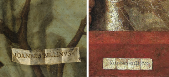
Cartellino details from Saint Francis in the Desert (Left) and Doge Loredano (Right)
If we are to believe that Gentile got his brother to finish the Saint Mark Preaching, then it follows from my connoisseurship argument and its trail of comparisons that the Doge Loredano in the National Gallery is an authentic work by Giovanni Bellini. The point that I wanted to make in calling this essay Balkanising Bellini – Part One was to suggest that not all the works with ‘Bellini’ labels, whether painted into the images or affixed beside them on gallery walls, are by Giovanni. It will need future Studies to demonstrate this, but if we agree to say that Giovanni is the author of the Loredan portrait, we have to question, and sooner or later deny, his authorship of many other paintings and drawings attributed to him, including most, if not all, the ‘Bellini’s in the London National Gallery. The corpus of all attributions to Giovanni Bellini (as to Rogier van der Weyden) is in reality no corpus, no coherent body of work, at all; it is a very unsatisfactory miscellany, a territory, as it were, that needs to be split up into separate states, each with the sort of identity that unites, I now think, this Loredan Master’s output.
Scholars accept that there was a workshop system, and they know a lot more about it than I do; but when they come to the task of attributing works, they are often affected by the ‘famous name syndrome’ that is rife among curators. The label ‘Giovanni Bellini’ becomes as prestigious for the modern museum as it was for the original Venetian clientele. It is known intellectually, but forgotten in practice, that ‘Giovanni Bellini’ means a firm named after the head of it, an individual called Giovanni Bellini, of the Bellini family, who worked in the shop alongside an unknown number of other artists. The commissions came in, work was allocated, in whole or in part, to this artist or that artist, and when the work was finished, it went out, duly labelled with the name of the firm.
The connoisseur – this one anyway – is understandably daunted by the huge task of sorting out the different hands responsible for these ‘Bellini’ products, but it needs to be undertaken if we are not to live with confusion and misapprehension. Pictures labelled with a name will have to be replaced with no name, an anonymous master of extant work that nevertheless has some stylistic coherence. I chose the Loredan portrait as a starting point because I admire it. Perhaps it really was painted by Giovanni Bellini and the label tells the truth; but if so, I have only begun a ‘balkanising’, distributive process that must go on and do justice to all the other excellent artists who worked in Bellini’s shop and whose artistic identity has been so long subsumed under his name.
2 notes
·
View notes
Text
Leonardo : The Benois Madonna
In my Study, Leonardo: a Radical Suggestion, I cast doubt on the attribution to him of four major works regularly included in the canon of his painted oeuvre. In this Shorter Notice I want to cast doubt on another painting nearly always considered to be authentic Leonardo: the Benois Madonna in the Hermitage Museum in St Petersburg.
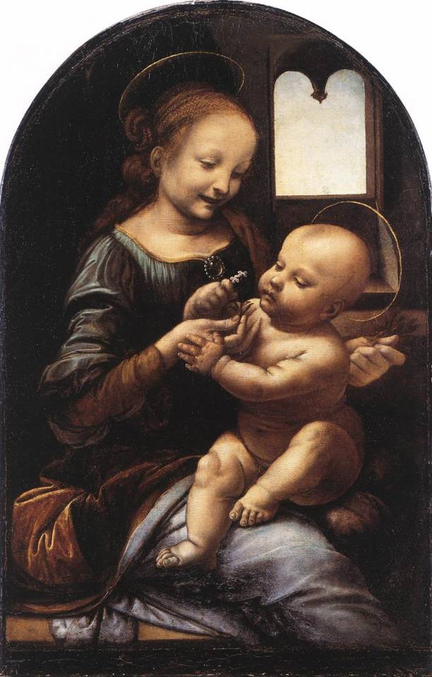
The Benois Madonna (Hermitage Museum, St Petersburg)
This picture has a deceptively Leonardesque feel to it, but I began to be undeceived when I came across an engraving of the composition in reverse. A reproduction of this engraving lies among the Leonardo files at the Witt Library at Somerset House, the invaluable archive that no British connoisseur can easily do without.

Engraving by Jean-Baptiste Mauzaisse from the collection of Baron Vivant Denon. Possibly 1829
The engraving, by a Frenchman, Mauzaisse, is subscribed as after a painting by Boltraffio, an attribution we can ignore. What is interesting here is the head of the Madonna: it is subtly different from that of the painted head of her as it now is, but strikingly similar to that of a drawing given to Verrocchio, in the British Museum Print Room.

Left to Right: The Benois Madonna; Engraving by Mauzaisse, Head of a Woman with Braided Hair by Verrocchio (British Museum)
That drawn head, clearly not by Leonardo, is most closely related to the head of the Virgin Enthroned, in the grandly spacious altarpiece sometimes called the ‘Madonna di Piazza’ in the cathedral at Pistoia, and to the head of the Virgin in a Verrocchio painting at the National Gallery in London, the Virgin and Child with Two Angels. Note the cupid-bow lips and weak eyebrows that everywhere characterise Verrocchio’s women.

Top Left: "Madonna di Piazza' (Pistoia) Top Right: Virgin and Child with Two Angels (National Gallery London) both Verrocchio. Details of the lips and eyes characteristic of Verrocchio
Turning from the head of the Virgin in the Benois Madonna to the naked Christchild, we find the above connections reinforced by a drawing, very much in Verrocchio’s style, from a Polish collection

Drawing of the Christchild from a Polish Collection (Can someone tell me where?)
This Child is not exactly in the pose of the Benois Child, but He is very similar in bodily type.
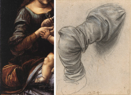
Detail of the sleeve from the Benois Madonna and a drawing by Leonardo - study of drapery for the arm of St Peter (Royal Collection Windsor)
It is agreed that the Benois Madonna has been much tampered with in the past, and one of the alterations is suggested by the brushwork on the sleeve and further down in the folds of the brown lining of the blue mantle. This is distinctly like Leonardo’s highlighting of folds, as in this drawing from Windsor. The present colour scheme of the Benois Madonna is puzzling, not particularly reflecting the palette of either Verrocchio or Leonardo. As for the window with the featureless sky, it seems surprising that Leonardo would resist the temptation to include some distant mountains, even if that meant having the window lower down.
The Benois Madonna will probably remain a bone of contention among scholars, but my hunch, as a connoisseur, is that Verrocchio painted it originally, but that Leonardo, here and there, added touches of his own. What others have done to it in the centuries following is for conservators to work out. There is much else regarding Verrocchio for connoisseurship to clarify; the Benois painting is only an outlying problem within his oeuvre. What it illustrates, from an aesthetic point of view is the often unsatisfactory nature of a hybrid work involving more than one artist, even when those are of the calibre of Verrocchio and Leonardo.
0 notes
Text
Leonardo - A Radical Suggestion
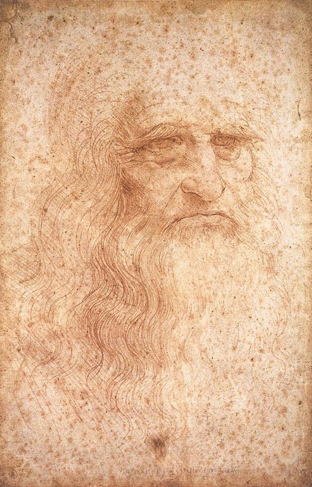
1 : INTRODUCTION
For those of us who operate in the Arts and not the Sciences, what is the difference, I wonder, between a hypothesis and a thesis? If both are based on research, is it mostly a degree of conviction? What begins as one can turn into the other. For my part, as I will set out in this essay, what began as an inkling regarding certain pictures ‘by Leonardo’ is now a genuine conviction which has become nailed to a Lutheran door, as it were, as an article of faith. There is something risky about it, it is provocative, radical in fact and will doubtless be considered heretical by those with a settled opposing view. My proposal is this: I believe that four paintings which currently bear the ‘Leonardo’ attribution are not by Leonardo, but the works of two other artists: three by Ambrogio de Predis and a fourth by an unknown hand. I will demonstrate how, using methods of connoisseurship, it is possible to discern the techniques of these other artists in the paintings whilst also offering comparisons to genuine works by Leonardo. I will be looking at the following paintings (left to right): The Virgin of the Rocks (National Gallery London), Ginevra de Benci (National Gallery Washington), Portrait of a Musician (Ambrosiana, Milan) and Lady with the Ermine (presently at Wawel Museum Krakow)
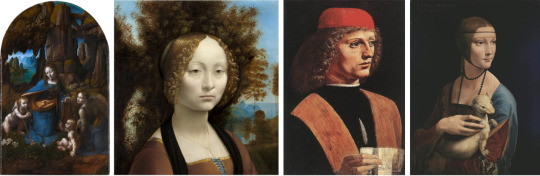
Opinions such as these are likely to provoke outrage quickly turning to contemptuous dismissal, especially among the curators of the galleries concerned. The National Gallery in London, for example, despite already owning the genuine Leonardo Cartoon of the Virgin and Child with St Anne – a drawing, albeit a large one – has placed a great deal of significance in its claim to owning an important painting by the same. Similarly, the National Gallery in Washington has accepted its Ginevra de’ Benci as authentic Leonardo for so long, it has appeared in so many books on him and been seen as his by so many gallery visitors, that any suggestion to the contrary is likely to be dismissed as weird or ridiculous. The portrait of the Lady with the Ermine at Krakow is so confidently ascribed to Leonardo that she even became the poster-girl for the 2011 Leonardo exhibition in London.
In view of this expected hostility I feel it prudent to revert to the more tentative position of having a hypothesis or hunch, a voice that says ‘Suppose that this is the case, what are the arguments for it, what is the visual evidence?’ Hence the title of this Study: a supposition or ‘radical suggestion’.
Before looking in detail at pictures and drawings it is helpful to reconsider what kind of a man Leonardo was. What impression do we gain from all his drawings and notebooks, the records of his thinking? Surely it is of a person of immense curiosity. Mentally he was always moving on, investigating the forms and mechanisms of life, inventing solutions to problems, addicted to exploring the variety, complexity and sheer beauty of anything he encountered. There was, however, a synthetic aspect to his imagination as well as the analytic one, and every now and again he turned to painting and through it gave expression to that poetic rather than scientific side of his nature. This switch occurred at intervals in a life otherwise devoted to description, analysis and problem-solving. Hardly a day passed, one imagines, without him drawing and making notes, but months, even years may have passed in which he was not painting, though a painting awaited his return to it. Even without the subtractions I would make, what has survived of his painted oeuvre is small relative to that of any other major artist one can think of. Painting was not a constant preoccupation of his life, though he took its practice seriously and was interested in its status vis-a-vis other arts.
I : LONDON AND PARIS
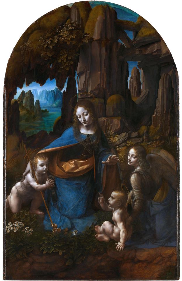
The Virgin among the Rocks - National Gallery London
Given all this, what are we to make of the proposition that Leonardo made a large-scale copy of one of his own works? How likely is it that such a restless mind would allow itself to be detained for as long as it would take to paint a huge version of a composition which he had earlier completed and from which he had mentally moved on? Even if some circumstance had forced this on him, would he not have taken the opportunity to make revisions of the composition far more radical than we see? Beethoven at the piano was inspired and inventive: when he took his hands off the keyboard and a lady exclaimed that she would never hear such a thing again, he replied, so the story goes, ‘oh yes you can, madam’ and started off again, yet not repeating himself but inventing along the way because he could not help doing so. The same is surely true of Leonardo, witness the profusion of compositional ideas scattered through his drawings.
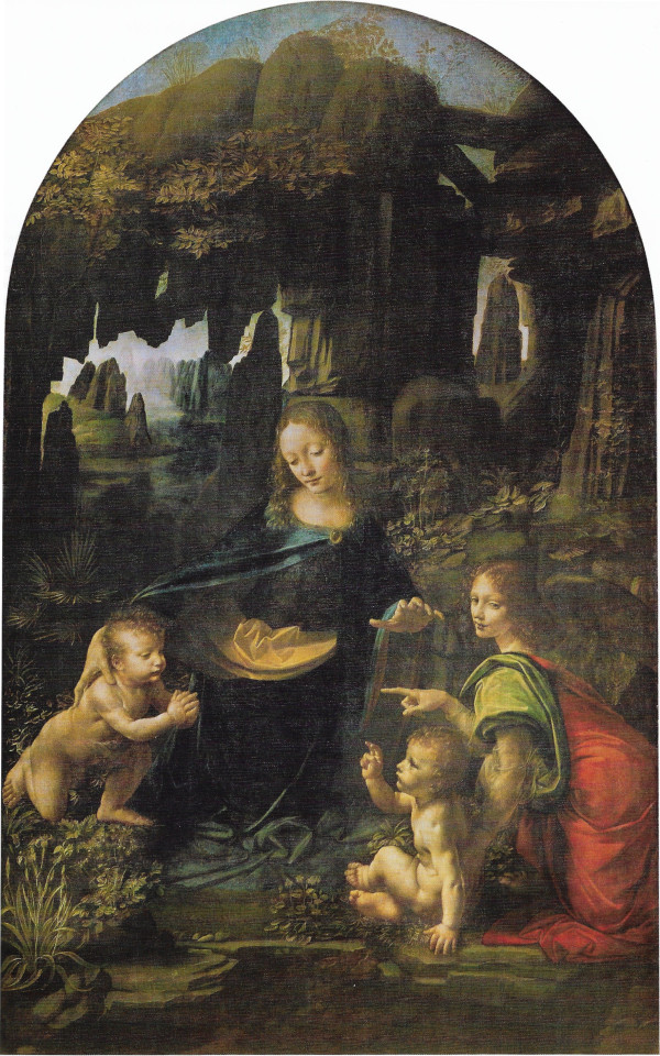
The Virgin among the Rocks - Musée du Louvre Paris
The Louvre Virgin among the Rocks is authentic Leonardo, I have no doubt. The forms of the figures, the shape of their faces, the drawing-related observation of plants and rocks, the suggestiveness of the cavernous environment, and the warmth of the palette, are all entirely characteristic of him.
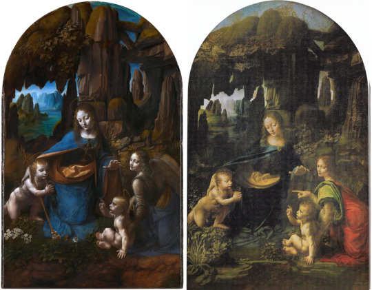
The Virgin among the Rocks - London (left) and Paris (right)
It is the status of the London version that one has to question. The composition is broadly the same, but the colour scheme is colder and bluer, the handling of paint heavier and more prosaic, the atmosphere sepulchrally chilly.

Detail of the Virgin’s head in both paintings
One of the differences between the Paris and London pictures is the lighting which affects, of course, the colouring. In Paris we have a light reminiscent of evening, the western sun to our left; faces, hands and naked bodies glow with a golden warmth. The arm of the infant Saint John, pressing for balance on a ledge of rock, is like an arm in Caravaggio, lit dramatically with warm shadow. Despite the cold, damp, uncomfortable setting, there is the residual warmth of a day, embers of a fire that the angel’s red cloak under the greenish-grey mantle keeps alive. In London we have a lighting closer to moonlight, colder, whiter and bluer; the faces and bodies are illuminated more emphatically but less subtly. This relative heaviness and simplification does not suggest Leonardo but is characteristic of Ambrogio.

Colder blues in London, warmer lights cast in Paris
The circuitry - like a cat’s cradle - of hand gestures and eye focus that depends, in the Paris picture, on the Virgin’s left hand being poised above the angel’s pointing one, is broken in London by the latter’s omission; it is earthed instead by the long diagonal of the Christ-child’s cross. Something important is being left out and the resulting void is a central darkness that engulfs the raised hand of Saint John. Similarly, the beautiful iris and fern at lower left in Paris are replaced by less complicated flora not based, as Leonardo’s are, on drawn observation.
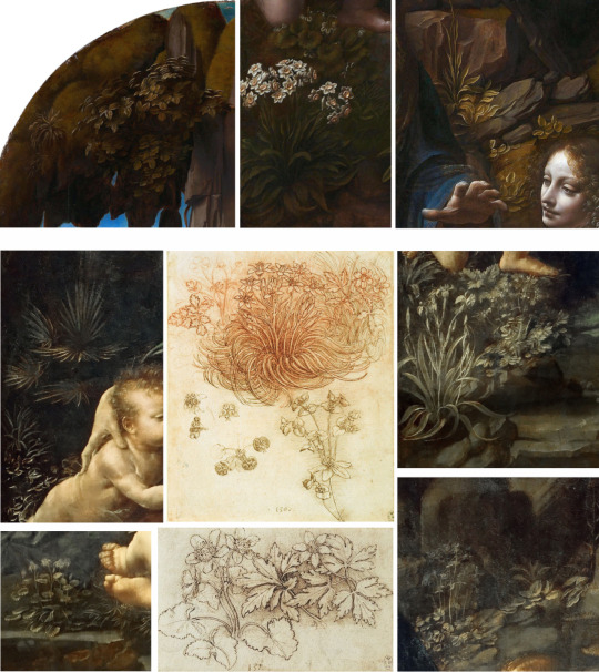
Top row - simplified plants featured in London painting; Centre - Leonardo’s studies of plants; Either side - more accurately observed plants featured in Paris painting
In London the rocks seem heavier and more depressive on the figures because they continue to the top and omit the arching of rock against sky which in Paris reinforces the Virgin’s ‘misericordia’ gesture as she puts her right arm round the head of her Son. The highlight in the gold mantle under her blue robe has a more complicated and spirited calligraphy in Paris and is omitted altogether where it appears in the Paris angel’s shoulder-wrap.
Leonardo’s eye for capturing the highlights and shadows of draped fabrics, clockwise from top left: Three drapery studies; Angel’s robe in Paris ‘Rocks’; Virgin’s hem in Paris ‘Rocks’; Madonna of the Carnation (Alte Pinakothek); detail from Mona Lisa (Musée du Louvre)
A theme in these Studies, and one of the insights that connoisseurship constantly throws up, is that how an artist draws will often if not always be reflected in how that artist paints; pencil and brush are used in similar ways. If, as I suggested earlier, Leonardo drew every day, it is very likely that when he painted, especially when he used a fine brush for more detailed final delineations, of plant stems or the highlights on sleeve-folds for example, we will see a resemblance between his mark-making with a brush and his mark-making with pen or pencil, chalk or silverpoint. And so it is, as these examples show.

Material details - fabric folds in Paris (left) and London (right) paintings
In the London version these final touches are absent because Ambrogio did not have Leonardo’s curiosity about natural forms, and his representations of them are inevitably more generalised and emblematic. Were I a supporter of the Leonardo attribution for the London picture, this omission would worry me greatly. Turn to drawings by Ambrogio, on the other hand, and one sees at once the coarser grain that is evident in the London Rocks.
Facial types in works by Ambrogio show wide eyes like those in London 'Rocks’
One begins to think that some of the challenges of making a replica of the Paris picture were just too demanding for the copyist, hence his omissions and the substitution of linear props like the cruciform staff, the haloes, and the vertical hemline of Mary’s robe. The major difference, however, remains the chromatic one: doing away with the angel’s red robe, combined with the loss of a quintessentially Leonardesque relationship between that red and the green, blue and yellow-gold in Paris, seems the surest sign of all that we are not looking at Leonardo’s work in London but at that of an artist who is happiest working with a palette of cold blues and browns.
2 : WASHINGTON
Cold blues and browns: that is what we find, among other signs, in the Ginevra de’ Benci at Washington (above) - the brown in the bodice, the blue-brown landscape beyond a sallow moon-face. particularly noticeable in that face are the high temple above eyes far apart, and cheekbones even farther apart with shadow under them level with nostrils, making mouth and chin seem disproportionately small. This is not a Leonardo construction of a face, but if one turns back to the London Virgin among the Rocks, it is there in the angel’s face and the Christchild’s though to a less exaggerated degree.
Noticeable, too, are the heavy upper and lower lids to rather long eyes. Here are some drawings, plausibly by Ambrogio de Predis, which reinforce these features as typical of his style.
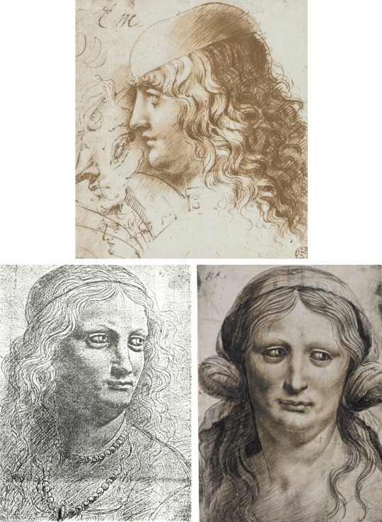
Recurrent in them is a certain heaviness, an overemphatic modelling and lighting, the strange eyes, the long, broad nose, and a scale that seems to enlarge as one ascends from the chin.
There is a further feature to remark on in the Ginevra and that is the treatment of hair strands and hair curls: they look metallic, as if made from fine picture wire, and the curls are tightly coiled as we see in several drawings. This is Leonardesque in general - it reminds one of his deluge drawings and water studies - but Leonardo the painter does not apply the curling tongs in such a steely manner, there is more poetic sfumato blending the ringlets into shadow, exposing here, losing there. They should not assume more importance than the facial features.

Ginevra de Benci’s tight curls as compared with those from works by Ambrogio - there is a further connection between the painting (bottom left) of St John the Baptist and the inscription on the reverse of Ginevra’s portrait
If I seem to denigrate Ambrogio de Predis vis-a-vis Leonardo it is because the distinction to be made is not just of style but of quality. His way of painting, as of drawing, is heavier, colder, cruder and far less poetically evocative. To make a version of a Leonardo on the scale of the London Virgin among the Rocks is undoubtedly impressive and Ambrogio is a very accomplished artist, but when attribution is at stake it should be recognised, after due consideration and comparison, that his painting in London is nothing like as good as the Paris original. On every measure the Louvre picture is superior. As for the Ginevra, just put it beside La Belle Ferroniere or Mona Lisa, (below) and see how it fails on both connoisseurship counts, likeness and quality.
3 :MILAN
There is another ‘Leonardo’ that fits well with these attributions, and that is the unfinished Portrait of a Musician at the Ambrosiana in Milan (above), a painting which Giovanni Morelli long ago assigned to Ambrogio, I think correctly. We are presented here with a memorable face and a convincing portrait of an individual, but once again the exaggerated lighting, the shape of the eyes and lids, the mouth, the wire-like curls and the low-slung cheekbone that is level with the nostril and far from the eye, betray, when taken together, the style of Ambrogio, not Leonardo.
The Portrait of a Musician and three works by Ambrogio all displaying similarly wide eyes and facial types - Head of Francesco Melzi; Portrait of a Young Man; Head of Bacchus
It is a style that produces an impression of forceful character, but just because it errs on the side of being over-determined it lacks the subtler sfumato, the more reticent but mysterious presence that is the ‘poesia’ of Leonardo. This is more assertively a portrait, but Leonardo, who was no more interested than Michelangelo was in the individual - and therefore not at heart a portraitist at all -aspires to a more universal and depersonalised image, the sublimated type of Mona Lisa. The contrast between the two men is admittedly disguised somewhat by the assimilation to Leonardo’s manner - Ambrogio was, after all, his close associate and admirer and his work is more nearly Leonardesque than most of the master’s followers - but the differences are there to be discerned and if we do not discern them I fear that our conception of Leonardo the painter will remain blurred by inconsistencies that distort our proper understanding of his development. He did develop, but credibly, not by suddenly adopting a new palette or a new way of constructing a face.
4 : KRAKOW
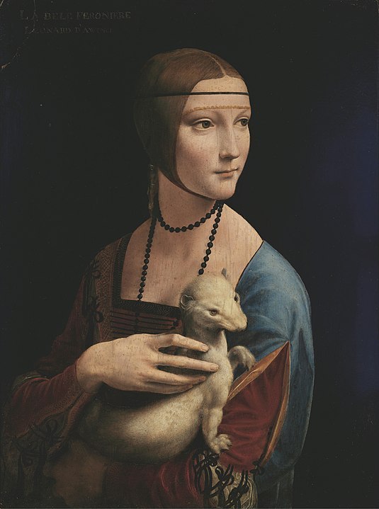
The focus of this Study being on what is, and is not, by Leonardo, I can leave Ambrogio now and turn to a work not by him but not, I believe, by Leonardo either, accepted though it usually is as an important example of his art: the Lady with the Ermine portrait of Cecilia Gallerani at Krakow. Whatever one’s theory about its authorship, few would disagree that it is a work of high quality, beauty and sophistication, almost certainly from the best years of its maker.
With that tribute to the work I shall cut to the quick of the connoisseurship argument by setting it between three other items (clockwise from top right): a painted Portrait of a Lady from the Musée Jacquemard André in Paris, a very impressive portrait drawing of a Woman, from the Uffizi Gabinetto and a profile Portrait of a Woman from the Kress Collection at Washington.
The salient features linking them are the smooth Bronzino-ish modelling, the profiles, the flesh colour, the treatment of folds in sleeves, and the form of the long-fingered hands. That curious pose of Cecilia’s right hand with its long and separated digits is not to be found, I think, in genuine Leonardo, but we shall see that it recurs in this master’s work.
With these initial comparisons in mind one can go on to other drawings and paintings bearing similar characteristics. The very soft muzzy shading within fine linear contours and hairline comes again in a drawing from the Pembroke collection at Wilton House; the woman’s profile repeats that of the Lady in the Kress painting.

Profile of a Woman - Wilton House
At Windsor, in the Leonardo corpus, are three studies of feet, one a child’s, that are clearly in the style of the drawing of the Lady in the Uffizi and the Pembroke drawing. A further drawing, from the Ambrosiana in Milan, not only belongs with it in drawing style but also makes a link with the Krakow painting of Cecilia Gallerani.

One sees the fastidiously neat, centrally-parted coiffure, relatively slight eyebrows, long nose, similar mouth, pointed chin. Some of these items might even be of the same woman; however, it is similarity of type and style, not identity of sitter, that is relevant for attribution, and as a group these drawings and paintings already suggest a common style and a common authorship that is distinct from what we recognise as ‘Leonardo’, and distinct also from Ambrogio de Predis. An artistic personality begins to emerge that makes the attribution of the Krakow picture to Leonardo seem increasingly unsafe and improbable.
The improbability is only confirmed when one moves to a painting of the Virgin and Child with an Angel and Saint John at a museum in Budapest. Here is the Krakow hand; here the marmoreal smoothness and delicate blush to the cheek; here a deep wine-red under blue mantle (and over a black-striped white silk undergarment); here the brown colour (in Cecilia’s right forearm; the wooden border of the angel’s lute); here the precise coiffure, pointy chins, delicately defined finger and toe nails.
Painting of the Virgin and Child with St John shows near identical hand posture to Lady with the Ermine, as well as similarities to unattributed studies of a child’s head (Musée des Beaux Arts Caen) and an engraving of an Old Man (Metropolitan Museum New York)
Relevant to this work in Budapest is a drawing in the British Museum (below) where the Child’s hand raised in benediction is much the same, and the Virgin’s hands around Him similarly arthritic but almost claw-like.
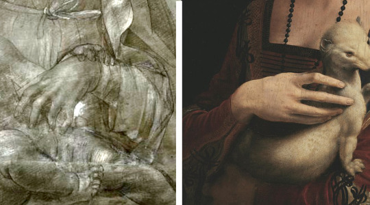
Enhanced close-up of the hand from the drawing showing a similarly “double-jointed” hand to that of the Lady with the Ermine
A much annotated drawing in the Uffizi, purporting to be of Beatrice d’Este, shows the Krakow Master’s refined line, but adding eyelashes which Cecilia Gallerani lacks. There are similarities between this Uffizi drawing and a supposed self-portrait drawing of Melzi at Bayonne: the same smooth modelling and combed hairlines (below).

Mention should be made at this point of an earlier, very charming work, a reliquary from the Sanctuary at Crea which has a portrait on one side of the Marchese di Monferrato and on the other his wife, Anna d’Alencon.

The portrait of the Marchesa is particularly close to the Krakow portrait, not in date but in profile, shape of face and facial features, treatment of hair, black necklace, juxtaposition of brown and slate blue.
More paintings and drawings, some in pen and ink, could be introduced to flesh out the career of this artist and take it back to its beginnings or forwards, to the Sforza Altarpiece; but for present purposes enough, I hope, has been garnered to make the case that the picture, fine though it is, is not by Leonardo but by another artist working at or near the height of his powers.
5 : CANON
Between the subtractions from the current Leonardo canon that I have proposed above and some additions to it that I would like to put forward for consideration, we can usefully mention what remains that is generally undisputed. With regard to early work there is room for dispute. I would argue, pace Vasari, against his having painted an angel in Verrocchio’s Baptism, on the ground that I see no difference between the two angels in the way they are painted, and that that way was Verrocchio’s way, as a drawing by him makes clear.
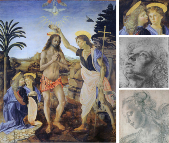
Verrocchio’s Baptism of the Christ and drawings of the Head of an Angel (Uffizi) and the Head of a Woman (Christchurch)
On another occasion I would at least cast doubt on Leonardo’s hand in the painting of the Virgin’s and angel’s heads in the Uffizi Annunciation while not denying that he contributed to other parts of both that picture and the Verrocchio Baptism. There is also an argument to be made about the authenticity of the much repainted Benois Madonna in the Hermitage.
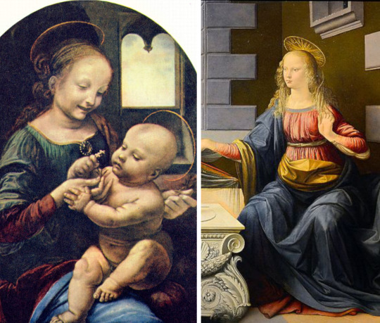
The Benois Madonna (left, attributed to Leonardo) bears similarities in style with the Virgin from Verrocchio’s Annunciation (right)
Apart from numerous drawings, the London Cartoon among them, we are left with the five pictures in the Louvre (Madonna of the Rocks,Virgin and Child with Saint Anne, Mona Lisa, La Belle Ferroniere, and Saint John the Baptist); the Madonna with the Carnation at Munich; the Last Supper fresco at Milan, the unfinished Adoration of the Kings in the Uffizi; and the unfinished Saint Jerome in the Vatican. What, if anything, can be added?
Leonardos at the Louvre
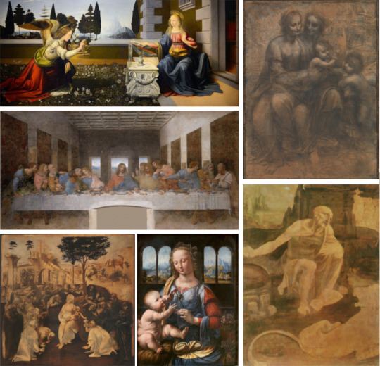
Leonardos around the world
5 : ADDENDA
I have not seen, nor do I know the location of, this probably small painting - perhaps a fragment, perhaps of the head of the Virgin (below). It was once in a private collection in Lugano, but is known to me only from a small but fortunately colour reproduction in an obscure catalogue of an exhibition of ‘Masterpieces of European art’ compiled by Amadore and Tony Porcella, at Tally Ho, Las Vegas, in 1963.

The book is a curious miscellany with some questionable attributions, but this one image has stuck in my mind and I remain as strangely confident now as I was when I first saw it that the original, if one knew where it was, would turn out to be a genuine early work by Leonardo, as the Porcellas claimed.
Place this image next to the renowned drawing at Turin of a woman’s head, and it is fairly easy to turn that head around a little and down a little to get the same or a very similar physiognomic type that is classic Leonardo. Place it against the Angel’s head in the Louvre Virgin among the Rocks and much the same match is achieved, with also, significantly, the same combination of red and green from a palette that is decidedly warm - the necessary warmth of an umber ground for anything to be by Leonardo.
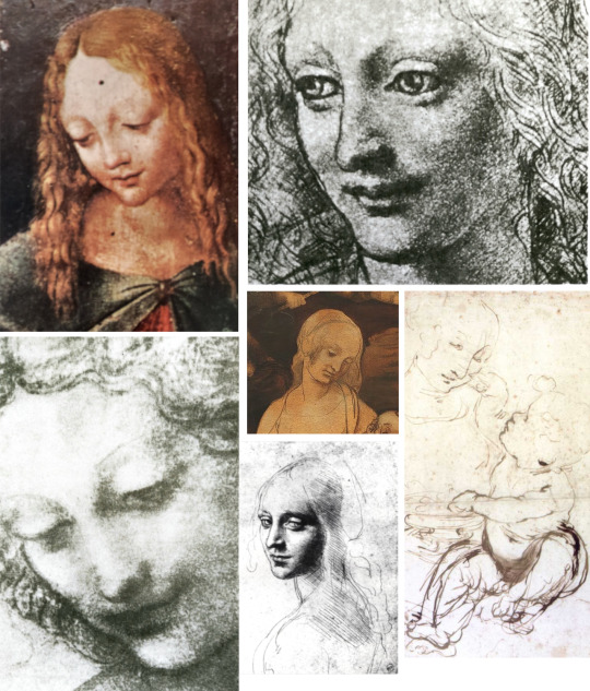
Faces in drawings by Leonardo compared with Porcella image
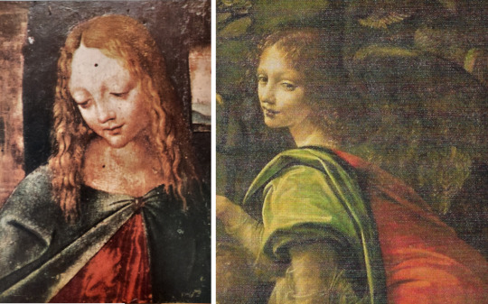
Colours in both Porcella image and Louvre Virgin of the Rocks
My other proposal on the credit side is a painting at Wilton House near Salisbury, one of a number of extant pictures on the theme of Leda and the Swan, a subject known from his drawings to have occupied Leonardo’s attention. This Wilton Leda is ascribed to Cesare da Sesto.

Leda and the Swan attrib. Cesare da Sesto - Wilton House
When I saw this Leda in the National Gallery’s 2011 Leonardo exhibition I remarked to my companion ‘Isn’t this good enough to be Leonardo’s?’ and added, to myself, ‘but I suppose the experts know something we don’t’. Now, after further consideration - seeing how faithful all aspects of the picture are to the pictorial language and practice of Leonardo, and finding in the language and practice of Cesare da Sesto nothing that convinces me that he could mimic Leonardo’s so perfectly - I simply ask of those experts: if I am missing something on the visible surface of that picture that clearly demonstrates that it must be by Cesare da Sesto and cannot be by Leonardo, please provide an equally visual argument to explain that case. To my eye the head of Leda is nowhere near the characteristic female head in Cesare’s work, but is extremely close to well-known drawings by Leonardo.

Examples of Faces in works by Cesare da Sesto - details from Madonna and Child with the Lamb; Study of a Man’s Head; detail from Madonna and Child with Sts John and George
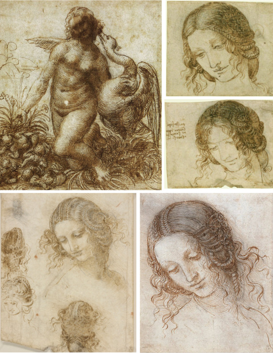
Studies for Leda and the Swan by Leonardo at Chatsworth (Top Left) and the Royal Collection at Windsor
The warm palette and all the background and foreground of the composition are likewise relatable to Leonardo and to studies by him of mountains, children and plants.
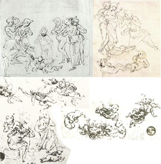

The children in the painting are reminiscent of sketches by Leonardo
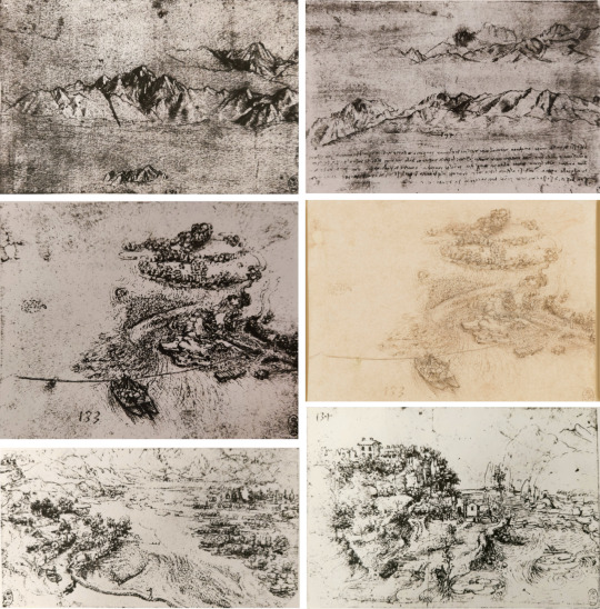
Landscape details can also be compared to studies by Leonardo, like those at the Royal Collection
Of course artists make copies of work by other artists, but in doing so they cannot help unconsciously introducing traces of their own habitual styles of figuration, physiognomy and palette. We know that even an artist with a conscious desire to deceive people (who therefore studies what he copies very carefully) betrays these personal idiosyncrasies. The Wilton picture, I suggest, merits consideration as authentic Leonardo. It is a work of remarkable quality, better, surely, than anything Cesare da Sesto ever achieved, and I would be quite happy to see it slipped into the oeuvre of Leonardo pittore, somewhere, at a guess, before Mona Lisa, because of the less veiled and mysterious landscape. I would add that what could be an autograph study for, rather than after, the head of the Wilton Leda is a beautiful grisaille (11 by 8in) sold by Christie in New York on 7 Dec 1977.
6 : CONCLUDING
I hope that this Study and its predecessors helps to demonstrate to anyone sceptical of the value of connoisseurship that, in common with any form of criticism, it is not a science but definitely a discipline, and one moreover that, properly practised, with plenty of close visual comparison can lead to a reappraisal, sometimes, as here, quite radical, of some of the leading lights in our pictorial heritage.The word ‘close’, however, is to be emphasised. There is no point in having a juxtaposition like this one (below) from a recent National Gallery exhibition catalogue, where the drawing is insufficiently similar to the detail in the painting and bears no resemblance to any drawing by Leonardo. Comparison must be accurate enough to advance an argument rather than spread confusion.
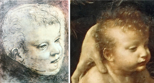
There is no lack of attention paid to Leonardo, but it is too often of a kind that produces claims of authenticity such as the Salvator Mundi of current fame, which connoisseurship, if applied, could show to be misplaced.
Alternatively, attention is of the kind that is not radical enough and tends to re-present the same items from one monograph or exhibition to the next, simply because it would look strange to omit them. The accumulated weight of past opinion confirms the rightful place of, say, the Ginevra de’ Benci in any presentation of Leonardo the artist. If it becomes unthinkable to leave her out, it becomes ever more eccentric to question her inclusion; so she is re-displayed or re-produced ‘on the nod’, with no questions asked.
There are, sad to say, vested interests at work here. The Ginevra, like so many famous images, belongs in, and to, a famous museum. Its curators, and curators everywhere, develop a quasi-proprietorial relationship with ‘their’ collections that is not so very different from that of private collectors. Naturally they do not want to risk asking, or inviting, questions that could undermine the prestigious status of a work in their care, lest doubts should lead to a less prestigious one. The reputation of connoisseurship itself has unfortunately been tainted by practitioners having these or other sorts of vested interest. Unattached to any institution I am powerless but lucky in this respect at least: being a private researcher I have no vested interest at all. Whether a picture is by Leonardo da Vinci or by Ambrogio de Predis is of no concern to me beyond my desire to ascribe it correctly, no matter who owns it or what its market value may be.
For all sorts of unquantifiable reasons I value Leonardo. I hope that the questions I raise here may lead to a more coherent, less inconsistent picture of his enduringly beautiful art.
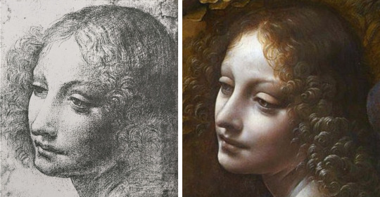
2 notes
·
View notes
Text
Madonna of the Pinks: An exercise in methodology
In the Sainsbury Wing of the National Gallery in London a small picture known as the Madonna of the Pinks now attracts no more attention than most pictures do: a brief perusal, a glance at the label -‘by Raphael’ - then a second look that is more reverential, before a turn to whatever hangs near. Yet in 1991 the little picture was the focus of a great deal of attention, from scholars, critics, journalists, pundits of many kinds, all because of that name on the label: Raphael. This was the art-historical discovery of the year or the decade, a new early work by the great prodigy of the High Renaissance brought out of the backstairs obscurity of a stately home to be revealed by laboratory examination to be no copy of a lost Raphael but the lost Raphael itself. After a fundraising campaign involving millions of pounds from public and private sources, the Madonna was installed in her new home, and there she sits with her Child, playing with the flowers, innocent of the whole kerfuffle.
‘Madonna dei Garofani’ known as ‘Madonna of the Pinks’ attr. Raphael
Nearly a quarter of a century later I am asking myself: what is the point of questioning this attribution when in my lifetime there is no chance that the National Gallery will change its mind, though I think it should. The man, Sir Nicholas Penny, who ‘discovered’ the ‘Raphael’ went on to become Director of the Gallery; clearly far too much is at stake, far too much face would be lost, not only for him but for the institution, if any admission of error were to be made. I suspect that ‘error’ meaning error of judgement would not be admissible anyway, because laboratory examination is regarded as ‘science’: if it confirms a hunch, then it is taken as conclusive and the hunch is turned into a fact. Error is demolished. Nobody can challenge a fact.
What I have just written is specious nonsense. Judgement, good or bad, is unavoidable. Dr Penny made a judgement at Alnwick Castle - this is not a copy - and his laboratory colleagues in London used their judgement to interpret the bits of evidence they found. Also, judgement, being human, may be clouded, for example by desire: would it not be wonderful if this was a genuine Raphael!
I wish that I could answer my question - what is the point? - with the simple word ‘truth’. I cannot because, while the truth is what we should all seek, we are on a journey here, a critical one involving judgements, and can only put an argument that may or may not convince others that it points in that direction. I wish to make an argument that this picture is unlikely to be by Raphael because I see a lot of visual evidence that leads me to judge that it is by someone else, a specific someone whose early admiration for Raphael made him wish to reproduce by his own hand, and learn from, a work by his hero that existed then but is now lost. I recognise that my argument will not be accepted by the National Gallery, but I wish to make it nevertheless, so that the ‘fact’ can be challenged in the future and a small but significant correction be made to the record of two artist’s work. For ‘truth’ I might substitute ‘justice’: while it does Raphael no justice to ascribe to him a work that is not worthy of him, it does someone else no justice to deprive him of the credit for making so creditable a copy of a Raphael that some have taken it for the real thing! It is almost certainly the best of the many copies that are known of this composition.
I need not describe the picture - people can go and see it or look again at the above illustration - but I must begin to undermine the National Gallery’s attribution before I suggest an alternative to it. For this purpose I hardly need to look further than to one small section of the painting, the landscape seen through the window in the upper right. If it is agreed that this picture was painted by one person, not two (no-one has suggested the latter and the impression of stylistic unity is against it), then the question arises: how could Raphael, that wunderkind who had already painted strong convincing landscape backgrounds by the time he is supposed to have painted this one (1506) have suddenly lapsed into a timidity and formal incoherence reminiscent of an amateur watercolorist? The ruined tower has no solidity, the tree beneath is weak and spindly, the clouds have no shape, shadow or bulk, the yellow-green foreground is equally vague and the whole scene lacks coordination. It is picturesque in the sense that it smacks of picture-making; it provides a pleasing enough prop for the main image, but no great artist would be satisfied with it, and certainly not Raphael.
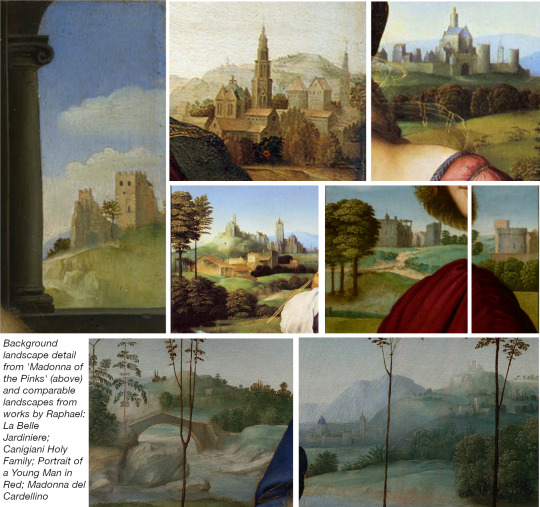
Comparing the simple background landscape in ‘Pinks’ to more detailed landscapes in genuine works by Raphael
To repeat, the likelihood that a second artist was responsible for the landscape only is negligible in the case of such a small picture. Let us agree that there was one artist for all of it. What do we know about artists? One thing we know is that each develops a distinctive palette. Does the palette here conform with what we find in other Madonna paintings by Raphael? Do we find this particular blue next to an ochreous sandy yellow that mixes with green? Do we find a grey that is slightly violet? I think not. Raphael’s palette characteristically revolves around the polarity of blue and rose, and there is never the melancholy brown darkness that envelops a figure clad in a cold mauve-grey.

Comparing the colder tones of the Madonna’s clothing in ‘Pinks’ with genuine works by Raphael
Another characteristic of artists: they develop a personal way of using paint. Where in Raphael is there this distinctive enamel-like smoothness as though the painting was on metal?
Every artist develops, also, a style that lies somewhere on a spectrum between breadth and refinement. Raphael did paint some small (predella) pictures, but they never look small because within them is that breadth and boldness that defies the cramped dimensions. Here, by contrast, we find a style that is distinctly miniaturist (in the sense of describing in fine detail): tiny streaks of hair on the Mother’s head and the Child’s; tiny suggestions of Her veil and halo; minute delineations of the pinks; fine strokes on the curtain at left and in the creases of Her sleeve. No wonder Professor Lisa Jardine (one of the pundits at the time of the ‘discovery’) described the picture as ‘exquisite’. It is indeed; but the Professor should have realised that the appropriateness of that word militated against the picture being Raphael’s, for when is Raphael ever exquisite in the sense that the Wilton Diptych is exquisite? Applying the word to a Raphael is a critical faux pas that adds to the confusion already caused by the fact that the word is often used to convey a generalised approval of workmanship, a level of technical accomplishment, irrespective of breadth or refinement. When we use the word descriptively, it is obvious that a Raphael is no worse for not being exquisite, and a Van Eyck, for example, no better for being so; they are just very different sorts of work by very different artists.
The above remarks are starting to engender some scepticism, I hope, regarding Raphael’s authorship of this Madonna, together with a suspicion that his original would have been bigger. There are other indications that should increase our doubt. How does the top of the Madonna’s left thigh relate to Her torso? Is Her hip in a credible place? Would Raphael, with all his study of the human figure, get that wrong? And the shape of the Madonna’s face: is it quite what we should expect of Raphael? The hair-line makes Her temple rather flat-topped, and the modelling is comparatively quite shallow and unconfident.
If connoisseurship is, in practice, a quest for authorship, it can never be enough to say that a particular work is not by the artist to whom it is currently or commonly credited. James Beck, the most authoritative of the sceptics, gave some reasons for doubting the National Gallery's attribution in an article in 2005 entitled Raphael's Madonna of the Pinks: a Connoisseurship Challenge, but in common with others he never provided an alternative to it. To cast doubt such as he and others have done on this attribution to Raphael is to express an opinion that may carry some weight according to the ‘authority’ of the person expressing it; but it sheds no positive light on the question which remains: who did it? Connoisseurship must not be confused with science; it is a particular application of criticism. Accept this, and no amount of scholarship or laboratory science should be allowed to mask the need for critical judgement about what we are facing when we confront the visible surface of a work. Having absorbed as much of its detailed peculiarities and sensuous quality as we can by looking, we then have to consider who else might have produced a work having these specific characteristics. There is no short cut for us. We have to examine, one by one, the oeuvre, in this case, of as many followers of Raphael as we can think of, and hope that by a process of elimination we can arrive at the answer in a moment of sudden recognition of what has hitherto eluded us. There is reason to hope: considering when this Madonna was painted, we would be remarkably unlucky if it was the only surviving work by its maker.
So, is it by Giulio Romano, Fra Bartolommeo, Franciabigio or Bugiardini? No to those. Is it by Cesare da Sesto? No. Innocenzo da imola? No. G.F.Penni? No. Bertucci? Closer, but no.
I do not know if this exhaustive checking and eliminating process was conducted at the National Gallery before the conclusion was drawn in favour of Raphael, but it should have been. We have to follow Karl Popper and try to prove our hypothesis wrong; and all the more diligently when we very much want it to be true. I blame no-one for wanting to discover a Raphael, it is a Raphael scholar’s dream, but for a connoisseur to omit a check of the kind just indicated is unprofessional. I, who am no scholar, have done the research over some years, and am now satisfied that I have identified the oeuvre into which the Madonna of the Pinks fits on all counts.
It is time to say it: it is the oeuvre - as much as one can reconstruct - of PIER FRANCESCO FOSCHI (1502 - 1567), a very competent if not very original Florentine painter of the Mannerist period, a specialist, it seems, in portraiture, an admirer of Raphael, and one of the collaborators with Vasari in the establishment of the Florentine Academy.
Portraits and drawings that can be ascribed to Foschi will play their part, but it may help to turn first to the end of his career by turning sharp right when we enter the church of Santo Spirito in Florence. There at the back of the church, in the corner, are two large paintings by him, one of which, The Immaculate Conception, shows Mary presented by God the Father against a cold grey cloth held at either side by angels; below are four male Saints, three of them holding books. In the predella we see the Torrigiano family, the donors of the picture.
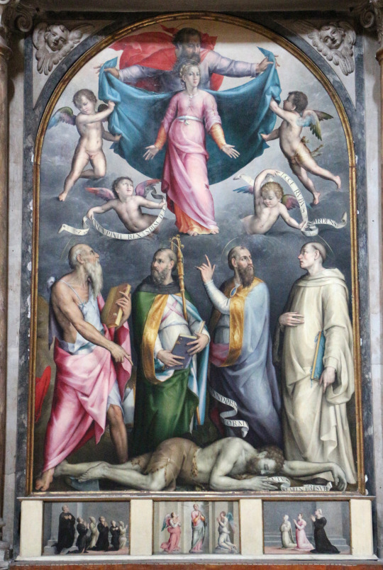
The Immaculate Conception by Foschi - church of Santo Spirito in Florence.
In this late work some of the palette of the Madonna of the Pinks is still apparent, though decades divide the two pictures and the scale is completely different. We see the mustard yellow and the cold grey with its hint of mauve; we see, in the inscribed banners, the clean creamy-white of the cushion beneath the Child in the Madonna and, importantly, we see something of the smoothness that I have described as like enamel finish in the draperies. Looking up to the face of the standing Virgin I see the same shape in it, like an oval fitted into a rectangle that I have drawn attention to in the London picture.
The ‘Pinks’ attr Raphael and ‘The Road to Calvary’ attr Bacchiacca
To find the blue in the Madonna - let us refer to it henceforth as the Pinks - we must go back in time to a period closer to it, perhaps even preceding it: a painting of Christ bearing the Cross on the Road to Calvary. This has been attributed to Bacchiacca and Bertucci, but I am confident that the correct assignment is to Foschi. In any case it is clearly by the painter of the Pinks. The blue of the sky, of which the Madonna’s robe is only a deeper shade, is the same in both pictures and is combined, in the landscape, with the same sandy yellow turning green over featureless, perfunctorily rendered terrain. That terrain, in the Road to Calvary picture, is the setting for another journey, the Flight into Egypt, made in the opposite direction and depicted with the Madonna’s miniaturist delicacy: the mule and the dog walk on spider-thin legs as they pass an equally spidery, rootless-looking tree. The similarity, in colour and detail, between the landscapes in these two pictures should make it impossible to link either of them with the name of Raphael, though, strange to say, both have been so linked at one time or another.
Clear similarity in colours for both paintings
Besides the landscapes, there is the white sleeve of Christ like the white cushion under the Christ-child; the painting of the fingers and finger-nails of His right hand resembles those of the Virgin’s left hand; and, as always in Foschi, the haloes are spectrally thin.
Returning to the head of the Virgin in the Pinks, I am reminded of a black chalk drawing very credibly by Foschi (Sotheby, London, 5 Dec 1977, Lot 20) though ascribed, less credibly, to Albertinelli. Here is the ‘oval within a rectangle’, the relatively weak indication of eyebrow, straight regular nose and linearity of upper and lower lip. All these features recur in Foschi’s portraits, for example A Musician (Uffizi), A Prelate (Art Market), A Lady (Thyssen, Madrid), A Man (Chantilly) and various others.
Face details in Foschi’s portraits and some misattributed works (from top to bottom) Left: Study of a Young Woman’s Head (attr Albertinelli); Portrait of a Woman (attr Bresciano). Centre: Portrait of Pontormo (disputed self-portrait by P); A Prelate; Andrea del Sarto; A Gentleman. Right: A Musician; Andrea Fausti (attr anon); Young Man Weaving a Garland; A Lady (attr Pontormo)
Sposalizio - Galleria Nazionale di Parma
At Parma we find a comparable head of the Virgin in a Sposalizio (wedding); her robe is a less vivid shade of the blue but it stands next to the priest’s strong yellow, and these local colours once again disappear into Foschian sub-fuse of shadowy background.
Study of a Woman’s Head (attr Bandinelli)
A drawing in the Uffizi (Inv.549Fv) that is certainly not by Bandinelli, strikes me as being a likely early drawing by Foschi, near in date to the London Pinks. The head is tilted at an angle different from the painted head but the form of it is compatible and we have sketched lines of the same bodice garment dipping below the shoulder and plunging again to her cleavage in the way that it does in the London picture.
Madonna della Misericordia (attrib Bertoia)
Still at Parma, we can surely see Foschi’s hand at work in a painting of the Virgin of the Misericordia protecting three kneeling monks on one side, three kneeling nuns on the other, assisted by flanking Saints with palm fronds, the one on the right holding the lilies of the Annunciation. In this picture all the relevant colours are present for comparison with the Pinks. The blue of the Virgin’s outer robe is lined with the yellow; there is the same white of the cushion under the Child, the same impenetrable dark, the same thin haloes, the same way of painting the stems of the flowers.
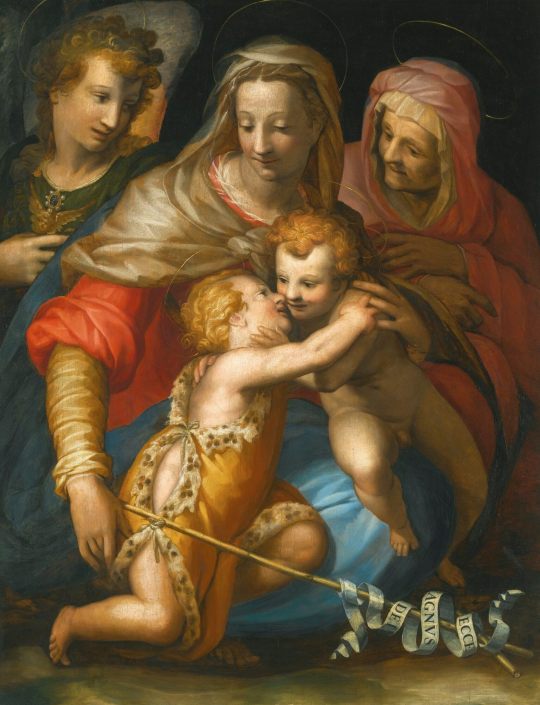
Holy Family (attrib Morandini)
As I remarked at the beginning, even late Foschi retains much of the palette that was there in the Pinks. If we do some reattributing, there is a Holy Family (given to Morandini) which clearly belongs near to the Santo Spirito pictures and we can see him still putting the yellow next to the blue as in the London picture and treating the creases of the paler yellow sleeves in remarkably similar fashion. Even the type of the Christchild and the painting of his hair has not changed much except that it is all more confident.

Head of a Saint (attr Ubertini and Bacchiacca)
Another example from his later career would be A Female Saint (Art Market, given to Bacchiacca) where one recognises the faintly violet grey of the Madonna’s bodice garment in the Pinks, the rose red of God the Father’s flying mantle at the top of the Santo Spirito painting and the robe of the Madonna della Misericordia at Parma. That red is eloquent also in a particularly attractive Portrait of a Scholar (Art Market, given to the ‘Studio of Santo di Tito’)
Portrait of a Scholar (attr School of Santo di Titto)
Drawings by Foschi are problematic for both attribution and dating, but I think we can cite a sheet once held in the Weld Collection at Lulworth Castle of two men talking, and a Head of a Man at Chatsworth.

Drawings from the collection of Joseph Weld of Lulworth Castle (left) and from the Devonshire Collection at Chatsworth (right)
Earlier and much more relevant to the Pinks is a drawing in the Uffizi (attr. Fra Bartolommeo) of the Head of a Young Woman. Place this head next to that of the Madonna in the Pinks, and the likeness speaks for itself.
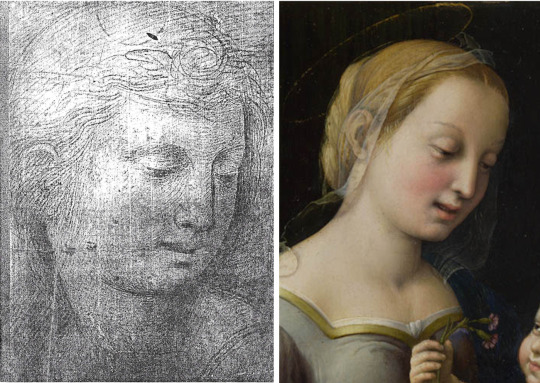
Drawing attributed to Fra Bartolommeo (left) and the ‘Pinks’
If an exhibition were to be devoted to the work of Foschi and we could see his Madonna of the Pinks alongside some of the paintings and drawings I have mentioned, I believe the coherence of his style would become apparent. Some technical features might emerge as well, for example his choice of support. He liked to paint on panel and I suspect we would discover a preference for fruit woods producing a certain tendency in the craquelure. We would see across his career his preferred palette and the common surface appearance of his painted work.
In the absence of such a gathering-together, physically, of his surviving oeuvre, I hope the argument of this Study will help to convince relevant people at some point that the Raphael attribution should be abandoned. I hope as much that in the making of the argument I have demonstrated something of what it takes to practise connoisseurship and how valuable this can be in arriving at a more accurate and a more just assessment of quality. Like water, quality will find its proper level in the end. Foschi is not Raphael, but the National Gallery has plenty of genuine Raphaels and now, if I am right, it has one Foschi, a respectable example of a modest talent paying its tribute to a great one.

Head of a Man from the School of Athens (top left); Detail from La Disputa (bottom left); Head of the Virgin after Raphael (centre); the ‘Pinks’
That tribute is nicely illustrated by what I take to be two early drawings by Foschi at the Lady Lever Art Gallery at Port Sunlight, near Liverpool. They are careful copies from details in Raphael’s Stanze della Segnatura in the Vatican: a male head from the School of Athens, and a head of the Virgin from the Disputa. The latter is the relevant one when juxtaposed with the head of the Madonna in the Pinks. The drawings themselves have a soft, even, unassertive tone quite different, of course, from the animated lines of Raphael’s own drawings.
To make an argument against an optimistic but already entrenched attribution is to risk being cast as a killjoy, and feeling one. The picture at Alnwick Castle certainly could have been a Raphael and we are poorer for it not being one. Years ago I learned much of a critical nature from a Curator I worked under at Leeds, Miranda Strickland-Constable. In a previous post at Birmingham she had inspected one day a small Harbour Scene brought in for opinion. Its quality convinced her that it was by Claude Lorrain. Later confirmed as such, the painting hangs in the Birmingham City Art Gallery. A Claude at Birmingham, a ‘Raphael’ in London: what determines authenticity? Not laboratory equipment, and not scholarship; those may, or may not, corroborate what begins as a judgement of quality. Such judgement grows over time through the effort to ‘know better’, connaitre, not savoir, as the word connoisseurship so aptly implies. In a disputed case, as here, the judgement has to be turned into an argument - not an assertion - and the argument must be presented visually, as must any counter-argument to it. It also has to offer an alternative to the work’s existing status. I have tried to satisfy these requirements, but now invite the viewer to decide.
0 notes
Text
Vermeer
Inside my copy of Ludwig Goldsheider's Phaidon Press Vermeer I wrote my name and the date of purchase, 1958. I was then fourteen years old. The battered volume is a record, therefore, of an attraction to this artist that stretches back to childhood. Not unnaturally I would like to find a way to acknowledge all that he has meant to me over the intervening years. I have no gift to write of his art like Lawrence Gowing - still less like Proust - but in any case my preference is to use connoisseurship to extend, if possible, our understanding of his oeuvre by seeing if there are viable addenda that can be appended to it; and that is the main purpose of this Study. A secondary aim is to draw attention to the dangers involved in 'cleaning' what we already have. By way of caveat I urge any readers I may have not to expect everything adduced to look like their idea of 'a Vermeer'. Connoisseurship has to allow for development. An early Cézanne does not look much like a late one.
To begin at the beginning of Vermeer's career as a painter is chronologically proper but somewhat frustrating because we know that he is farthest from where he needs to be and where we wish him to be. Through his and his father's picture-dealing he comes into contact with Italian paintings of a religious and mythological nature which encourage him to try his hand in a similar vein. What survives of this derivative, experimental period is the St Praxedis - his version of a composition by a Florentine artist Felice Ficherelli - and the Diana and her Companions.
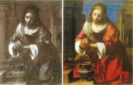
St Praxedis by Ficherelli (left) and Vermeer’s copy (right)
Being by Vermeer, these are not bad pictures; indeed the St Praxedis is that rare thing, a copy better than its original. In both works there is a fluency of brushwork, a Baroque rhythm, and a palette that at this stage includes a yellow, a deep blue, a winey brown, and a rose red that, mixed with white, becomes a violet.
I can only suggest one work to add to this early phase of Vermeer's oeuvre and that is a picture of the head and shoulders of a rosy-cheeked girl.

Portrait of a Girl by De Bray (left) and detail of St Praxedis (right)
When it passed through the hands of a London dealer (Chaucer Fine Arts) in 1989 it was attributed, not very accurately, to Jan de Bray. The face is painted in a style hard to reconcile with any of the young female faces in later Vermeer, but it does seem close to that of St Praxedis and to the facial types in the Diana picture. Common to all of them are the rose-white-violet juxtaposition, the swirling drapery and soft sfumato.

Christ at the House of Mary and Martha (National Gallery Scotland)
With the large ‘Christ in the house of Mary and Martha’ at Edinburgh we may be moving backwards rather than forwards chronologically, but Vermeer seems recognizably more Vermeerish. He is still in his broad-brush Religion and Myth phase but the religion is as domesticated as it can be in that story of Mary and Martha, so one feels that he is moving towards the territory that he will make his own. Even in the earliest pictures it is noticeable how women predominate as we know that they will in the future. On the relative merits of Mary’s life and Martha’s, Vermeer's art is, and remains, tacitly neutral: it pays tribute to both. As if to illustrate this there is a study in watercolour for the figure of Mary, and a drawing that is not for the figure of Martha (being stylistically later) but certainly alludes to her servant role.
In the Printroom at Leipzig is a remarkable wash drawing which Bernhard Degenhart included in an anthology of European drawings (Europaisches Handzeichnungen) published at Dresden in 1943 as the work of the landscapist Jan Siberechts.
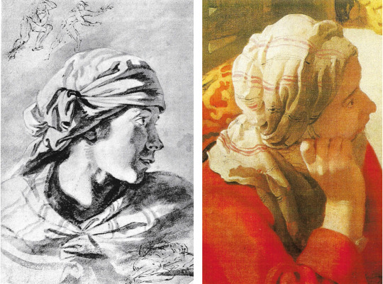
Drawing attributed to Siberechts (Leipzig) and detail of Martha
That attribution can be dismissed because there is nothing in Siberechts to support it beyond the flimsy fact of there being a landscape drawing on the verso. The little pen sketches of figures at the top and lower right of the sheet are by another artist; disregarding those, I think that there is a strong possibility that what we have here is a study by Vermeer for the figure of Mary in the Edinburgh picture; there the listening head is swivelled a little further round towards Christ. The light in consequence falls differently, but otherwise the similarities are close: there is the same profile with slightly parted lips, the same headcloth with the same striped pattern on it, and the same bright lighting from our left if we allow for the turn of her head.
It is the dramatic lighting, with maximum contrast in the folds of drapery and in the face too, not of Mary in the picture (now in shadow) but of Martha, that most accosts me. I notice as well the jugular vein in the neck of Christ. The wash is applied quickly but with complete assurance. The shadowed area of the face is conveyed in a manner that looks forward to the shadowed halves of the two heads in Washington, the Girl with a Red Hat and the Girl with a Flute.
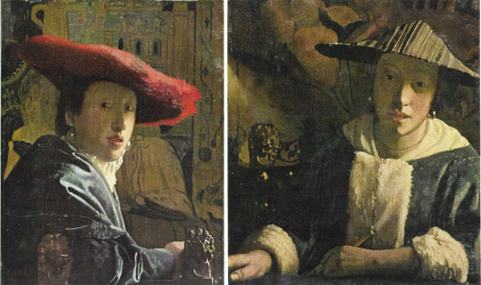
Girl with a Red Hat (left) and Girl with a Flute (right) (National Gallery Washington)
The strange wavy border that the bright light creates on her cheek, from the near edge of her eye down to her chin is typical of Vermeer’s observation of light, how it produces form, without line, in the most surprising ways. In this respect the Leipzig drawing seems more advanced and prophetic of his future powers than the painting.
The Leipzig drawing, as we have seen, is scarcely a drawing in the linear sense at all, but at Besançon there is a sketch of a more conventional kind. In what becomes his favoured graphic medium - black chalk heightened with white on blue paper - it shows a servant holding a shallow circular basket or tray.

Woman with Tray signed ‘De Hoogh’ (De Hooch)
She is probably not a study for Martha, but one can see the folds of her sleeve following the pattern of light and shadow that is distinctive at Edinburgh in the sleeves of all three participants but more particularly on Christ’s outstretched arm. Her face has the signature oval shape and high-arched brows.
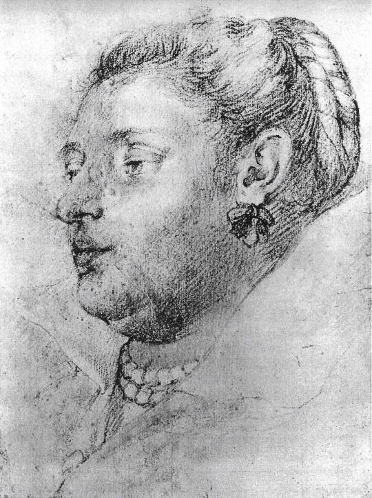
Portrait of a Lady (Royal Collection Windsor)
A third drawing may still be quite early but marks a change to something less loose, less generic, much more personal. This is in the Royal Collection at Windsor, a ‘Portrait of a Lady, Anonymous, Flemish school 91/2 x 7in, black chalk on white paper with red chalk for the flesh and the necklace of pearls’. The cataloguist comments that it is the ‘work of a follower of Rubens lacking peculiar characteristics’. If we stop thinking about Rubens, perhaps its characteristics will start to seem more peculiar, and peculiar, I suggest, to Vermeer. It is likely to be later in date than the Edinburgh picture, but the similarity of facial features if we compare the profile of this middle-aged woman with that of Christ is, for me, compelling.
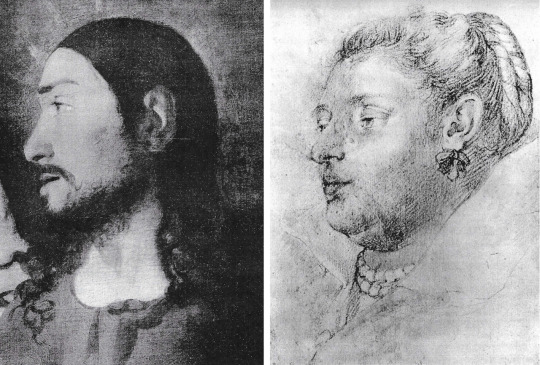
Detail of Christ at the House of Mary and Martha (left) and Portrait of a Lady (right)
It cannot be proven but my hunch is that this tender portrait is of Catarina Bolnes, Vermeer’s wife, bearer of their many children, and also likely model for the painting at Amsterdam of the pregnant Woman in Blue reading a Letter.

Woman in Blue and detail of face (Rijksmuseum)
Placing her tête-a-tête with Christ and putting aside the double chin so truthfully recorded, notice the mouth, the cupid’s bow upper lip and projecting lower, the depth of the upper eyelid, and the straight nose that nevertheless marks where the bone ends and softness begins. As for ribbons and pearls, they are fashion accessories worn by women in the paintings of other Dutch artists, so their presence in this drawing can only be corroborative evidence; still, we know from later paintings by Vermeer how much he liked his family members to sit or stand for him wearing these adornments, particularly pearls because they represented drops of light.
Whether or not I am right about Catarina, this sensitive, fairly rapid sketch does demonstrate that Vermeer needed to make drawings of his models. The camera oscura was invaluable for helping to accurately determine how furniture and figures are disposed within a chosen perspective, but that tool does not solve everything and I always thought it probable that for the faces at least he would have made some preliminary studies in chalk or oil paint on paper, even if no such drawings survived. Fortunately, as already suggested, a few have, and this is a particularly beautiful example.
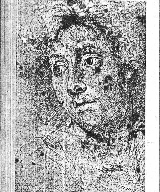
Portrait of a Young Man - Anonymous
At Rennes in France there is another close-up drawing, of a youngish man's face, his eyes directed down to our left as we look up. This is texturally very similar to the Windsor drawing, but it more particularly demonstrates three features found in the paintings. One is the drawing of the eyes, the almond shape of the eye itself, the broad strap of upper lid, and the elevated brow. This is famously clear in the Girl with a Pearl Earring at the Mauritshuis, but also in the Kenwood Girl with a Guitar, the Wrightsman Study of a Young Woman (Metropolitan Museum NY) and the two close-ups at Washington, Girl with a Red Hat and Girl with a Flute.
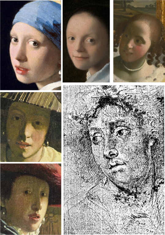
Details clockwise from top left: Girl with a Pearl Earring, Study of a Young Woman, Girl with a Guitar, Portrait of a Young Man, Girl with a Red Hat, Girl with a Flute
A second feature is the lips being parted, as in several of the works just cited. A third is the generous oval or elliptical shape of the face as a whole, which is the result of underplaying the chin and cheekbones.
Studienkopf - Study of a Boy’s Head, attributed to Vermeer
‘Oil paint on paper’ and the above remarks about oval faces are a cue to insert here a small study of a face in that medium that is in the Berlin Printroom. This has long been attributed to Vermeer, not by all but by many scholars from 1907 onwards. It bears all the signs of being by his hand and, besides being a fine and precious thing in itself, is a helpful link to other things. Notice, again, the shape of face that is different from what we find in other artists’ work, the mouth with its wavy upper and sensuous lower lip, a certain relationship and distance between eyebrow and eye, and of course the light that shapes everything. Whether this is an abandoned self-portrait no one can say for sure, but it could be. If one looks hard at oneself in a mirror, the eyes do narrow and squint a little, producing the fixed ‘tunnel’ gaze that this face returns to us so straightly and directly while giving, it must be said, nothing away (but what else would one expect of Vermeer?).
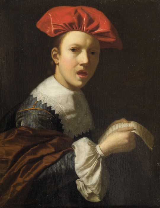
Singender Jüngling - no attribution
From Berlin to Vienna now, and from oil on paper to oil on oak: a small panel in the Kunsthistorisches Museum. This is of a young man singing (Singender Jüngling). The piece of paper he is holding does seem to be a sheet of music and as he is turned towards us with his mouth open he is probably singing, not talking to us about a letter. In any case what matters is that a living moment is caught in a turn of attention with a turn of the head, and thereby temporally and pictorially stopped for ever, as happens over and over in Vermeer. Is this picture by Vermeer? I offer it for consideration. If it is, it is not classic mature Vermeer, nor on the other hand is it very early. I would place it close to the Boston Concert (now sadly missing), the Frick ‘Girl Interrupted At Her Music’, the Metropolitan’s Servant Asleep. It is smaller than any of them, only 91/4 x 71/4 inches, the size, roughly, of the Louvre Lace Maker or the two Washington Girls.
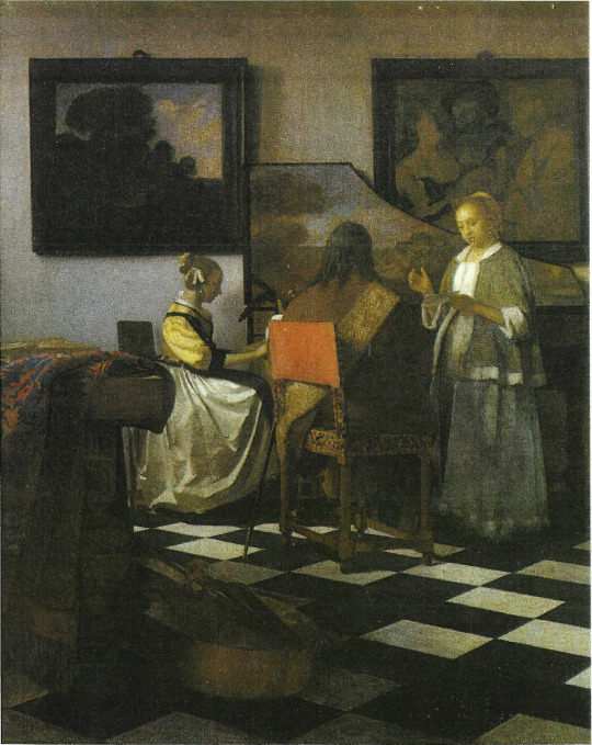
The Concert (stolen)

Girl Interrupted at her Music (Frick)

Servant Asleep at a Table (Metropolitan Museum)
At this point the Berlin oil study on paper provides a helpful comparison: for the shape of the face and of the eyes, the form of the lips (albeit closed in Berlin) and for the lighting if one imagines the face at Vienna upright, not tilted, and facing us straight on.
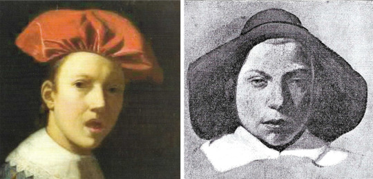
Detail of Singender Jüngling (left) and Studienkopf (right)
As for the palette the wine-dark brown mantle over the Singing Boy’s right arm reminds us of the colours in the dress of the Sleeping Servant and of the companion of Diana who sponges her foot.

Details of Servant Asleep (top) Singender Jüngling (btm left) and Diana’s servant (btm right)
From surviving images of the Boston Concert, we can not be certain but it seems likely that boy's orange ‘beret’ may be comparable with the chairback of that missing artwork.

Orange beret from Singender Jüngling (left) Chair-back from The Concert (right)
Lighting here is from a source to our left, but Vermeer – if it is he - is not yet committed fully to daylight; the boy is lit within an ambient darkness, much as in a Caravaggio or any number of portraits. The other thing to notice is the way the boy is holding the paper with both hands. One might think that numerous Dutch pictures would show hands in a similar position, but it does not appear that this is so; it is, however, a gesture that recurs in Vermeer, in the Lady in Blue at Amsterdam, the Girl Interrupted at he Music in the Frick, in the Dresden Girl Reading a Letter at an Open Window and, we shall see, in another putative Vermeer.

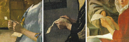
Details from Singender Jüngling (top), Woman in Blue (left), Girl Reading a Letter at an Open Window (centre) and Girl Interrupted at her Music (right)
With the Vienna Singing Youth we are, as noted, not out of dark and into sunlight; we are by no visible window and the light has no sparkle. We are in an enclosed world like that of the tavern or the brothel, the venue of the Procuress at Dresden where what light there is, golden and silent amid the muted voices, seems to move surreptitiously, illuminating part of a collar, a bit of wall, a patch of rug before landing in a blaze on a yellow jacket, a scarlet jerkin, a binary echoed in the carpet.
Here is another large early work, disconcertingly different from what precedes and what follows it. The oil medium is drier here and carefully applied with no broad-brush bravura, no squiggles of highlight. Where in the future it is light that will seem liquid, poured into a room as into a tank, here it is shadow that spreads downward, drowning much of the left side of the picture, all but hiding faces, turning the folds of the carpet into dark ravines, and generally claiming the territory. Here is an artist revealing himself, for now, to be potentially as great a poet of shadow as he will be of light; one is readily reminded of Caravaggio’s Calling of Matthew in Rome.
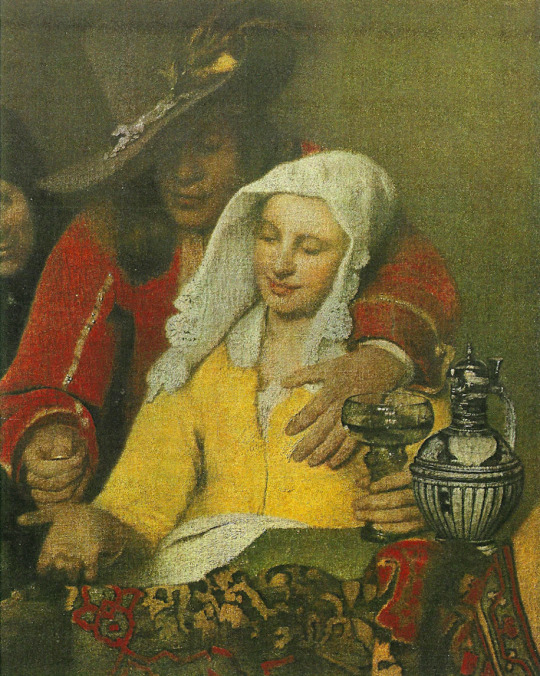
Detail from The Procuress
If we are to find anything to accompany the Procuress in this possibly short-lived stage in Vermeer's development, it must exhibit that dry handling of paint that we see in the depiction of the woman and her client. Again what I offer is a suggestion appended to a sad admission in this case that I have no idea where the picture is. It is a portrait known to me only as an old photo placed among other portraits that have been attributed at some time or another to Velasquez. It is at any rate not by him. It once belonged to a Mr A. W. Leatham.
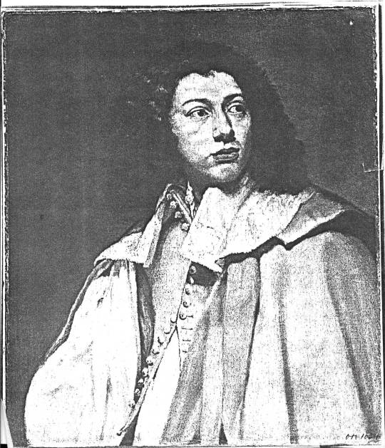
Portrait - attribution and whereabouts unknown
Here we clearly see, even in a photo, the dryness; but what lends credence to a Vermeer attribution is the face when one compares it with that of the Berlin oil study: within the same generous oval are the same eyebrows, nose and lips; the eyes in the Leatham picture are much more open but otherwise compatible. If this were to be Vermeer's it would be our only independent painted portrait - of whom we may never know.

Maidservant Warming Her Feet - attributed to Vermeer
In the volume referred to at the top of this essay, the 1958 Phaidon Vermeer by Ludwig Goldscheider, there is one drawing included among the main body of plates, a drawing therefore that Goldscheider clearly thought was definitely by Vermeer. It had been published once before, by H Leporini in 1925, but Goldscheider helpfully reproduces it in its actual size. He calls it Maidservant warming her Feet; the original is in the museum at Weimar. The monochrome reproduction gives one a good idea of the soft graininess of the black chalk finely hatched in strokes that run at right angles to the pose of the seated servant. What cannot be seen are the touches of red chalk added to neck and forearm (much as in the Windsor drawing) or the white heightening that in a photo looks deceptively like the white of the paper though the paper in reality is blue.
Why is this beautiful drawing omitted from subsequent books on Vermeer? Could it be that scholars are sceptical on account of the artist’s monogram V M drawn on the side on the footwarmer? One can agree that this is unusual, but that by itself should not be ground for exclusion; genius can be allowed some eccentricity, and anyway it is not too difficult to imagine that this very finished and presentable drawing was in fact presented to someone, possibly the model for it, and that the monogram was added as a mark of the special occasion or as a token of gratitude or to pay a debt. Nobody suggests that it is an outright fake from a later century, so it has to be of Vermeer's time and I question whether any contemporary could produce a drawing of this quality and of this kind - a drawing where form is defined so consistently by light. This is Vermeer's photographic vision, as it would be Seurat’s in a later age.
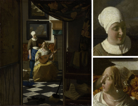
The Love Letter - Vermeer’s use of light is comparable to Maidservant Warming Her Feet
The sitter, besides: is surely the family's stalwart servant, Tanneke, the same who pours milk and delivers a letter (in two paintings) and maybe holds a jug as she opens a window.
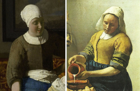
Details from The Love Letter and Milkmaid for which Vermeer used his maid Tanneke as a model
The date of the drawing is anyone's guess, but it clearly belongs in the period of the great cameral pictures. Another drawing, of unknown whereabouts and less remarkable is of similar facture and shows a servant asleep.

Drawing of a Servant Asleep - unknown
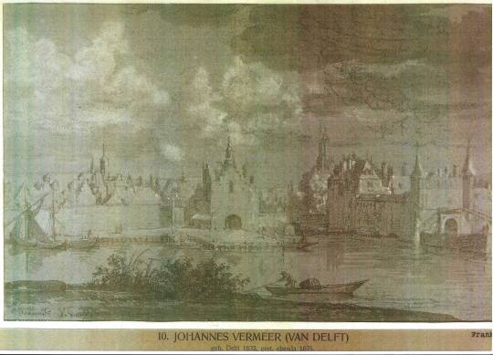
View of Delft by Moonlight - attributed to Vermeer
Scepticism regarding the Weimar drawing seems to have led to doubting generally that any extant drawing is by Vermeer. This is a pity because there is much to be learned from his draughtsmanship. Take this drawing at Frankfurt, a supposed copy of the famous View of Delft from across the canal to the south of the town.

The Original ‘View of Delft’ by Vermeer
Why would a copyist take such liberties with what he is copying from? Why alter the arrangements of the buildings, omit barges, totally change the sky and foreground, remove figures and substitute fishermen in boats? He would be a remarkably inventive copyist who did all that! How much more likely that this is a drawing Vermeer made in situ on a day when there was a busy sky with rain-threatening cloud but with sun behind him that lit the south-facing walls, towers and spires of the town. The painting in the Mauritshuis, like a large ‘Academy’ Constable, is the outcome of onsite visits and studies all of which contributed to his decision-making, but none of which was exclusively determining.
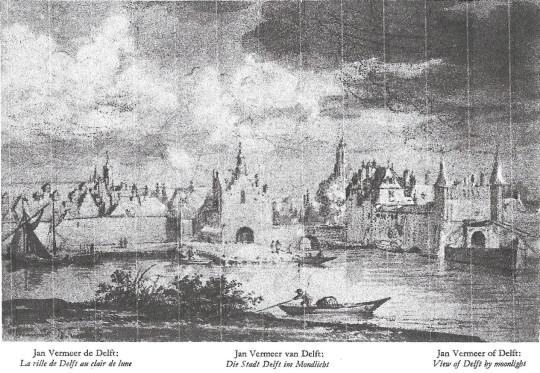
It is very believable that a painter with Vermeer's temperament, seeking always a calm resolution, would not in the end choose a hectic cloudscape, would want to clear the foreground of weeds and bushes, would reject as picturesque a man in a boat who distracts attention from the town across the water, and would decide that the town could not cohere if too many surfaces were lit at the same time across the whole piece. Instead, as we can see in his final consummation, he creates a series of long horizontals from the left, lowers the red- tiled roofline, extends the town wall and the quay, and emphasises all of this with a long placid reflection in the water.
The gap in the reflections comes where the two southern gates of the town connect at the bridge, and that is where he chooses to have the sunlight begin to illumine, not the immediate edge of the town but the buildings beyond and within it; this illumination then continues, ducking and weaving, to the limit of the picture on our right. It can therefore be said to be an outdoor view with an interior, of the town, lit from the right, as only the Lacemaker is among his indoor pictures.
Something curious about the painting vis-a-vis the drawing is the effect created by clearing the foreground of everything except very small figures that lead our eye from a point directly under the reflected left tower of the Rotterdam Gate, across the deserted sandy back to the two women talking, and thence to the group waiting for the ferry at the far left. Vermeer has radically revised in a way that manages to make the town as a whole seem nearer than the foreground figures but as calm and reflective as any of his single figures in a room. At the same time he has concentrated the light in the right half of the picture and given it a warmth to match the pale ochreous emptiness of the foreground that starts from the left, dies towards the right.
Old reproductions of this extraordinary painting show that the cloudscape was perhaps once much more modelled and interesting than it now is. As too often happens, there has been a flattening, a loss of density and volume in clouds that Vermeer knew to have both.
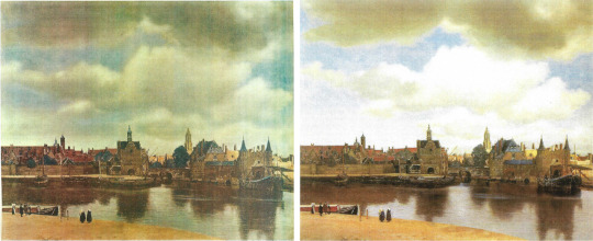
Vermeer’s painting before (left) and after (right) cleaning
If the drawing is original, then it tells us that Vermeer was no different from Ruysdael, Jan van der Cappelle or any of his country's great skyscapists in his understanding that clouds have a superstructure and an undercarriage and as such constitute a sort of moving architecture as they build, dissolve, and build again - a match for earthly buildings shaped by light.

Painting of Maid and Child - attribution and location unknown
The same lesson may be learned from the last item I can offer which, like the Leatham portrait, I know only from a photograph. I do not know its whereabouts or even whether it exists. Coming across the photo lying among unattributed Dutch paintings was nevertheless a memorable moment because I connected the image at once with Vermeer, specifically with his family’s servant, Tanneke, she of The Milkmaid, sitting in her place in the kitchen with a letter held between her hands - in that now familiar position - as she turns aside to attend to a child with a bowl. It seemed clear that the original, of which this may be the only record, was unfinished, abandoned by the artist for whatever reason.
If the original was indeed by Vermeer, then it would be unique among his known works in being a composition with a child in it. Why are there no children in Vermeer's paintings? Did he exclude them because they were too excitable, would never stay still? Did he exclude the elderly because they reminded him of the nearness of death, the fate of too many children of his time, including some of his own? In this case a child does get included, but how securely? Did the artist have doubts? If he took the child out, it would leave the servant looking down to our right for no obvious reason. Her pose is towards our left but her attention is to our right. If the child stays, the chiasm demands something - a small window - in the upper left corner.
Such is the rationale of the image as a composition, but the photo also suggested something about the original’s texture and lighting, factors which go together. What I particularly noticed and was excited by were incipient signs of those lovely beads of light so uniquely characteristic of Vermeer's art.
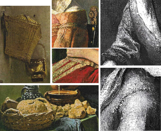
Details of painting techniques in The Milkmaid (left) and The Glass of Wine (centre) which could be compared with the portrait of Maid and Child
I had supposed that they were last touches, yet the photo appears to make them part of the earlier planning of a picture, prefigured elements in his vision of a scene. If the original ever turned up, we could be satisfied about these technical mysteries.
For myself, I am not sure that I want or need to know how Vermeer painted his pictures; I am reasonably content to marvel at the mysteries and credit them to genius. However, in view of the damage, as I see it, done by conservators to some of the Vermeers that we have in our museums the above old photo from 1947, of a lost picture that passed through the hands of a dealer called Katz, is valuable evidence that from the start of a painting Vermeer knew that what he wanted to record was light, and that light falls in a logical way which creates, according to the time of day, profound areas of shadow that can abut the light with little or no gradation.

Above are two photos using natural light and shadow (left and right) Detail from Lady Writing a Letter with her Maid (centre)
This is most true on a sunny day in the morning, less true by early afternoon. The contrast, clearly visible in the photo, between the lit and shadowed side of a sleeve is extreme. We all know this because we all live in the age of photography, the age that began just before Vermeer started to be rediscovered. Unfortunately for his paintings - and certainly not only his - we also inherit the preoccupations of the twentieth century which to a large extent revolved around the picture plane and its flatness. Combine flatness with iconography, another leading concern, and you get a visual sensibility that finds the pattern on a carpet more important to clarify than the logic of the light which would keep it dark. Here are two photos to illustrate (in the original sense of the word) the contrast that must be respected.
I am not a conservator. Even the thought of surgical intervention in the surface of a Vermeer makes me nervous; but if intervention is ever necessary I think two rules must apply: always respect the logic of the light, and never, if you can help it, reveal the canvas or other support. Vermeer's art is one of illusion, a very poetic and light-sensitive version of trompe l'oeil. Expose the canvas and you destroy the illusion; a wall ceases to ‘be’ a wall and becomes what it mostly is in de Hooch, a bit of brushwork pushed around over a bit of stretched cloth.
In conclusion I hope it is clear that drawings and even old photos can tell us important things about the essential nature of an artist's vision, the imagination that shapes images, in Vermeer's case through light and light’s dark accomplice. Having opened this essay testifying to my own long admiration for the art of Vermeer, I can best end it on a similar note but in the context of Delft. A painter called Cornelis de Man lived there at the same time as Vermeer and painted some pictures of domestic interiors that are testimony to his own admiration for those of Vermeer, a fellow-townsman and Guild member whom he personally knew.
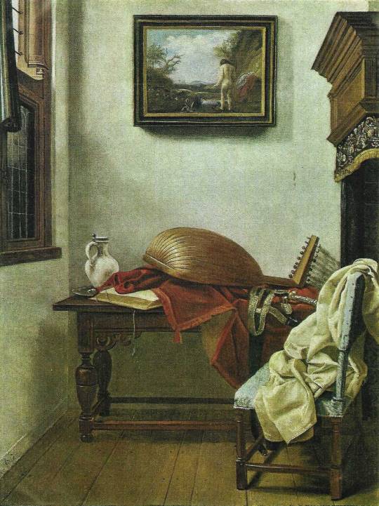
Still Life with Lute and a Jug - De Man
The picture of Vermeer that is now at Miami (and which was later engraved) is by this artist and very much in the Vermeer manner though crude and inferior by comparison.
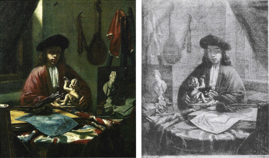
Portrait of Vermeer by De Man (left) and engraving thereof (right)
Also by this artist is a far better and more finished picture at Polesden Lacy near Dorking.
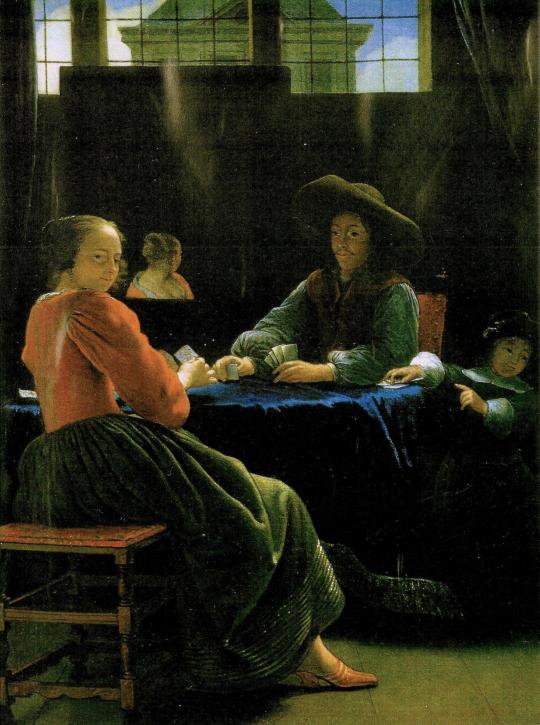
The Game of Cards - De Man
It shows a middle-aged man facing a young woman over a table where they are playing cards. A young child to the right who stands hardly higher than the table on which one hand rests looks out of the picture to direct, perhaps, another child's attention to the grown-up’s game. The young woman looks round towards us as one might turn to a camera.
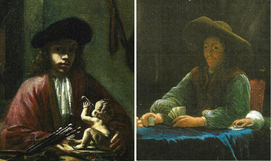
Details from De Man’s Portrait of Vermeer and The Game of Cards
Comparing the face of the man with that of the painter in the Miami picture, I think it very probable that we are looking at Vermeer himself relaxing opposite one of his daughters, with another of his many children beside him. The picture can stand in any case as a pleasant memorial to that genius of a ‘family man’, celebrant of town, home, kin and friends, who was happy to include those closest to him in what are still, despite the cleanings, some of the greatest of all representational paintings.
Julian Pritchard
March 2017
#vermeer#art history#dutch painter#flemish school#art theory#painting techniques#stolen art#frick museum#metropolitan museum of art#kenwood house#cornelis de man#girl with a pearl earring#connoisseurship
4 notes
·
View notes