
quirinah
Yeetus Yeetus Control Alt Deletus
|| Q || || ENG/中文 || calarts ca 28 || silly little artist drawing silly little things. requests are CLOSED.
891 posts
Last active 2 hours ago
Don't wanna be here? Send us removal request.
Last Seen Blogs
jonw8s
Jon's Lingerie Selection
miqothey
FREE PALESTINE

wamepibado
Untitled
wamepibado
Untitled
fetishanna
Fetishanna🦶🏼♥️
Text
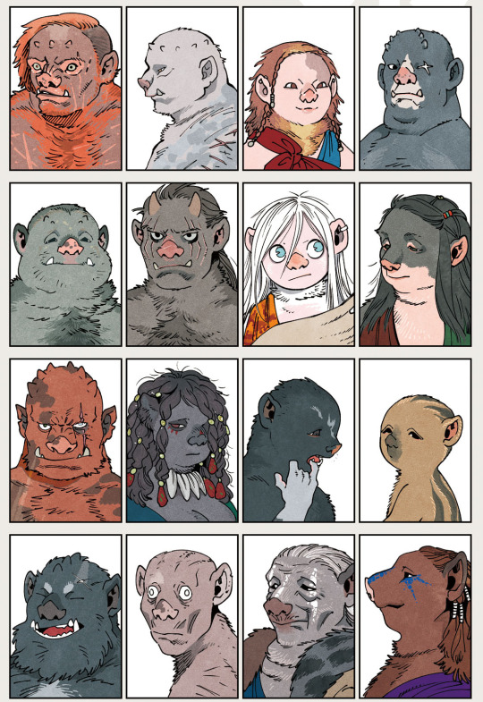
ummmmmmm guys this dungeons looking a little dark here..........................ummmm..... hello??? guys??
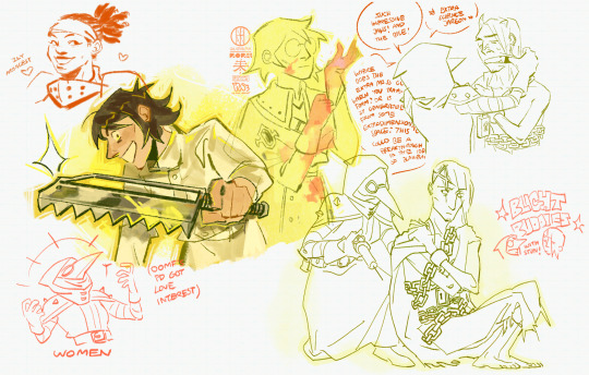
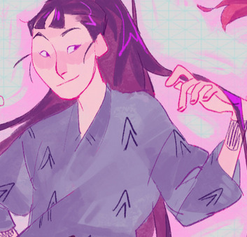
#quirinahdraws#darkest dungeon#darkest dungeon 2#IVE BEEN IN THE TRENCHES SO I NEED 2 POST MY EARLY APRIL DRAWINGS FROM WHEN I WAS (am) PLAYING THIS GAME TERMINALLY....#try to guess my favorite character (very difficult impossible /j)#notable moments include reynauld and dismas kicking the bucket in my first year to which i thought after the latter. ok at least theyre#together in death or watever. anyways i got a beyond the grave a week later with both of them and i could only revive one of them and my#first thought was wow! this would make great angst fodder! i should make a comic (and then i didnt)#but dismas is dead so i can never get the achievement but he basically carried me thru vvulf bc i didnt have any legend lvl frontliners and#i didnt know u could just sacrifice a hero to retreat. or that you had to destroy the bomb barrel HAHAHAHAH but we defeated vvulf SOMEHOW#sketchdump#digital#dd plague doctor#dd jester#dd shieldbreaker#dd arbalest#dd abomination#SORRY FOR YAOIFYING BIGBY THAT BADLY IDK WHAT HAPPENED...ETTO.......#my favorite builds are damage over time <3 number one blight buddy supporter#but marked for death r also my pookies....i just find marked builds a little awkward to use imo. but bh is like my blorbo#i find it funny drawing any of the charas bc i feel like i always draw characters a little too cutesy/colorful but its shrimpresting
101 notes
·
View notes
Text
HADES 2
#IM LATE BC I JUST GOT OFF A TRIP BUT#RAGHHHH#I THINK I HAUVE COVID#quirinahscreams#i signed up for early access...forlorn#.SAVE ME SELENE SAVE ME HEPHAESTUS SAVE ME UPDATED PORTRAITS SAVE ME LONG HAIRED HYPNOS#SAVE MEEEEEEEEEEEEEEEEEEEEEEEEEEEEEE#delete later#AG+HHHHHHHHHHHHHHHHHHH MY WALLET#AGHHHHHHHHHHHHHHHHHHHHHHHH#IM ON FIRE#AGHHHHHHHH
3 notes
·
View notes
Note
Yoooo I have no clue for what you draw fanart for but your artstyle is sick as hell!! It's so nice!!!
HI omg sorry 4 being the world's latest responder ever...thank you so much!!
#(to the tune of that one meme image) so theres this comedy show about ninjas from the 90s with no official english localization... 😳#ask#birdyverdie#i spam like a lot (got really into darkest dungeon like a week ago) (still hasn't finished fanart) lolol...#quirinahscreams
5 notes
·
View notes
Text
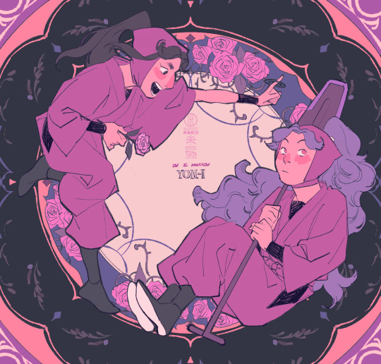


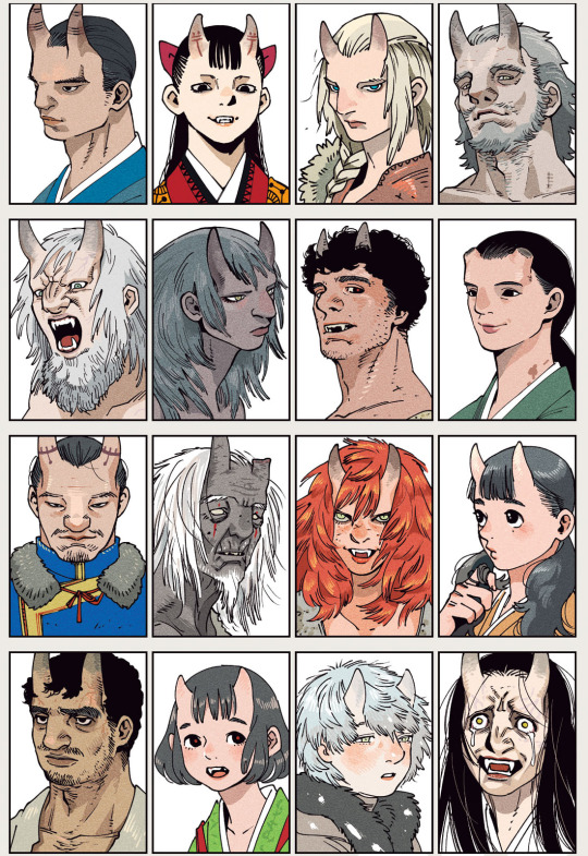
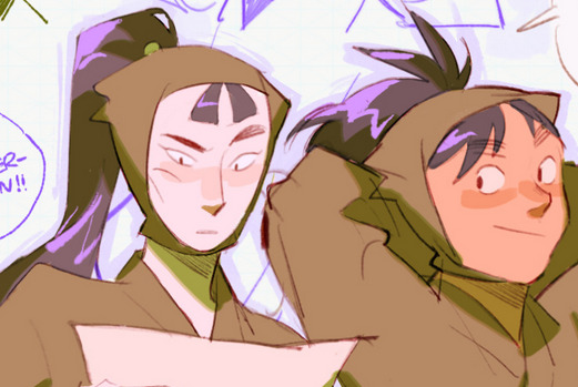
i! ro! ha!
#quirinahdraws#nintama#nintama rantarou#忍たま乱太郎#rkrn#四い#四ろ#四は#tairano takiyashamaru#ayabe kihachirou#hama shuichirou#tamura mikiemon#saitou takamaru#stuff from da character days on twitter!!!!#since all the different classes/duos have such different vibes I wanted 2 get different vibes for their drawings…I think yon-i has the best#composition to me and it was also the easiest to draw but I’m still very fond of the corny rock band parody of yonro#I wish takamarus color palette was darker it would’ve gone better w the other two but I scuffed his composition a lil…sowwy#SAVE ME ROTATIONAL SYMMETRY SAVE ME RADIAL SYMMETRY TOOL#I DID SO MUCH AND YET SO LITTLE DRAWING THIS WEEK UE UE UE#there was a really good duo with taki and shuichirou that came out and from all the fanart I’ve seen it looks REALLY GOOD#but I can’t watch s32 yet…ueueueueue#the sixth years occupy about 90% of my brain space but the fourth years are my other favorites. I just suck about talking about characters#(sixteen pages of psychoanalysis in my head) oh they’re cute…#twoomf kept posting about pe committee n taki..he has so much pomp but he’s also just genuinely such a sweet kid. and kinda insecure LOL#GAHHHH I CANT TALK ABOUT MY FAVES PROPERLYYY but …ouuuuu…fourth year disease#AGHH 4BBBB (other fourth year favorite is shuichirou)
7 notes
·
View notes
Text
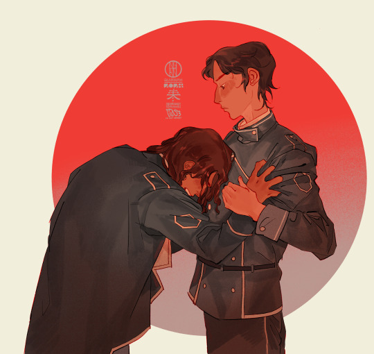
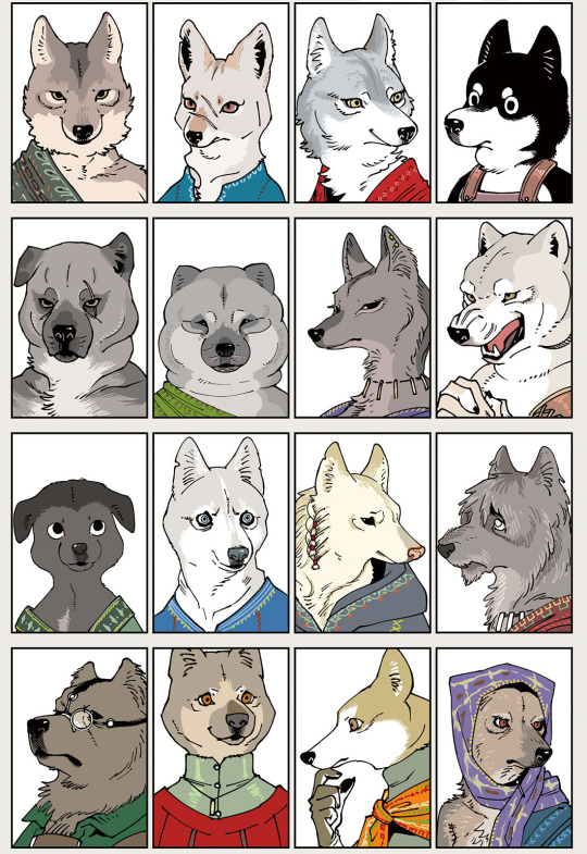
kaladin and moash drawn 4 a friend art trade 😵💫👍
695 notes
·
View notes

Photo
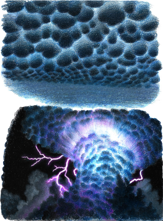
mammatus and cumulonimbus they are best friends
26K notes
·
View notes

Note
how do you get your colors to look so nice and your lineart so red and vibrant? i love it
omg anon thank you!! 😭 im going 2 be honest I am Not Great with color theory... but i like having my sketch pages look cohesive to me...
BUCKLE UP this is going to need a readmore bc i like talking.
I always sketch in neon colors it's a habit i picked up from an old teacher but I'll think of a color usually on a whim and draw with that. and then if i want to draw something else ill pick another color that i think goes well with the page. usually most of my color schemes r analogous (colors right next to each other on the wheel)

yanked this from recent dunmesh post; i kept most of my colors within the pink/red/orange range.
i wouldn't recommend doing everything in monochrome or analogous palettes though because it's sort of a guilty crutch of mine XD.
sometimes when im coloring ill change the layer mode of the sketch. color burn gets you either very very bright or very very deep colors depending on the color of the flats underneath. multiply and linear burn do the same thing but they're a lot tamer and generally always return darker colors. im sure there's some technical bits behind this though. ill either color my lineart afterward to compliment the color of the flats, leave it as is, or mess with layer modes if i feel like it. my favorite trick is color burn + linear burn + some combination of two lineart layers and just fiddling until i get a nice burn effect.
mithrun was done with crimson red on color burn.
coloring... like 999% of this is relative color which is like. kind of the idea that colors look different when placed next to each other. if you eyeball it a bit it's pretty noticeable.

what i used to do a bit ago was i would fill in the area i wanted to color with one big mask of color, make a new layer that has a clipping mask down to the flat layer of color, and then draw my actual flat colors. the color of the mask helped me pick my flat colors bc if I picked a color i think stood out too much next to the mask i could kind of just adjust it until it looked a little more cohesive.

old ish drawing next 2 a canon reference. i ignore local color a lot...mea culpa....but my overall color palette here was a light pink, so the shirt here is actually a desaturated pink? or violet i believe. if you shift sort of that purple color far enough into the gray area of your color wheel it can take on a blueish or even greenish hue. it being next to a lot of warm pinks/fuschias helps.
a neat thing that kind of helps is that if you desaturate or saturate certain colors they can kind of take on a certain hue? not sure if this makes sense. sort of how orange here turns tealish blue the grayer it gets. so if im drawing something that's predominantly orange and i have a blue color i can just take an orange color and desaturate it until i get a color that sort of looks like blue. and that way it kind of looks more harmonious? at least to me XD
shading. i don't apply serious lighting to a lot of my drawings, but a helpful bit is that the shadows tend to be the opposite of whatever color the lighting is? i try to think first about the "mood" or the main color i want to go for in the drawing and then i pick a shadow color opposite of that. so for here, i wanted the lighting to be a coolish magenta so the shadows r lime green. if there's anything off i fiddle around until i get something i like. the shadows on the skin here were too green initially so i shifted them a little more orange.
there's a "band" of color going on between the transition of the shadows to the light. generally this could be for a lot of reasons and i tend to use it differently (core shadow? overexposure? etc etc). but this is a color post so ill try not to go too off track.
but generally digital doesn't "mix" colors the same way traditional colors do if you use RGB (cmyk is a bit better with this but is kind of a pain to get used to), so to make blending a little less muddy, i sometimes add an intermediate color to smooth things out a little. for example, mixing digitally blue n yellow tends to get you gray, but generally, blue + yellow makes green, so if im making a blue->yellow transition ill slap some green color in the middle so it flows a little better.
I do a lot more cel shading nowadays. if you've been on here for a while earlier this year i have another style of coloring but it's not really accurate to how shadows really work so i wouldn't recommend looking at it. it's mostly to add zest and texture to the underlying flat colors.
coloring your lineart does a TON to helping your colors look vibrant, though its like the garnish on a dish to me (same with shadows). i think it's good to try and play with your flat colors and try to make sure those look in order first before adding flourishes. usually ill leave it a dark, saturated color that again matches my overall palette but sometimes i go in and color them by alpha locking my lineart layer and picking a color that matches the flat colors underneath? not sure how to explain it properly.

i used a darkish purple for shuro's ponytail to match the dull red of the flat colors (more relative color! trying to simulate a black/brown while keeping the pink palette there) but a lighter crimson for laios's blond. the light was this super intense like blush pink so i thought it might be cool to add this neon salmon red in the areas of that light to really give off that vibe of a very bright intense rim light.
sometimes you could also tweak with gradient maps or color balance, which adjusts hue based on how light or dark a color is. these r fun to mess with as a final touch but i need to watch using them because they can become crutches real fast XD but those are also just tools to help you. in the end just developing a good sense of how color works and how you want to use it is the best place to start.
LONGASS ramble but yeah. tldr just kind of train ur eye for color and look at what you like best. which is unhelpful and a little sucky but it really is just observation and practice and maybe some personal zest.
happy drawing!
#SORRY THIS IS THE SIZE OF CANADA I YAP A LOT#i like being thorough when explaining myself a lot XD but i think the easiest way to get good with this is just repeat practice n observing#and figuring out how stuff behaves in certain situations and what you like to do and blahblahblah#if you have artists u like that do this well looking at how they use color might be cool#...i feel this entire post is just putting my entire thought process on blast LOLLL.#“eyeball it out” -> study some actual fundamental stuff and or intake new info or art -> apply it back to just eyeballing it out#i dont think i have a natural sense for some basics#but i dont think im naturally one of those people who grind out studies all the time and breakdowns either#i guess i just kind of like knowing the mechanations behind why to do a certain thing or how stuff works and then figuring out#how that translates into what i know nerd emoji#james gurney has a good book on color and light#if you like reading. but its very informative!#quirinahscreams#ask#anon#this is mostly just me talking about how i draw i dont think this is meant to be educational or informative XD um
9 notes
·
View notes
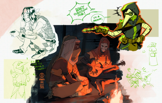
Text

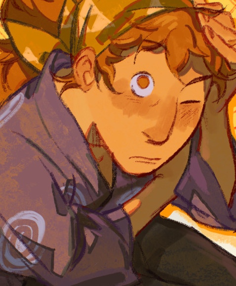
oomf was talking about this combi and I remembered the season 25 episode where they interact for like 30 seconds. and then i got progressively more invested
#quirinahdraws#WHATEVERRRR *exploding*#nintama#nintama rantarou#忍たま乱太郎#rkrn#nanamatsu koheita#tachibana senzou#i don’t know if i actually do ship them romantically but it’s a very fun idea to think about#Listen Listen Listen. Can anyone hear me. i just think koheita is way smarter than he looks (crazy person)#BUT REALLY. he’s quite knowledgeable and he’s very sincere and good and reading people but he’s also super intuitive#and makes most of his decisions on the spot based on how he reads a situation and how he feels so he’s difficult to keep up with#it would just be fun to see senzou whos also really smart! but likes being in control and looking unflappable and perfect#falling for a guy who he can’t read but who’s super sincere and encouraging nevertheless… (forlorn)#HE SAW THROUGH SABUROU’S DISGUISE OF SENZOU IN THE 5TH YEARS VS 6TH YEARS ARC CAN ANYONE HEAR MEEEEE (is dragged offstage)#こへ仙#kohesen#but i think they would be a fun duo nevertheless! I can’t write dialogue but i saw someone way long ago talking about how it would be fun t#see senzou as the planner/espionage kind of strategist and koheita as the guy who gets in and gets stuff done…#OR PLANNING TOGETHER I can’t write dialogue but I like to think about koheita already having assessed the circumstance and just#cooking up a plan on the fly…#I do think senzou is kind of like monjirou where he’s a little bit of a softie at heart but he isn’t around koheita all the time like monji#so it might be fun to see him more flustered/being unable to read kohe….i want to see them get along too…. (crazy person)#digital
12 notes
·
View notes
Text
wow....
#IVE HAD AN AFTERNOON TO PROCESS BUT ERM UM ETTO#guy who spammed about 02930294205 sketches on insta stories#idk if I'm going to yap on bird app ab it....but...#quirinahscreams#me when. Port Folio.#also character design reveal LOL#delete later?
9 notes
·
View notes
Text
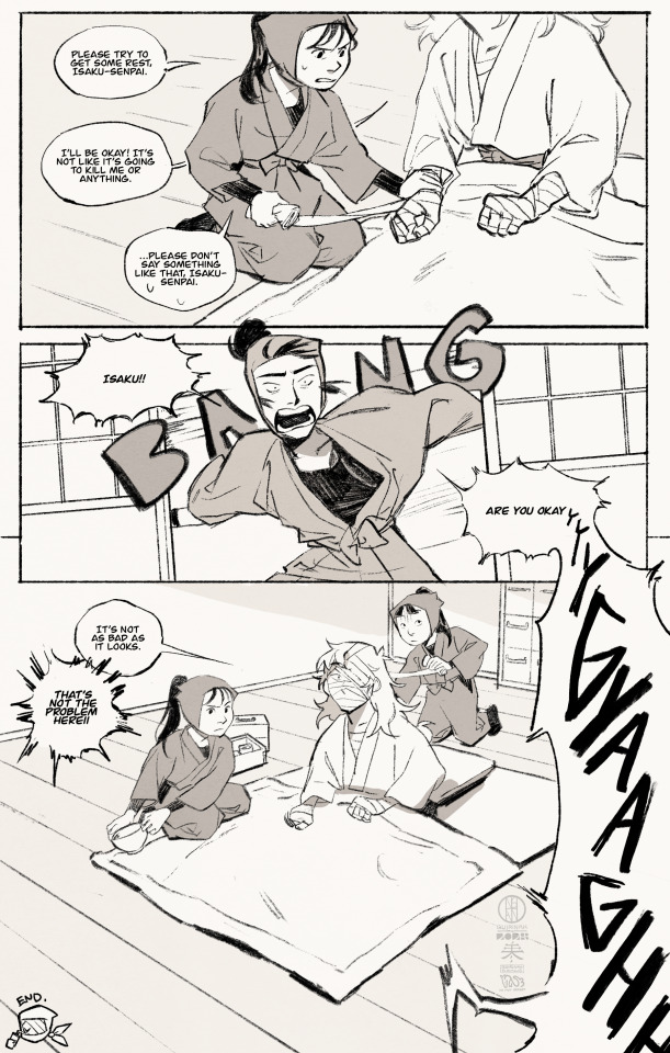
deja vu
#忍たま乱太郎#nintama#nintama rantarou#rkrn#quirinahdraws#comic#digital#zenpouji isaku#kawanishi sakon#kema tomesaburou#tsurumachi fushikizou#he’s fine dw. probably just fell in a hole LOL#I HATE COMPOSITION GRRR. um i hope the flow is readable#finally making gag manga again!! nature is healing ^_^#isaku busting it down zatto style….#erm. idk. i wanted to draw comic…
11 notes
·
View notes
Photo
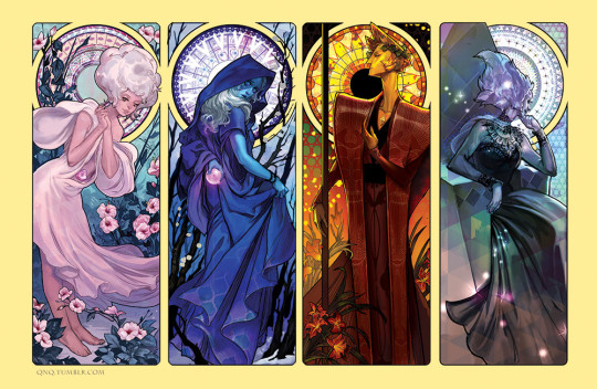
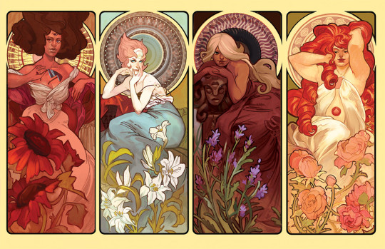
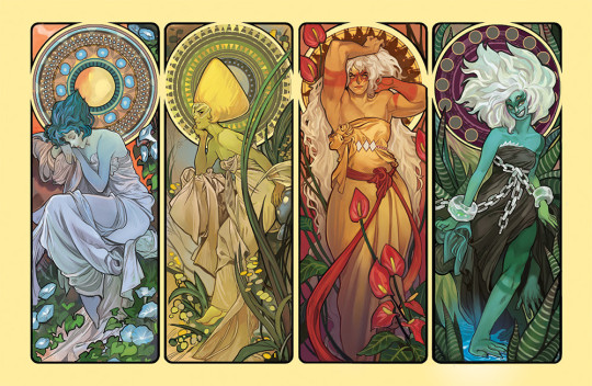
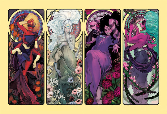
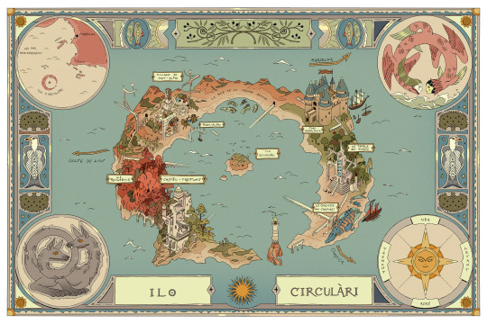
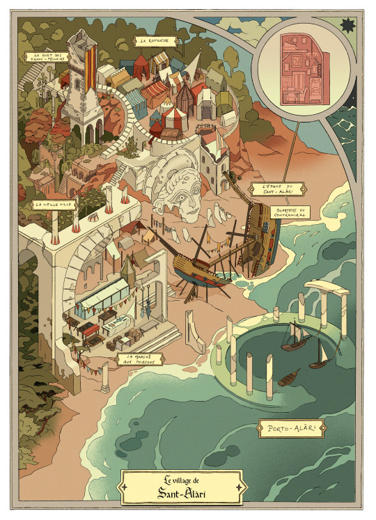
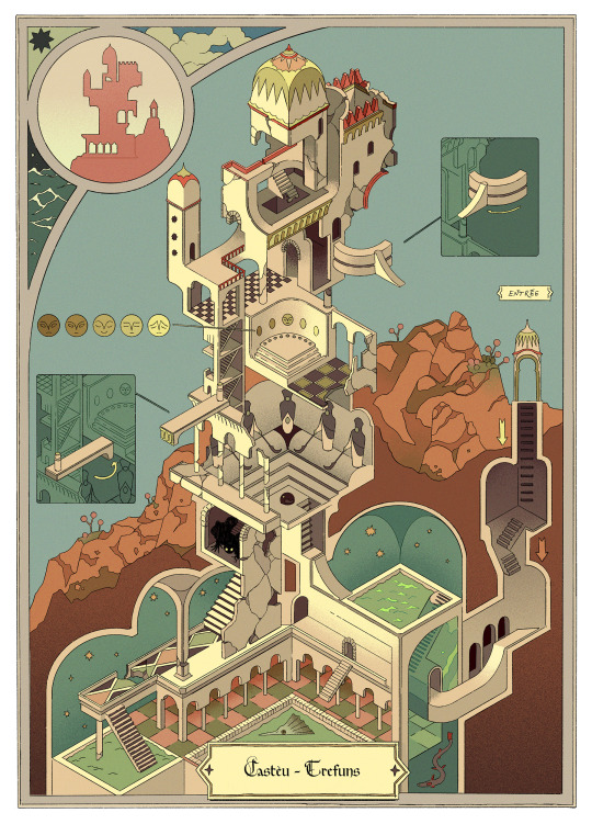
Steven Universe - Art Nouveau Series by Alexa Rockman
43K notes
·
View notes
Text
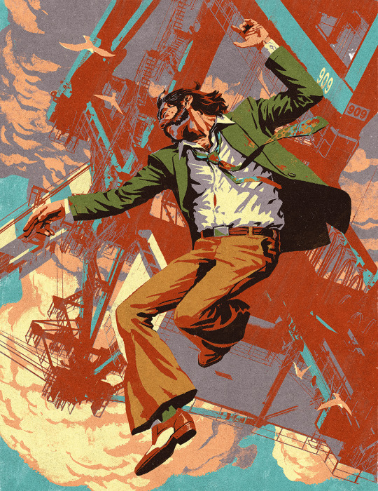
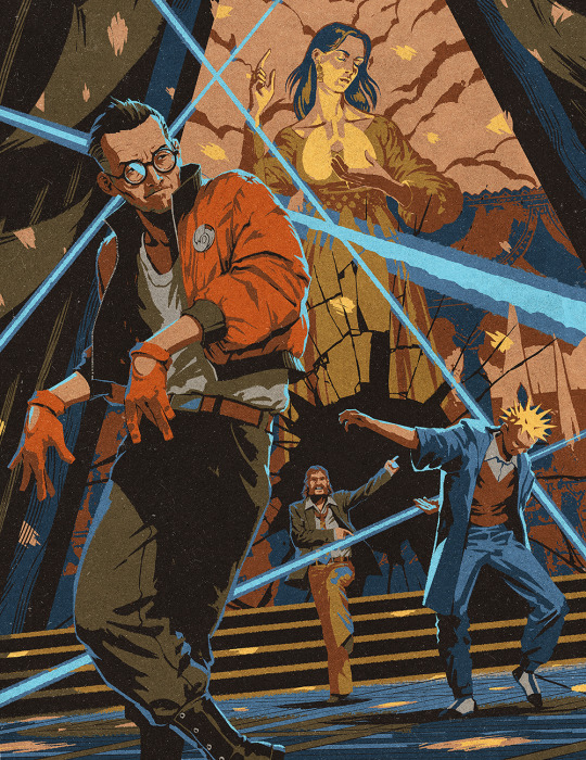
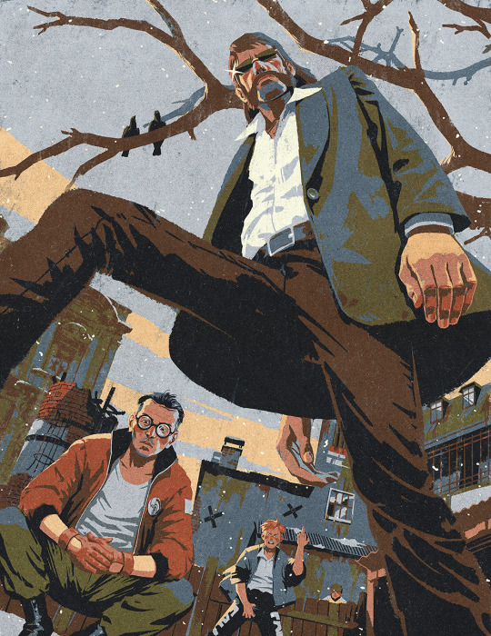
Hey, here's the full set of the brand new Disco Elysium pics!
Prints are available, and maybe these work well in poster format (which inprnt started doing a while ago)?
I'm sad I didn't get to draw any cars, would be nice to do 1 more, but I need to move on...
Also, there has been a promo on all summer at inprnt that might end soon, so these are at 35% off right now!
22K notes
·
View notes
Text

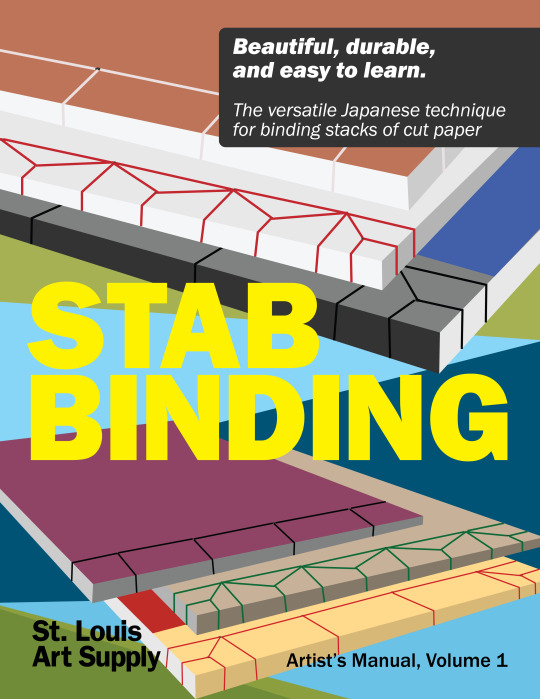

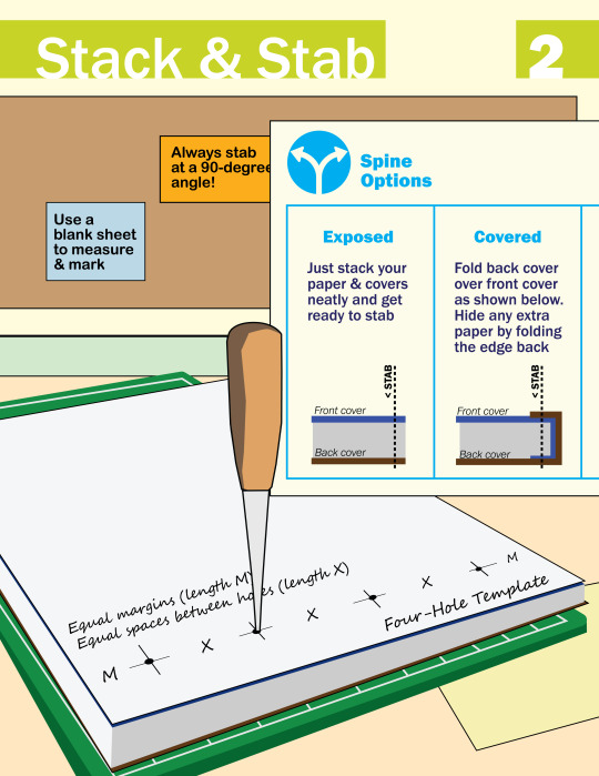

I made this zine last year to teach Japanese stab binding. It's a technique that every artist should know—with just a few tools, it's so easy to bind your own sketchbook or to make a physical version of your art/writing/etc.
Download the PDF version (with bonus photos & tips!)
4K notes
·
View notes
Photo
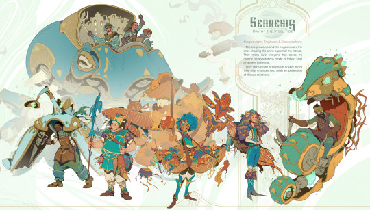
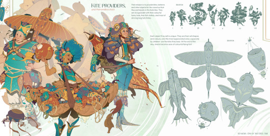


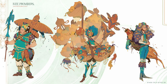

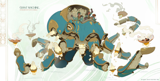
Seanesis - Kite Providers & Engineers by Gabrielle Penager
1K notes
·
View notes
Text
I made an art/anatomy tutorial about birds! I hope people will find it helpful!


25K notes
·
View notes