marikmizuki
Marik's Gallery
28 | From Germany | Artist
115 posts
Don't wanna be here? Send us removal request.
Last Seen Blogs

theseobaba
Seo Baba
convictedchinadoll
I Will Be Better This Time
theseobaba
Seo Baba

noahpt-blog
blurryface
Text
Remember this joke?
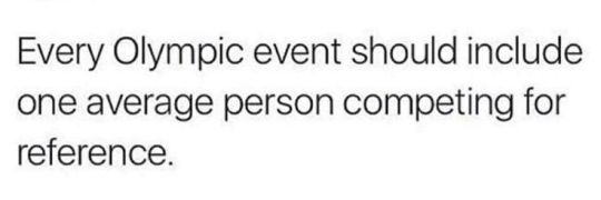
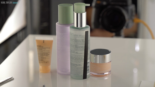
Well, I am going to do something similar only with photography. This is a photo someone took for an Amazon review of their Clinique products.
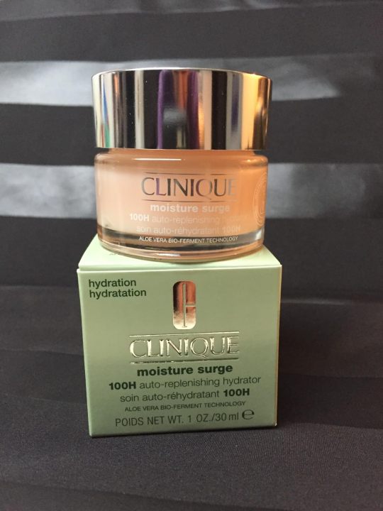
Honestly, it is not a terrible photo. They did some staging. They have an interesting background. All of the labels are legible. It is properly exposed. This would be a perfectly acceptable product photo for an Etsy page.
I've been taking these advanced photography courses in preparation for whenever I am able to create a new studio in the house. And my teacher is a photography badass. I just watched a 6 hour class on how to recreate a professional Clinique ad. And at first glance it looks deceptively simple. It's just some skin care products being splashed with a little water.
Which is why I wanted you to see an average person for reference.
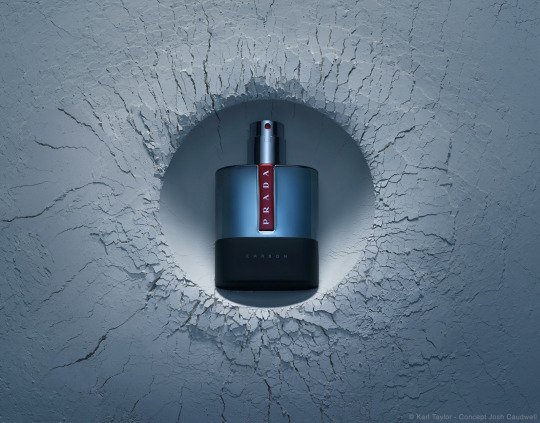
This is what Karl Taylor came up with.
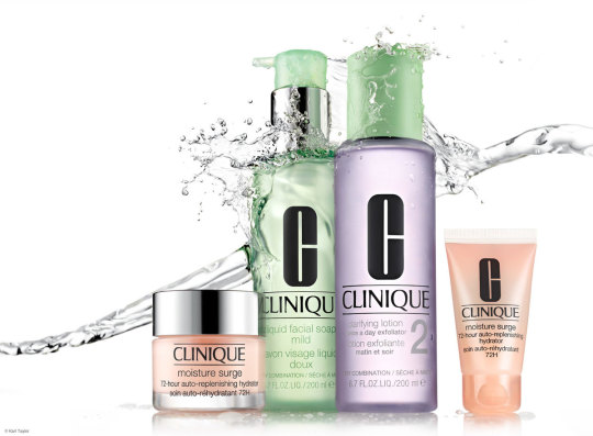
And I don't think I've learned so much about photography in one tutorial before.
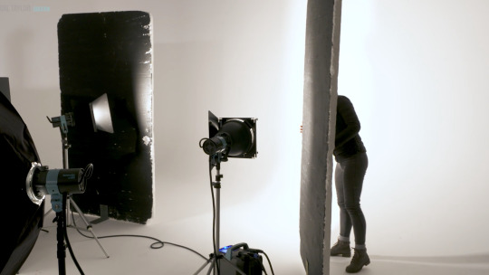
Product photography is just loads and loads of problem solving. You have to light the chrome caps with a gradient. Which requires giant diffusion scrims.

Those big white panels are literally only there for the two chrome caps.
You need a pure white background, but you can't let light spill all over the studio, so you put up giant black light blockers.
And you have to add another light just for the orange bottle on the right.

Oh, and if you want the bottles to glow, well, you have to hide a silver reflector behind them.
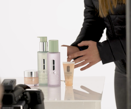
But you still want the edges of the bottles to be darker so they have some contrast. So you add some black tape to the sides.
And in order for the reflective labels to have bold black lettering, you have to reflect black cards into them.
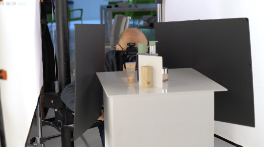
Ack! Karl's beautiful bald head is showing up in the chrome caps! He must put on the naughty blanket.
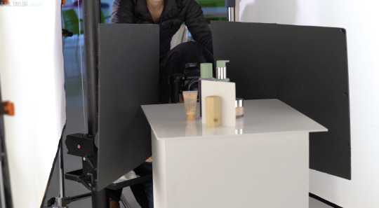
And once you get every aspect of every bottle perfectly lit, you finally get to yeet some water at it all.

I don't love product photography because I have a weird obsession to help greedy corporations make their wares look more beautiful. I love it because it is a complicated and challenging new puzzle every time. Every product is a different shape and requires a different technique to make it look its best.
I don't know if I will be able to live up to Karl's standards.

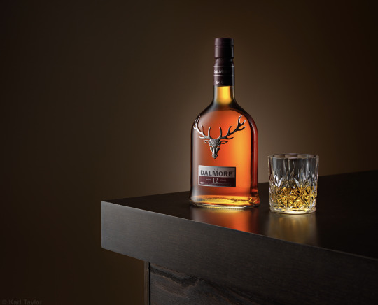
This is about the level I was at in 2017 before I quit photography.
I have so much more knowledge in my brain now. I'm really hoping I can surpass that.
4K notes
·
View notes
Text

As player with notoriously bad rolls, this moment really hit close to home....
#dimension 20#d20#dnd#Fantasy High Junior Year#fig#Fantasy High#fig faeth#Figueroth#Junior Year#my art#not fully happy with this one but it's been itching at the back of my brain
118 notes
·
View notes
Text

"Plenty" the Hivemind
Thi-kreen ⚬ Ranger ⚬ Swarmkeeper
#dnd#art#bug#alien#dnd art#Thri-kreen#monster#plenty#hivemind#based on a picasso bug#also my idiot ass uploaded it to my meme blog ofc.
28 notes
·
View notes
Text

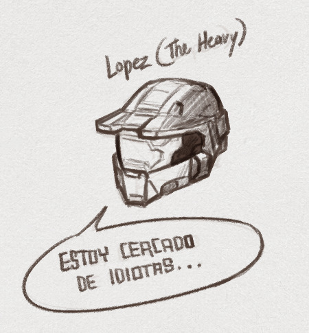

At long last, the reds to match the blues.
660 notes
·
View notes
Text
Hey, can y’all rb this if it’s okay to send you messages asking about your ocs, cause on god I wanna interact with y’all but I am terrified of being annoying lol
54K notes
·
View notes
Text

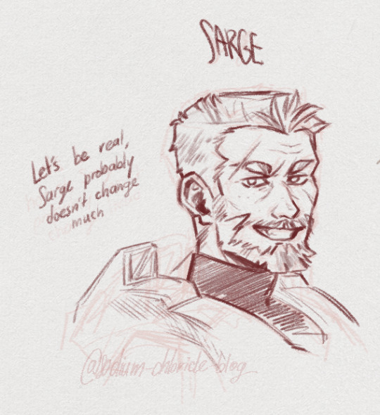
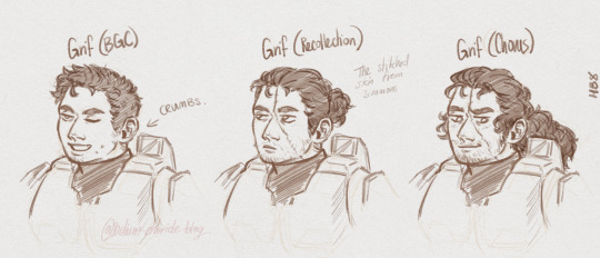
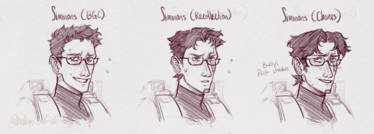
grimmons face canon change number who even knows at this point
713 notes
·
View notes
Text

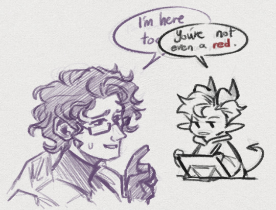
Figured I'll join the bandwagon! A splash art for the Simmons' route that I had an honor to make when I was a part of rvbfds project. Hope y'all like it as much as I enjoyed making this piece!
661 notes
·
View notes
Photo
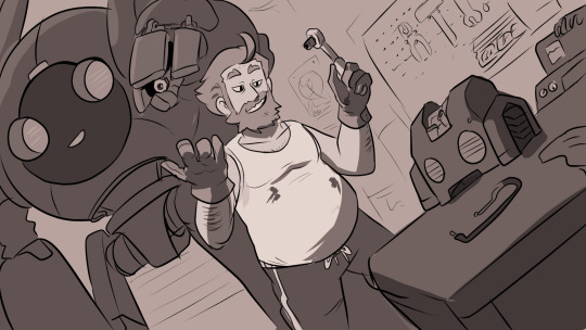

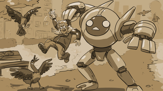


#robot#romance#robots#art#oc art#i never post anything i make#might aswell#ruben#ruben vermeil#maroon#robo romance#my art
18 notes
·
View notes
Text

More of my favorite little gremlin Axel and his best friends "O-Zone" and "T-Bone"
5 notes
·
View notes
Text

6 notes
·
View notes
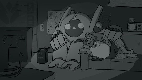
Text
Commission for @marikmizuki. Robo cuddles
9 notes
·
View notes
Text

Meet my latest sin: Axel Jagger.
He’s a student at the mage’s college aiming to become a famous bard. As such, he has joined the bard fraternity - aka. the ‘Malus’ connection.
This group of dance bards all pledge their souls to the incubus Malefont, who in turn for them being your stereotypical bardsTM (sleeping basically with anyone) gives them a fraction of his powers.
Essentially I'm playing a warlock charading to be a bard and having so much fun.
Credit for the gold font effect under the cut cause I just couldn't get it to look ok on my own...
Gold Font Effect by abdularis on Freepik
#dnd#bard#warlock#dnd character art#character art#oc#dance#Axel Jagger#Malefont#The Malus connection#all his frat bros also have names#from left to right we have#Ronny Tabs#Spanx#O-Zone#Green Gunshow#T-Bone#and#Rüdiger#they are all horrible and I love them#my art
1 note
·
View note
Photo
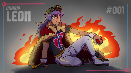
#pokemon#pokémon#leon#champ leon#delion#champ#fanart#i love this man#he's just absolute gender goals
30 notes
·
View notes
Photo
398 notes
·
View notes
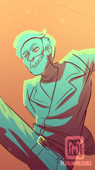
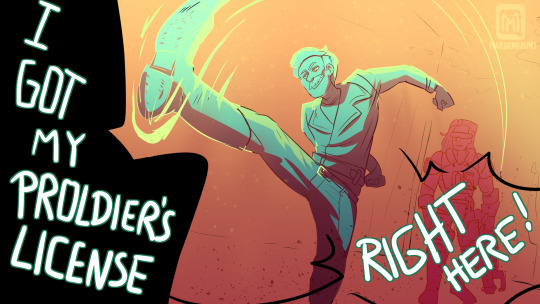
Photo
#d20#aso#dimension 20#a starstruck odyssey#norman skip takamori#skip#proldier's license#loved that scene#trying to fuck around with colors a bit#fanart
398 notes
·
View notes
Photo
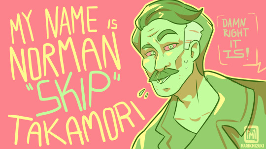
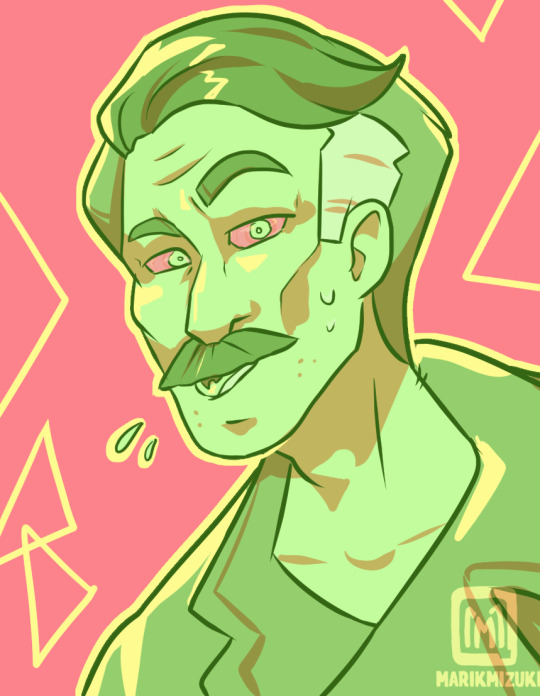
#d20#dimension 20#dimension20#norman skip takamori#a starstruck odyssey#norman takamori#d20 starstruck#cerebroslug#skip#I absolutely love this slug boi
138 notes
·
View notes
Photo
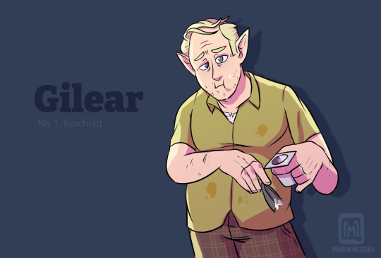
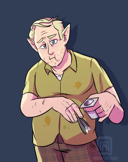
Super late to the party, but I love this pathetic little meow meow
#dimension 20#dimension20#fantasy high#fantasyhigh#gilear#gilear faeth#d20#no 1#lunchlad#he's the best#joghurt#man#I vote him as the next#tumblr sexyman
215 notes
·
View notes