lautonium
Still Learning
COMMISSIONS OPEN /
Hello and Welcome!
I'm Lautonium and while I've been drawing traditionally for a long time I've just started trying my hand at digital art. I hope to make something out of my skills someday.
169 posts
Last active 60 minutes ago
Don't wanna be here? Send us removal request.
Last Seen Blogs
oiledcola
Oiledcola's Storage
illegalsimpery101
cursed bitch

littlekiara96
Gallaghesley

thenwedied
thenwedied

digitalmarketingforstartups
Untitled
Text
slowly posting some old stuff from my ptreon that might be helpful
863 notes
·
View notes
Photo

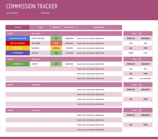
Commission Tracker (Google Sheets)
I made a personal commission tracker for Google Sheets that you can copy and edit however you want for personal use. This is according to how I organize my commissions but you can tweak it however you want for your own personal touches if you know how to use Sheets.
Download it here: Commission Tracker for Google Sheets
I can’t guarantee this will work in Excel or LibreOffice but you can try.
Read below the cut for installation instructions and editing.
Keep reading
423 notes
·
View notes
Text

5 notes
·
View notes
Text

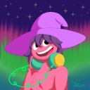
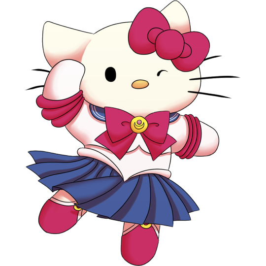
Turned my favorite stuffed animal into a character
#pink#mouse#pink mouse#art#digital#digital drawing#digital art#character#design#character design#character concept#concept art
0 notes

Text
General portfolio tips
Disclaimer These are ‘things I picked up from art school/industry experience that google didn’t tell me’ and rules that can be broken if you break them well enough. It also assumes that your work is already at or near industry level—check out the section at the bottom if you’d like some tips about that! Know that the judges of whatever you’re applying for are biased, based on the needs of the project & preferences—If a different group looked over the same pool of applicants, their selection will also look very different.
Have a good amount of your work right on the opening page (online). This’ll help people get a sense of your art without spending ages figuring out your site layout. Organizers going through a large quantity of applicants will likely give your portfolio about 5 seconds’ consideration—make sure to grab them right off the bat!
Your portfolio is only as strong as your weakest piece. Do NOT include that environment study “to show variety” if it doesn’t look as good as the rest of your work. Any person hiring will have to weigh how much they like most of your work vs. the chance of getting That Piece.
You’re essentially trying to pretend as hard as you can that you aren’t a student. The ones people call “student portfolios” look like a mix of life studies and despair—try to draw what you want to draw, because people can really tell when you CARE about something.
15+ pieces! A small amount will make the organizer think you haven’t drawn enough, but also don’t put in everything you’ve ever drawn. Selection of best work only!
You better enjoy whatever you put in your portfolio, because if you lost the last fragment of your soul to a cityscape that turned out well, some art director WILL make you draw cityscapes for the next five years.
Shrinking your images down (~1000-1920 pixels longest side) before you post them helps your site load faster.
Instagram & a tumblr art tag are pretty good if you’re applying to zines; it helps to get an actual website for jobs.
How to get better™
Draw a LOT. Don’t worry about STYLE, if everything looks different, embrace it and keep going! This is your brain & hands trying all the different combinations to eventually get where it wants to be! Trying to conform to one style & stuffing yourself into a box right off the bat will limit you before you can really start going! Be freeeeee—
Keep reading
744 notes
·
View notes
Text

A present for a friend
A cute Clown Girl
2 notes
·
View notes
Text
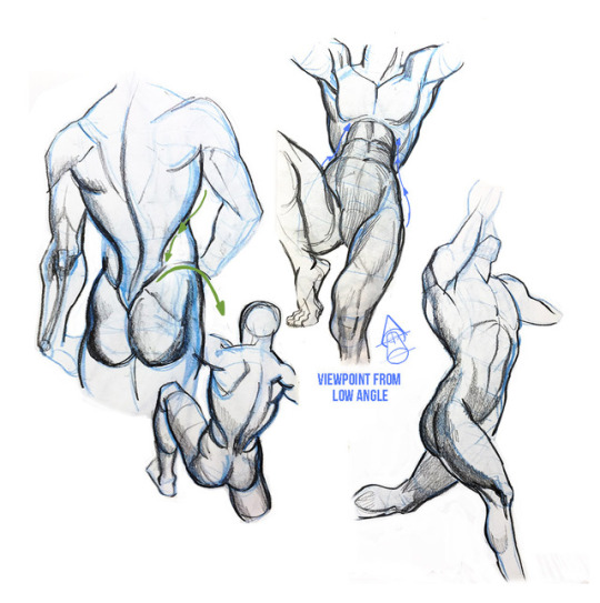
ayo i found 2 pages with head angles of humans and animals, could be useful to anyone reading this
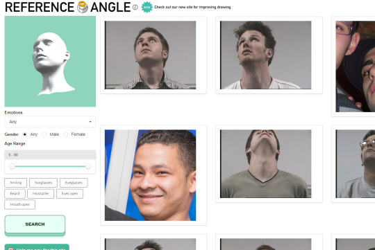
hoomans

animals
166K notes
·
View notes
Note
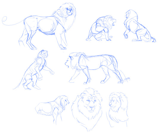
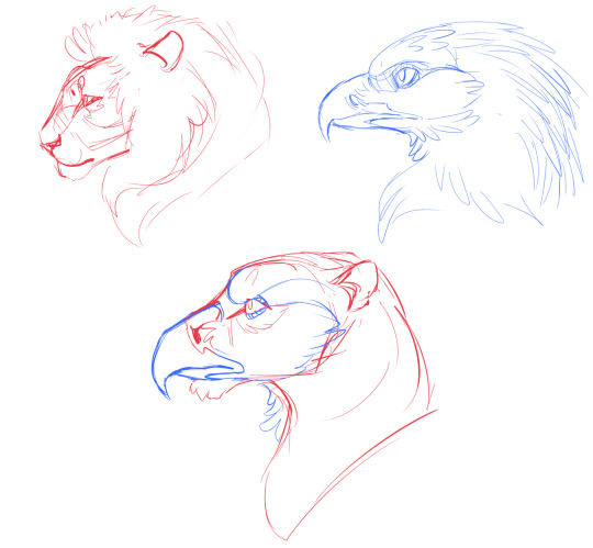
How to Draw and Design Gryphons and Hippogryphs by using photo references of eagles, lions and horses?
Draw everything individually, from multiple angles.
How to draw horses || How I practice anatomy || Gesture drawing
It's like juicing up for a very tasty dream by consuming your favorite genre, characters, settings, etc and hoping your subconscious combines them.
If the final result is your target, and you see your drawing arm as a gun taking aim, then references are your bullets. Fill the chamber with reference unless you want to play roulette.
Your first step in reference gathering is to be specific. Know what you want and stick with it. I searched specifically for African Lion and Gold Eagle. Being specific helps you observe detail more accurately, and it already puts you one step ahead of generic designs.
I'm only going to tackle Lion + Eagle today for simplicity, but you can use this advice to combine two, three, or dozens of animals including horses.
Get your reference, and start practicing. Keep it simple and undetailed, only drawing the essence of the photo, rather than exact position and proportion.
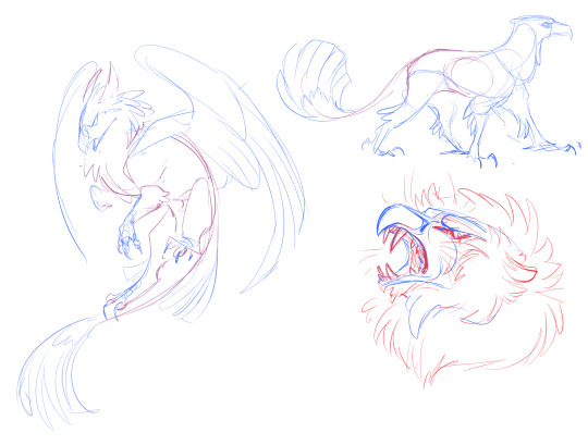
Use action poses to practice! Even though they're more challenging, they will infuse your final result with action as well. Look up things like hunting, fighting, walking, running, landing, etc to get action reference.
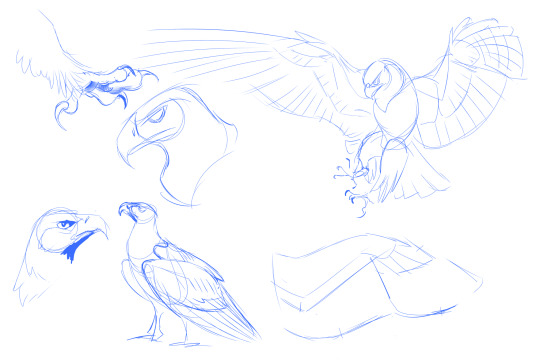
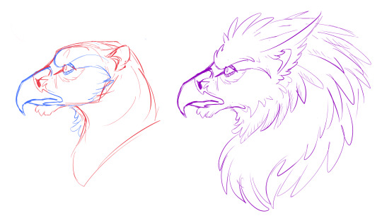
Practice most on the creature you're having the hardest time with. That was Lions, for me. I even did a separate page where I studied the structure of their manes, since I wanted that in my griffin design.
Remember: you can trace photos as part of study! This is helpful for correcting proportions and anatomy. Make sure you are tracing mass and bones, not outlines.

Now that you're weapon is loaded with reference, you'll be able to design freehand without copying a photo. This is IDEAL because you won't be slowed down by anatomy. Now what we're here for: Design.
Creature Design Masterpost || Splice Vs Blend
This is going to be yet another visit to Splice vs. Blend technique, so strap in. Here's some guys I drew after I finished studying. No photos needed at this stage because I've eaten them all.
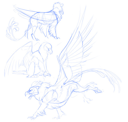
The most common creature design technique is something I call Splicing. You take pieces of animals and graft them onto each other with stitches. Griffins are notorious for this with their bird talons on the front legs and lion paws on the back. That's a creature that was formed through magic, not evolution. This automatically makes your griffin less believable. And probably a bit awkward in the walking department.
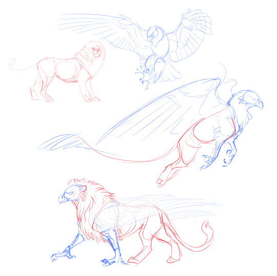
So here's a new challenge: Blending. Take bits of each creature and put them in a mixer, letting the ingredients land all over the place and amongst each other. What if we had a lion skull, with an extra-thick bird beak in place of the jaws? What if the lion chin was still there in the form of a tuft of fur? Maybe the tear duct from the lion, and the eyelids of bird? Let's give it lion ears with the furrowed brow so typical of raptors.
It already looks like a new life form, rather than a photoshopped amateur hour of recognizable animals. I could cover it in either feathers or fur and it would still be distinct as a new species. I want the classic lion mane in some form, so I'm taking the shape and turning it into long, fluffy feathers.
Don't stop there! Try identifying what traits make an eagle and eagle, or a lion a lion, and sticking them between each other.
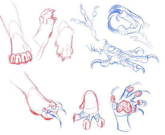
Keep combining! Challenge convention! Add and omit parts and pieces to your heart's content.
Take this practice to all parts of all creatures. Throw new stuff in a blender instead of stitching it together. This especially includes color! You see a lot of spliced markings in novelty griffins, with a specific cat and bird. Artists get stuck on copy-pasting animal patterns because they're afraid the ingredients won't be recognizable, or they're just lost in the sauce of loving tigers they forget to actually have fun with it.

It's still recognizable as tiger and peacock, but much more compelling, wouldn't you say? Go for something unique rather than staying with what feels "safe." There's a million griffin artists out there, but only one You.
7K notes
·
View notes
Text
fucked up how colors look different depending on what screen you’re looking at them on. that should be illegal I think
189K notes
·
View notes
Text
I was commissioned to design an inside joke card play mat by a friend
1 note
·
View note
Photo
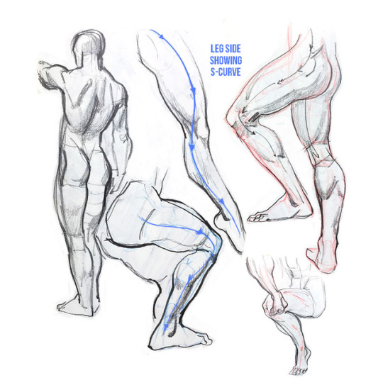
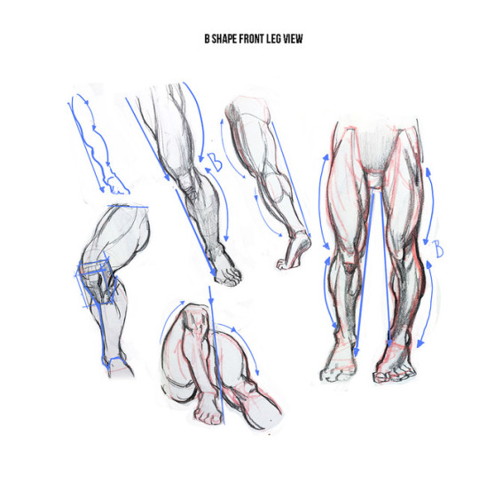

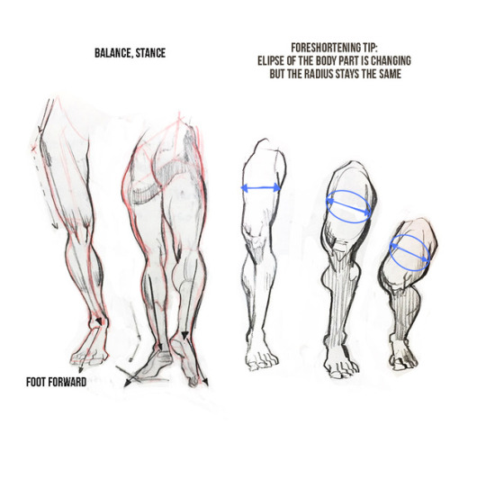


My opinion about Burne Hogarth’s ‘Dynamic figure drawing’
Some sketches and notes.
If you are artist that wants to learn anatomy or beginner artist and you are confused which resources to use to learn human figure you might find post helpful.
This is my take on the book and I want to share some thoughts after reading the book and practicing the topics. There are good things and thing I didn’t like and wouldn’t recommend.
Just to give you answer to the question if I liked the book. Yes I liked it. But I want to give you honest opinion on good and not so good things so you as a student or always learning artist can decide if you want to use this book to learn.
Let’s start with things I liked. It’s a book that covers unique topic: drawing figure in deep space and drawing without reference. I also liked that it doesn’t represent academic approach. Author rather helps people who had academic background and still have problems with drawing figure that isn’t standing straight like soldier. This book can help you fight stiffness in poses and helps generate ideas for dynamic poses. It teaches you how to draw figure in deep space, meaning : helps you create illusion of depth.
Approach to drawing human body is also interesting. Hogarth recommend starting from torso and then adds secondary forms : limbs.
This books helps you understand body curves so you don’t need to know anatomy. Actually this is something I like and at the same time I am not sure about. It’s good to know anatomy first before you get into this book. I would say that perfect audience for this book is student who has academic background but can only draw people standing straight like soldiers. Hogarth’s books will help you to invent interesting forms and positions.
Although you can’t take his anatomy literally. He has very characteristic style, that isn’t realistic but is believable. “Dynamic figure drawing” many covers male body and there’s very little about female body. It’s because female body just doesn’t look good. It’s like female’s version of male bodies. Doesn’t look very organic and remind me of ancient greek statues. Just to give you example : breasts looks like they are balls attached to the chest. Definitely look for some other source about female body.
Overall you can find some great tips and topics that are not covered in other books. This book is for already experienced artists who wish to learn techniques that will expand their academic knowledge. For anatomy look at Bridgman and Loomis 😃
I tried to keep this review as short as I could. Let me know how do you like these kind of reviews and if you would like to see more post like this one in the future.
14K notes
·
View notes
Note
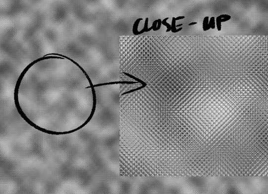
Hey there! Random question but I'm curious, how would you go about drawing chainmail? I have a D&D character that has chainmail under their armour and every time I try to draw them I'll start off by drawing all the links by hand then it gets way too tedious so I go look for chainmail pattern on google and paste it lmao but it feels like I'm cheating by doing that, and it clashes with the style I'm going for. I was wondering if you had any tips or tricks?
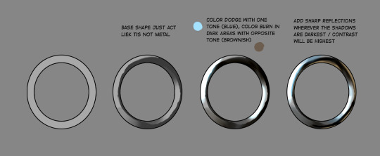
I don’t feel particularly great at drawing chain-mail either but there’s a technique I learned from a tutorial a bunch of years ago that I think makes a pretty good texture. It’s fast and the end result is cartoon-y enough to match a less photo-realistic style. I can’t for my life find the tutorial so I’ll recreate it here (using Photoshop):
1. Fill your canvas with black or white. Filter -> Render -> Clouds
2. Filter -> Filter Gallery -> Glass (under the Distort category)Keep smoothness as low as possible, play with the other settings
3. Find a filter in Filter Gallery that you like and apply it. Combine them, if needed.
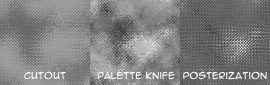
4. When applying texture to the drawing, use Edit->Transform->Warp to make it fit the shape you’re trying to convey

You can stack more filters on after the texture is placed or draw over it with a textured brush to make it look less uniform if that’s what you want. Add a shine to it with a big soft brush, colorize it, go crazy. I go with whatever looks best to me atm.
This is how I did Geralt’s armor too, though since I knew the final print will be smaller than 1.5″ I didn’t worry about details much.

Hope that helps!
18K notes
·
View notes
Text
being a self-taught artist with no formal training is having done art seriously since you were a young teenager and only finding out that you’re supposed to do warm up sketches every time you’re about to work on serious art when you’re fuckin twenty-five
363K notes
·
View notes
Text

Unfinished, but it deserves better than just sitting in my computer.
2 notes
·
View notes
Text

Unfinished, but it deserves better than just sitting in my computer.
1 note
·
View note
Text
I've been playing Neopets again
9 notes
·
View notes