flipsideprojectcdanna
FLIPSIDE
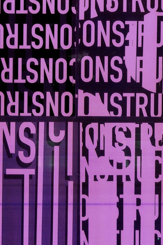
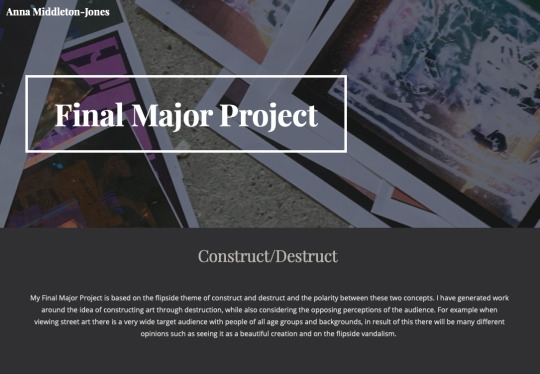
Construct/destruct
94 posts
Don't wanna be here? Send us removal request.
Last Seen Blogs

pissland
DICKS DICKS DICK
smoteki-blog
_Smokiet_

jayemwarehousing-blog
Jayem Warehousing Pvt Ltd

insansepl
Untitled
erzelmekkeltelitetturesseg
Érzelmekkel telített üresség
Text
evaluation
Evaluation;
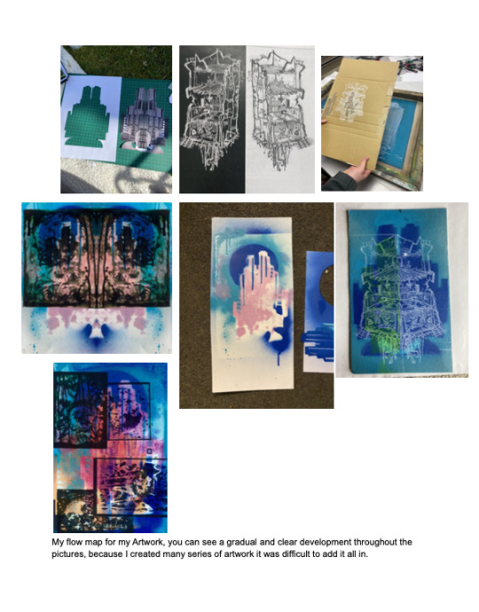
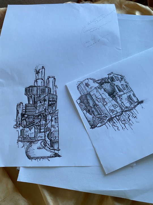
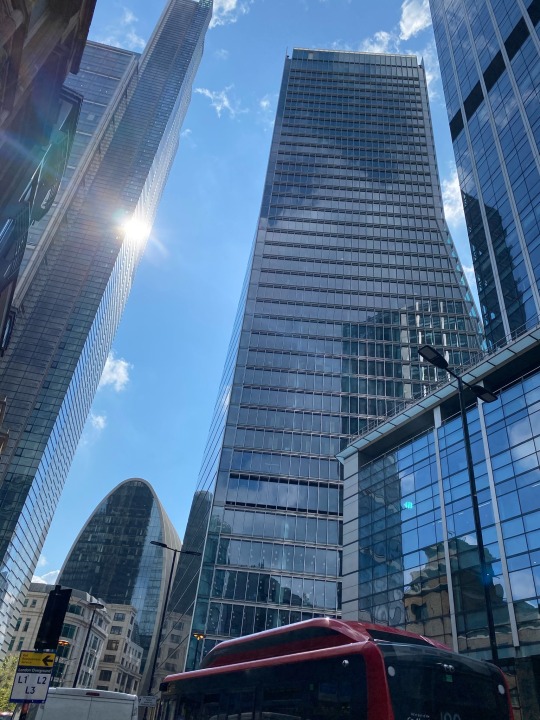
Originally for the flip side project I chose the theme order/disorder but I struggled to link my artist research and outcomes to the project. That’s when I chose to switch to construct/destruct. I preferred this theme much more as I found it easier to link my artwork to the project and create work that incorporated architectural imagery and abstract structures as I did not want to include portraits into my experimental work. This was because I wanted my outcomes to be abstract with no form of portraiture included. A lot of my outcomes were based around the idea of destroyed buildings and pristine buildings.
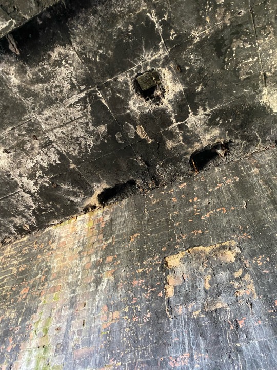
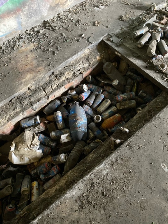
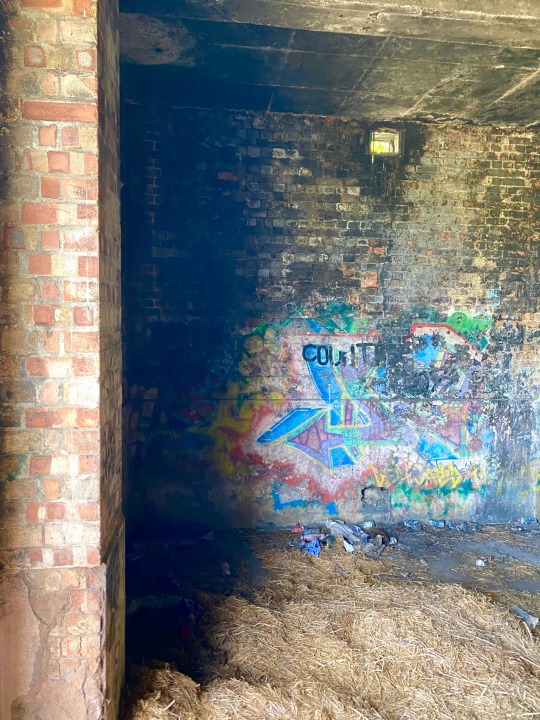
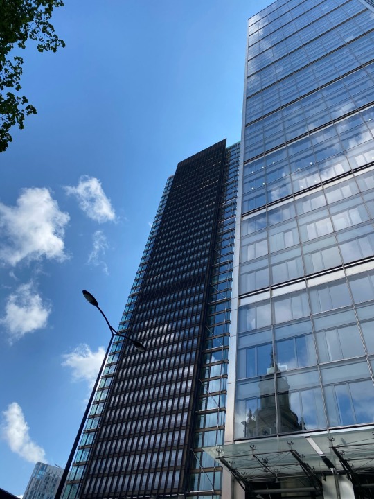
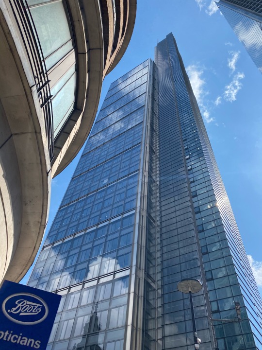
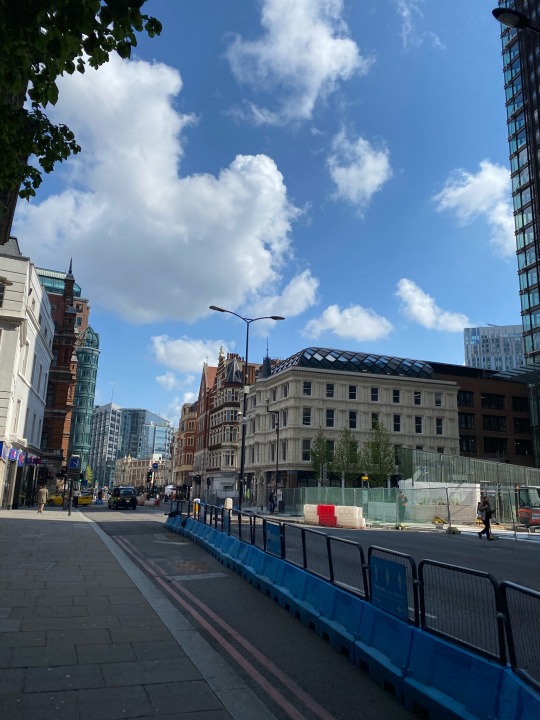
My research on the town shore-ditch was a key piece of research to my project. This is because I was looking into street art and the question of it being a form of expression or vandalism linked to the flip side of construct/destruct. After many years of being labelled as a run down area with crime and antisocial behaviour shore-ditch is now a well known tourist destination because of all the unique and diverse styles of street art and different artists tags.
The main concept of my final major project was the flip side of vandalism and expression and run down places compared to pristine new built cityscapes. My idea was to generate abstract outcomes using mediums such as, spray painting, screen printing, chemically developed photo images, and some stickers I had created with spare experimental artworks. It was really important to my outcomes that there was building/skyscraper imagery all though i wanted an abstract look.i also wanted my outcomes to look like street art and something you could see on the streets of shoreditch.
Mediums techniques and processes:
Going into the project I wanted to create mixed media collages with mediums such as a fine liner, collating and drawing. These were processes I was already pretty confident in with so I decided to experiment further. I wanted to try image transfer, there were many different ways to do this so I experimented with a couple such as, the solvent image method, Pva to canvas method and pva to wood. I chose these methods because I had all the materials to do so.
When attempting the pva to canvas method this did not work because of the texture and gloss on the canvas. This made it tricky for the image to stick as it's not absorbent and I used a variety of scraps instead of one solid image. At this point i had not done much research into the different methods so I wasn’t surprised that this went wrong however i did like the accidental outcome.
For my problem solving I looked into different methods and what the right materials were for the best outcome. I tried the solvent image method, this was much easier, less messy and very quick. When doing this it smelt quite bad and you had to thoroughly scratch the image otherwise it would not transfer fully.
I then tried the pva method but with the correct materials such as a wood sheet, magazine image and pva glue. This came out well but was not vibrant and very transparent.
Screen printing was another method I was interested in trying, I wasn’t used to it as I had only done it once before.
To make the screen I created some collages in photoshop which had to be very dark/bold otherwise you wouldn’t be able to see the design on the screen. When screen printing there were many things i had to take into account such as my work space (was there enough room) mixing inks, the materials i was printing onto and the tools. I really enjoyed this process because I created many experimental and possible outcomes. The downside to this was that it was quite messy and there was a lot of preparation so it wasn’t something i could take home and continue. You also had to wash the boards very regularly otherwise the paint would stick to the screen making your future prints grainy.
Manipulating text- I tend to stay away from digital processes but I thought it would be a good idea to spend a day in the mac studio trying different styles of manipulated text. I used adobe illustrator to create 4 different text pieces. I used these to make stickers with a printed it over some of my spray painted backgrounds.
Spray painting, I've never spray painted before so this was something I really wanted to try, it was also a really important medium to my project because of the relevance it holds to my research. I really enjoyed this because you could be free with it and it was almost impossible to make mistakes, especially if you're going for an abstract vibe.
I also made some stencils, this was for my spray painting. This is because it is difficult to create details with spray paints so I wanted an outline of buildings and this was the best way to do so. It was very easy if the shape was simple as I used a craft knife to cut out the stencil.
On one of Rachel’s sessions we created block point designs, ready to be carved out. I didn’t particularly enjoy this one as I found it very difficult to create detail in the block. I also found it really difficult to carve the block because it was so tough. I much preferred intaglio printing which I did in my last project.
Other techniques I tried;
Carbon paper
Layering art with photocopier Creating stickers using double sided sticker roll
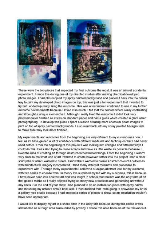
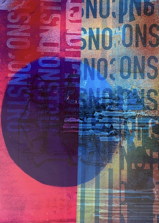
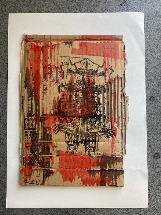
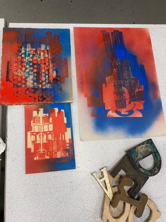
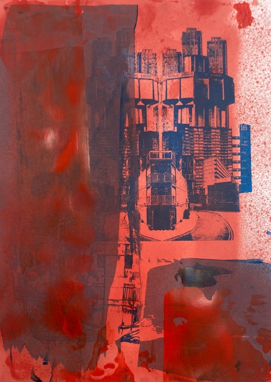
These were the two pieces that impacted my final outcome the most, it was an almost accidental experiment. I made this during one of my directed studies after making chemical developed photo images. I had photocopied my spray painted background and placed it back into the printer tray to print my developed photo images on top, this was just a fun experiment that I wanted to try but I ended up really liking the outcome. This was a technique I continued to use in my further outcome developments because I loved it so much. I felt that the colours where really contrasting and it bought a unique element to it. Although I really liked the outcome it didn’t look very professional or finished as it was on standard paper and had a gloss which created a glare when photographing. To develop this piece I spent a lesson creating more chemical photo images to print on top of spray painted backgrounds. I also went back into my spray painted backgrounds to make sure they look more finished.

0 notes
Text
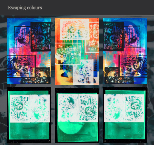
This is my google sites page, I have thought about the composition of the images because i wanted to highlight the flip side theme. I have done this by flipping images and placing them in rows of three for my escaping colours series.


0 notes
Text
Instagram
https://www.instagram.com/thedistressedcrayonn/
This is my art instagram for this fmp, i think it goes well with my project flip side because of the way i have payed my images out and the composition. You can also see a clear development throughout my project of my work.
0 notes
Text
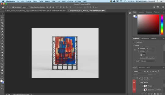
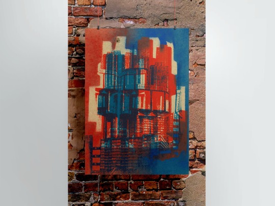

I attempted a mockup to present on my google sites for my fmp but i ended up disliking it. I prefer the rawness of a piece being mounted on a wall and photographing it. I do not like the look of the digital mock up because it looks very clean and precise, whereas my work is a bit rough around the edges.
0 notes
Text


Some collages I created with scraps i had left over, I really like these because the colours are quite different to what I would usually go for.
0 notes
Text


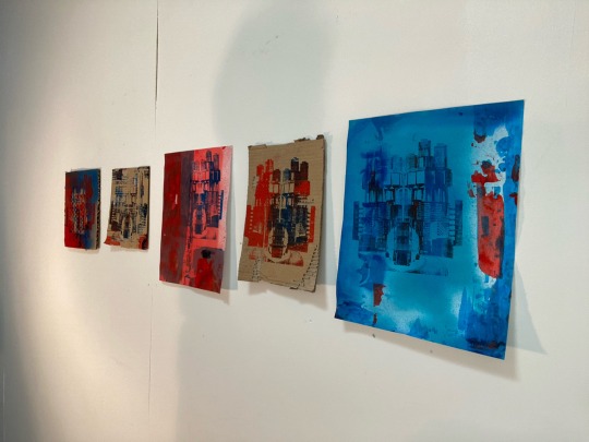
Photographing my work for google sites, trying different visions for my exhibition. I have done different angles ad compositions to try and picture what the viewer would see walking past my work.
0 notes
Text


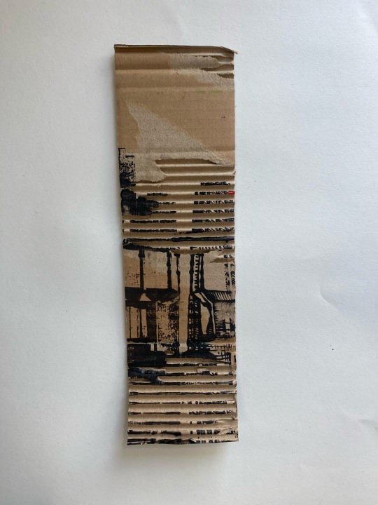

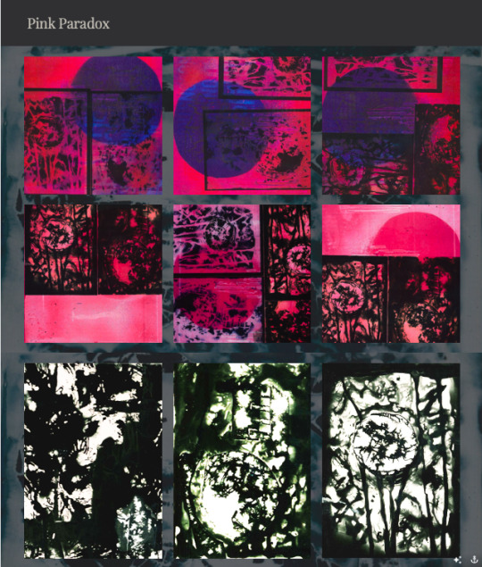
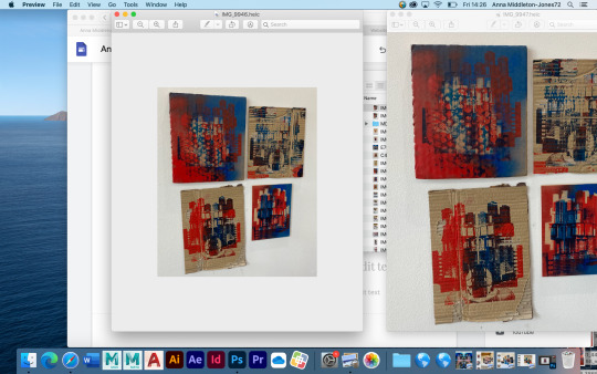
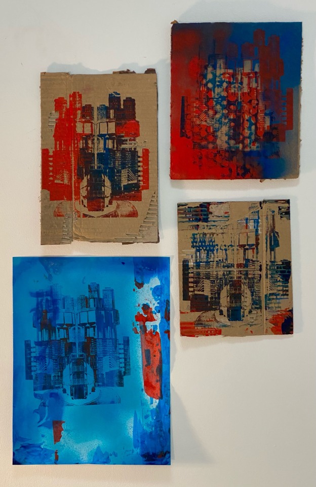
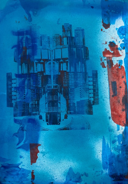
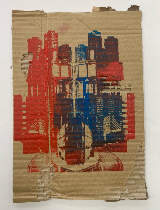
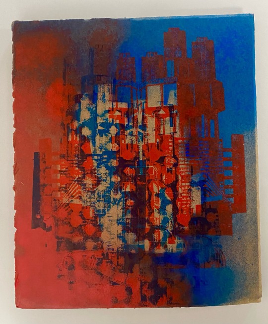
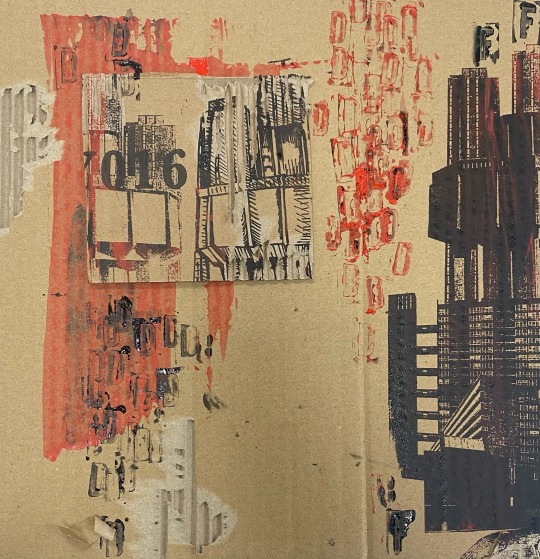
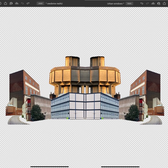
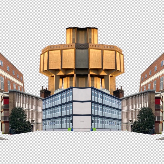
An extra series I created after screen printing with spare cardboard and ink, I ended up really liking it and having it as part of my ‘urban genesis’ series.
0 notes
Text

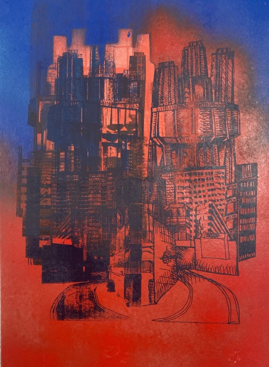


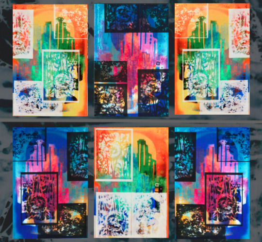
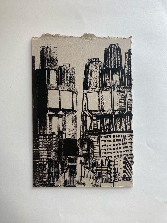
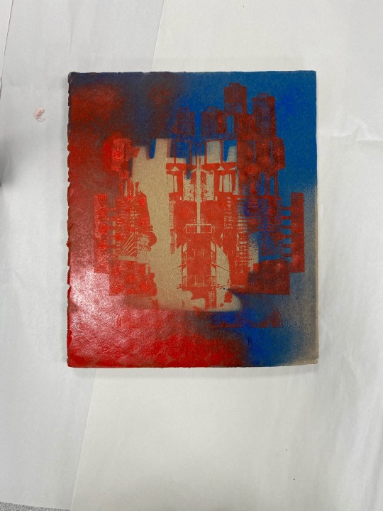
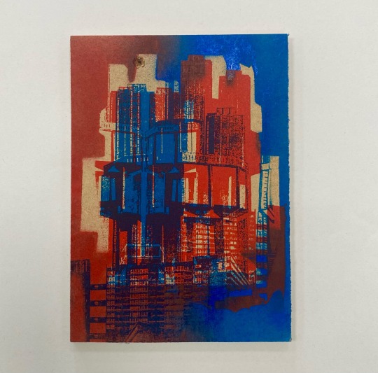
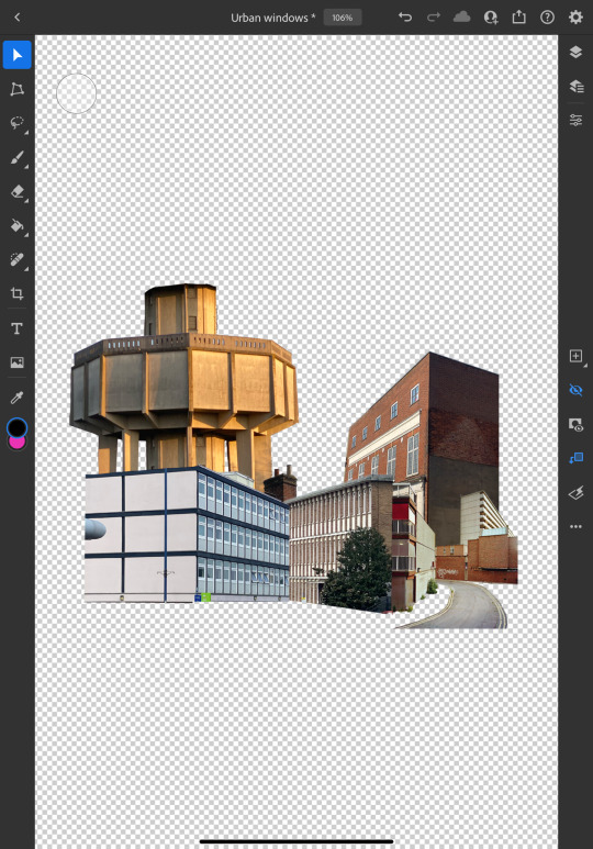
These were the pieces I planned to create inspired by my last artwork, I love how they came out. This will be one of my series for my fmp outcome and i will be calling it, ‘urban genesis’. I will be putting these images onto my google sites and create an aesthetically pleasing layout.
0 notes


Text

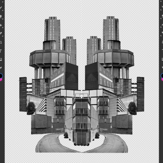

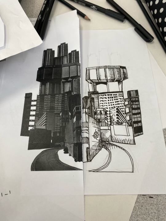


Once i had gathered my primary research I could create my collages for screen printing.
0 notes


Text
construct/destruct
recap, i thought it would be important to recap on the definitions of my fmp theme.
The process of initializing and starting up a class is called construction. The opposite of this is the process of tearing down a class and cleaning it up, which is called destruction or finalization. Class construction occurs either when an object is being initialized or upon first reference to a type.
Every act of creation is also an act of destruction. The creation of something new and different, something that has not yet been, demands the destruction of the old and the typical, what is now and what has come before. The presence of destruction is at the core of the creative process itself.
0 notes
Text
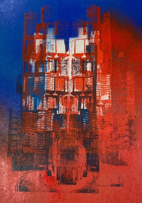
I loved these two experimental pieces so I felt encouraged to create more. This was a technique that. Will continue to use for my fmp so i am planning to make more chemical developed photo images to print on top of my outcomes

0 notes