fall-from-typeface
Fall From Typeface
Digital sketchbook of an HNC Graphic Design student at City of Glasgow College
155 posts
Don't wanna be here? Send us removal request.
Last Seen Blogs

laylalucie
lu do alastair

oogeewoogee
OOGEEWOOGEE
laylalucie
lu do alastair

layni17
who needs sleep
rhinozilla
Rhinozilla
Text
Type Detective

I was immediately drawn to this book by the cover and was hooked once I read the blurb. Not only is it an engaging read but the architectural illustrations by David F. Ross really helped to bring the location to life in my imagination. As ever I was also intrigued by the type on the cover designed by Mark Swan of Kid-Ethic.
From a bit of research I think the word 'Fall' may be set in Queulat by Jorge Cisterna at Latinotype.
"Queulat is a hybrid typeface that combines two different styles, reflecting charm, freshness and, especially, a strong personality."
(Fonts.com, n.d.)
To me the geometric slab serif of the type is evocative of the concrete slab architecture of the 1970's housing estate that is so central to the story. I loved the book and I love the cover!
Fonts.com. (n.d.). Queulat Font Family Typeface Story. [online] Available at: https://www.fonts.com/font/latinotype/queulat/story [Accessed 27 Feb. 2022].
0 notes
Text
Barcelona Dreaming

Book cover by Ellen Rockell Design for Barcelona Dreaming by Rupert Thomson
Saw this from across an airport bookshop; not only do I want to read the book but I want this as an enormous print for the wall - absolutely love it!
3 notes
·
View notes
Text
Type Detective
Saw a van on the motorway and the wordmark has been stuck in my head...
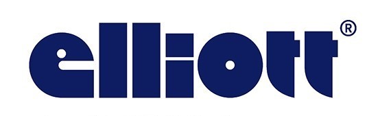
Elliott Logo from Elliott Group
The e makes me think of pac-man about to eat the rest of the name!
The tittle on the i and the ascenders on the t's contained within the x-height.
How the circular geometry of the e and o is carried through the terminals of the t's but not the l's or i
The closest letterform of a published font I could find is Geodezyx NF by Nick Curtis or its inspiration Disco by Photoscript.
Letter e glyph from Geodezyx NF
Although the Elliott wordmark doesn't use this font directly I see some similarities.
After a bit more internet digging I've found that Elliott is part of the Algeco group and this is where it appears the branding comes from. This deep dive article by the French Graphic Design Agency Grapheine is very insightful as to the history of its design
"A modular aesthetic that makes sense
It is a typographic block whose lettering style evokes Algeco's flagship product: the 15 m2 prefabricated module. Elementary and basic like a Lego brick, it evokes the idea of games, construction and customization.
In addition, this logo, unlike any other, conveys a resolutely modular, made-to-measure identity, built with precision from several simple geometric shapes. These are combined to recreate all the letters of the brand name. And within the solid blocks, each letter represents an Algeco module. The result is a "raw" aesthetic that is simultaneously "playful" and "agile". This custom lettering belongs only to Algeco."

(Graphéine - Agence de communication Paris Lyon, 2021)
Fascinating how a white van on the motorway leads down an internet rabbit hole to a French Design Agency and the most famous German school of Architecture and Design!
Graphéine - Agence de communication Paris Lyon. (2021). Algeco, an iconic logo and the quest of timeless brand identities. [online] Available at: https://www.grapheine.com/en/logo-news/algeco-logo-iconic-timeless-brand-identities [Accessed 12 Feb. 2022].
3 notes
·
View notes
Text
100 Days
Whilst reading the support material for our newest college brief I discovered The 100 Day Project a workshop first taught by Michael Bierut to his Graphic Design graduates at Yale School of Art. After following a few internet rabbit holes I found this inspiring TEDx talk by Emma Rogan from Auckland.
youtube
And it got me thinking....
Could I do this...?
100 days from today is Saturday 4th September, just before 2nd year of college starts so this could be an interesting summer 'holiday' project. So now that I've committed myself to the idea I had to come up with a project. I know I wanted to do something type based but one thing that always stumps me is actually having to write the content. I knew this would probably be too much and the writing of the content would take over from the creative bit I wanted to do. So I turned to song lyrics; to add some constraints I'm thinking of using lyrics from bands I've seen live. Which, given that I'm not really that 'into music', is quite a short and eclectic mix (some vaguely credible others most definitely not - these I shall be hiding far down the number of days)
Barrowland Album Pathway by LOCI Design and Jim Lambie
My Self Imposed Rules
A daily type response
Each response quotes the lyrics of a song from a band/singer I've seen live
Response can be analogue or digital
Bands can be repeated as many times as wanted
At least 1 quote from every headline band regardless of musical prowess (warm-up acts can also be included but this isn't essential as my memory isn't that good)
References
Design Observer. (n.d.). Five Years of 100 Days. [online] Available at: https://designobserver.com/feature/five-years-of-100-days/24678 [Accessed 27 May 2021].
White, G. (2014). The Vinyl Frontier: Barrowland Park by LOCI Design. [online] The Architects’ Journal. Available at: https://www.architectsjournal.co.uk/buildings/the-vinyl-frontier-barrowland-park-by-loci-design [Accessed 27 May 2021].
4 notes
·
View notes
Text
Getting mag ready
For our Working In The Field brief using Ready Mag I was initially drawn to creating a response which was PDF based so that it could be printed. In my head editorial design was print media such as magazines, newspaper and zines so this made sense. However after watching the Yes! Speaker Series with Matt Willey and hearing how he talked about the differences between the New York Times print magazine versus the digital version I came to appreciate a digital publication being more than a PDF of the print magazine. Looking at the Ready Mag editorial examples I started to appreciate what a digital publication could do that print couldn't. With this being the first project we've had where the final outcome was intended to be in purely a digital format I wanted to push myself to embrace this.
Before jumping into Ready Mag I set myself a colour palette from my color harmony book by pantone and noted the RGB references for the 3 colours (+ white)


I also set myself a typeface, I went for 'Mr Eaves Modern' by Zuzana Licko for Emigre Fonts as it had a few different weights which would give me some variation whilst remaining consistent across the publication.
I then made some sketches to consider how the pages would look and what elements would be interactive to embrace the digital possibilities.

After an initial few, frustrating(!) hours of not knowing how to use the animation tools on Ready Mag and not finding much in the way of tutorials to help I started to get the hang of it slowly. Once I got to grips with it I got really into seeing where I could take it. I've held off answering the last question until I've heard more of the speakers talks so haven't published my mag yet but I have screen recorded my progress so far
On reflection I've enjoyed this more than I thought once I separated the idea of it not having a print/physical outcome. Some of my page layouts aren't optimised for mobile, some automatically work - I'm not really sure why this is so this is the next thing on my list to investigate
#working in the field#hncgraphicdesign#cogc#city of glasgow college#editorial design#digital editorial
3 notes
·
View notes
Text
Love this from Ampersand Press Lab on twitter
12 notes
·
View notes
Text

Pantone Neon Basic Colours, Katowice Street Art Festival Poster by Marta Gawin
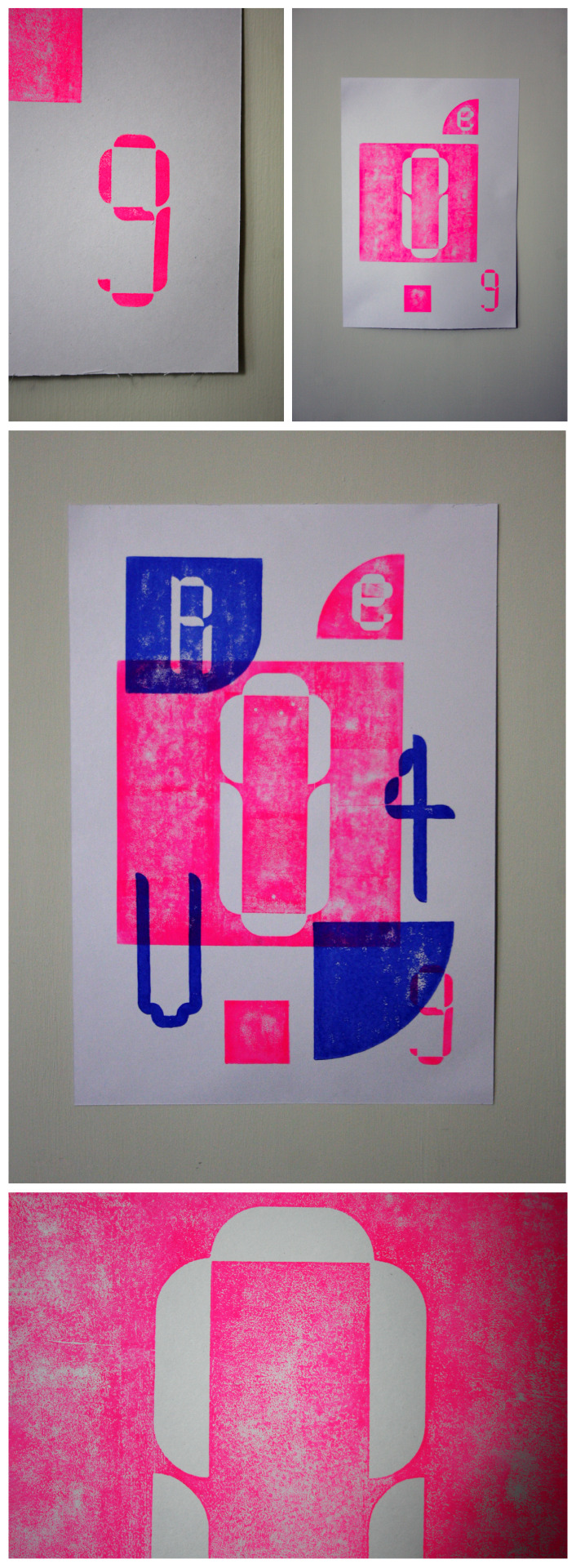
Following on from my earlier attempt to use and photograph reflective foil I wanted to experiment a bit more to see if this would be viable for a digital submission. Using my trial laser cut poster front I used spray mount to attach silver foil and neon pink paper. After being frustrated in my last project with my attempts to photograph and enhance my analogue experiments I have over the course of the last month or so spent time improving my Photoshop skills through Skillshare classes. I now feel a bit more confident in this area.
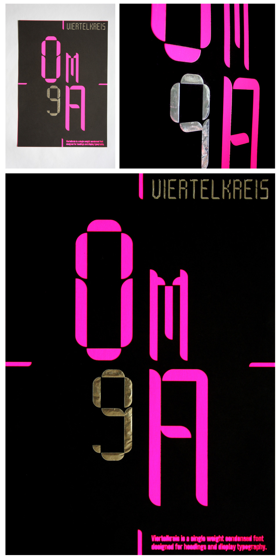
Top left, original photograph. Top right, trialling silver foil. Main image, trail laser cut - in my revised version I have removed the body text to the lower right of the poster as this was too small for the laser to cut without burning out.

Trialling different neon colours - these were only placed on the coloured backgrounds so there are some issues with where there are shadows appearing making the font name difficult to read.

Trial version of poster back, I'm hoping to make this in reverse tomorrow. A few adjustments are required to the file; improve the bridges in the number 4 and improve the bridges of the letter A in the stencil body text. At the assembly stage I need to take care to cover the front face well with spray mount, especially around the body text as any visible shadows make the text less legible in the photographed version.
References
Behance (n.d.). Katowice Street Art Festival 2015. [online] Behance. Available at: https://www.behance.net/gallery/28151519/Katowice-Street-Art-Festival-2015.
4 notes
·
View notes
Text
Printmaking experiments
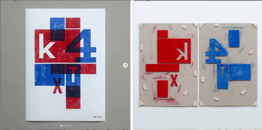
Adrian Talbot's home printed poster and hand cut print plates
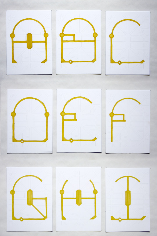
I came across the work of Adrian Talbot through his Instagram profile and immediately admired his typographic hand made prints. His posts contained enough of a step by step process that as a printing novice I felt I could have a go at doing something similar using some of my modular letterforms. Rather than hand cutting my letters in lino as he has done I opted to laser cut them using the safe (and cheap!) material of kids art foam. In the design of the two plates I wanted to emphasise the two module shapes of a square and quarter circle that make up my modular letters and numbers. Seeking advice from my college tutor I learnt I needed to add an extender to the blue lino ink as this would allow the other colour to show through which was the effect I wanted to achieve.
I set about sketching some ideas and deciding on a layout for my two plates then separated them on to two artboards, one for each colour. By laser engraving x2 2mm greyboards with the print in reverse and cutting the elements from the foam I could then stick the modules in place. I noted from Talbot's plates that he had added some extra pads, I think this might be to help keep the edges of the printed parts crisp as it avoids the printed material getting too squished when applying pressure. I applied some pads in a different colour so that I would remember not to ink these.

I really enjoyed being able to combine a bit of digital work with an analogue process to create a physical print. For a first attempt I'm happy with how my prints turned out and I quite enjoyed the unpredictability of how the prints would come off. I think I need to do a bit more experimentation with how much extender to add to the ink as there is some transparency but a little more could be good. Next time I try this process I would like to experiment with printing on to more types and colours of paper.

1 note
·
View note
Text
Velkro Paper Work
"Paper Work is an alphabet book consisting of 36 hand-made creative and artistic booklets of tear-out papers. It is a tribute to the work of Bruno Munari and inspired by his Libri Illegibili series, which plays with cut coloured sheets.
Throughout the pages, the letters and numbers unveil themselves with shapes and colours, as lines and curves interact with each other. The characters appear and disappear in the succession and superposition of cut-out sheets, “writing” themselves with simple geometric forms. The ensemble comes together to compose an alphabet made of a variation of 7 vivid and bold tones."
"A book with no words, the reader is encouraged to guess and create each letter and number. It is not meant to be read, but to be seen, felt and interacted with. Paper Work is a typographical experimentation. Looking for harmony and rhythm within basic geometry to design letters and numbers. By manipulating shades and minimal forms, we visually explore the limits of legibility.
The booklets were laser cut and hand assembled using Colorplan Bright Red, Mandarin, Citrine, Candy Pink, Sapphire, Racing Green and Real Grey, all in 135 and 350gsm. The boxes also used Colorplan and were screenprinted. Paper Work is by Velkro, a design studio based in Barcelona, and photographed by Leo García Mendez."
(gfsmith.com, n.d.)

Paper Work is by Velkro, a design studio based in Barcelona, and photographed by Leo García Mendez.
References
gfsmith.com. (n.d.). Velkro Paper Work - G.F Smith. [online] Available at: https://gfsmith.com/velkro-paper-work [Accessed 8 May 2021].
Anon, (n.d.). Paper Work | VELKRO. [online] Available at: https://wearevelkro.com/product/paper-work/ [Accessed 8 May 2021].
1 note
·
View note
Text

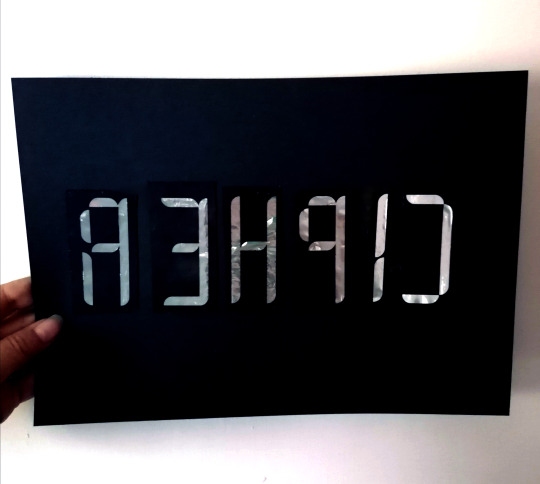
Type Specimen folio from Village. The Perception of Time by Aurelio Sánchez. Mamut Art Project 2015 by Sarp Sozdinler
I wanted the back of my poster to have the same feel as the front so was keen to continue with laser cutting. The design for the front is fairly minimal in terms of the number of characters from my modular font so, and with reference to looking at other examples of type specimens, I felt it was important to show all the characters in my alphabet, numbers and a few of the punctuation glyphs I had designed. This meant I had 40 characters to include (I decided not to include the lowercase) I also had to include my description, name of the font and my name. Initially I thought I would only be able to cut the larger type and have to print the smaller type - a combo I know from experience isn't the easiest to achieve.

I set about trying to create a grid on InDesign and used contrasting colours to block out the grid squares that would contain letters. With 50 blocks I could subtract 10 to give me 40 characters with two blocks of body text.
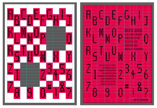
I then used the coloured blocks to set out my specimens letter and numbers and typeset my description text in the two grey blocks. I wanted to minimise the number of processes so resolved to experiment with the laser machine to see how small body text I could get away with. (My previous experiment had burnt out as the text was too small). I knew from having seen various bits of laser cut text I wanted to use a stencil font so that the counters would stay in place as I feel this helps to make the text more legible.
I chose the stencil font Big Shoulders by Patric King as it has a tall X-height and is sans serif which I felt would best complement my modular font.
When looking at my modular letter forms I made some minor adjustments using the direct selection tool to the letters with counters so that they would stay in place when cut.

Ideally I'd like to have the reverse of the poster be a colour reverse of the front but without the fluorescent card having arrived yet I ran a test on the same black card as the front. With a few adjustments to the power and speed of the laser I was able to keep the body text intact in the cutting process. Running this text did throw up a counter I had missed in the number 4 which I can fix for the pink cut.

Test run on black with pink placed behind
In these pictures the pink backing isn't attached so there are some shadows which are making the text slightly less legible in the photos than it is in real life. I also experimented with a piece of silver foil which I thought might work well to highlight certain cut-outs. I used it behind the font name which has worked really well in real life but sadly in the photograph it's not showing up. I might try some more experimenting with photographing a reflective silver foil to see if I can get a better photo.
References
vllg.com. (n.d.). Village: Type Specimen Folio. [online] Available at: https://vllg.com/products/type-specimen-folio [Accessed 8 May 2021].
Anon, (n.d.). The Perception of Time — Aurelio Sánchez — Art Direction & Graphic Design. [online] Available at: https://www.fluorink.net/the-perception-of-time [Accessed 8 May 2021].
typo/graphic posters. (n.d.). sarp sozdinler. [online] Available at: https://www.typographicposters.com/sarp-sozdinler [Accessed 8 May 2021].
4 notes
·
View notes
Text
Analogue experiments


3 notes
·
View notes
Text
"Pissing about with Type"
youtube
I found so much inspiration for our current college brief in this talk by Matt Willey last night!
In this experiment I have used the same approach as he demonstrates from 41:21 - 43:55 surrounding the design of the type for The New York Times Magazine 'New York Above 800 Feet'


(mattwilley.co.uk, n.d.)
I initially tried thinking about a layout using my modular type and blocked out a grid in InDesign
I quickly realised that this wasn't going to work as I was using different sizes of type, then using the direct selection tool to stretch it, I wasn't getting the effect I wanted. I needed to keep the type size consistent and it was just the Y length that would change.

This was more of the idea I was going for, but now I felt that the stroke of my type was too thin. As I was using my own modular type I didn't have a heavy or bold version to try. I'm not yet aware of how types are adapted to different weights so this is just quite a crude attempt in Illustrator. I knew I couldn't use the direct selection tool to stretch out the strokes on the X-axis as the geometry of the quarter circle terminals would get distorted. The only way I could see of doing it was to start again using a bigger quarter circle and fattening up the strokes that way. I tired this, with just two letters this time, and this is definitely more the look I was hoping to achieve.
I had one last play around with stretching type in this manor. To make it easier I took an existing typeface and stretched it using the direct selection tool. Ideally I was looking for something like Tungsten by Hoefler & Co but for the sake of speed and lack of budget I used Anton from Google Fonts.
This sort of worked - if not for the pesky letter S! Stretching using the direct selection distorted the letterform too much so I cheated and stretched the S using the Vertical Scale tool in InDesign (which is why it just looks wrong in the above text) Looking back at the construction of Hoefler's S in Tungsten I think it would be much more adaptable to stretching in this manor.
I think I may have veered into the territory of warping fonts so it's probably time to leave it there and go back to pissing about with my own type constructions!
References
Times, T.N.Y. (2016). New York Above 800 Feet. The New York Times. [online] 2 Jun. Available at: https://www.nytimes.com/interactive/2016/06/05/magazine/new-york-life.html#/the-citys-skyline-vertical-frontier-supertall-buildings [Accessed 8 May 2021].
Twitter. (n.d.). https://twitter.com/mrmattwilley/status/738808889110605824. [online] Available at: https://twitter.com/mrmattwilley/status/738808889110605824 [Accessed 8 May 2021].
mattwilley.co.uk. (n.d.). NYT 800ft Issue • — Matt Willey. [online] Available at: https://mattwilley.co.uk/NYT-800ft-Issue [Accessed 8 May 2021].
www.typography.com. (n.d.). Fonts by Hoefler&Co. [online] Available at: https://www.typography.com/fonts/tungsten/overview [Accessed 8 May 2021].
#gms hncgd1#hncgraphicdesign#cogc#cityofglasgowcollege#modular type#typography#design inspiration#Youtube#matt willey
1 note
·
View note
Text
instagram
0 notes
Text
Berlin Map Modular
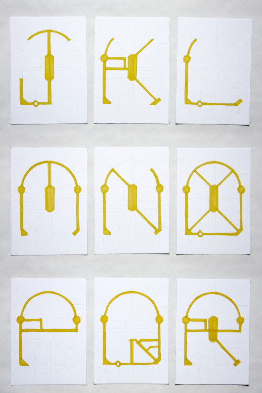
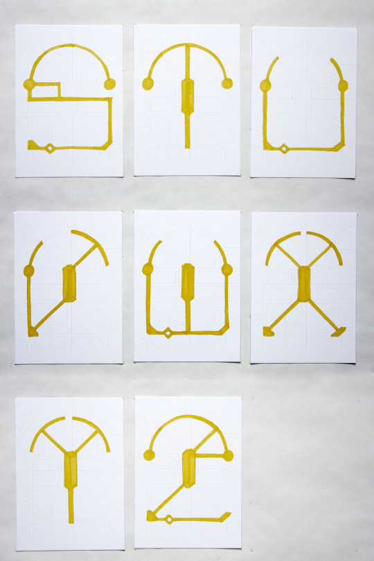
Extended my initial sketches to a full alphabet from the Berlin street map using my printed grid postcards. Photographed the letters and turned it into a mini stop frame animation using photoshop.
12 notes
·
View notes
Text
Extract from Monotype Trends Report 2021 - 8 bit fonts

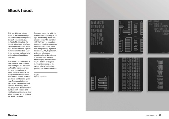

Page 29-31 from Monotype's Trend Report 2021
Monotype. (2020). Type Trends. [online] Available at: https://www.monotype.com/type-trends [Accessed 2 May 2021].
1 note
·
View note
Text
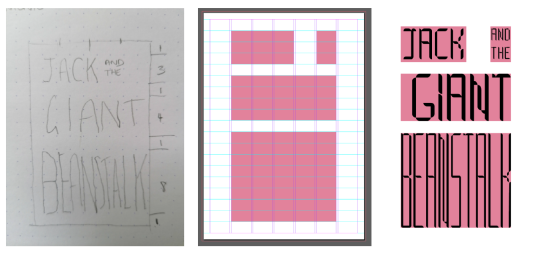
Type Specimen Sketch Ideas

Each letter of my modular type is based on the constraints of 5 modules wide by 12 modules tall so I experimented using 5 columns of 12 letter words. I wanted these columns to be visually uniform so chose the monospace font Overpass Mono. For the body copy I wanted something condensed to tie in with the condensed style of my modular font so I have gone for Antonio and kept it in upper case to coordinate.
I imagine this print to use fluorescent pink ink with a slight transparency on a grey paper.
2 notes
·
View notes