dtafm
DTAFM // Illustration + Design
AARON NESTOR | Art Director // Illustrator // Designer
216 posts
Don't wanna be here? Send us removal request.
Last Seen Blogs
violetlilrose
Rosie
str9led
Blender Visual
clubscene
♥ Club Scene ♥
urlocalcookie
Cookie
withoutyouimsaskia
Soulmates Never Die
Photo
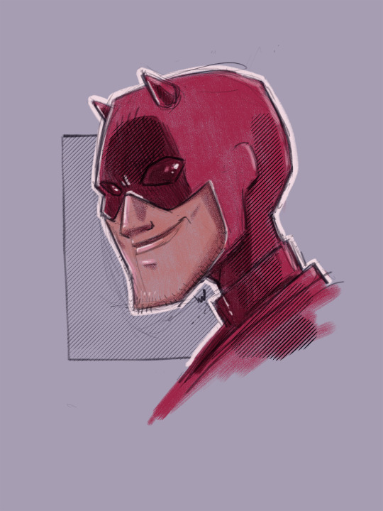
MAN WITHOUT FEAR // Illustration
One of my favorite lawyer vigilantes!
#dtafm#design#drawing#digital art#digital drawing#Digital Illustration#iPad#marvel#daredevil#man without fear#horny#devil#vigilante#lawyer#red suit#matt murdock#blind boy#scruffy#character art#fan art
3 notes
·
View notes
Photo

COFFIN HUNTER // Illustration
Watch out, Roland.
#dtafm#design#illustration#character design#character#western#coffin hunter#dark tower#digital art#digital illustration#ipad#autodesk sketchbook#process#progress#old#gritty#scratchy
6 notes
·
View notes
Photo


ALL-AMERICAN: VENUS & SERENA
This was another in the All-American series and the art came even quicker and easier than before. Two iconic tennis players. One clean and clear way to go. It's bold and bright and full of the same energy of our story subjects. And the fact that I got to put all of that on a billboard in Times Square NYC is just icing on the cake.
#dtafm#design#graphic design#process#progress#podcasts#podcast art#all-american#venus and serena#williams sisters#tennis#sports#documentary#bright#bold#colorful#art direction#creative direction#venus#serena#witness docs#billboard#times square#marketing
1 note
·
View note
Photo
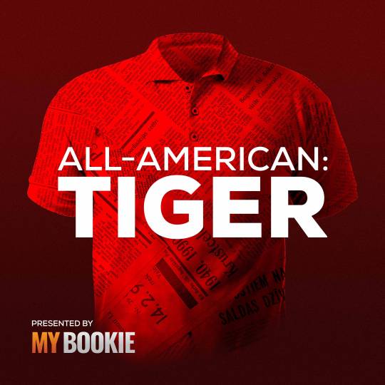

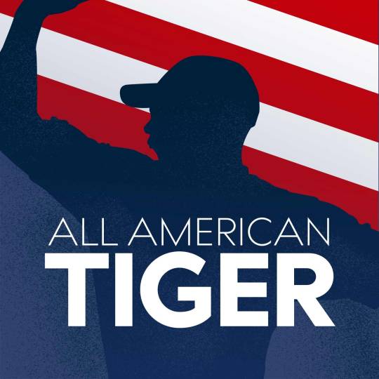


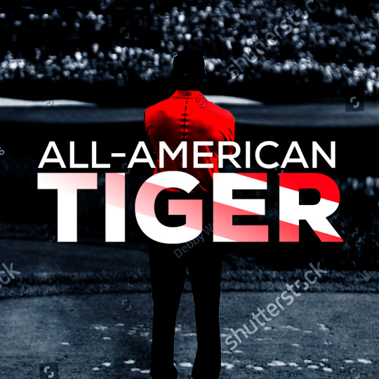
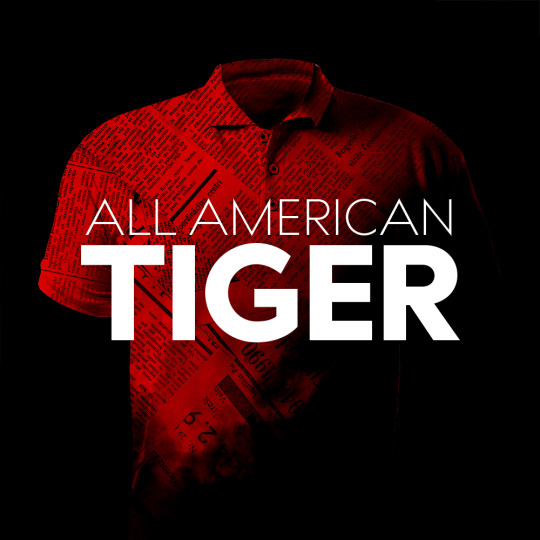
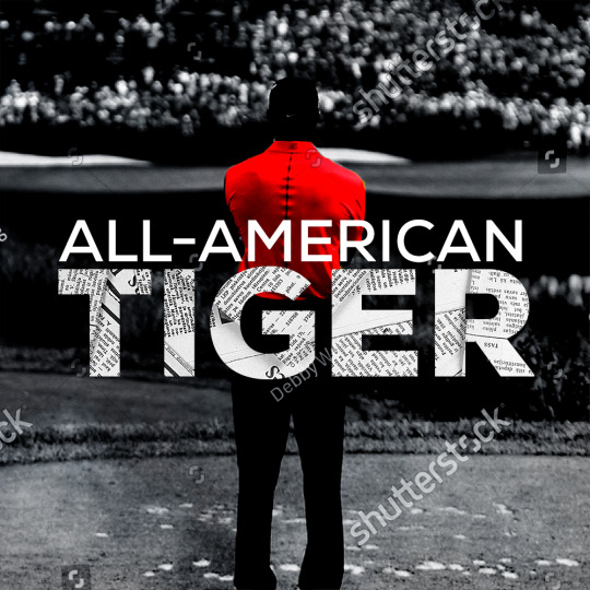
ALL-AMERICAN: TIGER // Cover Art
Turns out licensing an image of a world-famous golfer is expensive. So you have to problem solve. And what’s more iconic than the red polo shirt?!
#dtafm#design#podcasts#stitcher#witness docs#tiger#woods#tiger woods#golf#all-american#documentary#process#progress#illustration#vector#vector art#adobe illustrator#adobe photoshop#art direction#creative direction#title treatment#logo
0 notes
Photo

GRUMPYNAUT // Illustration
Must. Keep. Drawing.
#dtafm#design#illustration#character design#digital art#digital drawing#artists on tumblr#adobe#iPad#concept#bust#purple#orange#space#moon#astro#astronaut#grump#tube
0 notes
Photo


VIDEO ARCHIVES
Tarantino and Avary were straightforward from the start in using the old branding from the video store where they worked. They didn't have any files, just some small photos of various pieces of merch from the past. I busted out one of my oldest skills and started recreating this in Adobe Illustrator. It really was that easy! Now we can scale that sucker up as big as we want and it'll look crisp as heck.
#dtafm#design#graphic design#creative direction#art direction#process#progress#marketing#video archives#podcast#podcasts#vector#adobe#tarantino#avary#quentin tarantino#roger avary#movies#discussion#stitcher
1 note
·
View note
Photo
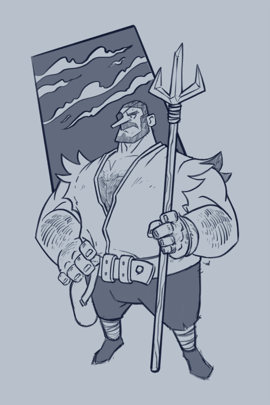
CHUNKY BIG SAILOR // Illustration
The time for adventure is nigh!
#dtafm#design#character design#illustration#raster#ipad#pencil#digital art#Digital Illustration#digital drawing#digital artist#sailor#trident#staff#eye patch#one eye#high seas#adventure#burly#chunky#big boi
0 notes
Photo


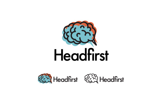


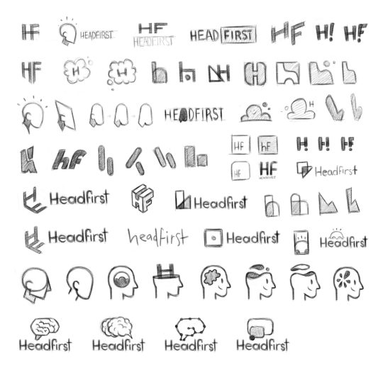
HEADFIRST // Logo Design
This is one of the pieces of network branding I had the chance to develop, similar to Witness Docs, under the Stitcher brand. Sadly we’ve been sun-setting these networks and integrating the shows into Stitcher Studios, but I’m very proud of the process and final logo that was developed for Headfirst.
The network was pitched as a place for fun and smart podcasts. And hopefully you’d learn something in the process! As usual, I started with thumbnails and a few different concepts then presented them to the team. We narrowed down a few different directions and I took to Adobe Illustrator to refine. I’m rather proud of each of these pieces and really wish I could’ve seen them on some cover art.
#podcasts#branding#logo design#process#progress#headfirst#smarts#vector#raster#sketching#thumbnails#big-brain#typography#letterform
0 notes
Photo


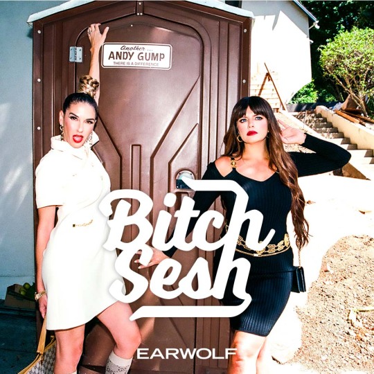


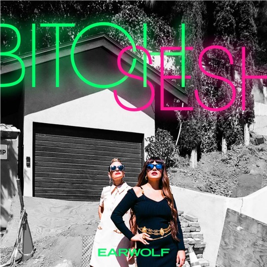
BITCH SESH // Cover Art
Casey and Danielle already had stellar photos and concepts. My main task here was to put some comps together with a handful of title treatments and see what resonated with everyone. Sometimes, it's as easy as that!
#dtafm#design#graphic design#process#progress#bitch sesh#podcast#podcasts#title treatments#casey wilson#danielle schneider#creative direction#art direction#bitchy
1 note
·
View note
Photo


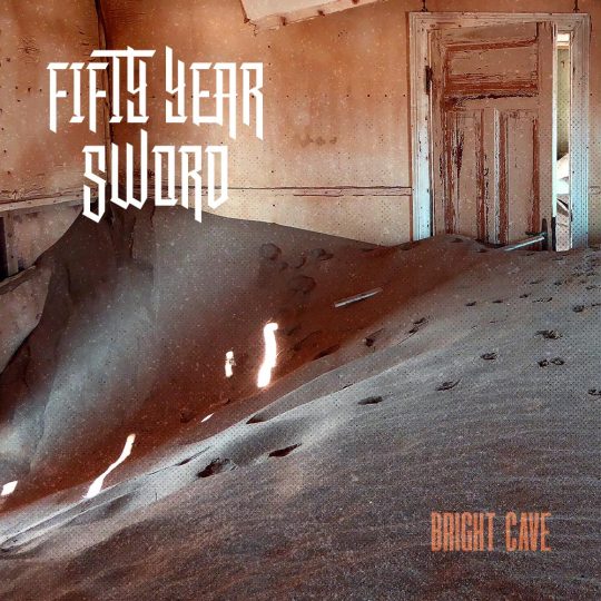


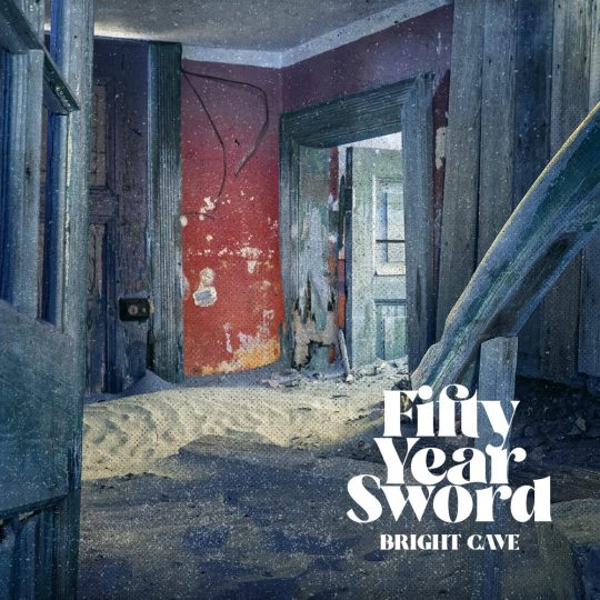
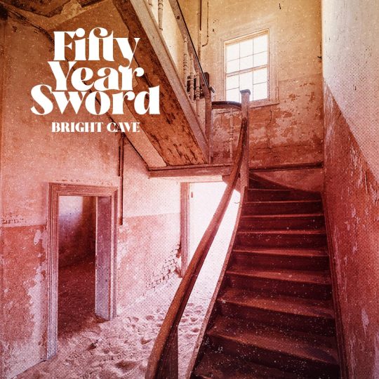
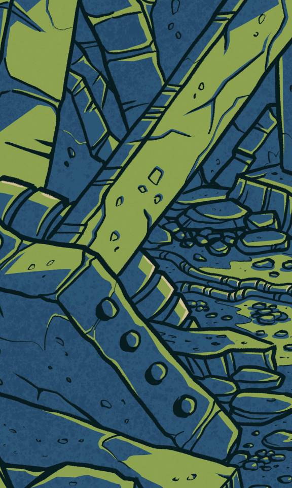
FIFTY YEAR SWORD // Bright Cave Album Art
This was the first release for a music group I’m part of. It was started during the pandemic as a way to sonically deal with the isolation the world was experiencing. We liked the idea of abandoned spaces reclaimed by the sands, taken over by dust and decay.
Check out the tunes here.
#design#graphic design#album art#albums#music#band art#fifty year sword#bright cave#sandy#isolation#tracks in the sand#abandoned#decayed#destroyed
0 notes
Photo
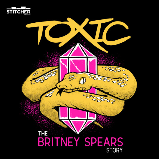


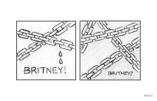
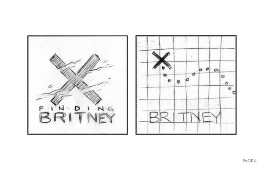


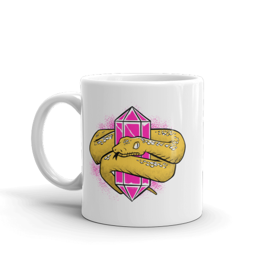
TOXIC: THE BRITNEY SPEARS STORY
This was such a creatively satisfying project. To really dig down into some conceptual ideas is something I always try to bring to a project. And for the team to be so onboard with these directions was a true delight.
Britney Spears was deep in her conservatorship and actively fighting against it. The hosts, Tess Barker and Babs Gray, were all over the ins and outs of Britney's situation and had developed a large online following. They developed the podcast and after an initial meeting I was off to solve the visuals of it all.
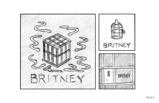
There were so many things we could reference, but I was immediately drawn to Britney and the snake. There was something really evocative about it all. And I began to think about that relationship of the snake surrounding Britney. Letting the snake represent the conservatorship and the crystal as Britney. Once we hit on that concept, the rest was a wonderfully satisfying illustration exercise on my end.
#dtafm#design#illustration#process#progress#artists on tumblr#podcasts#stitcher#witnessdocs#toxic#snakes#britney spears#merch#graphic design#graphic art#logo#type
1 note
·
View note
Photo
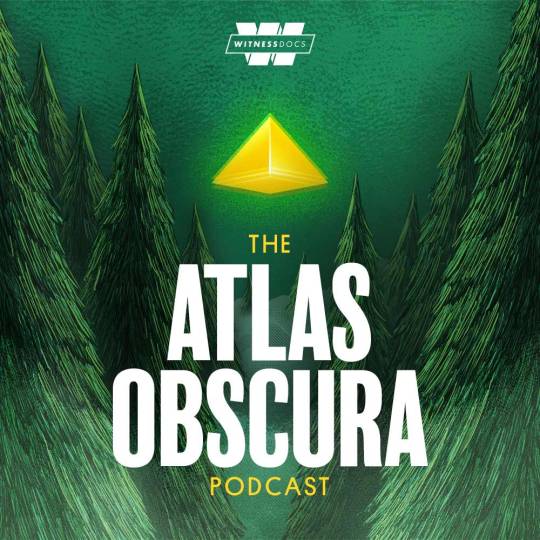
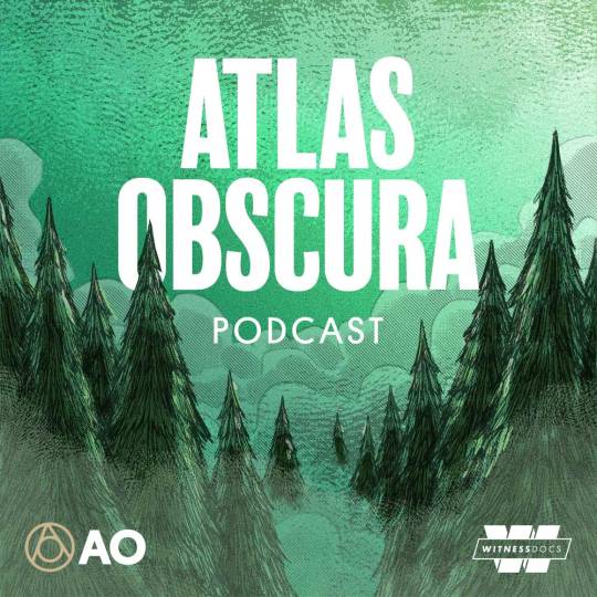
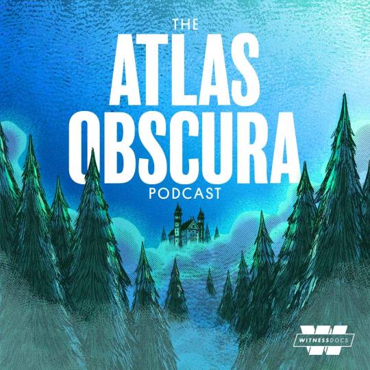

ATLAS OBSCURA // Cover Art [Unused]
The show wound up going in a different direction, but I couldn’t let these lovely drawings I made sit on the hard drive never to be seen.
#podcasts#illustration#process#progress#unused#atlas obscura#witnessdocs#stitcher#sketches#landscape#adventure#exploration#strangeness#dreamy
1 note
·
View note
Photo
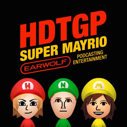
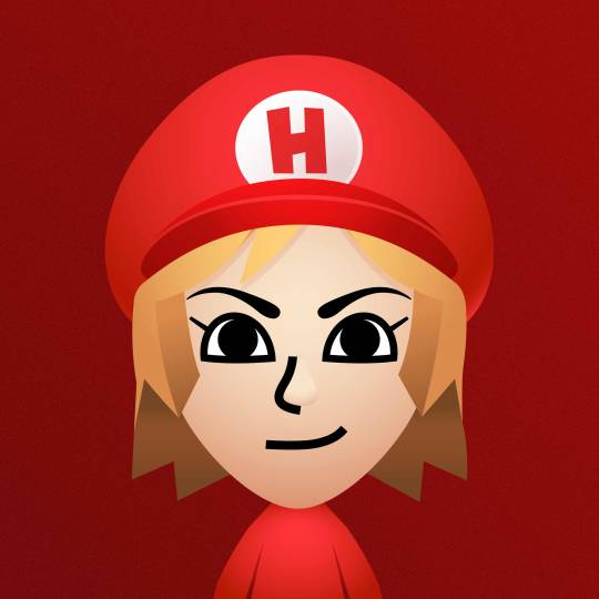
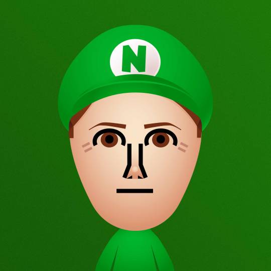
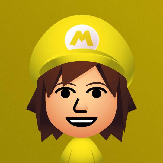
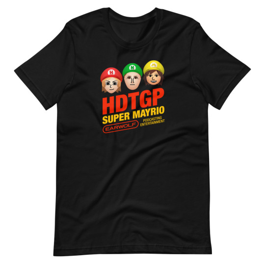
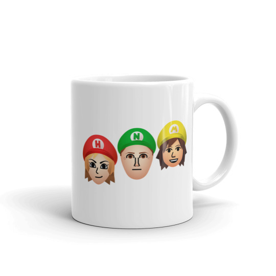
HOW DID THIS GET PLAYED // Super Mayrio Month!
The delightful show How Did This Get Played likes to have a theme month from time to time. For the month of May the theme was Super Mario Brothers! At first, my direction from the team was the idea of putting their respective heads on the characters of Mario, Luigi and Yoshi. But I just couldn’t wrap my head around it and all my ideas on solving that problem were coming up busted.
Then the idea struck me! If this is a podcast about video games hosted by avid gamers, well I bet all three of them have a Nintendo Mii character. And if that’s the case, maybe I could render high resolution vector images of those Mii characters. And then I can illustrate Mario Bros. style hats to pull the whole thing together!
I reached out to the producer Matt Apodaca (in the yellow) to see if he could provide me with screenshots of everyone. He kindly obliged. With that I set to recreating their characters on my Nintendo Switch. Then I took some larger photos / screenshots. I placed those shots into Adobe Illustrator and put together what you see here. I’d say it’s a good day when you use a game console for work. :)
With that, I put a few social assets together, some merchandise, and we called this project a wild success!
Listen to the podcast here.
#dtafm#design#illustration#vector#podswag#earwolf#podcasts#nintendo#nintendo mii#mario bros#super mario#process#progress#adobe illustrator#cute#video games#games#gaming#merch
5 notes
·
View notes
Photo


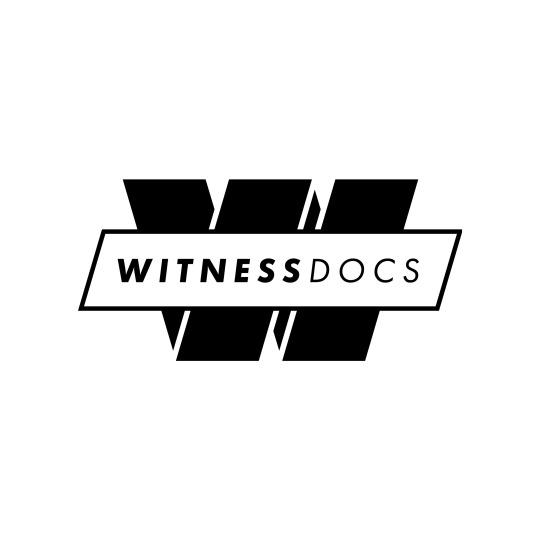

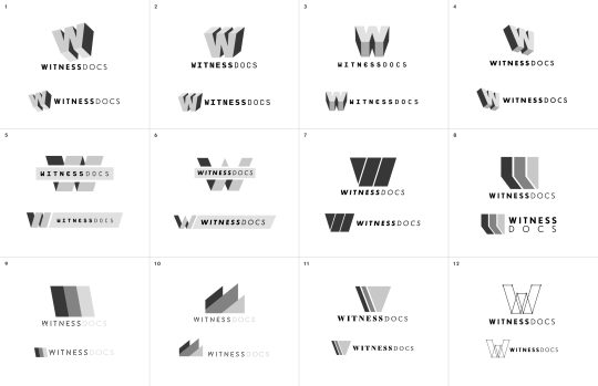

WITNESS DOCS // Logo Design
One of the great things about working in the world of podcasting is the variety of work I get to do. One day it’s illustration-heavy vinyl album art, the next, I’m staring at a host’s face and trying to find just the right typeface. And some days, well, I get to scratch the logo design itch!
At Stitcher, we have a few different networks and I’ve had the pleasure of branding a handful of them. Witness Docs was the first of the batch. As the name implies, it’s a documentary podcast network. They cover a variety of heavy topics worthy of a deep dive. From the unsolved murder of Isadore Banks in 1954, to an investigation into Britney Spears and conservatorships, each series digs in and brings these people’s stories to life.
For the network branding, I started where I always start - a kick-off meeting followed up with a bevy of sketches. After presenting these concepts, the team and I narrowed down to a small handful of directions. From there, I started refining the logomark as well as beginning to explore specific typefaces. From there we found our preferred direction and and I tightened up the details. We stuck with a simple black and white color palette, which allows for a clean and unobtrusive application across a variety of visually different podcast show art.
If you’re interested, you can find out more about the network here.
#dtafm#design#logo#branding#podcasts#documentary#deep dive#process#progress#typography#sketch#clean#minimal#witness docs#vector#illustrator#adobe#stitcher#podcasting
0 notes
Photo
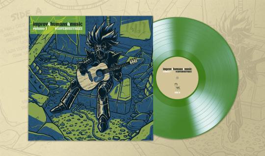
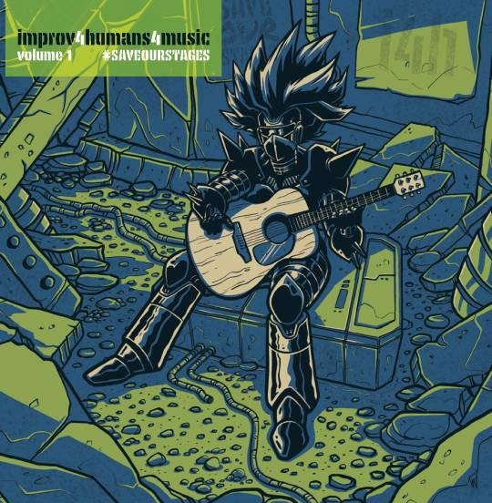

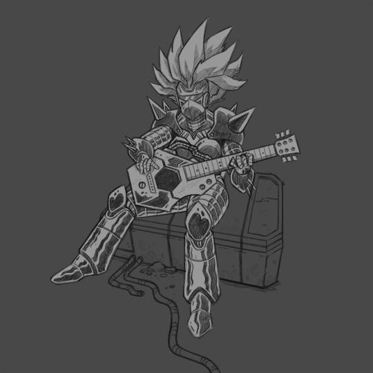
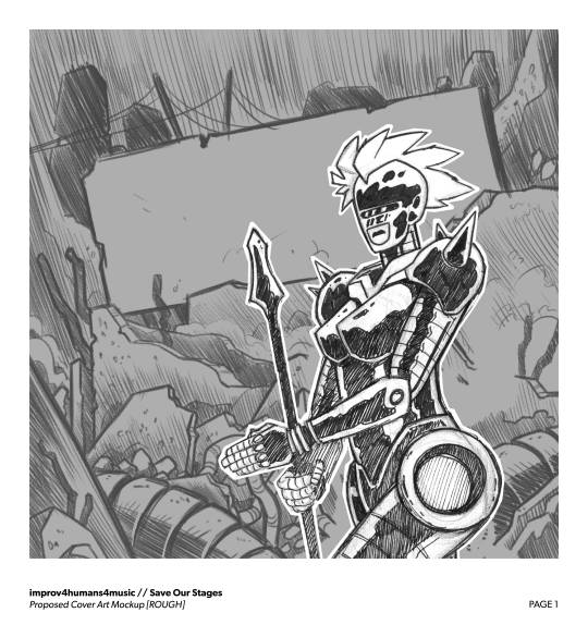


improv4humans4music // Vinyl Album Art
Holy frick!!! improv4humans on @earwolf is hands-down my favorite podcast in the entire universe, probably even the multi-verse! I created the original show art when it launched, and I was so excited to get to go wild on the art for a very special piece. During the big shutdown of basically everything due to Covid-19 in 2020, a lot if not all venues that put on live events were suffering.
Cut to the first few months of 2021 and we at Earwolf and Podswag are knee deep in putting together an album collection of a variety of live music performances that occurred on various episodes of the podcast. All the proceeds would be donated to the National Independent Venue Association and their #saveourstages campaign.
I had very little initial direction except for the idea of playing with the concept of the robot voice that pops up in the show taking corporeal form. Knowing that Besser was also a huge fan of post-apocalyptic fare, I set off into the land of sketching and put some rough ideas of how that robot character could look. Besser and the rest of the team really resonated with the robot holding the guitar. After a few rounds of back and forth, we settled on having the robot hold an acoustic guitar. Besser thought that was kinda funny as well as calling back to mainly acoustic performances. At that point I took to creating the final composition, lineart, colors, texture, and print-ready artwork.
I am so proud of the process and the final product. You can pre-order now! But I'd act fast as they will be limited to 500 units produced.
#dtafm#design#illustration#graphic design#process#progress#improv4humans#i4h#podcast#earwolf#comedy#music#improv#live performance#studiosessions#acoustic#robot#post apocalyptic#post apocalypse#digital illust#digital art#digital artist#digital drawing#sketch#wacom#cintiq#clip studio paint#ipad#saveourstages#national independent venue association
3 notes
·
View notes
Photo


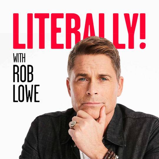
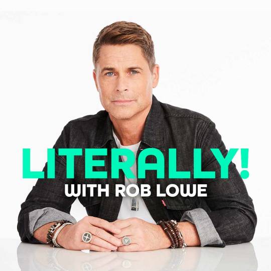

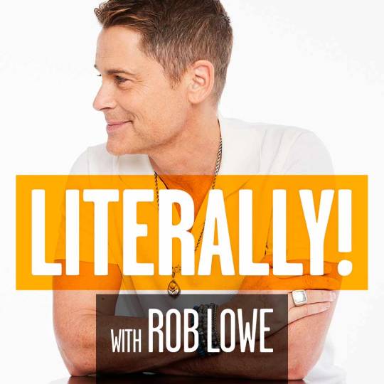
LITERALLY! WITH ROB LOWE // Cover Art
I suppose there are worse ways to spend a work day than making sure one Mr. Rob Lowe looks his best for his new podcast! The team delivered a handful of images for me to play with along with a straightforward direction of bold and crisp colors and typography. Add a little pattern / texture to the background and we have a winner!
You can listen here.
#dtafm#design#podcast#podcasts#cover#graphic design#Stitcher#rob lowe#literally!#process#progress#typography#team coco
3 notes
·
View notes
Photo
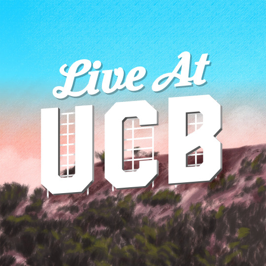
LIVE AT UCB // Cover Art
The direction was “The Hollywood Sign”. So, that’s what it is! Remember live comedy?! Anyone?! Hello?!
#dtafm#design#podcast#podcasts#cover#ucb#comedy#stitcher#earwolf#live comedy#digital art#Digital Illustration#digital drawing#digital paint#paint#hollywood#wacom#photoshop
0 notes