
claricelowww
Clarice Low
Hello, my name is Clarice! I'm a first year student in IACT College, pursuing a Bachelors Degree in Advertising and Design. This is a college assignment account. Here, I will be posting some of my previous advertising and design work to be critiqued by anyone from the industry. I'm hoping to learn and improve, so any and all constructive feedback would be greatly appreciated. Thank you in advance!
6 posts
Don't wanna be here? Send us removal request.
Last Seen Blogs
daediniarcaliel
δεκαετία τοῦ θηρίου
oliverdanvers
Oliver and Kara

totallyawriter
hello fellow shitposters

iogenesis-blog
Io's World

dontneedanothertomarryblog
butterbeers: AFTER DARK
Text
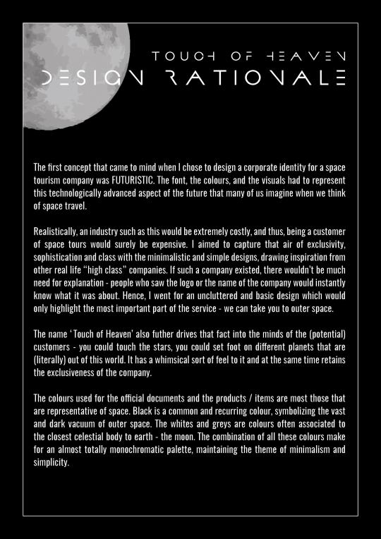
TOUCH OF HEAVEN
Touch of Heaven is a fictional company created for an assignment with the theme of Space Tourism. We were tasked to design items to reflect the nature of this new and innovative tourist opportunity.
POSTER
Imagine if space tourism was real; the whole world would already know about it and no explanation would be needed as to what the company was about. The concept behind the poster is to go as simple as possible. Hence, the focus of the visuals will be drawn to the bright moon directly in the center, serving also to catch the attention of people passing by the poster. The name of the company is used as part of the tagline as well.

DESIGN RATIONALE
CRITS
Felicia Lee:
The headline and visual should have a more futuristic tone to it. Since the idea of traveling to space is over the top, the look and feel should continue to drive that further.
Ida Chong:
The title has a good play with words and the overall design, font choice and rationale are nice. However, it could potentially be too simple despite the theme being minimalism. It could have been improved with perhaps a more detailed visual of the moon (since it is the center of attention) and a more elaborate background (maybe something like specks of stars or something with a galaxy-vibe).
0 notes
Text
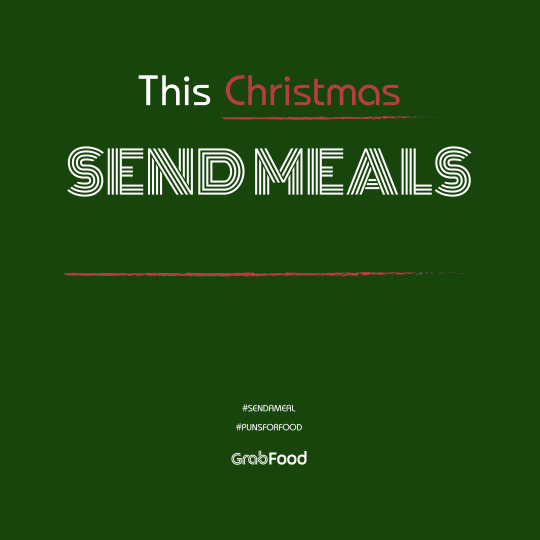
PUNS FOR GLEE, DELIVERY FOR FREE (#PUNSFORFOOD)
PUNS FOR GLEE, DELIVERY FOR FREE (#PUNSFORFOOD) is a mock campaign created for the food delivery aspect of Grab, GrabFood. The objectives of this campaign are to encourage the use of GrabFood over its competitors and to encourage users to send a meal.
It is an interactive, competitive social media campaign that will run all year long. Grab will release the set “template” for the pun a month before that particular season. For example, The Valentine’s Day template will be released in early January, while the Christmas “template will be released in November. Every month will be about a different “current” topic (such as a particular holiday, or even major events like election, Olympics, and so on).
The public are then supposed to come up with a pun according to the template and repost it on their own social media accounts while tagging GrabFood’s account and using the hashtags #sendameal and #punsforfood. Five winners will be chosen out of all the pun submissions via social media. Winners will be chosen by Grab and will receive their reward of free delivery for the next 3 months. Futhermore, their puns will be used as advertising material for Grab’s print ads during that particular season. The cycle repeats every month, giving others a chance to participate and win as well.
SOCIAL MEDIA VISUAL 1A

SOCIAL MEDIA VISUAL 1B
POSTER

BILLBOARD

CRITS
Felicia Lee:
Overall good interaction ground for consumers. Perhaps something that requires consumers to put more effort like creating an insta story filter/sticker/ drawing on the insta story canvas.
Ida Chong:
It is an interesting idea! The billboard and poster visuals, as well as font choice are good and very GrabFood styled. However, colour choice could be improved my choosing something more contrasting (perhaps a brighter pink) because it currently blends into background. As for the social media visuals, the font should probably be more interesting and consistent with those of the other print visuals.
0 notes
Text
#FORWHAT (Part 1)
#FORWHAT is a mock campaign created for the Japanese sports company ASICS. The objectives of this campaign are to create a unique brand image that is specifically catered to Malaysians and to increase customer engagement with the brand.
It takes on a very playful, Malaysian tone and asks the question: What are you moving for? A question that the customers can freely answer themselves.
It mainly runs as a social media campaign, which will be further explained in the Part 2 post, along with the social media promotional visuals.
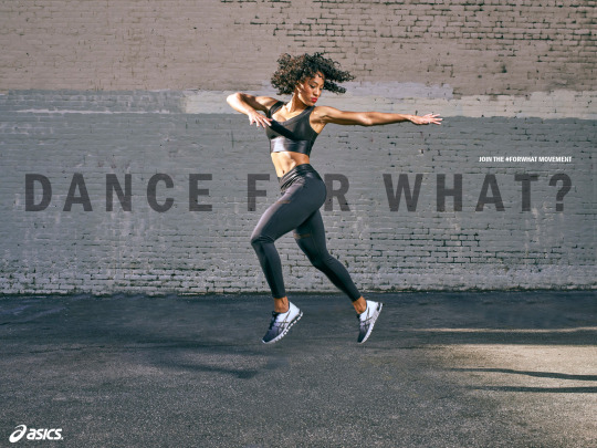
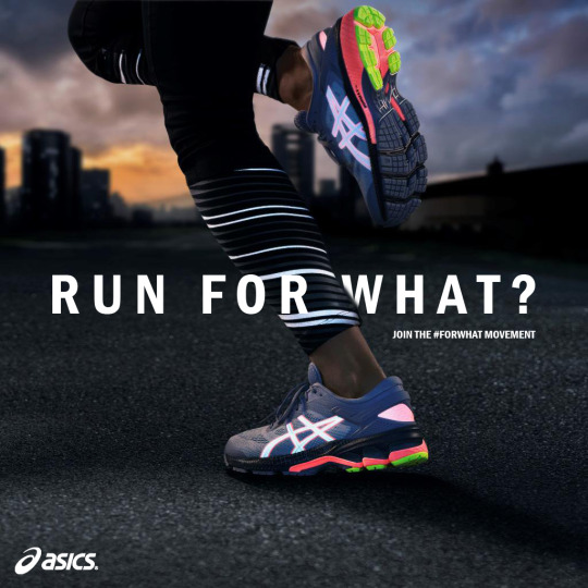
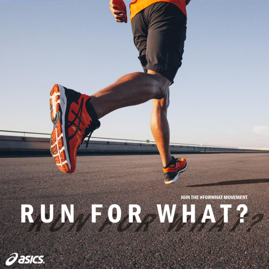
BILLBOARD

POSTER

Note: The original images used in the billboard and poster (without text or logo) were sourced from ASICS.
CRITS
Amanda Chan:
A suggestion for the poster visual would be to change the white text into the same colour as the shoes are, so it doesn’t look like you’re trying too hard to fit/blend the text in with the image.
Ida Chong:
The visuals, placements of text and colour choices overall make it look good and professional as though it’s an official campaign. Something to take note of is to be mindful of the size of the social media information/handles at the corner of the poster, because it could turn out massive when it ends up being printed.
2 notes
·
View notes
Text
#FORWHAT (Part 2)
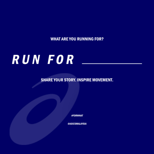
As mentioned in the Part 1 post, it runs as an interactive social media campaign. The concept of the campaign is to turn it into a competition / giveaway of sorts, getting the customers to fill in the blanks on their own with positive things that they want to MOVE for.
It would mainly take place on social media platforms such as Instagram (@asicsmalaysia) and Facebook (ASICS / ASICS Running Club Malaysia). Each post would consist of 3 visuals from ASICS - the thumbnail (Visual 1), the fill in the blank (Visual 2), and the recommended shoe and beneficial factors of said shoe (Visual 3).
For example, the visual would be “RUN FOR ___” and the customers would then have to fill in the blanks with their answer, and share their story/journey. After that, they would have to repost it on their social media with the #FORWHAT and tag @asicsmalaysia in order to submit their response. The people with the best caption and story would then be chosen to win the specified pair of shoes that have been recommended for that particular activity. The shoe recommendation also serves a second purpose, which is to inform all who see it about the qualities and benefits of the shoes. This would mean that, even if someone doesn’t win the giveaway, they could potentially go and purchase a pair for themselves because of the built up “hype/desire” towards trying to win the shoe.
But overall, this campaign allows the #FORWHAT movement to be one that moves towards nation-wide betterment. In other words, it also gets people to share their stories and inspire other Malaysians.
SOCIAL MEDIA VISUAL 1A
SOCIAL MEDIA VISUAL 1B
SOCIAL MEDIA VISUAL 1C
SOCIAL MEDIA VISUAL 2
SOCIAL MEDIA VISUAL 3

Note: The original images used in the social media visuals (without text or logo) were sourced from ASICS.
CRITS
Amanda Chan:
For visual 1C, the shadow of the text and the human is different (different lighting and different slant position). Be more cautious of the lighting and shadow angles in future. The designs for visuals 2 and 3 are generally alright, but they do look a bit plain. The first image is okay, but second image looks somewhat undone/incomplete, as though there’s something missing.
Eunice Loke:
The campaign seems as though it’s in different pieces and is lacking cohesiveness. Be cautious of the positioning of the campaign, because it would be dependent on the type of image they’re trying to put forward (for athletics, for leisure, etc). The intent of the campaign is good, but the “wellness” aspect doesn’t shine through the flashy visuals. The idea is there, but it needs refining.
Chynna:
Specify which social media platforms you want to use and help people understand it by creating mock-ups of the post on social media (this is because captions will help to boost the understanding / clarity of the direction that you want to take).
The images have been treated well – the title of the campaign hidden in the shadows looks nice (in the posters and social media visuals). A suggestion would have been to try playing with typography (some of the titles were upright, but it was suggested that they be made italic in order to show movement). As for the informative part of the social media visuals, the attention grabbing part of the message should be made to stand out (WIN A PAIR OF FREE SHOES etc).
Sarah Ann Toolseram:
When doing a real campaign in the future, consider the costs. Shoes being given away like that would result in very high costs. Besides that, the shadow in visual 1C is a bit off.
Basil Cha:
Love the idea of localization. Feels like it could be a very exciting campaign, but it feels too safe/normal still. Look at brands that are super strong on branding (Nike!! <- cannot emphasize this one more, Adidas, etc.). Also, just be clear on where you want to bring your audience to, in terms of campaign direction. I really like the idea of #ForWhat. I can imagine like a video ad of people like saying, “This one for what ah” “For what wan” and then ending with “For anything you want to be” or something along those lines.
Visuals are clean/not trying too hard, but I think there needs to be a bit more trying The #ForWhat copy is really cool, the idea of moving with purpose, etc. and I think it’s also a very challenging statement when Malaysians say “For what” and I think sport brands always push that kind of attitude whether it’s about challenging the norms, etc.
There also shouldn’t be too many words on a social media post. Things you can consider are creating a mockup of an Instagram post, where you can actually type in a caption so your design is in the context of a description, etc.
Damien Chung:
I think your idea is pretty good, as in it does give people the idea of what a shoe does, and that it's not just for style and looks, but it's functionality as well for the user. I think for the interactive part, judging from my experience right, these kind of shoes or brands actually have a very niche market. Especially Asics, which has marketed itself to be a sportswear brand, but branching out slowly into lifestyle.
So, I'm not sure if your assignment has anything to do with targeting groups on FB or some sorts. This can't be organic, it has to be boosted unless you have a face of an influencer in your visual that everyone knows and are a fan of, which would generate more engagement for the campaign. If this were to be an organic post, your organic reach would be very little, since the market is niche. The mechanics are great, which is to increase the shares. I was thinking of who is the one that would recommend the specific shoe for the winner or whoever the other participants are. The downside of it is that, what is recommended may not be what the users want, and opinion varies, so that's something we need to think about la. Perhaps you could also include like a voucher or a code for whoever that joined the contest (include a cap of course) to make people buy it rather than just finding out the type of shoes recommended for their activity, increasing the conversation rate.
The visuals used are great! But I think social media visual 2 and 3 can be less DI and more organic like your other visuals, it's more visually appealing than a blue background. Overall I like the idea! I might use it for my work too (haha).
Another thing to take note off, visuals that feature people are bound to get more attention yea. Or any big brands like Nike or Adidas, that would work well. So when your visual features someone, make sure it's someone relatable and you would know. Even if don't know, local would be good also.
Yaeber Neo:
Campaign as a whole has lack of a big idea. As a consumer, I’m not too sure what the campaign is about. What’s the movement about, what’s the key message, why should we join the movement? It’s very easy for people to turn it around and say join the movement for what? You’ll probably need something else to kickstart or introduce the campaign. For example, put together snippets of different athletes or influencers telling their own story of what they move for and why. Then it would carry forward better to Part 2 of the campaign where you focus on social engagement. Part 2 of the campaign could look at more recent trends on Social Media. TikTok for example encourages lots of movement where people do dance covers etc. See how you can leverage on that. Could Asics have their own song and dance challenge?
Felicia Lee:
Maybe this could kickstart by involving stories of day to day people. For example, the way Humans of New York portray stories of people. Story of a struggling modern dancer or an athlete. Then, followed by the audience to fill in the blanks.
Ida Chong:
The social media visuals are generally pretty good and have a sporty feel to them. It makes you feel like exercising because there is movement in the image. The masking and effects applied to the visuals are good as well. However it needs to connect more, in terms of the entirety of the 3 social media posts. This is because the thumbnail image doesn’t really connect with visuals 2 and 3 (probably because they are VERY blue). If the blue is still intended to be used to to it being the company’s colour, then perhaps it could be used as an overlay with another image or colour. Besides that, you should also take note that if the placement and words are simple then the background needs to have more happening.
Annabelle Foo:
I think the play on words here really added a catchy/playful touch to the messaging since it’s something you hear quite frequently, and it still followed through in reminding people why they do what they do. But also if the first phase begins with #ForWhat, it could be a bit difficult for people to translate that messaging right away. I think there’s a really good potential build-up here before #ForWhat comes in, maybe you could tap into how everyone has a different why to what they do and it may look really drastic but I think it’d be good to capture those differences at the start before establishing #ForWhat? Design could be a bit more cohesive in terms of typography style/placement, but visuals still eye-catching and clean!
1 note
·
View note
Text
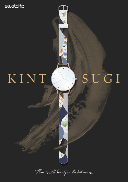
SWATCH × KINTSUGI
We were tasked to create a new, unique and commercially viable design for Swatch. Wanting to create something that would be meaningful and encouraging to the wearer, I decided to go with the theme of “Kintsugi”.
POSTER
DESIGN RATIONALE
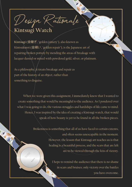
Note: The watch and designs shown above were created fully through Adobe Illustrator.
CRITS
Eunice Loke:
The design is simple and clean with clear message.
Chynna:
Clean, nicely designed and has a Japanese appeal to it. In future, be observant of logo placement in the company’s previous advertisements (SWATCH normally places their logo on the bottom of the poster).
Sarah Ann Toolseram:
The watch design is nice.
Basil Cha:
Very cool concept. It’s not just healing/fixing brokenness but the reminder that it takes TIME. The finishing/crafting is good too. I suppose this is the kind of style you like?
Damien Chung:
I love the Kintsugi idea, really really lovely. Good touch! I think it touches not just the value of the masterpiece and the meaning behind it, but it makes your users appreciate international culture as well, increasing cultural literacy.
Yaeber Neo:
Love the concept, design and choice of colours. Well done!
Ida Chong:
Pretty good and clear cut! People who like simple and that kind of element will have no issue.
Annabelle Foo:
Really love the whole art direction behind this, I think other than just having to sell a watch you managed to get people to buy into messaging which is really powerful too!
1 note
·
View note
Text
REAL MATERIAL, REAL MISSION
“Real Material, Real Mission” is a mock campaign created for the sustainable clothing and home textiles company, Real.m. The objective of the campaign is to increase brand awareness and the sales of their clothing line.
Campaign concept: When a purchase of clothing is made, a sum of money (cost of planting one tree) will be donated to the Tropical Rainforest Conservation and Research Centre, whom they are already partnering with in real life, to aid in their tree planting efforts across Malaysia. Besides the feel good factor, another incentive for customers is that they will be able to choose from the “Endangered Animals” stamp series (created in collaboration with a famous Malaysian graphic artist) and stamp it on their purchased clothing. The example of stamp choice shown above is of the orangutan.
POSTER
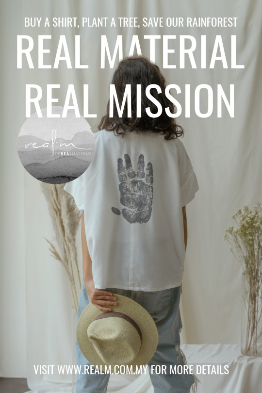
Note: The original image used in the poster (without text, stamp or logo) was sourced from Real.m.
CRITS
Eunice Loke:
There needs to be absolute clarification on the finance side and more research needs to be done about the cost of planting trees. A suggestion would be to involve the use of a microsite as a form of customer interaction, where they can actually see their efforts amounting to something rather than just promises.
Chynna:
The campaign seems like a blur between 2 things you’re trying to accomplish (maybe pick one or the other, because it’s a bit ambitious). But besides that, it clearly attracts niche customers but that’s okay because it’s the right group / target audience.
The poster looks like a book cover. The message of wanting to promote the brand doesn’t come through enough in the poster (seems to only promote the cause). A microsite could be useful in this campaign.
Sarah Ann Toolseram:
The stamp on the shirt aspect is a nice thought because it makes the product limited edition and increases exclusivity for the campaign (which is targeted towards an audience with higher income).
As for the poster, the brand logo could have just been the typography rather than the circle. The message is there and is presented clearly. A microsite could be considered. This campaign has potential to be expanded.
Basil Cha:
The poster would work fine as a deliverable, but you’d want to do more generally to showcase what you can do as a student. Like there’s a balance between just going all out with what you can do and still looking professional. Also, think about executing more even if it’s a small change in copy.
Damien Chung:
The idea behind it is great! Loving anything CSR. Maybe can also include some transparency in terms of the materials and also how you stamp and all, to showcase that you are truly who you say you are (show that you’re not going against your values of sustainability).
Yaeber Neo:
Explore a better placement, text alignment and choice of font. And as for the visuals, I think 1 poster isn’t enough to achieve campaign objective. Concept doesn’t come across in the poster strongly besides brief copy explanation.
Felicia Lee:
Perhaps this campaign copy can go around the thoughts of every tree (shirt) makes up a forest? Nice minimalistic concept on the t-shirts.
Ida Chong:
People who support the cause will definitely support the campaign. The stamp on shirts concept is nice because it has that customized appeal. Looks good visually!
0 notes