
Last Seen Blogs


4everflowercore
Am I happy too? I haven’t checked.🌸
wordsthatache
words that ache

actmiya
Act.NeaR

sihasmiles-blog
Small Things That Matter
Text

THE FRIDAY PIC is a pair of small bronzes by Richmond Barthé: Feral Benga (1935) and Stevedore (1937) from the little survey at Michael Rosenfeld in New York.
I wrote about the show (and two others) in today's New York Times. (See the text of my Barthé piece, below).
In the Times, I argued that Barthé's work should be seen as a kind of 3D photography, presenting Black people as a "normal" part of the everyday, contemporary reality of prewar America, not needing to be dressed up in the stylish (and often primitivizing) trappings of modernist art. (Or in any of the other stereotypes African Americans were forced to embody.) What I didn't have room to point out (or claim) was that Barthé, a gay man, maybe does the same with his homoerotic images, which also normalize, maybe even naturalize, gay desire and its objects. Only a high-realist style, aligned with the illusionism of photography, had the power to do that.
And here's what I wrote about Barthé in the Times (go to the whole article to read my other two brief reviews):
Richmond Barthé, the great African American sculptor, gets kudos for his realism, but that’s faint praise that damns him: In the 1930s, when his career took off, there were hundreds of artists who had as fine a technique; there are still lots in Times Square, sculpting tourists’ faces in clay.
Looking at the 16 busts and figures in the Barthé survey at Rosenfeld — it’s curated by the British artist Isaac Julien, who has a stunning video in the Whitney Biennial — I realized that it’s best to ignore technique and to think of them as three-dimensional photographs, or as much as you possibly could before the age of 3-D scanners. The sculptures look forward to our technology, not backward at traditional realism.
The best of Barthés’s figures make his Black sitters as directly available as possible to our eyes, the way a photo seems to. There’s no interfering dose of modernist style, which was imbued with stereotypes about Blackness and “primitive” African art that invoked ideas of the “savage” and the “primeval,” or, calling on an opposite set of clichés, of the “Edenic” and “authentic.” Those were applied to African Americans in Barthé’s era, forcing them into cultural pigeonholes.
He gives his subjects more room to breathe.
“African Woman,” from 1935, shows someone whose hairdo may distance her from 1930s America, but she’s not exotic or ancestral. She’s another person of today who happens to come from far away.
The male head in “The Negro Looks Ahead” enacts its title by just being there and looking out onto the world.
Three portraits of Black boys are just three children waiting to grow up, into a world they still imagine might treat them fairly.
4 notes
·
View notes
Text
THE FRIDAY PIC is Mavis Pusey's Within Manhattan, from 1977, now in the 2024 Whitney Biennial.
The almost-sort-of-maybe-not abstractions by Pusey (1928-2019) really feel as though they had something to say about art, and the world, as both existed at the moment she was making this work.
I can't say as much about pretty much anything else in the Biennial, except Isaac Julien's brilliant piece on Albert Barnes and Alain Locke. But then, I'm not impartial on that front — I'm just now on my last days of writing Barnes's biography, and Locke of course figures in it.
Image © Estate of Mavis Pusey. Photograph by Elon Schoenholz. Courtesy of the Whitney Museum of American Art.
7 notes
·
View notes
Text

THE FRIDAY PIC is "Untitled (Make-up)," a 20" x 24" Ektacolor photo, dated 1982–84, from the show called "Richard Prince: Early Photography, 1977–87," at Gagosian gallery in New York.
Looking at the exhibition, I felt distinctly looked-at.
An ad for Kool-Aid, offered in a 1983 copy-shot by Prince, shows a pitcher bearing the drink's trademark smiley face, its two eyes locked onto ours.
In an ad for Trix cereal, copied by Prince that same year, the googly gaze of the brand's "silly rabbit" looks out at us, knowing we're looking back.
In Prince's famous grid of photos titled "Live Free or Die," reproduced from biker magazines in 1986, nine motorcycle molls stare out, as though, like Kool-Aid, they can deliver "more smiles per gallon."
It's hardly an overstatement — in fact, by now it's almost a cliché — to say that our culture is a culture of consumption and that Prince's art gets at the vital role of images and vision in that culture. Before we buy, we look, less at the objects of desire themselves than at the photos that teach us what to want. In the 62 early works at Gagosian, Prince lets us look at that looking. But also, as I've just begun to notice, at how those images, and this art, look back at us.
Today's Friday Pic shows a young woman gazing into the mirror that's hinged onto the back of a deluxe box of eye shadow: In the act of looking at herself in that mirror — of making-up her eyes to look perfect for looking — she presents herself to the admiring eyes of a magazine's reader. And then, by copying the shot that offers her up, Prince sets us up to watch that complex transaction between looker and reader, adding our art-loving gaze into the equation. It's an infinite regress of desiring glances.
At Gagosian, the woman in that shot, like the women and men — and silly rabbits — in other Prince works, are also looking out of them at us, art lovers, as we look in on them. Just because we're standing in a fancy gallery doesn't mean we aren't part of the same vision culture, the same vision economy, as everyone and everything captured in Prince's images of images. Our gaze at a work by Prince is the gaze of readers looking at an eye-shadow ad, which is the gaze deployed by the woman as she looks at herself in her mirror, which is the same gaze an admirer is meant to direct at her, now that she's made herself worth gazing at.
But there is one thing that distinguishes a work by Prince from the image it copies, our sight of a Prince from our sight of an ad. Unlike an ad, an artwork's first and chief function is simply to offer itself up to our eyes and minds — it has no plan for what comes after. If someone buys it, that's none of its business.
Even in an art world that is so much about sales, the early works of Prince are selling us a chance to see and think, not to buy.
(Image © Richard Prince. Photo: Prudence Cuming Associates Ltd. Courtesy the artist and Gagosian)
13 notes
·
View notes
Text
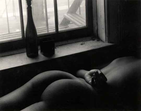
THE FRIDAY PIC is an untitled nude from the 1960s by Ray Francis, whose solo show I just wrote about in the New York Times.
In that piece, I set up a comparison with Ansel Adams's great "Moonrise, Hernandez, New Mexico, 1941," below. (Jokes about "moons" are strictly forbidden.)
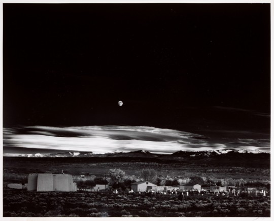
... but my goal was to point out how different they are, in their equally exquisite use of the black tones that mattered so much to their moment in "fine-art" photography.
Adams's shot is about nature, used to balance, even hide, the technologized world that shot comes out of — which includes the photographic technologies that allow for its blacks. (See my old piece that develops that idea.)
Whereas Francis's nude, for all its "naturalness", is about culture and nurture (or sometimes, lack of such), and about how culture shapes what black tones can mean.
13 notes
·
View notes
Text

On this 36th anniversary of Andy Warhol's passing, at 58, I thought it right to post this poignant photo by Peter Bellamy, which catches Warhol taking one of his very last limo rides.
“I believe in death after death,” Warhol once said. And, “When it’s
over, it’s over.” Maybe that's why he made such great use of the one life he did have — until it was broken off short.
26 notes
·
View notes
Text
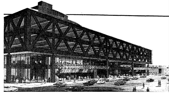
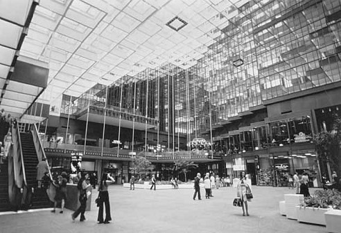
THE FRIDAY PIC is a 1980s rendering of New York's Port Authority Bus Terminal, in the news again as plans to replace it are moving forward, to much celebration.
A few years ago, I published a love letter to the PABT: https://brooklynrail.org/2021/02/special-report/Praising-the-Port-Authority-Terminal.
Rereading that piece today, in the face of all that celebration of its coming demise, I feel I should apologize for what I wrote: It was too half-hearted in its praise of the building.
I'm more than ever convinced that it is one of the truly great structures in New York, and by a long shot one of the most original. It's a fabulous example of functionalist Brutalism, descended straight from such functional treasures as the Roman aqueduct in Segovia.
We mourn the loss of the old Penn Station, even though plenty of experts once thought it was the height of Beaux Arts kitsch. Judging from the drawings I've seen for the PABT's banal replacement, we'll mourn the loss of its Brutalist ancestor just as much.
5 notes
·
View notes
Text
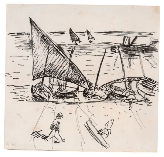
THE FRIDAY PIC is a 1905 image by Henri Matisse, drawn when he was at the port of Collioure, in the South of France, and now in the collection of the Musée d'art moderne in nearby Céret.
"Vertigo of Color: Matisse, Derain, and the Origins of Fauvism," at the Metropolitan Museum of Art, is all about the two artists' stay in Collioure.
Like every discussion of Fauvism, the Met's (as per its title) dwells on the movement's "pioneering" use of bright and unnatural colors — while mostly ignoring the powerful precedents set by van Gogh and Toulouse-Lautrec and even, in some ways, Monet.
I think the real radicalism on view in this show comes in its drawings. They are crude to the point of truly evoking the scratchings of "wild beasts." I'm not sure there's any precedent for their deliberate, extravagant ham-fistedness -- which they aren't using as a new style (earlier "bad" drawing could work as that) but as the refusal of anything like consistent, coherent, credible style.
I have a feeling that, in some sense, the wild color used by the Fauves was a kind of camouflage for the much wilder, weirder — uglier — drawing that lurked below it. Color, however bizarre, can always have a certain appeal. "Bad" drawing can feel like an attack on the world.
Image © Succession H. Matisse, photo Hélène Barbier.
14 notes
·
View notes
Text

THE FRIDAY PIC is a still from Ed Atkins’s “Pianowork 2,” a 16-minute video projection from 2023 that closes tomorrow at Gladstone Gallery's 21st Street space.
This image is one of the rare stills that captures the heart of a video work: Its figure looks so close to something real in the world, while giving telltale signs that it was born in a computer. And where does that leave the emotions it shows?
More on that work, and another Atkins video, below, in the little piece I wrote about his Gladstone show for the New York Times:
Atkins’s 16-minute “Pianowork 2” plunges deep inside the so-called uncanny valley, where digital simulations come close to perfect realism and seem the weirder for it. Using motion-capture technology, Atkins recorded himself playing a modernist piece for piano; the collected data was then turned into a nearly perfect digital animation of the same scene — “nearly” being the operative word. Atkins’s avatar emotes at the keyboard, just as any human pianist might — as we assume Atkins did, playing — but tiny glitches tell us that we are watching a digital creature that could never feel real emotions.
With traditional animation, we’d know that everything onscreen came from someone’s imagination; with a traditional video recording, we’d assume the scene had some real-world analogue. But “Pianowork 2” suggests the real, while making sure we don’t trust it.
Its companion at Gladstone, an 80-minute projection called “Sorcerer,” is a collaboration with the writer Steven Zultanski. It seems like the straightforward record of a theatrical piece: Two women and a man recite lines on a set that more or less recreates someone’s living room; their dialogue sounds like the almost-random chatter of friends, transcribed direct from life. Without going digital, this results in some of the same tensions as “Pianowork 2”: The transcribed chatter evokes the real, but putting it onstage is all about artifice.
Maybe the uncanny valley has always been a place where human culture likes to hang out.
2 notes
·
View notes
Text

THE FRIDAY PIC is a 1970 photo by the late Luigi Ghirri titled Modena, from his series Topographie - Iconographie. It's on view in Ghirri's latest solo show at Matthew Marks gallery in New York.
The shot reminds me of a particularly silly article I once wrote, as a barely-budding critic, comparing abstract patterns on shirts to abstract art in museums — but the Ghirri show makes me think I hadn't gone as far astray as I used to think.
Here's what I wrote about the show in today's New York Times:
Luigi Ghirri is “just” a street photographer the way Warhol was “just” some guy who liked to paint soup.
Ghirri, an Italian who died in 1992 at 49, is getting his fifth solo show at Matthew Marks, with 27 of his trademark color photos, taken between 1970 and 1990, on view. One thing that struck me, as it hadn’t before, is how Ghirri’s photos, although shot on the fly, manage to recapitulate the entire history of modernist painting.
There are images that seem almost Cubist, presenting the world as all disconnected: A woman’s eyes sit in front of her legs, and both float in front of the clothing store where she shops.
Other photos recall Surrealism: A silly toy gondola seems to bob in the photo of Venice that sits behind it, yielding a Magritte-y collision of the real and the fake.
A bunch of Ghirri’s pictures show telltale echoes of postwar abstraction. The modernist grid can be spotted in several, nodding to Agnes Martin or Sol LeWitt.
And Pop Art rears its head in his shots of graffiti and painted ads.
But maybe Ghirri wasn’t just paying homage to those roots in painting, or merely borrowing from them. I get a sense that he was also taking aim at painting’s false majesty, at a time when photography was still mostly denied equal status as art.
“You want fractures, dreamscapes, a modernist grid?” Ghirri seems to say. “I can give them to you at the press of a button.”
24 notes
·
View notes
Text
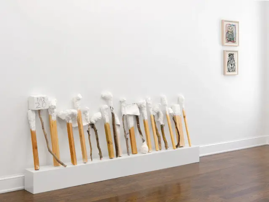
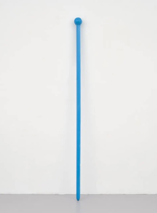
THE FRIDAY PIC is Nicole Eisenman's “Untitled (Billy Clubs),” from "The History of Hand Knitting," the two-woman show she shares with Rosemarie Trockel at Leo Koenig's gallery uptown in New York.
I reviewed the show for today's New York Times, and as I came up with what I wanted to say, I began to wonder how much of a critic's take can be purely personal, even eccentric, and how much has to be rooted in likely readings that others might come up with in looking at the work. Which is better, a reading of Hamlet that gets at his undoubted self-doubt and procrastination (for the umpteenth time) or one that decides to test the possibility that he's all about identifying with Ophelia's female gender? Which is better, that is, explication or interpretation?
At any rate ... here's what I did come up with for the Times:
So much of our suffering is caused by male aggression. (How many victims of war have been killed by women?) But for all the horror of that violence, there’s often something oafish about it, if only because of the boundless stupidity it represents.
This show captures some of masculinity’s toxic idiocy.
An untitled installation by Nicole Eisenman presents 20 “clubs” leaning against the wall. Each is just a length of scrap wood with a dumb blob of plaster at its top, as though its maker was either too lazy or too dimwitted to perfect his weapons beyond the minimum needed to bash a head. Nearby, also in plaster, a three-fingered blob of a hand sits on the floor, ready to grab at its clubs at the slightest provocation. (“You callin’ ME a blob of a hand?!”)
A blob of a head, about three feet tall and painted blue, looks on dimly from a pedestal, as though helpless to govern its own hand.
Rosemarie Trockel contributes quite different pieces to the show, but they hit similar notes. Back in 1984, she began to order up machine-knit balaclavas, like a terrorist or paramilitary fighter might wear. But instead of being bad-guy black, they had “girlish” patterns knit into them. My favorite covers its wearer’s face in plus and minus signs, like the love charms worn by Frenchwomen that stand for “more than yesterday, less than tomorrow.” It’s not clear if Trockel’s pattern counters the balaclava’s associations with masculine threat, or if instead of pointing to a love that’s bound to increase, it lets its wearer proclaim a hatred that’s always on the rise.
Photo by Shark Senesac
5 notes
·
View notes
Text

THE FRIDAY PIC shows a pair of details from, at left, Giorgione's "Three Philosophers," from around 1509, and Giovanni Bellini's "Saint Francis in the Desert," painted around 1475. (Uncropped images are below.) Both paintings are now hanging together, as they first were 500 years ago, at the Frick Madison in New York .
In today's New York Times I published a piece on how the two works, and the collection they joined in the 1520s in the home of the Venetian merchant Taddeo Contarini, mark the Big Bang beginning of our current conception of the art object, as an object whose main function is to be the subject of open-ended contemplation. https://www.nytimes.com/2023/11/22/arts/design/renaissance-works-frick-madison.html
But one detail I didn't have room for in my Times piece was the fact that it was the Bellini, and pictures like it, that set the scene for the kind of modern-style "art" that then got made by Giorgione. And that's because the new kind of perspectival, proto-photographic realism practiced by Bellini forced every inch of a painting to be filled with some kind of incident and information: There's no such thing as perfect emptiness in nature, and that means there can't be such a thing in naturalistic images. And the very plenitude this forces on artists means that there will be always be information in a picture that is in excess of what pure function demands; always information that is just there for the taking — and the contemplating.
Bellini's "Saint Francis" is the perfect example. Although it's possible to see all its details as motivated by its nature-loving hero, there's a sense that there's always more there in its landscape than can be explained away in such functional terms — that some of its features are just there because they are; that they are up for grabs, to do with as we please. That excessive detail — that detailed excess — paves the way for paintings, like Giorgione's "Three Philosophers," where every feature, large or small, is intended for the endless mulling over of ... art.


16 notes
·
View notes
Text

THE FRIDAY PIC is "Brown House," a 1969 painting by the late artist Eleanore Mikus, from her solo show now at Anders Wahlstedt Fine Art. Mikus is best known for the white-on-white, post-AbEx abstractions she made in the early 1960s. They rhyme with works of the same era by Agnes Martin and Chryssa. But her paintings at Wahlstedt come from a body of figurative work Mikus began showing in her 1969 solo at Ivan Karp's OK Harris gallery in New York.
Proto-Neo-Expressionist seems like a good way to describe them, since they so perfectly anticipate the figurative paintings that other, mostly younger, mostly European artists started making a decade or so later. But Mikus was born in 1927, so I have a feeling she's actually revisiting the outsiderish styles of female artists like Doris Lee and Carol Blanchard that played a major role in the American art world of her youth, but that we've almost totally forgotten. (Those styles were also vital to Andy's Warhol's 1950s work, as I discovered in my research on him, and probably to his later "performance" as an outsider, as well.)
I bet Ivan Karp recognized sources in Lee and Blanchard and their ilk, too. Born the year before Mikus, he always had an interest in that tradition, or at least in its vernacular roots.
7 notes
·
View notes
Text

THE FRIDAY PIC is a 1977 shot (two, actually) by Alen MacWeeney, from the exhibition of his subway photos now at the New York Public Library. I published a few words about his show in today's New York Times (text is below), but there was one detail, or question, I didn't have room to discuss: Is the figure at right, in the white coat and hat, possibly cross-dressed or transgendered? If so, there's a fascinating parallel between the collision of two codes implied in that figure and the collision of two images that is at stake in all the subway works by MacWeeney, which, as I explained in the Times, are in fact secret diptychs.
Here's my Times review:
Has there been another exhibition whose venue so perfectly suits its art? In one of the slender halls on the third floor of the New York Public Library’s Fifth Avenue headquarters, a civic landmark, hang photos shot in the slender cars of the New York subway, another symbol of the city. Walk down the hall at N.Y.P.L., and you might be on a platform looking into a stopped train: In one car, a weary-looking straphanger scowls while a rider in a head scarf and coat looks beatific; in another, a young woman ogles a dandy.
The Irish photographer Alen MacWeeney, 84, took these 44 photos in 1977 after arriving in Manhattan to work for Richard Avedon. They nod to the subway shots of Walker Evans from four decades earlier, with one major difference: In most of them, MacWeeney cleverly enlarges two subway shots onto one sheet of photo paper; with no seam between them, they register as a continuous scene. That gives each print a subtle surrealism, as we absorb the breach in space and time across its two photos without recognizing that they began life separately: A woman rests her eyes in a car that, thanks to MacWeeney, appears to have expanded into a maze of graffitied walls; another car seems to show its inside and outside at once, like a Möbius strip.
“The chance encounter of a sewing machine and an umbrella on an operating table” — that phrase by Isidore Lucien Ducasse is supposed to capture surrealism’s signature weirdness. But what about the encounter of an umbrella with another moment in its own existence? That’s the more peculiar strangeness we find in MacWeeney’s subway.
10 notes
·
View notes
Text
THE FRIDAY PIC is a piece from the solo show of new sculptures by Eric Wesley called "SWIZZLE TWIDDLE FIDDLE STICKS," at Bortolami gallery in TriBeCa in New York.
Leaning against the wall, the twelve pieces in the show evoke Minimalism — the leaning "Planks" of John McCracken — but also, more obviously, the enlargements of Pop: Most are modeled after barroom swizzle sticks (except one, that copies a kid's pick-up stick), yet all are the height of a basketball player.

But, as Wesley himself seems to imagine, they also constitute a little community, like drinkers waiting for a dive to open.
9 notes
·
View notes
Text
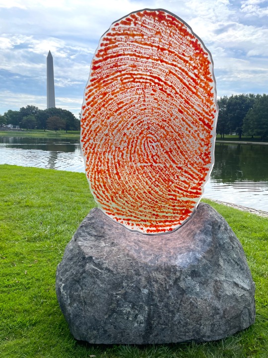
THE FRIDAY PIC is a photo I took of Wendy Red Star's sculpture called "The Soil You See...," from "Pulling Together," the big experiment in temporary monuments installed on the Mall in D.C. for the next month. I reviewed the project, at rather vast length, in today's New York Times.
In my Times piece, I claimed that "when you approach close enough to read Red Star's text, the Washington Monument pokes up in the distance. It seems small, almost insignificant next to Red Star's blood-red fingerprint," and I also talked about how the piece is "ready-made" for Instagram.
But thinking more about this, I've realized that in a sense my first claim depends on the second: Washington's monument only seems small compared to Red Star's when they are both seen in photos, like mine, that are taken in close proximity to the fingerprint — at an intimate, human-scaled distance you might call "selfie distance," even if the photographer's "self" isn't in the shot.
It's not a coincidence that, more and more, people can refer to all smartphone photos as selfies, because so many shots are now automatically taken from a distance that puts shooters close enough to their subject that they could, if they wanted, include themselves (even if in the end they choose not to). Most photos, that is, are now self-less selfies.
Photographs from the pre-smartphone, pre-selfie era shared the "viewing conditions" of traditional monumental sculpture: They could be taken from anywhere, by a roving camera's eye, just as outdoor sculpture traditionally invited a roving viewer to take it in from many different angles and distances.
The photos commissioned for my Times review (see below) are from that earlier era, where the specially empowered professional photographer still lives; that's why the Times photo of Red Star's piece fails to make the point that my self-less selfie does about how Red Star's fingerprint — naturally, automatically, essentially — dwarfs the Washington Monument. What I'm claiming is that in our smartphone era there is now a kind of natural distance, the "selfie distance," from which we "naturally" see the world around us, and that means that it is simply a fact, of culture if not of vision or optics, that Red Star's sculpture dwarfs the Washington Monument.
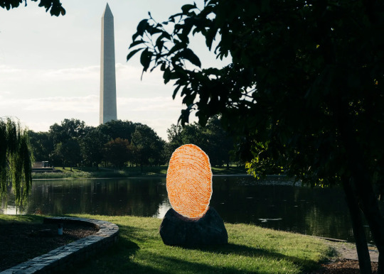
Justin T. Gellerson for The New York Times
Our omnipresent new imaging technology has, that is, returned outdoor sculpture, with its former address to a free-wheeling viewer, to the condition of an Old Master's perspectival painting, where the world is conceived as viewed from a fixed point — or at least, in our era, from the fixed distance and frontal position that has become natural to our smartphone-conditioned eyes and minds.
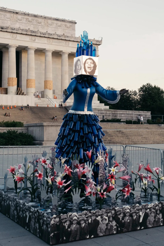
And that rebuts the complaint I made, in my review, about how Red Star's work, and also the statue of Marian Anderson by Vanessa German, were too small to hold their own on the vastness of the Mall. That would have been true in the old days, when we saw monuments truly in the round; today, with our selfied selves — our selfied minds — right up against those two new works, they loom huge. Even Washington's obelisk, or giant Mr. Lincoln on his marble chair, inevitably shrinks into the distance behind them.
Justin T. Gellerson for the New York Times
24 notes
·
View notes
Text
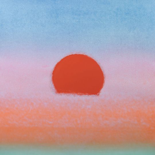
THE FRIDAY PIC is (sorry) yet another Warhol, one of the 472 prints of sunsets, each in its own colorway, that got used to decorate 472 rooms in Philip Johnson's groovy new Hotel Marquette in Minneapolis in 1972.
My excuse for going down the Warhol wormhole yet again is that this coming Sunday, Aug. 6, will be the 95th anniversary of his birth, so a little commemoration seems in order — and I thought an obscure image like this might make a better "gift" to the master than trotting out yet another Soup Can or Marilyn. There wasn't much that Warhol hated more than artistic cliché.
That same date of Aug. 6 marks the 78th anniversary of the destruction by A-bomb of Hiroshima, much in the news right now because of the recent biopic of Oppenheimer, father of that bomb. And I always imagine how Warhol must have felt, in 1945 on the day he turned seventeen, to discover that from then on any birthday celebration would have to compete with talk and images of the worst death and destruction the world had ever seen.
I can't help but feel that the glowing sunset in this print also hints at the well-known glow of nuclear detonation.
If that seems far fetched, it's worth noting that Warhol's chipper hotel prints have their roots in a never-finished "religious" film of sunsets he was commissioned to do for a never-built chapel planned by the de Menils as the Vatican pavilion at a Texas world's fair.
Warhol would have imagined his sunsets in competition, that is, with the brooding paintings the de Menils had already commissioned from Mark Rothko, and the hint of the apocalyptic they carry.
21 notes
·
View notes
Text
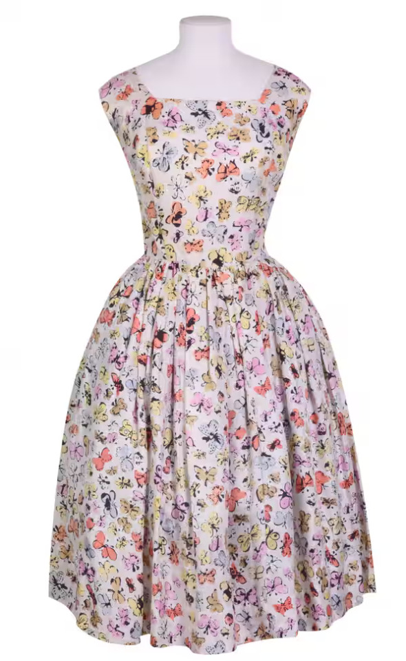
THE FRIDAY PIC is back in the saddle after a July vacation ... that included a trip London and a visit to the show of Warhol fabrics and garments now at the Fashion and Textile Museum.
The exhibition included this dress, made from a fabric designed by Warhol in the mid-1950s, and it came with a wall-text commenting on how the pattern must have been inspired by displays of mounted butterflies from the 18th or 19th centuries, and how that pattern seems to have been "a particularly happy expression of well-being for Warhol."
But I'd bet anything that the pattern was based on pinned butterflies that Warhol would have seen much more recently, in the 1930s in Pittsburgh in the Carnegie museum's natural history displays. And I think that pattern may just have had an almost political meaning for him.
The curator of those displays was an eminent White Russian lepidopterist named Andrey Avinoff, who was possibly the most openly gay man in Pittsburgh, caricatured as a "butterfly" in a local newspaper. (See the image at the end of this post.) So I think Warhol's butterfly pattern invoked that history, and was one of many examples of a gay man taking on mainstream society's homophobic stereotypes and slurs, as a way of resisting them.
I'd love to read a serious study of how mid-century gay culture used feminine signifiers — butterflies, flowers, pastel pinks, curlicued calligraphy — to assert itself in, and against, a society that billed gay men as fluttering pansies. Warhol would have to be Exhibit A.
Around the time of his butterfly fabric, Warhol did a self-portrait drawing of himself as a butterfly child, with a text that read: “Here
is Andy at the age of two—Looking wistfully at you—He has wings like a butterfly—And if you ask the reason why—He will say: I’m a butterfly you see—Won’t you come and fly with me.”

16 notes
·
View notes