art-bumblebea
art-bumblebea
i like to draw || medibang & krita
21 posts
Don't wanna be here? Send us removal request.
Last Seen Blogs

endlessspectrum
Endless☆Spectrum

kudinoxixuto
Untitled
summonersofruneterra
League of Legends
bigbouncingbassboy
Tickle Your Arse With a Feather
fuglyselfie
ok
Text
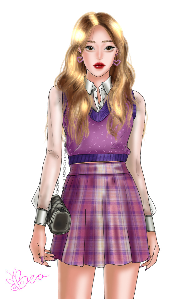
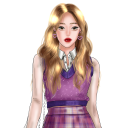
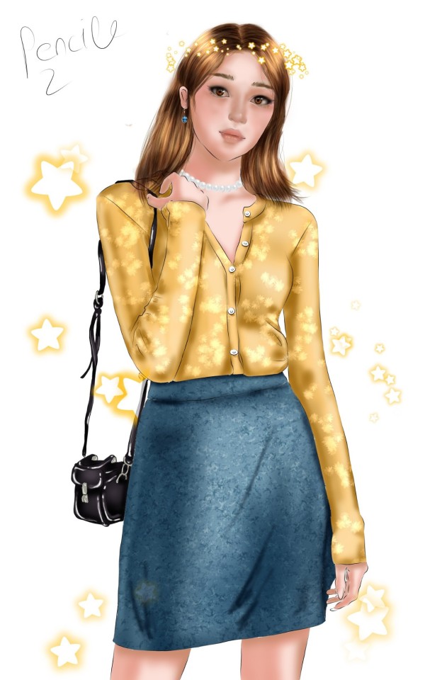
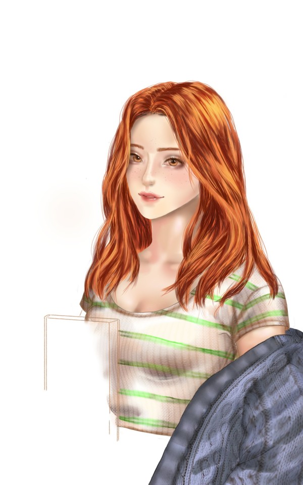
I still don't like medibang. However I think I'll use it in the future too, because the pen for lineart is so much better than the brush in krita.
Things I like:
1) I became a lot faster in the shading process. Once the sketching and lineart is down it's just *woosh* and the coloring is done.
2) I really like the face shape, the nose and the lips.
3) I think my clothes choices improved a bit.
Things I need to fix:
1) The eyes are not my favourite and the last one I did were much better.
2) I think the hair is a bit too bright and I don't really like the flow of it.
3) One eyebrow is too much in the middle of the face.
#medibang#made with medibang#krita#i miss krita#oc#orginal art#art#artist#digital art#my art#draw#drawing#illustration#anime#manga#digital#artist on tumblr#paint#painting#art blog#medibang still makes all my pictures blurry pls help#i wish i had a consistent style
1 note
·
View note
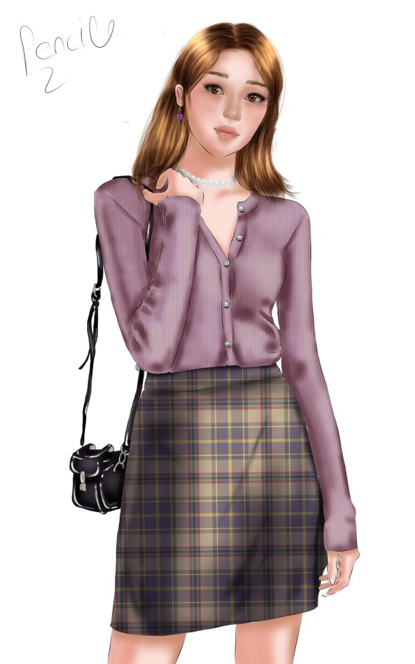
Text
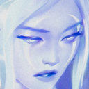
✨ ~Medibang still makes all pictures super blurry~ ✨
#medibang#made with medibang#krita#doodle#draw#drawing#art#artist#digital#digital art#artist on tumblr#my art#artist struggles#manga#anime#girl#in progress#omg her shoulders and arms are so big#but the face is pretty i think#i miss krita
2 notes
·
View notes
Text

There are still a few things I can't figure out on medibang and it bothers me so much because it was always so easy to do in krita and my old free Photoshop version.
- I can't find nothing helpful on the internet how to transform things and by that I don't mean how to make a thing bigger or smaller. There is this tool on krita, which can transform things perspectively, and I miss that.
- I downloaded a few brushes and even made one myself, but there are still not much to pick out. For textures I don't have none at all. I definitely need to find some more on the internet.
- Medibang make all my pictures really blurry and I don't know what I can do to prevent that. I use a 1600x2560, 300 dpi, canvas but however when I look at the picture on my phone it's still blurry.
#medibang#made with medibang#help#draw#drawing#program#art#artist#my art#artist on tumblr#artist struggles#painting#paint#digital#girl#art improvement#krita#webtoon#sketch#doodle#lineart#crafts#handmade#art by me#oc#huion
9 notes
·
View notes
Text


My favourite thing about painting digital is that it's so nice to have all these in-process pictures. It's so fun to see how things changed and got better.
#art#artist#draw#artist on tumblr#drawing#paint#painting#digital#illustration#medibang#girl#my art#illustrator#crafts
7 notes
·
View notes
Text

Slowly I get used to medibang. It's much more easy to make the lineart in medibang, than it is in krita.
Now that I drew a few things in medibang I started to miss a lot of things that I was used to use in krita.
- In krita you can have a separate color palette for each drawing and can switch between them. Also the palette is like a grid and each color can be organised freely in this grid. It was nice to have one block for skin colors.
- Kritas blending brush was the best.
- In krita the pressure sensibility is much more better. The brush thickness change more, than it does in medibang. This had the advantage that I didn't need to change the brush size so often. And on top of that krita have a lot more features to fine tune the brush settings.
#medibang#krita#drawing program#program#software#free#brush#draw#drawing#art#artist#my art#illustration#digital#painting#anime#girl#webtoon#artist on tumblr#star#sketch#doodle#my art style
2 notes
·
View notes
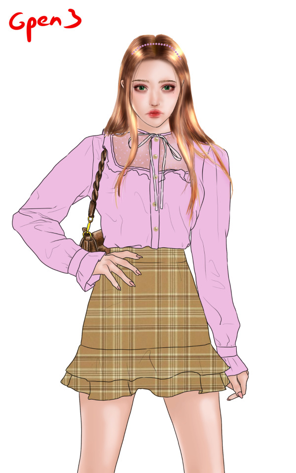
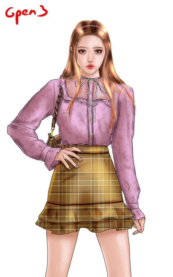
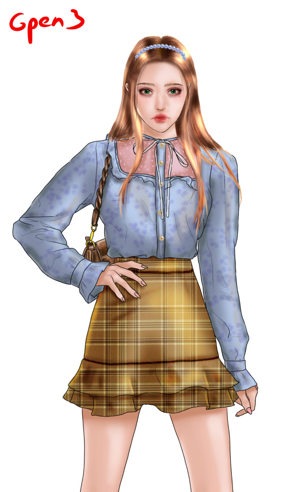
Text

This is my second try at medibang to figure out how the hair brush works. I think it's slightly better than last time.
I didn't finish it, because I notice the weird shoulder as a made the jpg.
My favourite things are the lips and the hair shading (but the form of the hair is kind of stiff).
1 note
·
View note
Text

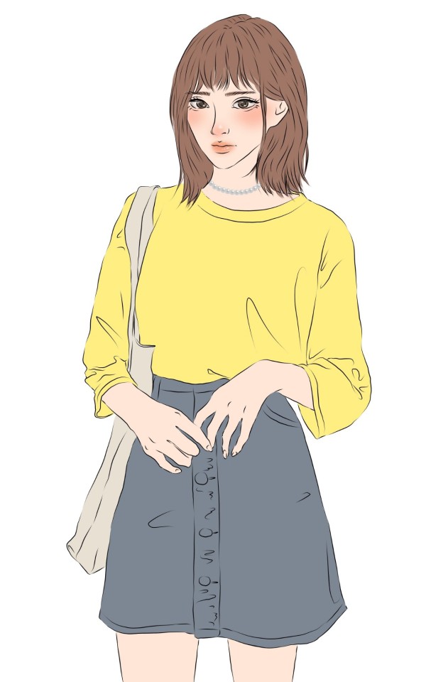
I'm new to medibang and I'm still trying to figure out how to use some brushes.
Here I was mostly focused on the hair. I don't like the brushes for hair on medibang and I think I'll make my own in the future, even if I don't made own before.
And yeah, eyes aren't my thing. I never had one single drawing where the eyes were fine.
#art#medibang#krita#painting#my art#sketch#doodle#girl#anime#manga#my art crap#it turned out not great
1 note
·
View note
Text
Today I downloaded medibang and so far I like it.
The first thing I noticed that's definitely different from krita is, that the lineart brush can fade automatically. The lineart looks so cool and fine with the changing thicknesses.
Also medibang made the coloring process a lot easy, because the brush don't overpaint the lineart.
On the other hand I miss krita. Medibang don't have so much brushes pre-installed.
0 notes
Text

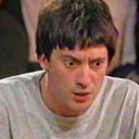
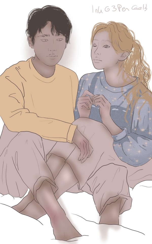
Last week I tried to do a "hair study" and today was the time I tried my first attempt to use this new technique.
Yeah, this is a huge fail. I hate this so much and it's definitely in the top three of all my art fails.
I always make my own little list of three things I like and three that I should improve next time. In my opinion this helps a lot and it makes me feel better, because I didn't "waste my time on this" and it's more like a learning experience.
Things I like:
1) The hair of the boy looks natural.
2) The shading on her elbow and arm looks good.
3) The lips of the boy have great colors.
Things that could be better:
1) The hands are really big and have a weird positions. Next time: A hand is kind of the same size like the face.
2) Not so great turned the blending on the face of the girl out. It looks really muddy and like she has a mustache.
3) Both the girl and the boy wear weird clothes. Next time: Look up some outfits online.
#fail#art#artist#my art#digital art#krita#painting#made with krita#draw#drawing#artist struggles#art fail#ugly#couple#anime#struggle#improving
0 notes
Text
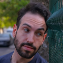
This week I found a really great artist that's called patnoc. (Please look at his/her works on twitter.)
Especially pretty in all her/his artworks are the hair and therefore I tried to do a "art study" about that.
I put the reference picture next to the drawing canvas and went straight ahead and kind of copy exactly what I saw.
I wanted to know how you would paint these style of hair and now my skills are definitely improved. The way how I paint hair changed since then. You can easy tell the quality difference between them and I feel a little bit weird to post something that's so highly influenced, but it helped so much.
My skills to draw hair changed so drastically. I notice it the most in the time I spent on it. Before my little study I needed embarrassingly long to draw hair and now it's just *wooosh* and it looks fine.
0 notes
Text


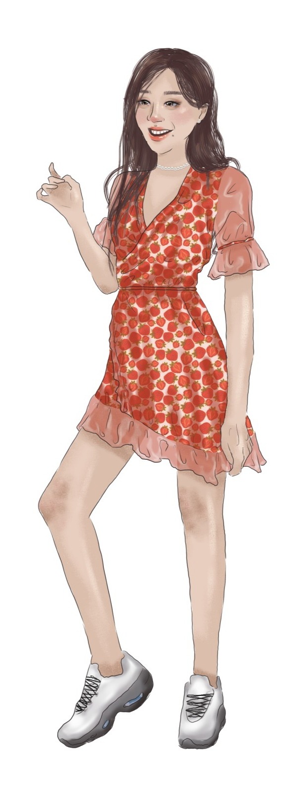
Oooh it turned out so pretty. (And it took me soooo long.)
I think I can finally see my style improving and become a lot more prettier.
Next time I should definitely spent less time really zoomed in, because I spent a lot of time to draw the folds very precise and now you can't really see all of the details. I should look at the drawings a bit more from afar and not so up close to it.
But overall I'm super happy with the end results.
#draw#drawing#art#artist#artist on tumblr#digital#painting#digital art#my art#girl#strawberry#illustration#character design#character#anime#paint#krita#made with krita
2 notes
·
View notes
Text
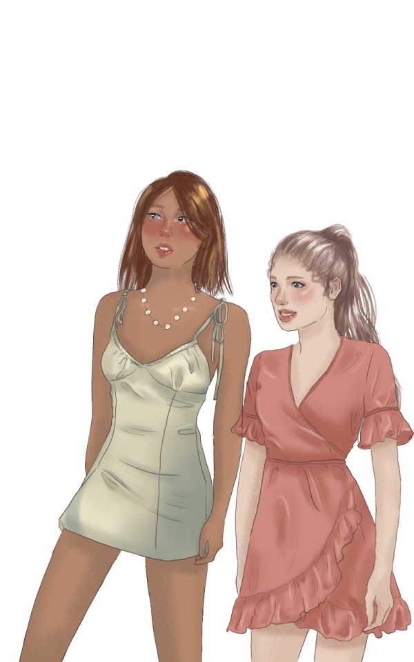
I love it so much!
Things I like:
1) All three faces are great. There are no things of the face that look off or bad positioned. Even the eyes are pretty fine for my skills.
2) The dress is pretty shiny and simmery. In the close ups it fits well and the body proportions look fine.
3) My favourite is the middle one, because I feel like ot has the most personality. It looks like she is going to speak. I know that all my drawings are kind of bland faced and expressionless, so this seems like a good step in the right direction.
Things I need to improve:
1) The proportion of the full body view need to be better. I wanted to make her a little bit cubby (all of my drawings are thin people), but it turned out weird. I think its mostly because the neckline of the dress is too low and her breasts are totally uneven.
2) The earnings could be more realistically shaded, so it looks really flat. Next time: More shadow and maybe make it golden to work better with her skin tone.
3) Her skin tone is fine, but it was so a pain to pick the right color. Most of the time it was super unhealthy red or had a huge yellow undertone. Next time: Add more shades to the skin color palette. I would love to make her skin more darker.
#draw#drawing#art#artist#artist on tumblr#my art#painting#paint#krita#digital#digital art#portrait#skin color#anime#webtoon#illustration
0 notes
Text
It's just a sketch, nevertheless I think it looks really pretty.
The lineart is always hard to do in krita, but this time I adore the result so much. The lines look so fine and less statically, because of all the different thicknesses.
My favourite thing about this are the faces. I like the expression of the boy and that he is looking to the girl, which is looking in the distance.
I tried to make the shading on the sweater a bit more like in animes, but it turned out weird and generally is her top not well designed. Next time: Look up some real sweaters for design inspiration.
#art#artist#sketch#draw#drawing#my art#my art lol#anime art#doodle#handmade#artist on tumblr#krita#made with krita#digital art#painting
0 notes
Text

Okay, okay, I'm soooo proud of myself. I'll never be able to draw something this pretty again, for sure.
It's by far my favourite thing I ever made.
Things I really love:
1) The smile of the boy turned out so great. It looks kind of shy and uncomfortable and I love it so much. I like his eyebrows really much too.
2) The hair looks so good too. Especially up close you can see all the single strands of it.
3) Her face and lips are so well done too. I love everything about it.
#art#artist#my art#art blog#digital#draw#drawing#krita#made with krita#paint#painting#couple#anime#love#lineart#program
0 notes
Text

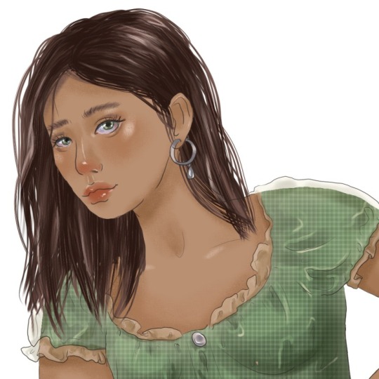
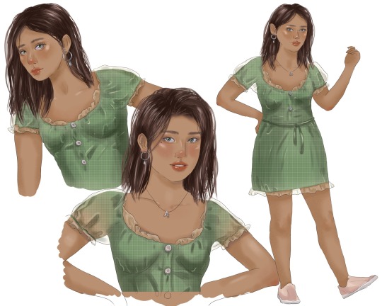
I finally found a way to do hair digitally. Currently I'm still new to krita and today I figured out that there is a brush pre-installed that mimic hair.
For my first attempts the hair look a lot better than in my previous works. The one with the green dress is more of a sketch and you can definitely tell that the girls in the fleshed out version have really pretty hair.
Also I experimented with the brushes a bit. Now the skin has a lot more "texture" and don't look so flat.
0 notes
Text

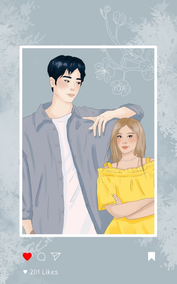
I think this is my favourite thing I ever made!
Things I like:
1) The lineart is so pretty. I'm so proud of myself, because it looks so fine and subtle.
2) I really like the color of the clothes, especially that the shirt isn't white and instead more a grey with a purple tint. All the colors together seem just really harmonic.
3) I don't know what it's about her face that I like so much. It looks just really cute and nice. On top of that the position of the eyes is really good.
Things I need to improve:
1) The hair is still kind of flat. I would like if it has more details and more strands.
3) Next time I should make the shoes more like the shirt in a slightly tinted white. Now they just look bold and don't fit in the rest of the painting.
3) The folds of the fabric on the arm with the coffee are a little bit weird. On the other arm they look fine.
#art#artist#my art#artist on tumblr#paint#painting#draw#drawing#illustration#illustrator#krita#made with krita#anime#girl#webtoon#digital#design#character#manga#my stuff#orginal art#my oc#sketch#doodle
1 note
·
View note
Text

It took me so long to make the lineart so thin. In my last drawing the lineart was really thick and bold, so I find that I improved it this time.
Also I think the folds in the fabric turned out more natural and realistic than last time.
The only thing that bothers me is the arm of the girl, which is made out of three parts instead of two. I feel a little dumb that I didn't notice that till now and that I drew such a weird arm in the first place.
Overall both drawings are kind of cute and minimalistic.
#draw#drawing#art#artist on tumblr#artist#painting#paint#digital#digital art#illustration#krita#made with krita
0 notes